If you’re still trying to figure out how to incorporate Rose Quartz and Serenity into your home, let alone Greenery, then you’ll be pushed to even ponder the release of next year’s colour schemes. But low and behold, the Pantone colour forecast for 2018 has arrived.

At the International Home + Housewares Show last week, the Pantone Colour Institute executive director, Leatrice Eiseman, gave a sneak peak into what colour and design trends for 2018 we can expect to see. And there appears to be something for everyone.
Eiseman predicts that our infatuation with iridescence will continue, since ‘the human eye can absolutely not avoid’ anything pearlised or translucent. Metallics are set to shift to neutrals, while bright and bold colours will replace pastel shades, reflecting our increasingly intense lifestyles and thought processes.
Here is a closer look at the eight palettes you can expect to see next year.
Playful (above and below): As the name suggests, this palette is not to be taken too seriously. Fun colours such as Minion Yellow and Lime Popsicle remind people to stop and smile - perfect if you love bright colours or you're a sucker for those little yellow troublemakers.

Discretion: Branded as Playful's alter ego, Discretion is the queen of subtle hues. Desaturated hues, such as Elderberry and Hawthorne, are said to offer a new sense of strength, while the power of pink comes into its own.
Verdure: Think robin’s egg blue, berry purple and celery green – this palette is symbolic of health with vegetal colours aplenty.
Far-fetched (below): An attempt to reach out and embrace different cultures, this palette is made up of warm, earthy tones such as Cornsilk Yellow.

Resourceful: A combination of warm and cool tones, this palette consists of complementary blues and oranges that, when put together, really draw the eye in.
TECH-nique (below) : Brilliant White and Frosted Almond balance out the bright pink, turquoise and purple shades in this palette, which is a nod to technology.

Intricacy (below): An abundance of neutral metallics (aka, the "new neutrals") with accents of dramatic Holly Berry Red and yellow Sulfur.

Intensity: This eclectic mix of colours evokes a sense of strength, power and sophistication, balanced with black and gold.
Can’t get your head around them all? Don’t worry, we’ve still got about eight months of Greenery left.
-
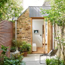 How to soundproof a garden - 7 ways to block out the noise
Stuck with noisy neighbours? Busy road ruining your garden tranquillity? Here’s some effective ways to shut out the sounds
-
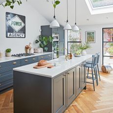 The best kitchen island layout ideas for a sociable and practical cooking space
Kitchen designers reveal the ideal kitchen layout ideas to make the most of every inch of space
-
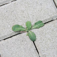 Does salt kill weeds? Absolutely, but gardening experts urge you to take note of these key considerations first
The most effective way to use it for maximum impact


