

When the owners bought this three-bedroom terrace house in London, they fell in love with the really high ceilings and feeling of space. It was the only house they walked into where the couple felt it was ‘the one’.
Most of the work was cosmetic. They removed carpets and restored the wooden floors across the whole house. They also stripped wallpaper and re-plastered, as well as knocking through the two reception rooms and putting in bi-fold doors.
The living room

The living room idea is used as more of an adult space for entertaining, while the second reception room is more of a family TV room, so the owners wanted to separate the two spaces out.
'It looks quite minimal at the moment, but we plan to eventually build in some beautiful storage, including a library around the doorframe, as well as buying some new pieces of furniture,' they explain.
The owners wanted a simple, clean and calm look in in the living room: 'Some people think that any white is white and tend to go for the easy choice of Pure White. The colour we ended up choosing is quite a soft white. It works well with lots of different colours but feels slightly greyer in the evenings.'
As they had chosen quite a slouchy living room sofa idea in the other reception room, the couple picked a vintage Danish design as they wanted something more contemporary and minimal for when visitors came round.

The owners hired professionals to repair, fill, sand and stain the original floorboards as they only had a month to get all the work done. 'It has totally transformed the feel of the house and six months in it still looks great,' they told us.
The decorators also re-painted the original fireplace and the couple found the perfect living room shelving idea for the alcove. Made of solid metal, it's heavy but fits well and offers a modern aesthetic. Abstract, modern artwork throughout the home helps link the spaces together.
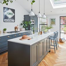
The kitchen diner

As the previous owners had installed the kitchen just a couple of years ago, the couple kept the units but replaced the horrible grey lino. They thought about restoring the wood floor, but ended up choosing tiles as they’re more practical in a busy kitchen idea.
'I had black and white checkerboard tiles in the house I grew up in, and we’re both keen on the monochrome look. They’re absolutely beautiful and really make the rest of the ground floor kitchen area and downstairs toilet sing, as well as working really well with the natural wood table. As with most families, we tend to spend a lot of our time in the kitchen now,' the owner explained.
The landing

In the hallway idea, the owners chose Mylands’ Marble Matt finish paint for the walls, which is scrubbable so it’s great if you get scuffs. On the stairs, they used a gloss finish, which is reflective and and really hardwearing.
The bannister had too many layers of paint to strip it back and restore, so they painted it a dark brown to look like real wood. They teamed this with a playful blue shade.
The master bedroom

‘Our bedroom is one of my favourite rooms in the house,' says the owner. 'I absolutely love the shade of blue paint. It’s a spectacular colour, which feels vibrant in bright light and warm. Then cosy and enveloping in the evening light, which is exactly what you want in a bedroom.
As there’s a big bay window idea and lots of light coming into the room, the light play was important with the colour scheme. The couple went for a tonal scheme, with blue blackout curtains, which really darken the space and make it feel cosy at night. The artwork by Lucy Giles and yellow throw bring a brighter colour pop into the space.
The upholstered headboard is made from Molly Mahon fabric, which tones well with the walls. They chose moveable wall lights as they’re much better for reading and the bedside tables were a vintage find.
The children's bedroom

The kids bedroom idea is a good size but the owners wanted to create a space that wouldn’t date too quickly and would last the two boys for the next five to eight years.
They were inspired by similar built-in joinery online and came up with a design featuring four single beds to make the most of the space.
'We don’t want to move anytime soon and most of our family don’t live in London, so it doubles up as a place where friends and family can stay over, and in future the boys can have sleepovers,' they explain.
'I think we’ve succeeded in creating a look that’s not too childish. It adds some storage to the room and also works with the light in the space. The gloss finish on the beds was intentional as it’s extremely hard wearing and plays well will the light, both in the daytime and evening.'
Have you been inspired to ditch the frills for a minimalist look?
The third bedroom

When the family first moved in, this was a child’s bedroom with a horrible carpet and light pink walls. As this room looks onto the rear garden, they picked a greenish-grey colour that connects with the outside.
As the owners plan to make this their home office idea, they chose a white dome-shaped light that feels quite calm and helps to create a peaceful work space away from the kids.
'We’re both quite into abstract art, and in general love monochrome, so the canvas by Adriana Jaros was something that sung out to us and contrasts well with the rest of the space.'
-
 The best kitchen island layout ideas for a sociable and practical cooking space
Kitchen designers reveal the ideal kitchen layout ideas to make the most of every inch of space
-
 Does salt kill weeds? Absolutely, but gardening experts urge you to take note of these key considerations first
The most effective way to use it for maximum impact
-
 How we test air purifiers at Ideal Home
We've put multiple air purifiers through Ideal Home's testing process to find the best-in-class. Here's how we do it.


