Dulux's Colour of the Year 2018 encompasses the mood of the moment, and Heart Wood has been chosen as the colour that best reflects the nation’s yearning to transform their homes into true sanctuaries. The colour is inspired by the warmth of wooden tones. It is a warm neutral, with a hint of heather.
Go two-tone

When planning the overall decorating scheme for your home, tie in colour themes. Paint two bands of colour on a wall as an effective way of introducing strong colour into a room without allowing one hue to dominate. This will allow you to recreate the look of a dado rail but with a modern edge.
Read more: Nine signs you're obsessed with interior design
It is all in the detail

Paint the back of a display cabinet or alcove in alternate shades of Millennial pink and soft lilac as a pretty backdrop to china, glassware and books for a contemporary look that is easily changeable.
Highlight architectural features

If you are lucky enough to have high ceilings then why not make the room appear cosier by bringing the ceiling colour down to the picture rail. Choose varying hues of heather and go for tonally close hues such as inky blue and dusky pink elsewhere.
Read more: Check out Pantone's colour trend predictions for 2018
Go dramatic in the boudoir

For a dramatic look in your bedroom, paint walls a deep luxurious shade such as dusky mauve and deep plum. Compliment the wall colour with wood and metallics such as a rose gold table, or a wooden bedstead. 'The warmth of wood reflects the comfort that we need in these uncertain times – this material is an essential element for creating the welcoming environments we desire,' say Dulux.
Make a feature of it

Adding a bright hue to your bathroom will really lift your whole home, bringing this functional space into line with the rest of your decor. Or, if you prefer a chic and modern take on interiors, you can choose muted tones to complement your otherwise neutral bathroom colour scheme. Here, two complementary colours work beautifully to draw the eye in.

In the past, there may have been more of an all-or-nothing approach to colour in the kitchen - remember avocado green and burnt orange in the 1970s? The new palette is a bit more restrained, with pale purples, greys and darker, inky shades proving a big hit - though that doesn't mean you can't have fun with kitchen colour. Tone is important too - even within the grey family, warmer greys create a different feel from blue-based shades of slate. Team with wood for a warm and welcoming scheme.
Combine colours

Re-energise your hallway with a powerful colour combination. Yellow and purple sit opposite each other on the colour wheel. Use these complementary colours as a sure fire way to brighten your day. Include accessories and furniture in a similar palette to ensure the scheme is cohesive rather than chaotic.
Will you be using this colour palette in your home?
-
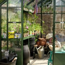
 Worried about protecting your garden this summer? Here’s how a bespoke security kit can help
Keep your garden safe with the help of BURG-WÄCHTER.
-
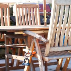
 How to clean garden tools - Top tips to keep your hand tools and trusty lawn mower in check
Yes, you really do need to clean your watering can
-
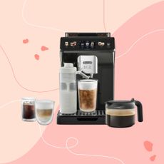 We try De'Longhi's latest superstar bean-to-cup coffee machine
This bean-to-cup coffee machine could curb your habit of buying iced lattes forever.


