Gelato glam – 7 ways to embrace sundae shades
Embrace the only palette that's good enough to eat
Sign up to our newsletter for style inspiration, real homes, project and garden advice and shopping know-how
You are now subscribed
Your newsletter sign-up was successful
Looking for summer colour ideas? Take your inspiration from lazy, sunshine treats by choosing furniture and accessories with a cool ice-cream kick. Which flavour would you like? Cup or cone?
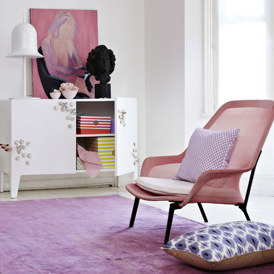
1. They highlight iconic status
The Bouroullec brothers' classic Slow chair takes on a whole new look in pastel pink. Work it with tonal hues, but keep the backdrop neutral so the punchy piece takes centre stage. Shots of black and geometric print prevent the scheme from being sickly sweet.
Slow chair, Ronan & Erwan Bouroullec for Vitra.
Article continues below 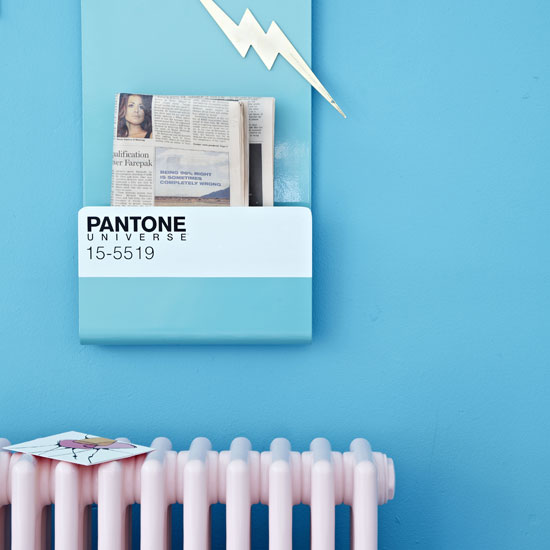
2. They transform the industrial
Functional hardware is a great foil to the gelato trend. This vintage-look iron radiator is as pretty as it is
practical. Installing a Wallstore that displays its Pantone credentials reveals a knowing, confident artistic touch.
Radiator, Bisque. Pantone wallstore, Seletti.
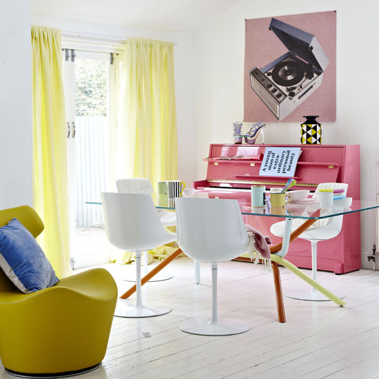
3. They're the perfect partner for brights
A mix of different gelato shades works well in a scheme, but introducing a bold citrus hue really ups the ante. This brightly upholstered chair goes perfectly with the pastel yellow table legs and washed-out lemon curtains. The spirit-lifting palette pops in a white space.
Piccola Papilio armchair, Naoto Fukasawa for B&B Italia. Table, Ross Lovegrove for Knoll. Curtains made from Brera Alta linen in Willow, Designers Guild.
Sign up to our newsletter for style inspiration, real homes, project and garden advice and shopping know-how
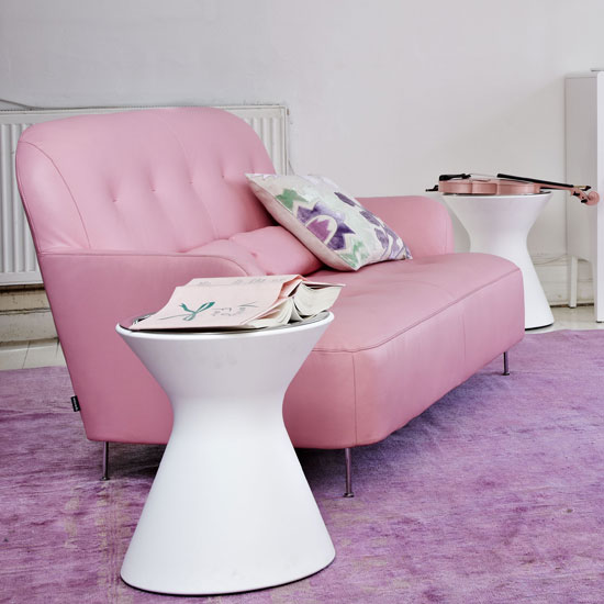
4. They're the height of retro chic
The curvy Harry sofa
in crushed raspberry has a strong, almost kitsch, Fifties vibe, especially when teamed with a blueberry rug. Pastels combine well with white, but you could venture an apricot-coloured wall to give the space a warmer feel.
Harry sofa, Eric Jourdan at Ligne Roset.
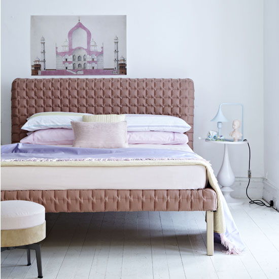
5. They’re versatile – and add depth
There’s more to sundae shades than vanilla, strawberry, mint and pistachio. For an alternative yet equally delicious colour pop, try this dusky shade of pink, or faded raspberry if you will. This sophisticated take reveals the edgier side of pastels (we saw it everywhere at the Chelsea Flower Show) – this bed may be pink, but it’s far from girlie.
Ruché bed, Inga Sempé at Ligne Roset.
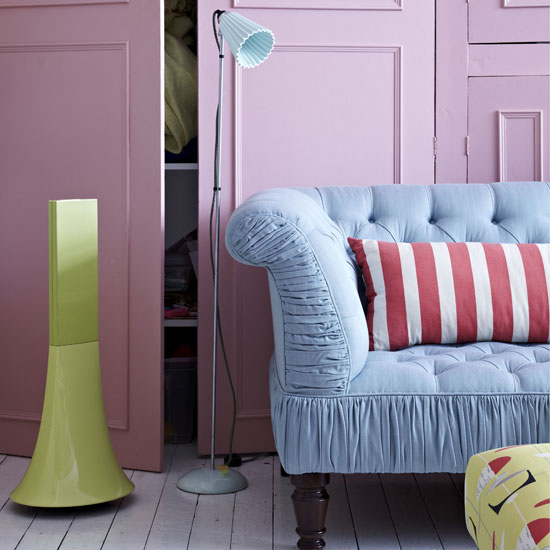
6. They make textures pop
Delicate it may be, but this powder blue is a power colour with the ability to soften both a formal sofa and the ridges of a ceramic lampshade. Add a few retro print cushions for added vintage edge.
Hector pleat floor lamp, Original BTC. Alexandra sofa covered in Claremont Serge Antique, George Smith. Parrot speaker, Philippe Starck at The Conran Shop.
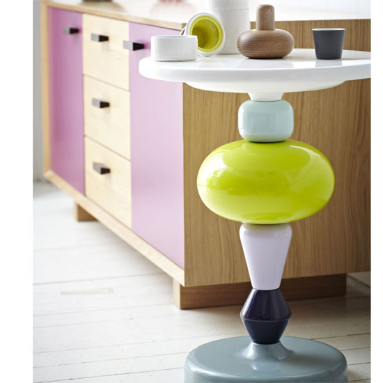
7. They add a joyful twist
We love this Shuffle table. Not only does it combine a fab mix of colours, its components can be threaded in any order you like – giving the piece a fun, Liquorice Allsorts feel. Combine with the Coast sideboard in Battenburg pink and yellow and you've got one rocking, witty corner to be proud of.
Like this? You'll colour these colour combos that shouldn't work (but do!).
******
******
Shuffle table, Mia Hamborg for &Tradition. Coast sideboard, Steuart Padwick.
For more great styling ideas, see housetohome.co.uk/livingetc
******
Tamara was Ideal Home's Digital Editor before joining the Woman & Home team in 2022. She has spent the last 15 years working with the style teams at Country Homes & Interiors and Ideal Home, both now at Future PLC. It’s with these award wining interiors teams that she's honed her skills and passion for shopping, styling and writing. Tamara is always ahead of the curve when it comes to interiors trends – and is great at seeking out designer dupes on the high street.