6 colour schemes that work every time
Can’t decide on a colour scheme? Choose one of these foolproof palettes for a room that feels both timeless and fresh

Sign up to our newsletter for style inspiration, real homes, project and garden advice and shopping know-how
You are now subscribed
Your newsletter sign-up was successful
Colour is the easiest and most effective way of instantly creating a mood for every room in your home. Get it right, and you could be on to a winner. Take a peek at these 6 colour schemes that will work every time...
Black-and-white
Go back to basics with monochrome. From the two-tone Tudors to 1920s Art Deco style to the sleek and slick 1990s, this ageless theme transcends time. Black and white is as practical as it is striking, allowing for the easy introduction of textures and colours and a no-fail way to co-ordinate a room. It's also an incredibly hard-working option.
Article continues below 
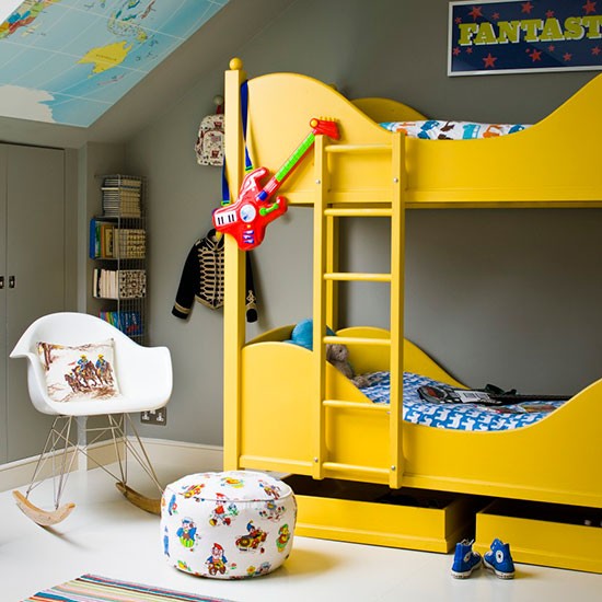
Grey and yellow
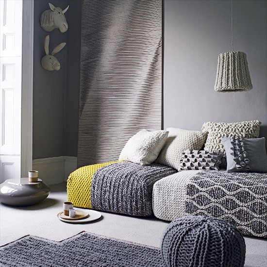
Grey and yellow is a winning combo. Not only does it make a luscious statement, it will also stand the test of time. From acid brights and slate-inspired hues to pale pastels and soft greys, this arresting colour combination is playful, fun and full of character.
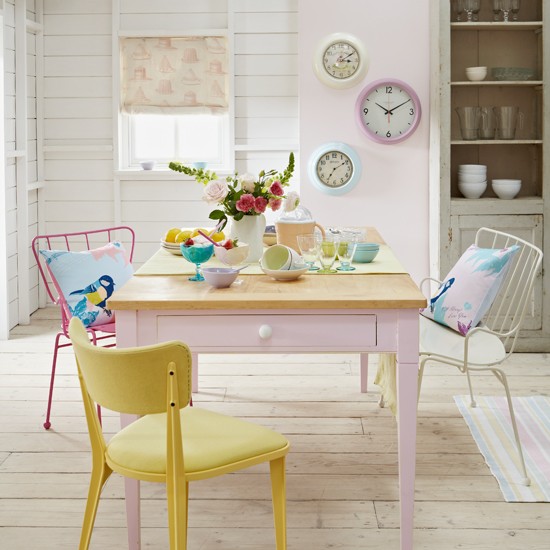
Faded pastels
Although you might think pastel colours will only work in the spring, these soft shades are actually great for making your home feel light and airy all year round. Muted tones of mint, lemon and duck egg can make just as much of a statement as more vibrant colours. Whether your tastes are grounded in classic country, or something more along the line of hotel-chic you still can make this popular colour scheme work for you.
Sign up to our newsletter for style inspiration, real homes, project and garden advice and shopping know-how
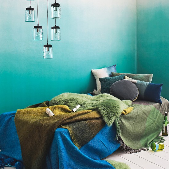
Blue and green
Who said blue and green should never be seen? This organic colour combination takes its cue from nature, and when done right, it can look incredible. While we appreciate that these are not complementary colours, a combination of the two hues will create a harmonious scheme. Ocean-inspired tones of green and aqua combine with rich petrol blue for a dramatic, coastal feel.
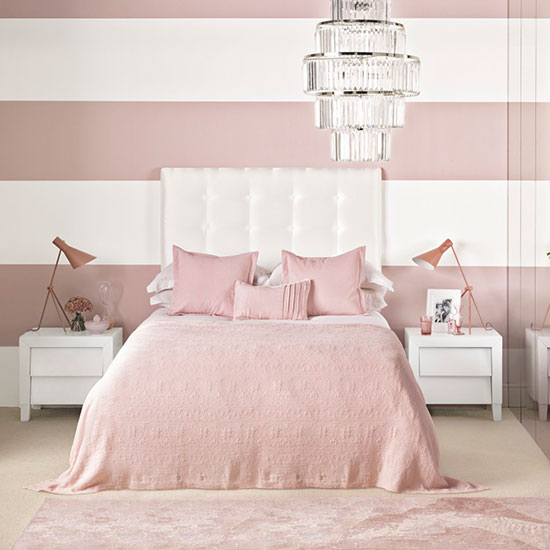
Nude pink and white
The time has come to think pink - or rethink pink, anyway. Delicate nude pink is an elegant hue that's perfect for a romantic feel. Its underlying beige tones prevent it from being too girly and it looks classy and sophisticated when paired with white on the walls and furniture.
Grey-on-grey
This trend shows no sign of flailing. Explore the many depths of a grey colour palette by layering tones to create a scheme that looks cohesive and considered. By using the same colour, but in both its palest and deepest incarnations, you can create a rich, contrasting look that is still harmonious and coordinated.
Take a look at some of these other great colour combinations that work a treat.

Thea Babington-Stitt is the Managing Editor for Ideal Home. Thea has been working across some of the UK’s leading interiors titles since 2016.
She started working on these magazines and websites after graduating from City University London with a Masters in Magazine Journalism. Before moving to Ideal Home, Thea was News and Features Editor at Homes & Gardens, LivingEtc and Country Homes & Interiors. In addition to her role at Ideal Home, Thea is studying for a diploma in interior design with The Interior Design Institute.