How to choose the perfect paint colour for your home – experts reveal their top tips to make this decision as easy and straightforward as possible
This expert-approved guide takes the guesswork out of picking the right shade for your space

Sara Hesikova
Choosing a paint colour for any room in your home is usually a very exciting yet a very daunting task at the same time. The sheer amount of choice there is out there on the market can make this rather overwhelming – which is why we’ve asked several paint experts how to choose the perfect paint colour to make the process as easy and fun as possible.
The paint ideas they’ve come back with is nothing short of genius. This expert-approved guide to choosing the perfect paint shade for any room in your home includes every necessary step you need to take and every question you need to ask yourself to arrive at the best possible paint colour for you and your space.
‘Choosing paint colours can be overwhelming, so the best thing to do is to limit your options based on yourself and who will be living in that space,’ says Marianne Shillingford, creative director and colour expert at Dulux.
Article continues belowHow to choose the perfect paint colour
Even if you are colour-shy that doesn’t mean everything needs to be covered in your best white paint. But rather, opt for some exciting accent colour ideas.
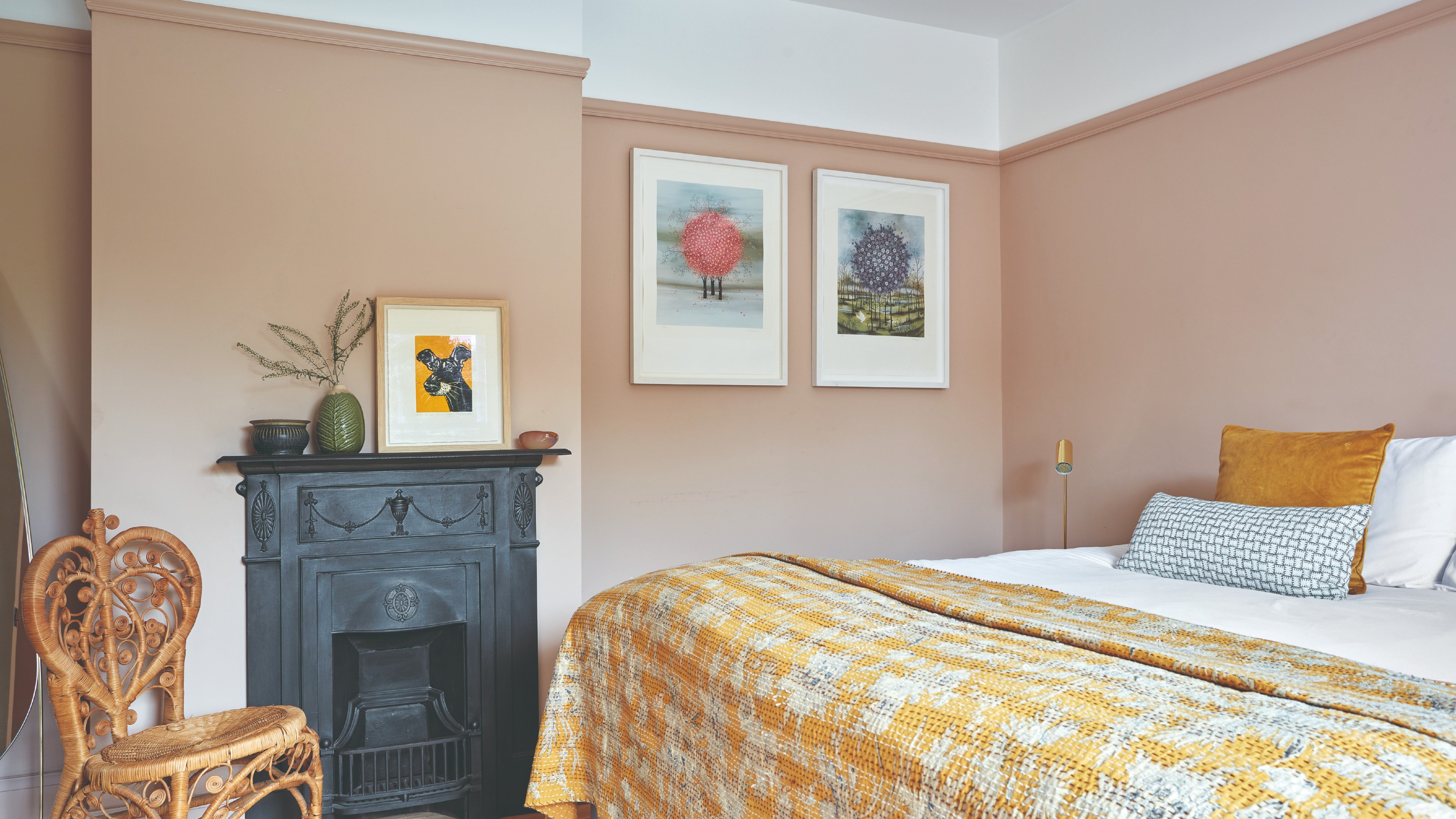
‘Although white is a safe and easy option, don’t be afraid of adding pops of colour,’ says Helen Shaw, international director of marketing at Benjamin Moore. ‘If you're a little colour-shy, featuring just a few bright accents will create an uplifting space. Painting a single wall, ceiling or elements of the woodwork is a good way to use such colour, so it doesn't feel too overwhelming. If you are lucky enough to have architectural features such as picture rails and cornices in your home, adding a burst of colour to create highlights is guaranteed to boost your space and can be personalised to the individual’s taste.’
However, even when choosing accent paint colours, you should follow the same process as when selecting your main paint colour.
So whether you're colour-drenching your room or going for just one wall, these are the questions you should be asking yourself when deciding on your perfect paint colour or colours and what you need to do…
Sign up to our newsletter for style inspiration, real homes, project and garden advice and shopping know-how
1. Which direction does the room face?
Working out the direction the room faces (the side the windows are on) in relation to the sun is a great starting point for choosing paint colour. This is because sunlight can have a huge influence on paint colours, pulling out different base tones depending on the warmth or coolness of the sunlight. In a south-facing room the same colour can look totally different than it will in a north-facing room.
'It’s important to take note of which direction the room faces and therefore how much natural light will enter the room as this can impact the colours. As a general rule, rooms facing south will be filled with natural light whereas those facing north lack the warm sunlight so can feel a little cool, particularly in smaller spaces,' Helen at Benjamin Moore explains.
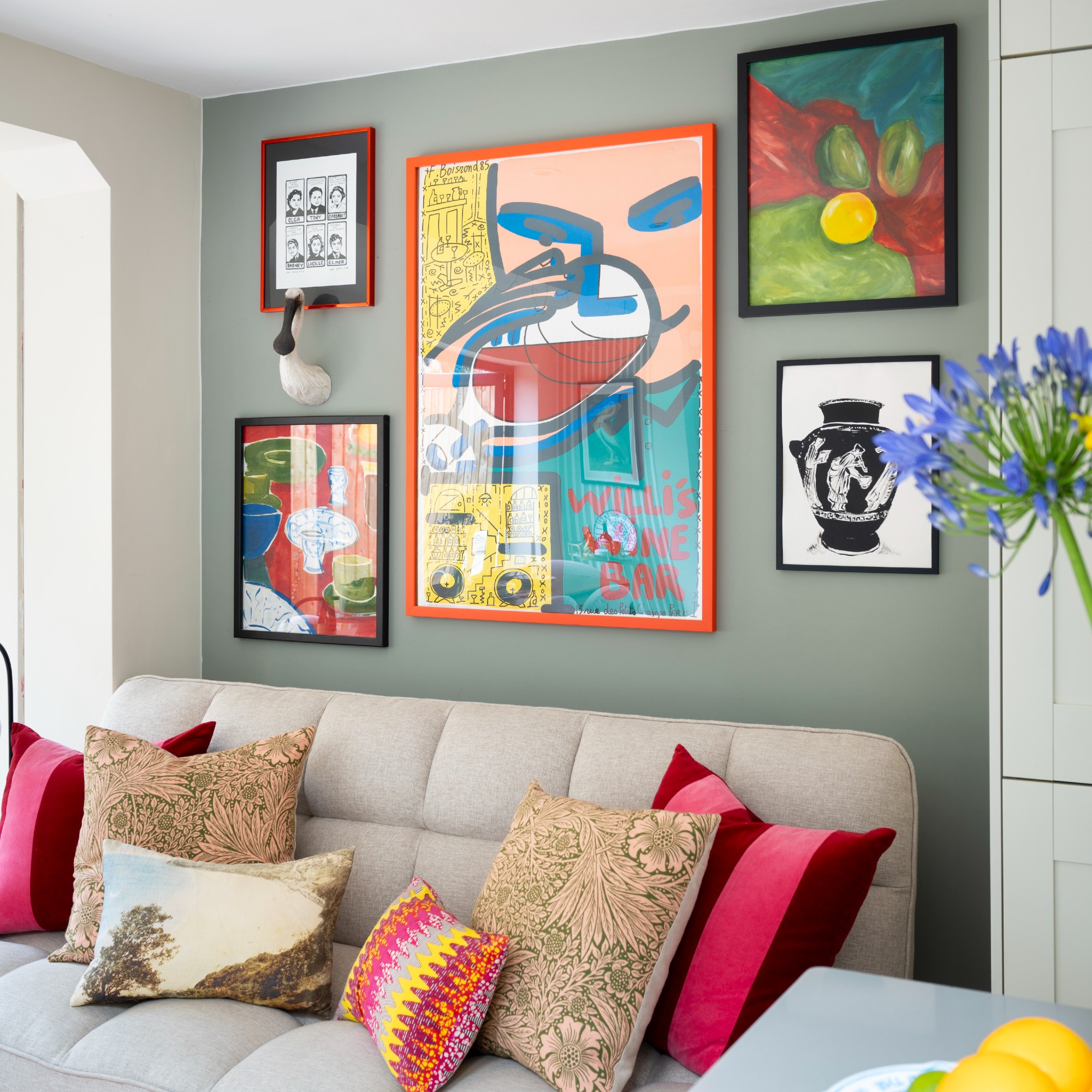
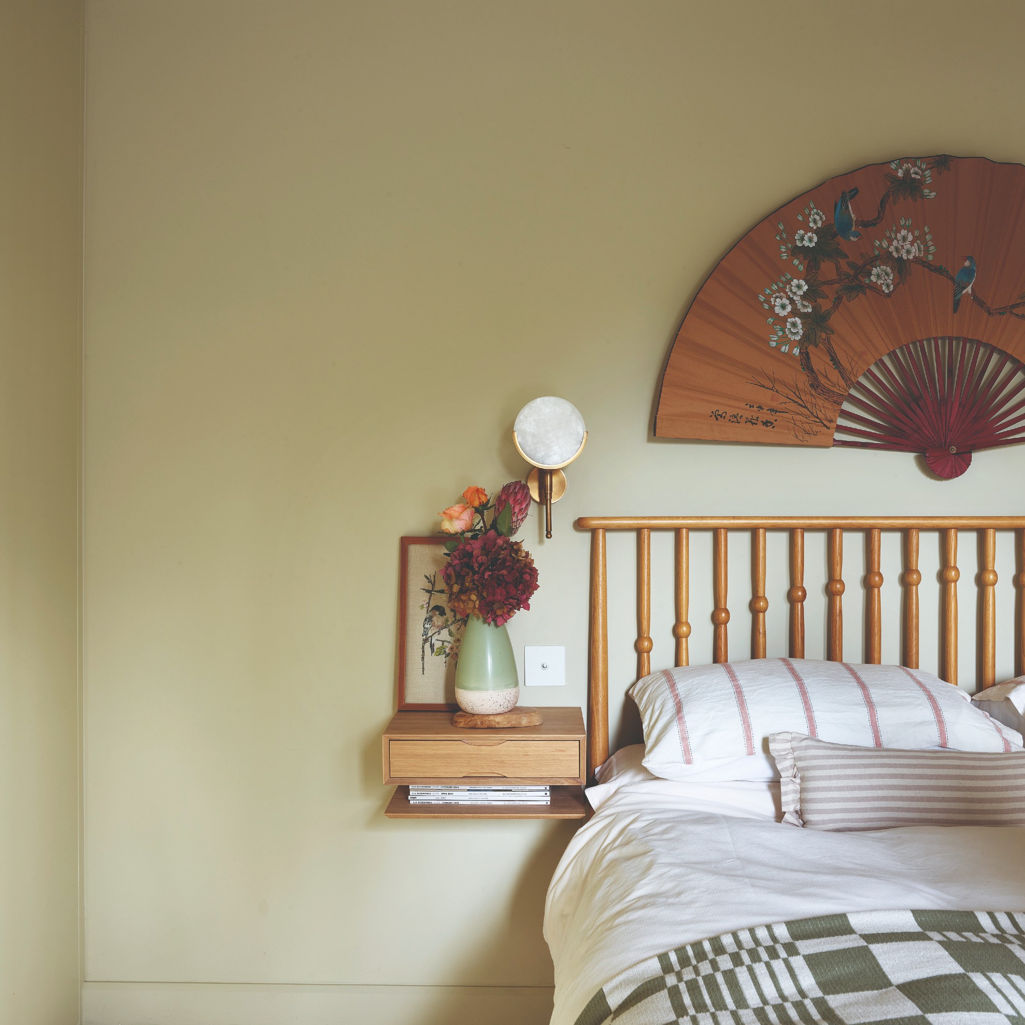
Flora Hogg, colour specialist and interior designer at paint brand Craig & Rose, talks us through which paint colours to decorate north-facing rooms with and which are better for south-oriented ones. ‘Rooms that face south get warmer light, which can bring out yellow base tones. So, choose something cooler than you might normally go for – the sun will warm it up. Blues, greys and greens are perfect choices for south-facing rooms,’ she says. ‘North-facing rooms can feel cold and flat. Opt for warmer tones to counteract this, such as creams, yellow-based neutrals, and plaster-like shades.’
2. What colours do you like?
With so many colours to choose from, it makes sense to narrow your choices down by thinking about the colours you are naturally drawn to, whether consciously or subconsciously.
'I always say, decorate like no one's watching,' says Tash Bradley, Lick’s director of interior design and colour psychologist. 'When choosing colours for your home, it's so important that you decorate for you and you choose things that you love and that make you happy and bring you joy. Because our homes are a reflection of us.'
And if you're not quite sure what those colours you gravitate towards are, you can look to your wardrobe and see what shades it's largely populated with.
'You want the colours to speak to you in a positive and uplifting way, so don’t pick colours based solely on trends because you’ve got to love it! One of my biggest tips for choosing colours is to look at your wardrobe and see what colours mainly feature – those are the colours you naturally gravitate towards,' Marianne at Dulux says.
Alternatively, you can also turn to mood-boarding – and one of the easiest tools to do this digitally without any fuss is Pinterest. 'I always say Pinterest is my most used tool of all time. I use it with my clients every day because it removes the scariness of making a choice. I get them to save things on Pinterest, just pin things that they like. They might not know what they like about it, but I just want them to pin loads of stuff. And because it's digital, it's really easy. People have no fear when it comes to it. Now, the key with it is then to go in deeper and work out what you like about it,' Tash explains.
3. How do you want the room to feel?
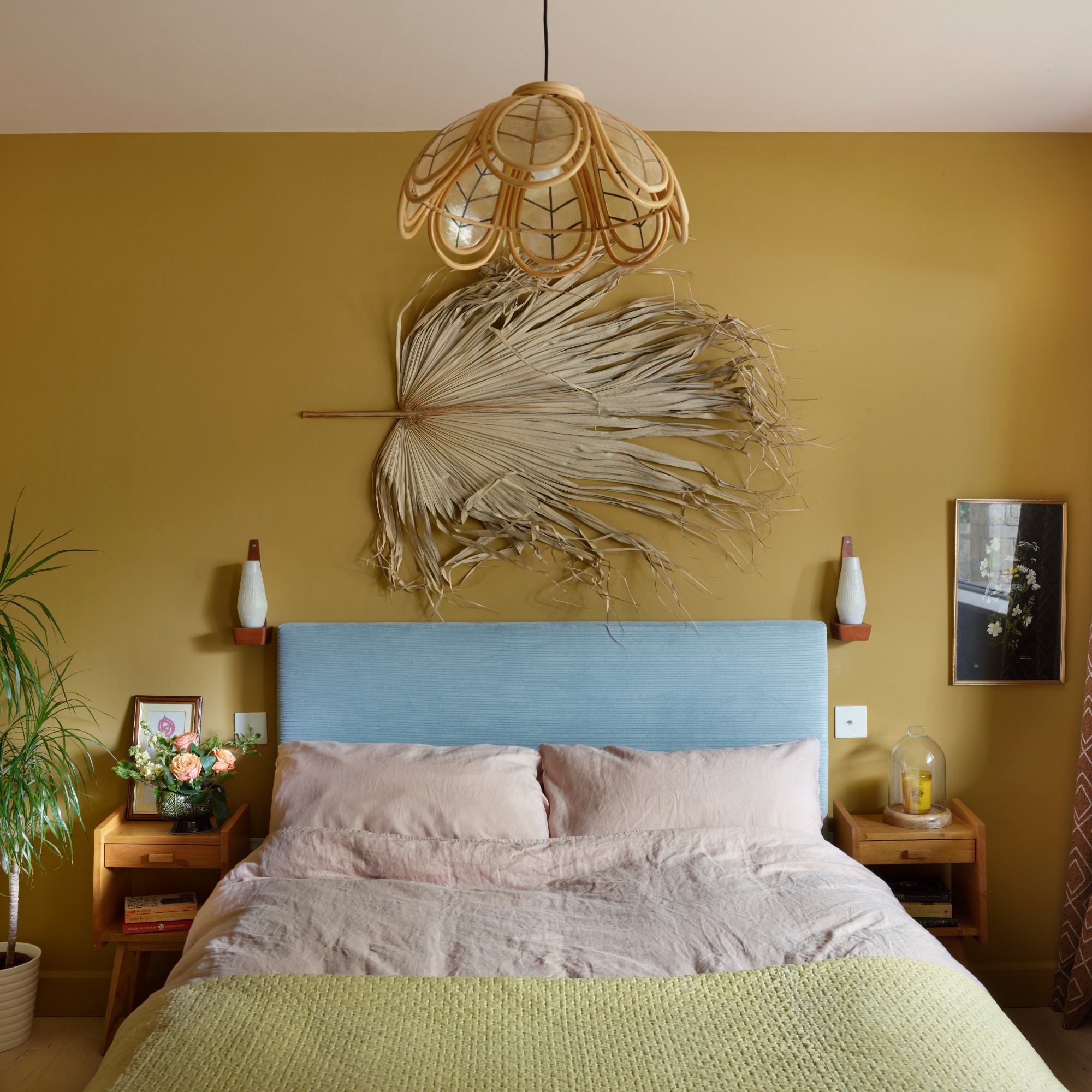
Figuring out what kind of atmosphere and feel you're going for in the room in question should also help you arrive at the most suitable paint colours for that space – want a calming, relaxing room? Then bright, vibrant shades are likely not going to be it. Or are you creating an energising type of space? Soft pastels are probably not the way to go then.
'Start with how you want to feel, not just how you want it to look,' says Jen Devaney, Frenchic Paint’s colour consultant. 'Do you want to feel energised? Grounded? Softened? Begin with the mood and the purpose. Not just the function of the room but how you want to feel in it. Trends are great for inspiration, they often reflect the emotional mood of the wider world. But if they don’t resonate with you personally, that’s okay. Colour is more than visual, it’s emotional. That’s the part many people skip.'
4. What is the purpose of the space?
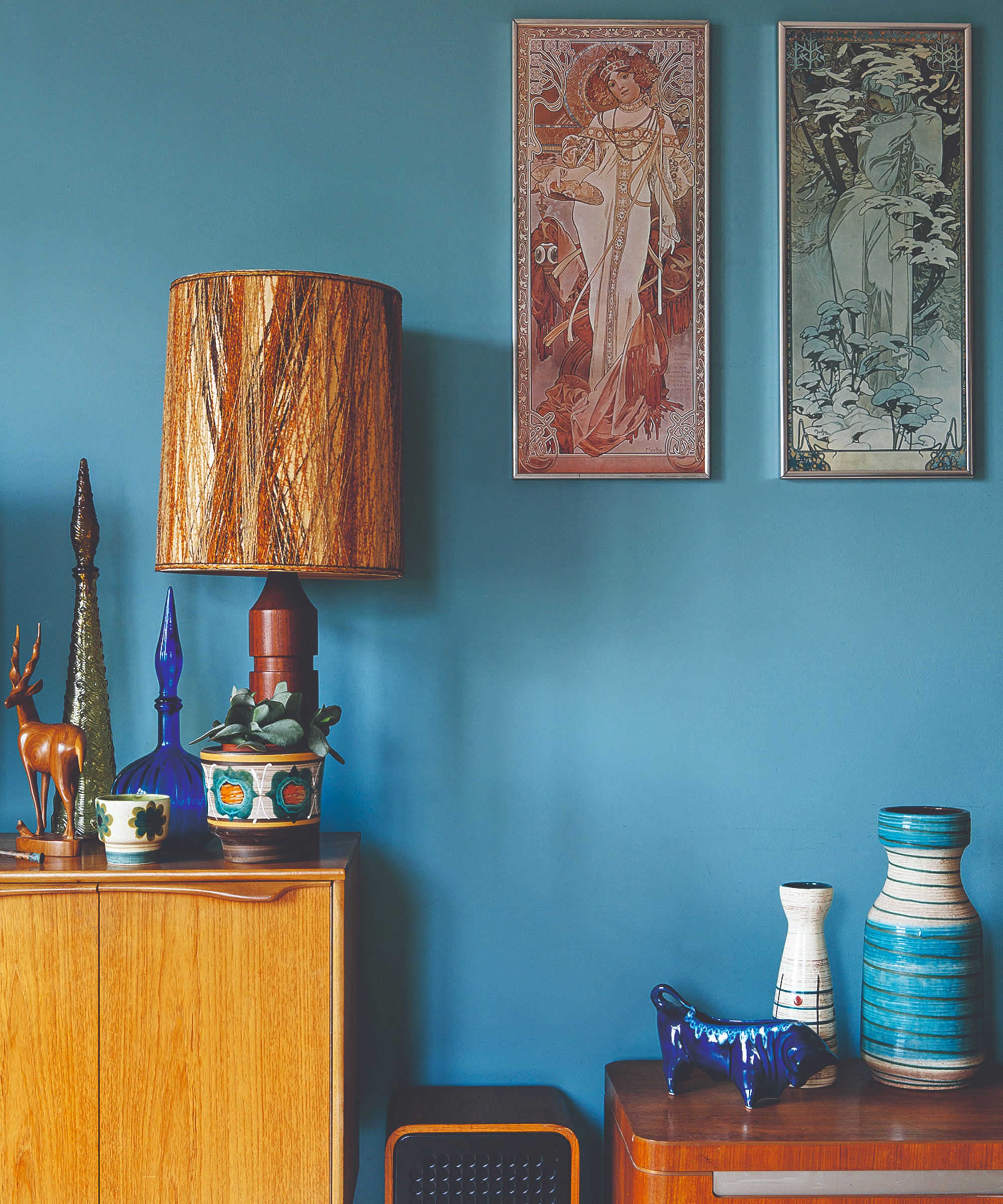
Another important question you need to ask yourself is, 'how is the space going to be used?' And this includes everything from the various purposes of the space to the times of the day that you'll be using it.
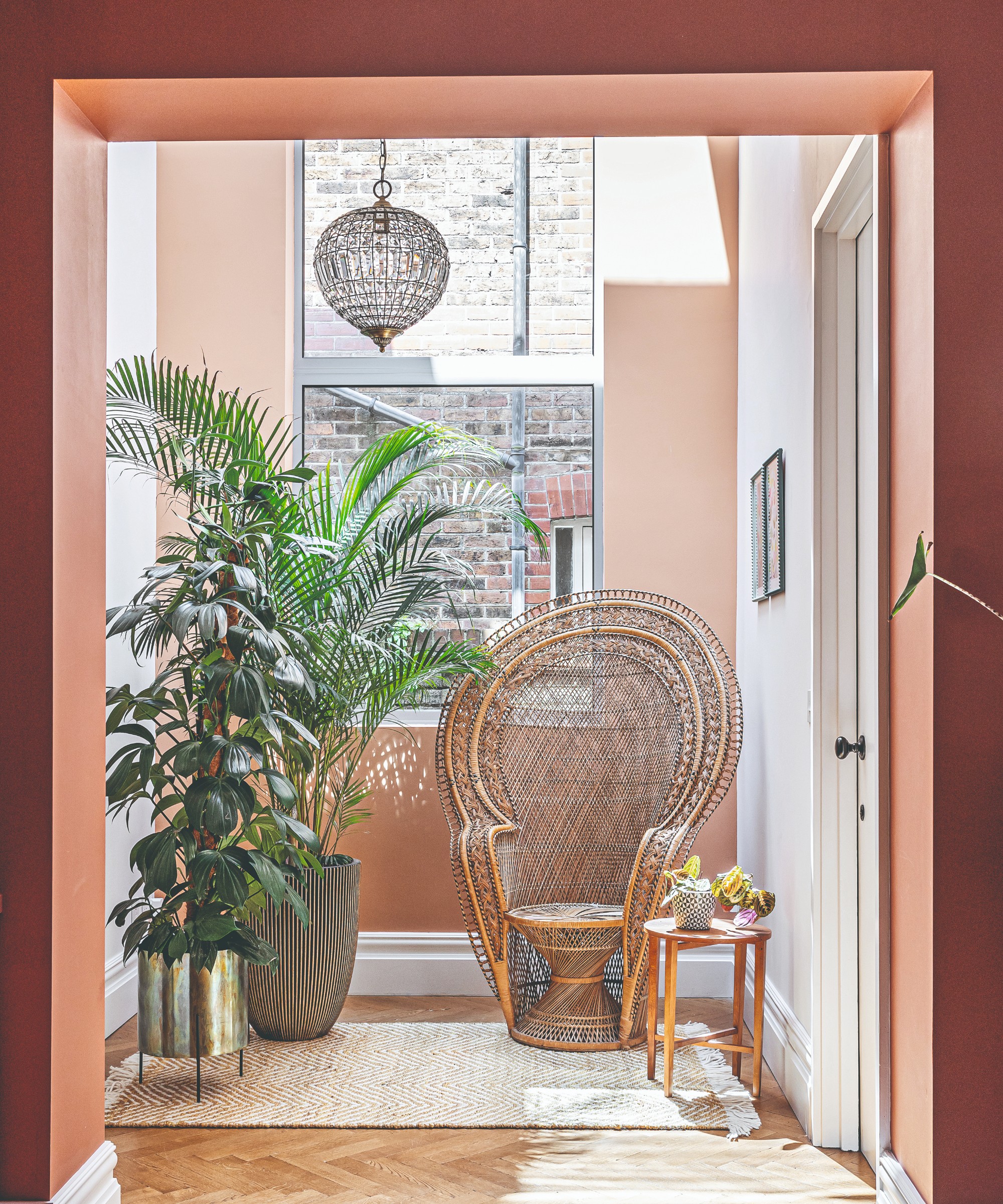
'It’s important to think of the optimum time you will be using your room and work backwards from that,' says Emma Bestley, creative director and co-founder of YesColours. 'If you only use it at night, sample colours you will predominantly see at night with artificial light. The darker they are, the more they will darken as the night draws in. Deep jewel tones of blue, terracotta, green and teal are ideal for a cosy, intimate space at night. On the other hand, if your space is used mostly during the day and you want to create a fresh and airy feel, opt for softer hues of peach, green and pink with a muted undertone to achieve a more serene environment.'
Tash at Lick paints a picture, 'Think of the purpose that the room is going to serve. Is it a room where you'll have lots of people? Like a kitchen – it's a busy space., it's super social. You want to make tea in the morning, but then you want to work from there in the day, and then at night, you want to host a dinner party.'
5. What are the other colours in the room?
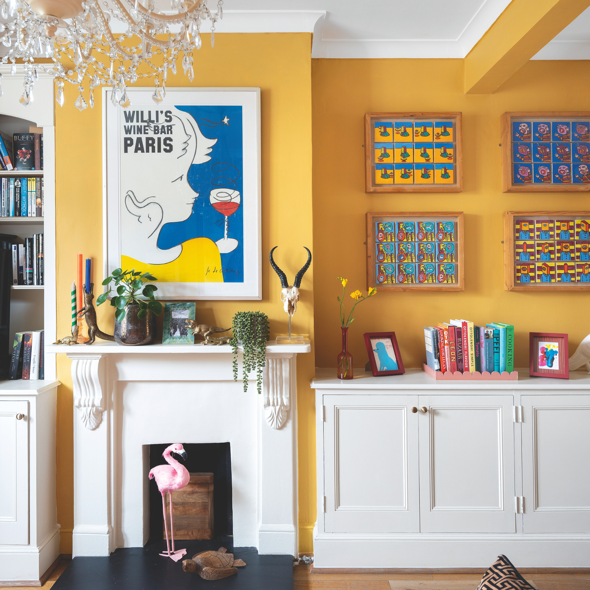
No colour in interiors exists in isolation – it always interacts with other colours as part of a bigger living room or bedroom colour scheme. So when deciding on your paint colour, consider what other elements are you looking to keep an bring in - whether that's flooring, large pieces of furniture or even home accessories - and what their colours are.
'We never see colour in isolation – so you're never just looking at the wall colour. But rather the wall colour with the flooring, with the sofa, the curtains and the artwork. Ask yourself what's staying, what the fixed elements are. That is what's going to give you that end-result feeling that you want,' Tash at Lick says.
Helen at Benjamin Moore takes it even further, 'Create a balanced and harmonious feel throughout with a colour scheme that flows seamlessly, not only in the room being painted but also throughout the whole house to connect one space to the next.'
6. Order paint samples
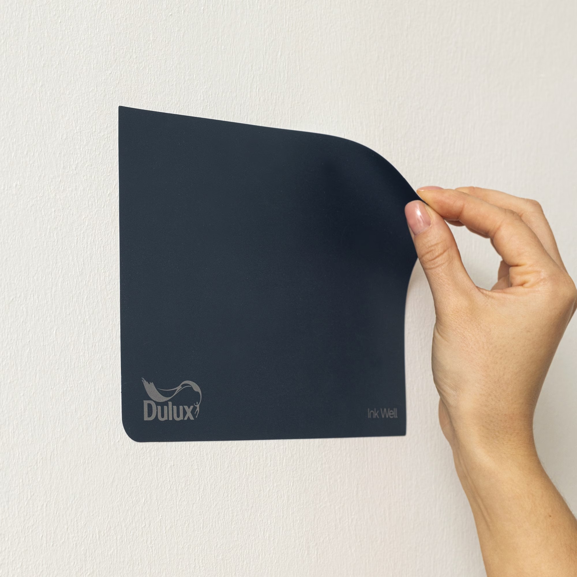
Since paint colours can look very different on a screen than on the walls, most paint companies sell tester pots, or large pre-painted paper swatches that you can stick on the walls. And all of the experts we've spoken to recommend ordering these, getting them up on your wall to see how the shades look and behave in your actual home.
'We always recommend experimenting with sample pots painted onto card,' says Ruth Mottershead, creative director at Little Greene. 'This approach allows you to move the card around the room, enabling you to see how the colour evolves in different lighting conditions throughout the day. It also gives you the opportunity to assess how the hue interacts with your furniture and other elements in the space. This method ensures you fully understand the nuances of the colour, ensuring it complements the room’s atmosphere and enhances the overall design, rather than simply testing it in isolation.'
Tash at Lick agrees, 'The one thing I want to encourage people to do is to try a sample out in their own home. And that applies, by the way, not just for paint, but with every furnishing option. It looks so different in a store. The colour is so influenced by different lighting. So if you fall in love with a colour, take it home. Look at what it looks like in your space. Stick the sample on the wall. If you're painting the ceiling, stick the sample on the ceiling and have a look at it throughout the day.'
It’s wise to try and narrow down your choices as much as possible before ordering tester pots or stick-and-peel samples, as major indecision can mean you end up spending more on testers than you do on the final paint choice.
Where to get your paint samples
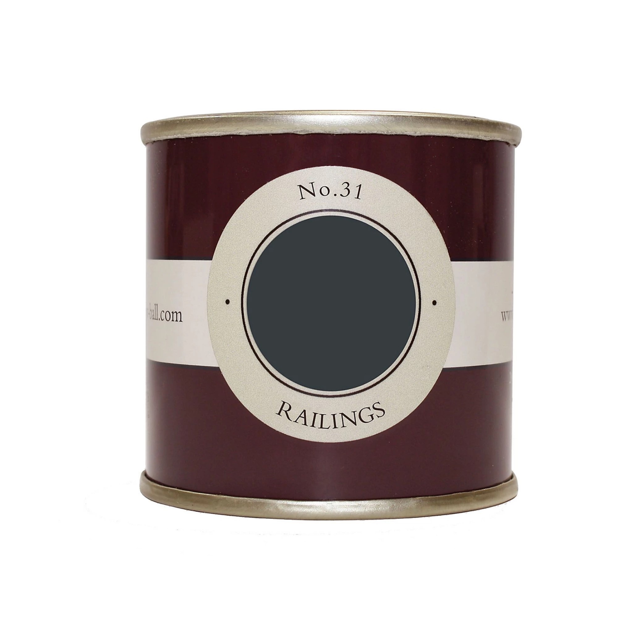
Farrow & Ball is one of interior designers' favourite paint brands that sets many a paint trend and is seen as an authority on paint. Railings is one of the most popular Farrow & Ball paint shades despite being so bold - so if you, too, are considering it, you can get this 100ml sample pot first to try it out.
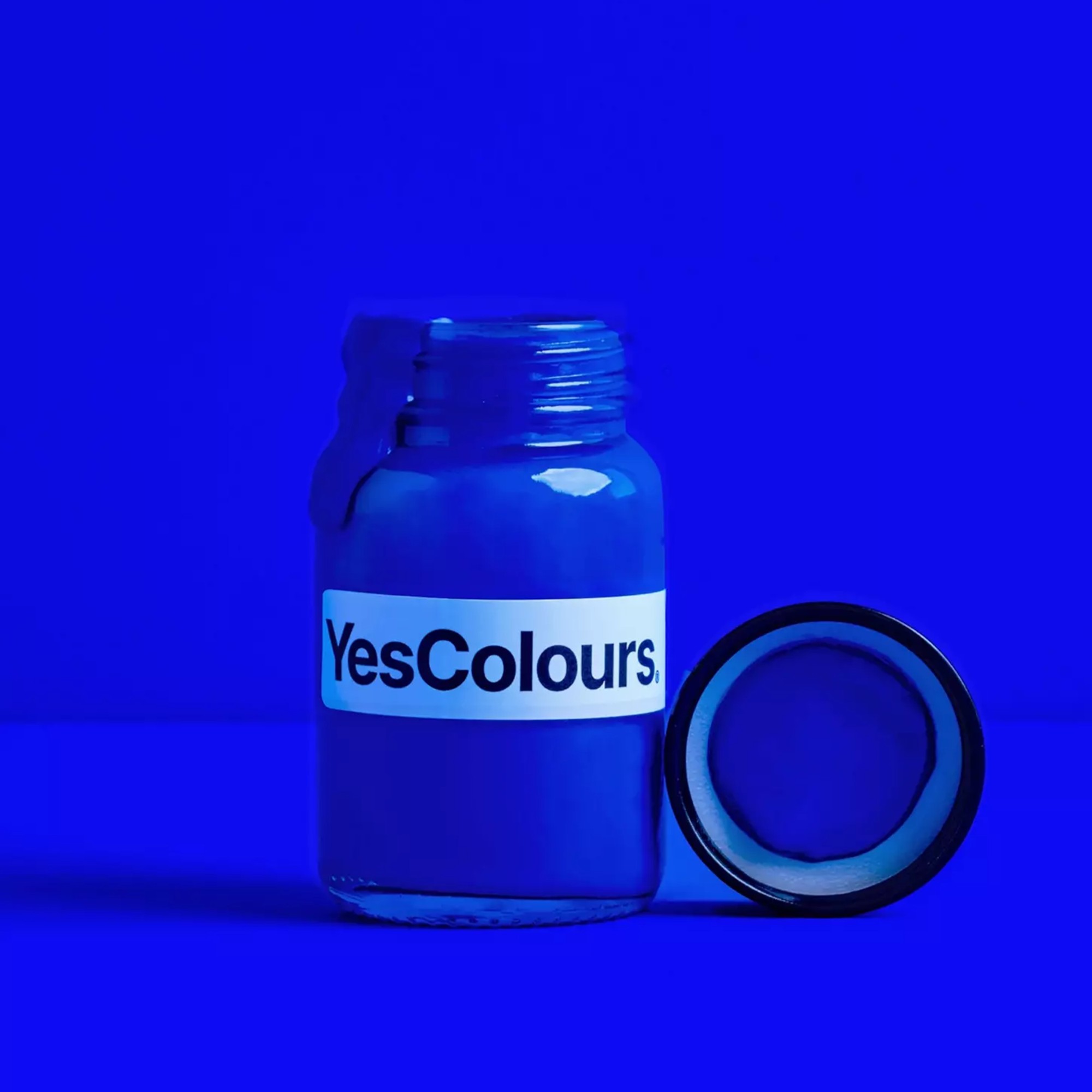
If vibrant paint shades like this highly saturated electric blue is what you're after, we couldn't recommend YesColours more. As the brand name suggests, vibrant colours are its specialty. And the company's sample pots are now also available at Anthropologie so you can get your home accessories and paint tester in the same place.
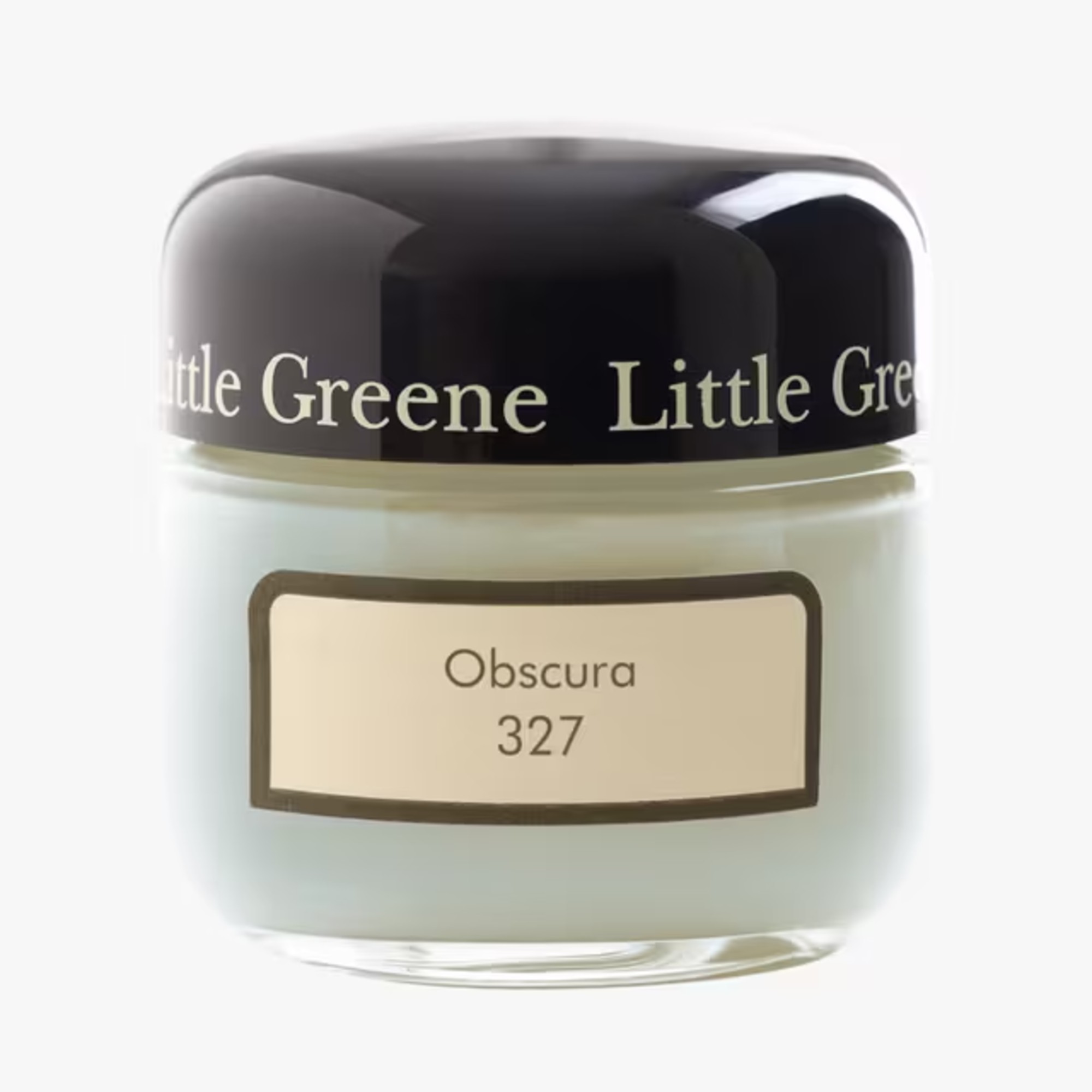
Similarly to Farrow & Ball, Little Greene, too, is a UK-based, heritage paint brand that boasts an extensive library of paint shades. And as of recent, the brand is stocked at John Lewis where you can also get your tester pots to try at home.
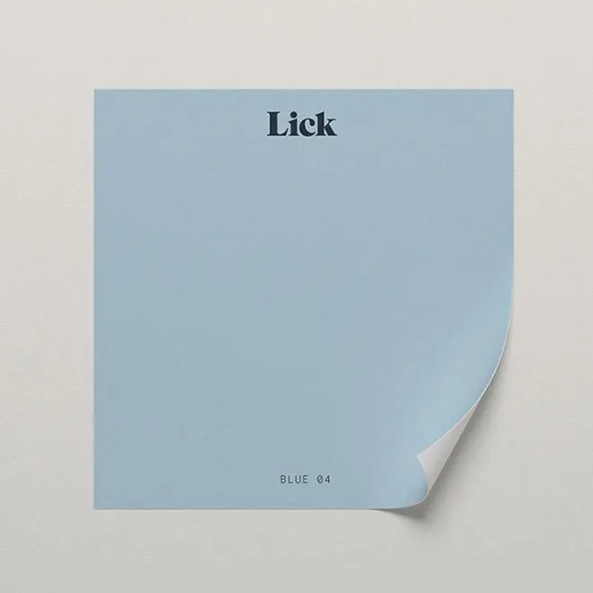
Several paint brands have switched from paint tester pots to stick and peel samples which usually makes them cheaper as well. Lick's stick samples like this pretty pale blue from Lick's colour palette of the year for 2025, are only £2.
FAQs
What paint colour is the most flattering?
‘Earthy pinks are your friend here for flattery, as they will emit a warmish glow that can flatter one’s complexion,' says Patrick O’Donnell, international brand ambassador at Farrow & Ball. 'They are also brilliantly versatile to layer with many other colours. Setting Plaster, one of our best sellers, is the perfect go-to colour for flattering spaces or try its colour scale stablemates Templeton Pink (slightly darker), or Pink Ground (a softer option).’
Should you go darker or lighter with paint?
There’s a consensus that light colours will make a room appear lighter and dark colours do the opposite, but there are additional factors to consider. The natural light in the room is a big one. It doesn’t matter how light your paint colour is, if the room has no windows, it will not appear lighter. In fact, in electric light it will more likely feel cold and unwelcoming. Choosing dark colours in a windowless or north-facing room can make it feel cocooning and cosy. Light paint colours can make a small room appear bigger, especially if it is well-lit.
Personal preference is the main factor you should consider when deciding should you go darker or lighter with paint. ‘First of all, ask yourself which colours you love. Then, ask yourself which you hate,' says Francesca Hadland, styling expert at Bridgman.
'Make sure you create a colour palette that makes you feel comfortable. So, go bold if you feel safe taking risks with a more playful, adventurous palette – deep colours can feel rich, intimate and moody, while bright tones can energise and invigorate your space.'
Are you now feeling more confident to choose the best paint colour for your space? We hope so!

Linda Clayton is a professionally trained journalist, and has specialised in product design, interiors and fitness for more than two decades. Linda has written for a wide range of publications, from the Daily Telegraph and Guardian to Homes & Gardens and Livingetc. She has been freelancing for Ideal Home Magazine since 2008, covering design trends, home makeovers, product reviews and much more.
- Sara HesikovaRoom Decor Editor

