This design decision knocked £35K off the value of our flat – and I’d do it again to create my dream bathroom
Deciding to design for how we live was game-changing


Strategist and content creator Francesca Swan is one of Ideal Home's new Open House contributors, sharing her thoughts on the concept of 'Everything' and what makes a home special to you. See the rest of her articles here.
When we first bought our apartment, we made a decision that immediately wiped approximately £35k off its value. Yes, yes – I can already imagine the raised eyebrows and sharp intakes of breath. Trust me, I had it first-hand from friends and several trusted estate agents.
“Absolute madness” and “nutbag crazy” were two particularly memorable reactions.
And of course, when stated so bluntly, that response is understandable. So let me explain.
When we moved in, we weren’t at all sure what to do with the front half of the apartment. As I’ve touched on in previous articles, it was a complicated maze of rooms set off the main hallway: the primary bedroom, the former kitchen, and a connecting vestibule. Three separate doors coming off an area measuring just 1.5m² – finding your way out really was luck of the draw (or door!).
We knew these interconnected rooms, separated from the rest of the apartment, had the potential to become our dream primary suite: bedroom, walk-in wardrobes, vanity area and bathroom.
The old kitchen was a generous room with a beautiful, big window, linked to the bedroom via the vestibule.
Sign up to our newsletter for style inspiration, real homes, project and garden advice and shopping know-how
The vestibule itself was simple and perfectly suited for built-in storage and a vanity area. Sorted.
The big debate centred on the old kitchen: should it become a spare bedroom with wardrobes, or a bathroom?
Planned cleverly, it was large enough to function as a snug but comfortable double bedroom with ample wardrobes. The bathroom could then have been built into the back half of the bedroom using a partial-height partition wall and borrowed light from the main bedroom window.
But there was another option: a spacious, statement, luxury bathroom.
From a commercial perspective, the spare bedroom was the clear winner. The bathroom option made zero sense.
But the bathroom had a secret weapon on its side; a very strong Everything impulse – that intuitive, emotional pull built from deeply embedded memories and experiences that instinctively guide you to turn a house into a home.
So where did the Everything that drove this highly irrational, yet inimitably right decision come from?
The Everything factor: light and water
Outdoor showers in the likes of Goa, Mexico and the Caribbean were an incredible revelation to me – unbeatable, sensory experiences submerged in abundant light, warmth and water.
They are the ultimate Everything: transportive yet grounding, restorative and energising. You’re completely immersed in the moment and your surroundings. Nothing else exists, and it’s incomparable.
Interestingly, I grew up in a big Victorian house with a very large bathroom and an even bigger window. Looking back, bathing in bright natural light was quietly embedded in me from childhood – albeit in the decidedly less glamorous surroundings of Stockton-on Tees, as opposed to Goa.
And then there was our previous apartment. The bathroom was south facing, with a huge statement window. If you timed it right, sun flooded the room - with the window open, it genuinely felt like showering outdoors. Of course, ensuring you carefully judged the window opening to avoid accidentally putting on a show for the neighbours.
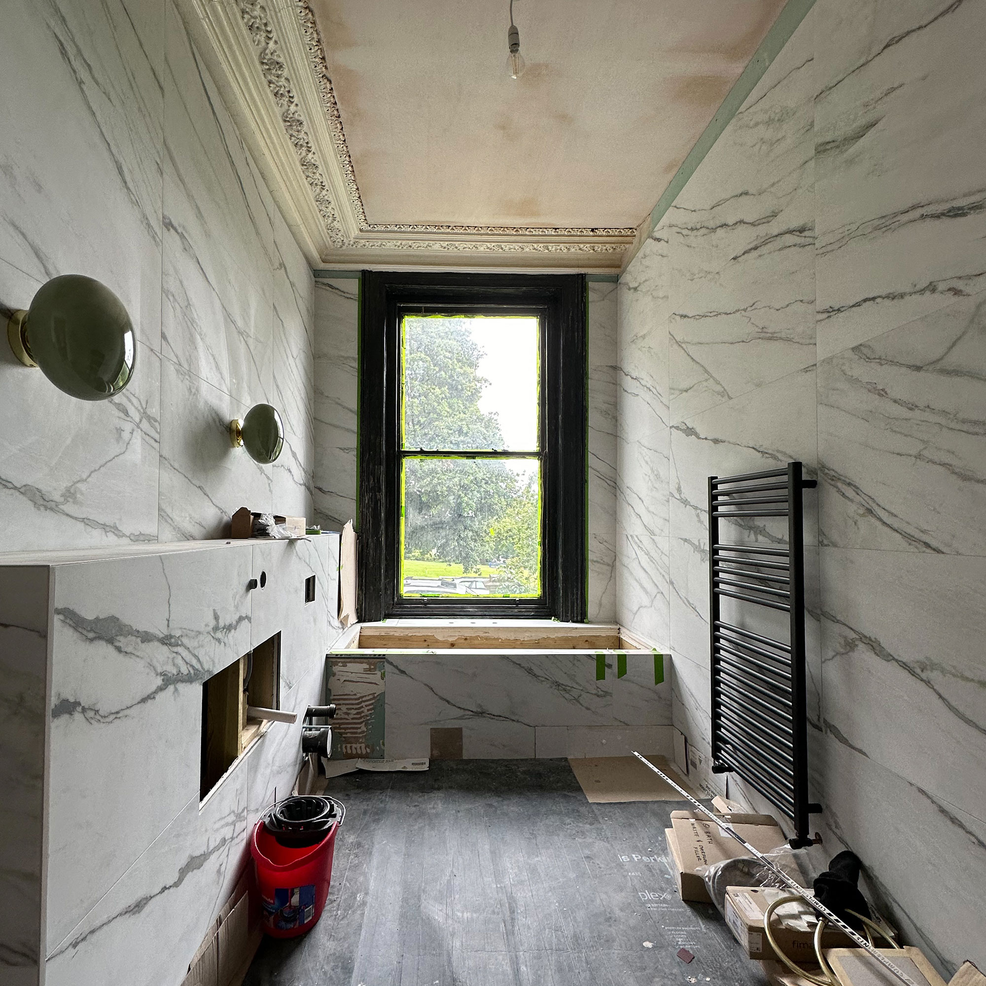
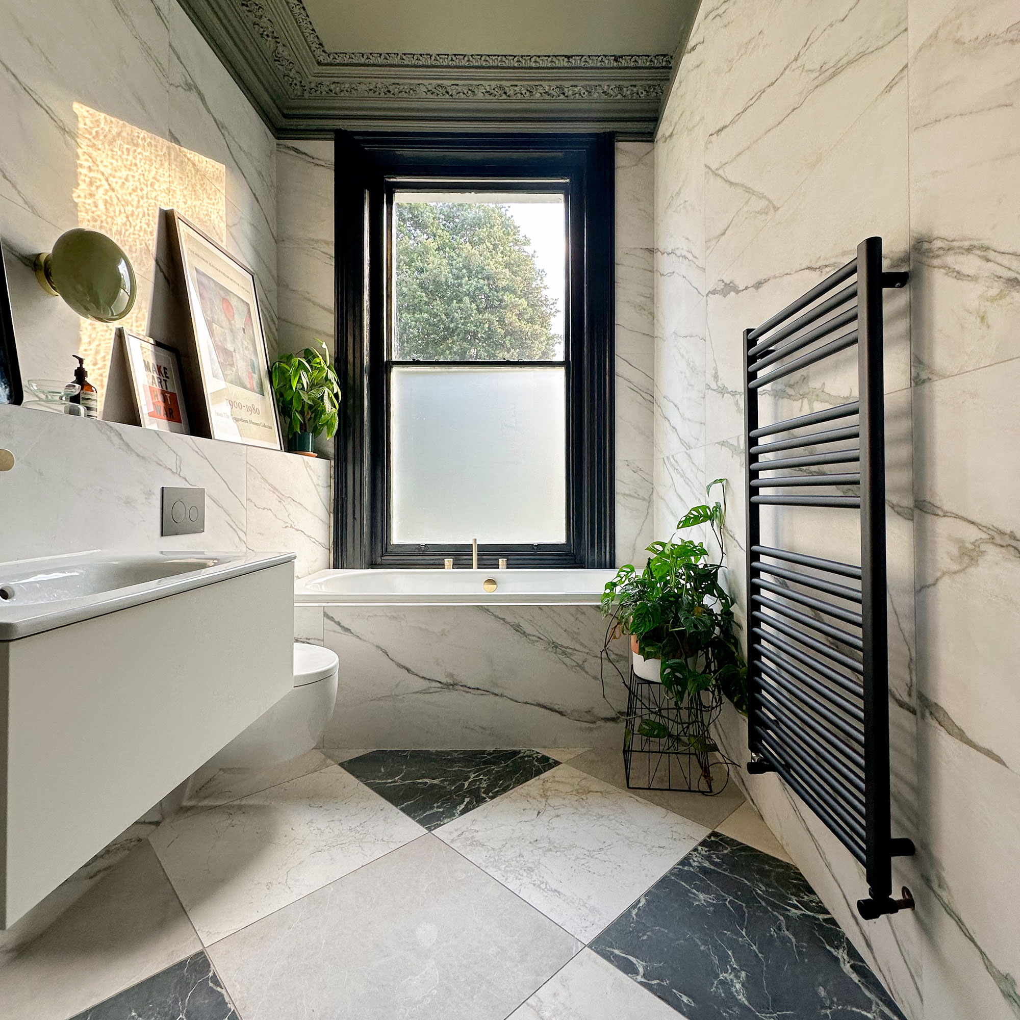
We both loved that experience, and it became a shared Everything feeling. This room offered the same potential: a statement window, exceptional quality and quantity of light, plus enough space to install a much-desired bath beneath it.
So, there it was. Our dilemma in a nutshell: a commercially savvy spare bedroom, or the bathroom of our dreams. The decision was far from easy. I had many sleepless nights weighing up the financial implications of losing a second bedroom versus creating the bathroom we truly wanted.
The spare room would have been the smarter choice.
But sometimes soul outweighs smart. The bathroom clearly won. And the reason was that overpoweringly strong Everything feeling – rooted in connection and experience. Not to mention how we live and what we intuitively wanted.

If you're interested in becoming one of our Open House creators, sign up to learn more here and we'll be in touch with more details very soon.
Designing for your life: the primary suite
Ultimately, we were both clear about what we wanted from a bathroom, and the connecting rooms in general.
We don’t have children. We value our peace and privacy. Don’t get me wrong. We love having people to visit and stay, just not in our face 24/7.
We wanted a primary suite designed specifically for us, to be used only by us: bathroom, vanity area, walk-in wardrobes and bedroom – interconnected, yet contained, with a door we could shut to the rest of the apartment.
Had we turned that room into a spare bedroom, we would have compromised the sanctity of our personal space and the ability to close the door when guests were staying. Which is why we’ve put a guest suite outside, in the summerhouse. I like to think our guests will prefer this arrangement too.
PS: friends and family, you’re obviously welcome to visit at any time. Please refer to the google calendar and take your pick of availability from the fourteen allotted visitor nights per year. I'm joking, of course. It’s actually only seven.
Flow, doors and practical logic
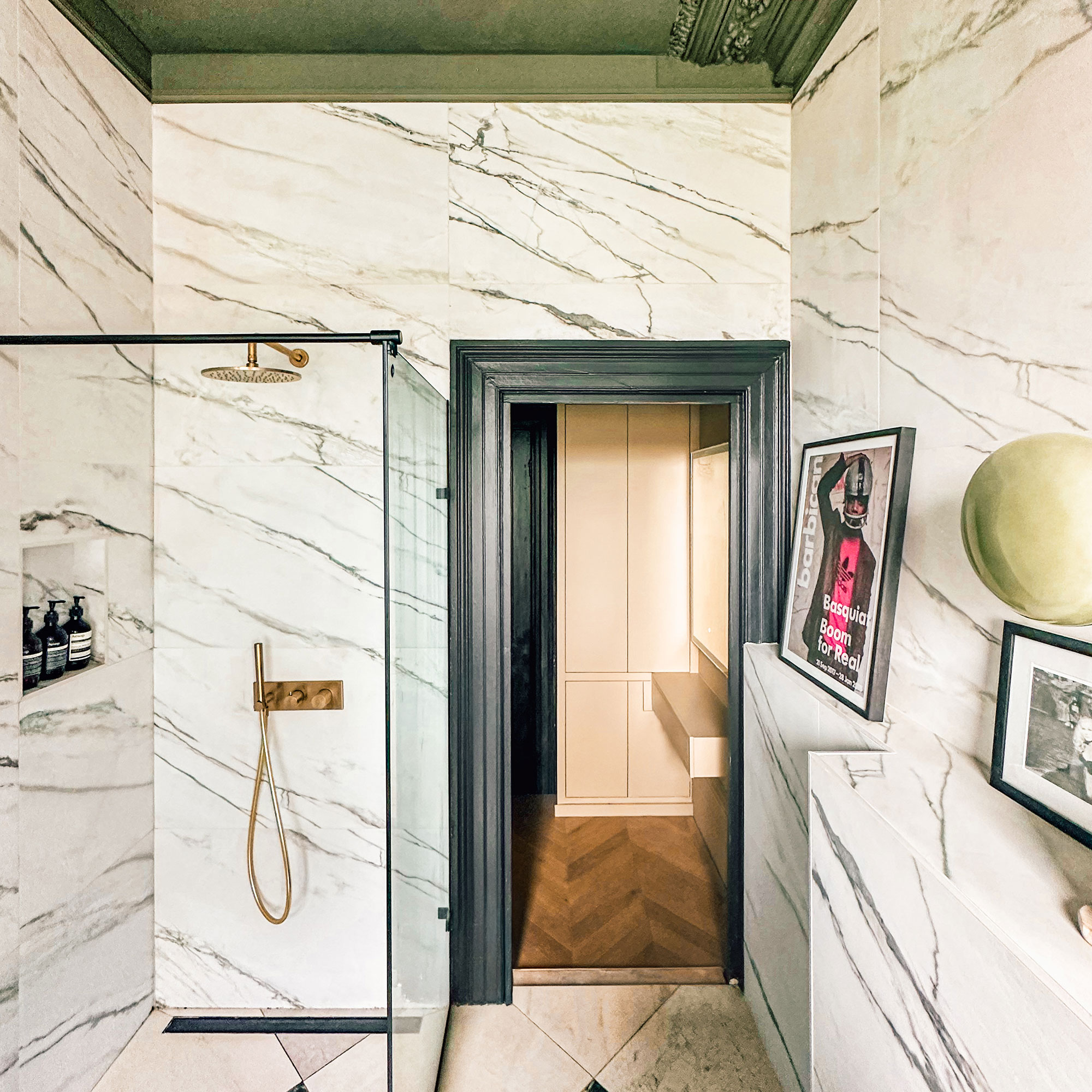
The final controversial decision to make the flow of rooms work was removing the bathroom door.
For many, that would be unthinkable. But given the separation with the vanity area, which wardrobes and bedroom – plus a separate cloakroom WC – it works.
Practically, the vestibule simply couldn’t cope with three doors in such a small footprint. Removing both the bedroom and bathroom doors was the only way to make the space functional.
In the end, it was a logical design decision that worked for us and the space.
Design evolution: finding my style
By the time I designed this bathroom, my style had evolved. I was viewing it as part of the wider apartment scheme: contemporary classical, slightly eclectic, respectful of the period features, but complemented with a modern edge.
After months lost in many deep Pinterest holes, a clear bathroom concept emerged rooted in Italianate marble traditions, yet interpreted through a more progressive lens to suit our style, whilst honouring the apartment heritage.
The hero: statement tiling
The tiling was fundamental to getting the design right.
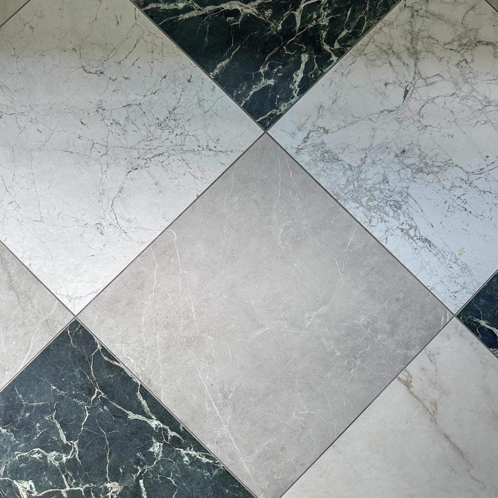
I love a checkerboard – it featured heavily in our previous apartment and was also making its presence felt in new mood boards. But this time I wanted something more unusual than a traditional two-tone.
The answer was mixing different colours and marbles. It wasn’t traditional, but it provided graphic impact and a considered edge, whilst keeping it individual to us.
Material choice: porcelain over marble
The choice of tiles – marble vs marble effect porcelain, the variety of colours, sizes, styles, not to mention technical considerations – quite frankly blew my mind.
I always say, you don’t know what you don’t know, so go to the experts. We worked closely with Mandarin Stone, who helped us navigate the decisions without inducing an ADHD-fuelled meltdown.
I spoke to the lovely Louisa Morgan, Marketing Director at Mandarin Stone for her top tips on picking the right stone for your bathroom:
Why is porcelain a great choice in a bathroom vs marble?
'Porcelain delivers the visual elegance of marble with far greater practicality. It’s non porous, highly resistant to water and staining, and doesn’t require sealing.'
'Marble-effect porcelain is also available in large formats and minimal thicknesses, making it far more adaptable for walls, floors and built-in features. Real marble can be impractical or restrictive in size and thickness, whereas porcelain allows for a seamless architectural finish that’s durable and easy to live with.'
You have such a huge collection of colours and marbles. Let’s recap on how we selected the right porcelain for our project…
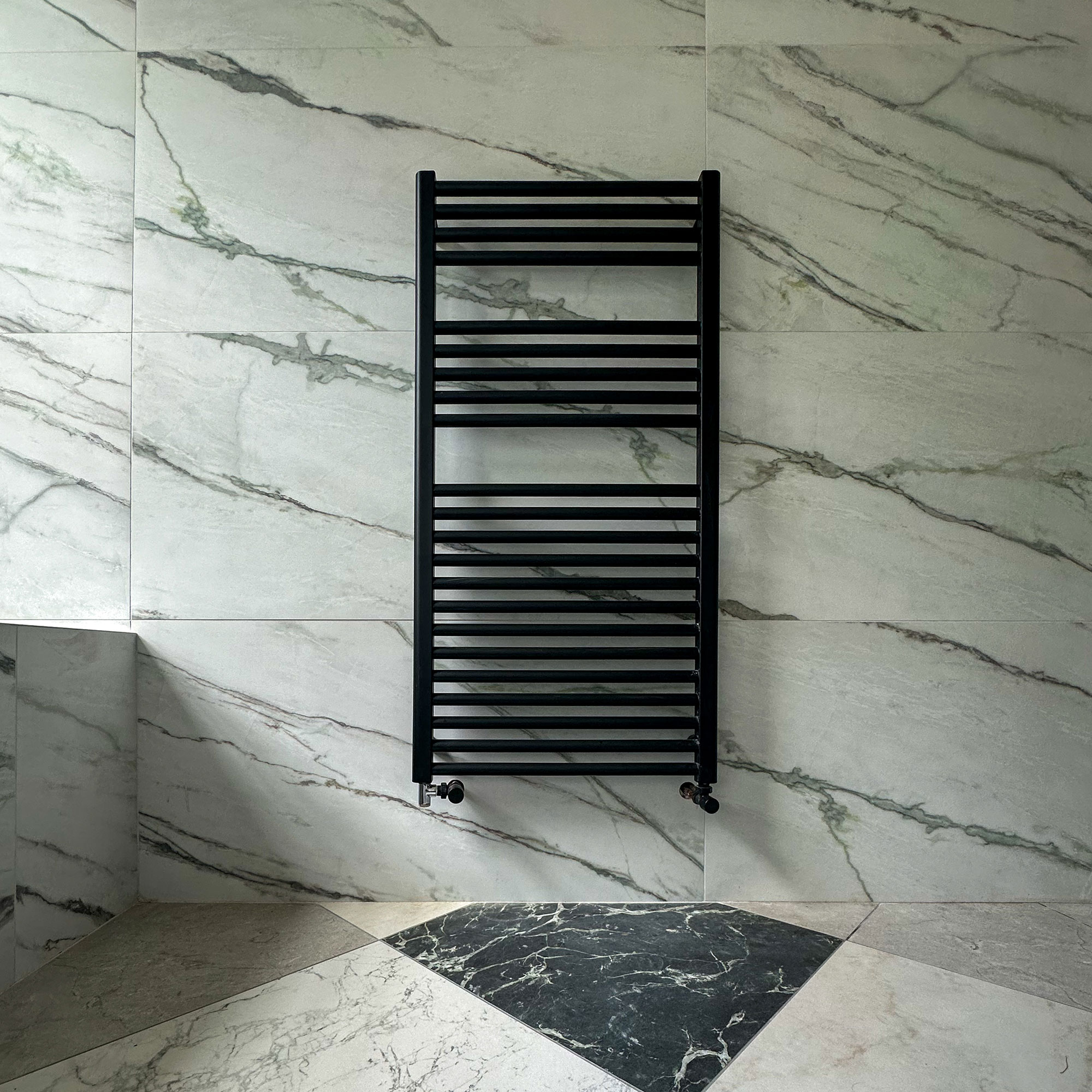
'Your project needed a clean, white base to make the most of the light, without feeling boring or clinical. Nordic Green was perfect; a white based marble effect porcelain with stronger mixed green veining, offering a contemporary interpretation of a classic green marble that feels crisp and highly considered in your scheme.'
'For the checkerboard floor, we mixed four complementary yet contrasting tones from the Piazza range to get the right balance of movement and colour, whilst also working in harmony with the Nordic Green'
● Grigio: 'For soft grey tones, perfect for your modern, yet classic design where subtle character is key.'
● Bianco: 'For a clean, white balanced aesthetic with gentle veining for interest without overpowering.'
● Amber: 'For warmth and richness - making it inviting, not cold.'
● Nero: 'For depth and drama, with subtle green undertones creating architectural impact against the lighter surfaces and your warm brass fixtures.'
'These all accentuate the different colours, tonality and detail in the primarily white Nordic Green tile, creating interest to ensure it didn’t feel clinical.'
The finishing touches: my stubborn style
This was the first room I designed in the new apartment, and my recurring motifs (or stubborn style, as someone recently called it) reappeared immediately.
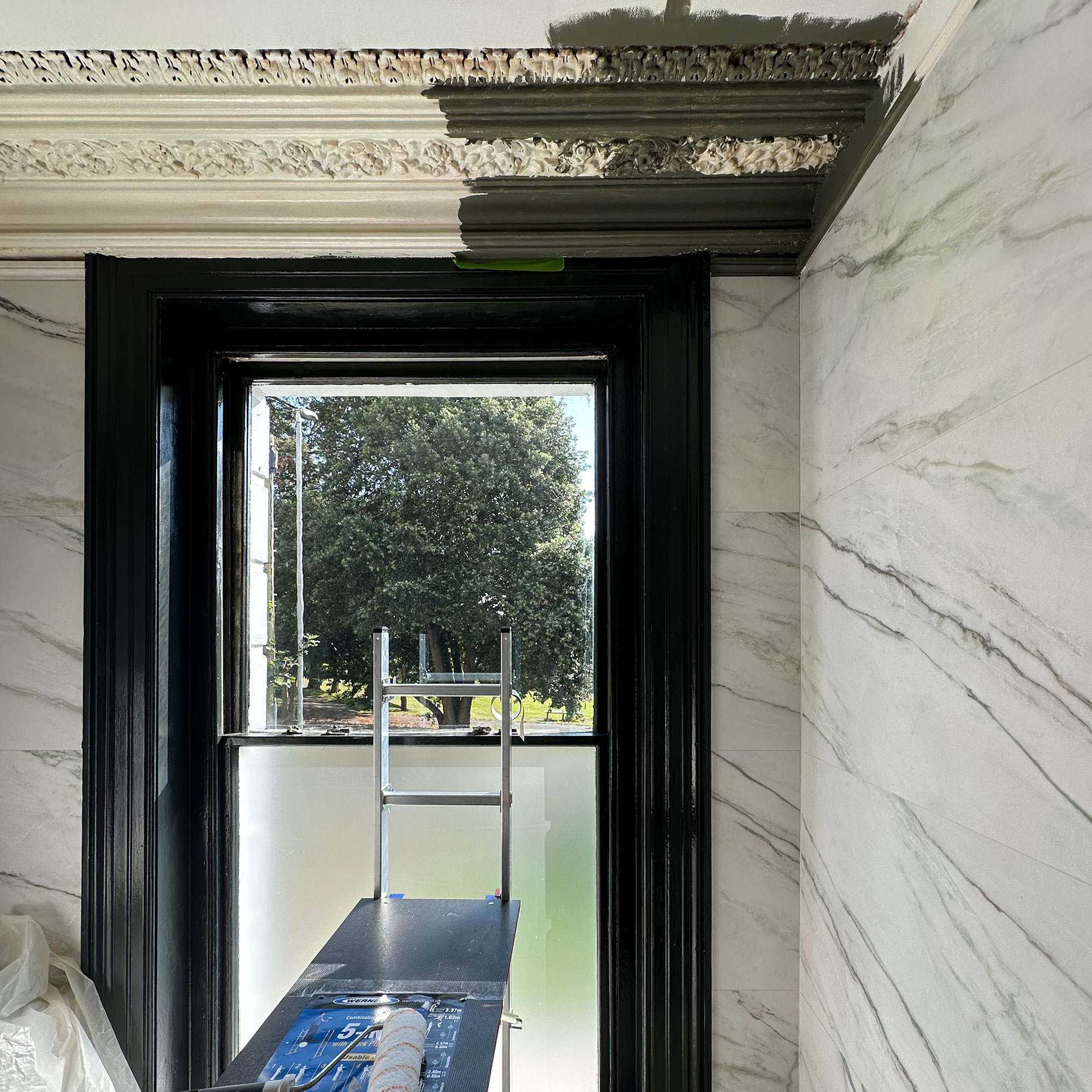
A forest-green painted ceiling was a must; to ground the room, highlight the beautiful coving and balance the light. It immediately brought extra warmth and drama and subtly accented the variety of tones in the Nordic Green tile.
The black gloss window worked perfectly with the natural light to provide even more interest, whilst creating a statement focal point that draws the eye and anchors the bath.
It felt very ME and very Everything.
Art in a light-filled bathroom
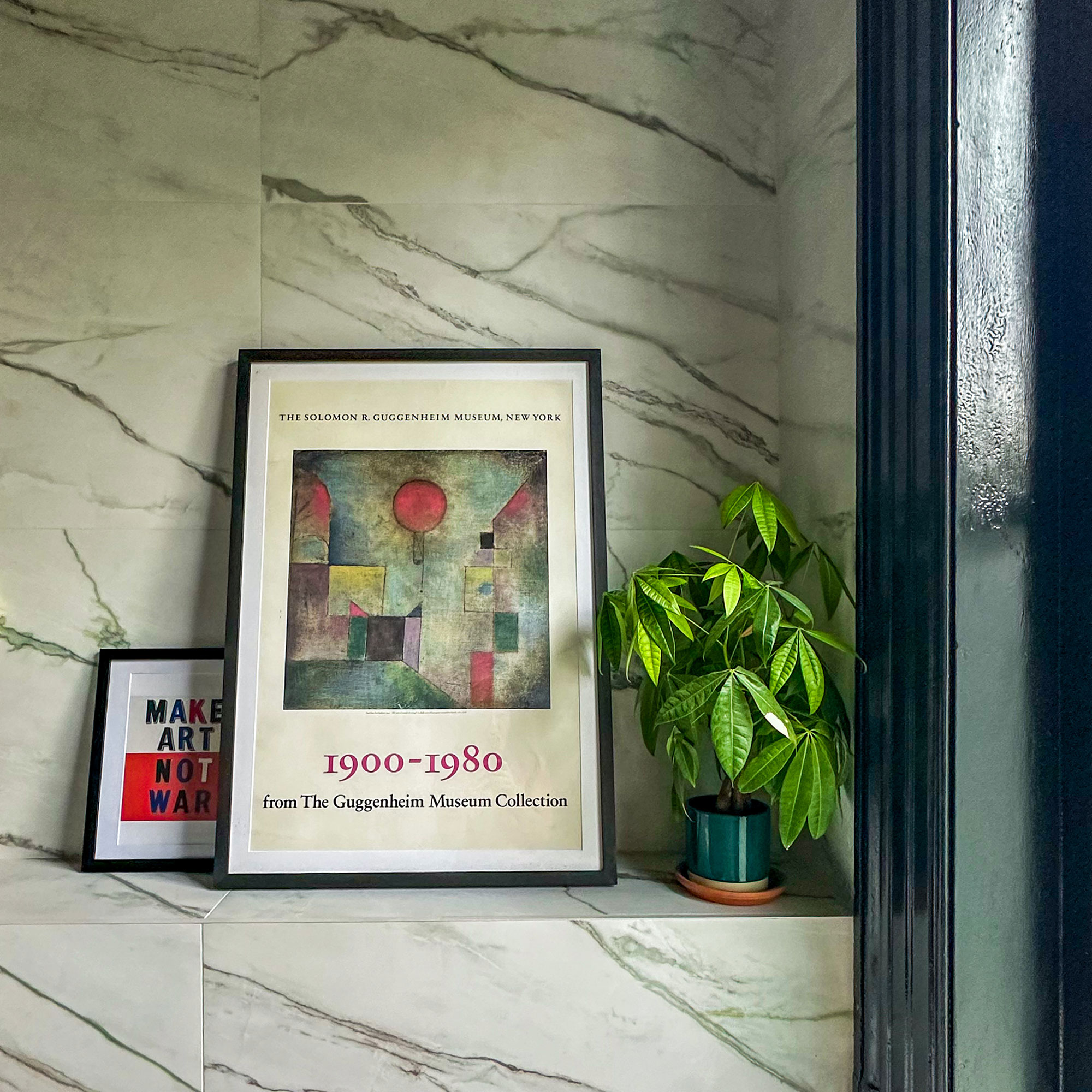
Give me a wall and I’ll eventually fill it with art. This bathroom was no different and especially needed finishing touches of personality and extra colour.
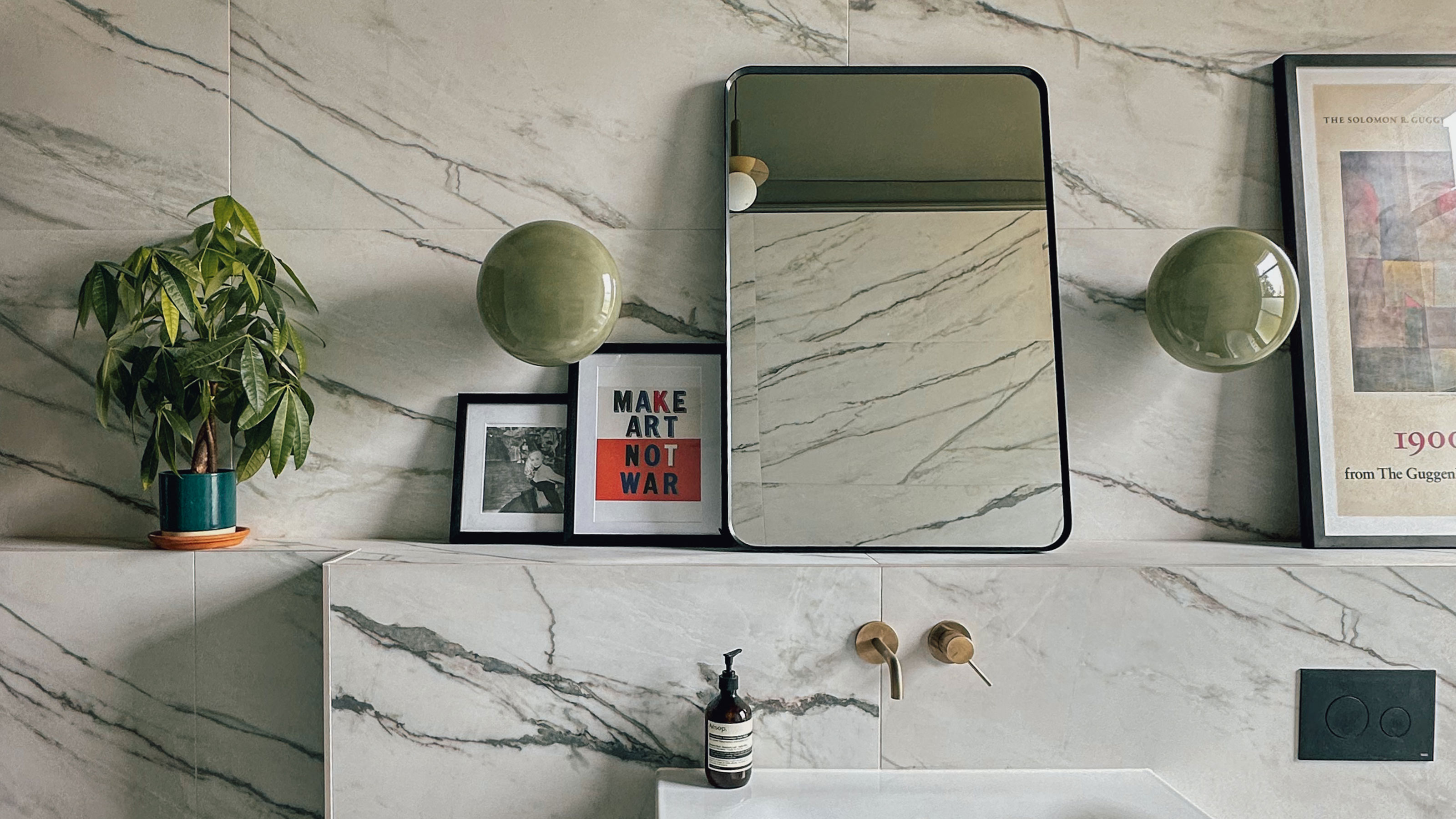
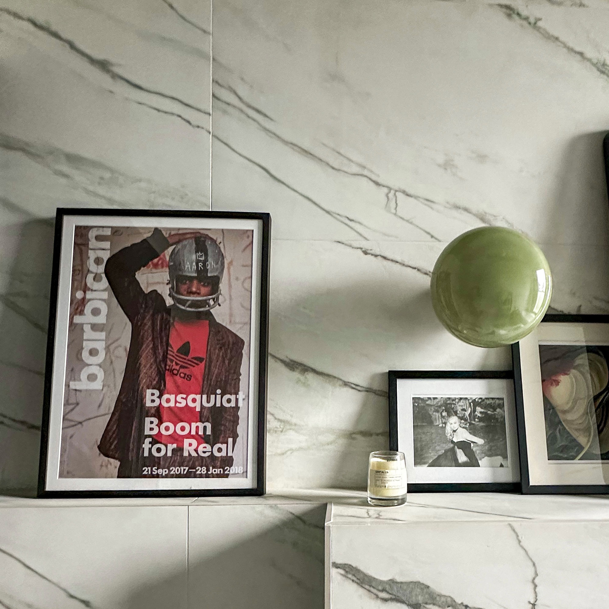
The built-out wall provided the perfect ledge for leaning art. We chose two large statement pieces: a Paul Klee print and a Jean-Michel Basquiat Barbican poster, pulling in bold primary colours to energise the space.
A word of warning: if you’re placing art near windows, always use UV-resistant glass. My Klee print is now sadly bleached beyond recognition – a lesson learned.
A statement light
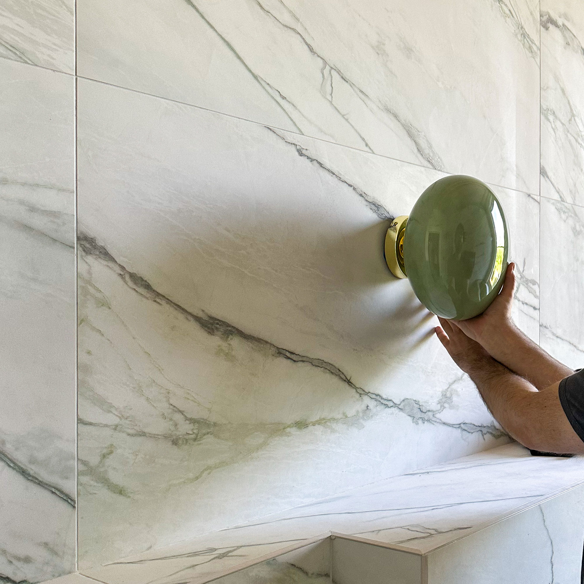
I do love a statement light. I sourced two wall lights from Made, that are basically pistachio green Smarties functioning as wall lights. They not only completed the bathroom but also give me inestimable joy every time I look at them. An Everything find, for sure!
Designing for your life
This decision wasn’t for everyone. Ultimately, though it was driven by our Everything feeling. Value isn’t just financial. Homes need to work for how you live. For us, this is a forever home, so we designed it for long term experience, convenience and joy, not a resale price.
Interrogate what matters most to you: immersion, connection, daily life – now and in the long term. We did all this and so made this decision with confidence. And we’d make it again. In this case, Everything was right. As always.

Francesca Swan is a strategist, content creator, and interiors obsessive whose career blends brand expertise, lived experience and a creative instinct for the unexpected and unique.
