As a screen printer, I work with colour every single day – these are my go-to colour pairings I use to create what I like to think of as the perfect clash
Grey homes are not my bag


Screen printer Hannah Carvell is one of Ideal Home's new Open House contributors, sharing her thoughts on colourful home design for a creative family to live in. See the rest of her articles here.
As a screen printer, I get the joy of working with colour every single day. I’ve always been drawn to bright, vibrant shades and, in particular, strong contrast. In my work I’m constantly experimenting with colour combinations – layering inks to create new tones within a print and pairing colours to create what I like to think of as the perfect clash. I want every colour I use to stand out and really pop off the paper.
Muted tones have never been my thing. The grey-home trend of a few years ago was, quite frankly, my idea of hell. Bright colour genuinely makes me feel happy or, to borrow Marie Kondo’s phrase, it truly does “spark joy”.
I’m always on the lookout for inspiring colour combinations in everyday life: the perfect shade of green paint peeling from an old stairwell railing, with flashes of rusty orange shining through; the endless palettes you find in the garden. I love growing flowers, and the colours found in nature never disappoint. Green I think goes with anything, but green and pink is truly a perfect match.
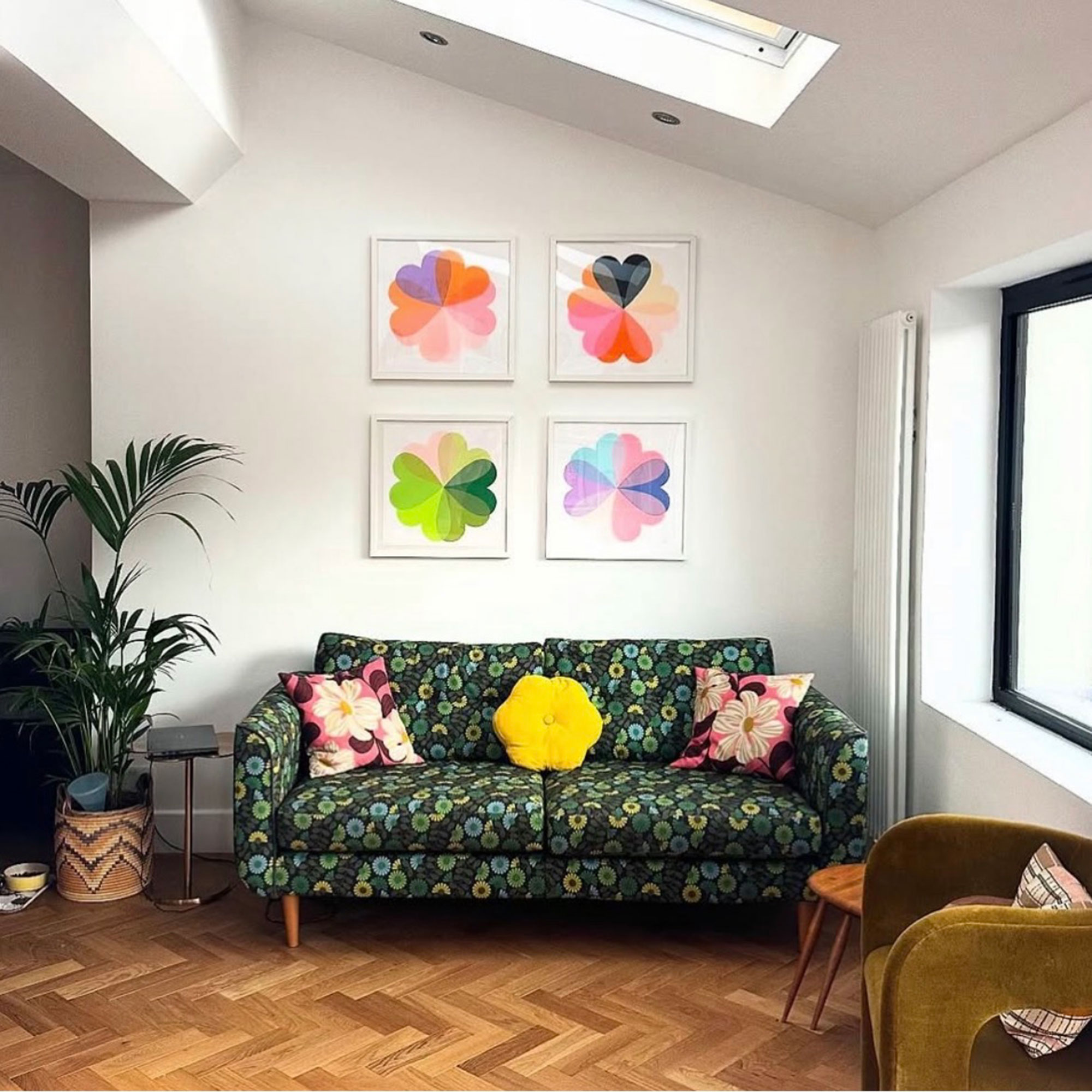
Last summer I became obsessed with a combination of deep burgundy, bright red and orange after spotting the exact mix among my pots of geraniums. It sounds unusual, but seeing those colours together made something click, and I had to try it in a print. That’s often how my colour palettes are born – through observation, curiosity and a willingness to experiment.
Over the years I’ve been asked to commission screen prints in blacks and greys to suit someone’s home aesthetic, and I’ve always said no. It simply wouldn’t feel like my work, and more importantly, I wouldn’t enjoy making it. Colour is at the heart of what I do.
Here are some of the colour pairings I return to time and time again – and why they always work.
Sign up to our newsletter for style inspiration, real homes, project and garden advice and shopping know-how
Pink and Red
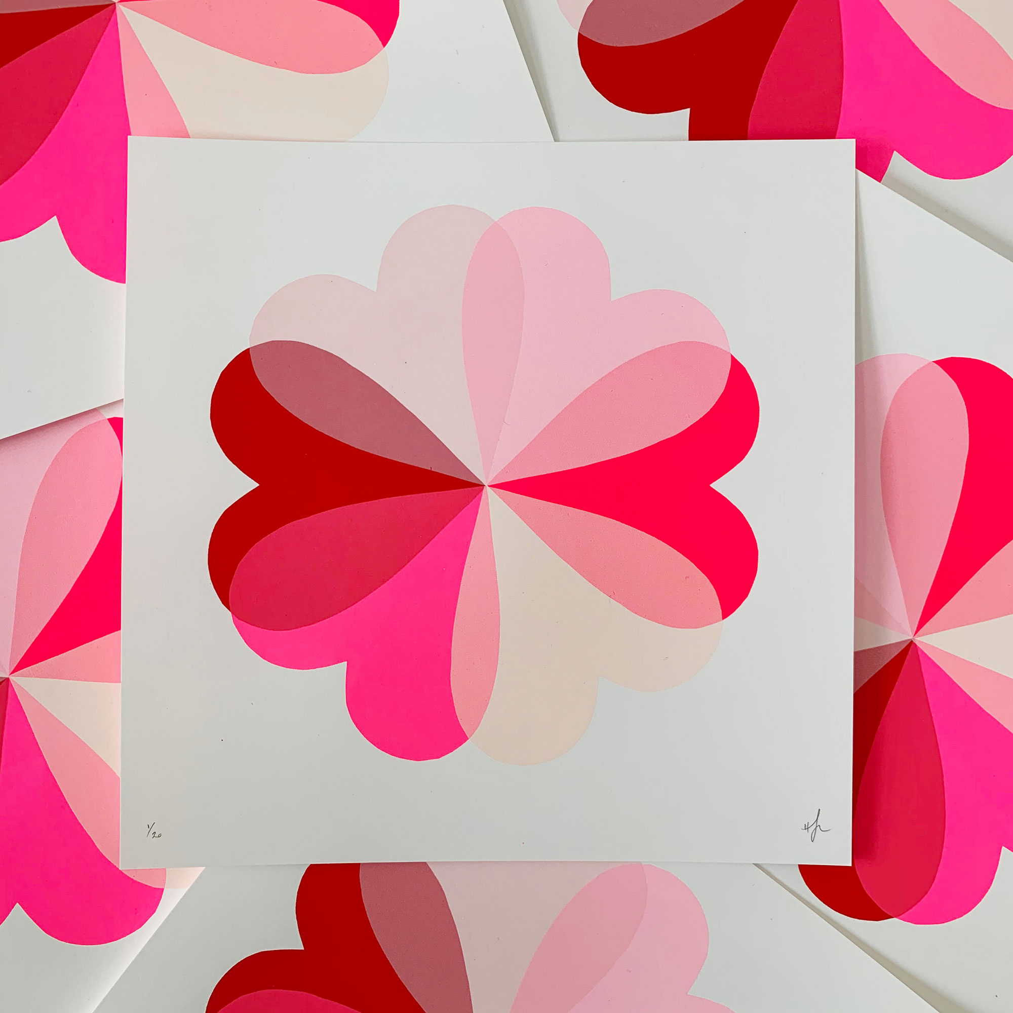
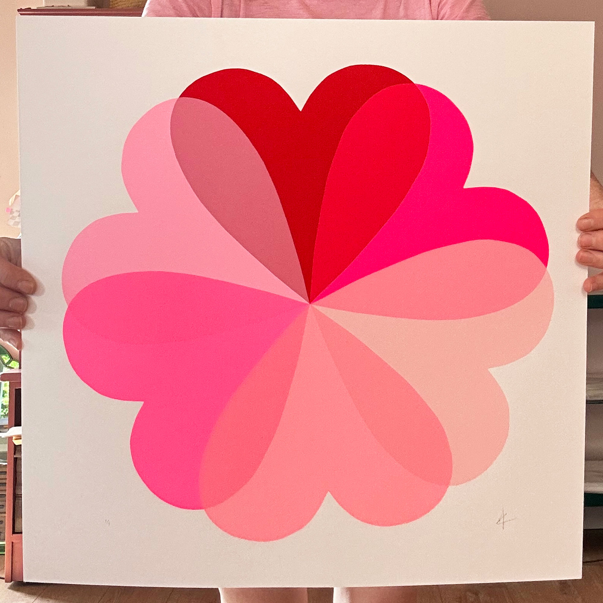
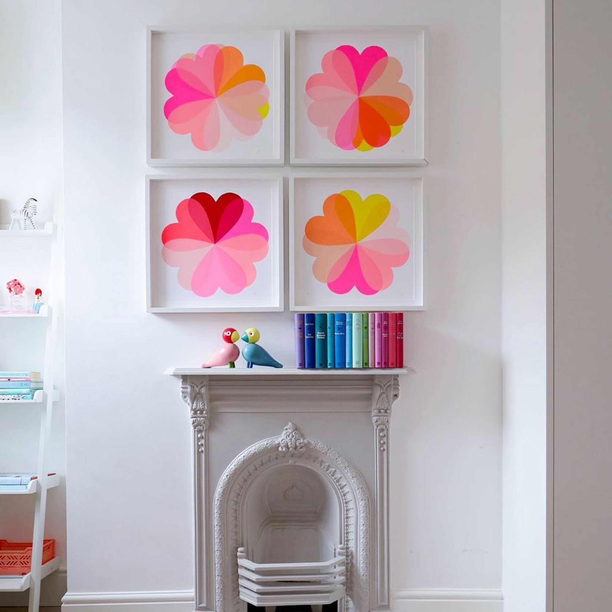
Pink and red is one of my all-time favourite combinations. It’s vibrant, confident and I think looks really cool. I particularly love layering a very bright fluorescent pink over a deep pillar-box red. They complement each other perfectly, making the pink appear even brighter and the red feel richer and deeper.
In my best-sellingHearts and Flowers screen prints, red and neon pink form the starting point From there, I introduce lighter shades – softer pinks and peachy tones –to allow those hero colours to shine. By layering inks carefully, each colour enhances the one it sits alongside, adding depth and energy to the finished print.
At home, I use red and pink as accent colours rather than overwhelming a space, I probably wouldn’t paint my walls red I am more drawn to greens and blues and softer pinks. But a bright piece of art, a painted chair, or a splash of colour in fabric or vintage finds is often enough and creates a beautiful, eye-catching contrast.

If you're interested in becoming one of our Open House creators, sign up to learn more here and we'll be in touch with more details very soon.
Blue and Orange
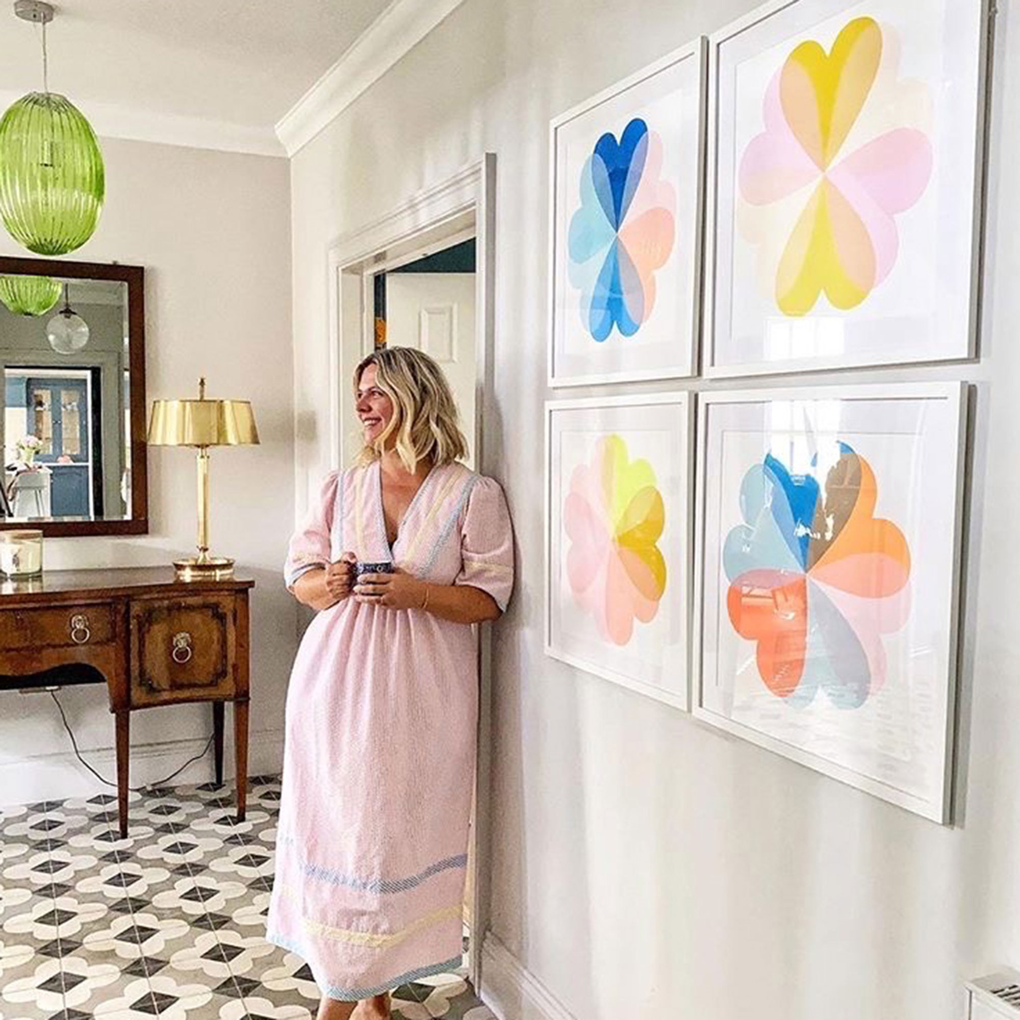
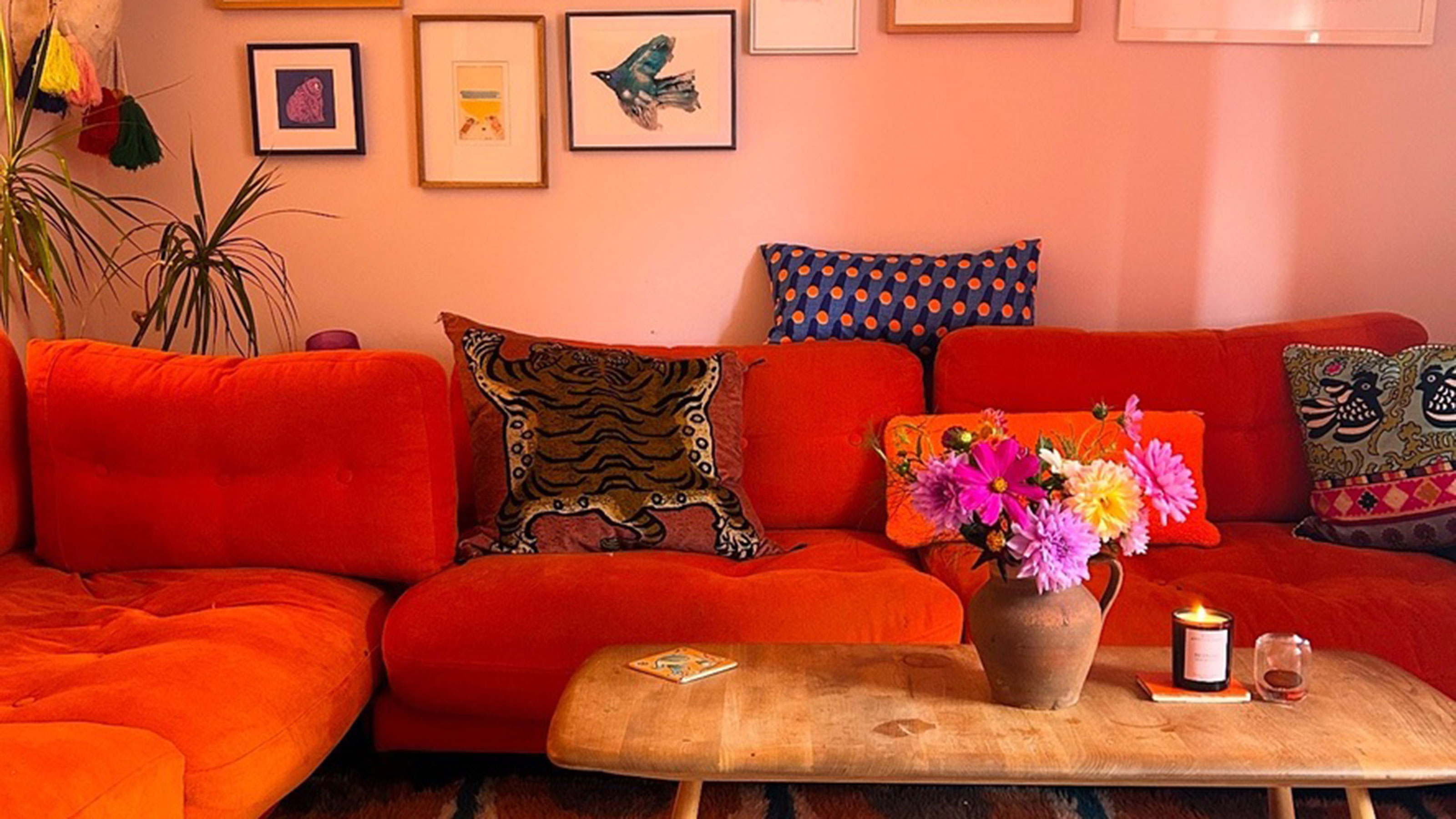
Another palette I rely on both in my screen prints and at home is blue and orange –specifically cobalt blue. These colours sit opposite each other on the colour wheel, which is why the contrast feels so striking yet balanced.
In my prints, I’ll layer cobalt blue with oranges and soft pinks to let each shade pop off the paper. At home, I chose peachy-pink walls as a neutral backdrop, then searched endlessly for the brightest orange sofa I could find (burnt orange simply wouldn’t cut it). I eventually found a vintage Habitat orange velvet sofa on eBay, which became the heart of the room.
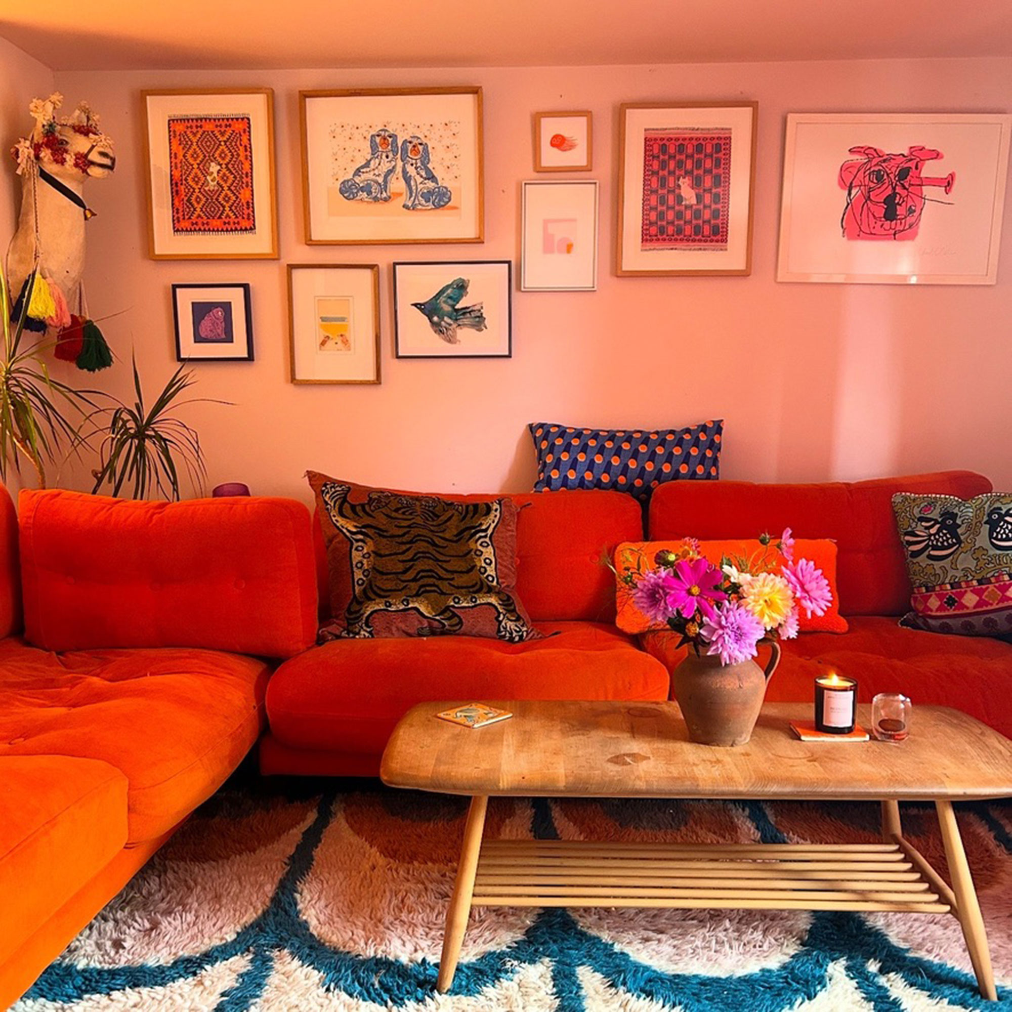
I brought the blues in through a cobalt blue Berber rug, blue patterned Bert & May fireplace tiles, and a small vintage accent table painted in Yes Colours’ Electric Blue.
The result was a room full of joy and energy, layered with colourful cushions and artwork that brought everything together.
Pink and Yellow
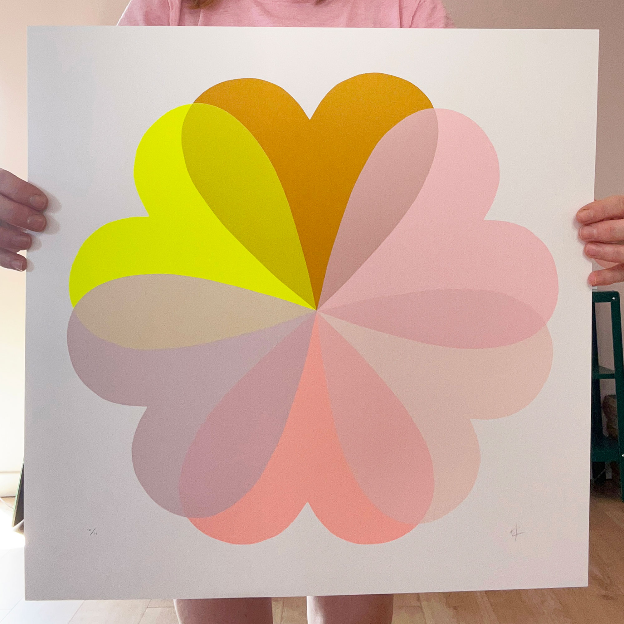
While I love bold and neon shades, I’m equally drawn to softer palettes. Pink and yellow is one I return to again and again. Mustard yellow, in particular, is such a stylish shade, and when paired with a pale pink it feels warm, playful and sophisticated.
I have a screen print called Sherbet Lemon, and the moment I layered mustard yellows with pinks and a pop of neon yellow, I knew I’d hit on something special. The print became a best seller, and it still reminds me of sunshine and hazy summer days – bright, but gentle and full of joy. I feel like its hanging a slice of Sunshine on your walls.
At home, I’ve used mustard paint to transform floors and cupboards, pairing it with soft pink walls and accessories. The combination brings warmth to a space without overpowering it, and it never fails to lift my mood.
The colour combinations I return to again and again aren’t about rules or trends necessarily. Screen printing has taught me that colour behaves differently depending on what it sits beside, I am forever experimenting with colour and discover some of my favourite palettes in my test sheets, and the same is true in our homes. A shade you might think feels “too much” on its own can suddenly make perfect sense when paired with the right partner.
I am a more is more kind of girl when it comes to colour, the brighter the better. My advice is always to start small and be brave. Introduce colour through art, textiles or a single painted piece of furniture and see how it makes you feel.
If it brings you energy, warmth or joy, then it’s working – regardless of what’s currently in fashion. Colour should make you smile when you walk into a room, and when you find a pairing that does that, you’ll know you’ve got it right.
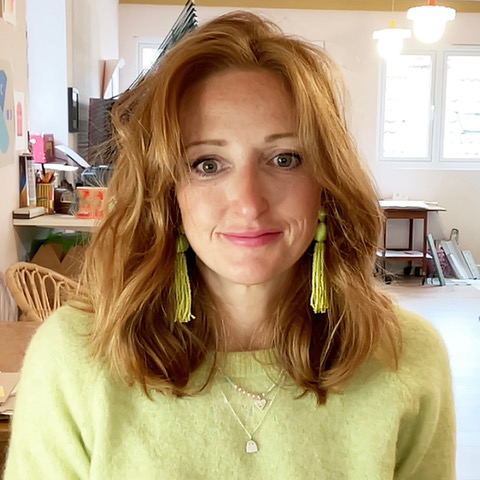
Hannah Carvell is a screen printer based in the rural heart of Somerset, where she works from a converted stone outbuilding nestled beside her cottage. Her work has been featured in national press such as Livingetc and Ideal Home, and in the the homes - and Instagram feeds - of people such as Erica Davies and Louise Thompson. Her home studio is the creative hub where she hand-pulls her vibrant, layered prints, known for their rich use of colour and the alchemy of overlapping inks that produce unexpected, luminous shades.
Hannah's signature aesthetic – bold, playful, and full of movement – reflects her fascination with how hues interact and transform when placed in conversation with one another.