I’m obsessed with decorating with green – why it's my go-to colour and how to choose the perfect shade for your home
I've tried so many and now know exactly which shade to use where


Sign up to our newsletter for style inspiration, real homes, project and garden advice and shopping know-how
You are now subscribed
Your newsletter sign-up was successful
Screen printer Hannah Carvell is one of Ideal Home's new Open House contributors, sharing her thoughts on colourful home design for a creative family to live in. See the rest of her articles here.
I’m obsessed with decorating with green, and over the years I’ve learnt a lot about choosing the right shade for the right space.
I’ve always loved green. It’s bright and vibrant, which naturally appeals to me more than neutral creams or beige tones, but more than that it connects me to nature and the outdoors. If I had to choose a favourite season, it would be spring – I love how green and hopeful everything feels. Shoots appear on trees, bulbs push through the soil and suddenly everything looks fresh again. That sense of renewal is something I try to recreate indoors.
Article continues belowThat said, every season has its own green appeal. Winter brings deep, rich shades through Christmas trees and holly, while summer lawns paired with blue skies create the perfect backdrop for flowers and sunshine. As someone who loves gardening and finds being outdoors calming for a busy brain, green is a colour I return to again and again when decorating my home. It’s my way of bringing the outside in.
Dark, elegant greens versus light, playful shades
Choosing the right shade of green really comes down to personal preference – there’s no wrong answer. If you’re drawn to a darker, more sophisticated look, deep greens can feel instantly elegant and work beautifully as a backdrop for bolder accent colours. Pink and green is a combination I particularly love, while dark greens paired with gold accents – think cabinet knobs, lamps or candlesticks – create a timeless, grown-up feel.
Personally, I’m less drawn to sophistication and more to playfulness. I tend to favour lighter, brighter shades, which may well be my love of spring showing through. Over the years, I’ve chosen green time and time again in different homes, and I never seem to tire of it.
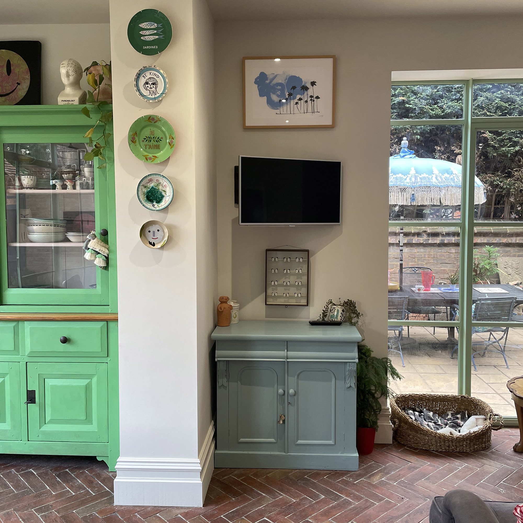
I adore a minty green. At one point I painted an entire kitchen in Arsenic by Farrow & Ball – a shade I can spot instantly. It was bright, happy and perfect for a busy family space with young children. I spent so much time in that room and never once grew tired of it. I’ve also painted countless chairs in Little Greene’s Green Verditer gloss, which, in my opinion, is the perfect mint green. I still use it whenever I’m refreshing an old piece of furniture.
Sign up to our newsletter for style inspiration, real homes, project and garden advice and shopping know-how
I even chose mint green for the steel-style doors in my last kitchen. While black may have been the best-selling option, I knew that green was a colour I’d never tire of seeing.
Using green in children’s rooms
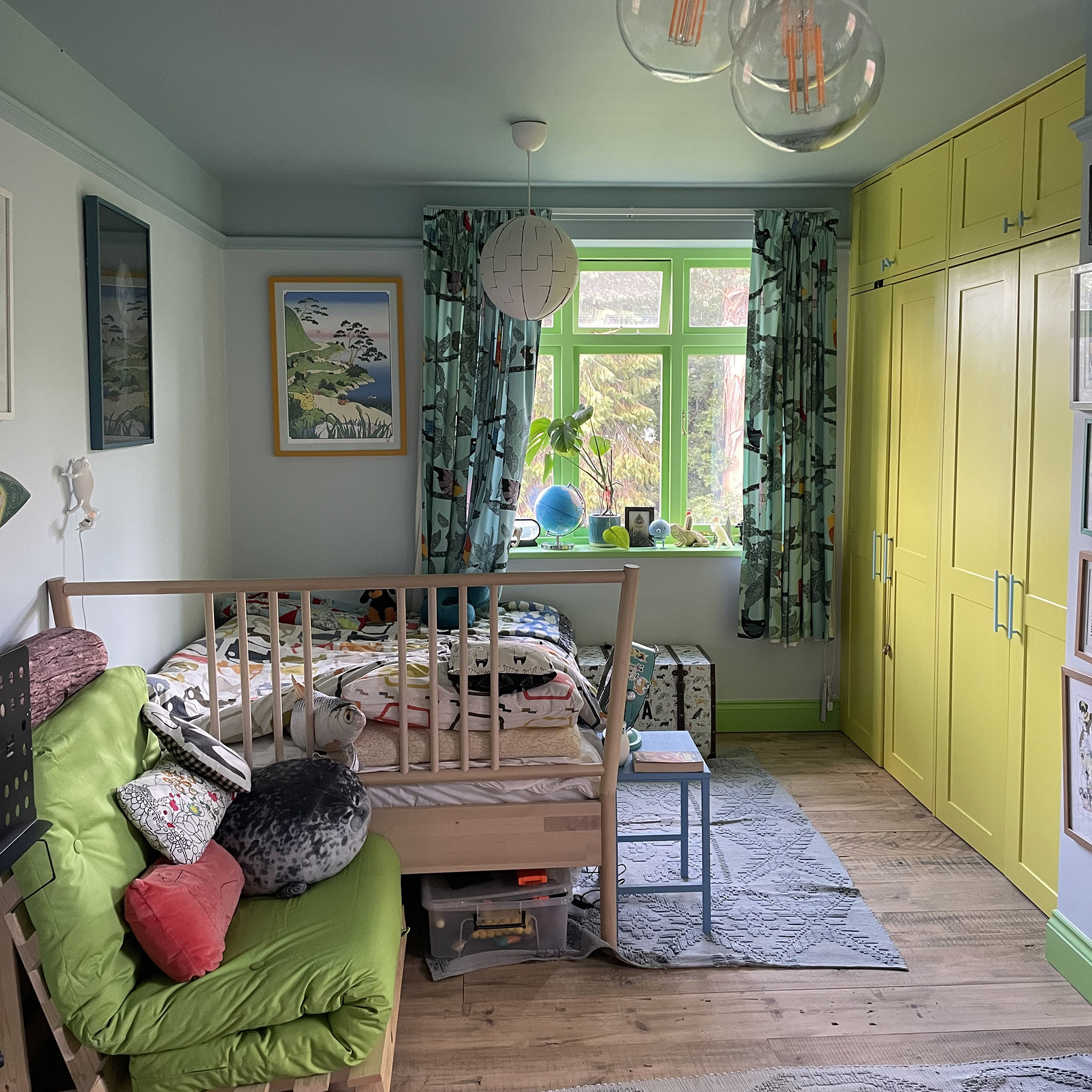
When decorating my little boy’s bedroom a few years ago, I knew I wanted it to feel bright and joyful. I opted for blues and greens – summer sky blue on the walls and ceilings, with the brightest green I could find on the skirting boards and window frames. The result was a fresh, happy space and the perfect backdrop for other bold colours.
I’m never too concerned with strict coordination. I love contrast and colour combinations that allow each shade to stand out. In this room, we added a neon yellow light fitting, colourful artwork and layers of bright accessories. The green window frames glowed and became a real focal point, proving that green works just as well as an accent as it does on walls.
Bringing green into darker spaces
My current home is still very much a work in progress, but green has already made an appearance. At the end of our kitchen is a dining area that lacks natural light and originally had dark brown wooden doors and windows. As a quick fix, I painted them in a bright green eggshell – Yeabridge Green by Farrow & Ball – and the difference was immediate. The space felt lighter, fresher and far more inviting.
I also refreshed our old pine dining table by painting the legs in a green gloss. We have a mismatched collection of chairs, and leftover paint is a brilliant way to give them a new lease of life while adding pops of colour around the table.
Going all-in with green
Next on my list is the living room, where I plan to go fully green – walls, ceiling and even the exposed brick fireplace that houses the log burner. My husband is understandably sceptical, but the bricks are new and uniform rather than characterful, and I know I’d much rather look at green than the current dark red tone.
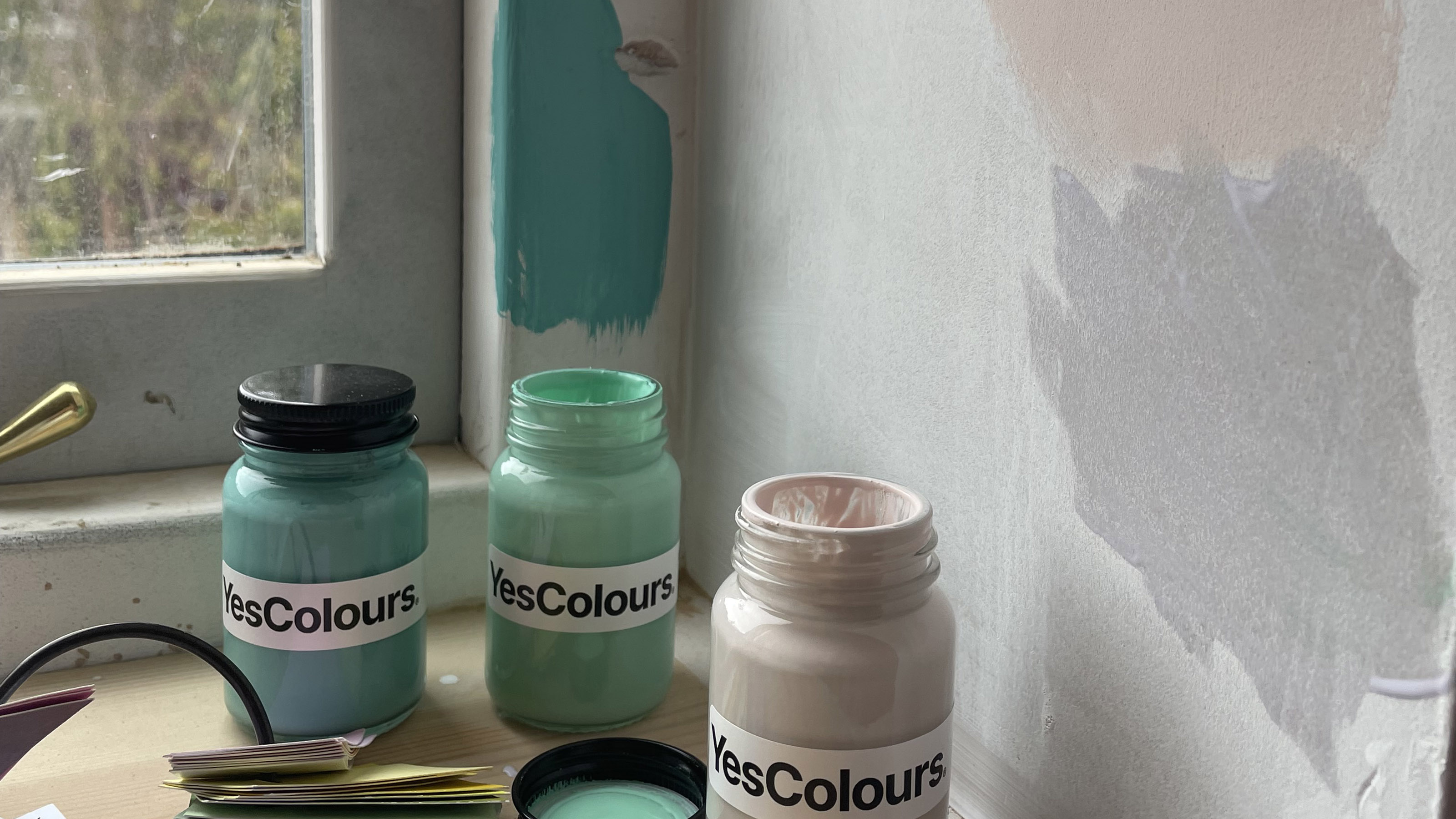
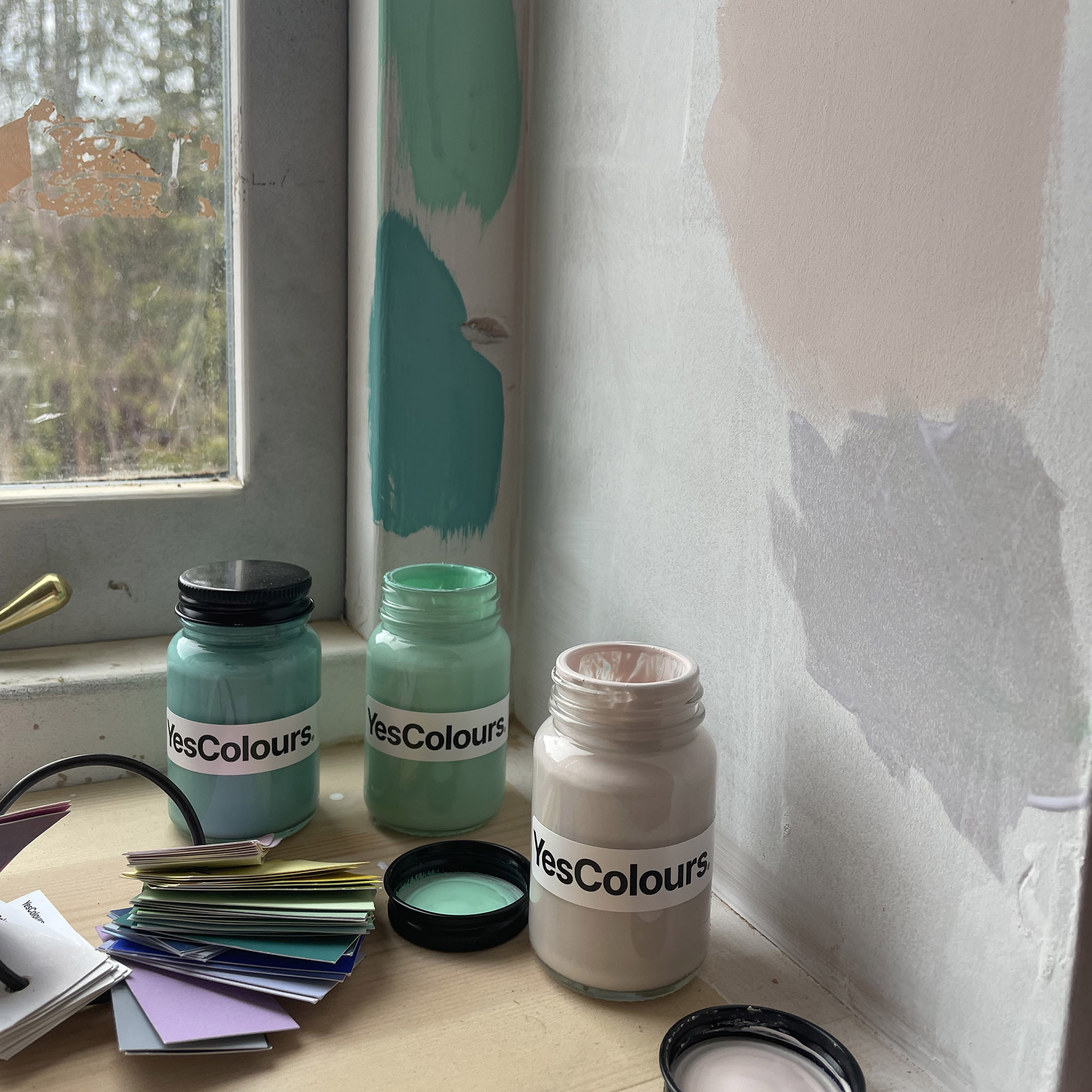
It’s a darker room with low ceilings, so keeping things light and bright is key. The floor is very dark wood, so I’m planning to soften it with green-toned rugs. I recently bought a boldly patterned green floral sofa, and I’ll likely choose a wall colour pulled from that design so everything ties together. Luckily, one of those shades is a beautiful mint, and I have my eye on Nostalgic Green from Yes Colours.
How to choose your perfect green
Ultimately, choosing the right shade of green is about how you want your home to feel. A very pale green can add subtle colour without overwhelming a space, while deep shades create a luxurious, enveloping backdrop that allows furniture and artwork to shine. Brighter greens bring energy and joy, and when inspired by nature – particularly springtime tones – they feel fresh rather than childish.
Green is often used in hospital waiting rooms because it’s considered calming, and I couldn’t agree more. Whether you go soft, dark or vibrant, it’s a colour that brings balance, comfort and a sense of life into the home – and for me, that’s exactly what decorating should do.

Hannah Carvell is a screen printer based in the rural heart of Somerset, where she works from a converted stone outbuilding nestled beside her cottage. Her work has been featured in national press such as Livingetc and Ideal Home, and in the the homes - and Instagram feeds - of people such as Erica Davies and Louise Thompson. Her home studio is the creative hub where she hand-pulls her vibrant, layered prints, known for their rich use of colour and the alchemy of overlapping inks that produce unexpected, luminous shades.
Hannah's signature aesthetic – bold, playful, and full of movement – reflects her fascination with how hues interact and transform when placed in conversation with one another.