

We moved to Somerset nearly three years ago. There were a few indoor leaks to greet us, along with all the chaos that comes with moving a family across the country, but even on that grey, rainy day, I instantly felt at peace with our little slice of countryside.
Look through any window and there are trees, grass and hills, so when we finally started thinking seriously about decorating the living room, I knew I wanted to bring some of that feeling indoors. When I discovered Dulux Heritage Sage Green, it immediately felt right: slightly vintage, with a nod to the landscape outside.
By the time we decided to decorate, we’d lived in the house for nearly three years. I'd experienced every season here in Somerset and, in doing so, had come to realise what I love most about this house.
Summer is wonderful because we spend so much time outside, but it's autumn and winter that the cottage really comes into its own. The log burner is lit, we're all gathered together, and the house feels cosy and properly lived in.
Like many older cottages, ours has very low ceilings, and during the winter months the living room can feel quite dark. Rather than fight those characteristics, I wanted to embrace them and create a room that felt relaxed and enveloping: somewhere the whole family would want to gather, light the fire and watch films together. That's where the idea of colour drenching came in.

Choosing the perfect shade of green
While green felt like the obvious starting point, choosing the right shade was much harder. I wanted something that connected to the landscape outside without feeling too literal or too bright. Dulux Heritage Sage Green was perfect: a soft, chalky green with a slightly blue-grey quality that works beautifully with the changing light in the room. More importantly, to me, it feels like a colour that belongs in this house.
I love that it echoes the greens outside but is still calm enough to live with every day. We have lots of vintage furniture and a growing collection of colourful artwork, so I wanted the walls to feel connected to the countryside while providing a backdrop for everything else we’ve collected. I took Sage Green beyond the walls and onto the skirtings and ceiling too, creating that cocooning, colour-drenched effect while also giving the illusion of a higher ceiling.
I was also drawn to the Dulux Heritage colour palettes, particularly the “Designers Choice” combination of Sage Green with Potters Pink and Coral Pink. Helpfully, each colour page on the Dulux Heritage website suggests Curated Palettes: trios of shades that look lovely when grouped together.
After being tempted by Potters Pink, I made my order and painted one of the internal doors and its frame. It was a relatively small change, but it made a surprisingly big difference, lightening that part of the room while giving the green something to play against. I also love that it's a nod to a very pretty pale pink rose bush just outside the window.

Seeing the transformation come to life
I used Dulux Heritage Velvet Matt in Sage Green on the walls and ceiling, while the woodwork and door were painted in Dulux Heritage Eggshell. One of the things that surprised me most was just how good the coverage was: two coats was all it took. Painting the ceiling was my favourite part of the whole transformation. Instead of your eye stopping where the wall meets the ceiling, the colour wraps around you. It’s such a transformation.
The paint itself is lovely to use. It's thick, easy to apply and has that premium quality you’d expect from a Dulux Heritage paint. Once dry, the Velvet Matt has the gorgeous soft, almost powdery finish I was hoping for. It doesn't feel harsh or overly flat; instead, the colour seems to change subtly with the light coming into the room.
Our Somerset cottage is very old, with lovely thick stone walls, but that means there are curves and irregularities in the room. The finish of the paint has really blended these beautifully, working with the wonky bits to bring the walls and ceiling together into one cohesive space.

What I'd recommend before renovating your living room
My biggest tip is that you don't always need to rush a decorating decision. Living in a room first can tell you far more than a moodboard ever could.
- Embrace the seasons: If you can, experience the space through different seasons and at different times of day. You'll learn far more about what it needs and how you want it to feel.
- Don't be afraid of colour drenching: Painting walls, ceilings and skirtings in the same colour can create a cohesive, cocooning feel. In a room with low ceilings, it can make the ceiling height feel less noticeable.
- Always test colours first: A colour can look completely different depending on the light in your own home. Tester pots are worth the small investment.

- Consider an accent colour: Introducing a pop of colour against the walls is a great way to add personality. Our Potters Pink door offers such a fresh contrast against the Sage Green without feeling out of place.
- Choose a colour that will influence how you feel: For me, the most important question wasn't “What colour is fashionable?” It was “How do I want this room to make us feel?” I wanted it to feel cosy, calm and connected to the countryside, and Dulux Heritage Sage Green has given me exactly that.
Ready to refresh your living space? Explore the full Dulux Heritage collection, their online tools make choosing your perfect shade refreshingly simple – from seeing how your shade changes throughout the day (and night) to finding your nearest stockist to pick up a Dulux Heritage Colour Card or tester pot before making your final choice.

-
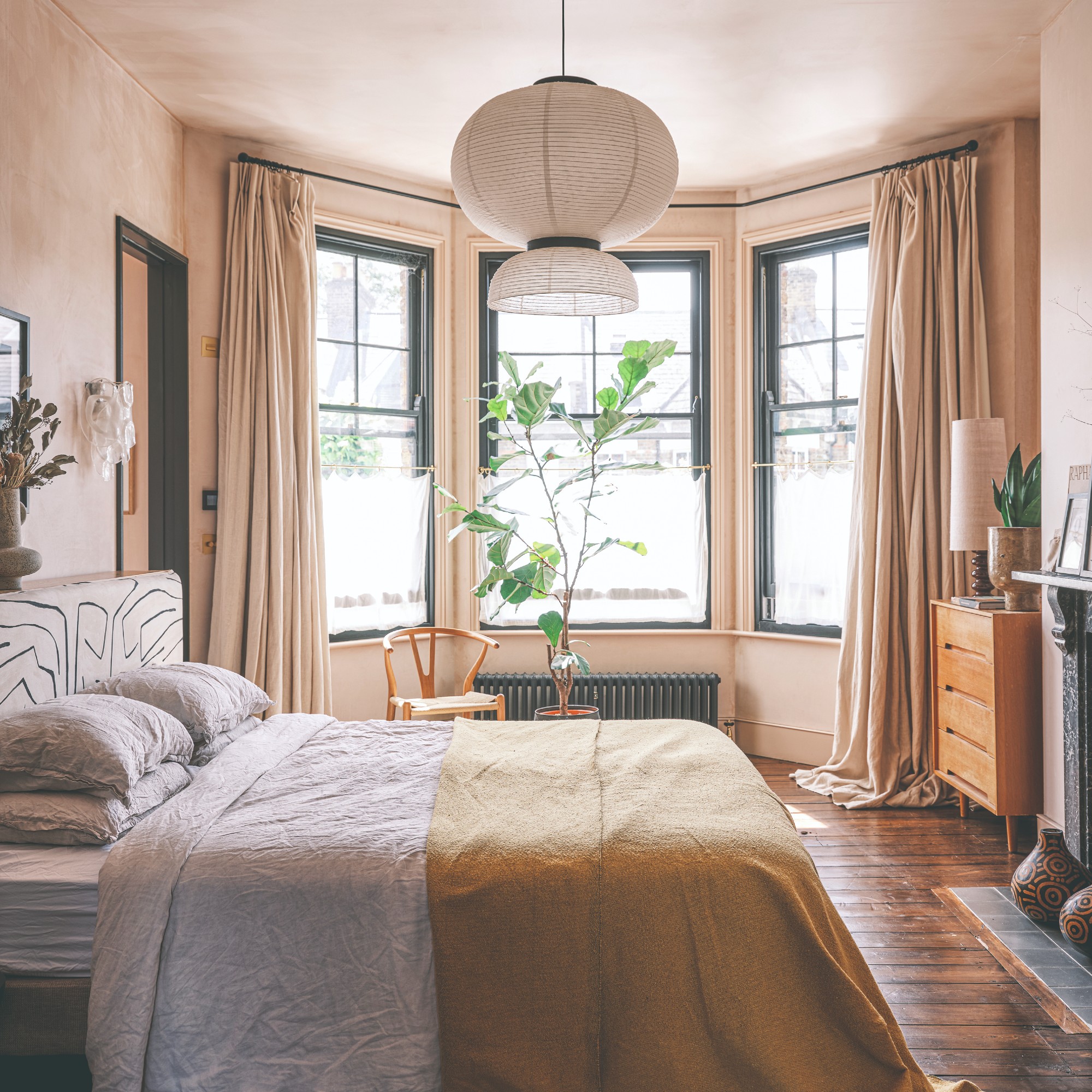 'Curtain-stacking' is the simple trick experts recommend for making a cold bedroom feel warm and cosy
This is how to do it
-
 I just found the easiest way to spread topsoil on a lawn – it’s a simple, time-saving tool
I wish I'd found it sooner
-
 My mum taught me this old-fashioned trick for fresher pillows and cushions
The simple housekeeping routine I've carried into my own home


