10 questions with... Habitat
In our interview series, we talk to our favourite bloggers and experts about their trend predictions and styles. Here, we meet Polly Dickens, Creative Director of Habitat
Sign up to our newsletter for style inspiration, real homes, project and garden advice and shopping know-how
You are now subscribed
Your newsletter sign-up was successful
Follow Habitat on Instagram @habitatuk
1. Which trend would you like to see the back of – and why?
I like it used as an accent or a single key piece but I’m a bit over the metallic copper trend that seems to be covering everything currently! It started back with Tom Dixon bringing the metal to notoriety in interiors but it has felt like such a ‘me too’ thing with a lot of shops copper-ising everything with row after row of copper products. It’s proliferated the market so fast and for so long that I’m really keen to see a new wave of metallics like brass, rose gold and chrome come through again just to move things on a bit.
Article continues below 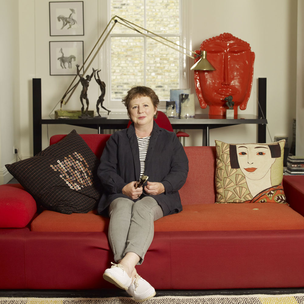
2. Where do you find your inspiration?
For me it’s normally from my travels around the world, visiting restaurants, markets, exhibitions…the list goes on! We’re continually absorbing inspiration every day from colours to textures and all of this will eventually manifest itself in a product or a trend that feels relevant for the time. Often a new production technique seen in a workshop or factory will be a starting point for a design or a whole new collection. Industry trade fairs like the Milan Salone and Paris Maison et Objet are important in terms of what materials and colours are starting to show up but I don’t tend to look at trend forecasts because these simply lead everyone in the same direction which then makes the interiors market seem saturated with the ‘same old thing’.
At Habitat we create our own design trends each season rather than following the pack and prefer being the odd one out that is surprising and refreshing each season.
3. Which key trends should we be looking out for come Autumn/Winter?
Sign up to our newsletter for style inspiration, real homes, project and garden advice and shopping know-how
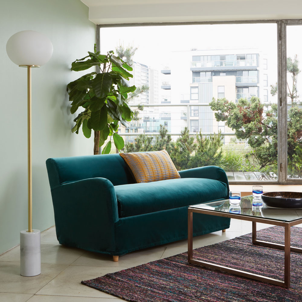
Italian High Glamour - Brings together traditionally luxe materials like marble, brass and velvet, but translates them into a series of ultra-contemporary designs without being OTT. Mixing more muted metals alongside marble creates a very understated, elegant look and we purposefully made the decision to introduce green and brown veined marble this season - alongside white – to add a real touch of cool sophistication.
Black tableware – Forget the traditional white dinner service. Black dinnerware not only enhances the colour of foods (beetroot pink/ pea green / pumpkin orange) it also creates sophisticated look for winter dining tables. Look for black ceramics with interesting glaze techniques that will reflect candlelight and also dramatic shapes like jugs, vases and cake stands that will add interesting silhouettes to a table.
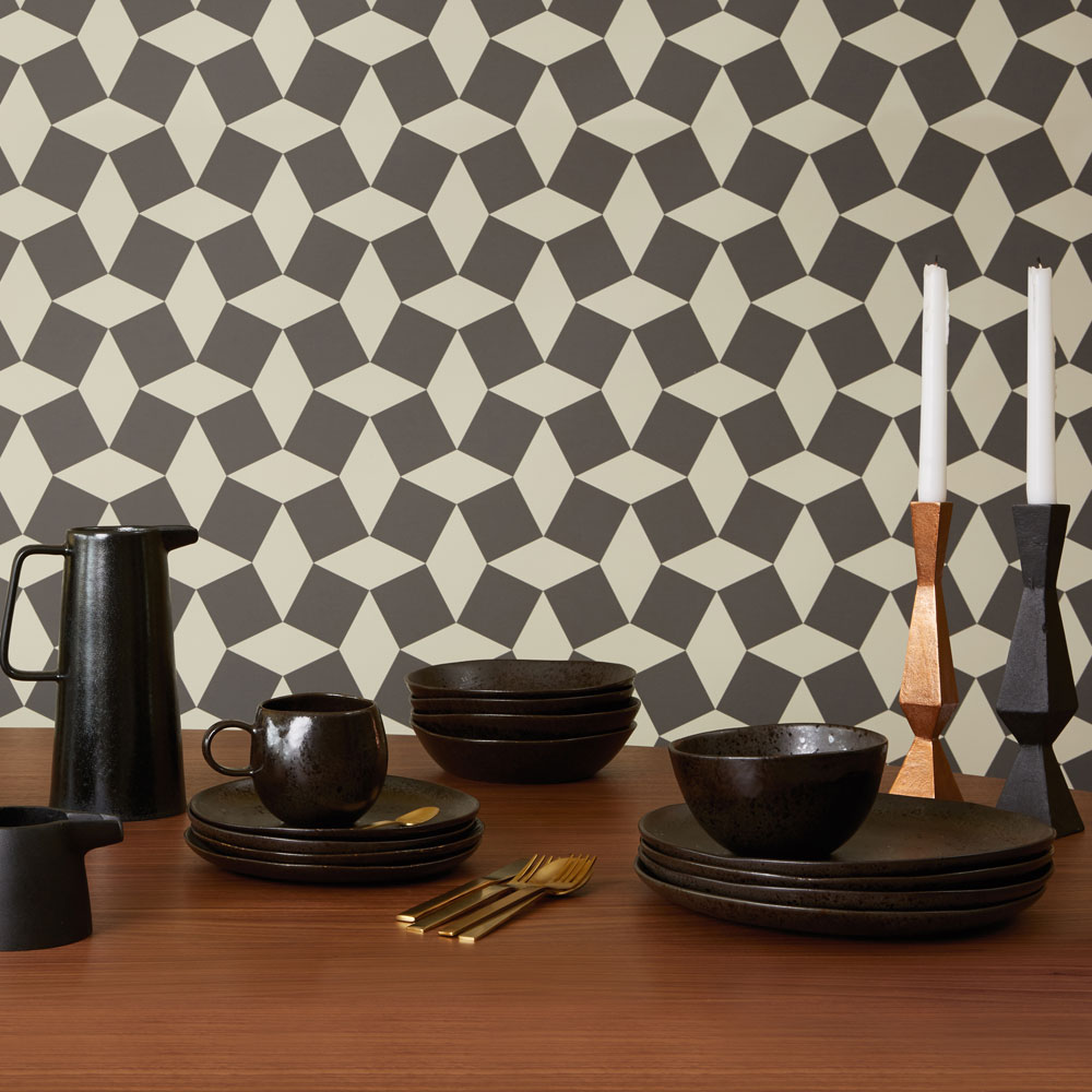
Tiled Textiles – Traditional tiling has featured on furniture and flooring for years but this look translates so well across textiles. A mix of geometric, repeated patterns with different scale and formation, tiling pattern means you can (literally) throw lots of different colours and materials together and it still works perfectly.
Hand Crafted – Products that have been obviously worked on by hand - where you can see a person has actually painted or embroidered a product – are part of a growing interior trend on the high street. Designs with slight imperfections or subtle differences mean that each piece is unique.
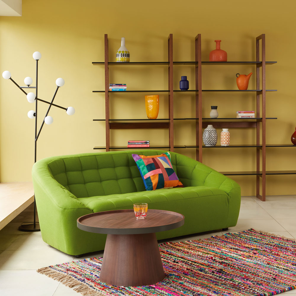
1970’s Bohemia - For fans of the eclecticism of the 1970’s, this trend is a pretty wild mix of bright primary colours and pattern mixed purposefully alongside walnut – a wood recently associated with more refined schemes. This shows how you can use walnut in fun, bohemian way mixing alongside upcycled multi-coloured rugs, painted vases and bold statement colour sofas.
4. Predicting trends is big business. How does trend forecasting work?
The way we do this at Habitat is as an internal design team. My designers have a period of time for each season to gather images and ideas of anything that they feel might be interesting, inspiring and relevant. We sift through these ideas as a team and it is always surprising how the same strands crop up in quite a diverse group of people with different interests and points of view. These ideas are then translated into a visual orientation ‘guidebook’ which then informs all of the design work, colour and pattern for the season. We work 18 months ahead of each seasonal collection.
5. Can you share your top decorating tips with us?
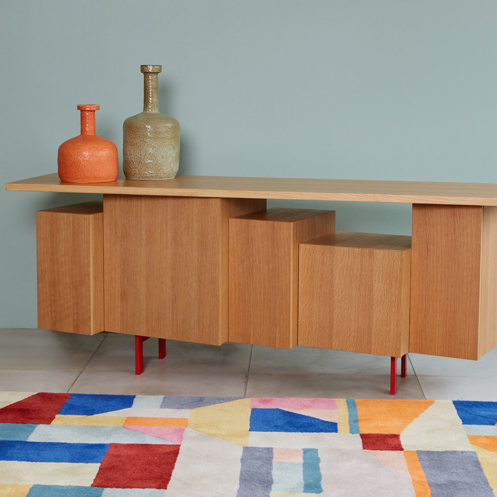
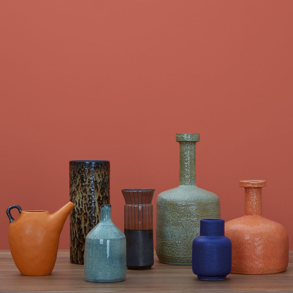
I have a lot of possessions gathered over the years from many travels, as well as pieces that I have been unable to resist from collections that I have been involved with! These require a strong and simple background/framework to arrange them against, so I advocate simple black floors and white walls with plenty of open storage – which is either part of the architecture or quite stark museum style black metal shelves. To soften this, the black floors are layered with black rugs – cowskin, jute or wool. The multiple vases, objects, books and textiles then layer over this neutral ‘base’ and it’s through these accessories that I can introduce colour to the space which I can update easily when I want to move things on.
6. What does your role as a creative director entail?
I look after the running of the Design, Visual Merchandising and Graphics teams at Habitat. I’m responsible for having an overall vision of all things visual for the business (product design, photography, web design, store designs and display etc) and overseeing the implementation of this. Deciding the direction for the product design and development for the business is also part of my job and I spend a lot of time travelling with the buying and design teams to turn this into reality. Getting on a plane and working in factories and workshops across the world is still really important to me and feeds my creativity - I hate spending too long behind a desk in the office!
7. Describe your style in three words
Decisive. Bold. Colourful.
8. What’s the most common decorating mistake you see?
Everyone should reflect themselves through their own interiors how they want but for me too many ideas and styles crammed together in one room can really be confusing for the eye, making a space feel smaller and cluttered. Allow space for things to breathe. Use a very simple, neutral base and have fewer, better things.
9. What interiors objects are you currently lusting over?
Inevitably I have my favourites from each seasonal collection. These tend to creep into lots of our Habitat photography as I never really have the space for them at home! For AW17 I absolutely love our new brass Tabitha chair, the bright Coates bedlinen as well as our whole monochrome handwoven Khadi and Ikat story in textiles. I also think that the new Mortimer sideboard – designed by Matthew Long – is one of the most beautiful pieces of storage furniture.
10. Have you ever had a decorating/design disaster?
We painted a bathroom red once and immediately hated it. Stick to black and white – you can never go wrong!
Jennifer is the Deputy Editor (Digital) for Homes & Gardens online. Prior to her current position, she completed various short courses a KLC Design School, and wrote across sister brands Ideal Home, LivingEtc, 25 Beautiful Homes, Country Homes & Interiors, and Style at Home.