A house full of contrast, that all works in harmony to create a beautiful home
Both dark and moody and light and bright, monochrome in parts and colour elsewhere... it shouldn't work, but it does
Sign up to our newsletter for style inspiration, real homes, project and garden advice and shopping know-how
You are now subscribed
Your newsletter sign-up was successful
After years of renting together, this young couple knew exactly what they wanted from their first home: space, character, and the opportunity to make the property their own.
Because their previous two-bedroom rented house was on the rural outskirts of the town of Grimsby, they wanted to buy somewhere more central. And when they found the perfect house - this three-bed Victorian townhouse - they got straight to work.
‘We viewed a few properties,' explains the owner, 'and ended up falling for and buying the cheapest and most dated Victorian terraced house of all! Luckily, it had central heating and a new roof, along with bags of potential for us to make our mark on it.’
Article continues below‘Having viewed other similar properties,' she continues, 'we’d seen what could work with our own, so a few months after moving in, we started the renovations. We engaged builders to knock through the old dining room, tiny kitchen and utility room to create one long kitchen-diner at the rear of the house.'
'They vaulted the ceiling and added skylights,' she continues, 'and blocked up a window and side door to give us more scope for placing kitchen units and other pieces of furniture. Shortly afterwards, they knocked the front living room through to the second reception room, which became our more formal dining area.’
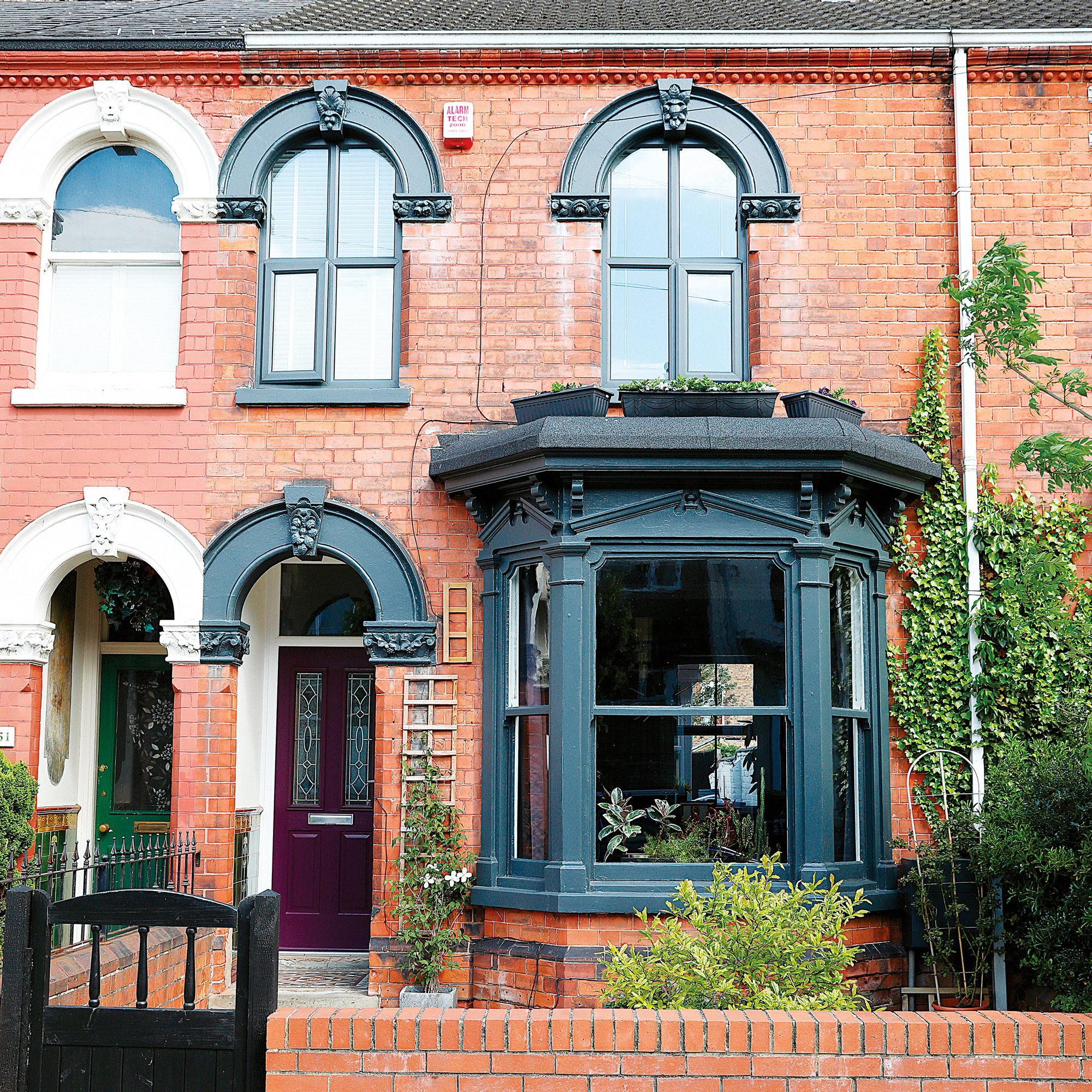
‘Over the years,' she explains, 'we’ve honed our interiors style, and enjoy combining contemporary and traditional elements. We love period features so we wanted to restore as many as we could, while also making the house feel modern. The living room and main bedroom are just for us to relax in, so we went for dark, cosy colours.'
'However,' she continues, 'the reconfigured kitchen-diner ideas at the back of the house is bright, colourful and fun – ideal for when we have friends and family round. We love making an impact, and I very much enjoy showing people my ideas and waiting for their reactions!’
Sign up to our newsletter for style inspiration, real homes, project and garden advice and shopping know-how
‘We can’t imagine moving for a very long time.' she says. 'We’ve put so much blood, sweat and tears into this property, and have created our dream home.’
The monochrome hallway
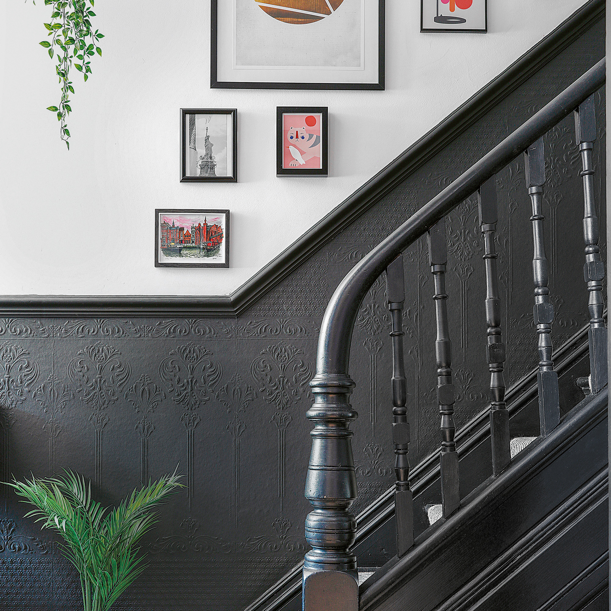
'This is my favourite room - it has the instant 'wow' factor,' explains the owner. 'I love that it blends our style perfectly with the period of the house. The original tiled flooring was the clincher for us to buy the house. We decorated with daring black paint, and added a smart hallway runner.’
The light and bright kitchen diner
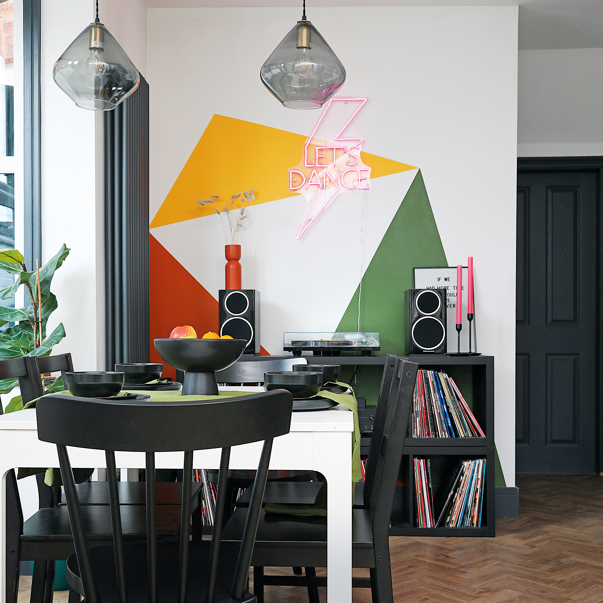
‘We love entertaining,' she says, 'and it’s great being able to prep in here while chatting. I painted the mural above the record player and added a neon sign.'
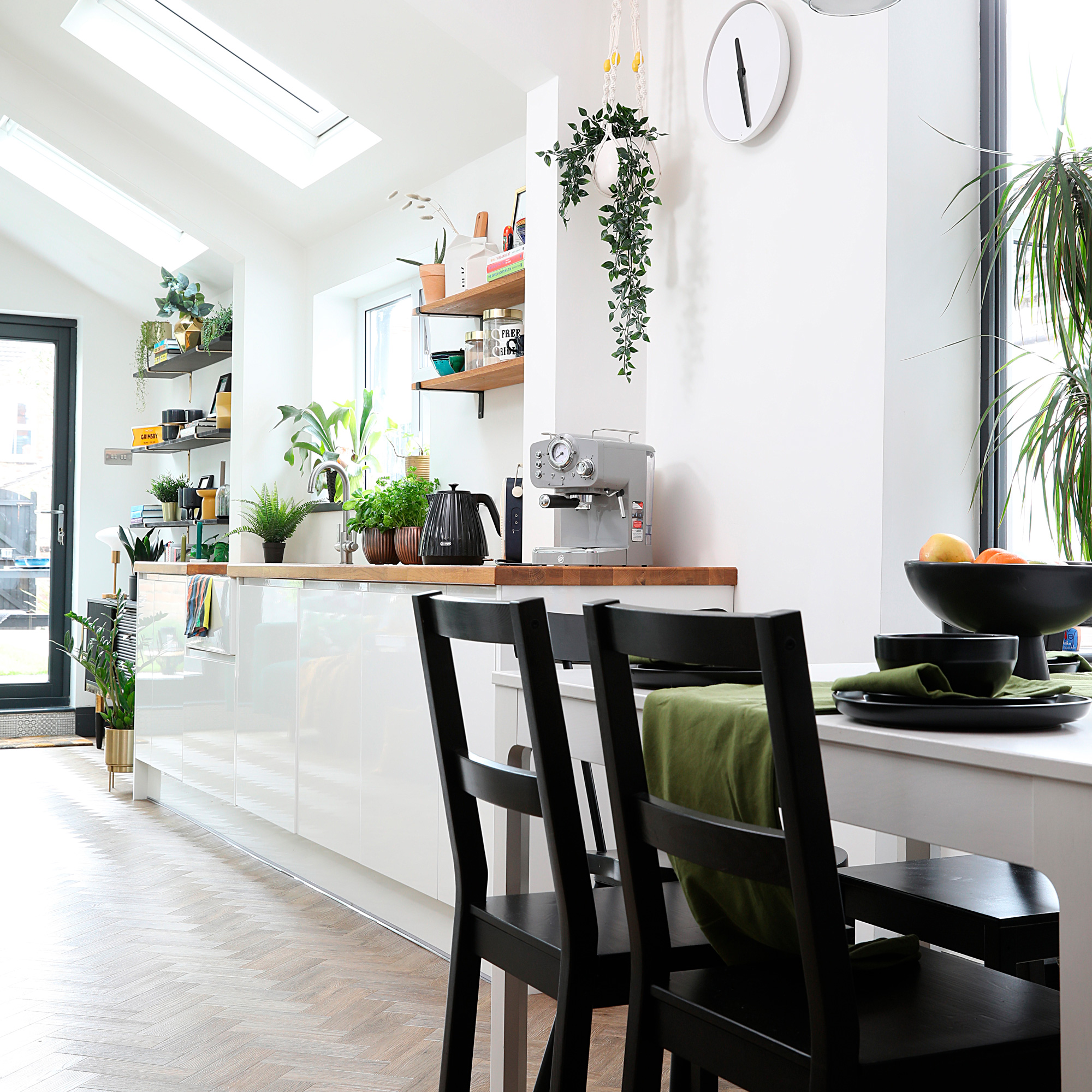
‘The new space with its galley kitchen in the middle, flows so much better,' explains the owner. 'We chose handleless high-gloss units as the wipeable surfaces are easy to look after. We also wanted an element of natural texture, so we chose a wooden worktop. It’s a bit more high maintenance but we sand it down every year and re-seal it.’
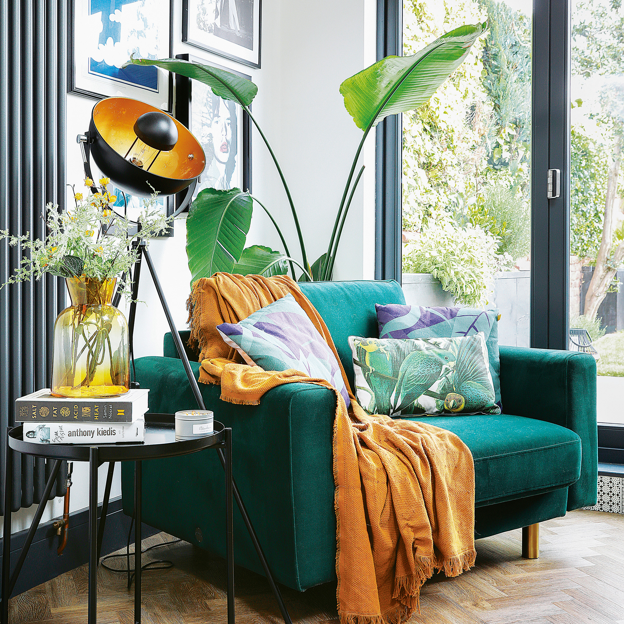
‘There was a chair in the kitchen space here before, but we’d always fight over it!' she says. 'The space wasn’t suitable for a sofa as it would be parallel with the kitchen and create one long line, so a love seat was the best option. It fits perfectly in the corner at an angle, and we can both squeeze onto it together.’
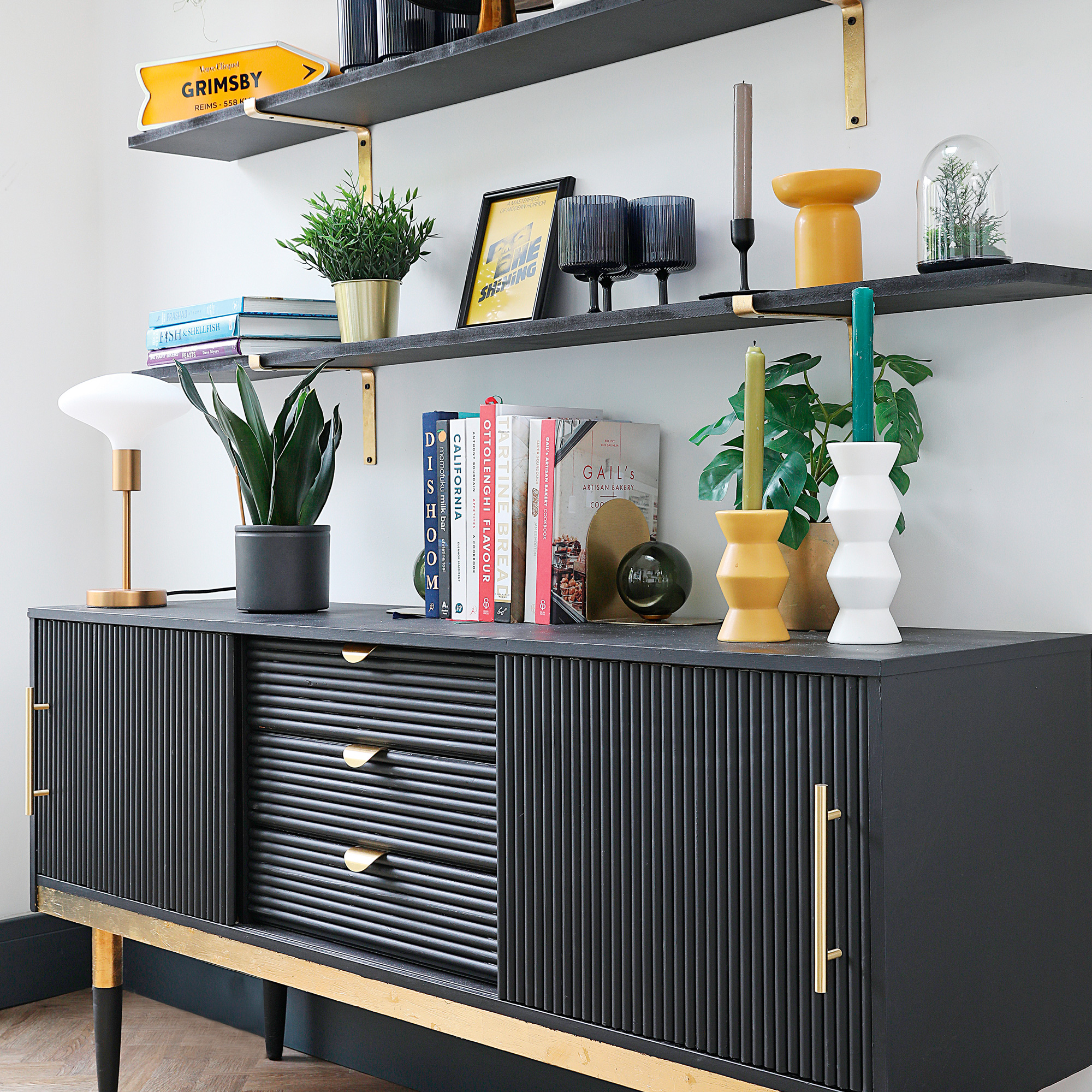
‘Instead of having a tall shelving unit,' says the owner, 'I’ve created the look by upcycling a vintage sideboard beneath shelves painted the same colour. The gold-toned brackets tie in with the detailing that I added to the sideboard. This is where we keep all our cookbooks for easy access from the kitchen.’
‘We love having family over for Sunday tea and hosting games nights with friends. It’s great being able to prep in the kitchen while chatting and, with our record player in here, we can shift the table to have late-night kitchen discos.'
The cosy dining area
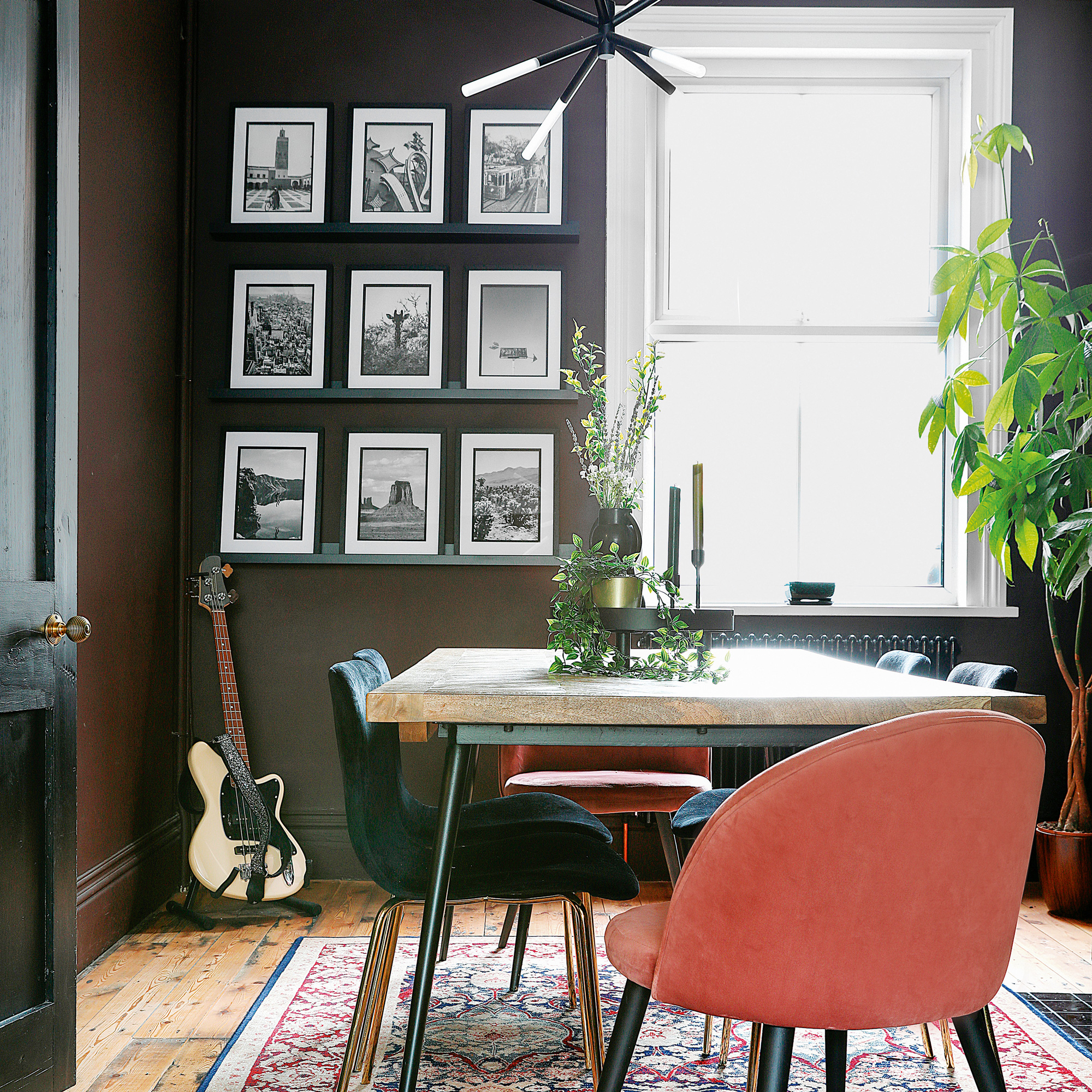
‘We’ve made a gallery wall ideas above the dining table of photos taken on our travels,' she says. 'We pinched the idea from one of the homes we viewed. The lighting in this area took careful consideration as I wanted something modern and large enough to make a statement. This ceiling light is like a piece of art.’
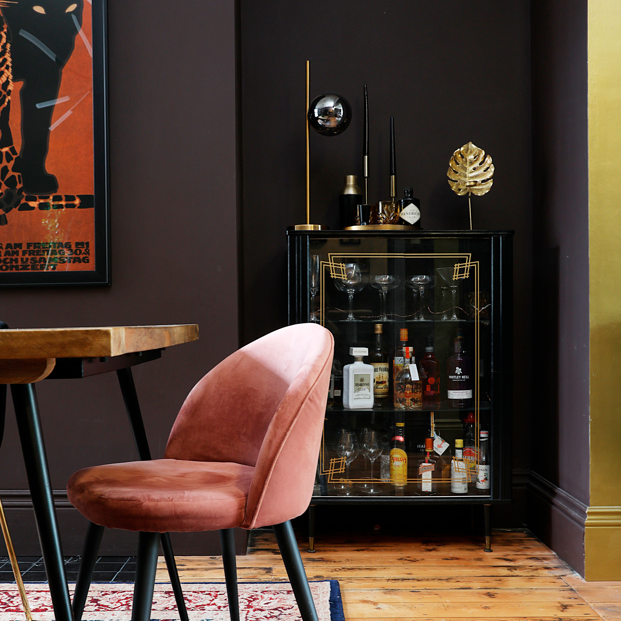
Here, the gold highlights from the drinks cabinet door and decorative accessories is echoed in the band of gold paint that marks the separation between the dining room and the living room.
The luxe-look living room
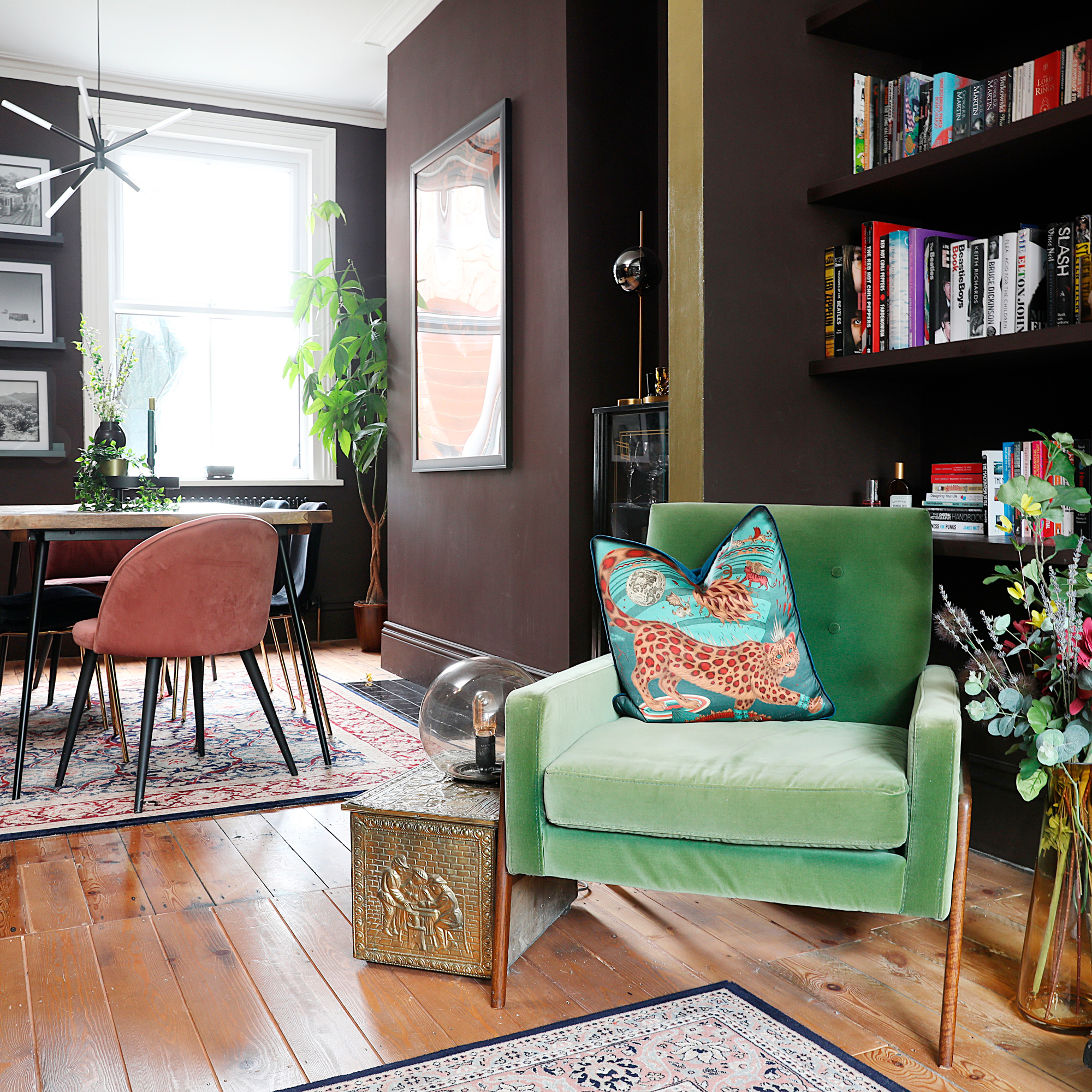
'Previously, this room had a dado rail with red and magnolia walls,' explains the owner, 'but this was removed before the walls were replastered and the floorboards sanded. We were going to add a picture rail and paint it white above, but we wanted to bring the dark burnt-red paint colour right up to the coving. I’m so pleased we did it, as it feels really cocooning.’
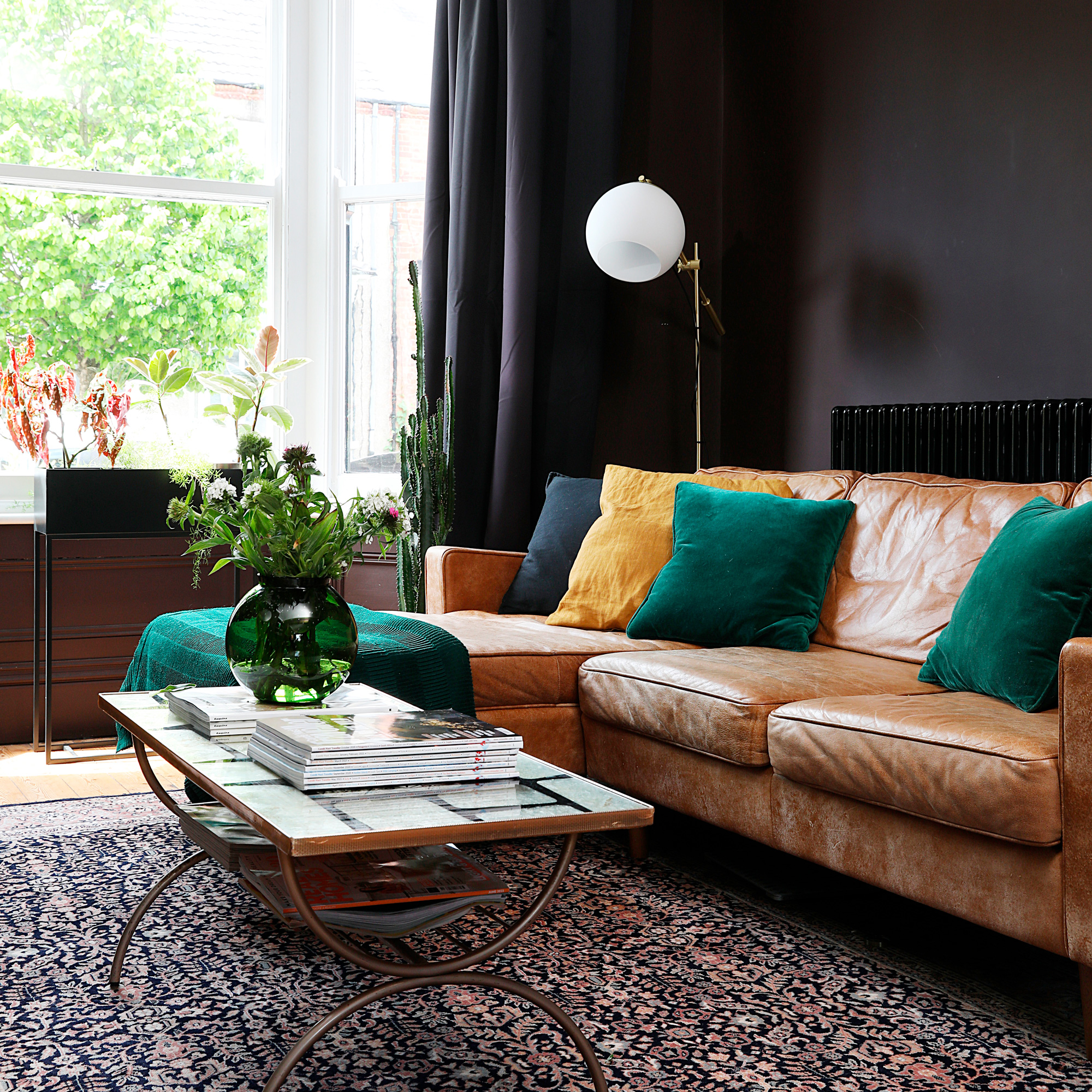
‘With its high ceiling,' she says, 'we knew this space could take a strong colour. The room gets a lot of late afternoon sun and is a lovely place to relax after work. The 1950s coffee table was £70 from a vintage fair in Liverpool. When we got home, we Googled it and discovered it’s a designer piece that can sell for hundreds!’
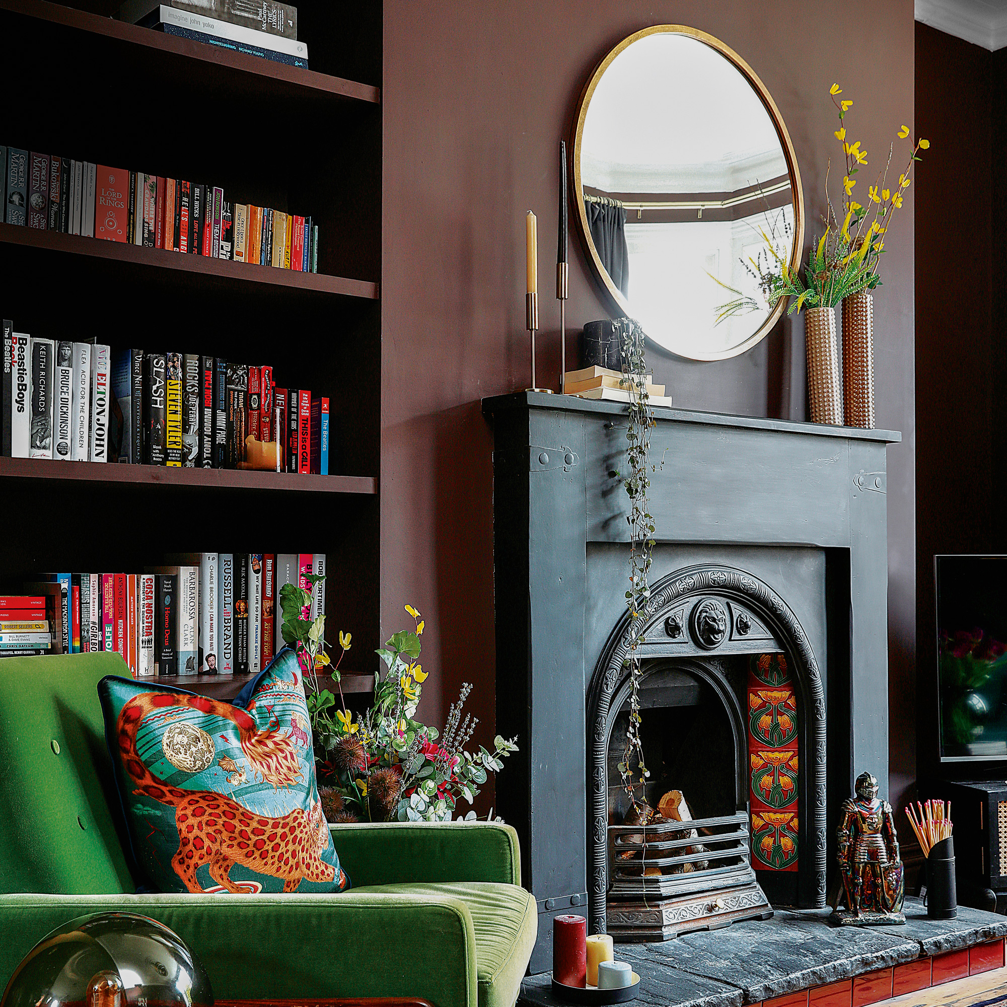
The alcove is filled with shelving, all painted in the same colour as the walls so that it blends into the cocoon-like space, rather than contrasting.
The moody main bedroom
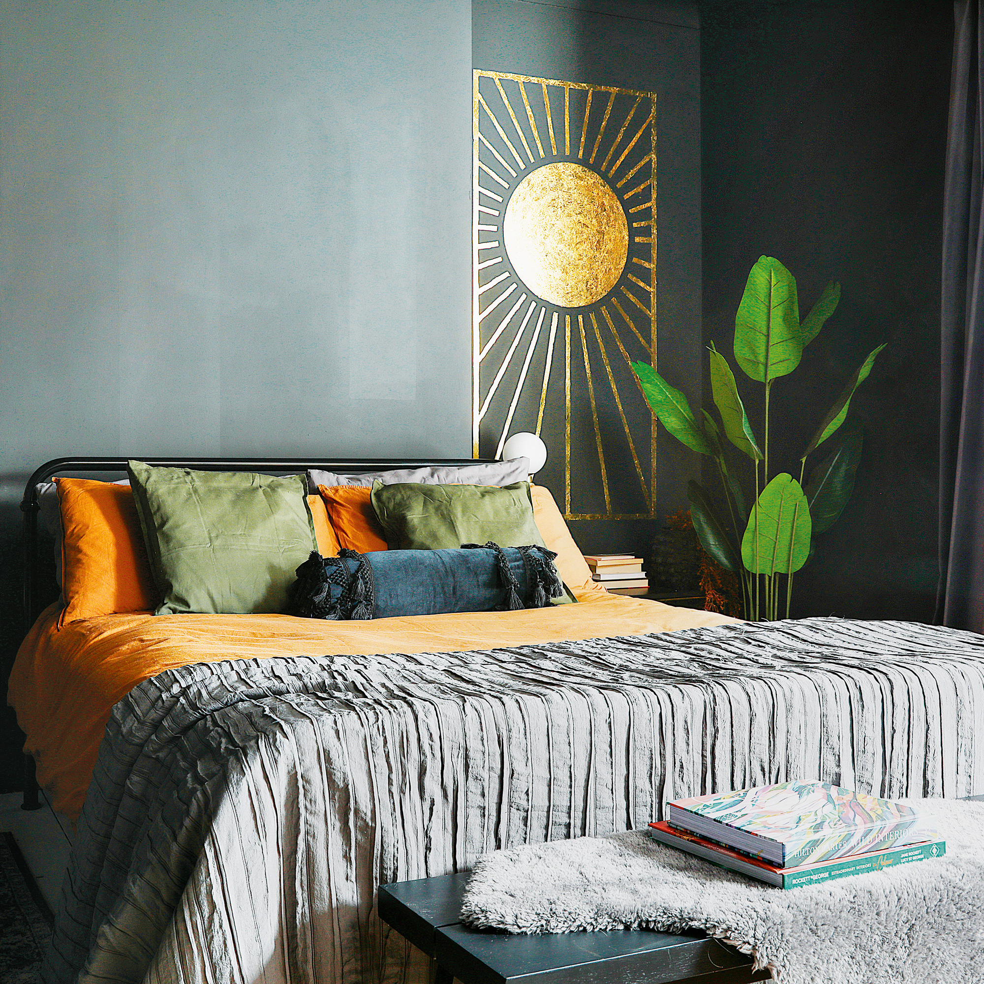
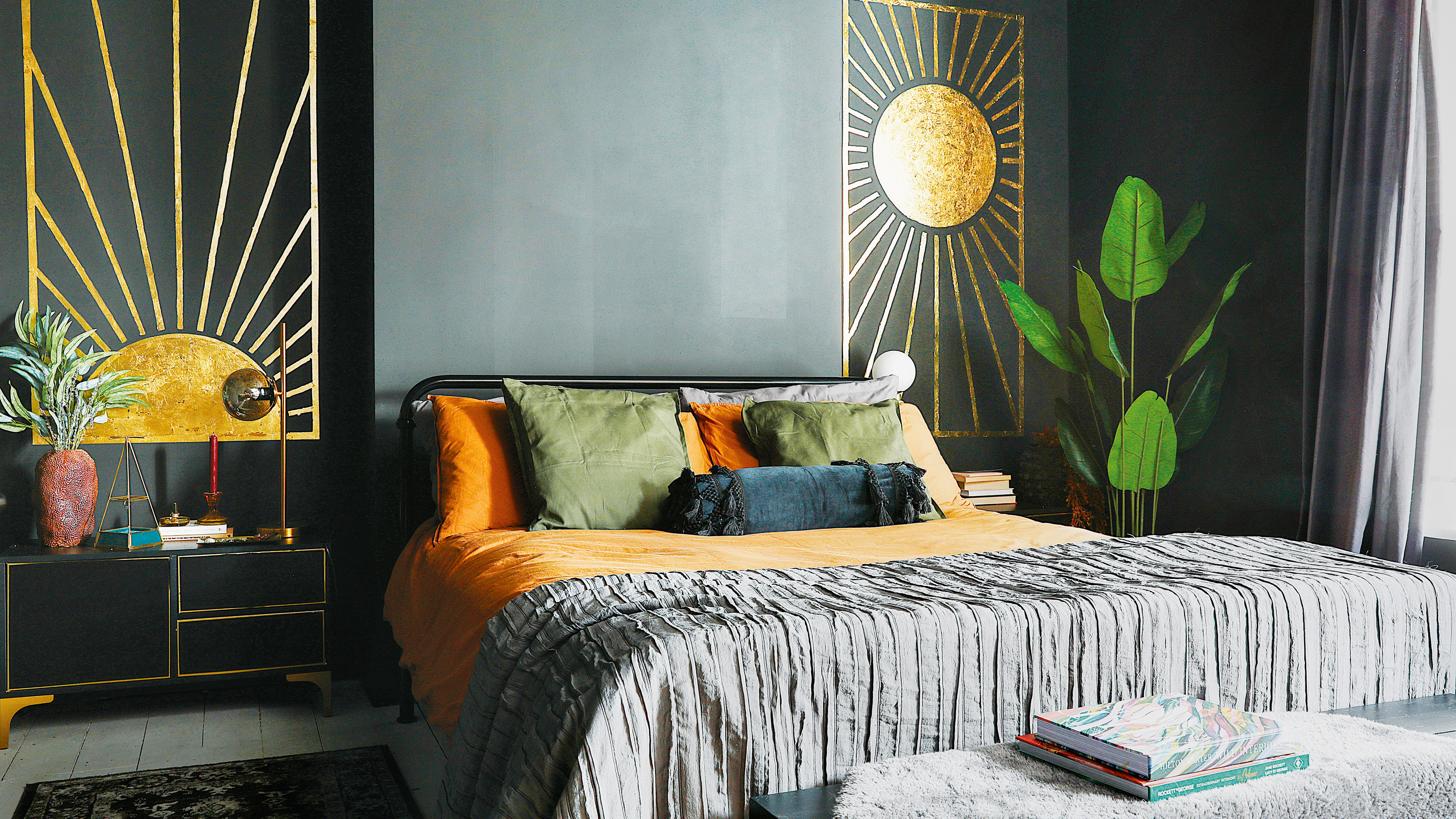
‘Drenching the bedroom from ceiling-to-floor was my husband's idea,' says the owner. 'If anything, he’s a tiny bit more daring, which encourages me. We call it the “womb room” as it’s so cocooning and relaxing. We’ve kept the area above the bed bare, so the alcoves are the points of focus.’
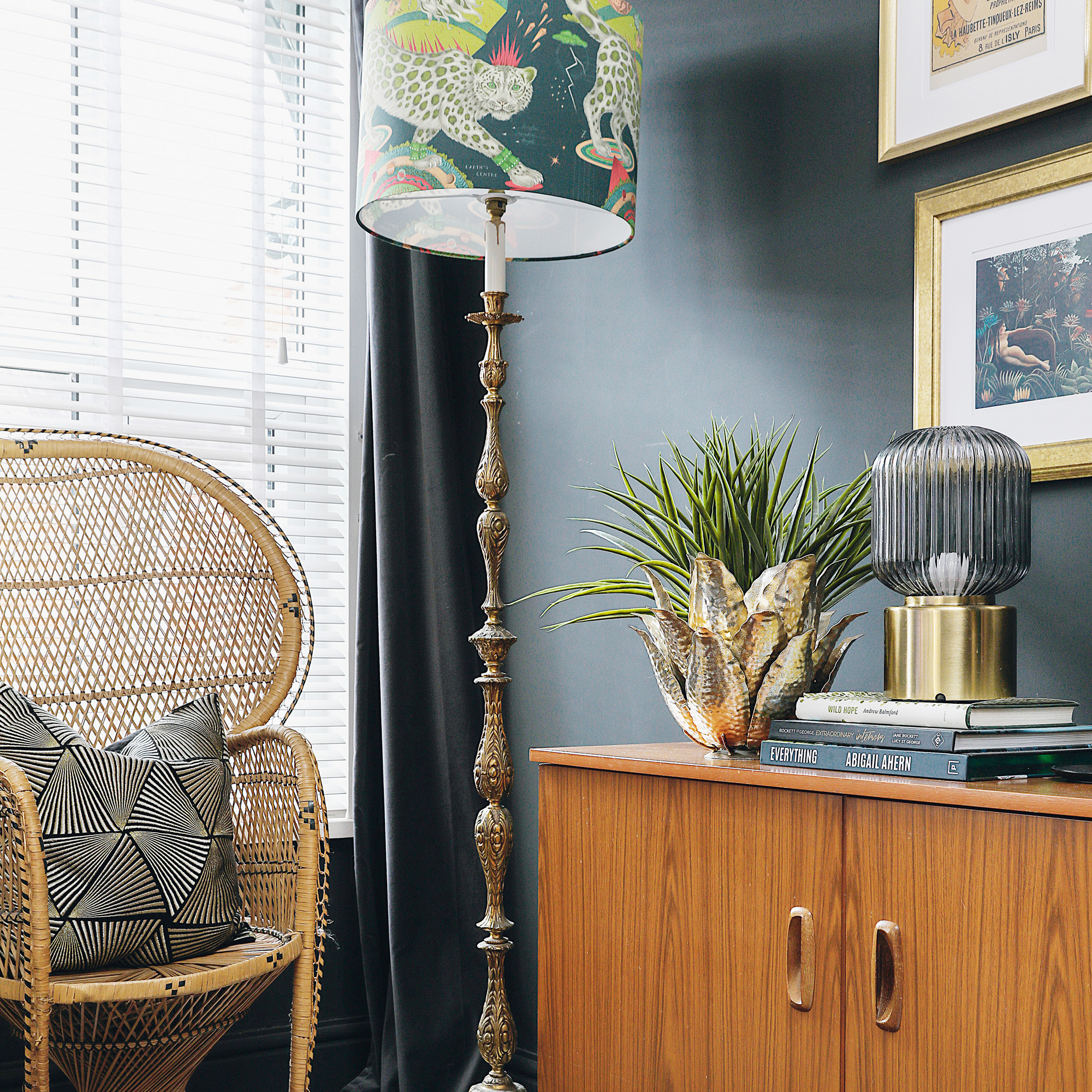
‘The vintage brass lamp base had a bare bulb for ages, until I finally found this lovely, colourful lampshade by Emma J Shipley,' she says.
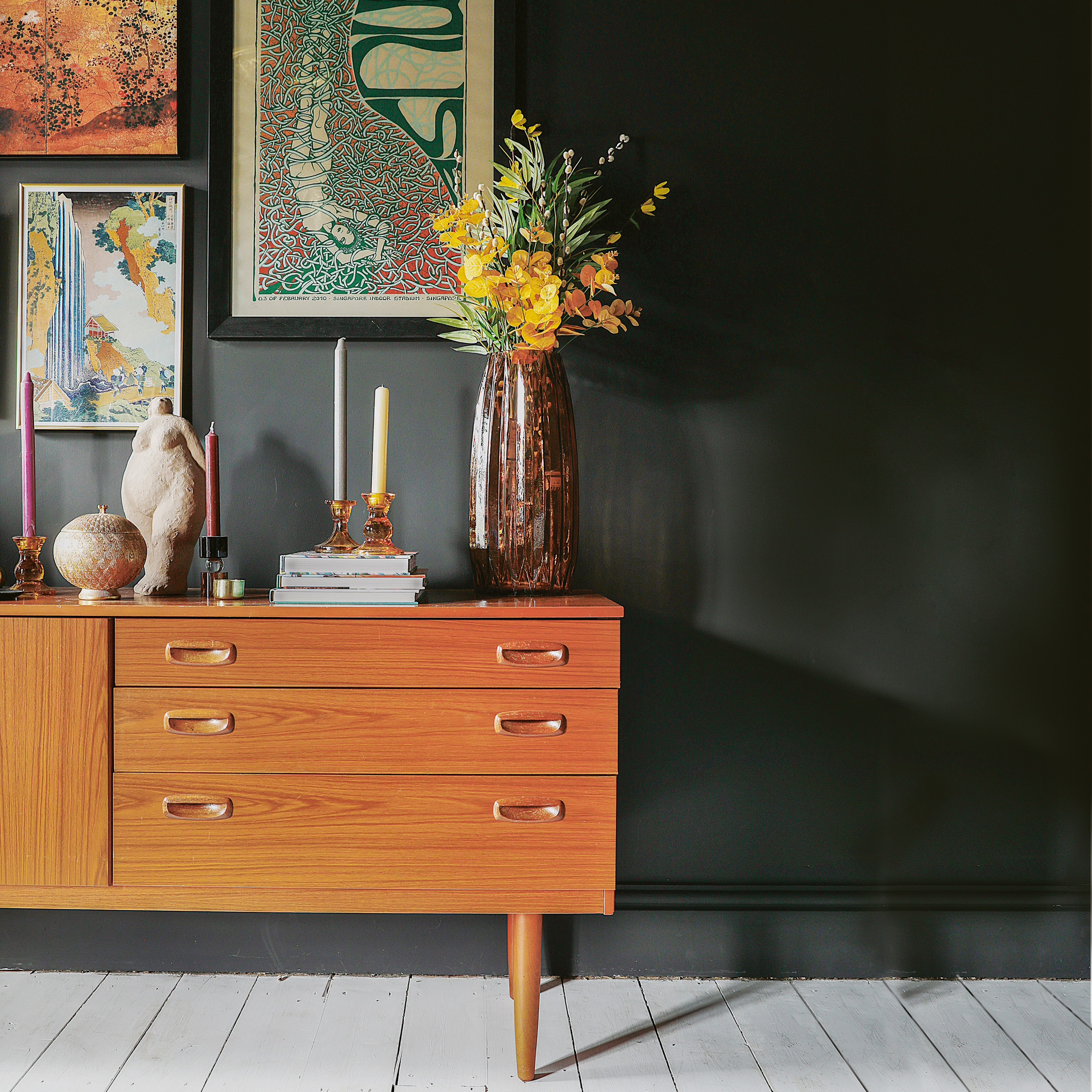
‘Most of our furniture is secondhand,' explains the owner. 'I’ll typically look on various home websites first, then always try and find the same thing on eBay. I bought this vintage sideboard on a whim and was going to upcycle it, but the colours suited the space so well, I decided to leave it as it was.'
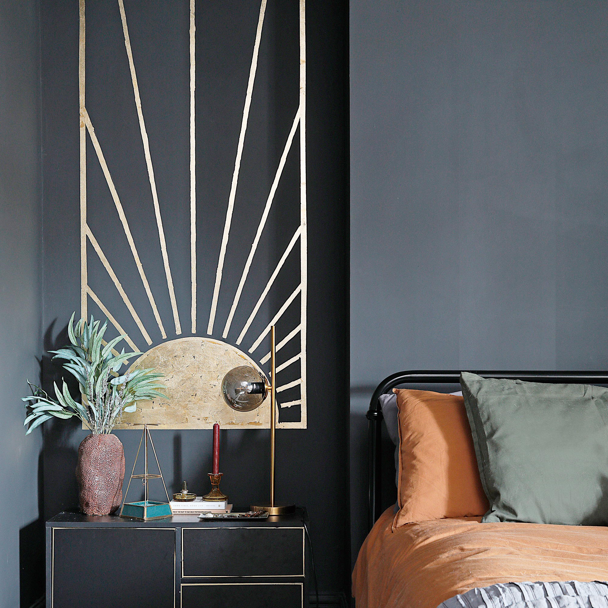
‘After taking a design class by Abigail Ahern,' she adds, 'I felt even more confident in my design choices, such as creating alcove murals. As they have a Japanese feel, I wanted an oriental thread running through the accessories and artwork, so chose items with touches of gold and pretty patterns.’
The colourful guest bedroom
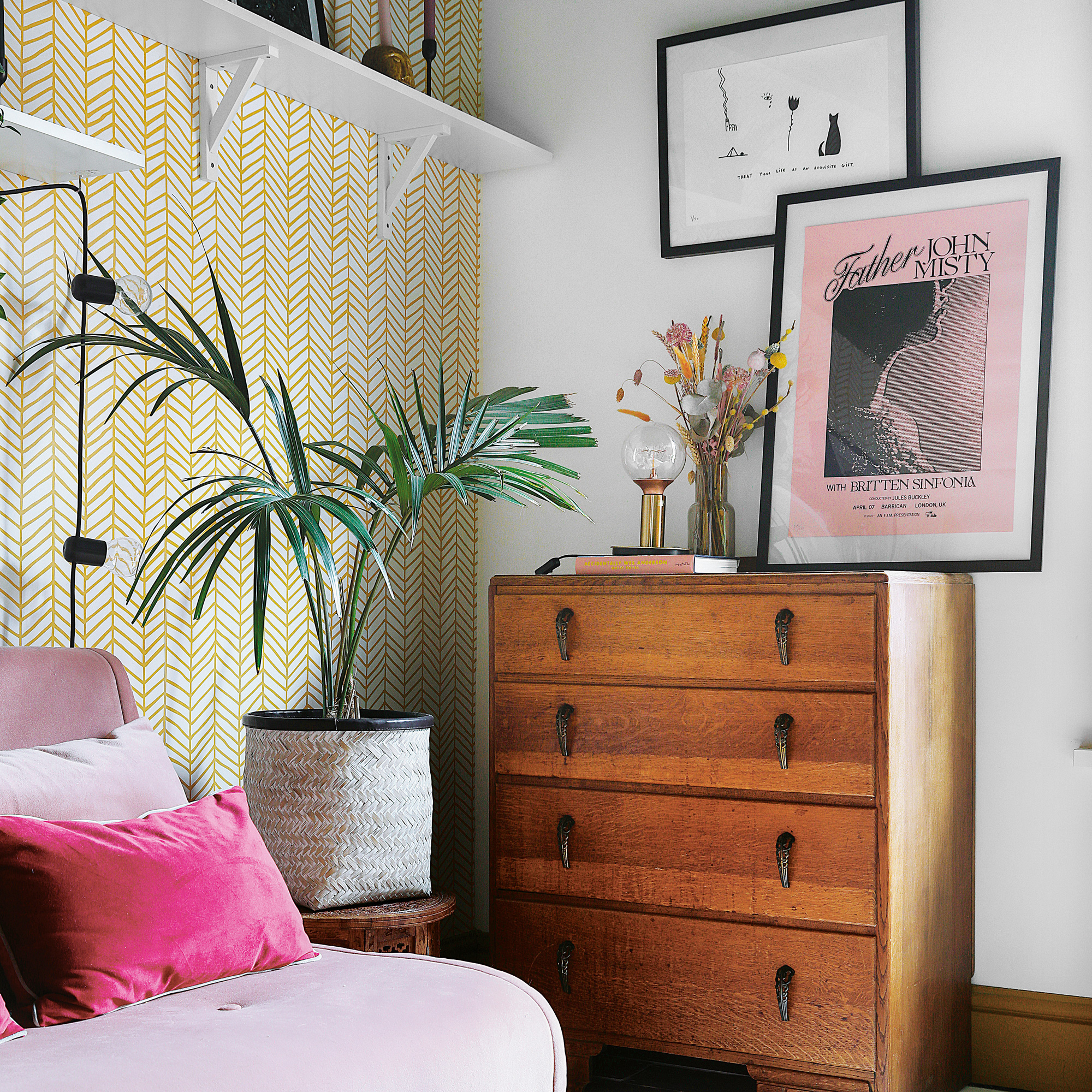
They decorated the guest room in stages and the design evolved throughout. 'I initially painted the magnolia walls in the guest bedroom white, with a baby pink ceiling and mustard yellow woodwork. However, it started to feel like a nursery, so we added a picture rail. Then I painted a wall and the ceiling in green to add some character. I’ve kept the touches of pink to the furnishings and accessories, then chosen a striking accent wallpaper with a graphic pattern to keep things feeling modern.’
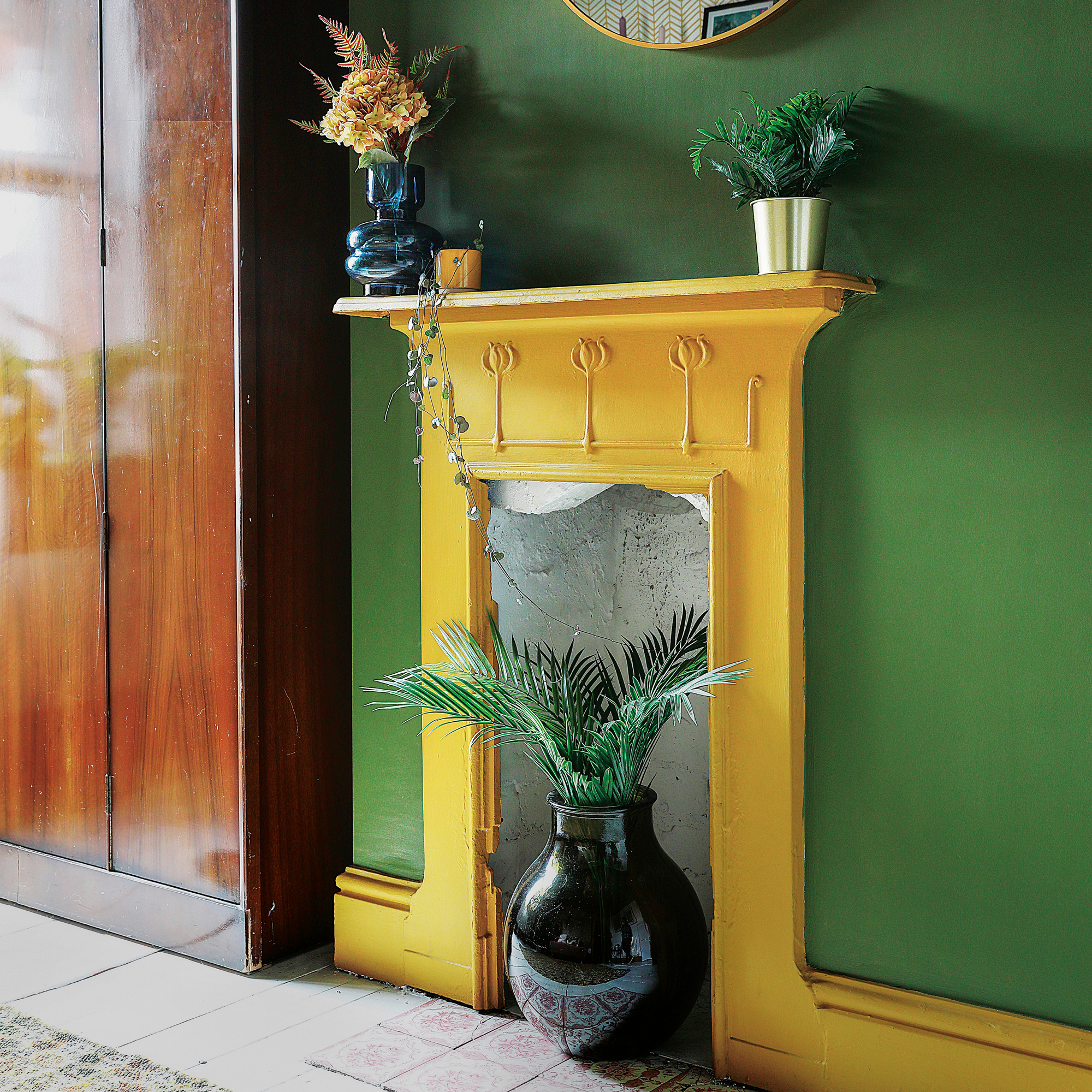
'The fireplace and hearth tiles were a dream discovery, as they had been boarded up and covered with a blue carpet.’
The striking bathroom
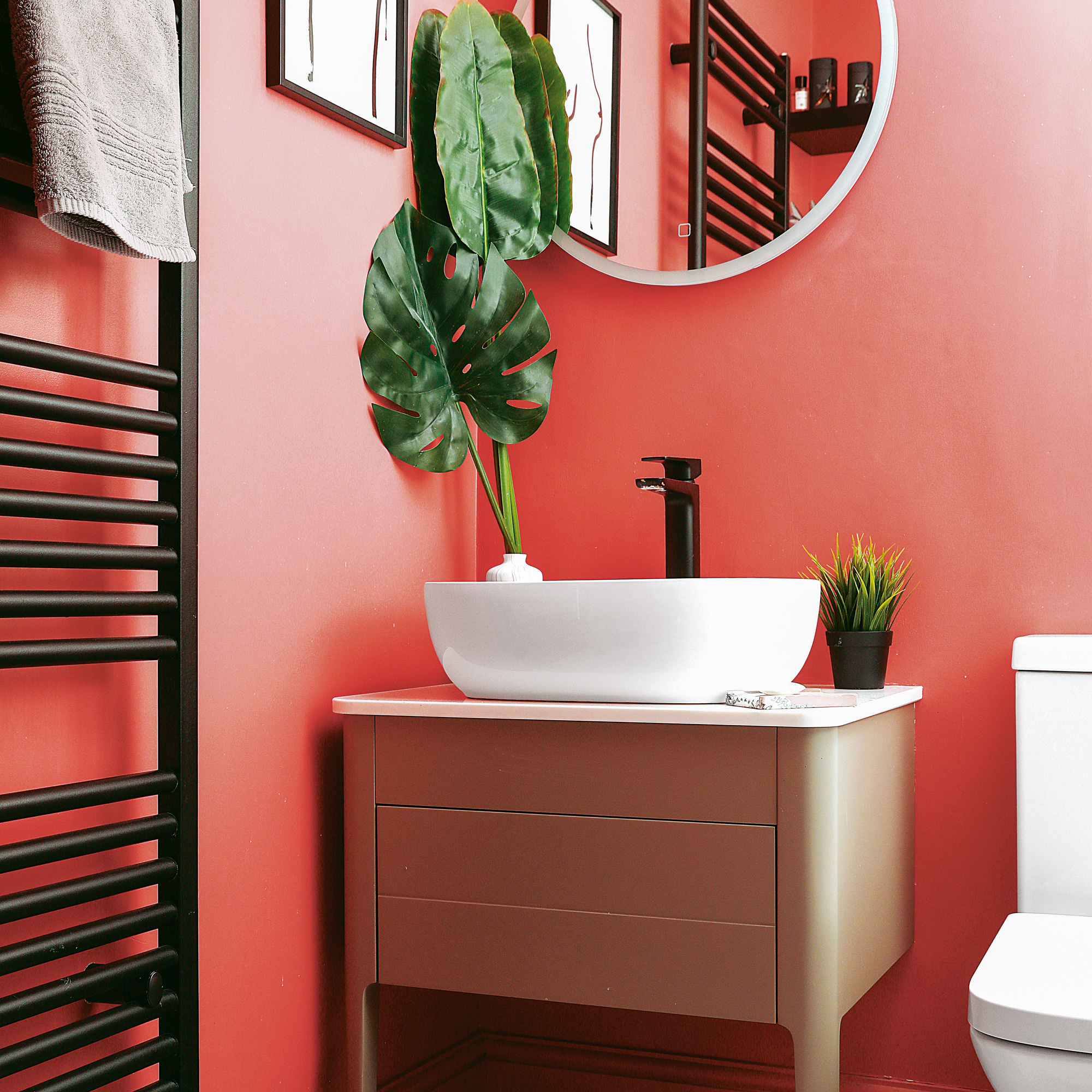
‘We toyed with the idea of going more traditional in the bathroom to match the era of the house,' she explains, 'but soon changed our minds after being drawn to contemporary styles. The pink walls were a bit of a wild card, but they contrast well against the black and white fittings.’