Brilliant or bonkers? Lime green colour-banding from Changing Rooms
The Ideal Home team has their say on the latest episode

Sign up to our newsletter for style inspiration, real homes, project and garden advice and shopping know-how
You are now subscribed
Your newsletter sign-up was successful
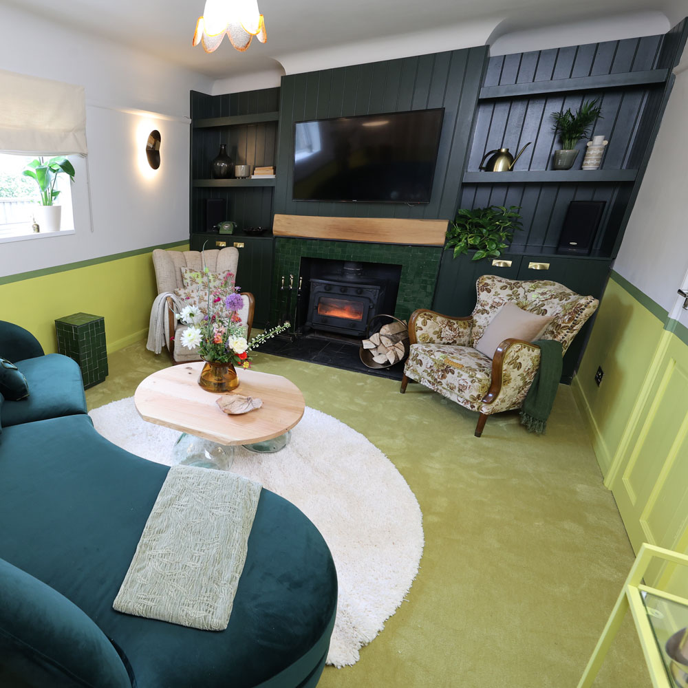
This week, Changing Rooms took us to Fareham as Laurence LB, Russell and Jordan gave two tired and rooms a bright and bold makeover. The 2LG interior designers transformed a drab living room belonging to hi-fi loving Keith and partner Kath, with a modern take on cottagecore.
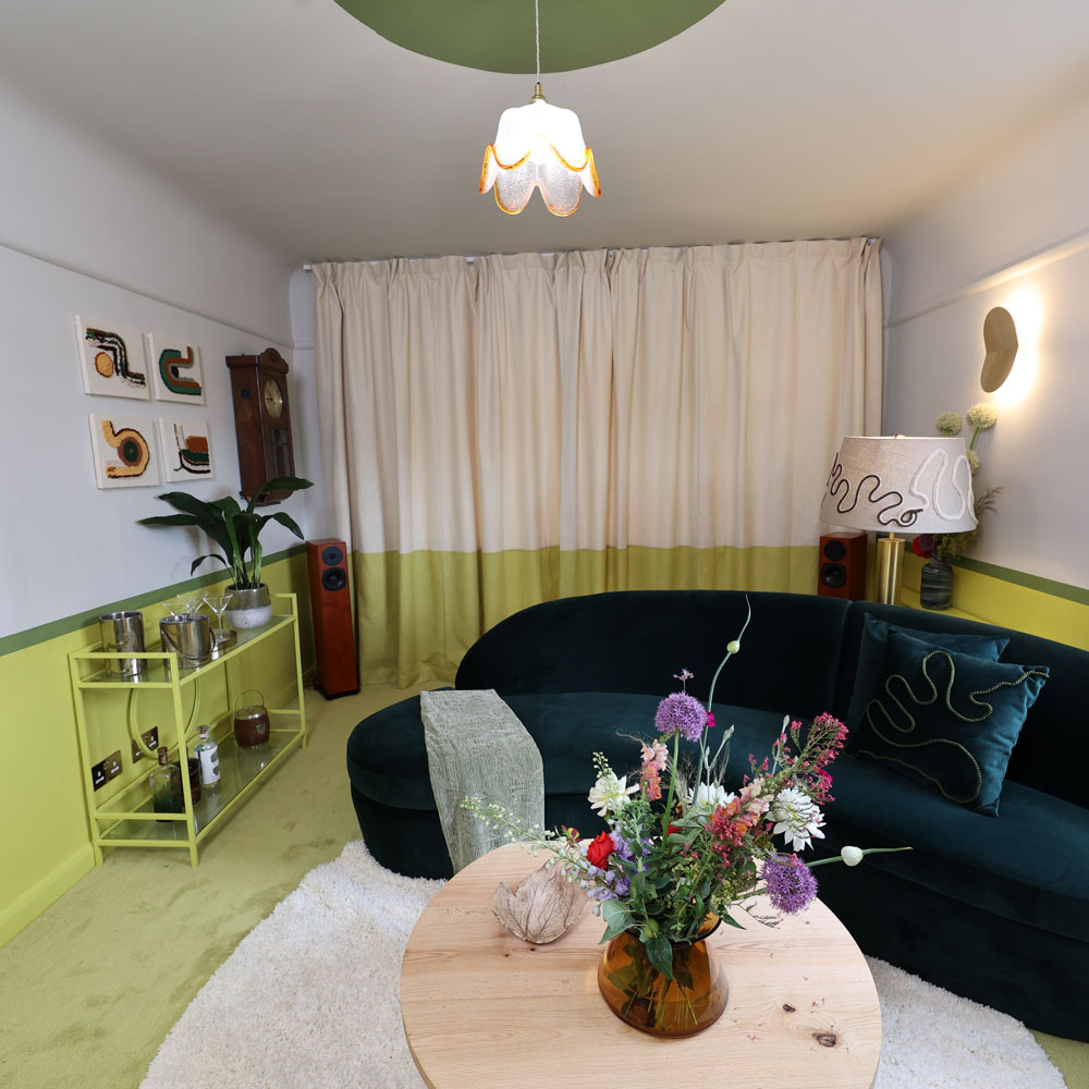
One striking design feature was the use of lime green colour-banding around the room. As living room paint ideas go, zingy green is very brave - so was it a stroke of genius or totally bonkers?
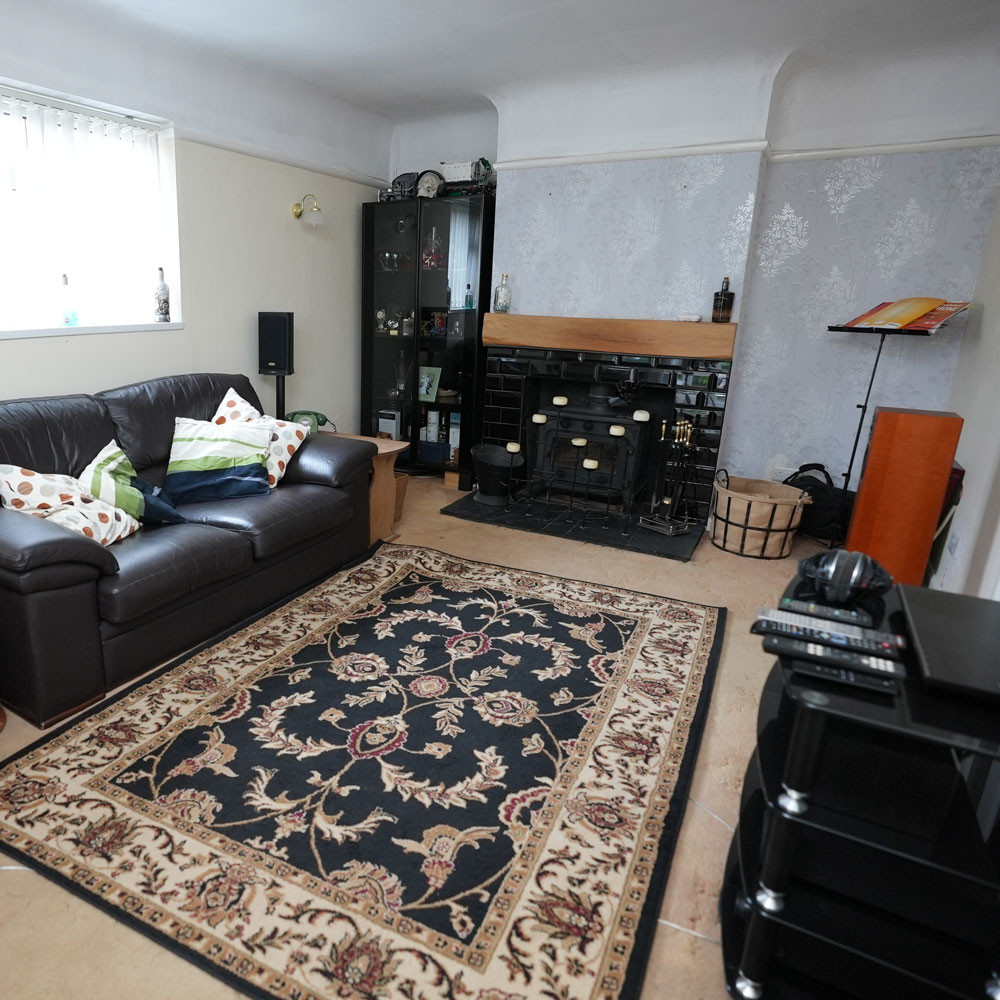
Before

This was one of the best transformations we've seen so far. Previously, the living room was having a bit of an identity crisis, with shiny wallpaper, lots of black furniture sucking up light, and a decorative skull.
Article continues belowRussell and Jordan's vintage armchairs, tongue and groove wall and green-tiled fireplace are all ticking our boxes. And the citrus on the walls? It helps to ground the space, making the room feel more fun and cosy come evening, compared to plain white.
Ideal Home Digital Editor Tamara Kelly liked the concept, but wasn't so sure about the choice of carpet. 'I loved the idea of painting the lower half of the room to draw the eye down, in effect pushing the ceiling away to make the room feel bigger,' says Tamara.

'Including the door into the paint effect was genius, making it disappear into the wall. For me, the colour was too bright - not rich enough to ground the overall look.
'But ultimately it was the flooring that let it down. The lime walls made the carpet look dirty and sludgy. It just didn't deliver, when it had so much promise.'
Sign up to our newsletter for style inspiration, real homes, project and garden advice and shopping know-how
Perhaps a rich navy could have worked better, following on with the same colour on the wood panelling. Given that we tend to spend time in the living room in the evenings when the room is under electric light, darker paints can be a really cool feature.

News Editor Rebecca Knight points out that the colour-banding is a brilliant option for anyone decorating on a budget. 'I like the painting on the bottom half of the wall idea, and how the drinks cart has been blended into it.
'I mean, it's a smart way to skimp on paint/wallpaper costs. However, the curtains have really torn me - I can't quite decide if carrying the colour onto them is brilliant or a step too far,' says Rebecca.
We can't call it - love the idea, maybe just in a slightly softer hue.

Millie Hurst was Senior Content Editor at Ideal Home from 2020-2022, and is now Section Editor at Homes & Gardens. Before stepping into the world of interiors, she worked as a Senior SEO Editor for News UK in both London and New York. You can usually find her looking up trending terms and finding real-life budget makeovers our readers love. Millie came up with the website's daily dupes article which gives readers ways to curate a stylish home for less.