Is your home's colour affecting your mood? Here's what the experts have to say
What colour psychology is and how you can use it to your advantage
CHow to use colour psychology in interior design to set your home's mood olour psychology in interior design is well worth paying attention to. Have you ever walked into a sunny cafe with bright yellow walls and instantly felt perkier (and not just in anticipation of caffeine)? Or entered the calm, cocooning environs of a Spa decorated in soft, natural tones and felt your worries drift away?
The colour combinations and paint ideas used in your home can affect your mood in exactly the same way, and have the power to make you feel bright and buzzy, chilled and relaxed or just a bit meh!
While colour psychologists have identified how we are most likely to react to different colours, the research is not designed to be taken as gospel. Our reactions to and experiences of colour are personal and individual, which is why some people thrive in a home painted almost entirely black, while others may feel claustrophobic.
‘Colour is a deeply personal thing,’ agrees colour and paint expert Annie Sloan. ‘But it is helpful to look at colours in terms of whether they’re active and dynamic or serene and calming.'
'For me, a colour clash will always put me in a good mood because it feels cheeky and daring and mischievous and heightens the qualities of each colour to fabulous effect!’
How to use colour psychology in interior design

Certain colours can even make you feel borderline depressed if you get it really wrong, so it’s worth taking the time to consider the mood-altering capacity of colour before you decorate.
Knowing how to use the colour wheel is a good place to start, and here we'll cover the broad brushstrokes of colour psychology in interior design, and how you might expect certain colours to make you feel.
But it’s also important to think about what shades make you, and your family, happy, sad, relaxed, focus and energised before you commit.
What impact can colour have on your mood?

Annie Sloane's English Yellow
Certified colour therapist Momtaz Begum-Hossain advocates the benefits of colour psychology in interior design in terms of our wellbeing. She believes colour has a huge impact on whether we experience our homes in a positive or negative way, as well as helping us get in the mood for studying, relaxing or whatever it may be.
‘For example, a positive trait of yellow, as well as boosting your mood, is that it can help you make decisions. If you’re overwhelmed by choices, you may be lacking in yellow energy. Surround yourself with yellow soft furnishings at home to boost your decisiveness and focus.'
Using paint colour to set the mood

A new coat of paint on the walls can do so much more than just freshen the place up. As walls cover a large area, painting is a great way to go all-out with mood-boosting colour.
A ‘full drip’ or ‘colour drench’, where the walls, ceiling and woodwork are all painted out in the same shade can be especially impactful. In darker, cosy shades, this approach can make you feel cosseted and safe, and in light neutrals the resulting space can make you feel clean and fresh, with a clearer mind.
Using colour psychology in interior design to set the mood can also be a very flexible option, with the potential to control the colour levels. For example, you might choose to direct your hit of energising colour to one ‘feature wall’, allowing the eyes a rest on other elevations, or you could go for a half wall, where the more invigorating shade is kept below eye level.
Of course, the true beauty of using paint to set the mood is that it will not be the end of the world if you get the colour wrong, particularly if you are handy with a paintbrush and don’t have to pay someone else to rectify your mistake!
Using colour in other home decor and furniture

Injecting colour through accessories and home furnishing can be just as effective as paint when seeking to change the mood in a room. So if you’ve been dithering over kitchen paint ideas or bathroom paint ideas, perhaps change tactics and try different colours out on accessories first.
‘Smaller accessories like colourful cushions and throws, rugs, artwork and ornaments can prove a great way to test out your reaction to certain colours, and can be easily swapped out if they don’t hit the mark,’ says Tara Gilson, interior designer, Uber Interiors.
Larger, high investment pieces, such as sofas, beds and dressers, require a little more bravery on the colour commitment front but, as they take up more visual space in the room, they have the potential to yield more immediate results on the mood setting front.
The best colours for a happy energising mood - and how to use them

A happy and energetic mood can be created by colours that reflect the summer season and are typically shades sourced from the warm side of the colour spectrum.
In colour psychology in interior design, yellow, orange, red and amber are all thought to give off good energy and are popular in sociable spaces where we often entertain, like the kitchen and living room. Jewel colours, like teal and emerald can also feel bold and exciting and is where those who prefer the drama of dark shades can get their kicks.
‘If you're looking to create a bold and vibrant atmosphere, I highly suggest using bright, energetic colours like yellow or red which are usually associated with energy, creativity and happiness, making them a great mood and morale boost,’ agrees Paul Brundell, founder, Kosy Living.
‘However, be careful not to overdo it as an oversaturation of energising hues can be overwhelming and overstimulating so stick to a feature wall or brightly coloured accessories to not overdo it.’
The best colours for a soothing retreat - and how to use them
Restful shades tend to hail from the cooler side of the colour spectrum and are often common colours found in nature. Think sky blue, moss green and lilac.
‘Choose a lilac shade with grey undertones, rather than a more poppy-pastel shade, and you’ll find it works perfectly as an almost-neutral shade while providing quiet energy and warmth thanks to its calming properties,’ adds Shelley Cochrane, accessories buyer at Furniture Village.
To make the most of colour psychology in interior design in a bedroom, colour therapist Suzy Chiazzari recommends blue. ‘It’s the colour of the night and synonymous with slowing down your body and mental processes.'
'Blue bedrooms create a quiet retreat of peace and tranquillity, provided the tone you choose is not too dark or cold. If you don’t fancy painting your walls blue, you can always incorporate colourful blue furniture accents.’
The best colours for a cosy, nurturing space - and how to use them

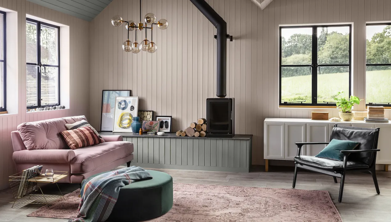
We're told in colour psychology in interior design that neutral, earthy tones are thought to be nurturing, while warm colours linked to physical warmth are best for making a room feel cosy and inviting. Combine both for maximum effect. We’re talking rich browns and earthy reds like Little Greene’s Chocolate Colour and Nether Red.
Use these cosy colours in rooms dedicated to relaxing, such as the living room and bedroom. Deeper shades that envelop and protect in a cloak of darkness can feel particularly comforting, especially if there’s plenty of warm lighting and a fireplace in play.
‘A cosy and nurturing aesthetic can be achieved by introducing an array of warm colours,’ agrees Yvonne Drury, founder of wallpaper brand MissPrint. ‘Earth tones in particular, such as brown, rust, and terracotta can create a sense of depth in your environment.'
'These colours are best incorporated through layers, such as using natural wood or stone materials and combining them with an earth-tone wall and soft furnishings such as blankets and rugs.’
The best colours for a romantic and intimate scheme - and how to use them

Red is the most obvious colour when thinking about romance and passion, and it is widely believed to create a sense of intimacy and warmth. However, some reds can also make you feel alert, and can even trigger feelings of rage and anxiety.
‘Of course, there are many shades of red and all of them affect an interior space in different ways,' says colour therapy expert, Momtaz Begum-Hossain. 'Adding red accents in the finer details like in an ornament or a vase of roses will make a space feel welcoming but not intimidating enough to make anxiety flare up.'
For romance with less intensity, lean into dirty pinks, like Farrow & Ball’s Setting Plaster and Sulking Room Pink, which are feminine without being too girly so will suit adult spaces like the master bedroom and intimate dining areas.
‘Deep pink tones can create a dreamy and amorous theme that is perfect for romantic and sensual rooms,' notes colour therapist, Suzy Chiazzari. 'In the bedroom set them off with crisp white bedlinen to make the bed more appealing.'
What colour is best for setting the mood?

It depends on what mood you are channeling! But if it’s a happy home you’re after, then colour psychology in interior design tells us that yellow is a shade few will fail to react positively towards.
‘Bright colours are great for delivering a dose of dynamism into our lives and creating happy moods all round,’ says Helen Shaw, director of marketing at paint company Benjamin Moore. ‘Yellow is the perfect example of an uplifting shade, it’s synonymous with happiness and evokes a feeling of warmth and connection to the sun.'
'Yellow balances well with hues from the greyscale, from crisp white to deep black. For the ultimate endorphin boost, embrace all yellow walls with crisp white woodwork, complete with a fresh bunch of flowers as a final touch.’
How colour can control our mood?

The crux of colour psychology in interior design psychology is all about how different colours affect human mood and behaviour. Control might be a stretch, but certain colours can evoke certain feelings in some people.
Several universally accepted associations have been widely established and accepted. These associations are the reason you’ll often find red in the décor of fast-food restaurants, as it’s believed to stimulate appetite. Similarly, many hospitals and schools are painted pale blue because it is thought to help instil a calm, restful atmosphere.
How powerfully colour associations affect different people’s mood is also heavily dependent on individual personality traits, and you should take this into account when planning colour schemes.
‘A colour scheme should always reflect your personality first and foremost,’ says American colour psychologist Sally Augustin. ‘If you’re an extrovert, you are more likely to enjoy bright, vivid saturated colours. But if you’re an introvert, because you’re relatively more efficient at processing visual stimuli, you’re likely to prefer more restrained colours.’
