Farrow & Ball has launched a range of new colours for the first time in four years
One of these 11 new colours could be the next Elephants Breath

Exciting news – the much-loved paint brand Farrow & Ball has announced 11 brand new colours, and we reckon you're bound to find your perfect match somewhere in their fabulous new palette.
Many of the Farrow & Ball shades have developed a cult following like few other paints can with Elephants Breaths, Hague Blue and Downpipe achieving a celebrity status to the point many people can name the colours on sight.
The 11 new paint shades mark the first additions to Farrow & Ball's range in over four years. So if you're looking for new inspiration for your home decor this autumn, you needn't look any further.

From deep reds to muted greys, and warming, delicate pinks, these colours will spark new paint ideas for every room in your home.
Charlotte Cosby, Head of Creative at Farrow & Ball, said, 'I've developed a soft spot for many of the new colours, especially Beverly which, just like its namesake, is reassuring, uncomplicated, and full of depth.'
If you're ready to discover the new colours, take a look below...
Farrow & Ball's new colours
In typical Farrow & Ball fashion, all of the eleven new colours in the collection have brilliantly unusual names, ranging from 'Stirabout' to 'Whirlybird'. And while some of them match 2022 paint trends from expert predictions, there are a few wildcard colours in there that we adore.
'The arrival of new colours to the Farrow & Ball colour card is always exciting,' says Ideal Home's Editor-in-Chief Heather Young, who was at the launch event at Farrow & Ball's factory in Dorset. 'There's something for everyone in the new additions to the much-loved colour card, and I definitely have my eye on a couple for my own home.'
1. Bamboozle

The first new colour is Bamboozle, which is a deep, almost burnt-orange red that feels right on trend (the bottom colour in the picture above). We reckon it would be the perfect option for creating a warm and cosy bedroom space, or pairing with a lighter colour in a comforting living room.
'Bamboozle really stands out for me,' says Heather. 'It looks great on its own but makes an amazing pairing with so many of the other new colours, from pinks to blues.'
2. Kittiwake

In contrast to Bamboozle is Kittiwake (yes, it is named after the bird), which Farrow & Ball describe as a 'clean cool blue inspired by the wings of these noisy seabirds when seen in bright sunlight'.
This blue shade has almost a grey tinge, meaning that while it feels fresh and modern, it also gives off a comforting feel that wouldn't be out of place in a living or dining area. We're picturing this in coastal living rooms up and down the country.
3. Eddy

Third in the new range is Eddy, a darker pastel green which F&B explain is inspired by the current trend of wild swimming.
They say, 'This is a lighter shade than French Gray - or a greener alternative to Cromarty.' So for those looking for that perfect in-between shade, this may well be your ideal match!
4. Stirabout

Stirabout is a rather classic looking warm, neutral beige colour, which actually looks quite cool as the light shines on the walls. F&B say it's a 'lighter version of Sandy Jitney'.
5. Beverly

The Beverly shade is pretty much the millennial green colour of our dreams.
While fairly dark whilst the sun is down, it appears to light up as the sun shines on it. Touchingly, Farrow & Ball explain that it is named after a 'kind and generous' member of their team, who they say is 'no longer with us'.
6. Tailor Tack

For those who tend to favour pinks in their interior decor, Farrow & Ball explain that the new Tailor Tack shade is the lightest and 'most delicate' of all the pinks in their range.
A blend of beige and pastel tones, it's ideal for those who might feel hesitant about trying a bolder pink out, but are after a paint colour that will still offer a fun and colourful backdrop to rooms that might be lacking a bit of character.
7. Whirlybird

Next up is the brilliantly-named Whirlybird, which is the 'softer version of Breakfast Room Green'.
A lighter, mid-point green, this is a great paint colour for those who want to brighten up a dark room; if you're feeling brave, why not try painting your kitchen with it?
8. Selvedge

Selvedge is a pointed mix between blue and grey, and is a good option for those who don't want to choose a blue that's too dramatic.
Farrow & Ball have revealed that it's a lighter version of their De Nimes shade.
9. Templeton Pink
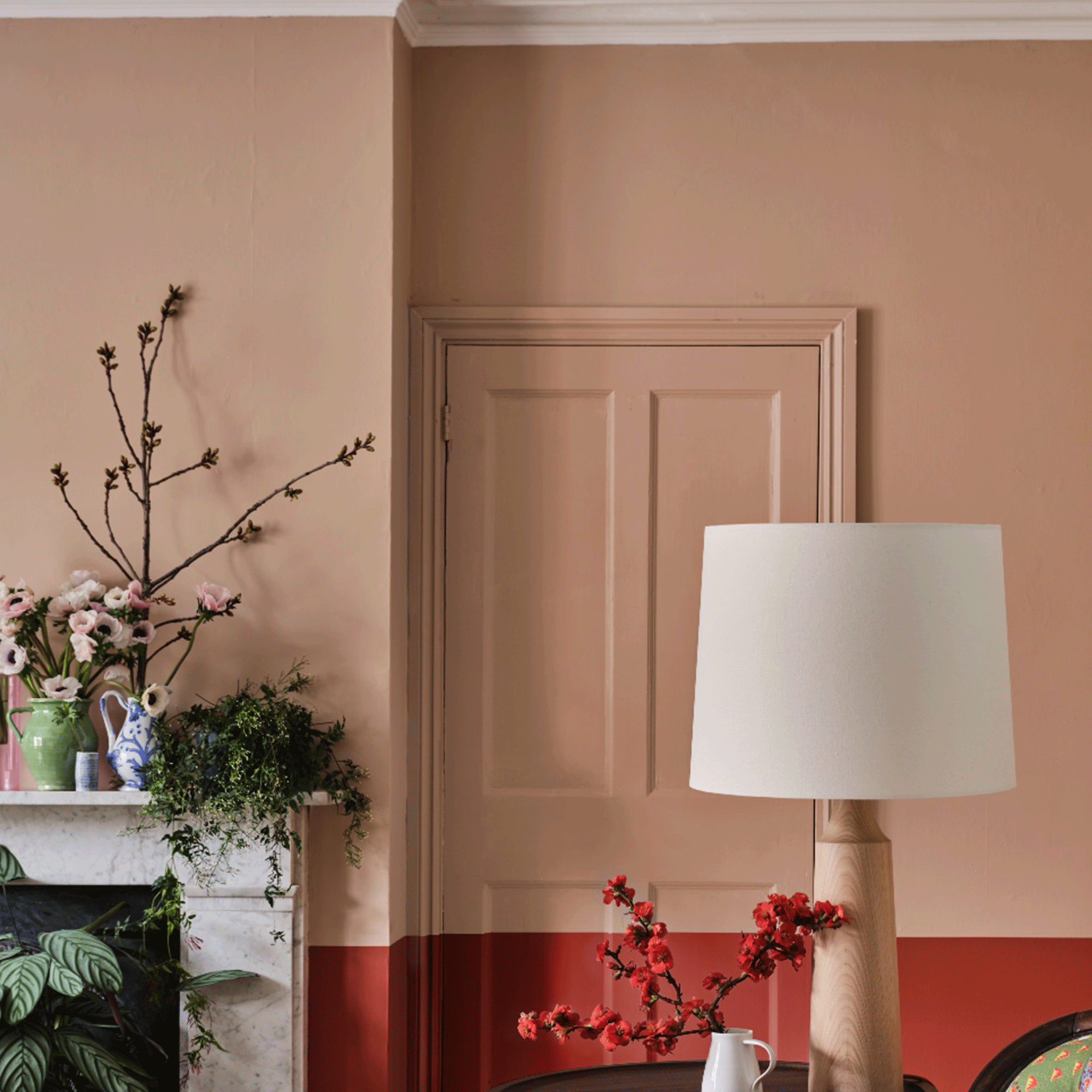
Maybe our writer's favourite new shade is Templeton Pink (the shade at the top in the above image), which is a chalkier, millennial pink-esque colour that treads the line between pink and beige.
The brand say that it was 'developed for the dining room at Templeton House to offset the magnificent Wedgwood plaques made to commemorate a former owner'.
10. Hopper Head

Hopper Head is an intense new F&B shade which sits between the ever popular Railings and Down Pipe in the colour wheel.
It's dark, moody, and oh-so-sultry. This would work well in bedrooms or offices, to create a commanding but cosy space.
'Having just painted my living room in Farrow & Ball's Railings, I'm immediately drawn to Hopper Head as its got the same intense vibe,' says Heather. 'I can't wait to get a swatch of this shade painted on my wall at home, as I'm determined to introduce it to my home.'
11. Wine Dark

The final new colour for Farrow & Ball is Wine Dark (we like the name already), which they say is 'inspired by midnight skies'.
The brand explain that 'this spiritual colour is named after the term Homer used to describe the sea, and is perfect to create an intimate space'. We couldn't agree more.
