Paint trends 2025 – the 9 shades, colour schemes and paint techniques you’ll be obsessed with this year
These are the expert-recommended paint colours, schemes and techniques to embrace in your home in the new year

Sign up to our newsletter for style inspiration, real homes, project and garden advice and shopping know-how
You are now subscribed
Your newsletter sign-up was successful
With every new year and new season, trends change as the changing of the collective mood makes way for new trends to come in. And paint trends are no exception as 2025 ushers in a new approach to decorating our homes – one filled with fresh colour shades and paint techniques to try our hand at.
Exciting new paint ideas are one of the easiest ways to give your home an instant update, transforming a room into a brand new space beyond recognition – and that’s true whether you paint an entire a room a new colour or simply add some new accents, from a contrasting window frame to a colour-drenched ceiling.
And at least once a year, most of us do get that itch to go for a new and up-to-date living room colour scheme informed by current colour trends and popular colours of the year from the likes of Pantone and Dulux that often define the colour mood for the entire year. Or perhaps you'll want to try a trending paint technique emerging from the world of DIY-focused social media content that creates a cosy or more elevated look in interiors. If you’re currently feeling that craving for change, these are the paint looks that are worth considering in 2025.
Article continues belowPaint trends 2025
If we could pinpoint an overarching mood or approach to paint trends in 2025, it would be confidence – a confidence to go bold, embrace colour and personalise the home with the help of paint. And we love to see it.
‘It’s always fascinating to see how colour confidence and the use of colour changes over time,’ says Ruth Mottershead, creative director at Little Greene. ‘The understanding of the effect of colour on the atmosphere of a space is something that has grown exponentially over the past few years.’
1. Decorate with deep reds and purples
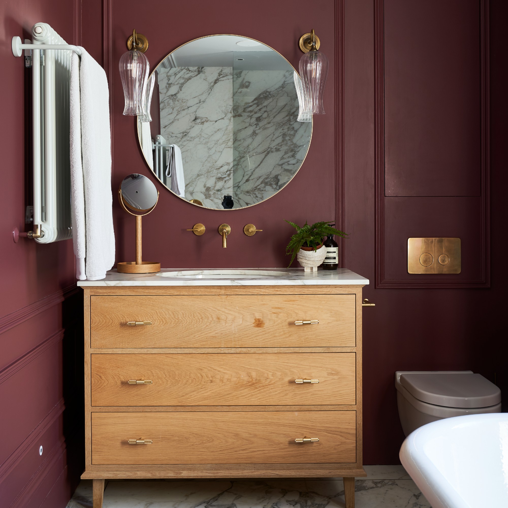
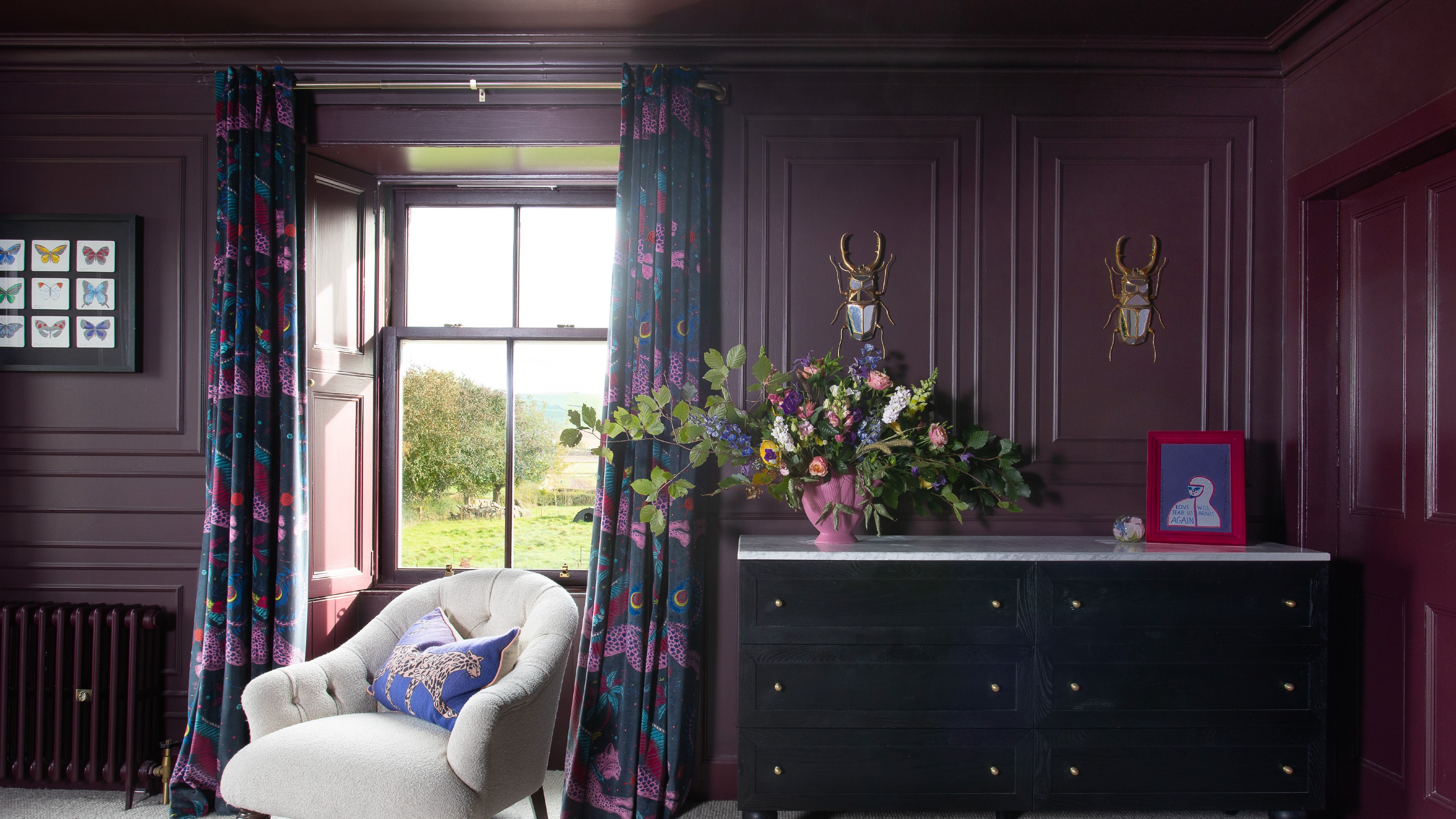
The trend of embracing deep purples and dark reds like the cherry red shade championed by Pinterest for 2025 perfectly demonstrates the colour confidence people are clearly feeling going into this year.
‘People are no longer afraid to go bold or step outside of the “safe” neutral zone, and that’s a trend I only see growing in 2025,’ says Michael Rolland, managing director at The Paint Shed. ‘Gone are the days when white, beige, or pale greys were the default choice for every wall. While these timeless shades still have their place, 2025 will be about experimenting with bolder colour schemes – think plums and wine reds.’
Sign up to our newsletter for style inspiration, real homes, project and garden advice and shopping know-how
Tash Bradley, Lick’s director of interior design and colour psychologist, continues, ‘The rising popularity of jewel tones certainly ties back to the purple colour trend, which shows no signs of slowing down. Deep plum purples and rich reds are everywhere right now because of their luxurious appeal. Jewel tones evoke feelings of luxury and comfort. Their depth allows them to create a cosy atmosphere without being overly loud or stimulating. This makes them particularly appealing for spaces that might lack natural light, as they can enhance the moodiness of a room in an intentional way.’
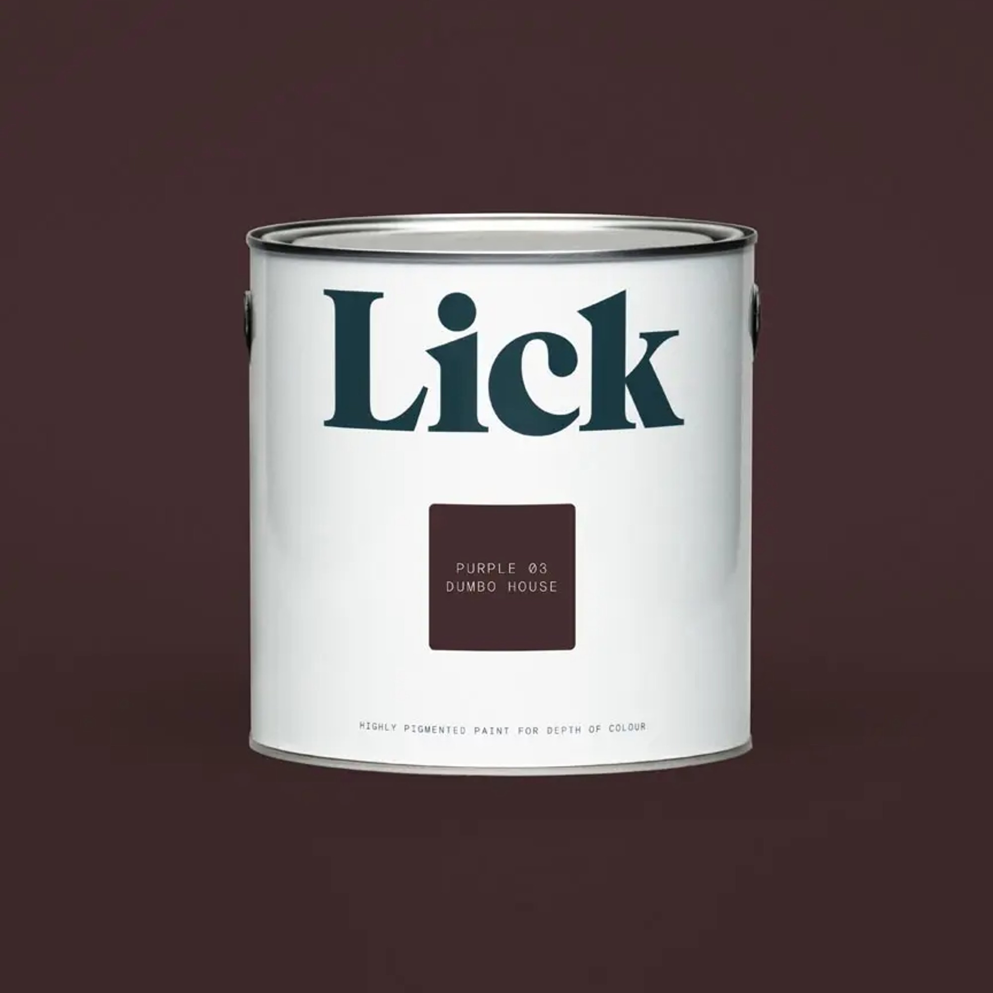
Created in collaboration with the chic Soho House institution, this is a grown-up take on the colour purple. And this deep aubergine shade looks perfect paired with the baby blue from Lick's colour palette of the year for 2025.

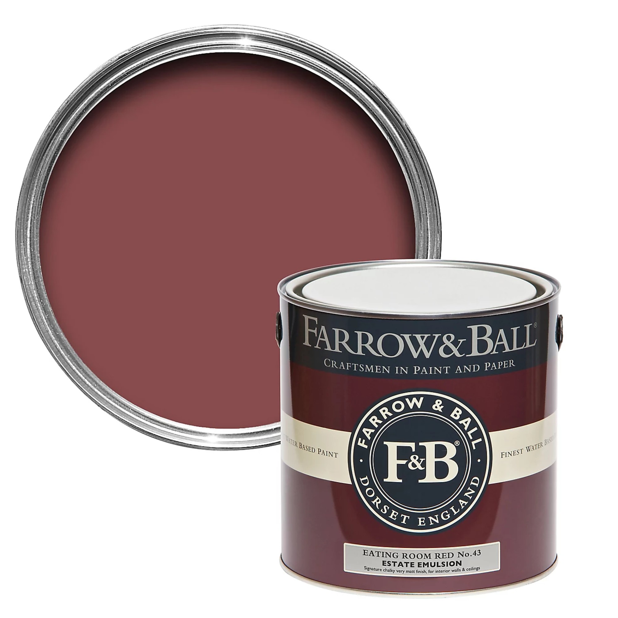
If you're looking to embrace the cherry red trend then Little Greene's Baked Cherry paint is the perfect shade to pick. While you can use it for little pops of red here and there, it will also look beautiful covering entire walls of dining rooms and offices.
2. Embrace brown, the colour of the year
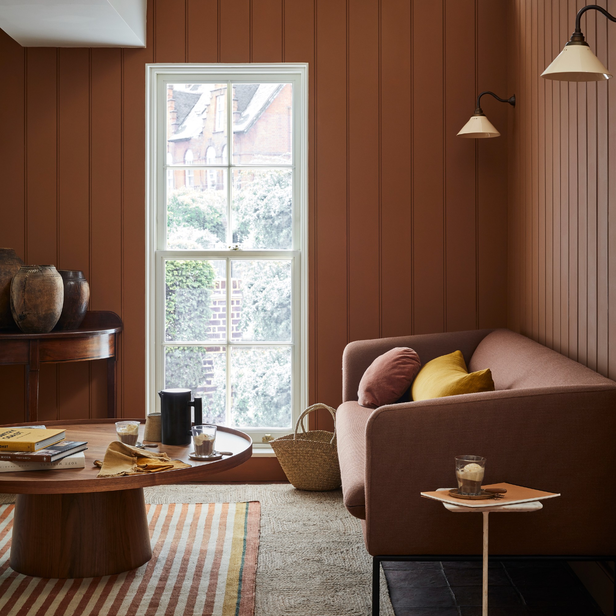
One of the hottest colour trends of the year that is already making its way into interiors in a big way is brown. This is partly due to Pantone’s colour of the year being Mocha Mousse, a soft and cocooning shade of brown. But it’s also due to the versatility of this shade that’s richer and cosier than most neutrals – and it seems that cosiness is all that we are craving this year.
‘Brown shades have grown rapidly in popularity in recent years, ranging from a delicate taupe to a strong chocolate shade,’ says Emma Bestley, co-founder and creative director of YesColours. ‘Pantone’s Colour of the Year 2025, Mocha Mousse, embodies this trend perfectly, with its rich, warm tone providing a fresh yet comforting take on brown.’
Michael at The Paint Shed adds, ‘Dusky browns offer a perfect balance of moodiness and warmth. Much like the perfect snack pairing of espresso, cream, and biscuits, these colours complement each other beautifully in interiors. They’re easy, they’re homely, and they’re just a crowd-pleaser.’
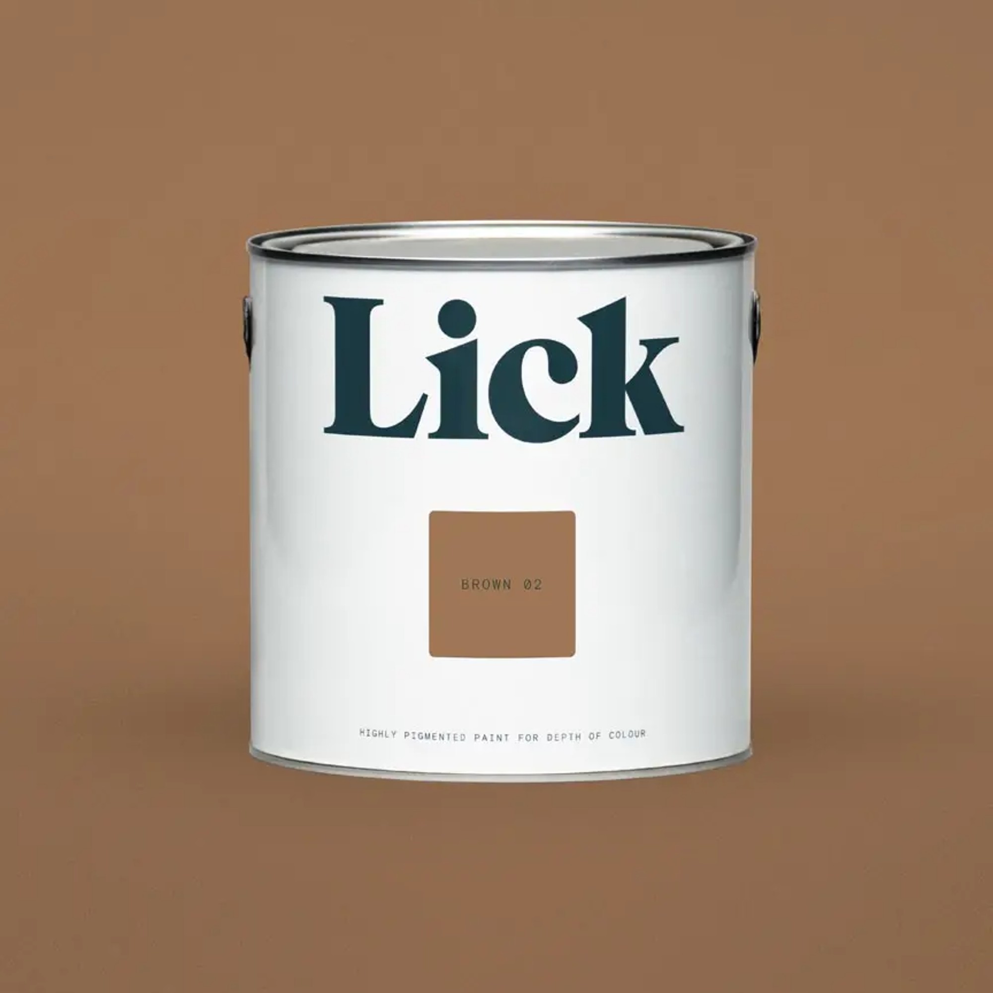
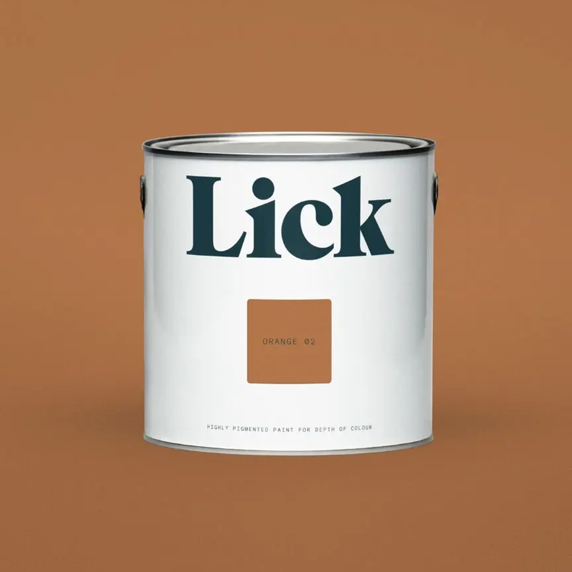
Part of Lick's colour palette of the year 2025, this delicious and warm shade of brown with red undertones is cocooning and grounding. But equally, the shade has a brightness to it and since it's not too dark, you don't have to worry about making your home look too dingy.
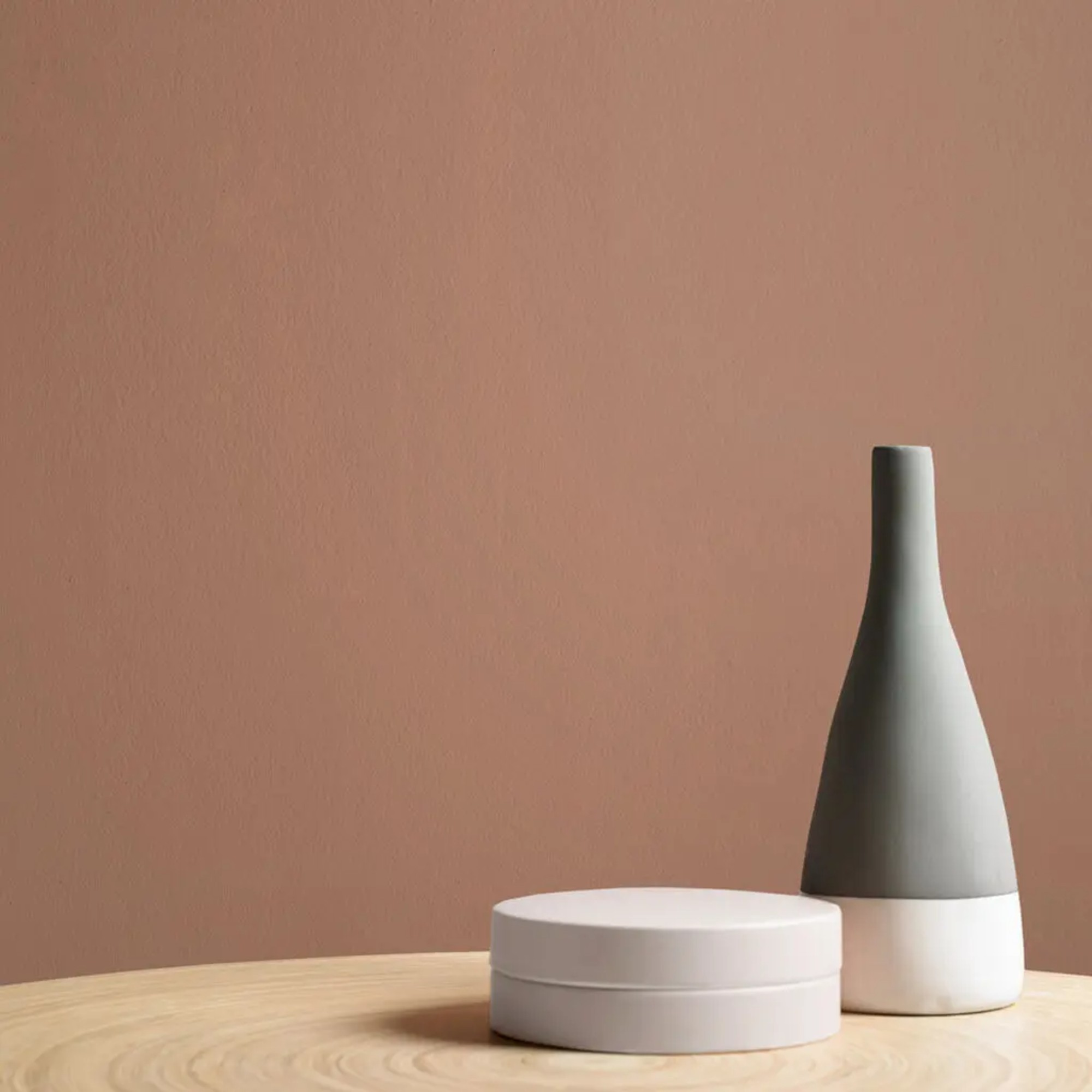
If you want to decorate with Mocha Mousse and are looking for a paint colour closest to its particular shade, then you can't go much closer than with Graham & Brown's Hot Mocha. Even the name is on point.
3. Be bold with colour drenching
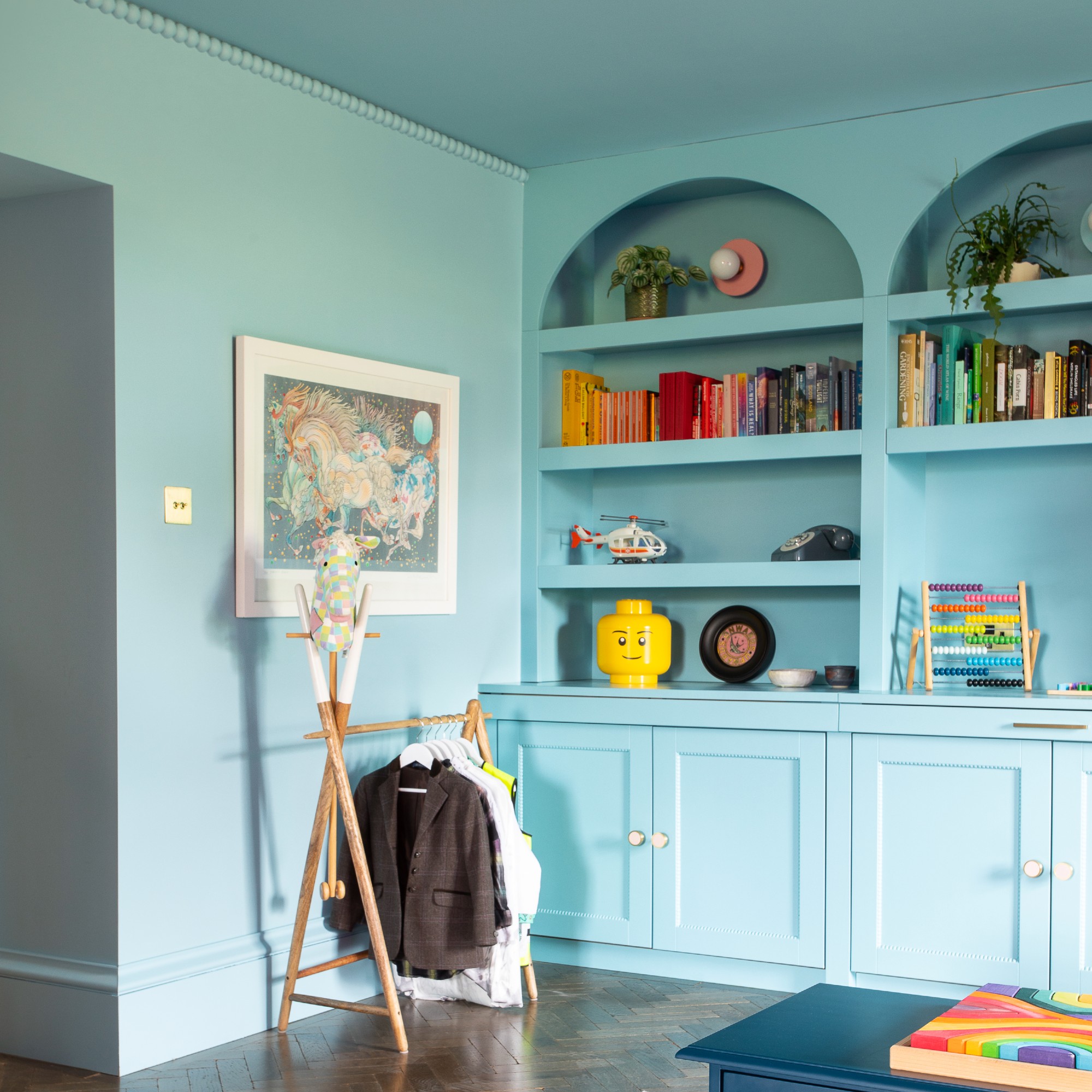
Colour drenching has been steadily gaining popularity for a while now and really exploding in 2024. And in 2025, it's not going anywhere – in fact, it's only getting bigger. It involves painting walls, ceiling, architraves, doors and even cabinetry all in the shade which creates an enveloping effect. It can feel like a commitment if you're not very colour confident, but it's certainly replaced feature walls as a way to make a statement. You could start small with a colour-drenched cloakroom or create a cosy living room coated in a deep, inviting hue.
'We’ve seen a huge shift in the way decorators approach painting their homes. They are having more confidence with colour and leaning towards richer deeper tones. What we are seeing more and more of is decorators colour drenching their spaces in these deeper colours. This involves painting everything from your walls to your woodwork in one colour. Think skirting boards, radiators, doors, window frames, picture rails and ceilings. This paint technique actually works to tone down the intensity of the colour as there is less contrast for your eye to focus on, creating spaces that feel surprisingly calm. I am seeing this technique being adopted more and more in smaller spaces – colour drenching hallways, downstairs bathrooms, home offices,' Tash at Lick says.
4. Try your hand at double drenching
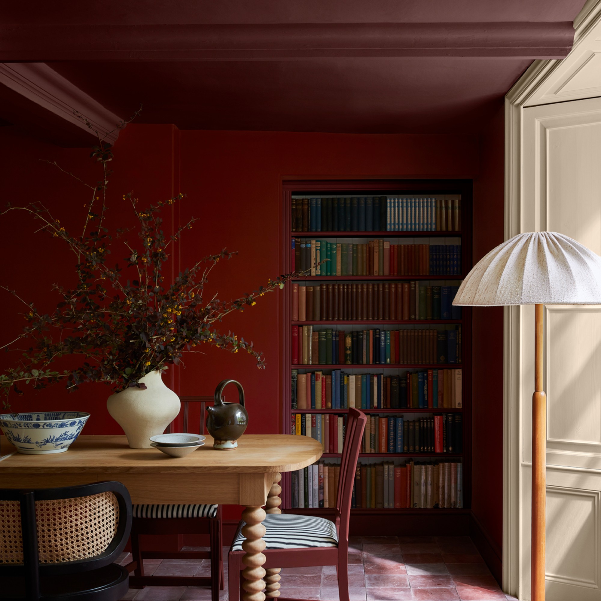
While colour drenching is still very much on trend in 2025, there is a new variation on the look that’s recently emerged called ‘double drenching’ which is similar but different.
‘One of the wonderful things about “double drenching” is its versatility. Double drenching can work to add unexpected contrast to modern homes where architectural detail is lacking, highlighting the ceiling, walls and woodwork or zoning spaces, or it can draw attention to more classical architectural elements within period properties. A double drenching approach is about fully enveloping a space with colour, there is no space for white ceilings or skirting with this decorating style, instead use two or more related colours with varying undertones to drench your interior from top to bottom,’ Ruth at Little Greene explains.
5. Focus on the ceiling
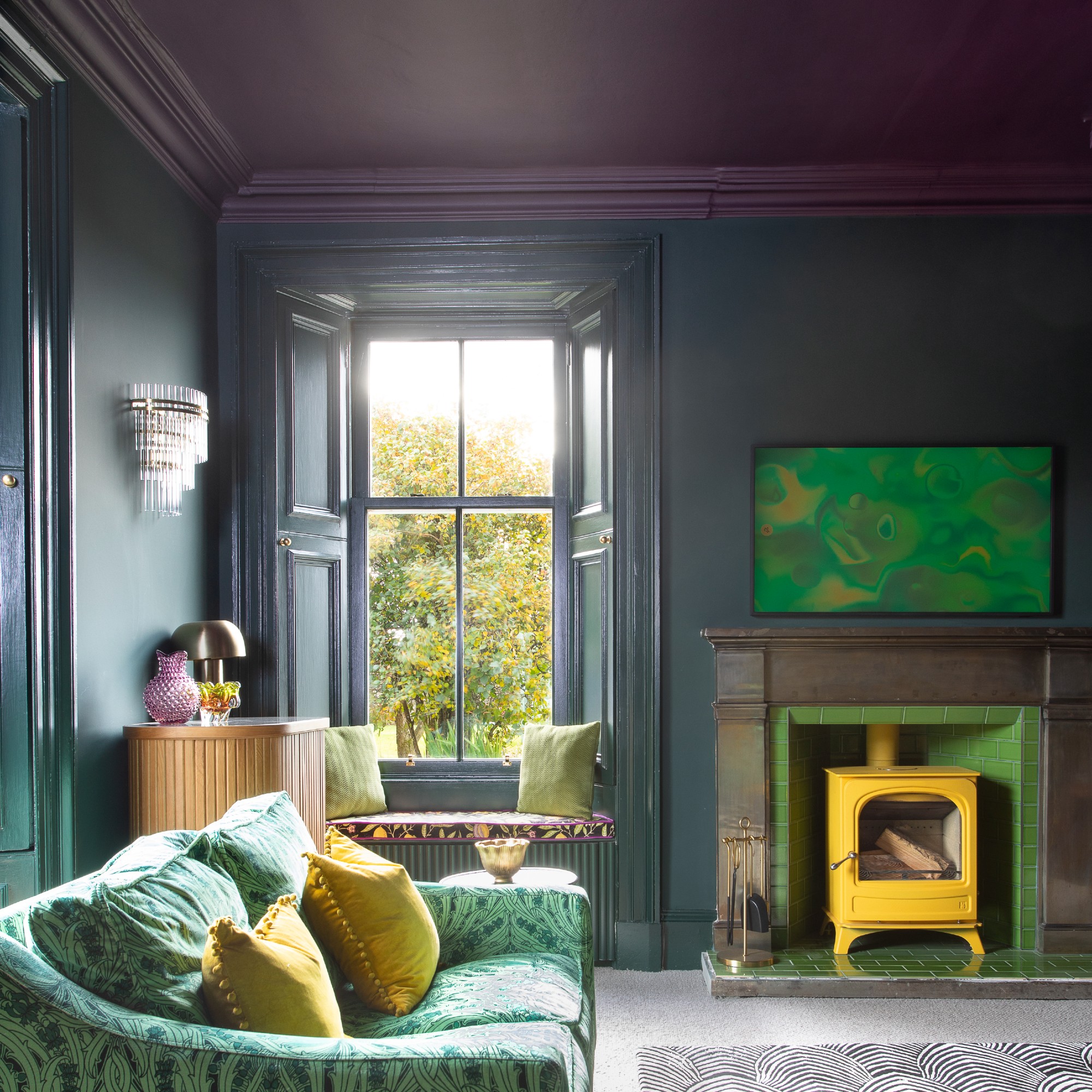
The ceiling often gets forgotten or simply left white, while the walls all get all the colourful treatment. Colour drenching is the trend that’s been more inclusive of ceilings in the past couple of years but the newest trend actually makes a feature of the ceiling, also known as the ‘fifth wall’.
‘Painting the ceiling is getting bigger and bigger and bigger,’ says Marianne Shillingford, creative director and colour expert at Dulux. ‘People are seeing this idea of having colour just up on the ceiling rather than the walls and bringing it down a little bit from the ceiling.’
Painting the ceiling is the perfect small bedroom paint idea as it doesn’t overwhelm the space and it draws the eye upwards, taking advantage of the vertical space and making the room appear bigger than it is. Especially if you opt for a bright colour like the Dulux colour of the year for 2025, True Joy.
6. Try freestyling
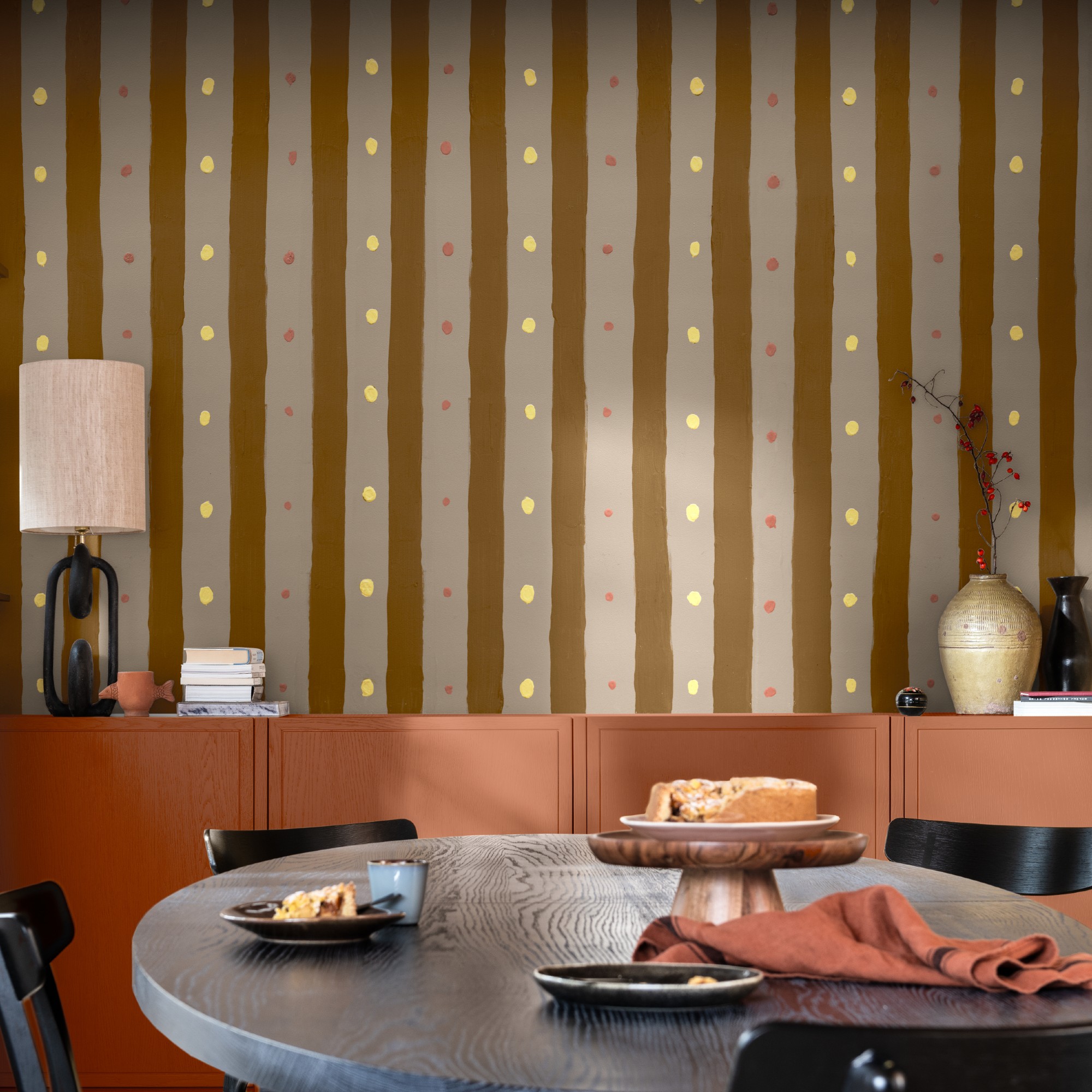
Perfection is no longer a requirement when painting your home’s walls – now, ditching the masking tape and embracing imperfect painted shapes is in. Whether that’s not completely straight stripes or irregular scallops, anything goes.
‘What I think will come through next year is hand painting style. Circles, scallops but really simple ones, doing stripes without masking tape… And it looks amazing. And again, you need to be brave, you need to take a leap,’ Marianne at Dulux says, referencing the brand’s bravery and confidence-inspired colour of the year for 2025.
7. Embrace dark earthy tones
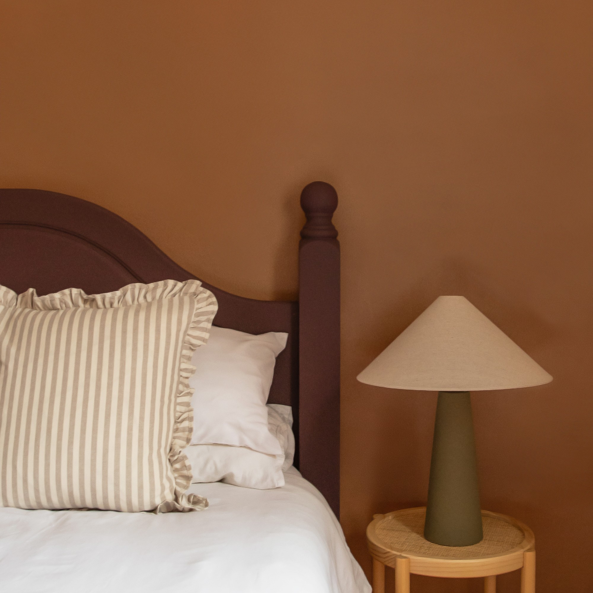
There's nothing more inviting and cocooning than wrapping your hands around a mug of hot chocolate, or a caramel latte. So it’s no surprise that these delicious but earthy colours are being seen more and more, along with shades of terracotta and spices. But while neutral, earthy colours have been popular over the last couple of years, going forward, the colour palette is getting deeper and darker.
‘We’ve seen more and more decorators embracing deeper, richer tones - red-based browns, dark clay reds, earthy oranges, dusky pinks, terracotta and plum purples - and then layering on lighter sky blues and warm taupes. Why? These earthy tones are surprisingly calming and cocooning, bringing people comfort in their homes. Neutrals are not just white and grey, they take the shape of taupes, beiges, reds, browns, oranges – you name it. Just think of gorgeous landscapes and the rich natural pigments found in soil and clay – these colours are undeniably grounding and in the home, they will work to create spaces that feel irresistibly cosy,’ Tash at Lick explains, giving us some cosy living room ideas.
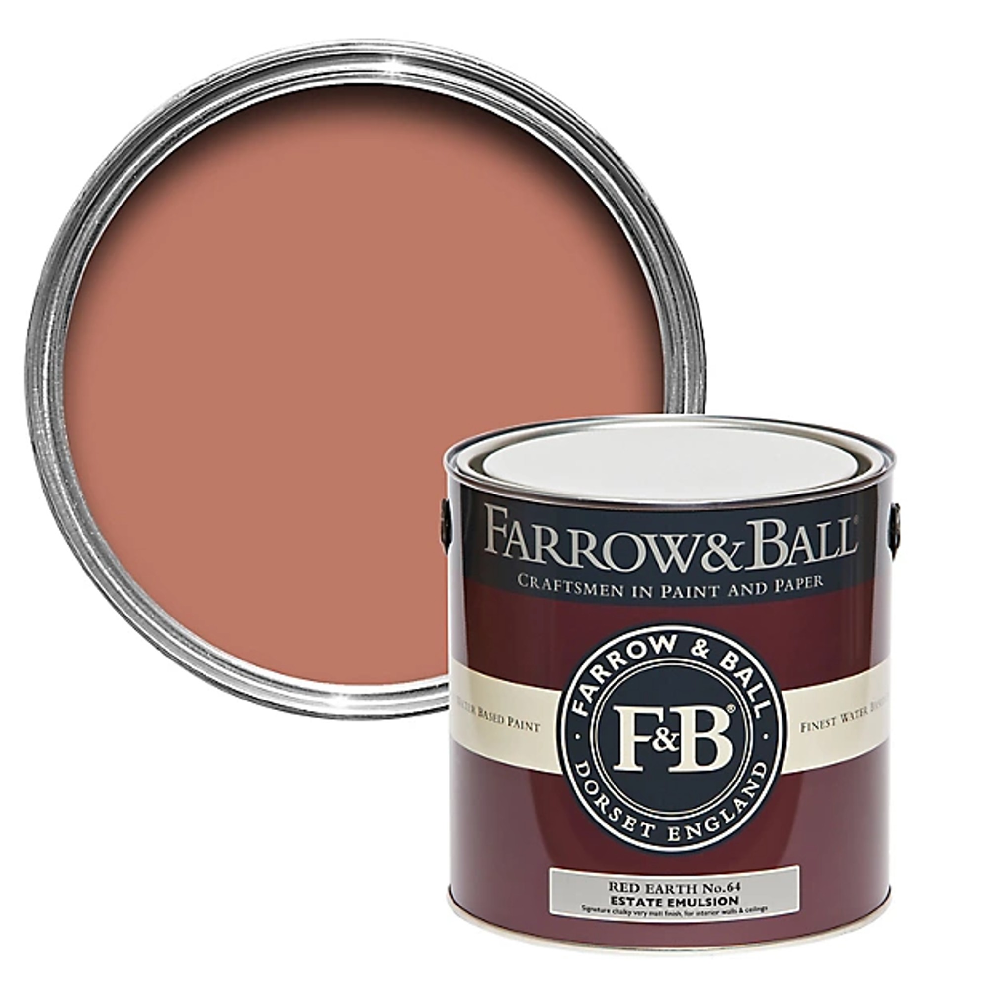
Terracotta reds are beautiful because they are both reminiscent of the earth, as well as holidays in Mediterranean countries. So warming! As far as terracottas go, they can be even darker than this but we love the brightness this one from Farrow & Ball brings.
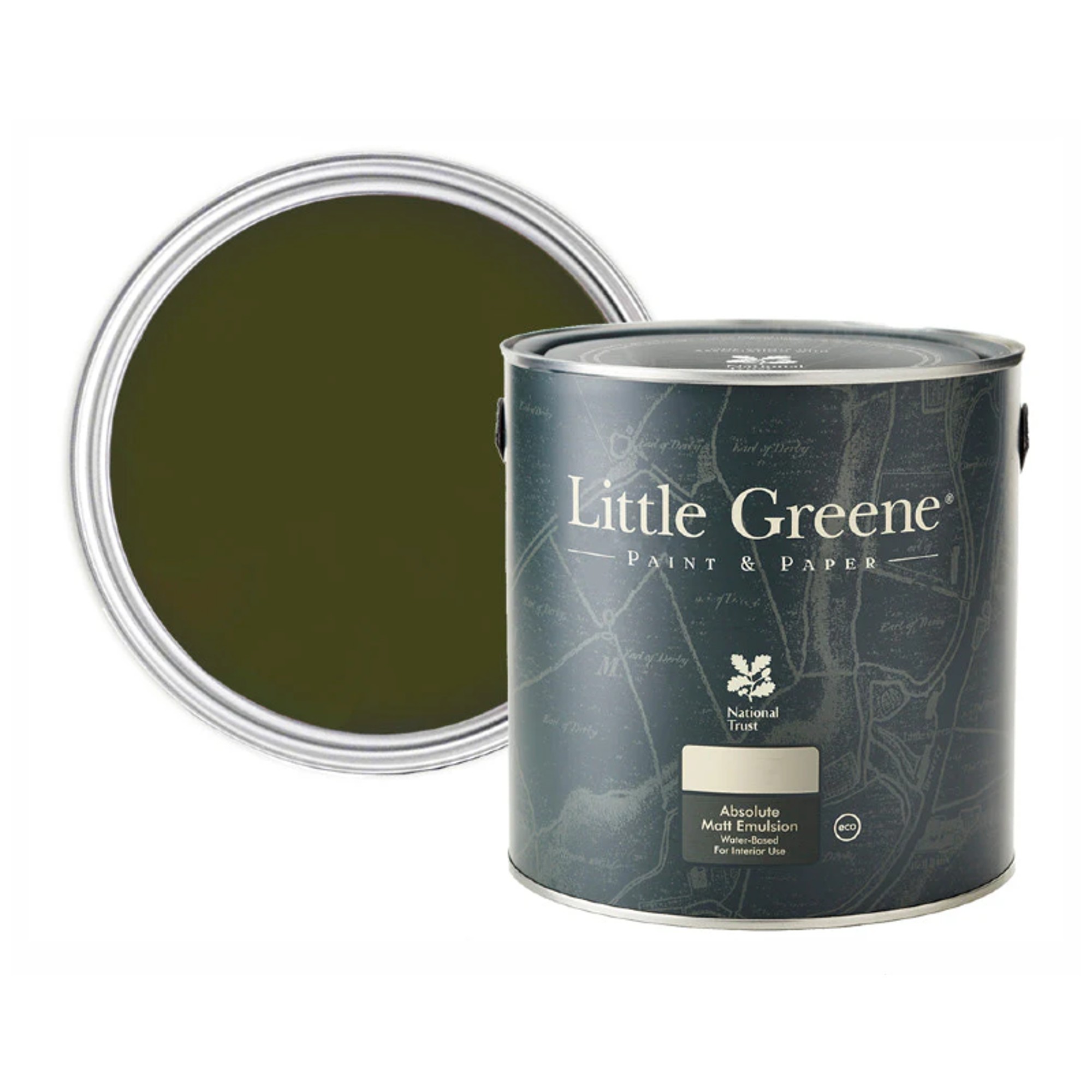
Olive green was one of the trending green shades of summer 2024. But dark, earthy shades like this one, perfectly portrayed by Little Greene's Olive Colour, fits very well into earthy colour schemes of 2025, too.
8. Choose meaningful colours to you
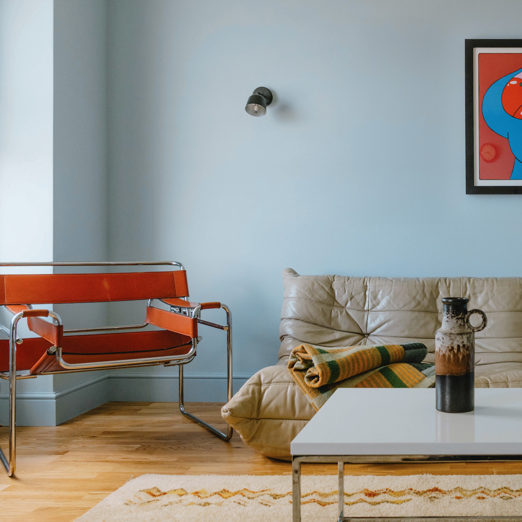
This trend is a bit of an anti-trend actually as it encourages people to ignore colour trends and instead inject their homes with the shades that mean something to them personally or make them feel something, whether that’s joy or calm. Our homes are our own, our refuge from the world and having our personalities and interests reflected within our interiors is becoming increasingly more important to us – this includes the colours we put on our walls or even furniture.
‘People are using colour in a much more emotional way. Rather than just looking great with all of your stuff, it's giving you something,’ Marianne at Dulux says.
Tash at Lick continues as the brand’s colour palette of the year for 2025 was inspired by the feeling of nostalgia. ‘Nostalgia is all about memories. This trend will be a factor in choosing paint shades because it encourages decorators to think about the colours that mean something to them. It’s bringing awareness to how colour is so personal and how certain colours can trigger really different feelings and associations. Just like a song or a scent.'
'More and more, we are seeing decorators wanting to create spaces that feel like a true reflection of their personalities and experiences – filling their homes with little trinkets from their travels, or designing spaces that remind them of their favourite places growing up. The nostalgia trend is encouraging people to tune into their relationship with colour and choose colours that trigger those positive, happy memories, so that they can create homes that bring them emotional comfort and refuge.’
9. Colour block with primary shades
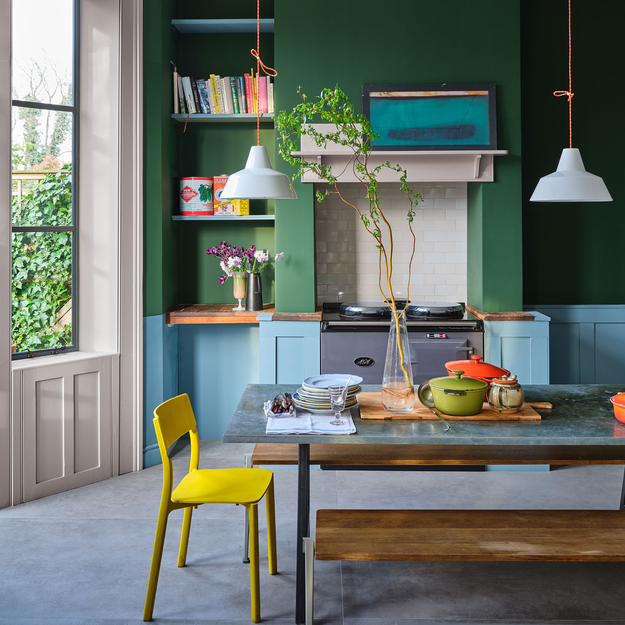
Take inspiration from colour-blocking, still found to be popular in the fashion world, and think about dressing your home like you would pull an outfit together! One colour for the top and another for the bottom, with a little injection of colour for accessories. Primary Play is one of Pinterest's predicted trends for 2025 and it's perfectly in line with the dopamine decor trend that's been popular for the past year.
Joa Studholme, colour curator at Farrow & Ball, explains how to achieve this, ‘The biggest overall paint trend will be about how we use colour as much as the colour itself. The use of stronger, simpler colours is extremely popular. Eclectic mixes evoke the warmth and harmony of a more innocent age.'
'This can be achieved by using two colours on one wall – easy if you have panelling or a dado rail, but if not then arm yourself with masking tape and just paint the bottom third of the wall in one colour and the top in another. The blue tones of Selvedge are made to feel all the more upbeat when combined with deeply saturated green Beverly and this look sums up this growing trend of using a friendly combination of block colours.'
FAQs
What paint trends are out in 2025?
While some of the paint trends of 2024 have carried over into the new year, with the rise of some new looks, a handful of the familiar and once-popular trends are being left behind in 2024.
As colour drenching and double drenching come into focus this year, the days of contrasting, stark white ceilings and trims are over (or at least on pause).
‘We are confidently moving away from the default white ceiling, whether that is opting for the same shade as the walls and woodwork for an encompassing scheme, or tonal colour to bring a harmonious point of difference, or perhaps adding a highlight detail such as a stripe in a contrasting colour,’ says Andy Greenall, head of design at Paint and Paper Library. ‘The most expansive ‘wall’ in the room is now very much considered as part of the overall scheme, and as such can deliver an impactful effect that will feel both sumptuous and soothing.’
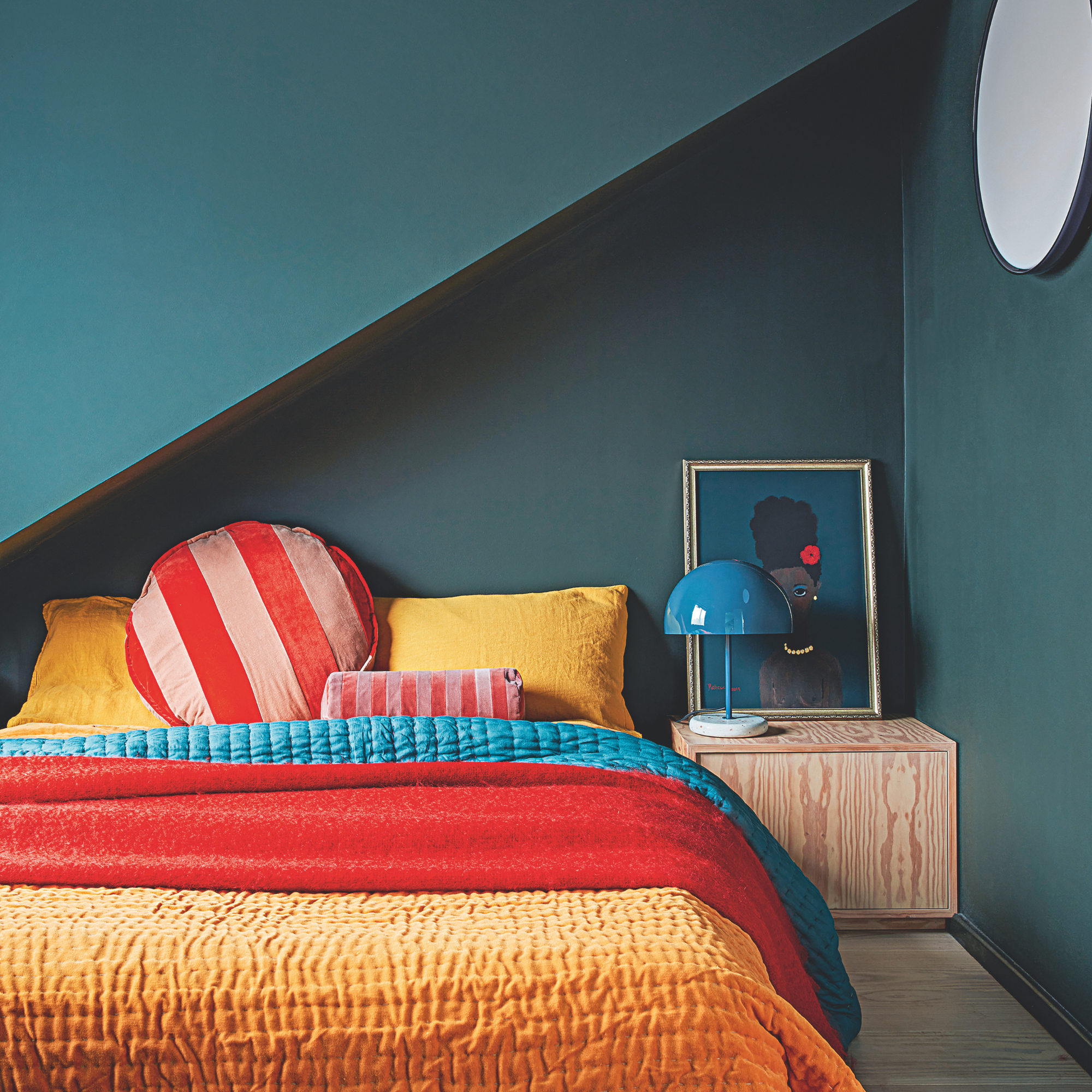
Another trend that is slowly fading away are pale, pastel paint shades like the popular Peach Fuzz, Pantone’s colour of the year for 2024. But the one exception to this seems to be baby or sky blue that is still very much high in demand.
‘We have noticed that people seem to be steering away from gentle tones and opting for deeper paint shades so that rooms have a cosier feel,’ says Michael Rolland at The Paint Shed. ‘2024’s colour of the year was Peach Fuzz, which was embraced much further than in the home, with it being prominent in beauty and fashion. However, in 2024 we have seen an overexposure of pastels, with appeal shifting more towards earthy, muted, yet deeper colours, such as olive green, deep rusts or ochre.’
What colour is replacing grey?
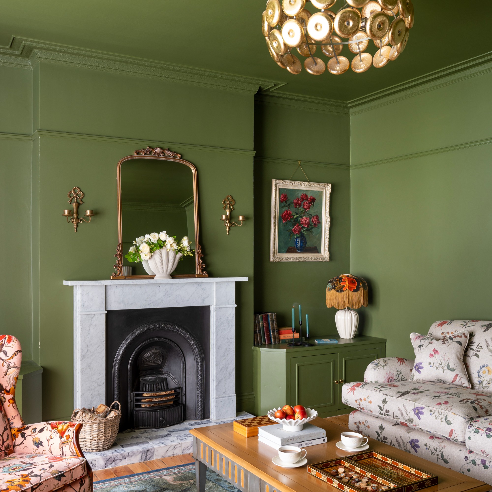
For years, grey was the favoured, go-to neutral shade in interiors. But its popularity has been slowly fading over the last couple of years with shades like cream and beige slowly taking over – and this year, it’s being replaced by the warmer colour brown.
‘Shades of brown work really well in a colour drenched room as an alternative to grey or stone,’ says Ruth Mottershead at Little Greene. ‘Juxtapose them with deeper tonal browns and blacks to create a captivating, sophisticated interior. Soft, warmer whites will elegantly complement these shades to maintain a more traditional feel, and they will equally support an accent of a brighter, contrasting highlight, such as a bold yellow or striking blue, for a more dynamic look.’
Emma Bestley at YesColours agrees, ‘Rather than the cooler undertones of the once very popular grey, we’re finding people are gravitating towards the warmer hues found on the colour wheel, such as browns.’
Which paint trend are you feeling most inspired by?

Sara Hesikova has been Room Decor Editor at Ideal Home since June 2024, starting at the title as a News Writer in July 2023. She is now also the Ideal Home Certified Expert on Furniture, and so far has tried over 300 different sofas.
Graduating from London College of Fashion with a bachelor’s degree in fashion journalism in 2016, she got her start in niche fashion and lifestyle magazines like Glass and Alvar as a writer and editor before making the leap into interiors, working with the likes of 91 Magazine and copywriting for luxury bed linen brand Yves Delorme among others.
