What is an analogous colour scheme? The tried and tested design method for creating a relaxed home
How to know the method known for creating calming interiors

Sign up to our newsletter for style inspiration, real homes, project and garden advice and shopping know-how
You are now subscribed
Your newsletter sign-up was successful
Analogous colour schemes are one of the lesser known concepts in the world of interior design, but that's not for lack of popularity; at some point you've probably seen, or maybe even used, an analogous colour scheme yourself. And still you might be thinking, what is an analogous colour scheme?
Analogous colour schemes use colours that sit next to each other on the colour wheel, to create seamless and coherent interiors. Paint trends are constantly shifting and refreshing, but some of them have been around a long time - and analogous designs are one of them.
'If you’re feeling overwhelmed by colour choices, analogous colour schemes are a great place to start, says Rachel Binks, stylist, Hillarys. 'These are palettes made up of neighbouring colours on the colour wheel that create a naturally harmonious and calming effect.'
Article continues belowIf you're like us and are always looking for new and exciting colour combinations to try, creating an analogous colour scheme in your home could be your next creative venture. But before we start redecorating, we wanted to get a clear answer to the question - what is an analogous colour scheme - from the experts.
What is an analogous colour scheme?
Paint ideas are never in short supply, but deciding which ones to implement in our own home should be carefully considered. Knowing whether or not an analogous colour scheme is for you firstly comes from having a good understanding of what it is.
Here's what the experts said when we asked them, what is an analogous colour scheme, plus tips on how to use this design method yourself.
'An analogous (or harmonious) colour scheme is all about choosing colours on the colour wheel that are side-by-side as natural neighbours,' says Anna Hill, colour consultant, Fenwick & Tilbrook. 'It's a popular colour scheme as it helps to create a seamless finish. This approach often draws from a segment of the colour wheel, bringing together three to five colours.'
Sign up to our newsletter for style inspiration, real homes, project and garden advice and shopping know-how
Unlike a complementary colour scheme, which uses colours that sit opposite each other on the colour wheel, the analogous method pairs colours that sit next to each other, so they're usually closer in hues and tones.
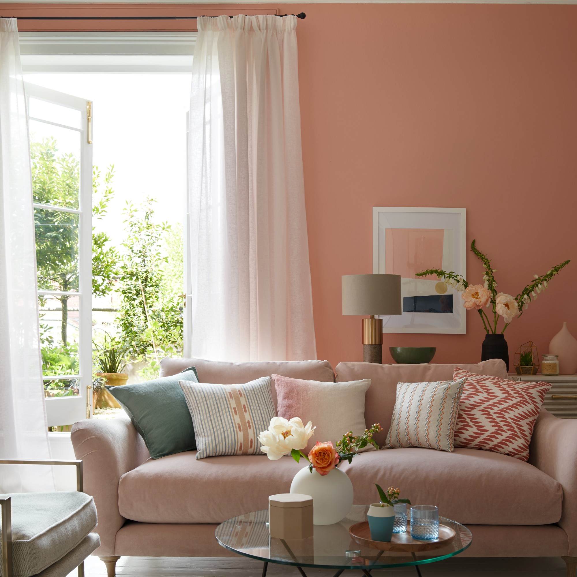
'Imagine a sunset with those passionate reds, oranges, and yellows melting perfectly, or an ocean scene with blues, teals, and greens blending together,' says Samuel Platt, creative manager for Homebase . 'These neighbourly colours get along great, making everything look harmonious and natural.'

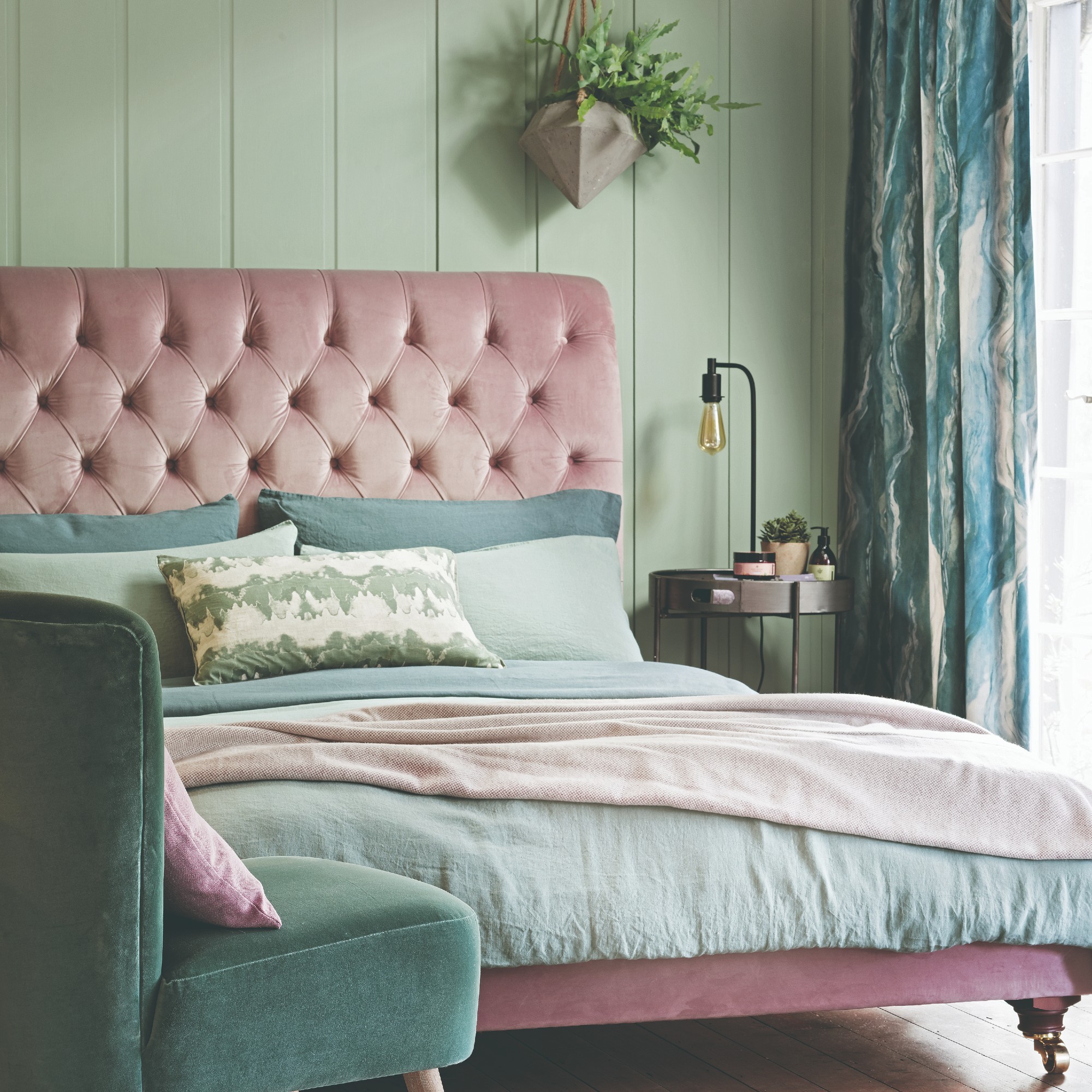
Purple, pink and red is another example of an analogous colour scheme. These colours are used together in interiors because they bleed into each other nicely, and all of their varying tones and hues work together to create a seamless look.
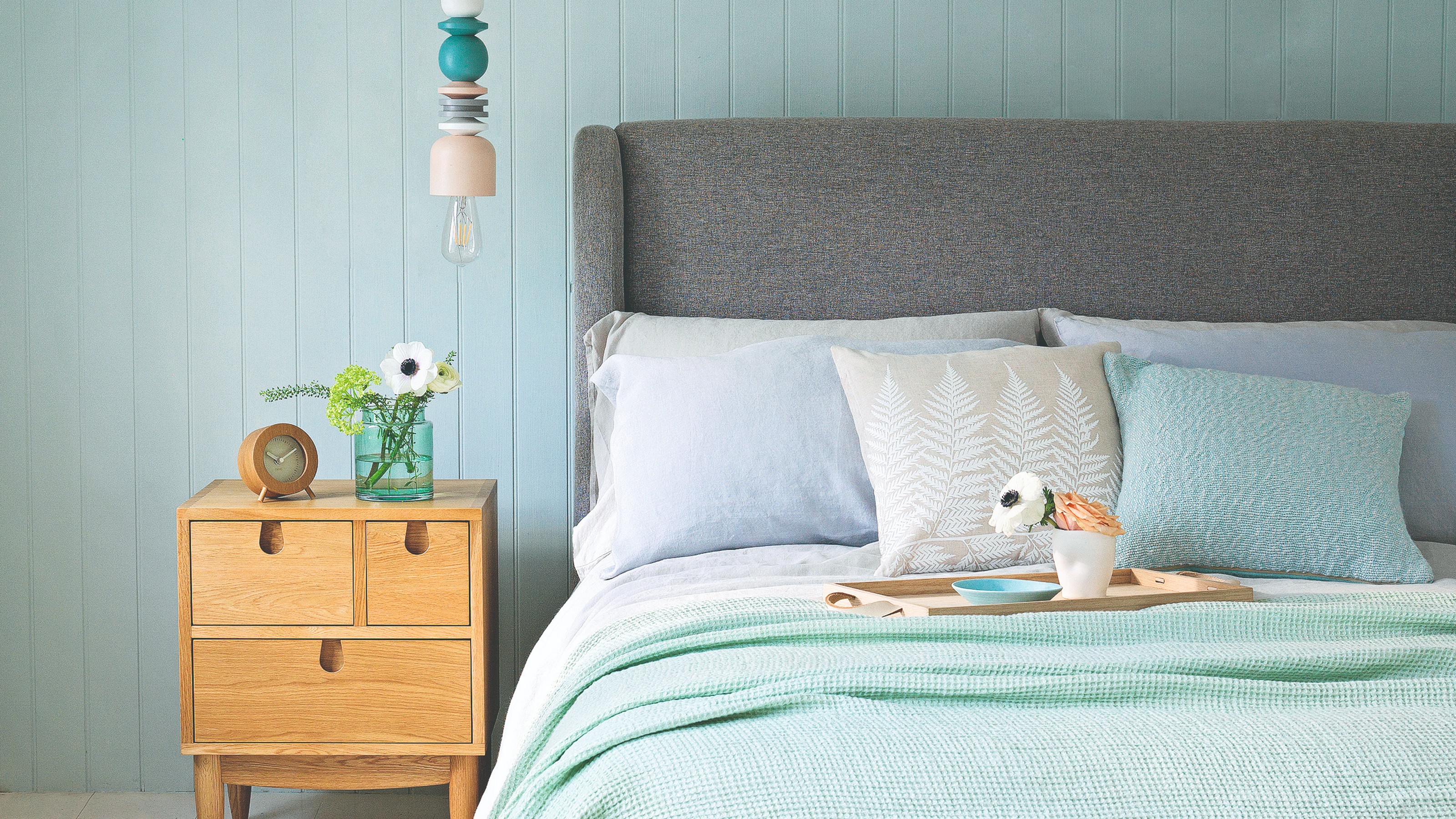
'For a soothing, analogous colour scheme, you might choose shades of blue, blue-green and green to bring in a tranquil, nature-inspired feel,' suggests Anna from Fenwick & Tilbrook.
'For something bolder, red, red-orange and orange is a great combination to bring in warmth and energy to a space. These colour schemes are often used in interior design and art to help create a cohesive, balanced look.'
'It plays to the natural compatibility of neighbouring colours to achieve a final design that feels beautiful yet effortlessly put-together and easy to live with.'
Typically, an analogous colour scheme uses three colours, but can involve more. 'There's usually a dominant colour, often a primary colour such as red, blue or green, alongside a supporting colour,' explains Sian Jenkins, creative director at Show Business Interiors, the design company behind David Wilson Homes.
'Finally, there's a tertiary colour, which can be a mixture of the first two colours or an accent colour that pops.'
This design method is ideal for creating a sense of flow throughout the home, through the use of colours that naturally create a seamless aesthetic, given their close neighbouring positions on the colour wheel.
Analogous colour schemes are popular with calm bedroom ideas for examples, as the colours help to create a soothing atmosphere by naturally flowing into each other.
How to use an analogous colour scheme in your home
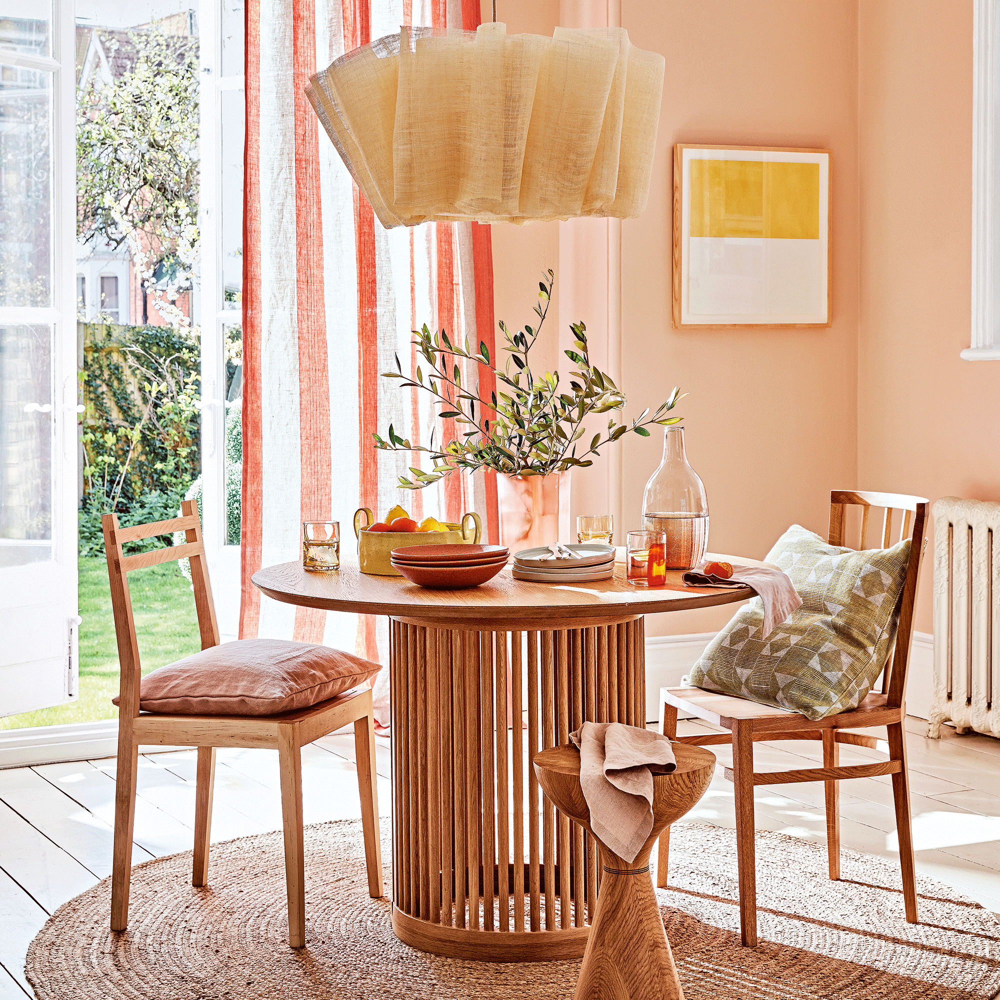
Now that we've cleared up the question - what is an analogous colour scheme - you're probably wondering how to go about using it in your own home. The best place to start is to choose your base colour - this should be a colour you feel comfortable building around, as it may be used across multiple walls and pieces of furniture.
'Once you have your base hue, look at a colour wheel', says Rachel from Hillarys. 'The colours sitting directly next to it are your neighbouring shades. For example, if your base is seafoam green, this could be a light mint green and a deeper teal. Play around with samples – do they feel like they naturally complement each other?'
An analogous colour scheme can either be three colours that are different, or three shades of the same colour, like in Rachel's example - though this would be more likely to be described as a monochrome colour scheme. As long as the colours sit next to each other on the wheel, it counts as analogous.
'Make your chosen base hue your starting point by painting the walls,' Rachel says. 'Then, bring in the neighbouring colours as accents, either through skirtings, window frames, furniture, or a textured throw or rug. These elements will tone with the wall colour and create a cohesive feel.'
FAQs
What does analogous colour scheme mean?
'Unlike the incredibly popular monochrome styling that we see so much of in interiors, that is comprised of the same tints and tones of a single hue – an analogue colour scheme is a group of three colours that are adjacent to each other on the colour wheel,' says Sarah Ross, director of homeware brand Addison Ross.
Analogous means to be comparable or similar, and in interior design, this concept is applied to colours that sit next to each other on the colour wheel, as these are naturally similar in tones and hues.
Take a look at the colour wheel and look at any three neighbouring colours - these can be combined to make an analogous scheme. Sometimes, analogous colour schemes use three different shades of one colour, though this would be more typically described as a monochrome colour scheme.
What are the effects of an analogous colour scheme?
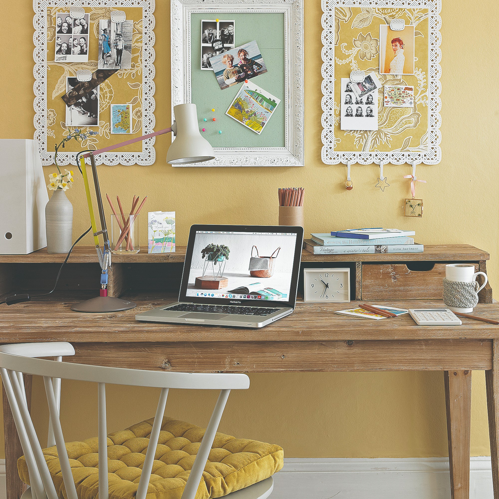
Analogous colour schemes can often have calming and soothing effects, because of the way in which the colours flow into each other. There aren't any sharp contrasts or clashing tones in this design method.
'This type of colour scheme enhances harmony, tranquillity, and coherence, while also offering simplicity and flexibility in design,' says creative director Sian from David Wilson Homes.
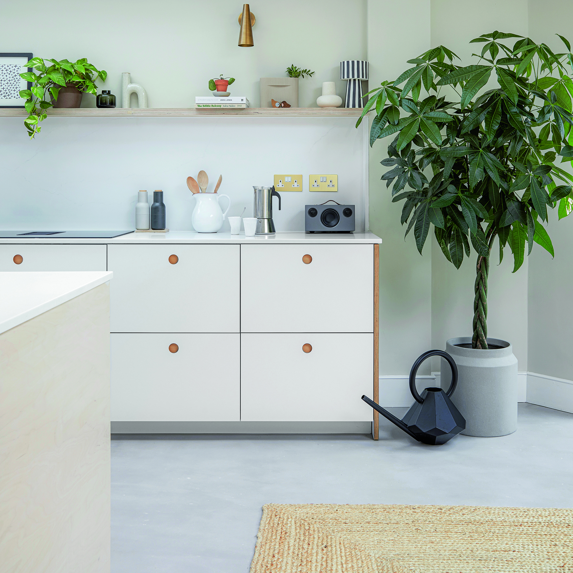
'If we look at nature, this colour scheme is present in plants and flowers so referring to this colour technique mirrors the natural world, making one feel quite tranquil and settled,' says Sarah from Addison Ross. 'And this is why it’s a great method for decorating communal spaces, like the living room or kitchen – as it’s the perfect approach for feeling harmonious in a space that you spend the most time in.'
Now you know all about analogous colour schemes, will you be using this design method to create a relaxing aesthetic in your own home? Remember, you can choose any three colours you like, as long as they sit next to each other on the colour wheel. Happy decorating!

Katie has been writing freelance since early 2022, specialising in all things homes and gardens, following achieving a Masters in Media and Journalism. She started out writing e-commerce content for several of Future’s interior titles, including Real Homes, Gardeningetc, Livingetc, and Homes and Gardens. Since then she’s been a regular contributor on Ideal Home’s digital team, covering news topics, how-to guides, and product reviews.