The best colours for a period kitchen – from Victorian to mid-century, these are the authentic shades to use for each era
Do you know which colour works best for each time period?

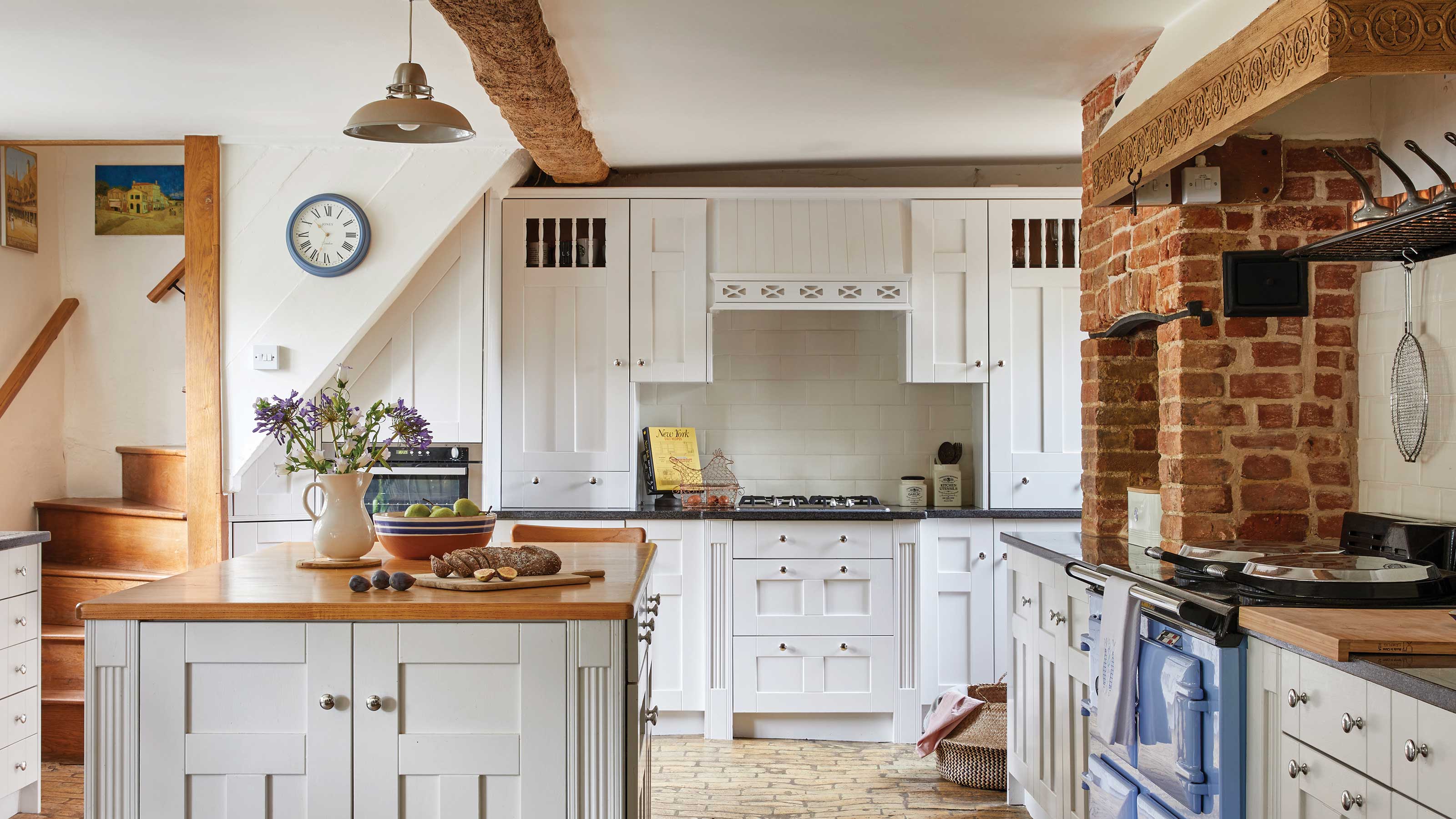
If you're lucky enough to live in a period property, you most likely have a home full of character, with your kitchen taking centre stage. Period homes in the UK can range from 15th century medieval abodes, to modern-day 21st century pads, and everything in between.
But knowing the best colours for a period kitchen that are sympathetic to the time the house was built, is a tricky one to get right. After all, kitchen colour schemes can send you into decision-making overdrive at the best of times, but if you also have to take into consideration where the kitchen is situated in terms of the light it gets, plus its dimensions and what colours were popular in the era it was built, it can seem pretty overwhelming.
But luckily we are here to help. We've spoken to some of the industry's top colour and kitchen experts, to get the low down on the best colours for a period kitchen, no matter when it was built.
Article continues below1. Georgian
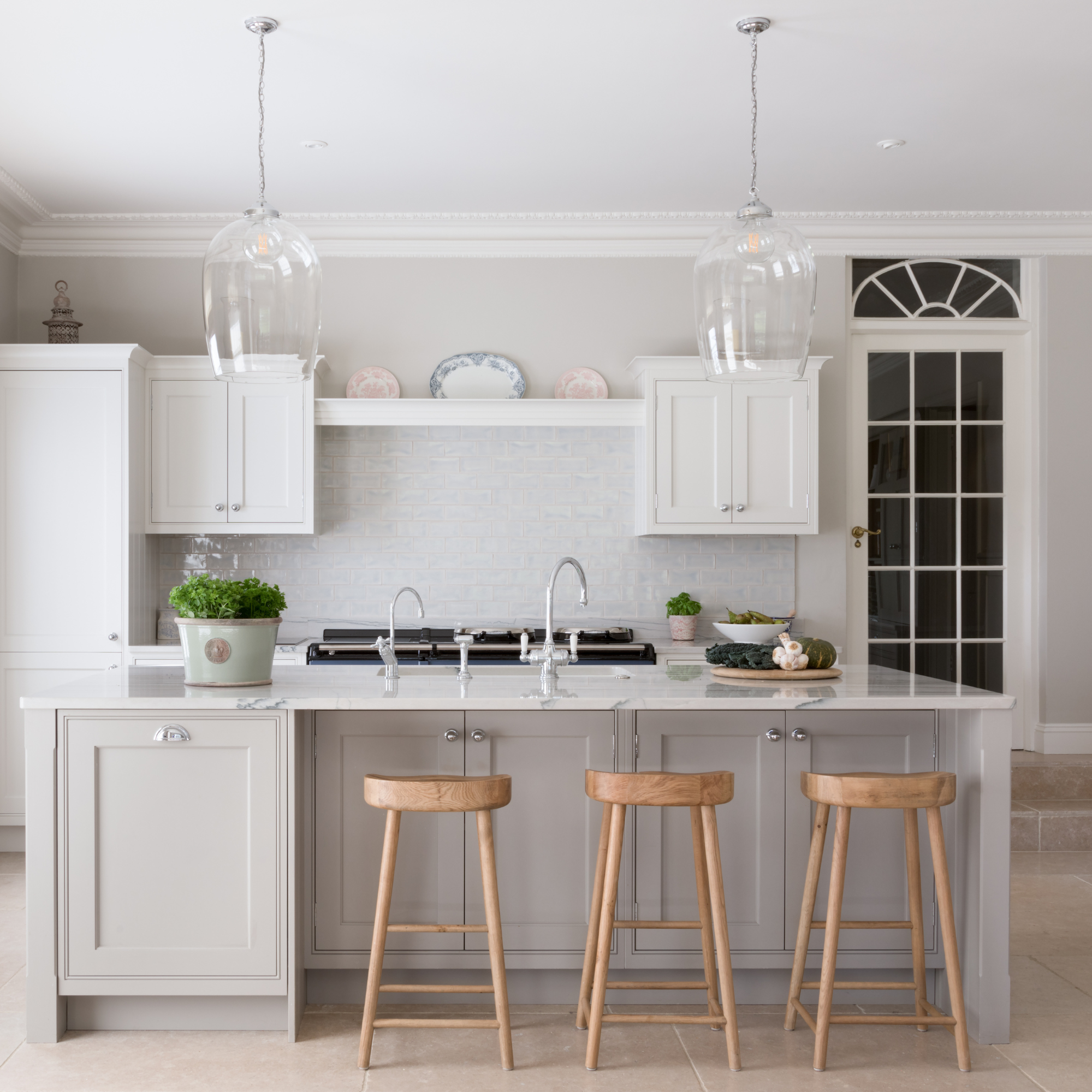
This kitchen is in the former drawing room of a Georgian country house, and the colours used - Slaked Lime and French Grey by Little Greene, are typical of a kitchen from that era.
Let us begin with a quick history lesson. The Georgian era, which began in 1714, saw the growth of some of the UK's major cities, such as our capital London, as well as Edinburgh and Newcastle where many Georgian townhouses still stand today and remain hugely sought after too.
But if you have been lucky enough to snap up a Georgian home, what colour is going to be best for your traditional kitchen?
Darren Taylor, managing director, Searle & Taylor comments, 'Paint colours for the interior of a Georgian home would have been in a range of blues and greens, with white or cream mouldings, panelling and skirtings, while the kitchen would have been painted white, off-white, neutral taupes or leaden greys, often because the paints themselves were lead-based.'
'In a typical Georgian property, the kitchen would have been in the basement at the back of the house with very little natural light, next to an ice house and near to the servants’ quarters. Because it needed to be cool, and without the benefit of refrigeration appliances, it would often be situated in a North-facing position.'
Sign up to our newsletter for style inspiration, real homes, project and garden advice and shopping know-how
'Nowadays, many of the kitchens that we design for larger Georgian properties are in south-facing drawing rooms that have been re-purposed so that the tall sash windows, typical of Georgian properties, allow for natural light to flow in during the day, and for necessary ventilation. Creams, taupes, greys and dark sage green are often still used as key colours for traditional kitchens in Georgian homes. However, the paints we use now are lead-free and always low in VOCs.'
Painted in Little Greene Galette, this kitchen brings a sense of warmth to a modern-Georgian home.
But if you're worried that off-whites and greys won't work well in your space, especially if it is a small kitchen that doesn't receive very much light (as was the norm at the time), colours with more warmth might be better suited for your space.
Ruth Mottershead, creative director at Little Greene explains, 'Highly practical colours such as ‘Scullery’ which was taken from the pantry door at National Trust property Wimpole Hall, is a Georgian colour typical of the browns used to paint ‘back-of-house’ kitchen areas, where staff would prepare meals for the owners of grand country homes. These muted browns and neutral colours were popular because they didn’t show dirt or damage easily and were thriftily produced by blending leftover paints and pigments from the decoration of the main house,' she explains.
2. Victorian
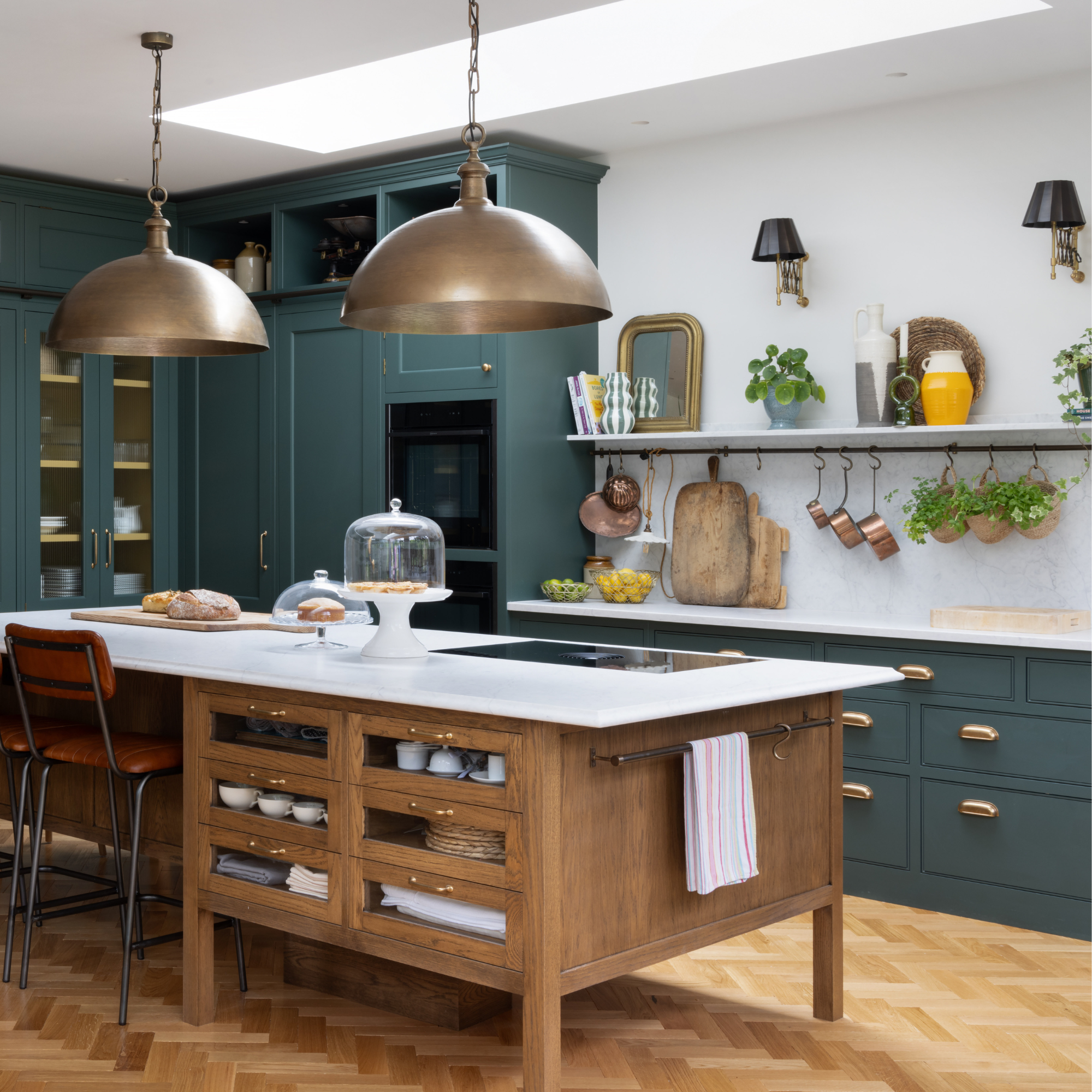
This shaker-style kitchen takes centre stage in a gothic-victorian property and has been painted in Little Greene's Three Farm Green.
Following the Georgian era, the more exuberant Victorian period began. This brought with it colours with a bit more depth and richness, bidding farewell to the safer, neutral colours of the previous century. And with the Industrial Revolution generating a housebuilding boom, a greater display of affluence came with it, encouraging homeowners to decorate more extravagantly.
'The largest group of period homes in the UK are of Victorian heritage as this period was a time of great ingenuity,' explains Ruth. 'Reflecting the time, Victorian colours have a strong identity in themselves; often the colours used were darker and more saturated like ‘Dark Brunswick Green’ and ‘Purple Brown.'
Lucy Steele, paint & interiors expert at Valspar Paint adds, 'A traditional Victorian colour palette consists of warm rich hues, such as deep reds, burgundy and dark greens. Dark green, such as Forest Symphony, will bring a depth of character and warmth to any kitchen space. When paired with white paint and grey wood, it creates a timeless, sophisticated look that ties together both modern and traditional Victorian kitchen designs seamlessly. The deep, earthy tone of dark green adds a rich feel, while the white and grey wood provides a clean, fresh contrast, ensuring that your green kitchen feels open and airy.'
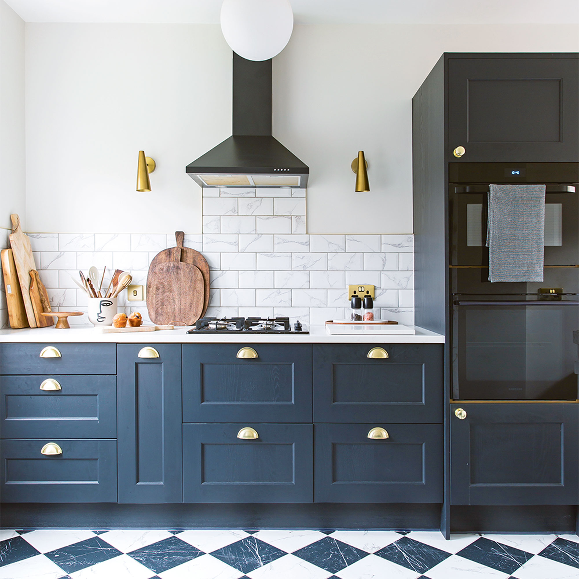
Deep blue became a popular shade for kitchens during the Victorian period.
So Ruth and Lucy agree that green is a great colour to use if your kitchen hails from the Victorian period, but are there any other colours that would also be sympathetic to that time?
Tim Higham, founder of Shaker kitchen brand Higham Furniture comments, 'Together with polished wood furniture, richer, dark bolder colours became prevalent, including reds, burgundies and maroons alongside dark greens and dark blues with bronze or brass accents. Shaker kitchens remain perennially popular style choices for Victorian properties and these dramatic colours are still on-trend today.'
3. Art Nouveau
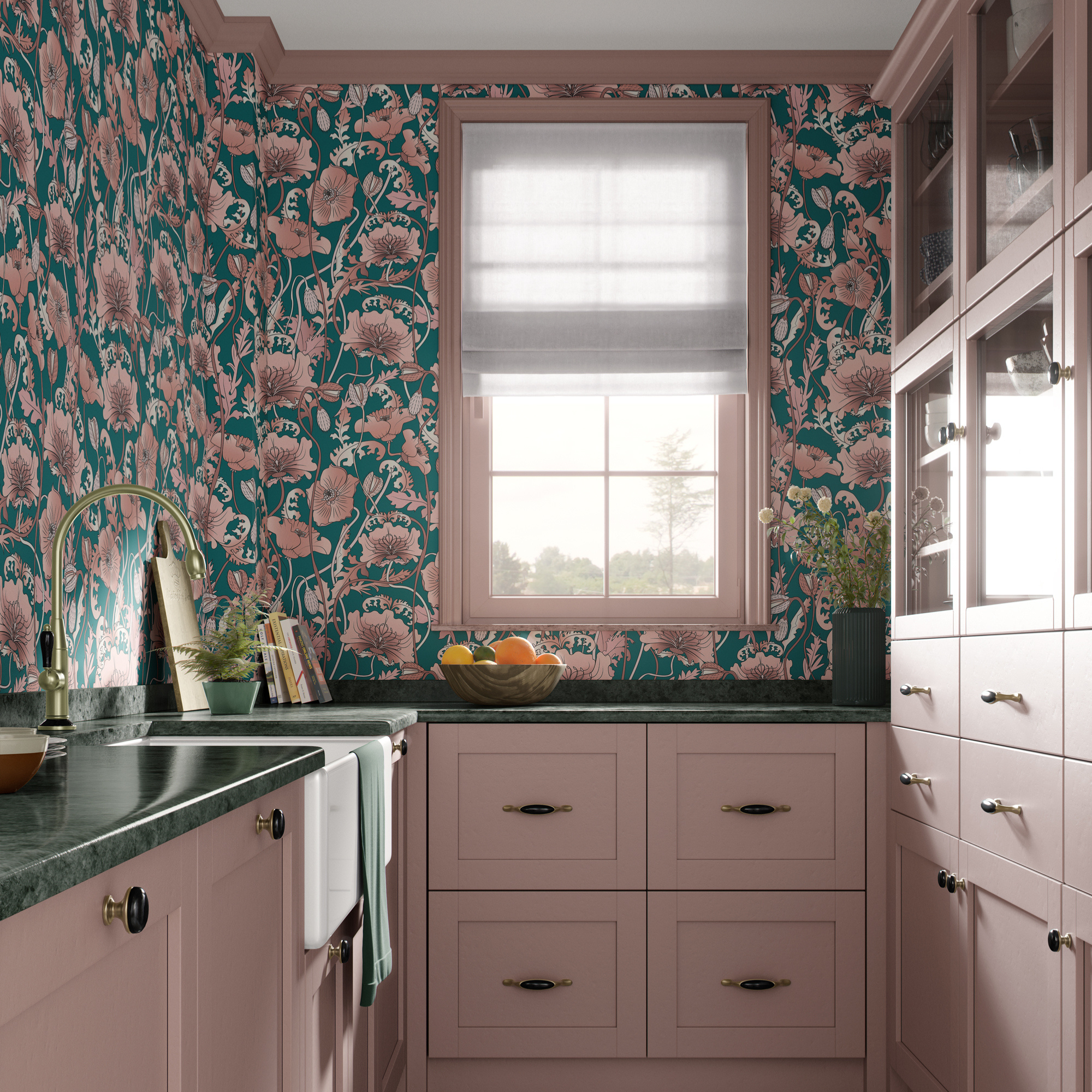
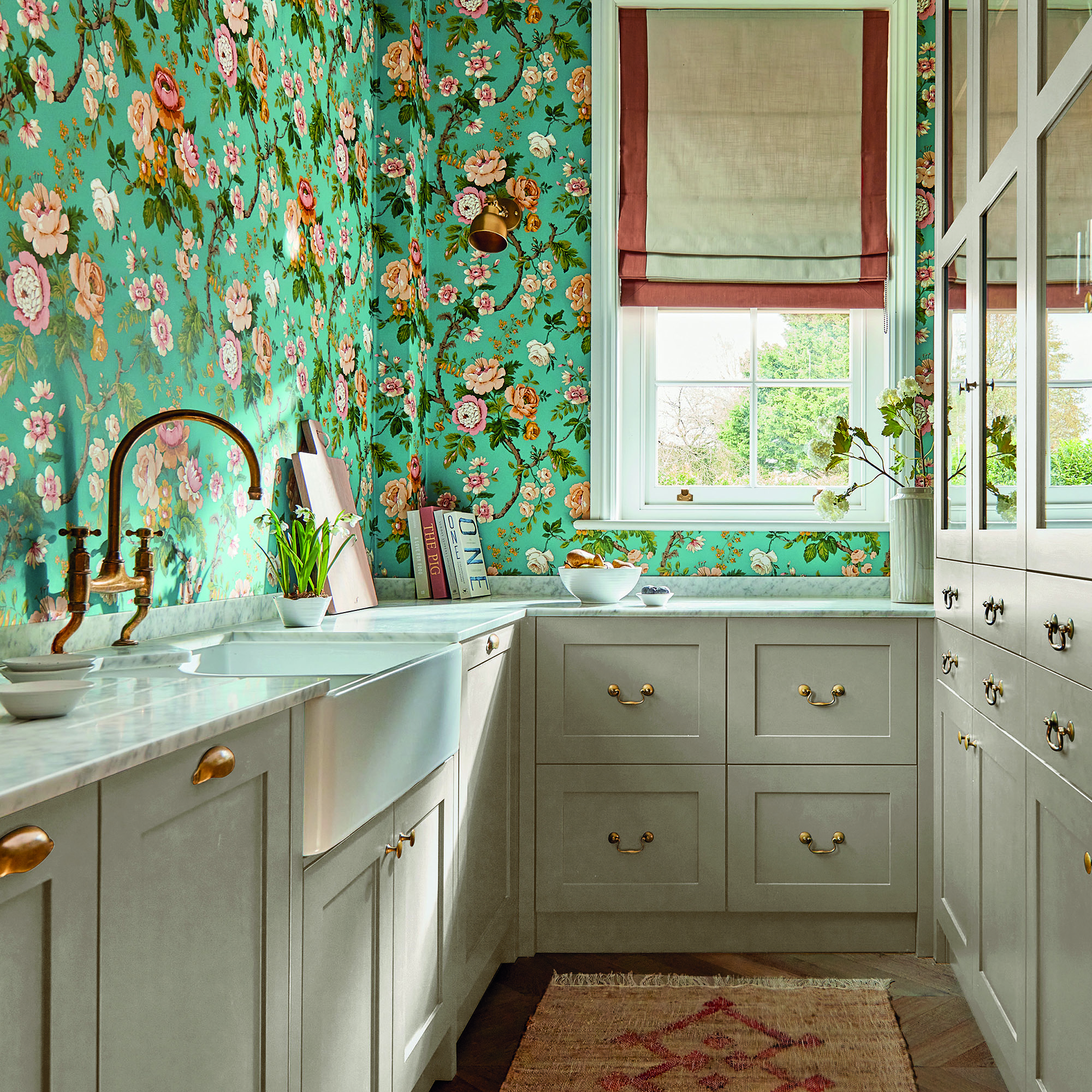
The fluid shapes and colours of this Art Nouveau-inspired wallpaper, ties perfectly with the dusty rose kitchen cabinets.
At the tail end of the Victorian era, came Art Nouveau. Although short and sweet in comparison, it still made an impact on the interior design world and kitchens of this time would have featured curves and shapes inspired by nature.
Richard Davonport, managing director at Davonport comments, 'There’s a softness to Art Nouveau that still resonates today, with colours that were drawn from nature, such as mossy greens, lilac-greys and dusty rose. These hues were used to complement the movement’s curved forms and flowing lines, often in homes with generous cornicing, tall windows and original joinery.'
'In Art Nouveau kitchens, the space respond best to colours that are subtle, as you don’t want anything too flat or uniform. We find that using an Art Nouveau palette with contemporary cabinetry shapes brings something quite special as the colour brings to life that period of time while the modern cabinetry adds a crisp and contemporary feel.'
If you have an Art Nouveau-style kitchen, why not use it as an opportunity to lean towards pink kitchen ideas and create a warm and welcoming, yet authentic space to cook.
4. Art Deco
After the pale and more muted colours of the Art Nouveau period, it was time to shake things up a bit, as the arrival of Art Deco brought with it more intense colours and plenty of glam metallics too.
Richard says, 'Art Deco was a period of bold contrast and stylised glamour and that’s still a rich source of inspiration for kitchen design. In Deco-era homes, you’ll often find well-proportioned rooms with central windows, tiled floors, and symmetrical layouts all of which lend themselves beautifully to strong visual statements that kitchens provide. Black and cream was a classic pairing of the time, joined by deep teals, rich woods, and touches of brass or chrome.'
'These colours worked well in the 1930s because they suited both natural and electric light, allowing the room to shift from day to evening with ease. Today, we take that same principle but soften the gloss: matt finishes, brushed metals, and the richness of woods.'
But the more subtle colours that came from the Art Nouveau period were still in circulation, so for an Art Deco kitchen that doesn't want to be too bold, there is still the choice to go for a more muted colour palette- or at least combine a bit of both.
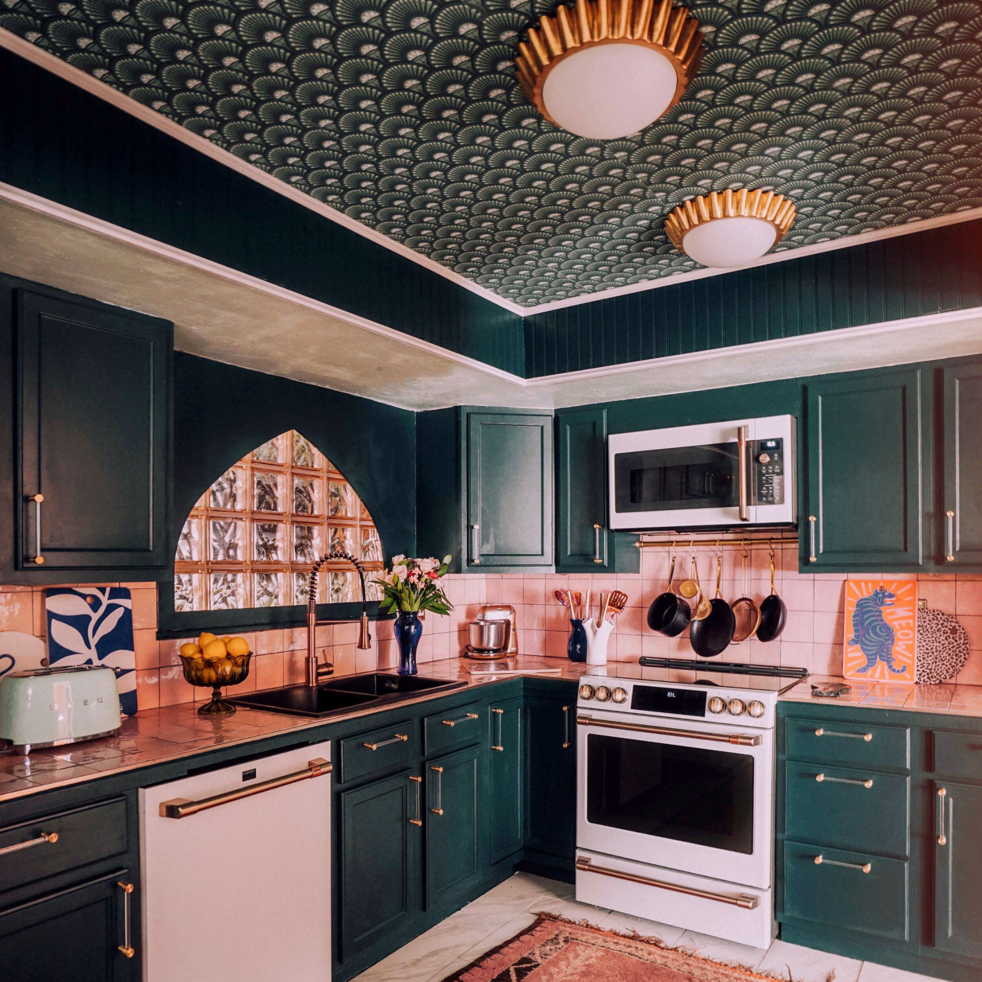
This deep teal kitchen features glam brass hardware and a statement papered ceiling to boot.
Ruth explains, 'Colour choices moved back towards whites and soft pastel shades made popular during the short Art Nouveau era. The bright pure green 'Eau-de-Nil' delivers a fresh yet nostalgic feel to kitchens and pairs well with coordinating rich greens like 'Jewel Beetle' or ’Sir Lutyens’ Sage’.
'Eau-de-Nil also provides a contrasting accent to brighter hues such as ‘Orange Aurora’. Due to its origins in the 1930s, it naturally feels at home in 1930s architecture or period-inspired interiors. However, like other fresh, pure greens, it is equally suited to country homes or more contemporary spaces.'
5. Mid-century modern
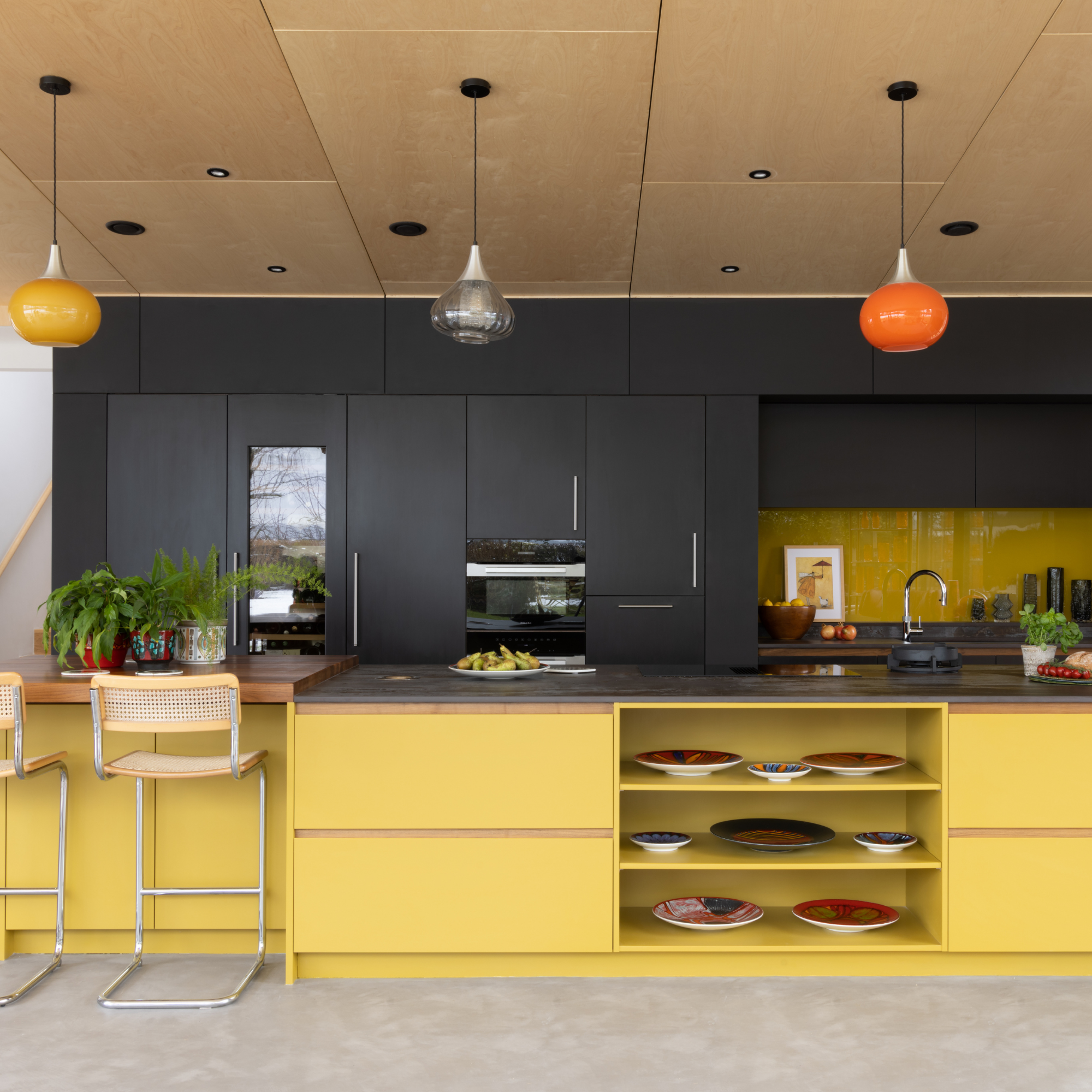
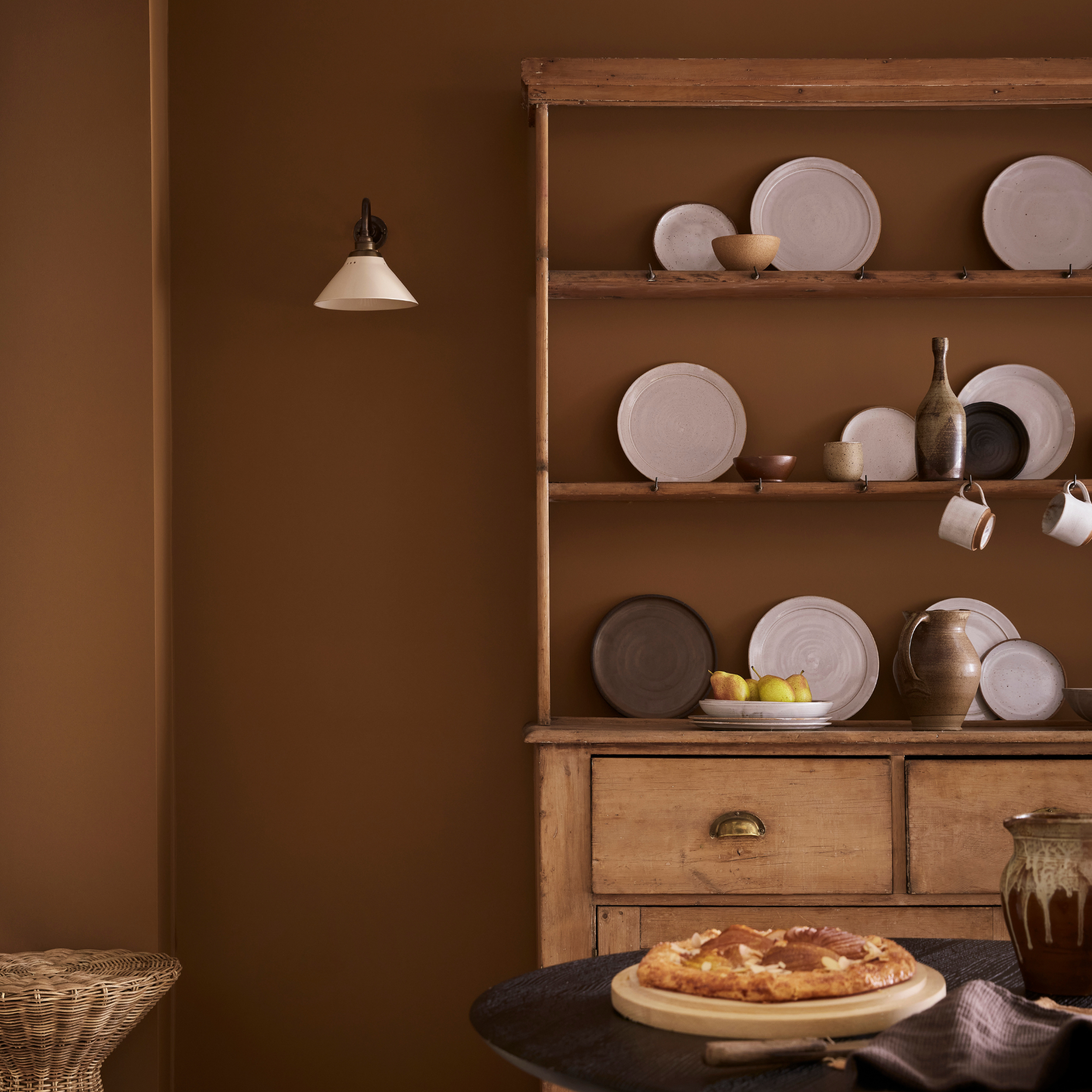
This mid-century modern kitchen has been painted in Grapefruit 302 by Tikkurila Paints.
Mid-century modern homes are another lust-worthy property type that are full of character and oh-so-fun to decorate. With plenty of iconic designers producing furniture pieces for this time period, a day trawling vintage shops and fairs should result in some bargain buys. But what about colours for your kitchen? Darren has some expert advice...
'Dating between 1945 and 1969, the term mid-century modern covers several different interior styles that would have been staples in the homes of the baby-boomer generation,' he explains. 'From the kitsch post-war pastels of the 1950’s to the advent of the sleek Scandinavian influences of the 1960’s, the bold colours that are typical of the latter period contrast with the use of plain natural woods, often teak, oak or plywood, within a kitchen or interior scheme.'
'The use of these colours was a deliberate rejection of post-war austerity and representative of a new modern era of change in Britain at the time. Primary colours, red, yellow and blue are indicative of this period, along with browns, olive greens, orange and tangerine shades.'
6. Modern-contemporary
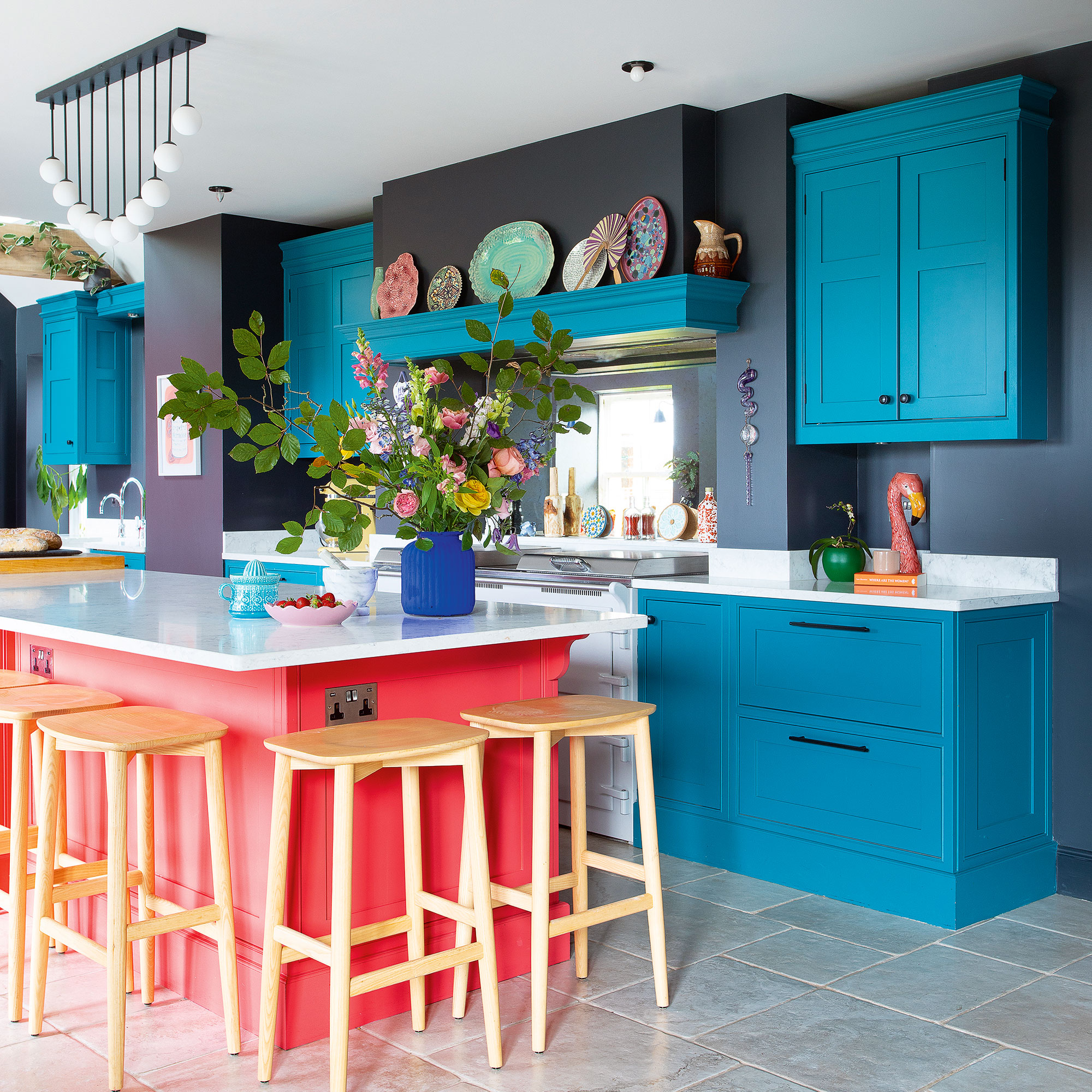
The final period of homes we asked our experts about are modern-contemporary homes, from around the 1980s to now. One of the biggest changes for kitchens today, is that open-plan layouts have become the norm, thus changing how we use and therefore decorate our homes.
Ruth explains, 'The most significant change in kitchen design can be seen in more modern homes with kitchens no-longer being hidden away, either centrally located and linked to dining rooms or living spaces, or integrated into an open plan space, kitchens have become the heart of a family home, a social space for gathering with friends and family.'
'The colour choices for kitchens have been transformed by this new approach, with kitchens becoming an extension of a home’s design scheme, carrying a colour palette through into the kitchen space to create a harmonious transition between, living, dining and kitchen spaces.'
For a vibrant, contemporary, tonal scheme, combine complementary green shades ‘Harley Green’ and ‘Tea with Florence’ to create a subtle contrast that is perfect alongside light wooden furniture and gold hardware. Or opt for dusky pink ‘Light Peachblossom’ complemented with handmade patchwork tiles and ‘Grey Teal’ units, which is a perfect partner for light pink and peach hues.'
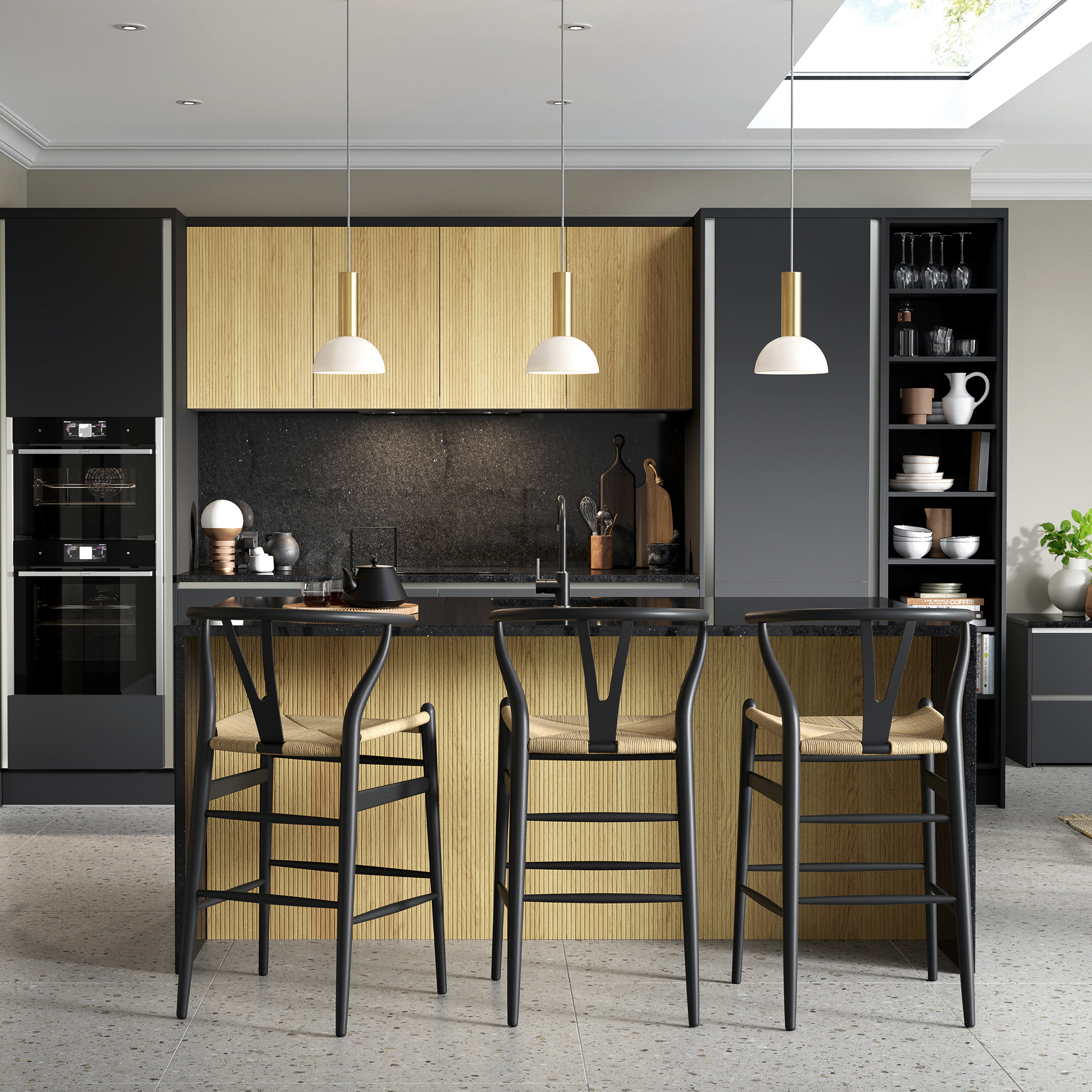
If a two-tone kitchen isn't quite the aesthetic you want to go for in your modern kitchen, Lucy advises opting for a safe but stylish colour choice.
'Empirical Grey kitchen ideas or dark colour schemes work well in a kitchen for a modern-contemporary and clean, sleek appearance. Darker shades often work best in larger kitchens, however, if your kitchen is smaller, try a 50/50 wall paint technique, keeping the top half of your walls in a light shade. This way you won’t overwhelm the space or make it feel smaller than it is.'
Richard adds, 'What defines modern-contemporary kitchens is their flexibility as they are shaped more by the space you have to play with than by tradition.'
'Instead of following one look, we’re seeing an emphasis on tone: soft, layered palettes that respond to light throughout the day. Colours like warm greige, chalky white and blue kitchen ideas feel at home here, especially when offset with natural textures like oak or stone. The aim isn’t to match everything, but to create balance and atmosphere. Colour becomes a way to link zones and guide the eye, something that has become essential in today’s multifunctional homes.'
Shop decor for period kitchens
So after that mammoth read, which shade do you think would work best in your period kitchen?
What period is your kitchen from? Let us know in the comments below whether you'll be sticking to the guidance for the period your home is from or mixing in a more contemporary colour scheme.

Holly Walsh is a freelance Interiors Writer and Shopping Editor, but worked in-house here at Ideal Home for nearly 10 years. With a background of studies in Interior Design, her career in interior journalism was a no-brainer and her passion for decorating homes is still as strong now 15 years after she started, as it ever was. While Holly has written for most of the home titles at Future, including Livingetc, Country Homes & Interiors, Homes and Gardens, Woman & Home and Style at Home, Ideal Home has always been her ideal home, and she can still be found sharing her expertise and advice across both the printed magazine and the website, while also raising her two young children.
