3 colours to avoid when painting window frames – experts say they might draw the eye, but not in a good way
These are the colours to avoid if you want to transform your window frames from drab to dazzling
If repainting the window frames is high up on your to-do list this spring, you're probably wondering which colour would make the best choice. And as with many interior decisions, a good place to start is by eliminating the colours which would be a bad choice.
According to interior design experts, there are three colours to avoid painting window frames with. Learning how to paint window frames is one of the fastest ways to up your home's kerb appeal. While individual tastes and preferences will come into your paint colour choice, some colours will have a negative impact on the look of your home inside and out.
Before you make a choice you'll regret, we've asked design and window experts to share the top colours to avoid painting window frames, and alternative shades if you can't be swayed from those colours.
Most of the colours listed apply to the colour you use when painting the exterior window frames, but it's still worth considering the advice for the interior frame too.
1. Red
As one of the primary colours, red definitely has a place in interior design - but window frames are not one of them, particularly when it's used in a brighter, more dominant form.
'Bright red always draws the eye, but not necessarily in a good way!' Lucy Mather, design expert at Arighi Bianchi says. 'Red window frames tend to dominate a home’s façade rather than complement it. And they can also fade unevenly over time, leaving your home looking tired and unkempt.'

If you want to add a dash of red to your window frames, consider focusing on the inside and using a different colour for the outside
To stop your window frames attracting unwanted attention, opt for rich burgundy or deep terracotta instead. These earthy tones can help make the space look more inviting, without being overwhelming. 'They’re also much easier to pair with brick, stone, and neutral renders,' Lucy adds.
2. Pure white
Window frames are one of the areas in the home not to paint pure white, according to the experts. This might come as a surprise, as white is a common choice for window frames - but because of its ability to highlight dirt, dust and debris, it's a high-maintenance pick.
'So many people think a nice crisp white is a top choice, but I would highly recommend avoiding it unless you can commit to repainting it regularly,' Alan Reid, a uPVC and home improvement specialist at Art Windows and Doors says. 'It shows dust, dirt and discolours very quickly compared to other colours. Any mark is going to pick up straight away, so it’s not really worth it.'
If you do prefer white window frames to more distinct colours, opt for ivory instead. It's a lot more forgiving than pure white, and can be softer on the eye as well.
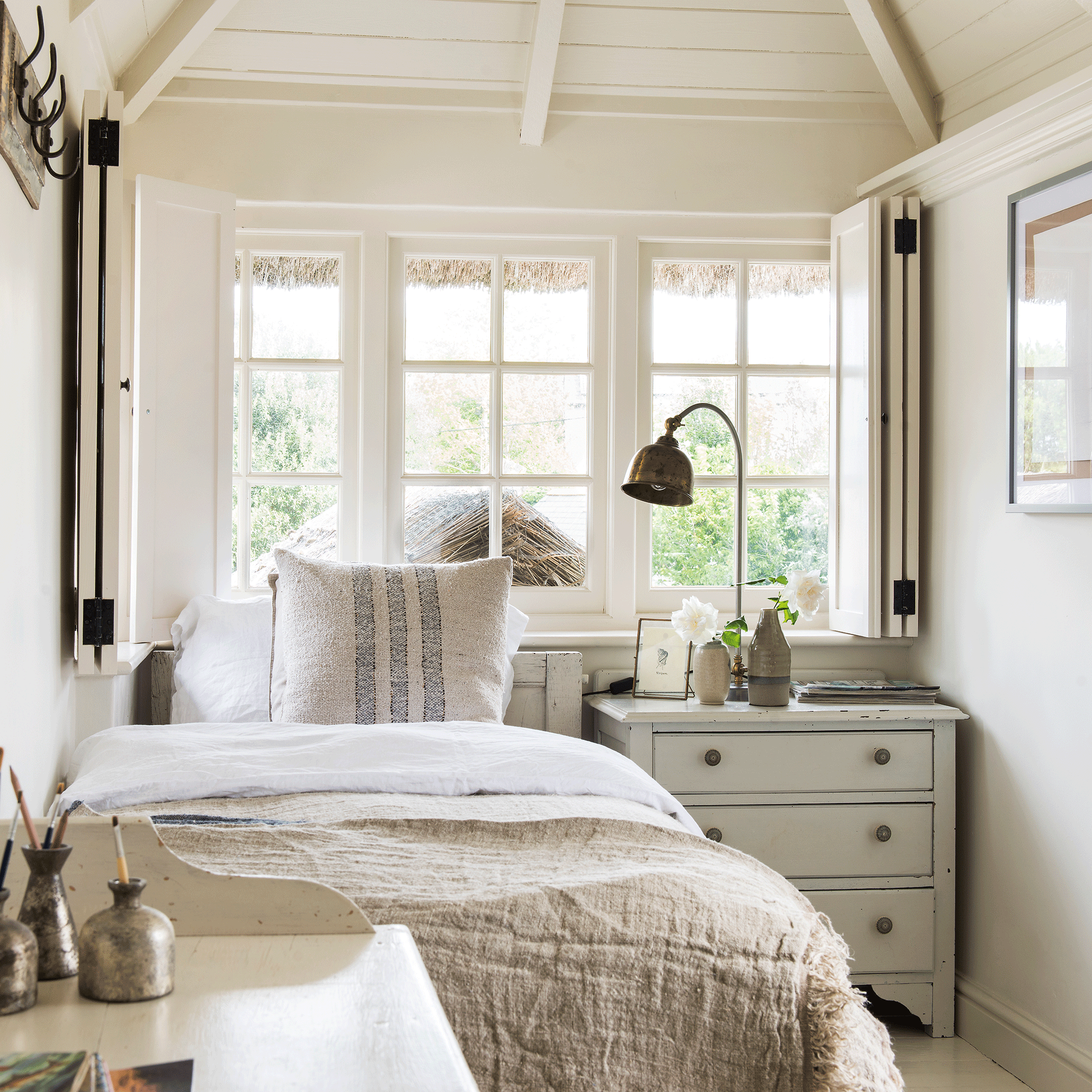
A soft ivory has been used on these window frames, seen from the inside.
3. Bright green
The last of the top colours to avoid painting window frames with is - perhaps unsurprisingly - bright green. While we're all for making bold choices and injecting personality into the home, bright green doesn't have much longevity, in terms of both style and finish.
'Bright green frames tend to date very quickly,' Matt Thomas, Director of Apollo Blinds confirms. 'They can make a home look out of place or overly trend-driven and are a risky choice if you’re thinking of selling as they could put off future buyers. And because they clash with traditional materials and textures, using very bright colours generally makes it much harder to achieve a cohesive exterior vibe.'
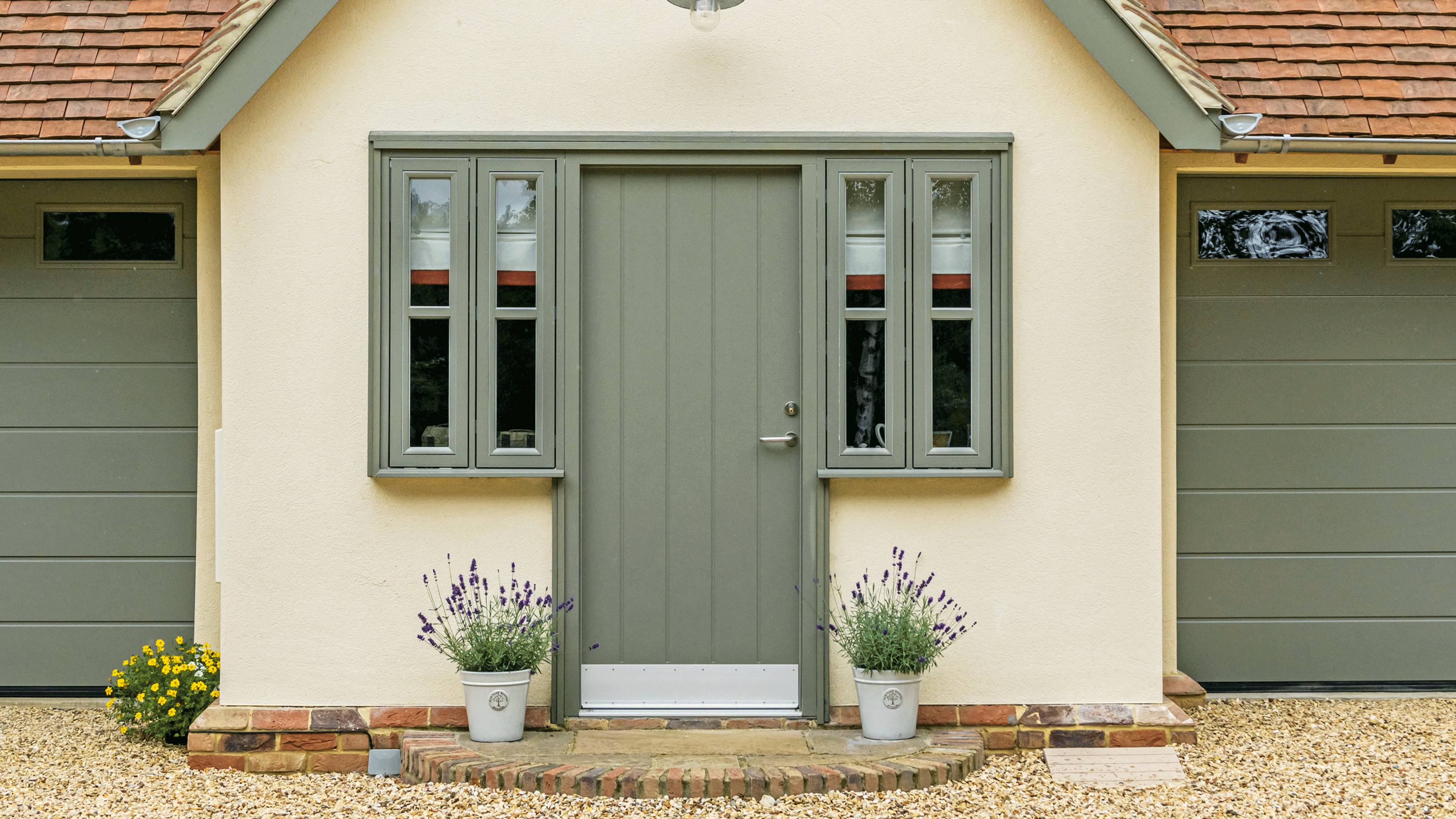
Sage green on the other hand is the ideal way to add a touch of vibrancy, while still maintaining a timeless appeal. It's a nice way to subtly contrast your window frames with the surrounding walls.
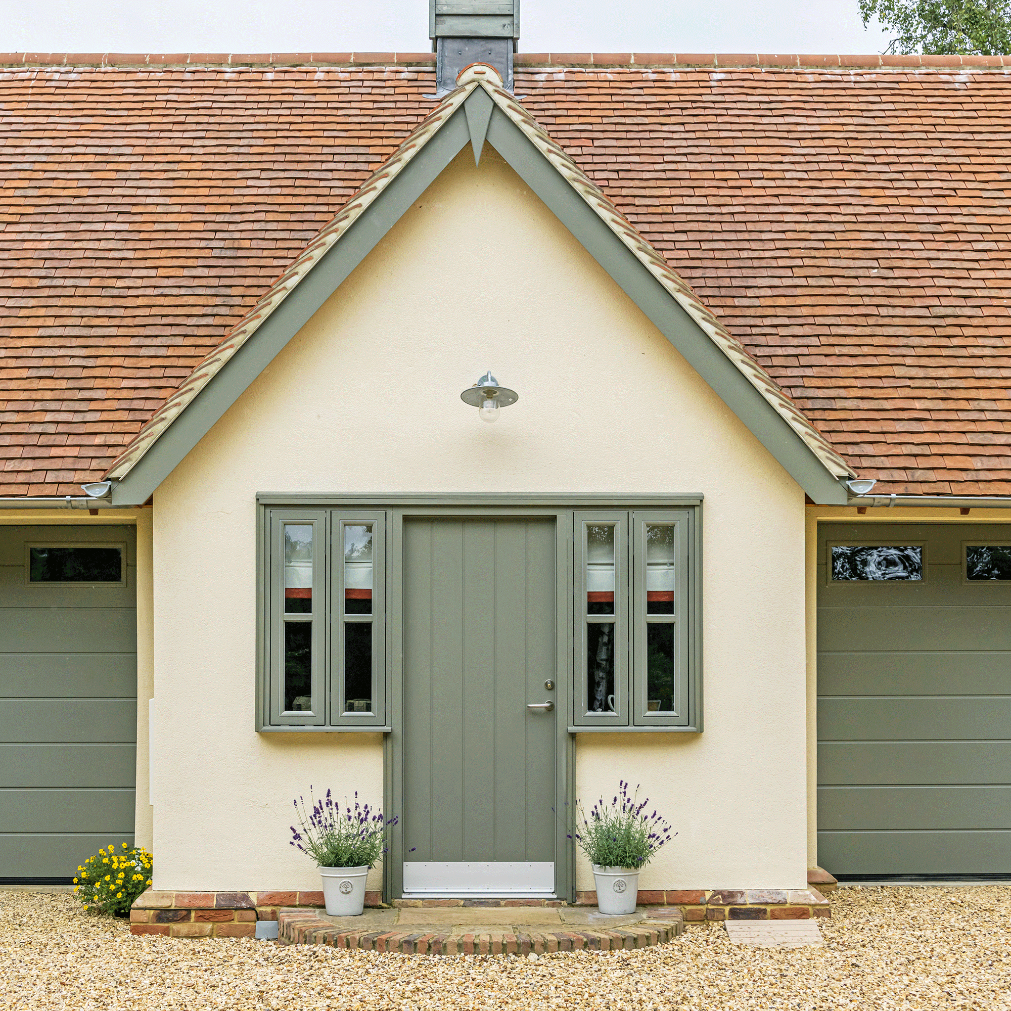
The sage green on these window frame complements the front door and picks out the trim around the roof.
FAQs
Should window frames be lighter or darker than walls?
In many cases, window frames that are darker than the surrounding walls work well. They create a nice, visual contrast that naturally draws the eye.
'Darker frames create contrast, which adds structure and elegance to a façade,' explains Matt. 'They help define the windows and often make the whole home feel more architectural.'
But, as Matt adds, 'lighter frames can work well on homes with traditional or coastal styles, especially when paired with soft wall colours and lighter trim.'
Ultimately, whether your window frames should be darker or lighter comes down to your personal taste. 'The key is to make sure of is that there’s enough contrast between the wall and the frame to avoid it looking washed out and blending in,' Alan from Art Windows and Doors says.
What is the most popular window frame colour?
As with many paint trends, colour choices for window frames can shift in popularity over time. Right now, slate grey is one of the most popular colours, due to its modern, versatile look.
'Anthracite grey works well on both contemporary and traditional homes, which makes it a go-to for many homeowners,' Alan says. 'It creates clean lines, is low maintenance, and does a great job of hiding dirt and weathering over time.'
Similarly, matt black for window frames is having a moment in the sun, again because of its versatility. 'It’s sleek, versatile, and works across almost all home styles – from period properties to industrial style lofts,' design expert Lucy explains. 'It frames your views like a picture and pairs well with both light and dark wall colours.'
Now you know the top three colours to avoid painting window frames, you should have a clearer idea of what will work in your home. Happy painting!
