6 colours that will transform a dark kitchen with little natural light and make low-light cooking spaces feel welcoming
Turn the fortunes of a light-starved kitchen around with these expert-approved shades

Kitchens with no or very limited natural light can be depressing to spend time in and depressingly tricky to decorate. Even if you have windows in your kitchen, but they’re facing north or impossibly small and low (period cottages are notoriously gloomy inside), you'll know this pain well.
Without sunshine pouring in, or even a cleverly positioned skylight, it’s tempting to reach for the palest of colour charts. But the truth is, darkness only feels depressing if you let it. Transforming a low-lit kitchen into something uplifting takes effort, but it’s entirely possible to shift the mood.
Start by embracing the shadows, leaning into the atmosphere, and reframing it as cosy – then make it so. Happily, the colour experts agree. Dark kitchen ideas don’t have to be a buzzkill. In fact, with the right approach to kitchen colour schemes, even the gloomiest space can feel surprisingly warm, rich and full of depth.

Success starts with selecting colours that thrive in low light. Sure, that could be warm off-whites that glow softly, but you can also plump for darker tones, like moody greens and inky blues that feel cocooning, or earthy hues that radiate cosy warmth.
No daylight to speak of? No stress. These six colour strategies will help dial up the depth, bounce what precious light you do have, and transform your kitchen from unwelcoming cave to cocooning cooking place.
1. Warm whites

White kitchen ideas are generally the first choice in kitchens without much natural light, but you really need to be clever about it. And by clever, we mean picky! White is only as bright as the light that shines on it, and if there’s precious little available, the wrong white can feel stark, even cold. Sad times.
Avoid any whites with blue undertones, and instead seek out soft off-whites with warm undertones. Think yellow, peach or pink tinted whites, which will have a gentler, more flattering look under artificial lighting and, crucially, none of the hospital waiting room vibes.
'Warm neutrals work beautifully in areas with poor or cool light, such as north-facing kitchens, they cocoon the room and add a touch of elegance,' agrees Anna Hill, Brand Director and Colour Consultant at Fenwick & Tilbrook. She also recommends avoiding a bright white ceiling: 'Instead, keep the same colour throughout both walls and ceilings to create a cohesive feel.'
To stop things from feeling flat, a satin or eggshell finish on cabinetry will softly illuminate electric light. Add glossy tiles or polished stone splashback for extra shimmer, and pile on the texture with timber flooring, rattan storage and warm metallics for a luxe, layered look.

After nearly 12 years in corporate merchandising for UK and international brands, Anna Hill swapped the fast pace for rural Norfolk, joining the family business at Fenwick & Tilbrook. Five years on, she now leads the thriving luxury paint brand, known for its premium, pigment-rich colours, made to order in six high-performance finishes using only the finest ingredients.
2. Moody greens

If your kitchen doesn’t get much Vitamin D, make like a tree and plump for the rich, verdant joyfulness that nature’s most abundant colour can provide. Moody green kitchen ideas, such as olive and forest, are surprisingly effective in dimly lit rooms, creating an atmospheric feel that’s earthy, calm and timeless.
'These rich, grounded tones bring depth and character, particularly effective in smaller, low-light kitchens when used strategically,' explains Anna Hill. Her advice? 'Limit their use to lower cabinets, kitchen islands, or a single statement wall to avoid overwhelming the space, and pair with a warm neutral to maintain balance.'
To prevent moody greens from overpowering, lift the look with pale kitchen worktops, natural stone-look flooring and glossy tiles.
'Green works especially well alongside natural materials such as timber and unlacquered brass or copper finishes, which will add warmth and texture,' adds Anna. 'Install discreet under-shelf lighting to bring the colour to life.'
3. Inky blues and blacks

Dramatic, regal and endlessly elegant, deep navy blues and inky near-blacks are a confident choice for a light-starved kitchen. Opting to go this dark is a brave move but there are ways to mitigate the descent into murkiness and keep it uplifting.
'These dramatic hues add sophistication and contrast, though they can absorb light – so use them with intention,' advises Anna Hill. 'Apply on lower cabinetry, keeping upper walls in a lighter tone or warm neutral, and consider incorporating open shelving to prevent the space from feeling too closed in.'
Ink blues work especially well because of their depth. Bluer than black, they shift in tone depending on your lighting. 'Balance inky tones with reflective surfaces — distressed antique-style mottled mirror tiles, for example, could create an eye-catching splashback, while helping to bounce light around the room,' suggests Anna.
Layer kitchen lighting ideas – think ceiling spots, wall lamps and under-cabinet strips – for a dynamic, polished finish, and don’t forget the gold accents. Polished brass hardware can really double down on the grandeur of a deep blue kitchen, making it sparkle under electric lighting.
4. Mushroom and taupe

Neutrals with depth – nothing wishy-washy – are what you need for a hearty dose of warmth in a poorly lit kitchen. We're talking shades like stone, mushroom and taupe with these neutral kitchen ideas, which are quietly warm, sophisticated and really flattering under electric lighting.
'Mid-tone neutrals such as stone, warm greys and misty tones work particularly well in kitchens with limited natural light,' says Helen Shaw, Director of Marketing at Benjamin Moore. 'These hues have soft undertones of brown and beige which feel warm even in low light and they offer a timeless and cosy backdrop for a kitchen space.'
Because these colours don’t absorb the light like darker hues, they keep the atmosphere uplifting without feeling sterile. 'They’re best paired with accents of warm white and slightly reflective surfaces,' recommends Helen. 'Add texture via timber, concrete, brushed metals, and consider tone-on-tone schemes for a calm, cohesive feel.'

Helen co‑founded Shaw Paints Ltd with her husband Craig in 2015, establishing it as Benjamin Moore’s exclusive UK distributor. After Benjamin Moore & Co acquired Shaw Paints in 2020, Helen joined the firm’s senior team, leading marketing and colour consultancy.
5. Reds and browns

Unexpected but totally dreamy, red-led shades like terracotta, rust and deep burgundy are trending hard. Whether on cabinets or walls, they inject an exotic feel and Mediterranean-grade warmth – perfect if you can’t even see the sky (clear blue or otherwise) from your kitchen.
'Earthy colours like terracotta or clay boast a reddish-orange base that catches low light well, making them a great choice for those who want a bolder colour option in their windowless kitchen,' says Helen Shaw.
To keep the look balanced, Helen advises using these tones as accents on backsplashes, islands or low-level cabinets paired with lighter colours above. 'Think pale travertine, terrazzo-style floors, or whitewashed walls to bring contrast,' she adds
6. Yellow and ochre

Yellow can bring all the sunshine into a dark kitchen, even one that has never seen the light of day. Just make sure you go for mellow shades, like mustard, ochre and butter yellow – anything too bright can feel harsh under artificial lighting. Soft, muted yellows are more grounded and inviting.
'Mustards and ochres have a naturally sunny, golden quality that enlivens shadowy spaces,' says Helen Shaw. 'Such colours bring energy without the starkness of true yellow, which can be particularly useful in north-facing kitchens.'
Helen recommends pairing yellows with off-white wall accents and natural woods for an organic but dynamic look. “Add terracotta floor tiles, blackened bronze hardware or creamy quartzite worktops to lean into their warmth without overpowering your palette,” she suggests.
Get the look

You'll have seen this lamp all over Instagram, and it's a great way to brighten up a kitchen worktop in a dark kitchen.
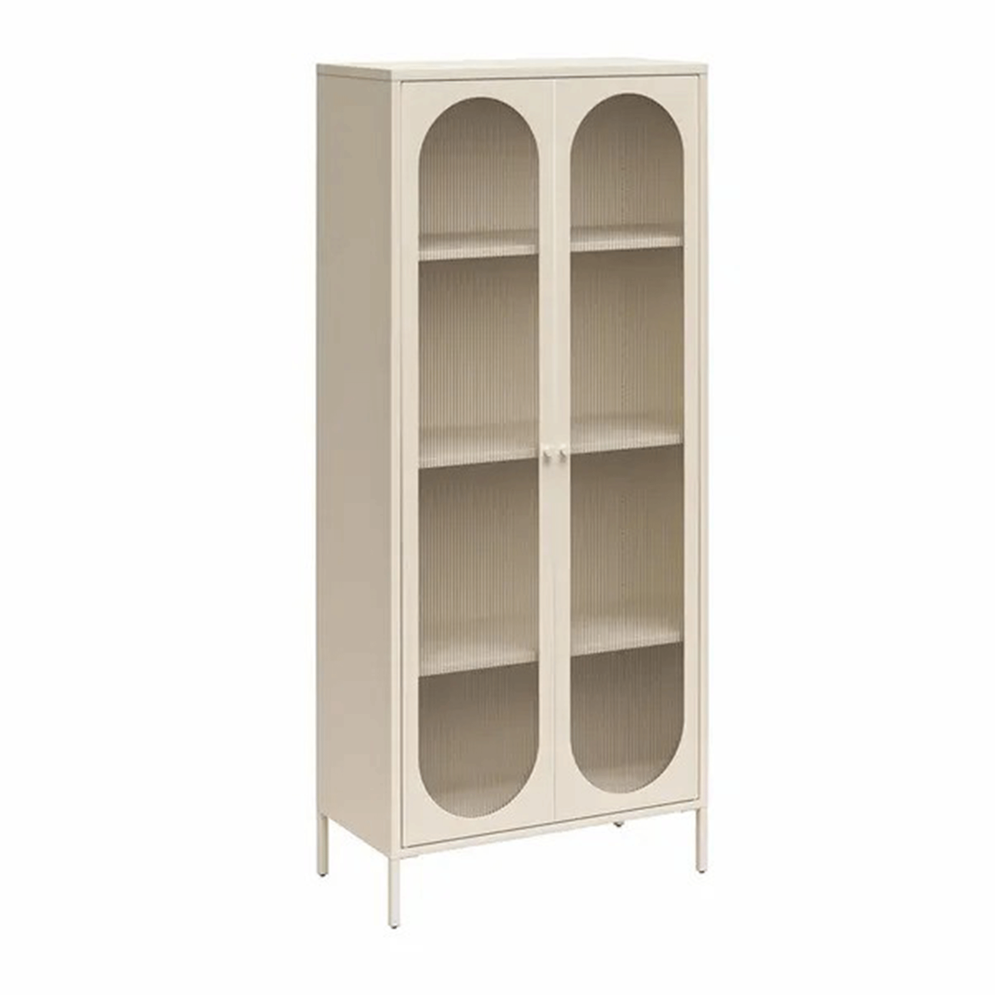
This free standing cabinet with a glazed front will help bounce more light around a darker kitchen.
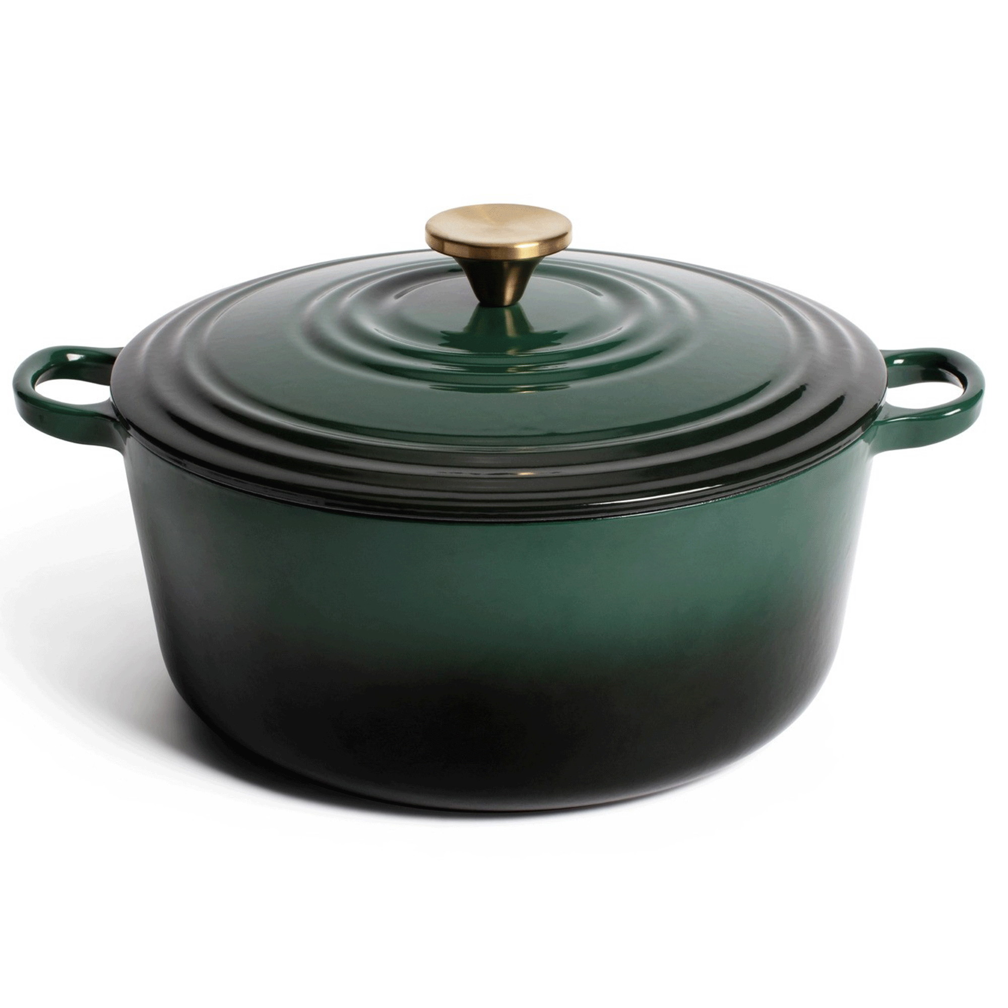
Leave this dark green pot in pride of place on the stove of a dark kitchen to add interest and colour.
FAQs
What is the worst colour to paint a dark kitchen with no natural light?
The worst colour to use in a dark kitchen with no natural light is a stark, brilliant white – the cheapest white that housing firms favour on ceilings.
While it might seem like the best choice, pure white being bright and light, it will most likely have the opposite effect in rooms with small or no windows. Without natural daylight to knock out the harshness and counteract the blue undertones, a true white can appear cold and sterile.
If you’re leaning towards pale colours, it’s way wiser to choose warm-toned off-whites, stone-like neutrals or terracotta shades with yellow, peach or pink undertones. These shades will bring gentle warmth right into the darkest corners of your kitchen.
Are there other ways to brighten a dark kitchen without natural light?
Heck yes, paint colour is just one weapon in the battle to brighten a dark kitchen. Lighting design is right up there, and it pays to have this done by a professional if you’re relying on artificial lighting for everything.
A layered kitchen lighting scheme is the goal – go for ceiling spotlights with under-cabinet LEDs, pendants, and wall lights to flood light across multiple areas and cull shadows. Fit bulbs with a warm white temperature (around 2700K–3000K) like these ones on Amazon to replicate the natural glow of daylight.
Reflective surfaces can also make a big difference but don’t go mad, again think layered not glaring. Gloss or satin paint finishes on cabinetry can work well with dark colours like olive greens and inky blues, while glazed tiles (we love the natural undulations of Zellige-style tiles), and mirrored splashbacks (go for antiqued glass to reduce glare) will all help bounce light around the room.
Light-toned worktops, open shelving and glazed cabinets (with internal lighting) can also help lighten the visual load in a dimly lit kitchen.
Just because natural daylight has gone MIA, doesn’t mean your kitchen has to suffer. In fact, low-lit kitchens offer the perfect opportunity to embrace richer colours, atmospheric contrasts and a more tactile, layered approach. How will you help your dark kitchen shine?
