10 blue kitchen ideas to inspire a bright, airy and on trend cooking space
Make a splash with your kitchen decorating scheme with hues of aqua marine, periwinkle, sky blue and more
Holly Cockburn
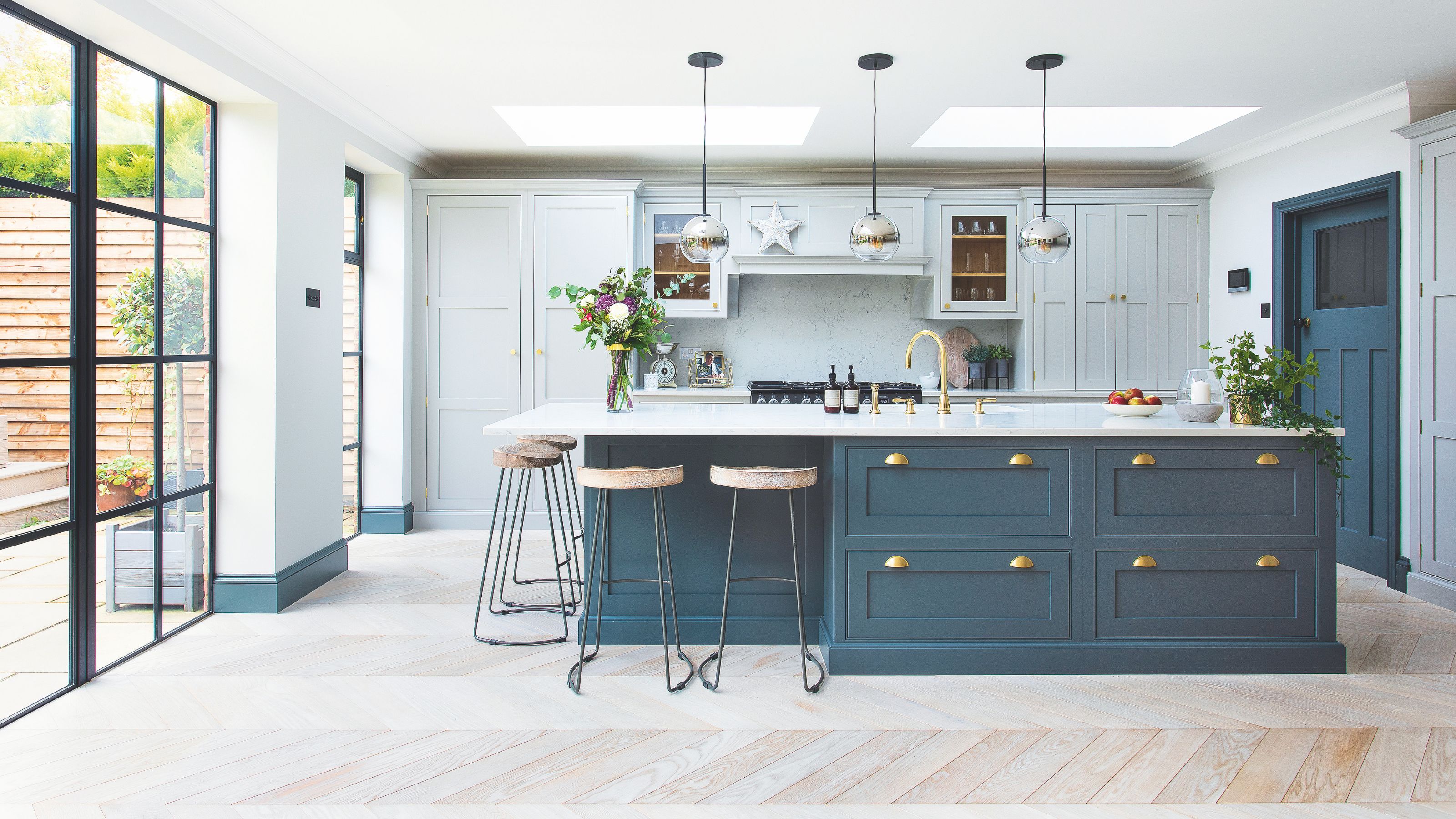
- 1. Choose a deep navy palette
- 2. Embrace a country aesthetic
- 3. Make a splash with patterned tiles
- 4. Pair with classic cream
- 5. Style with natural wood tones
- 6. Go bold with electric blue cabinetry
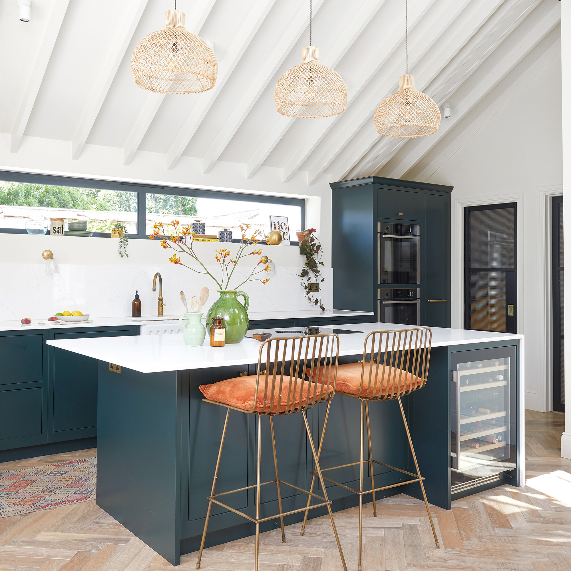
- 7. Make a feature with a blue island
- 8. Create impact with teal and stone tones
- 9. Choose a calming tone for a busy kitchen
- 10. Give grey a lift
- FAQs
When it comes to blue kitchen ideas, navy has been riding high in the style stakes for a while. Yet it's not the only shade of blue that can create an impact in your kitchen. There's a spectrum of alternative blues to choose, if navy is too dark for you to embrace.
From the palest sky-blue, duck-egg or pretty periwinkle, through to teal, aqua-marine and the punchier electric hues, there are plenty of shades to consider to dip your toe into this invigorating kitchen colour scheme.
'We all know that kitchens can sometimes be stressful places. That’s what makes blue such a good spectrum of colour to use for any room where food is prepared. It's tranquil, calming and most importantly always stylish,' says Susie Spence, Trend Expert and Head of Interiors at B&Q.
Article continues belowBlue kitchen ideas
There's no denying that blue units look beautiful and make a bold statement, but it's not always necessary to change everything. Of course, if it's time for a new kitchen that's exciting. Yet there are other ways to introduce shades of blue that don't entail huge expense. 'Painting your kitchen cabinets is an easy and cost-effective way of upgrading your kitchen without much effort,' says Susie Spence, Trend Expert and Head of Interiors at B&Q.
It's easy enough to find out how to paint kitchen cabinets or tile a splashback too, if you want to be canny with your cash or prefer to update than replace.
1. Choose a deep navy palette
There are so many shades of blue to choose from and one of the most popular is rich navy. Opting for a darker shade of blue doesn't need to feel daunting; it's surprisingly simple to decorate with and creates a cosy scheme full of depth.
Navy kitchen ideas have been popular for some years now but we don't see the trend going anywhere. Whether you have a small kitchen which would benefit from a cosy feel or a large space that can handle a strong colour, navy is a timeless choice.
Sign up to our newsletter for style inspiration, real homes, project and garden advice and shopping know-how
2. Embrace a country aesthetic
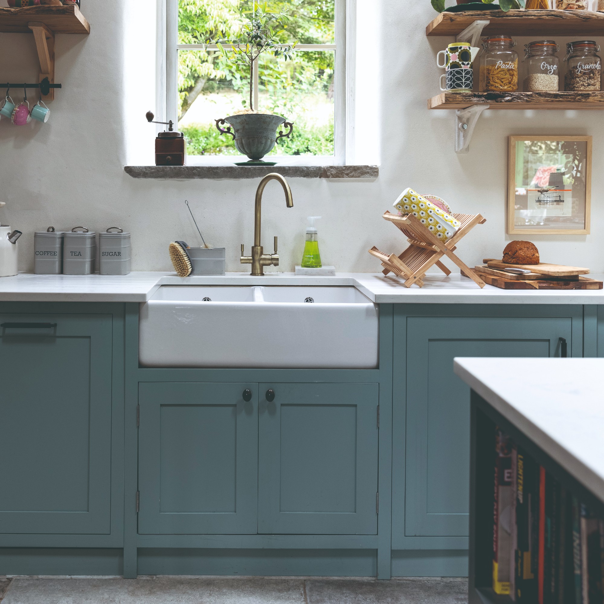
On the other end of the spectrum sits pale blue. Typically, pale pastel shades were commonly seen in traditional kitchen ideas, but the sky blue shade has been big in 2025 and heading into 2026.
Pair a sky blue shade with Shaker cabinetry, a classic Belfast sink and lots of wood surfaces for a country kitchen idea that will make your cooking space the true heart of your home.
3. Make a splash with patterned tiles
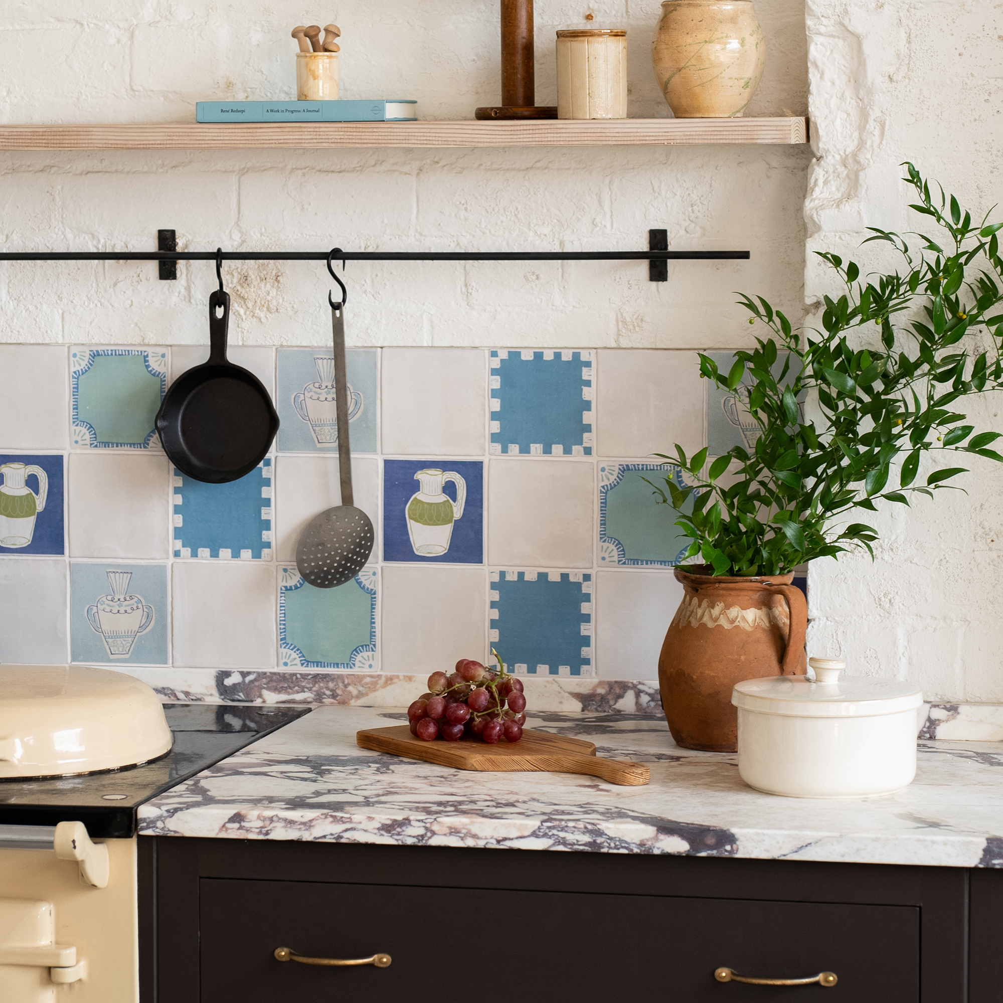
If you've already scrolled through white kitchen ideas and settled on neutral cabinetry, give it a lift with pretty patterned tiles and accessories. A combination blue splashback is a perfect partner to white worktops or lime-washed cabinetry. With traditional fittings, this colour combo can result in a feeling of heartwarming nostalgia.
'Patterned tiles are back in a big way and it’s easy to see why. They provide an easy way to add interest and colour to a kitchen without being overpowering,' says Colin Lincoln-Evans, Buyer, Tile Mountain. 'Whether you create a simple splashback behind a sink or tile above your kitchen cabinetry remember that a little pattern can go a long way.'
'Smaller kitchens can easily be overpowered by intricate patterns. So choose carefully and look for one that will create a focal point without dominating the space.'
4. Pair with classic cream
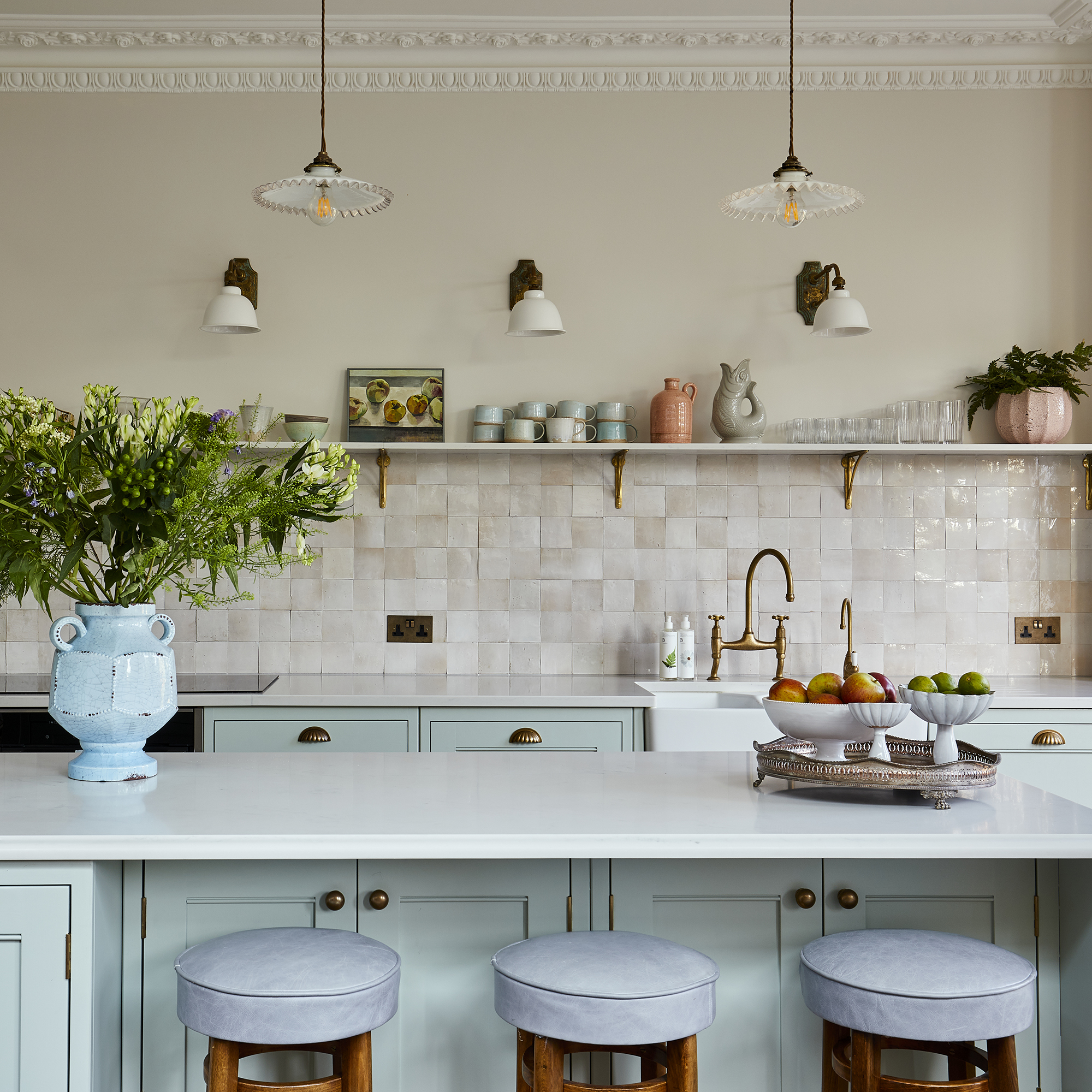
Using colour in a kitchen can sometimes feel overwhelming, particularly if you're trying to make a small kitchen feel bigger. However, adding visual interest through a light colour such as blue will actually help to add dimension into the space.
To increase the amount of natural light, consider pairing with cream walls and accessories. White may look too stark, whereas a warm off-white shade will perfectly contrast cool-toned pale blue.
5. Style with natural wood tones
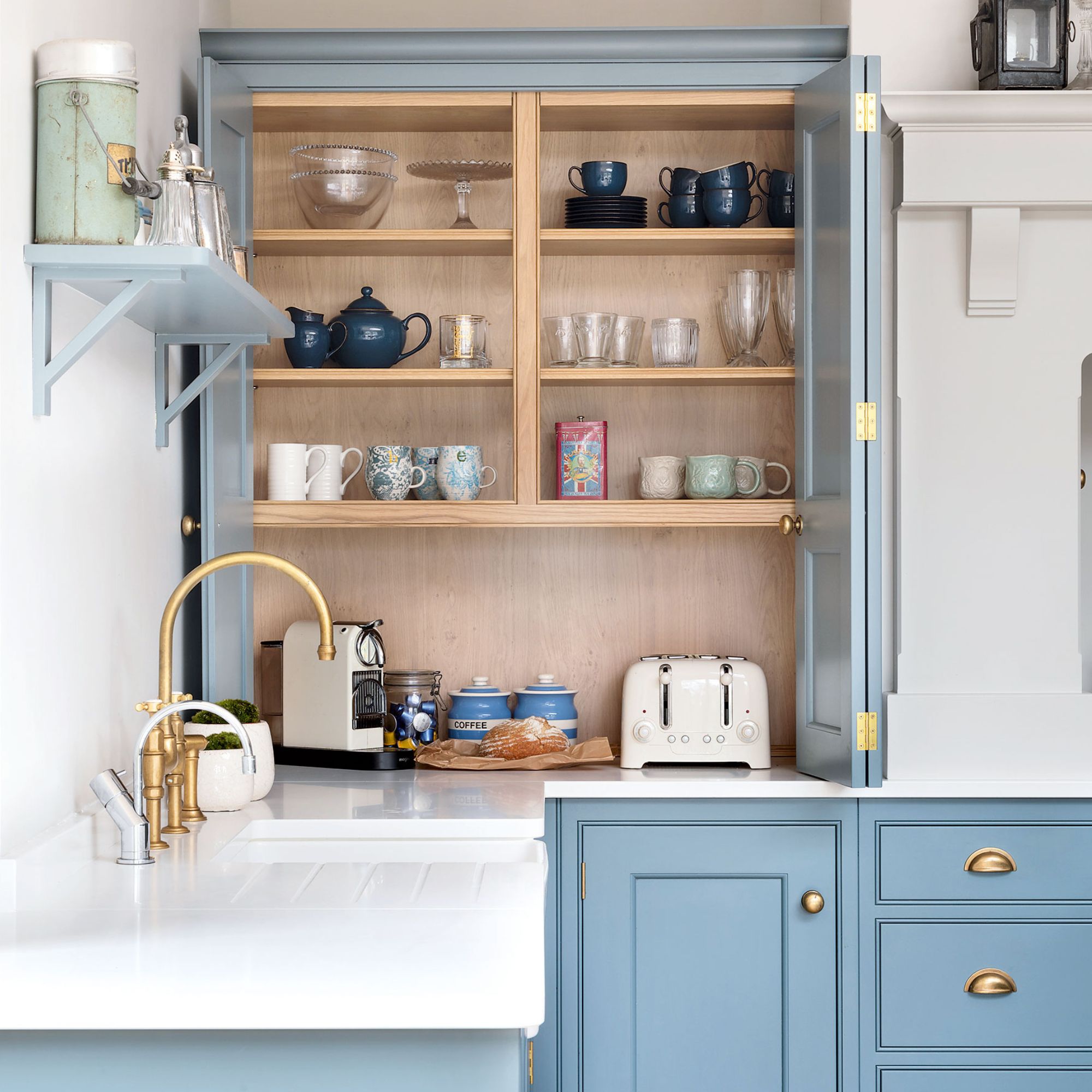
Most shades of blue have a cool undertone, making them perfect for south-facing rooms but a little on the cold side if you have a north-facing kitchen. An easy way to counteract this and bring in more warmth is to opt for lots of natural wood features in your cooking space.
Whether this is a worktop or cupboard interiors, as shown above, the effect is an inviting family kitchen that will feel like a joy to spend time in.
6. Go bold with electric blue cabinetry
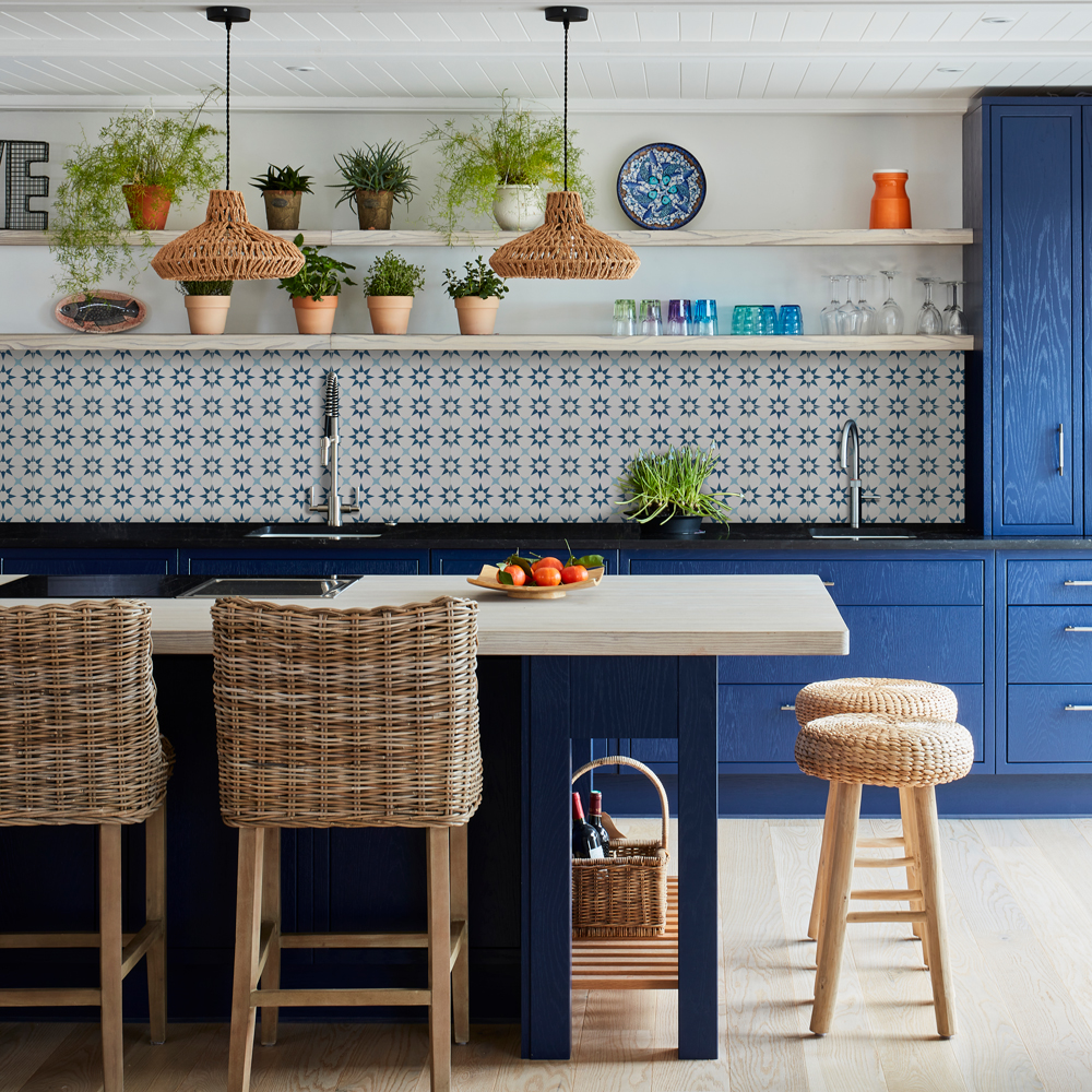
If you want something unique, choose a company that can colour match your favourite shades, such as Better Kitchens. Or create them yourself by painting existing units. Once you've found the best paint for kitchen cabinets, you can let your imagination run riot with the colour. A bold shade, like electric blue, will instantly inject personality into your space, particularly when coordinate with vibrant tiles.
Just be sure it's a colour you can live with, it's not called electric blue for nothing. It gives your senses a jolt, so it's best suited to kitchens that aren't open plan.
7. Make a feature with a blue island
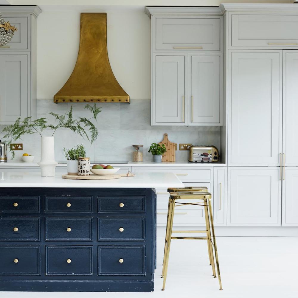
Colour doesn't have to take over all of your kitchen cabinetry. Break up a big space or a long run of white units with an island in a striking shade of blue. Where an all-navy kitchen idea might feel too much, picking out just an island in the more dominant shade allows you to embrace colour without overwhelming the space.
Keep the scheme cohesive with worktops in the same material across all of the base cabinets and choose a finish that complements both colours, like this sleek marble example. Introducing bar stools with seats in the same metal finish as the door handles and fixtures will tie the scheme together.
8. Create impact with teal and stone tones
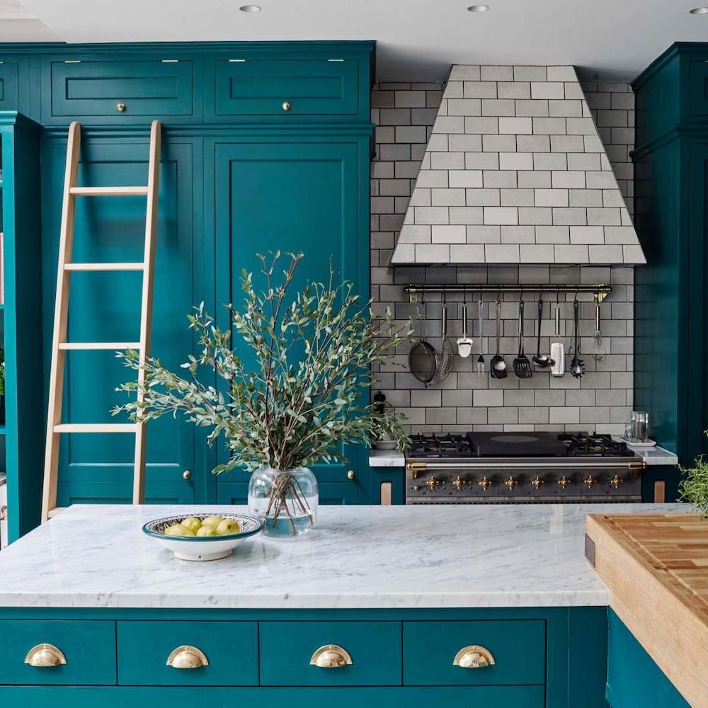
This teal kitchen is a show stopper, with its bold, floor-to-ceiling painted cabinetry. To balance the strong blue-green shade, the colour is broken up with large areas of pale stone grey tones through the marble worktops, the tiled splashback and cooker hood. The different tones in the tiles and the work surface bring in a natural feel that adds subtle movement, which you wouldn't see with a block of flat colour.
9. Choose a calming tone for a busy kitchen
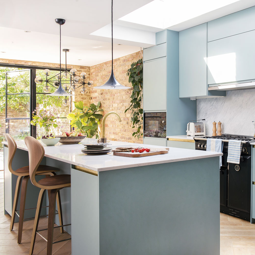
A gentle tone of blue-green that's warm in winter and fresh in summer is ideal for a kitchen where you want to spend all your time. Pale blue is also a timeless shade that's easy to live with and can help bring calm to the chaos of family mealtimes.
Team the cabinets with simple white worktops and smart brass door handles to enhance the colour.
10. Give grey a lift
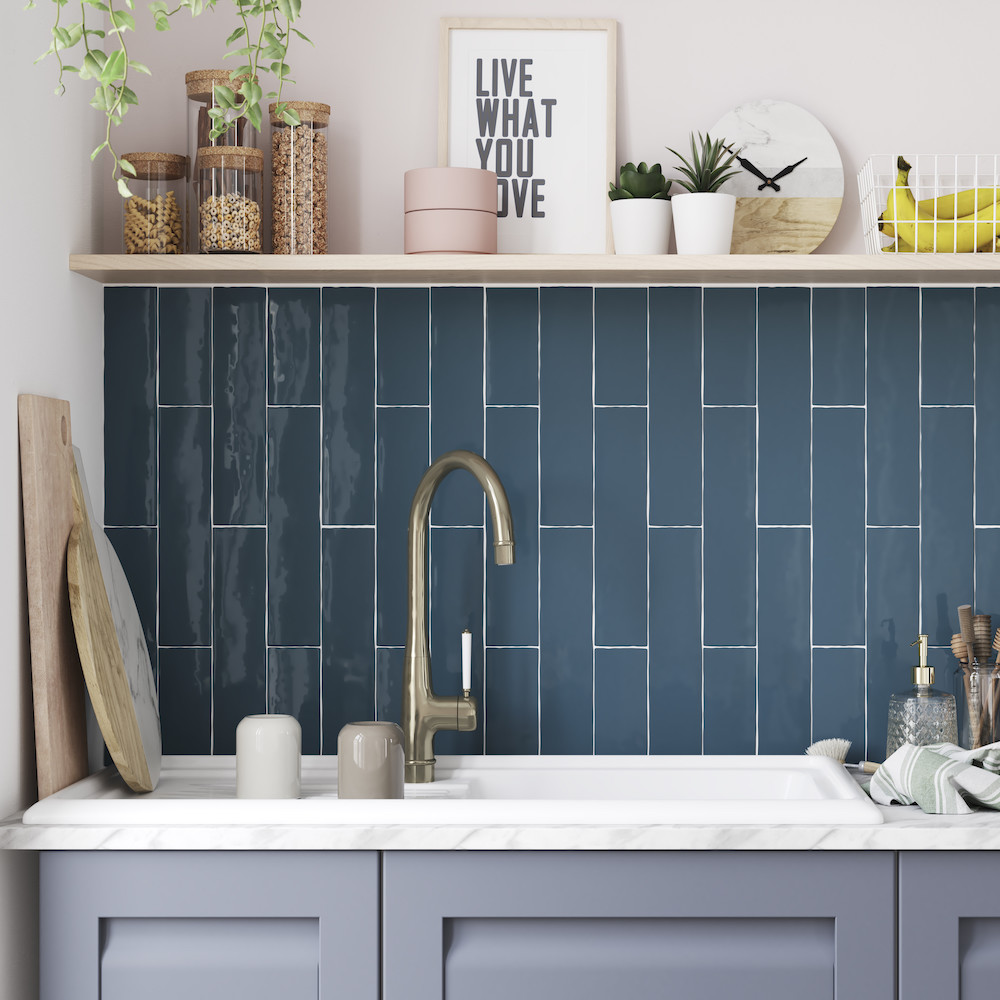
Grey kitchen ideas have been popular for a while, yet as glorious as these smoky toned cook zones are, they can look a little drab without an accent shade. Give grey cabinets a lift by teaming them with blue tiles; ideally a shade with a grey-ish undertone. These vernisse blue tiles from B&Q work a treat. By laying them in a vertical pattern, (rather than the traditional horizontal style we're used to), makes them feel instantly modern.
FAQs
What shade of blue is good for kitchen cabinets?
'Navy is a classic shade for kitchen cabinets, it’s bold and sophisticated,' says Richard Ferguson, Kitchen Buying Manager, Homebase. 'However, pastel blue is becoming more popular. It’s a great choice for someone who’s looking to add a splash of colour to brighten up their home.'
Susie Spence, Trend Expert and Head of Interiors at B&Q adds, 'Cerulean will transform your kitchen into a coastal paradise, whereas cobalt will create a more modern, energising look. If you are looking for a sophisticated and contemporary feel, darker blues should be your go to.'
What colour walls go with a blue kitchen?
It depends on the shade of blue, so look at the undertones. They might be grey, green or yellow, so use that as a pointer. If in doubt, you can't go wrong with white walls.
'Two-tone decorating in the kitchen is a trend that’s continuing. Teaming bold colours for the cabinets with subdued walls in a complementary or contrasting colour and this works really well with blue kitchens,' says Richard Ferguson, Kitchens Buying Manager, Homebase.
How do you decorate a blue kitchen?
'Make sure to look for paint that is washable and scrubbable,' says Susie Spence, Trend Expert and Head of Interiors at B&Q. 'If you're looking to make an impact with blue, position it alongside neutral countertops to really make the colour pop.'
'Tones of grey and white with darker blues are perfect for creating those cosy moments. Lighter shades of blue, such as sky blue, can work perfectly with greys, whites, or blacks, and create a more vibrant feel.'
Jacky Parker is a freelance interiors & lifestyle journalist, specialising in modern interiors, design and eco living. She has written for Future’s interior magazines and websites including Livingetc, Homes & Gardens, Country Homes & Interiors and Ideal Home for over fifteen years, both as a freelance contributor and inhouse, with stints as Acting Digital Editor, Livingetc and Acting Style Content Editor, Country Homes & Interiors. Her work also features in national and international publications including Sunday Times Style, Telegraph Stella, The Guardian, Grand Designs, House Beautiful and more. With years of experience in the industry Jacky is privy to the insider view and the go-to places for interior inspiration and design-savvy décor.
- Holly CockburnContent Editor