Should you paint your downstairs toilet a bright colour? Experts reveal what to avoid to create a pretty space
The do's and don'ts of adding a burst of colour to your cloakroom, according to experts

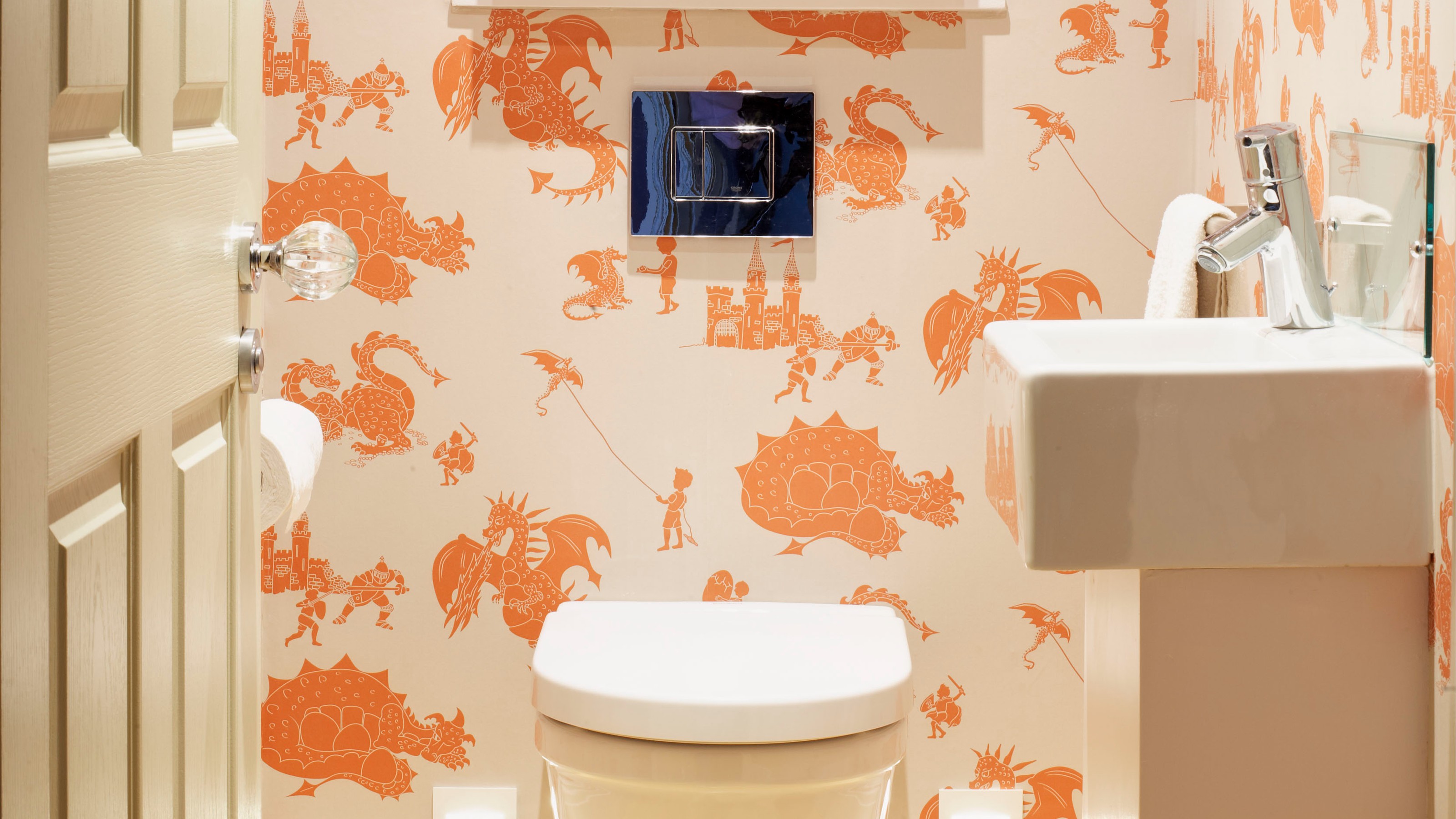
Despite its petite size, your downstairs toilet doesn’t need to be boring or overlooked. What is often an afterthought of a space can actually be a wonderful opportunity to experiment and impress your guests in the process. But to do that, should you paint your downstairs toilet a bright colour?
While it’s certainly a bold cloakroom idea, it could also transform the space into a pretty, intriguing and comfortable place to be. If executed correctly, of course.
In the first episode of Farrow & Ball’s recently launched podcast, The Chromologist, retail expert and founder of her own creative agency, Mary Portas speaks about her statement downstairs toilet painted bright orange paired with a bold floral wallpaper which contrasts the rest of her earthy-coloured home. Mary reflects on her love of beautiful hotel loos and how she wanted to recreate that effect - and it’s clearly worked as it’s apparently every guest’s favourite room to be in. Including Farrow & Ball’s own brand ambassador, Patrick O’Donnell.
So if you want a piece of the daring Mary Portas effect, then this is what our experts recommend when it comes to covering your cloakroom in vibrant, statement shades.
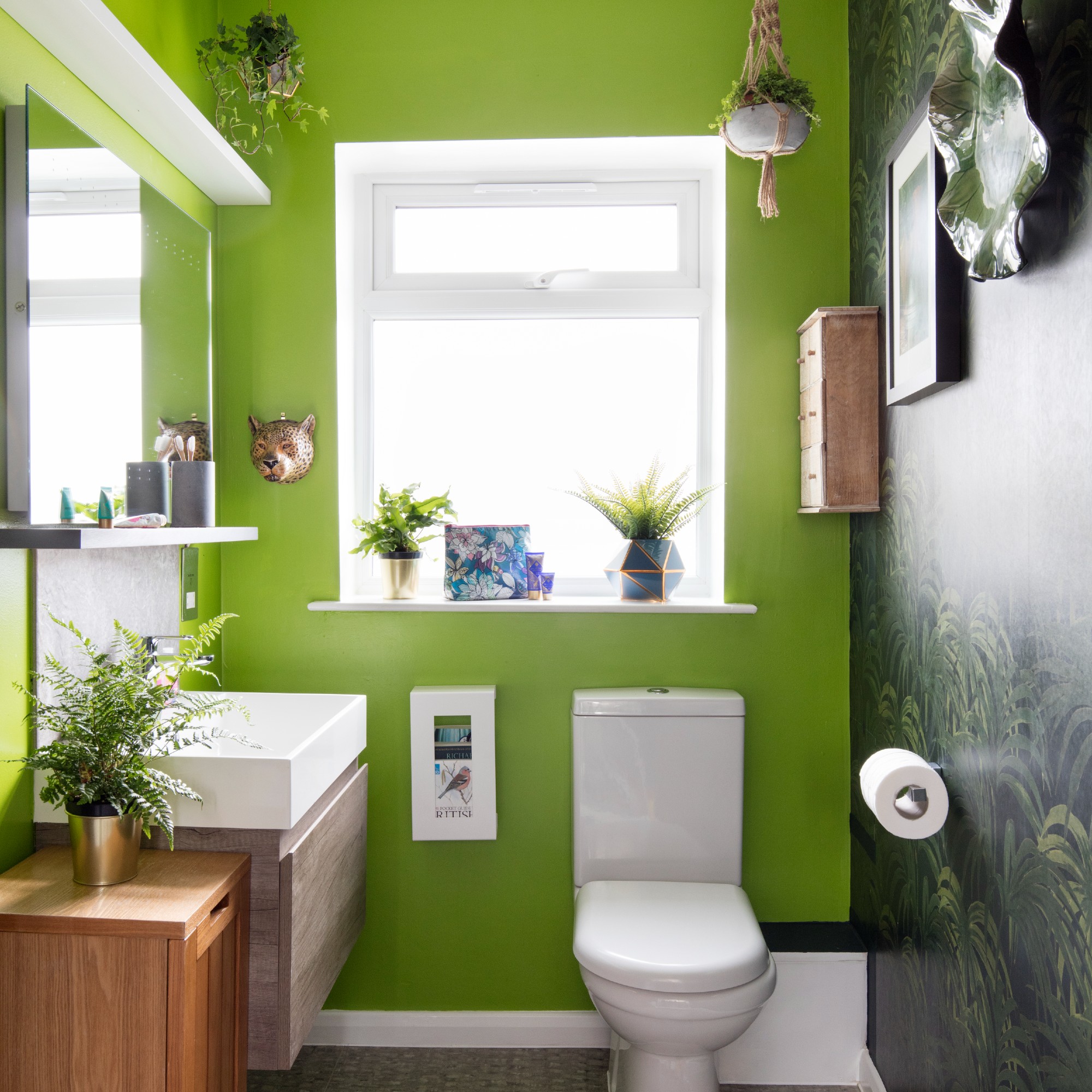
Should you paint your downstairs toilet a bright colour?
Even though bathroom colour schemes tend to be rather tame and neutral as it is seen as a space to relax, that doesn’t mean you have to keep with this tradition. And in fact, experts say bathrooms and toilets are the perfect place to go big and go bold.
‘A bathroom is the perfect place to experiment with bold colours and fun patterns, allowing you to opt for something that you may not be brave enough to add to another space in the home,’ says Chelsea Clark, head of brand at Lust Home. ‘Painting a loo in a bright colour is a great way to add some colour to a typically boring bathroom feature and make a statement.’
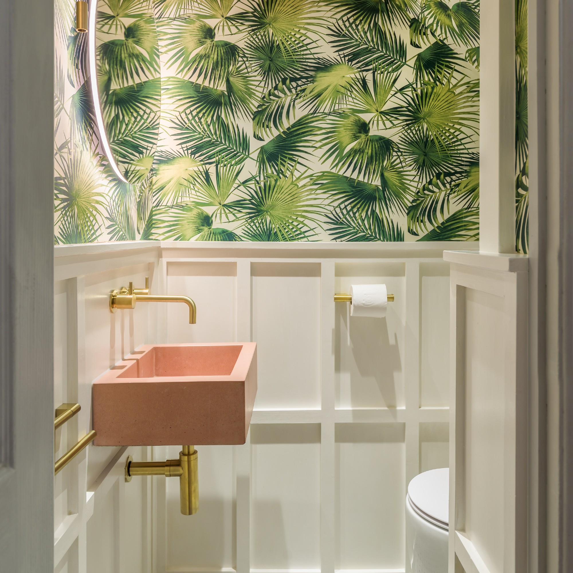
And similarly to Mary Portas, you don’t have to stick to paint as there are plenty of downstairs toilet wallpaper ideas to explore.
Sign up to our newsletter for style inspiration, real homes, project and garden advice and shopping know-how
‘Maximalism leans into the more is more mentality, embracing bold use of colour, pattern and layering that celebrates excess,’ says Grazzie Wilson, head of creative at Ca’ Pietra. ‘As there is lots going on, cloakrooms lend themselves to being a space to try out the look as it’s a smaller space to get creative in. If you do want to be brave and try something different, this is a great room to try it in.’
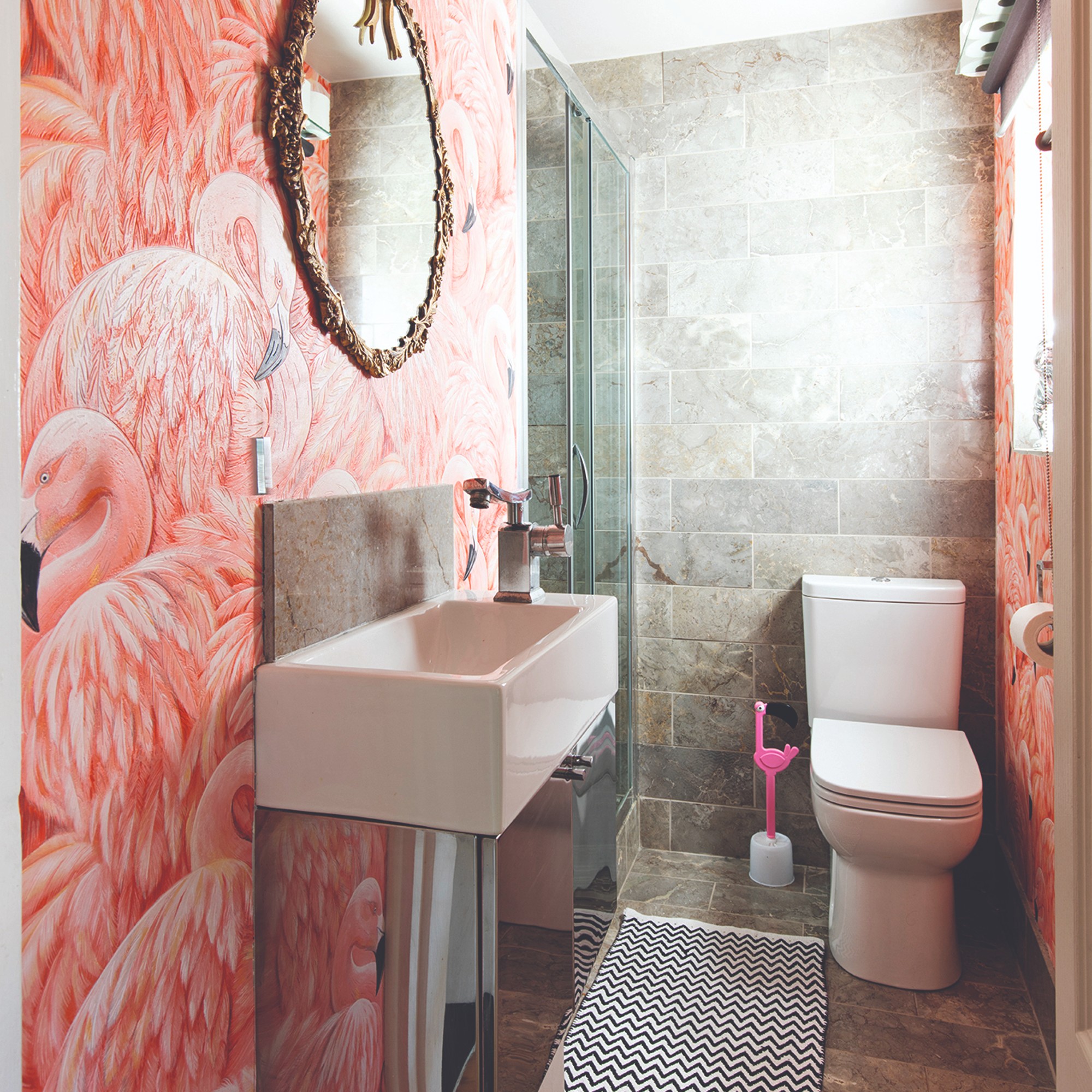
What colour is best for a small downstairs toilet?
If you’re looking for the best colour to paint your downstairs bathroom, there isn’t one size fits all as it depends on the overall style and feel you’re looking to achieve. But our experts do come with advice.
‘While there isn’t a right or wrong answer to what colours to choose, and nearly every colour can work in a downstairs loo as it is such a small space, you can be creative,’ says Barrie Cutchie, design director at BC Designs. ‘If you do want to add in more than one bright shade or colour, it is really important to study the colour wheel to see what works together and what should be avoided.’
Chelsea adds another helpful tip, ‘When choosing your colour, you want to consider the existing fixtures in your bathroom first. When choosing a colour to paint anywhere, it’s important to consider the light and how the colour will position in the room. Before making a final decision, we suggest using testers to consider how a colour looks throughout the day, as the light changes or you introduce artificial light to an area.’
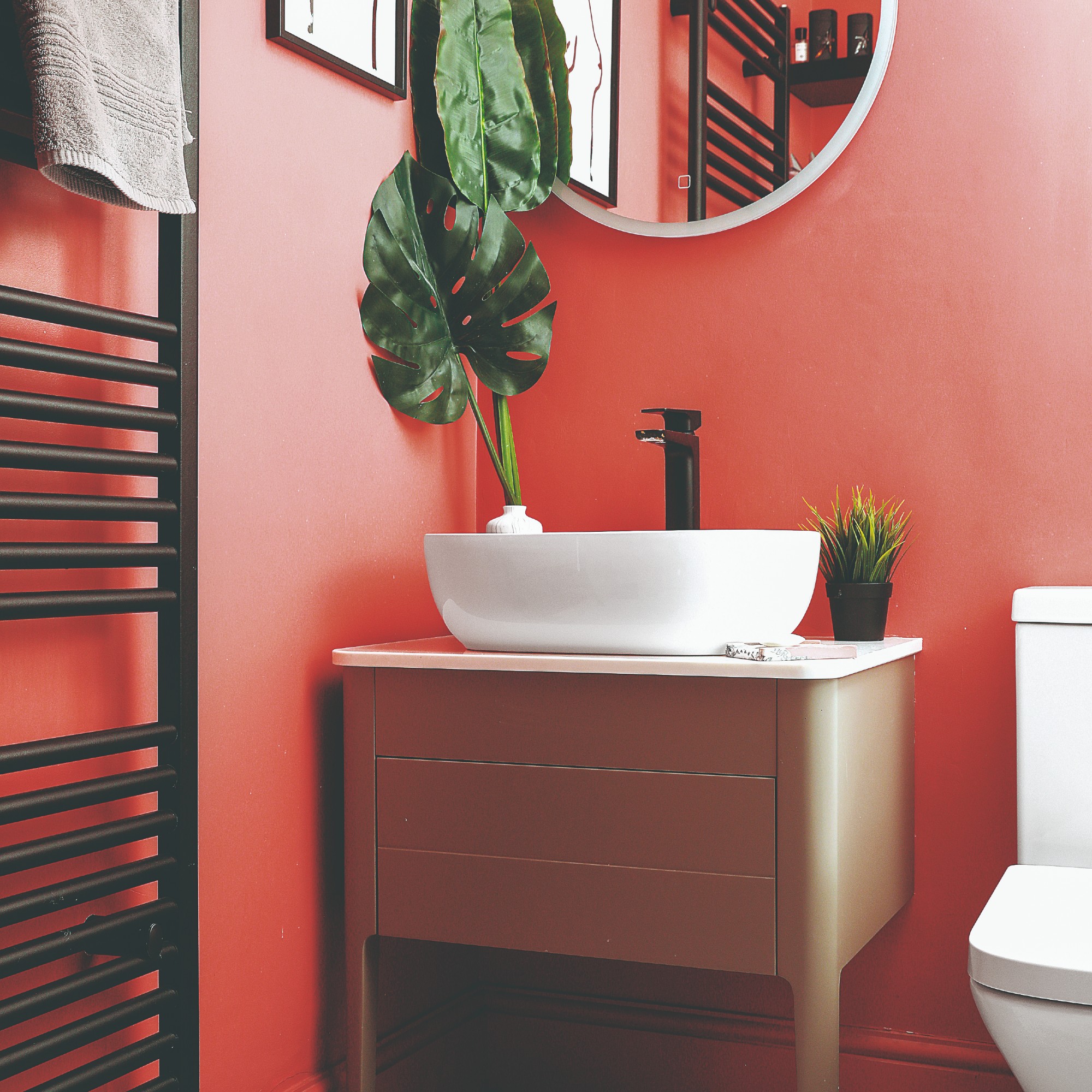
Sarah Lloyd, paint & interiors expert from Valspar Paint, has more specific colour advice. ‘Bolder colours, such as orange paint might seem like a scary option for a bathroom, but a peachy shade is by no means threatening or garish. In fact, it is quite the opposite. Orange wall paint can add a warm, inviting and almost Mediterranean-like feel to the space. Layer with a small colourful print or piece of artwork to make the room feel harmonious.’
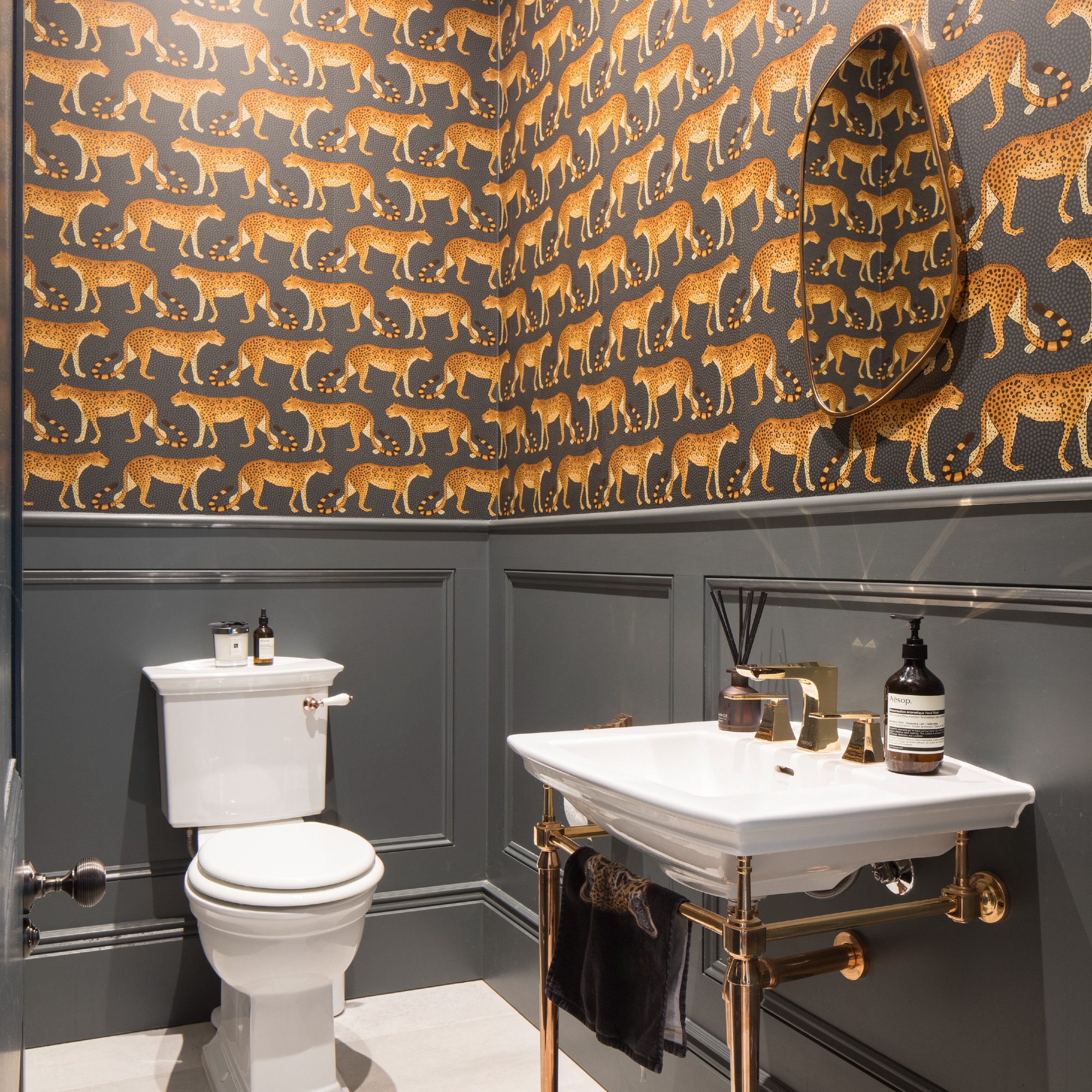
Another shade that she recommends which might not be bright but certainly is bold is black. ‘If you are wanting to create something more intimate and cosier, then darks and patterns can help achieve this. Black is a bold and striking colour that can create a luxurious and sophisticated feel in the bathroom, especially when paired with gold or brass accents.’
What colour should you avoid for a downstairs toilet?
The one colour that Sarah would steer clear of when redoing your cloakroom is red. ‘Red is a distracting colour and is especially bad in small areas where it will completely take over the focus of the room. If you’re insistent on including red, have some very small red accents and make sure it blends in well with the decor. Red soft furnishings, such as towels or bath matts would look good. Tonal reds like rustic reds would also be better than a traditional bold red,’ she concludes.
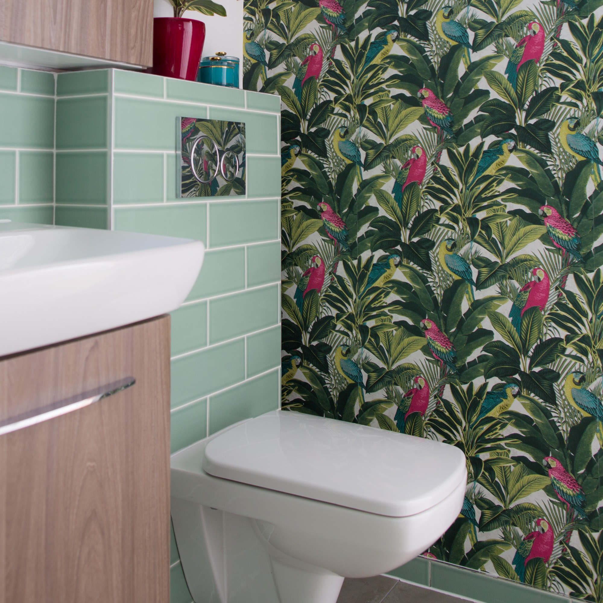
The bottom line is that if you’re wanting to get creative and paint (or wallpaper) your downstairs toilet in bright colours then you absolutely can. But if bold shades are not your style, then sticking with neutrals works just as well.

Sara Hesikova has been Room Decor Editor at Ideal Home since June 2024, starting at the title as a News Writer in July 2023. She is now also the Ideal Home Certified Expert on Furniture, and so far has tried over 300 different sofas.
Graduating from London College of Fashion with a bachelor’s degree in fashion journalism in 2016, she got her start in niche fashion and lifestyle magazines like Glass and Alvar as a writer and editor before making the leap into interiors, working with the likes of 91 Magazine and copywriting for luxury bed linen brand Yves Delorme among others.