Colours that go with yellow and how to use them in every room
Love a bit of citrus, mustard or sunshine yellow? Discover their perfect colour pairings so you can design your dream scheme

Sign up to our newsletter for style inspiration, real homes, project and garden advice and shopping know-how
You are now subscribed
Your newsletter sign-up was successful
We've all seen a colour wheel, but when you have a favourite shade, there's nothing better than a cheat sheet. We've rounded up some of the best colours that go with yellow so you can decorate with colour in confidence.
Playing with colour combinations is one of the most fun and creative aspects of design. That said, it can seem scary to make bold decisions.
Make things easier for yourself by first focusing on your primary colour. No, we don't mean only red, blue or yellow - simply the shade you want to take precedence in the space. Then work with that to find your secondary colour, which you want to complement the first. From there you'll discover that everything starts to fall into place.
Article continues belowConsider this your go-to guide for helping you work out which secondary colours you can pair with yellow. While all of these go with the yellow in a broader sense, we've also broken down which specific tones work best. We've also provided tips and ideas for how to use these colour combos in various rooms of your house, so you can shout your favourite shades from the rafters!
Colours that go with yellow
If you know how to use the colour wheel, then you'll have at least a vague understanding of how to pair colours. Take things to the next level of expertise by discovering more specific colour combinations that show off the most beautiful shades of yellow.
1. Aquamarine
This fresh blue-green shade looks amazing paired with bold, sunny yellows for a joyful mix.
Begin with a mid-tone aqua. Not as dark as a teal, but still sitting on the fence between blue and green, aquamarine has an undertone of black yet can still be considered warm. Calming and restorative, it’s great for social spaces, as well as more private bedrooms or snugs.
Sign up to our newsletter for style inspiration, real homes, project and garden advice and shopping know-how
Next you'll want o inject a splash of sunshine Citrus yellow conjures up the sights, smells and tastes of the Mediterranean and it’s this warmth and freshness that gives it energy. Verging on the side of lime, its green undertones pair beautifully with the green tones of aqua, making this a perfect match.
A heavily patterned wallpaper featuring a combination of these shades will break up solid blocks of wall colour, and act as a detailed backdrop. Creamy whites on furniture or on the ceiling will balance the vibrancy of these hues and bring some serenity.
Look to add in some greenery. Whether faux or fresh, using houseplants or stems of leafy eucalyptus as decor will capture that energy and sense of life in your space. Encouraging wellbeing, plants will pop against the citrus yellow, and pick out the greener tones of the aqua.
Use it in a kitchen
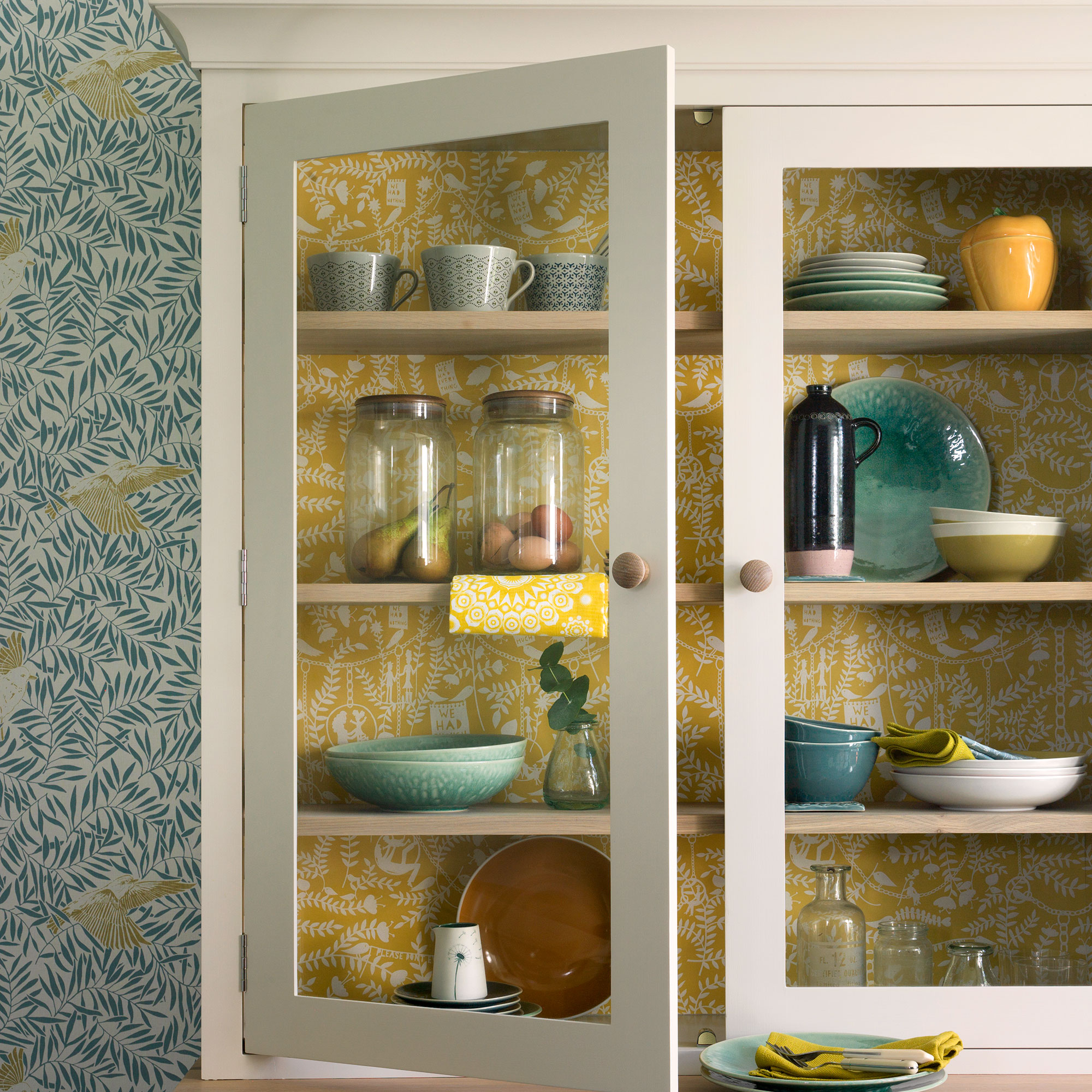
Papering the inside of a dresser or built-in shelving allows your tableware and glassware to become more of a display.
Choose a design with a fairly small-scale pattern so that the solidness of your ceramics take centre stage.
Use it in a dining room
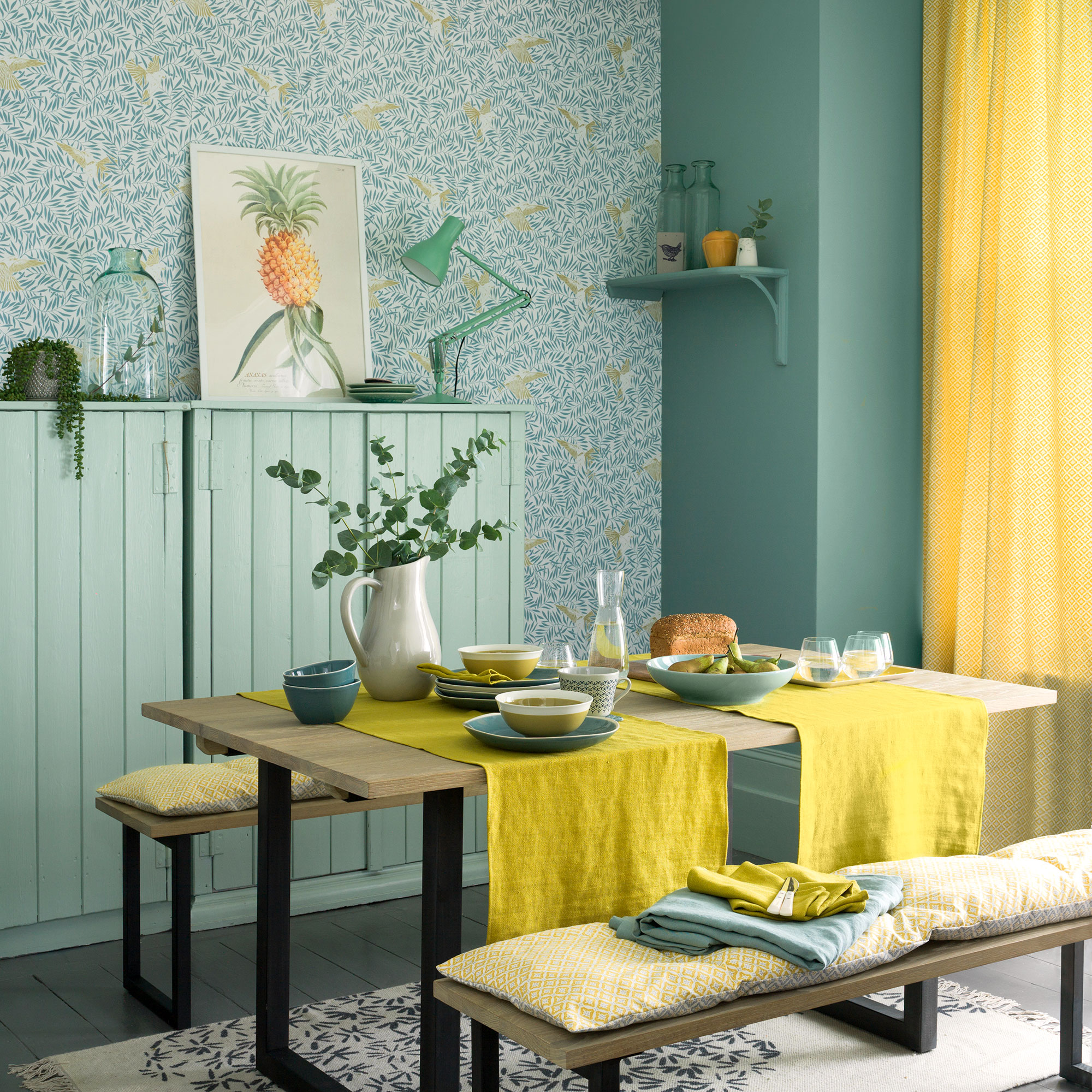
Table linen and crockery make for the perfect way to pair these bold colours in a social setting.
While a cloth covering the entire table could be a bit overpowering for the space, runners allow the grain of a natural wood table to be seen and offer some texture to the room.
2. Charcoal
Of all the colours that go with yellow, grey is certainly having a moment. Mix contemporary charcoal with warm and cheerful mustard for an uplifting and fresh colour combo.
Start by finding the perfect yellow. While yellows look lovely in all forms, to make this scheme both modern and warm, you’ll want to stick to mustards, deep golds and ochres. Paler tones have a tendency to feel wishy-washy and lack impact next to dark grey.
Next, add in your charcoal tones. The deepest greys create a bold contrast to mellow yellows. Treat mustard as your dominant colour. Charcoal is most effective here when used in moderation – think sleek trimmings, accents and accessories.
To really up the ante, work in slices of bright white. Either add to sections of the walls and floor, or include in decorative accessories to give breathing space between the mustard and charcoal tones.
The classic combination of greys and yellows was really popular in the 1960s and 1970s. Back then, it was typically with buttercup and smoke tones. For a contemporary upgrade, use bold, retro graphics in the deeper, more daring variations of these colours.
Use it in a home office
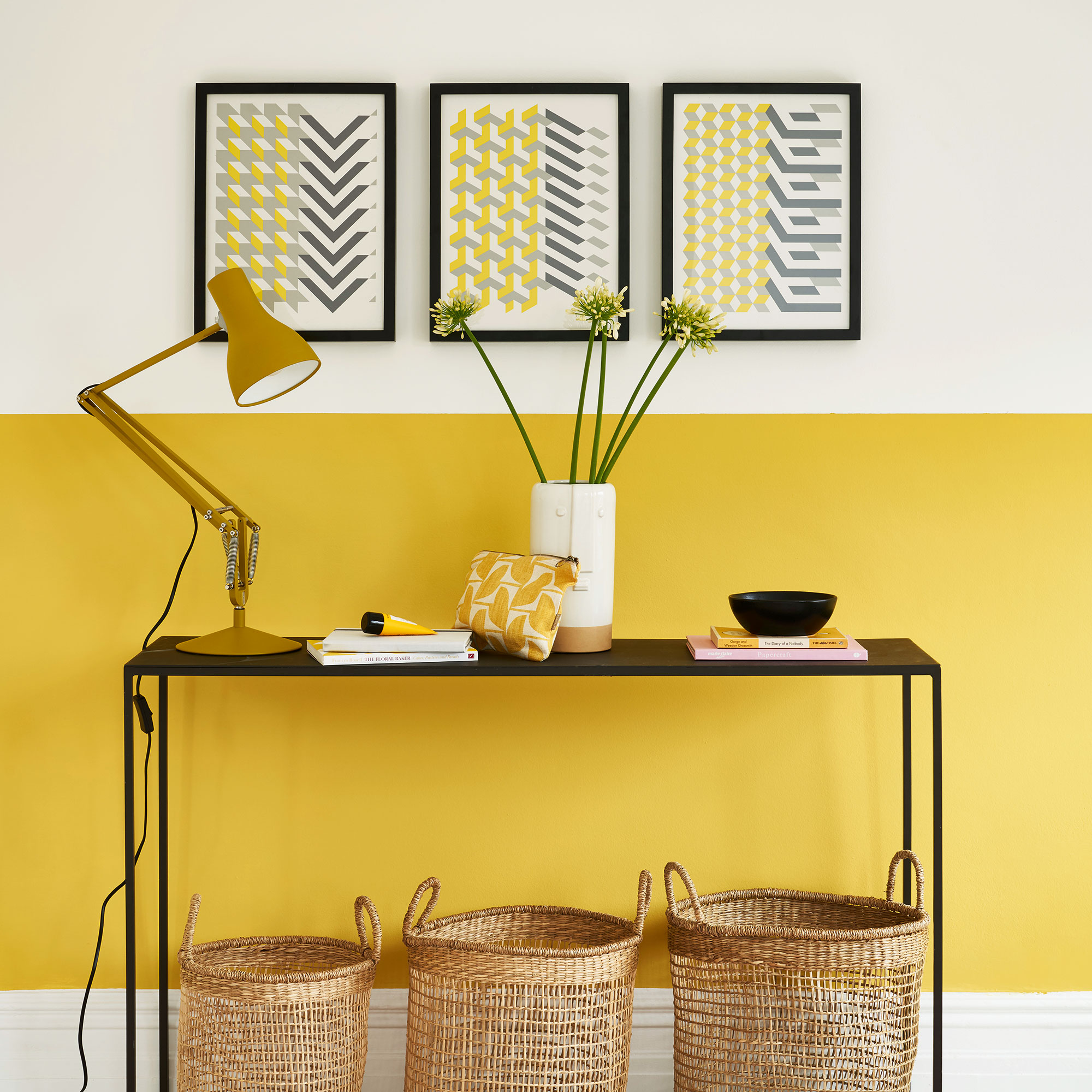
In an office you need both colour to add joy to the working day, as well as calming whites to keep you focused.
Including furniture with sleek charcoal lines will add that contemporary smart, sophisticated touch. These tips also work for yellow and grey living room ideas.
Use it in a a kitchen
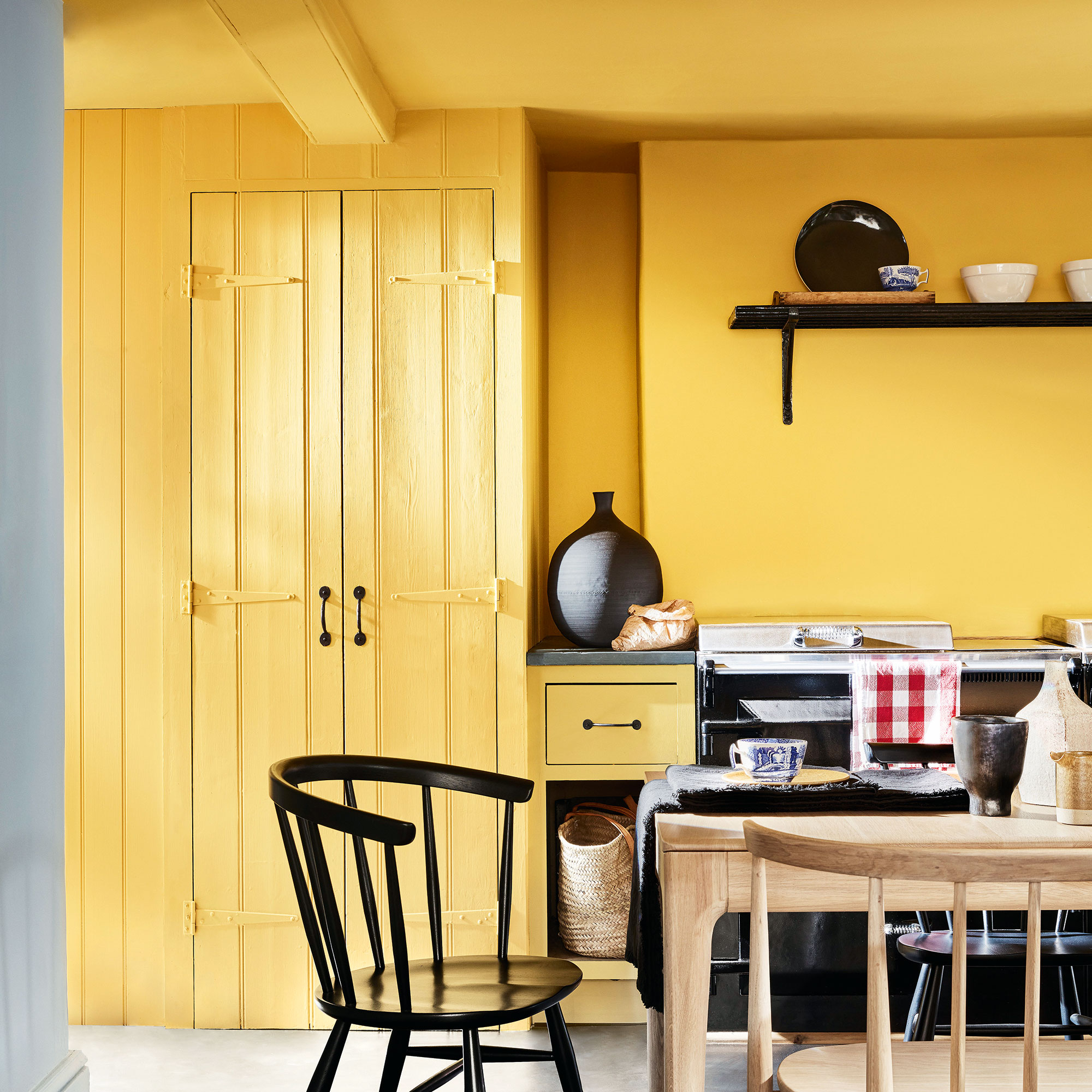
The enlivening power of yellow makes it a perfect choice for kitchens – helping to boost energy levels even on the dullest of mornings.
Cover walls and cabinetry in warm yellow, like Giallo by Little Greene, and use deep greys on hardware and accessories to create a smart and tailored finish
3. Terracotta
Escape to warmer climes by pairing the sun-baked hues of terracotta and ochre.
You'll want to have holiday vibes in mind here. Deep terracotta conjures images of Mediterranean roof tiles and aged ceramic pots lined up on a sun-drenched terrace. The word terracotta literally translates as ‘baked earth’, making it the perfect colour choice for adding warmth to a room scheme.
When considering colours that go with yellow, for terracotta you'll want to look on the deeper side. Ochre is a grown-up choice with a mellow quality when compared to its perkier, more youthful counterparts such as lemon, buttercup or canary. This on-trend hue is a harmonious accent across a variety of schemes from retro to ultra-modern.
Terracotta and ochre are a colour combination made in heaven as they are both derived from natural clay pigments. The grounded nature of reddy-brown terracotta underpins the vibrancy of golden ochre, creating balance within a scheme.
Elevate this earthy pairing with luxurious shapes and textures. Pick a curvaceous sofa in plush ochre velvet featuring classic turned-wood feet. Wall panelling has a traditional look that’s brought up to date when painted in this earthy colourway.
Use it in a study
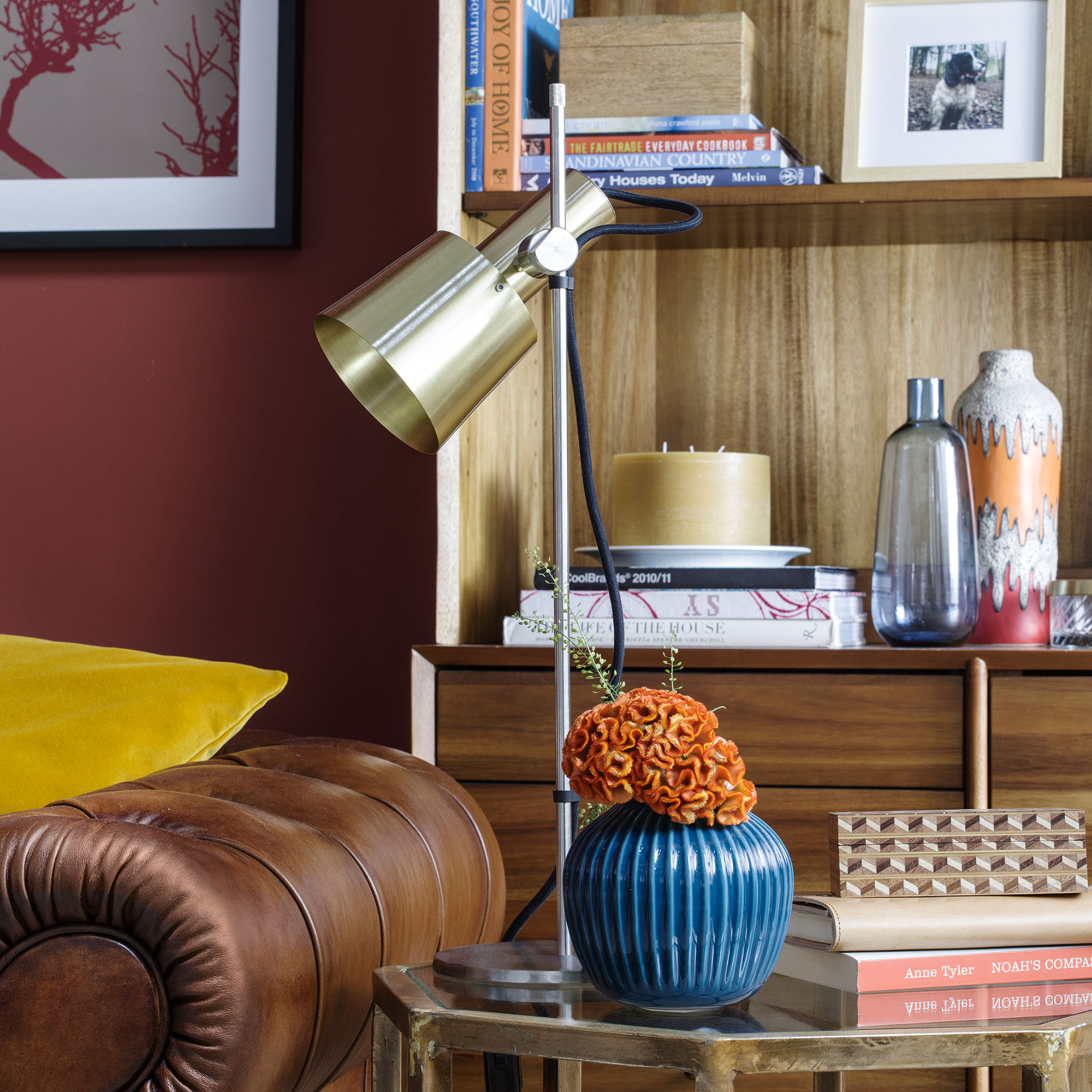
Create a laid-back drawing room vibe in a home office or study area.
Pair a rich leather Chesterfield sofa or armchair with soft textiles in warm and uplifting ochres. Touches of metallic details will bring the two colours together, highlighting this perfect pairing.
Use it in a living room
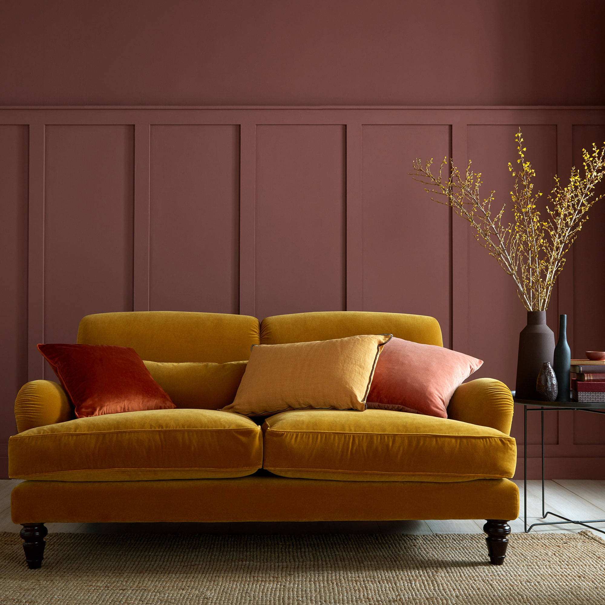
If using a dark colour on walls, like Nutkin by Earthborn, then choose a lighter surface on floors to avoid the room feeling too enclosed.
A pale wood laminate or vinyl is a good contemporary choice, teamed with a natural jute rug for added texture. The jute will also pick out the golden tones of your ochre touches.
4. Blossom pink
Embrace floral tones by pairing buttercup yellows with blossom pinks.
It's important to work with your light when selecting the right yellow for your walls. Yellow automatically invites light into your space. Even darker rooms become warm and welcoming with a touch of yellow. That said, make sure you use your natural light to select the right colour for the mood you want to create.
In north-facing rooms, you want to bounce light around, so stick to ‘true’ yellows, steering clear of any with a green or blue undertone. In south-facing rooms light becomes warmer, meaning deep yellows will be intensified, so it depends how warm or bright you want to make your space.
Of all the colours that go with yellow, touches of pretty pinks have the ability to tone down the scheme without losing any of its fresh and cheerful nature. Stick to beige or brown-based pinks for a grown-up springtime vibe. You don’t need much to add impact; even a few key items picked out in pinks will do the trick.
Keep things on the modern side by offering breathing room for the pastels with cool contemporary touches. Think blond woods, fresh green houseplants and graphic prints. Slices of strong black will set the scheme off to perfection
Use it in a kitchen
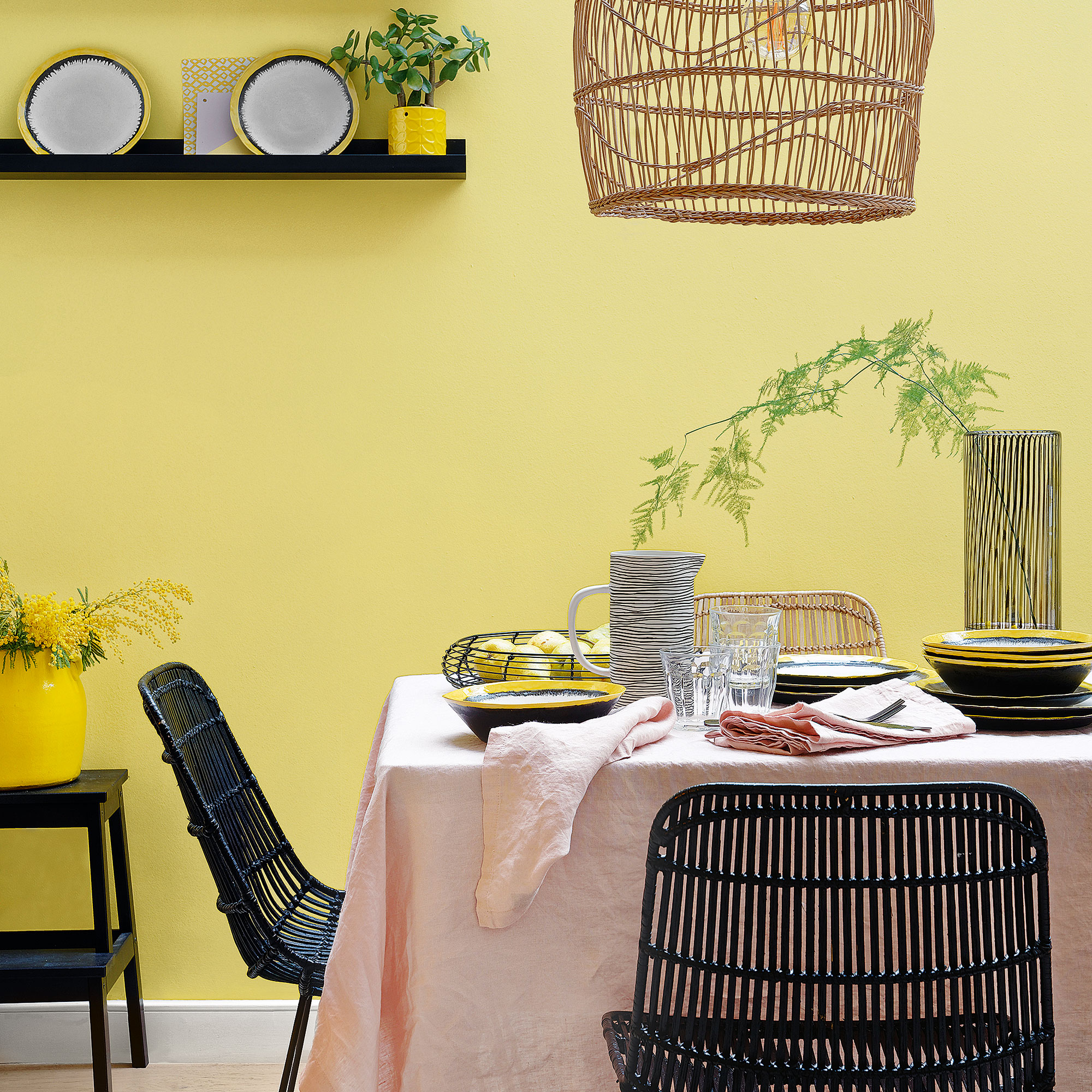
Paler yellows are perfect in a kitchen as you won’t get tired of them – always important to bear in mind with rooms you spend lots of time in.
Black details create a bold look, although you could opt for softer white or grey. Bring in pinks on linens rather than paint for a more subtle scheme.
Use it in a bedroom
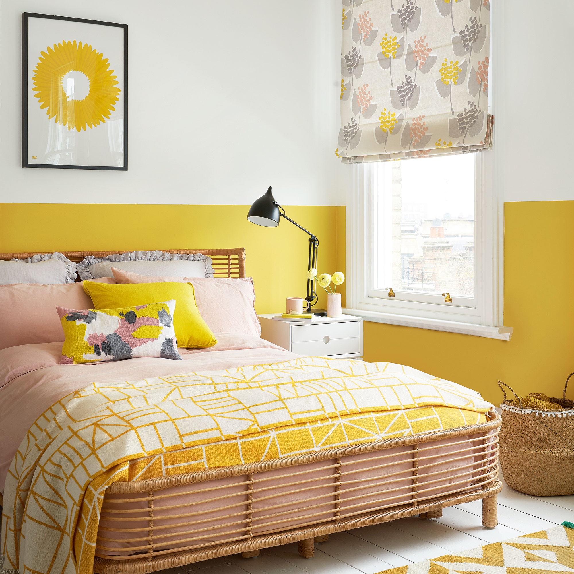
Make energising yellow bedroom ideas more restful come evening by painting the upper two-thirds of walls in a calming white.
Pink linens and the pink tones in natural woven rattan blend perfectly with this colour combination.
Additional words by Holly Walsh

Thea Babington-Stitt is the Managing Editor for Ideal Home. Thea has been working across some of the UK’s leading interiors titles since 2016.
She started working on these magazines and websites after graduating from City University London with a Masters in Magazine Journalism. Before moving to Ideal Home, Thea was News and Features Editor at Homes & Gardens, LivingEtc and Country Homes & Interiors. In addition to her role at Ideal Home, Thea is studying for a diploma in interior design with The Interior Design Institute.