Splidge, splodge, smudge: how to make sense of the ink-blot wallpaper trend
Blurry, inky, painterly pattern is all over walls this season. Here's how to make it work for you.

Sign up to our newsletter for style inspiration, real homes, project and garden advice and shopping know-how
You are now subscribed
Your newsletter sign-up was successful
This summer, the best way to add some wow to your walls is by spilling something on them. Or making a mistake. Going messily, but artfully, over the edge. Seriously, this season we've seen a real move towards much looser pattern with designs that make their mark using ink blots, painterly brushstrokes and watercolour bleeds. The result is a look that's less ordered, more relaxed and extremely easy to live with. The ocean blue palette is key, as it offers a sunkissed Mediterranean vibe, or choose soft tonal shades, that will please the eye while still making a bold statement.
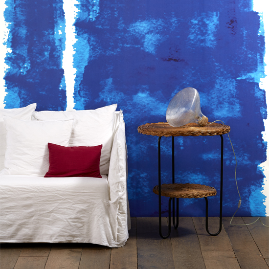
The eclectic Italian designer/architect Paola Navone's Addiction range, available from Bodie and Fou hits the mark, being both daring, loud and beautiful. Work it as a bold mural, but keep the rest of the room fairly neutral to avoid any sense of overkill.
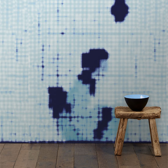
No, you don't need an eye test. Also from Paola Navone's Addiction range, this style has a more Japanese-y vibe, and nods to the Eastern concept of wabi-sabi (honouring the beauty that is found in imperfection). It would look stunning in a hallway, or even a bedroom as it's soft enough to be relaxing while still getting itself noticed.
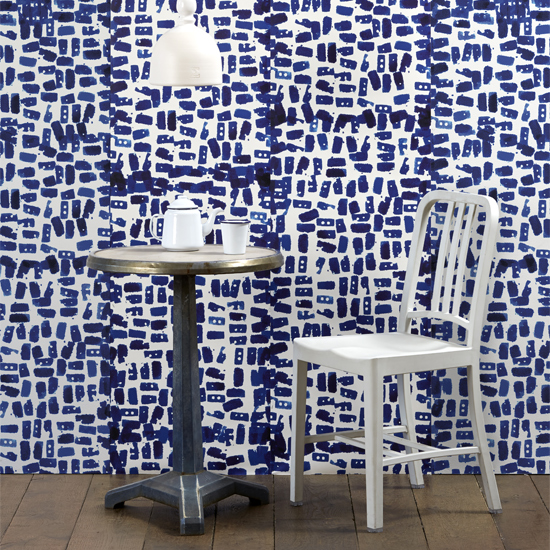
When it comes to pattern, think ink! Also from the Addiction range.
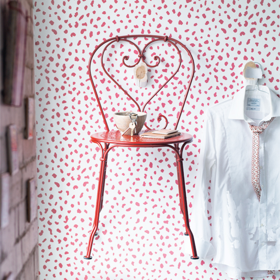
Blue isn't the only colour that's making a mark. For something a bit more daring, why not be a dab hand in red? This wallpaper is from the Tanzania range by Thibaut.
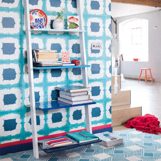
Ocean, colour scene, this Shoji wallpaper by Scion may have the complicated symmetry of a psychological Rorsach text but the acquamarine palette calms it down. It would work beautifully as a feature wall in a hallway, adding a beachhouse vibe.
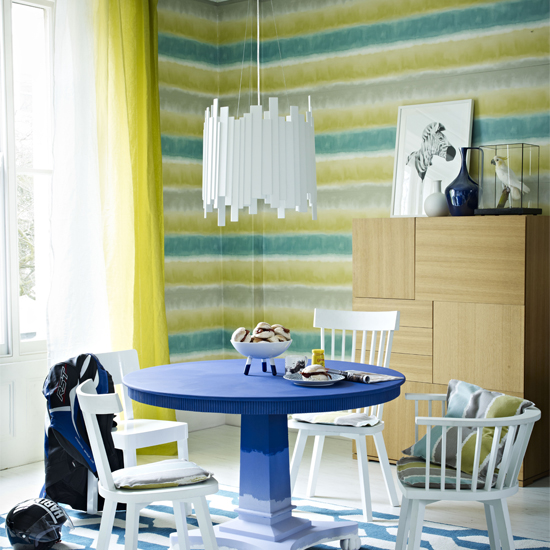
Stripes don't have to be hard edged! Softening the edges with a watercolour bleed just relaxes things beautifully, creating a softer way to do lines. This is the Demeter Stripe from Harlequin.
Sign up to our newsletter for style inspiration, real homes, project and garden advice and shopping know-how
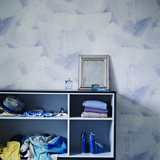
You could get this layered painterly look with a large dry brush and thin top coats of paint. Or, simply buy the wallpaper and make life easier on yourself. The Libero range from Elitis at Abbott & Boyd is full of interest yet subtle enough work brilliantly in a bedroom.
Click here for more great wall ideas from Livingetc
******

Thea Babington-Stitt is the Managing Editor for Ideal Home. Thea has been working across some of the UK’s leading interiors titles since 2016.
She started working on these magazines and websites after graduating from City University London with a Masters in Magazine Journalism. Before moving to Ideal Home, Thea was News and Features Editor at Homes & Gardens, LivingEtc and Country Homes & Interiors. In addition to her role at Ideal Home, Thea is studying for a diploma in interior design with The Interior Design Institute.