'We created a colourful kitchen that’s perfect for entertaining'
Faced with a small, narrow and low-ceilinged kitchen, this couple took on a refit that totally transformed the cramped space using colour and light

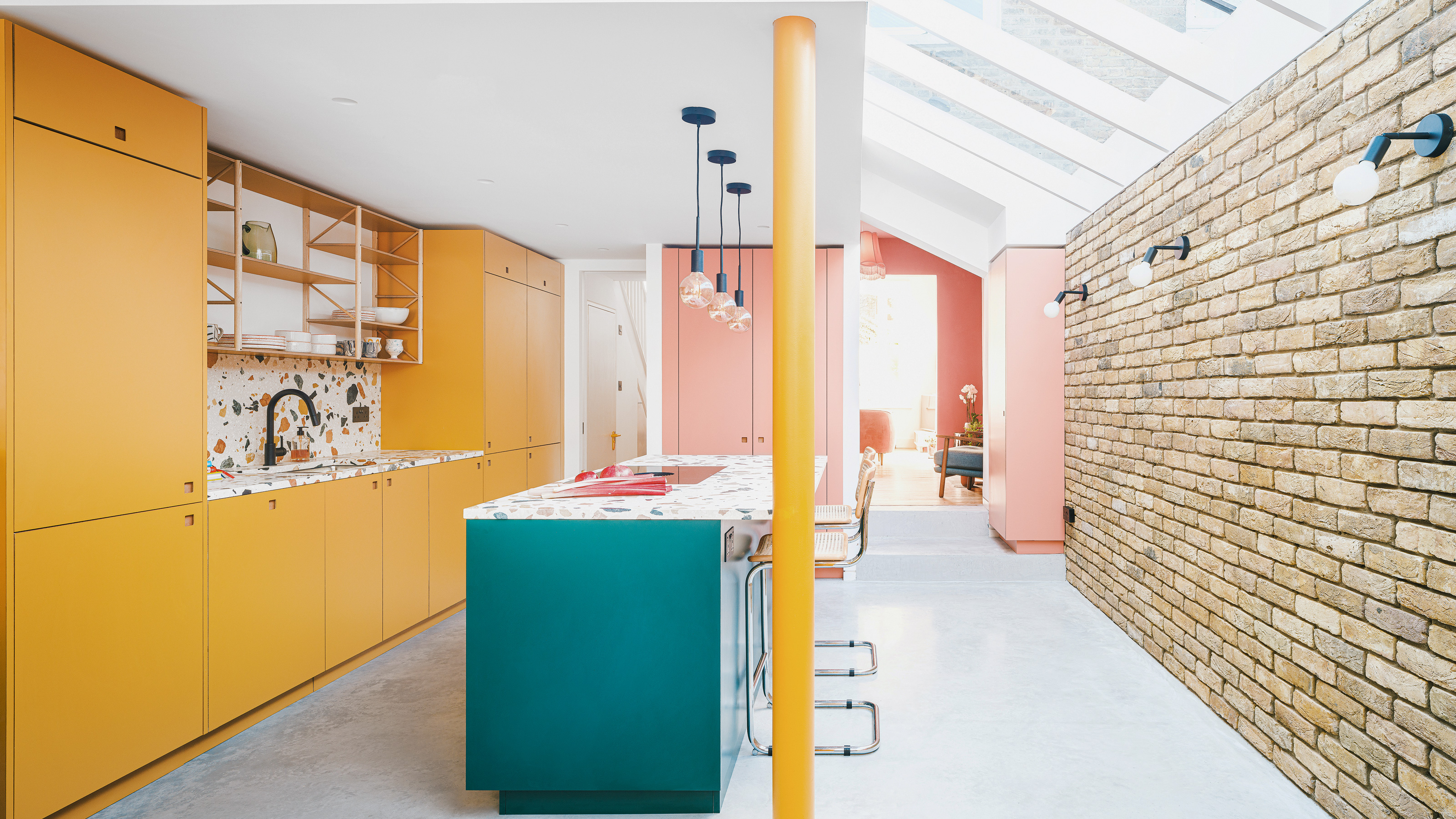
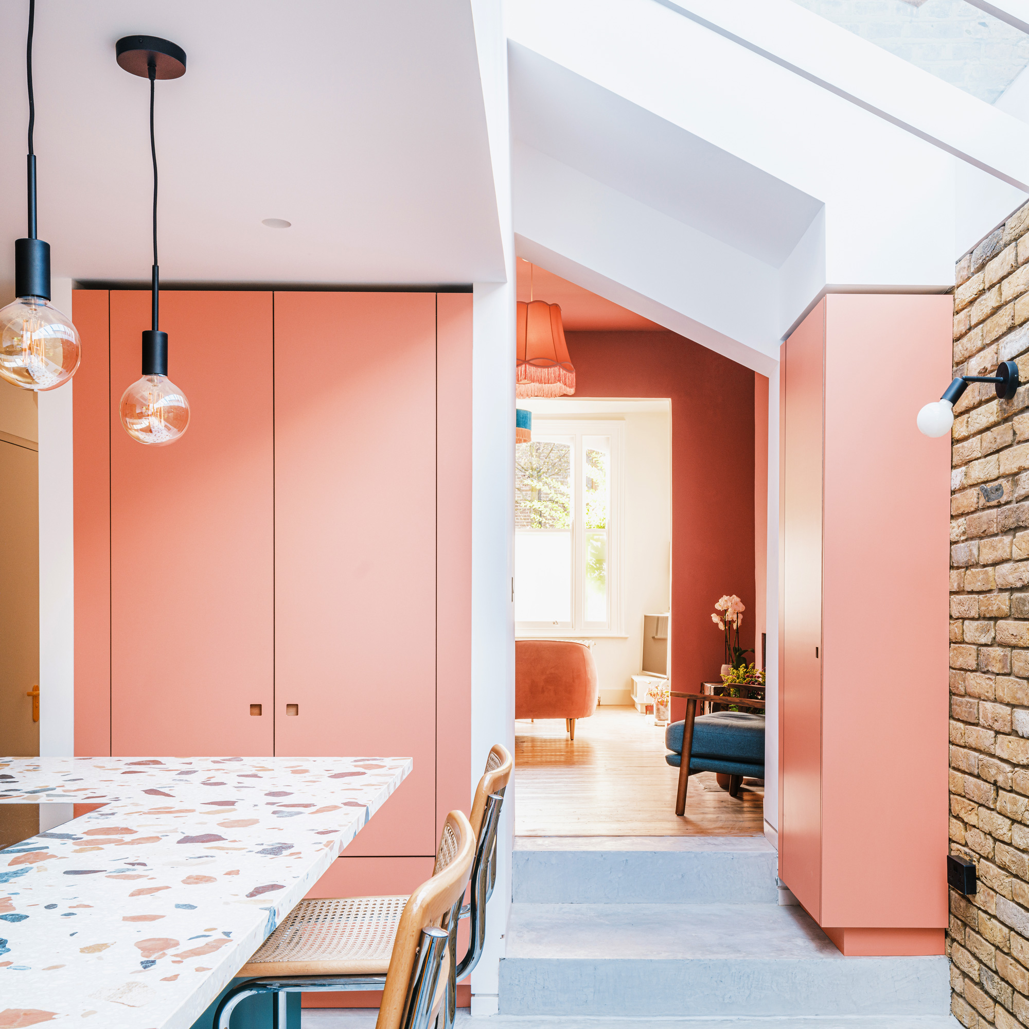
When they first moved in, the new owners of this Victorian terraced house in south London had inherited a small kitchen with low ceilings. In order to make the small room feel more spacious, the previous owners stripped the kitchen of any colour so it was very much a blank canvas.
Their plans to make the space their own was to create a kitchen extension at the rear of the property.
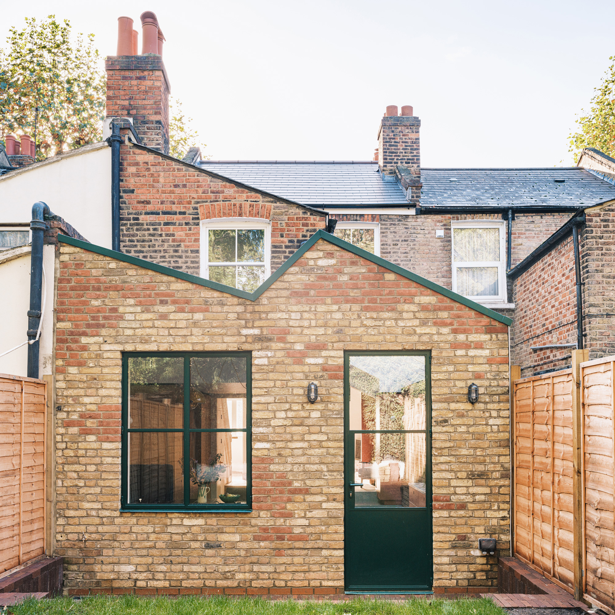
'We knew we wanted a colourful space as part of a downstairs extension incorporating yellow and green,' explains the owner. 'We started working with Pluck on a design and we loved their colour palette options.'
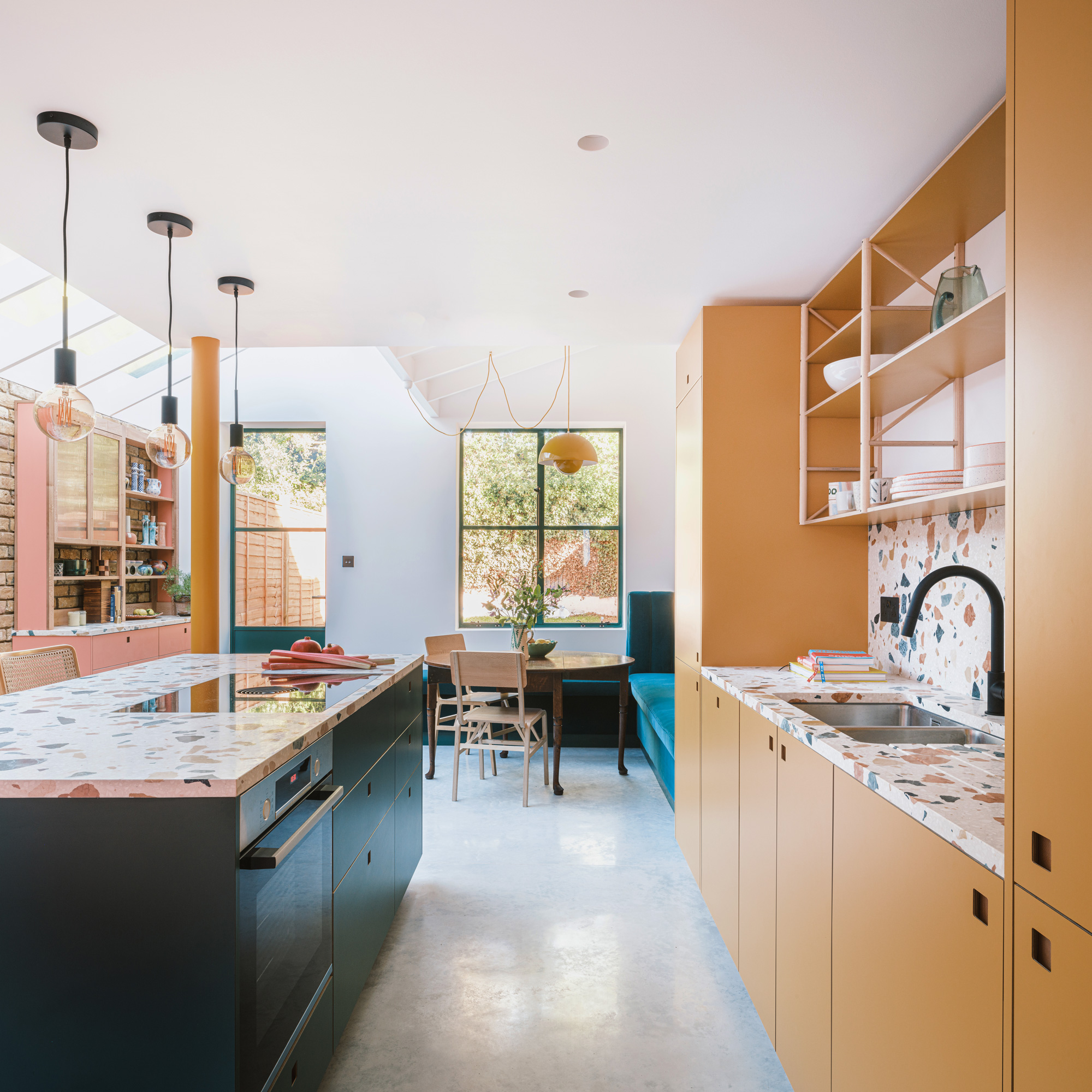
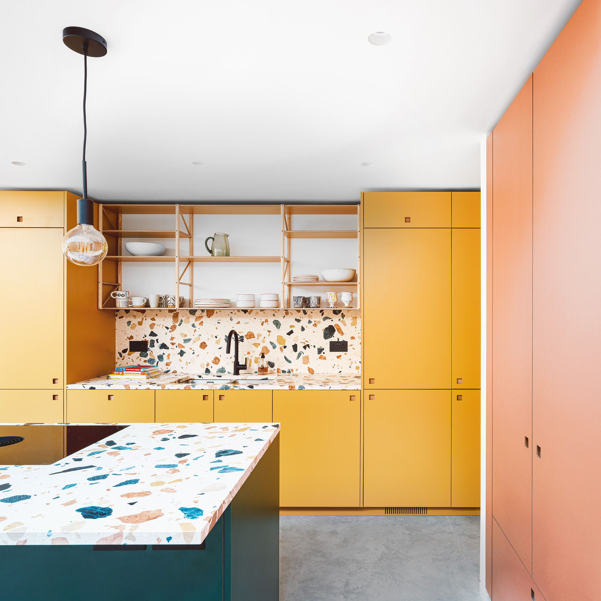
Article continues below'We chose to use a combination of their colours Market Mustard, Bonnington Green and Ritzy (pink). We then chose matt black fixtures, fittings and lighting to keep the rest of the kitchen feeling clean and consistent.'
'We had a good idea of what we wanted our kitchen to look like, but our architects Delve gave us the idea of digging down deeper into the foundations to give us more space.'
'Our home is already colourful,' she says, 'but we want more! We have a yellow gloss downstairs WC, a colour-drenched pink room and our baby’s room has yellow stripes on the ceiling and down one wall. Now, our new kitchen is colourful, spacious and ready for a party!'
The colour kitchen makeover
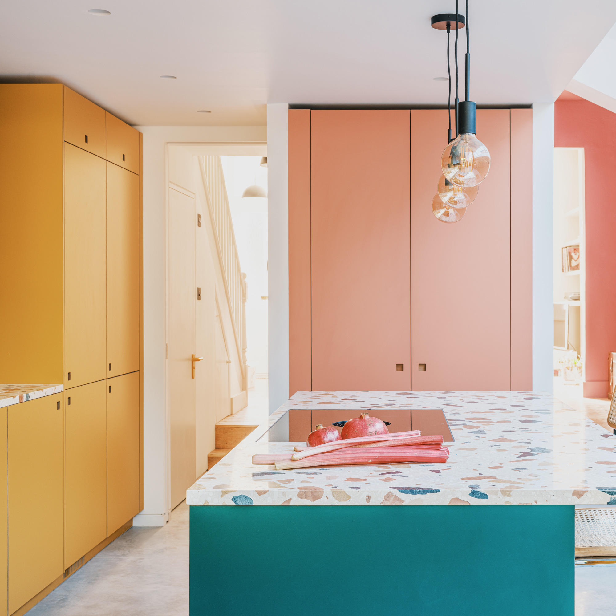
The tall pink cupboard is actually a stylish larder, with groceries stored close to hand when cooking. It also houses practical things like the best vacuum cleaner and cleaning products.'
Sign up to our newsletter for style inspiration, real homes, project and garden advice and shopping know-how
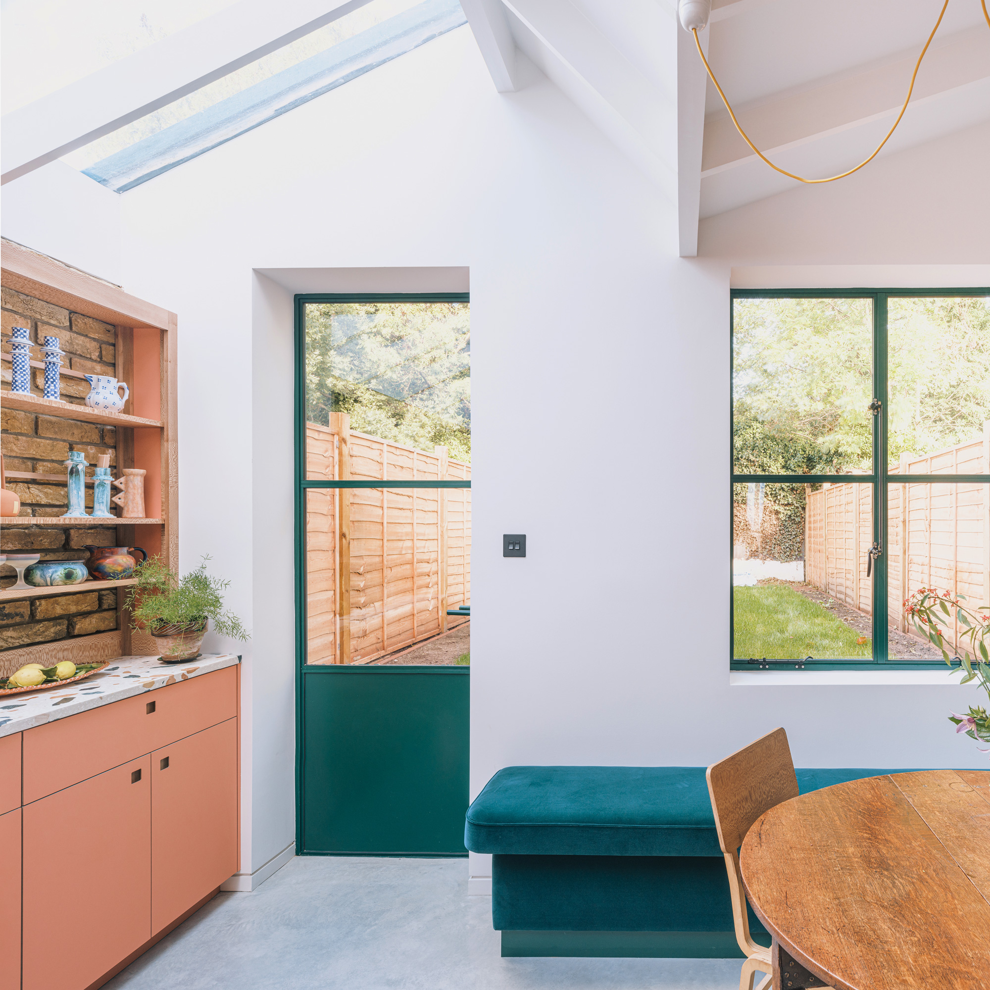
'We chose to install polished grey concrete kitchen flooring,' explains the owner, 'because we like the clean, industrial grey look against the other colourful kitchen parts.'
A durable and easy-to-maintain flooring, polished concrete works well with underfloor heating.
The dining area with banquette seating

'Our dining area is great for entertaining a larger group and maximises the space we have. Working with an architect helped us piece everything together and create structures and features we hadn’t thought of.’
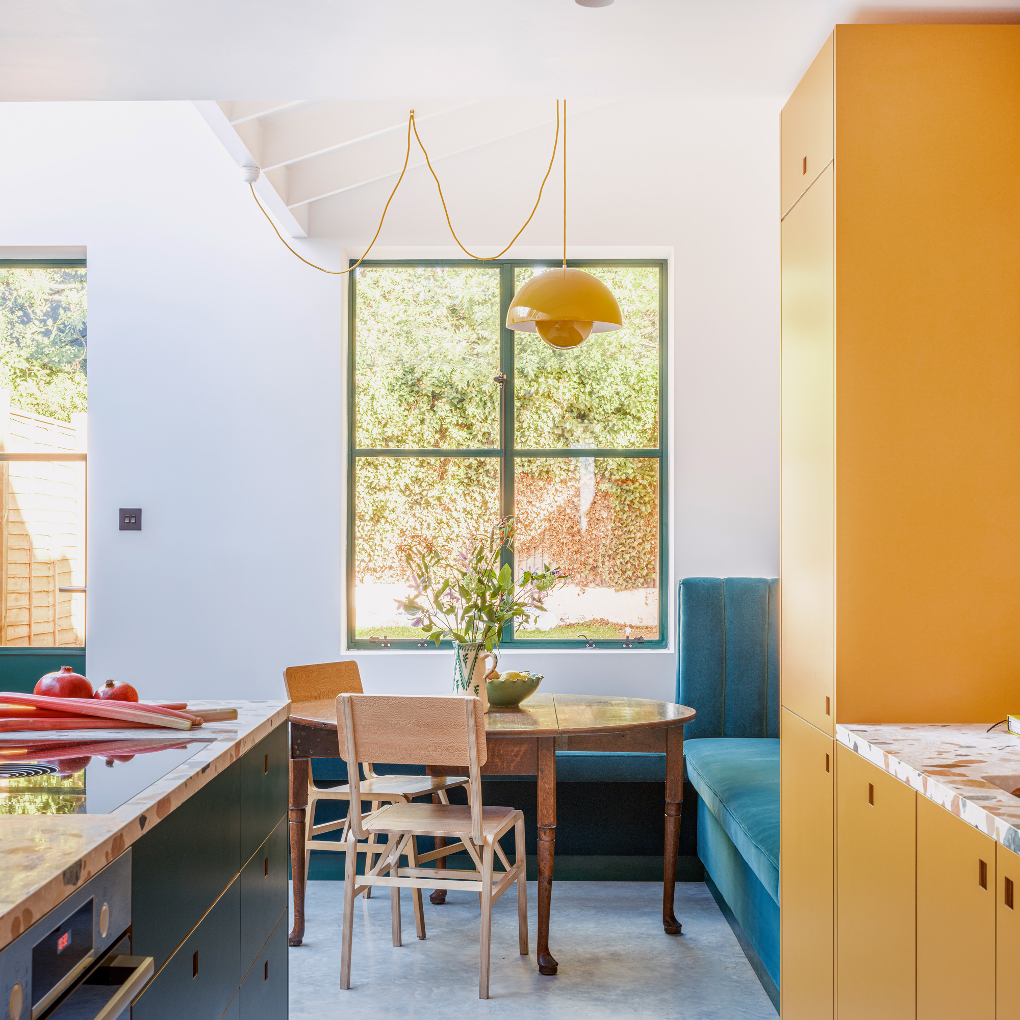
'After choosing the colours from Pluck for the kitchen cabinets, we were then able to colour match other areas of the kitchen, such as the pendant lighting, banquette seating ideas and window frames.’
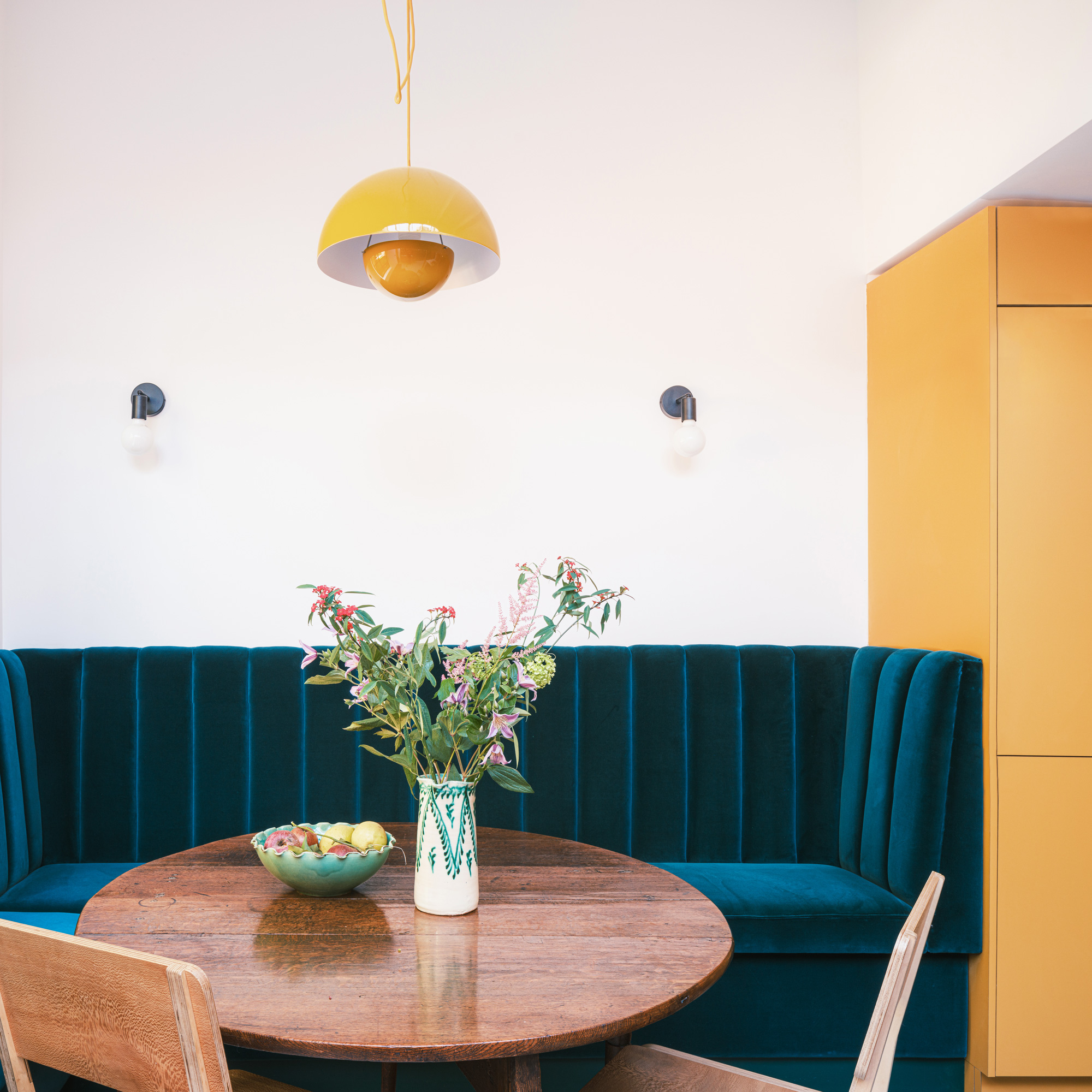
'We’d seen similar banquette seating in cocktail bars, and thought a bespoke design would be a great way to maximise our entertaining space. We worked with Shoreditch Design Rooms on the design and upholstery and our builders made the base to fit.’
'It looks great - it uses the space well and is great for entertaining, but the material we chose for the upholstery is too delicate for everyday use. We’d choose a more hardwearing fabric if we did it again.'
The decorative details
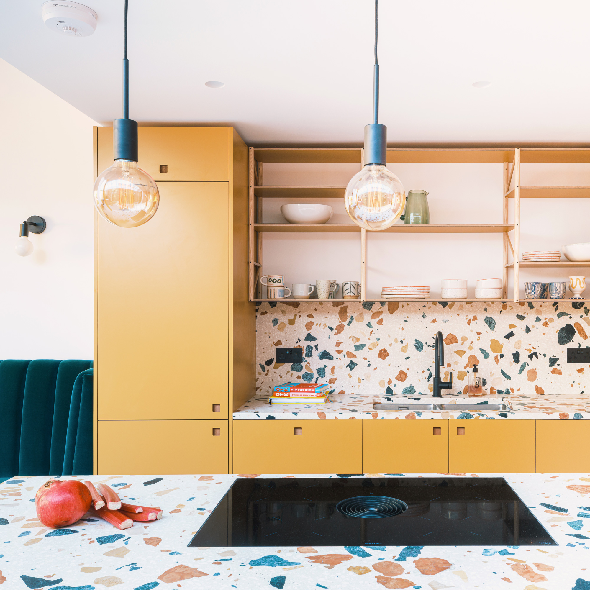
'The kitchen lighting ideas are varied, with different options in each area; there’s a big pendant over the dining table, small exposed bulb pendants over the island, wall lights on the brick wall and above the sofa, and spotlights in the main kitchen area. We were initially worried that it might be too much, but it’s given us lots of flexibility.’
The induction hob from Bora features built-in extraction which negates the need for an overhead fan.
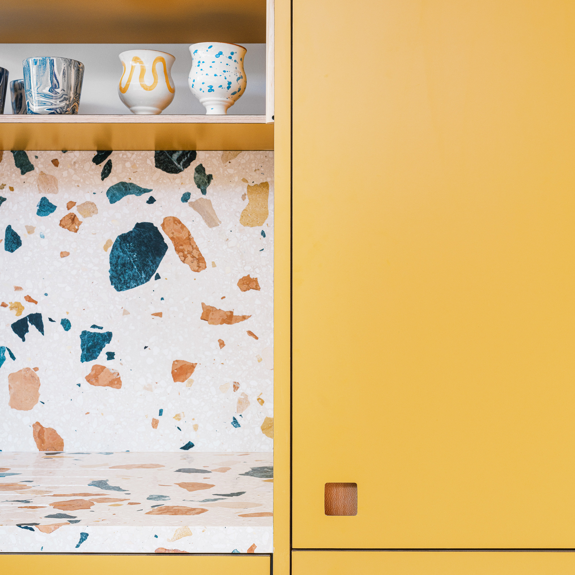
'We chose a vibrant terrazzo for the worktops and splashbacks in a colourway to link with our theme. The open shelving was inspired by what we had in the original kitchen; it’s a great place to display treasured ceramics.’
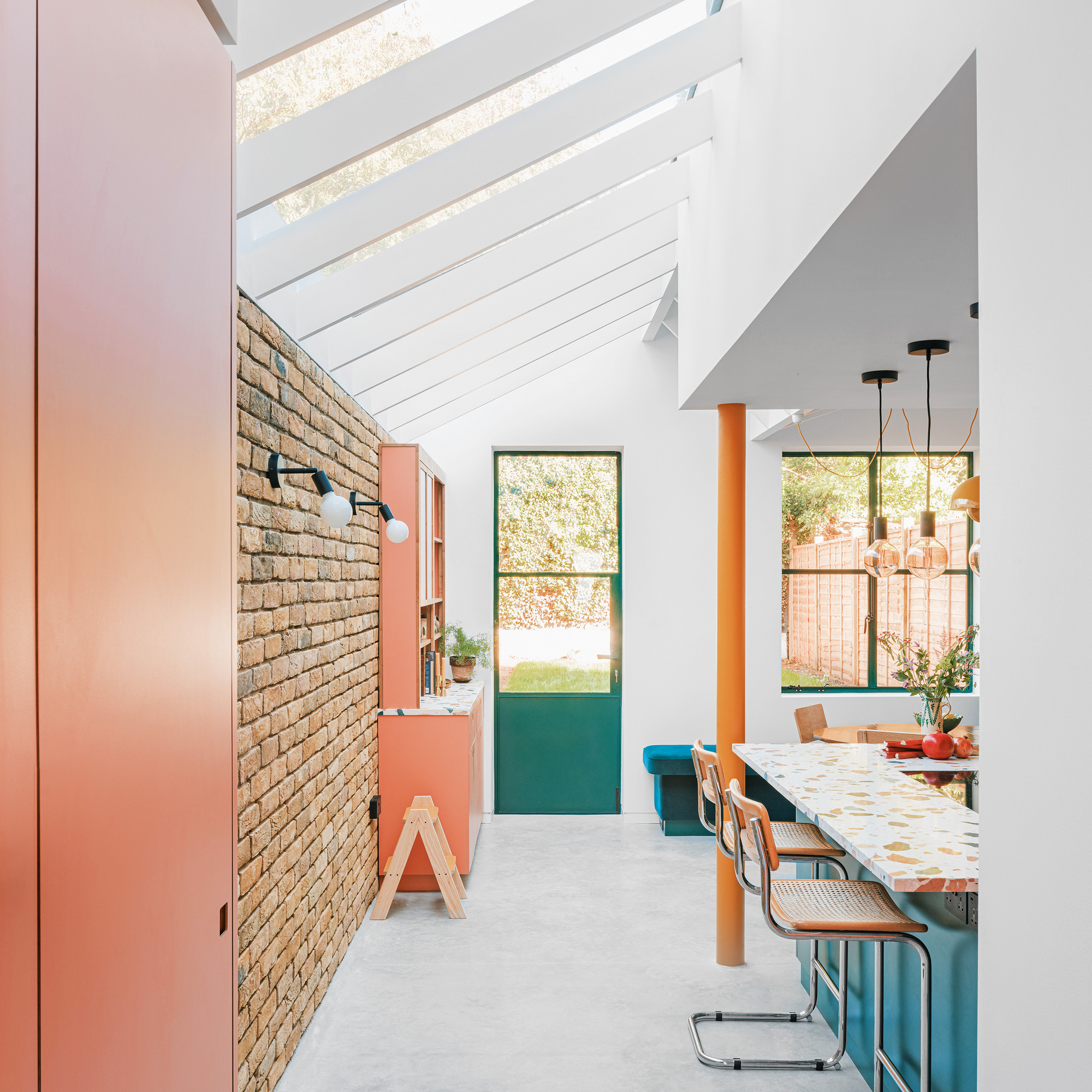
‘We matched the traditional colour bricks from the back of the original house and used them inside to add texture. Leaving the exposed brick wall and deciding not to render them means that they really stand out.'
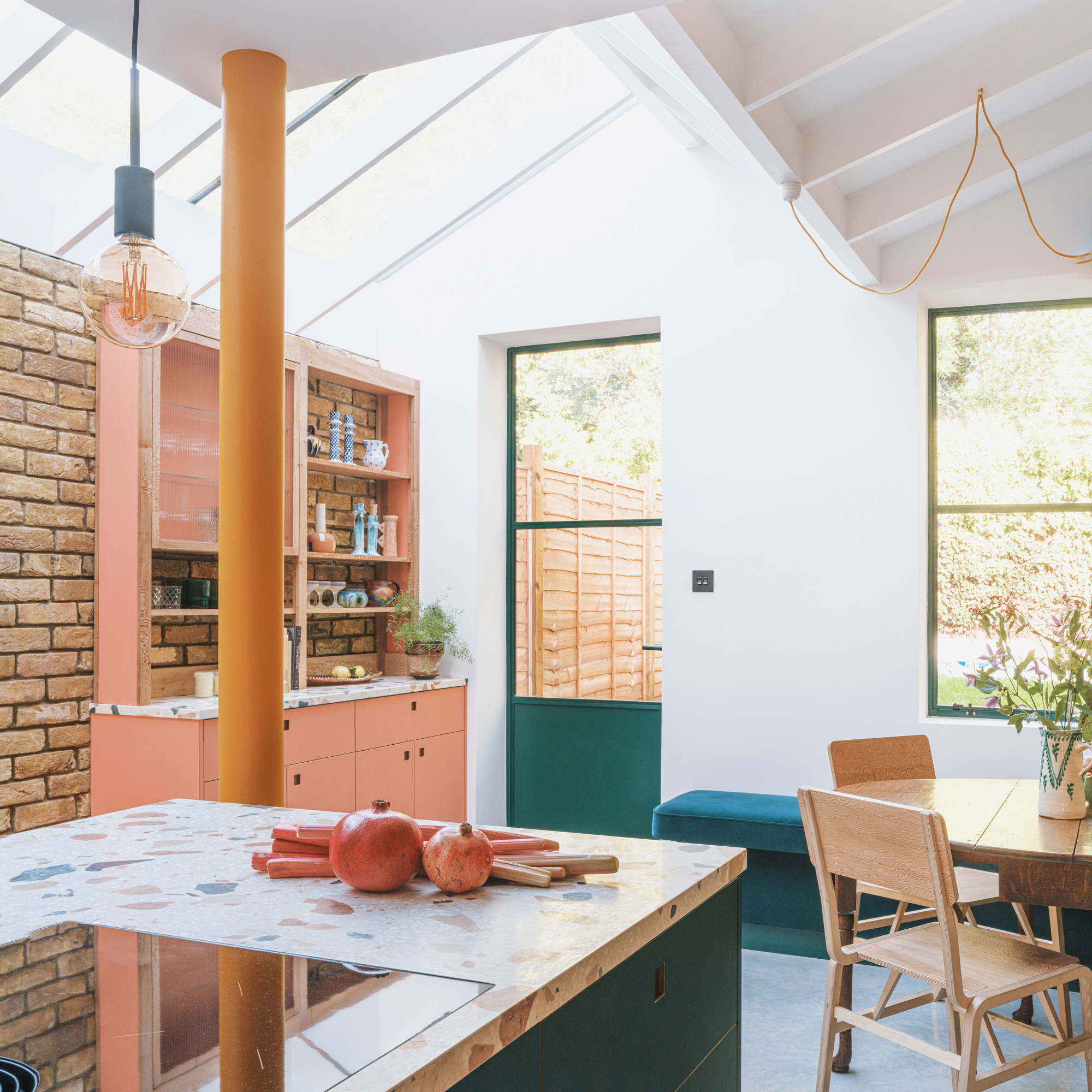
'For an extra splash of colour, our builders suggested painting the structural column.'
The bespoke drinks cabinet
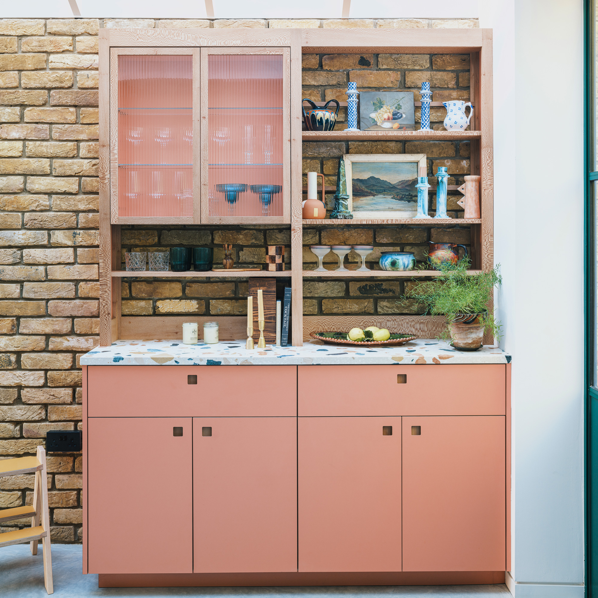
'The cocktail cabinet, made by Pluck, is our favourite part of the space. We chose London Plane wood.’
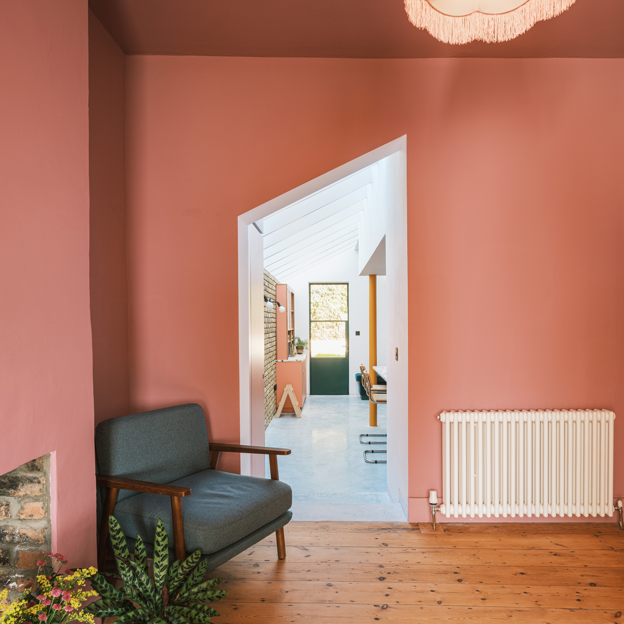
'The opening to the front of the house matches the angle of the skylights so that the spaces flow into each other.’
Understanding RAL colours
For exact colour-matching in your kitchen project, use the RAL system. Here’s the lowdown…
- For this project, the homeowners wanted to pick out their cabinetry colours and match them with other elements. And for an accurate result, they used the colour-matching system RAL, which defines the standard colours for paints, powder coatings.
- You might have heard of the similar ways to standardise colours, such as the RGB colour model, which is used in printing, or Pantone shades for fashion or product design. Before any of these were introduced, colour samples were exchanged and matched by eye.
- RAL was developed in Germany in 1927 and initially comprised 40 colours. Unlike the other colour systems, it can define matt, glossy and metallic surfaces. You’ll see an RAL written as a code with a colour description, such as RAL 6000 Patina Green. The numbers represent the hue, lightness, saturation, gloss level and if the colour is solid or metallic. For example, the ‘M’ in RAL 210-M represents ‘metallic’.
- To match RAL colours to your cabinetry in your own project, ask your kitchen manufacturer for the code and pass it on to your builder, the paint company or other manufacturers.

Ali has been the Houses Editor at Ideal Home for the past two years, following 12 years in interiors magazines, writing features, interviewing homeowners and styling shoots. She's now in charge of finding all the most inspiring and special homes to appear in Ideal Home magazine.