This cosy and warm colour is on track to become autumn's stand out shade
The experts share their top tips for embracing the shade in practically every room in your home

EDITOR’S NOTE: An earlier version of this article included a quote from a purported expert whose credentials we have not been able to verify. The quote has been removed. We regret this lapse in our verification process and have updated our internal protocols to reduce the risk of recurrence.
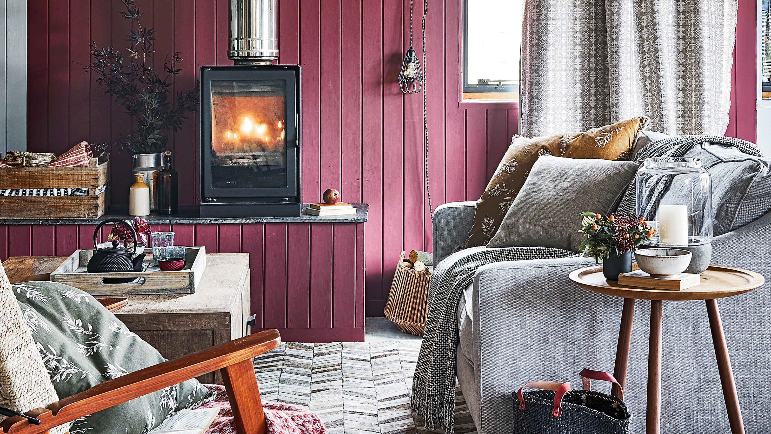
In the middle of summer, the last thing we want to be talking about is autumn and winter, however, there is a new paint trend that has us actually looking forward to sweater weather - damson. The rich purple-y hue has been dominating the previews we've seen of the new season home decor collections.
John Lewis & Partners have gone as far as to name it their colour of the season for autumn/winter 2023. John Lewis' colour expert, Melanie Archer, reveals, ‘Damson is the perfect shade for autumn, both a bold and harmonious colour, it works effortlessly into customers' existing schemes, which was important to us when making a decision.’
It isn't just John Lewis singing the praises of this sumptuous colour. ‘As we step into autumn/winter 2023, the colour damson emerges as the enchanting shade set to dominate the season. It has an undeniable allure that is perfectly suited to the cooler months, details Kate Palmer, Creative Director at The Painted Furniture Company.


How to use damson in your home
‘Rich berry shades bring an instant feeling of depth and warmth, as well as creating a wonderful, jewel-like effect within a room,’ suggests Ruth Mottershead, Creative Director at Little Greene.
‘These berry shades are a step forward from previous pink tones such as millennial pink, Pantone’s Colour of the Year 2023, Viva Magenta, as well as the hot pink ‘Barbie’ inspired choices that have been seen everywhere this summer. Damson is a mature and timeless choice that is not simply a style du jour,’ proffers Sam Sutherland, Flitch’s Interior Stylist.
‘Damson's velvety undertones create an atmosphere of luxury and comfort, whether used on accent walls, upholstery, or soft furnishings, it effortlessly adds depth and sophistication to any room,’ says Kate.
1. Calm a bedroom with a feature wall

‘Darker shades, like damson, gracefully embrace the dimmer light, creating a cosy and welcoming atmosphere,’ affirms Rex Isap, CEO and sleep expert at Happy Beds. And one room where this is especially true is in the bedroom.
‘Its depth makes it a dreamy colour choice for bedrooms during the cosy autumn/winter months,’ Rex remarks. ‘From a colour psychology perspective, damson exudes feelings of calmness, soothingness, and comfort. Its muted tone creates a sense of cosiness and snugness, transforming your bedroom into a haven of relaxation, ideal for drifting into a peaceful slumber.’
‘Moreover, purple is often associated with emotional balance and harmony, making it the perfect hue to surround yourself with at night. As a mix of blue, which aids calmness, and red, which aids alertness, it creates a delicate balance,’ Rex continues.
2. Colour drench a living room

‘We’ve seen a steep rise in popularity for our Drenched Damsons clever velvet making it our best-selling purple tone,' reveals Nicky Line, Chief Product Officer at Loaf. 'We’re seeing it used confidently on larger upholstery pieces like sofas and beds to create a real impact.'
‘For an extra cosy effect in a living room, we recommend colour drenching to really embrace the plum shade; Our favourite shade to use for this is Damson in Distress. Or if you are looking for some pattern then why not opt for an autumnal floral wallpaper Meiying Mauve with the rich damson shade as a backdrop,’ outlines Graham & Brown’s paint expert, James Greenwood.
3. Cosy up with damson fabrics
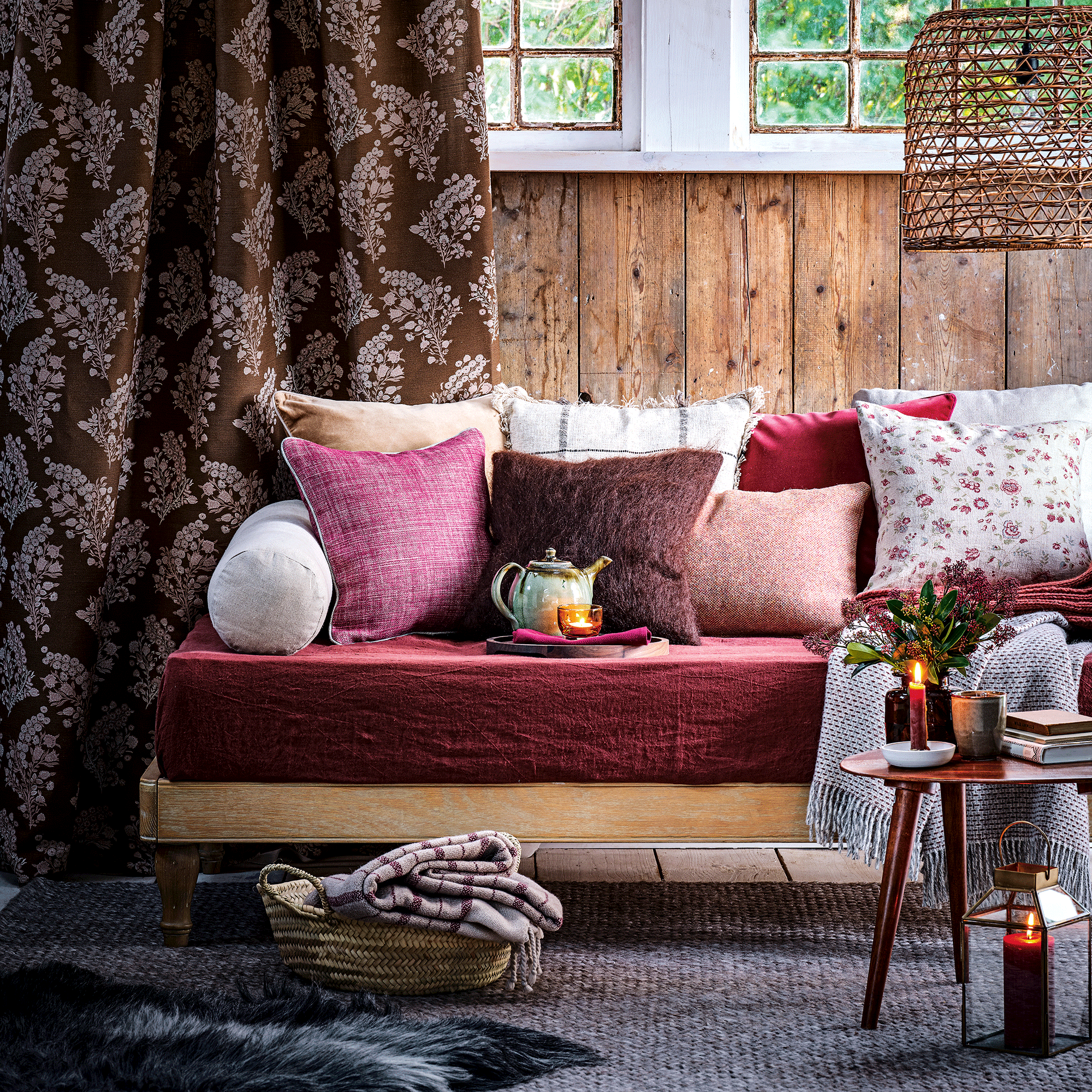
If you don’t feel like picking up a paintbrush to embrace the trending tone, adding soft furnishings that exude warmth and cosiness is key.
‘Understandably not everyone will want to splash the colour all over the walls,’ details Avalana Simpson from Avalana Design. ‘However, a darker, richer version of the hue can give a connotation of a warm hug or a sense of romance in the home if used correctly.’
4. Make a statement with colour blocking

‘If you're ready to embrace the damson trend, why not try colour blocking and opt for a fully damson bathroom, utilising the same damson tile across your walls and using a matching paint shade on the ceiling to create a cocooning atmosphere,’ suggests Harriet Goodacre, Brand Communications Manager and sTile Consultant at Topps Tiles. ‘Pair the look with gold hardware for the ultimate refined finish.’
5. Incorporate the colour in tiles

‘A great way of introducing damson tiles into your kitchen is by adding a subtle tiled splashback in this colour,’ says Harriet. ‘Or if you want to make a statement, consider using tiles to frame your cooking space and draw the eye to the best features in your kitchen, such as a beautiful Aga.’
‘If you’re a fan of colour, consider adding fruity tones for standout. Raspberry and lemon, when combined with crisp white, can give a modern, clean feel to the colour damson, balancing out its warm vibrancy, whereas shades of purple and dark blue offer a more moody, soulful take on the colour.'
Get the look


Which colours complement damson?
‘For an impactful scheme, consider warm deep paint colours like ‘Adventurer’, which is a rich and reassuring plum-aubergine, and pair with ‘Sage Green’ on woodwork,’ recommends Ruth from Little Greene. ‘This very natural palette is reflective of the green and purple combinations we often find in nature.’
‘For an elegant and sophisticated ambience, look to combining deeper shades of damson with softer grey, where the warmth of the berry colour is tempered with a cooler, natural stone tone. Adding a touch of a mid-muted pink such as ‘Blush’ will work brilliantly as a highlight, accent colour,’ too, Ruth continues.
‘As well as chiming with neutrals, damson also works brilliantly against darker backdrops like inky blues, greens, and teal, especially when combined with vivid crimson red,’ outlines Wayfair's Resident Style Advisor, Dee Fontenot.
Melanie echoes this, as she shares, ‘damson is a shade that works well with a range of tones, from a warm palette of gold and copper, to cooler shades of blues and neutrals.’
