What colours make you tired – avoid these if you’re already lacking energy
We asked the experts what colours can make you feel tired and drained – and how to use them in a positive way

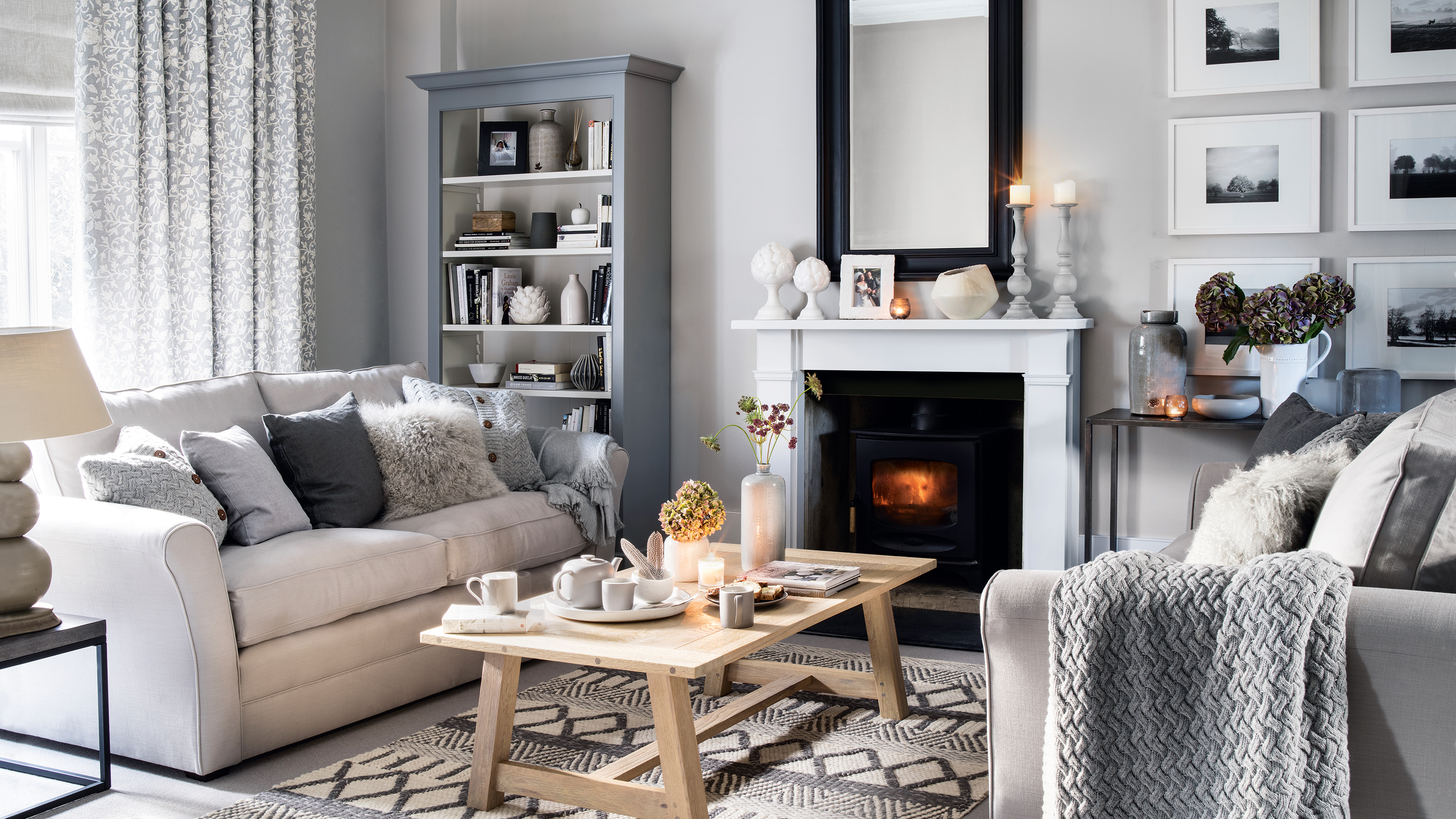
Colour has a lot to answer for, and just as they can be uplifting and energy-boosting, some colours make you tired, too. According to colour psychology, they can make you feel tired for different reasons. We've explored which shades do this, why, and what we can do about it.
A 1942 study of colour by neurologist Kurt Goldstein that’s still used today found that colours with longer wavelengths (red, orange, yellow) are more stimulating. The effect of these saturated shades, especially if used on all four walls or in small spaces, can be overwhelming.
At the other end of the spectrum are colours that feel drab and lacking in energy, giving ‘meh’ vibes if used incorrectly. Get them right, though, and you have the perfect recipe for a cool and relaxing space for sleep. According to Goldstein’s study, these are shorter wavelength colours like violet and pale blues.
We now know that neutrals sit in this category, too. A 2020 study by a team of experimental psychologists, Feeling Blue or Seeing Red?, (Domicele Jonauskaite et al), found that test subjects identified grey, brown, white, black and blue as ‘low arousal’ in terms of the emotional response they inspired. That makes them great for winding-down, zoning-out spaces, but not so good if you’re in need of a pick-me-up.
Combining colours to create a balance is key, which is why the best colour combinations are ageless. ‘Meh’ tones might be draining in themselves, but pair them with a wakey-wakey one and together you’ve got a decorating scheme made in colour-harmony heaven.
Colours that make you tired
Experts reveal the colours that can drain your energy and how to make them restful rather than spirit-sapping
1. Saturated reds
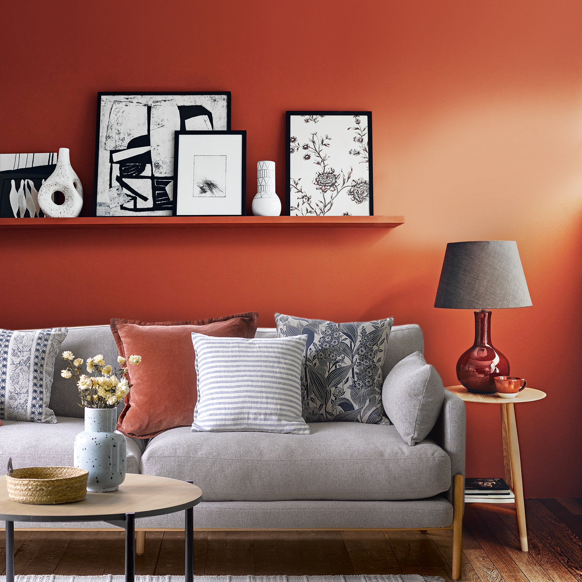
It may be surprisingly that colours make you tired aren't just 'boring' colours - bold shades can be exhausting, too. Red is a full-on colour and, although it brings a lot of energy, it can become tiring over time.
Sign up to our newsletter for style inspiration, real homes, project and garden advice and shopping know-how
‘Being surrounded by some colours in our environment can influence how we feel emotionally, energetically and how we interact with each other. Colours that are vibrant, vivid and intense have the potential to over-stimulate us,' explains psychologist and wellbeing consultant Lee Chambers.
'While this can increase our alertness and sociability, it also makes it harder for us to relax and switch off. Other colours to be mindful of in this respect are orange, electric blues and neon greens.’
Beware of using it immersively, but let it add just the right amount of energy to your room as an accent colour. Joa Studholme, colour curator for Farrow & Ball, suggests using it in unexpected places. ‘A stripe of fiery red on the edge of a door will add a little personality,’ she says.
‘Consider painting a piece of furniture red, or adding a red highlight to woodwork in a monochromatic colour scheme,' suggests Little Greene’s creative director, Ruth Mottershead. ‘Consider a terracotta hue for an interior that feels rich and vibrant, without being overpowering,’ she says. She also suggests using a technique called ‘colour blocking’: ‘Use equal parts of red and a paler neutral to balance the room.’
Ideal Home’s editor, Heather Young, likes to tone down reds with calming colours, too. ‘Avoid strong contrasts like red and white, but team shades like earthy reds and sandy, plaster-pinks for a gentler pairing,' she adds.
2. Grey
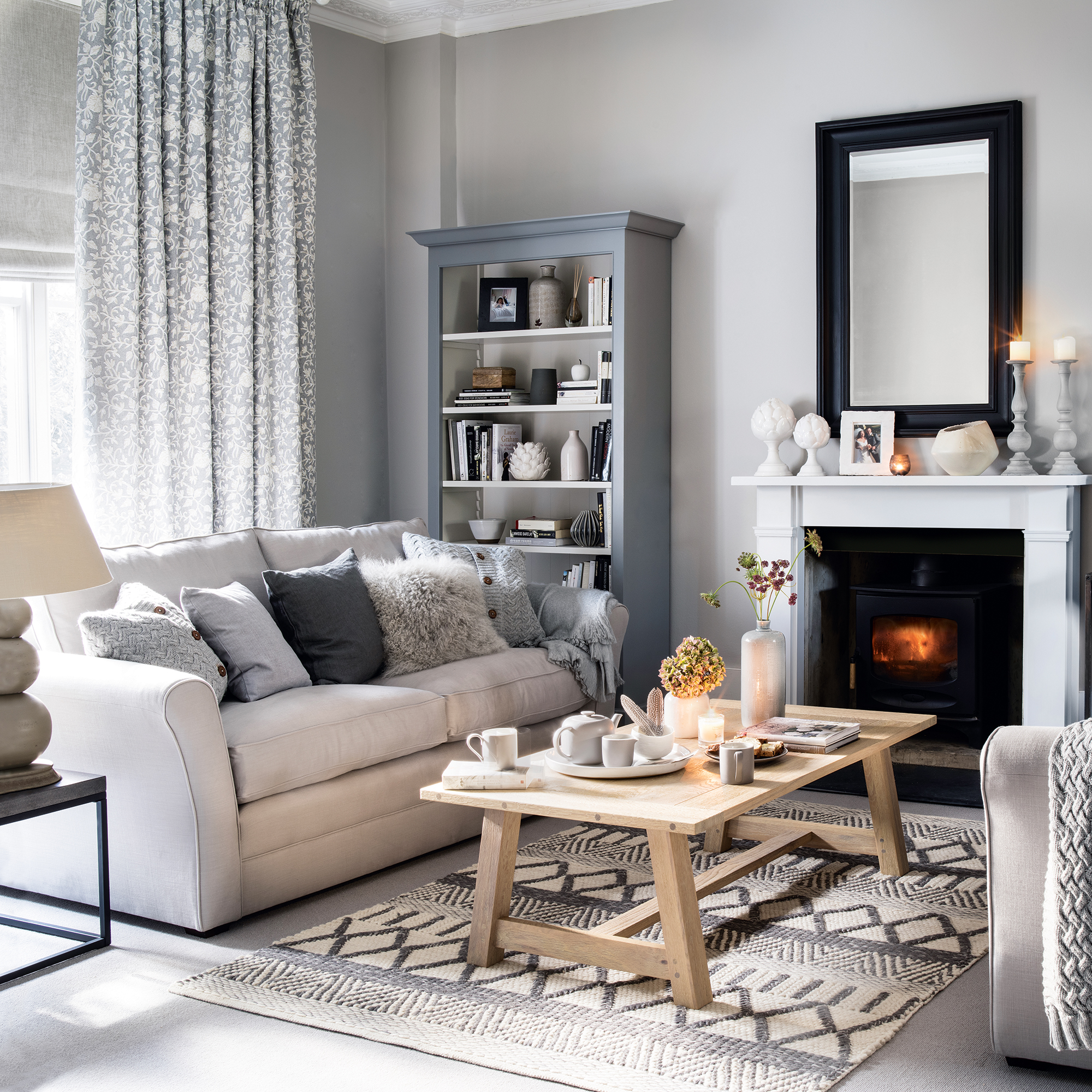
Our love affair with cool, calm grey continues, but it comes with many a pitfall – the biggest one of which is that it can look, well, boring.
‘The colour that can make us feel drained and tired that most people don’t realise is grey,' explains Karen Haller, a behavioural design consultant, colour specialist and author of bestseller The Little Book of Colour. 'When it comes to colour psychology, what we think of as a calming sensation can be depleting our emotions.'
'So while you might initially feel a sense of calm, over time you could feel drained, tired and lethargic. I’ve had many clients who sleep in a grey bedroom and they find they wake up tired and reaching for a strong coffee.’
The first mistake to avoid is using too much of it. Grey is best used in partnership with an accent and it plays well with others, giving you the freedom to have fun with the latest paint trends and trending colours. Pink, yellow, orange, black… they’ll all bring grey to life.
The secret is in finding the right shade of grey because they are not all created equal. Avoiding ‘flat’ greys and looking for a hint of a tint will give your walls more energy. A blue or purple undertone will cool down a south-facing room, while a pink, brown or green tint will feel more earthy and comforting.
‘Natural stone colours will bring a sense of peace to a room,’ says Ruth from Little Greene. ‘Soft, muted green such as Sage Green or Green Stone work well in bedrooms for a comforting feel and they harmonise well with all wood tones.’
3. Beige on beige
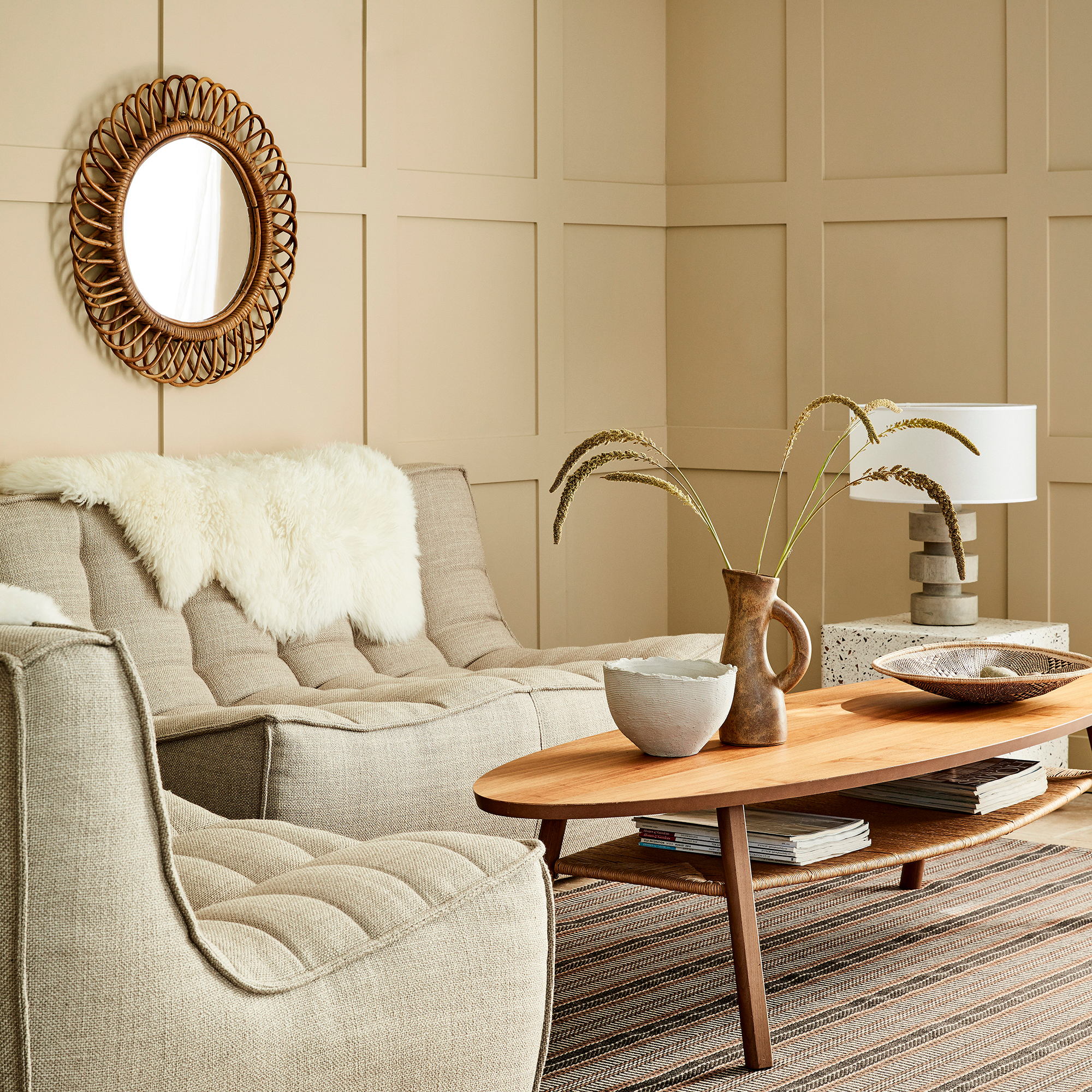
People often fall for the smooth subtlety of beige, which is reflected in the names that beige products are often gifted with: ‘champagne’, ‘cappuccino’, ‘caramel’, etc. All delicious sounding, but all with the dangerous propensity of making a room feel dull-witted rather than sparklingly sophisticated.
Beige, as with all neutrals, are essentially unchallenging to the eye as the contrasts created with other colours in the room are gentler. And when your eyes are given a rest, the urge to snooze soon follows.
You could embrace this effect in a bedroom with an immersive colour scheme that’s a holiday for the eyes. ‘Bedrooms feel so much more restful if the walls and trim are painted in the same colour so your eyes don’t have to keep reading contrasts,' says Farrow & Ball's Joa. 'To achieve ultimate calm, use the same colour on the ceiling, too ‘It will also increase your perceived room height.’
But what if you’re committed to the idea of using it in a busy space that needs more energy? Joa’s solution is to layer neutral living rooms, so you never use one solo but create a complex scheme with more for the eye to work on.
‘Neutrals alone are not fail-safe,’ she warns. ‘It’s all too easy to fall into the trap of using bland, depressing colours that are nothing like the subtle, complex palettes that make spaces elegantly sophisticated.’
She recommends layering four different but related neutral shades. Farrow & Ball does this with the six neutral colour groupings in its palette. ‘Using four complementary shades in one group, each one can be relied upon to work together perfectly in seemingly endless permutations to create an effortless flow and variety of moods in your home.'
4. Nearly black
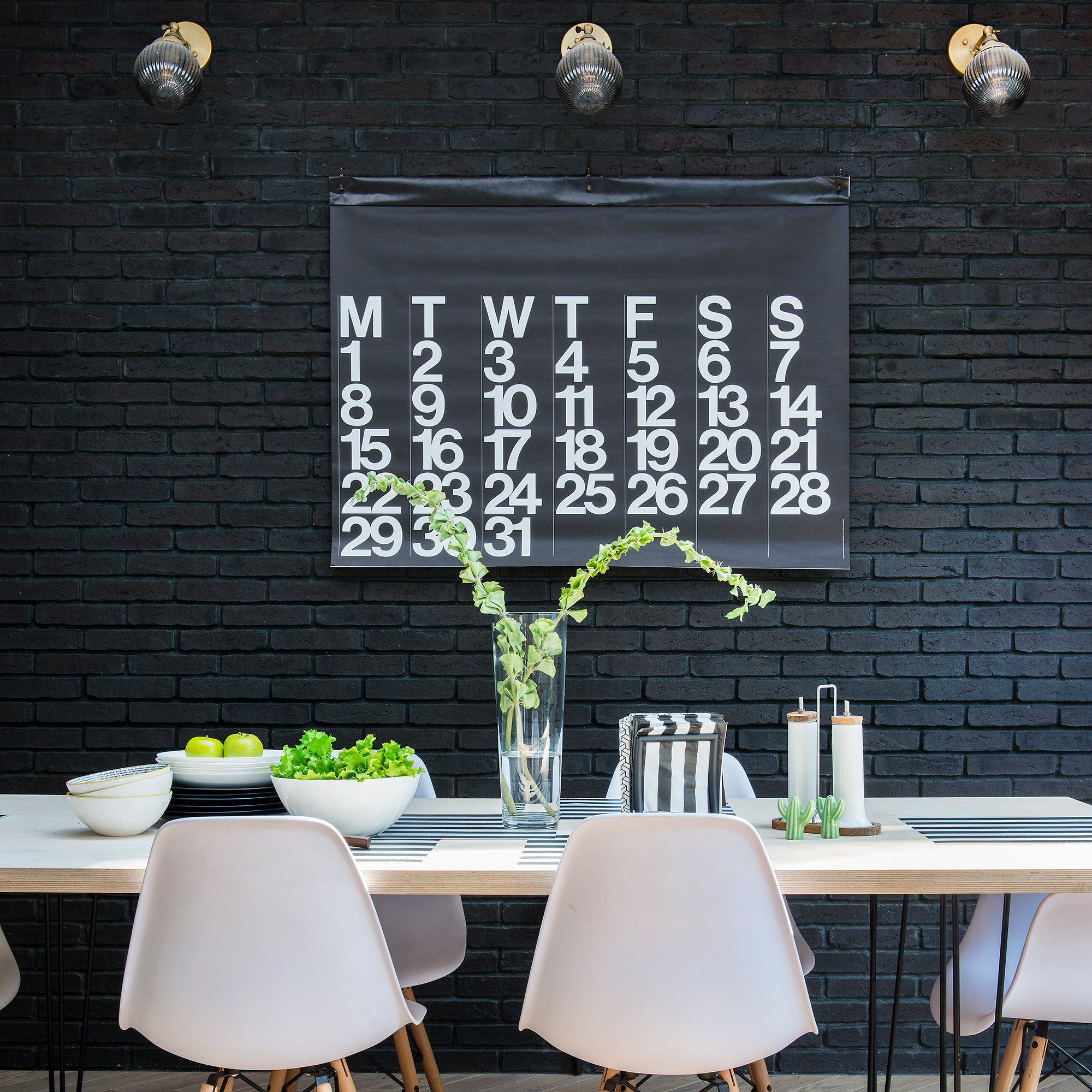
If any colour’s guaranteed to make your eyelids heavy, it’s the colour of night. Although, to be accurate, any deep, dark colour will do the trick – including inky blues, forest green, aubergine and coffee colours will have the same effect if used immersively.
To create a cocooning bedroom for deeper sleep, you can treat this as a strength and minimise visual contrasts by painting woodwork to match. If you love playing with deep, bold colour, this is your cue to go hunting for bedroom paint ideas…
Black is a classy colour – we link it to ideas of style and quality. That’s why beauty companies use predominantly black packaging for make-up products. Proceed with caution, though, because the emotional associations with black can have a negative rather than a positive effect, adding to its tiring vibe.
The study Feeling Blue or Seeing Red tasked test subjects with choosing emotional concepts linked to colour swatches. One of the most dramatic reactions was to black: its authors noted, ‘...it was associated with almost all of the negative emotions, ie. sadness, guilt, regret, disappointment, fear, disgust, contempt, hate and anger.’
FAQs
What is the most tiring colour?
Red – it’s so visually demanding if you use it on all four walls, it could drain your energy over time. Keep it out of relaxation spaces then, but use it to stimulate convivial conversation among friends in a dining space or ramp up your alertness and focus in a home office.
What colour will keep me awake?
Bright yellow. The sunshine colour is like caffeine in a paint can, so enjoy it in a kitchen for a breakfast-time boost, in a shower room for an early wake-up call or a home office to keep you on top of your game all day.

Vanessa Richmond has been a freelance writer, editor and editorial consultant since 2021. Her career in magazines began in 1998 and, apart from a four-year stint at women’s lifestyle magazine Red, it has been spent working on interiors titles including House Beautiful, Country Homes & Interiors and Style at Home. She is a former editor of Ideal Home, Country Homes & Interiors and Style at Home magazines. She has also worked for House Beautiful and Red. During her 25 years as a journalist, she has been a sub-editor, columnist, deputy editor and editor. Now she combines freelance writing with being a secondary-school English teacher.