Love The Hoxton hotels? There is now a paint range devoted to helping you get the look in your home
Get the cool and international look with The Hoxton x Bauwerk Neighbourhood collection of paints

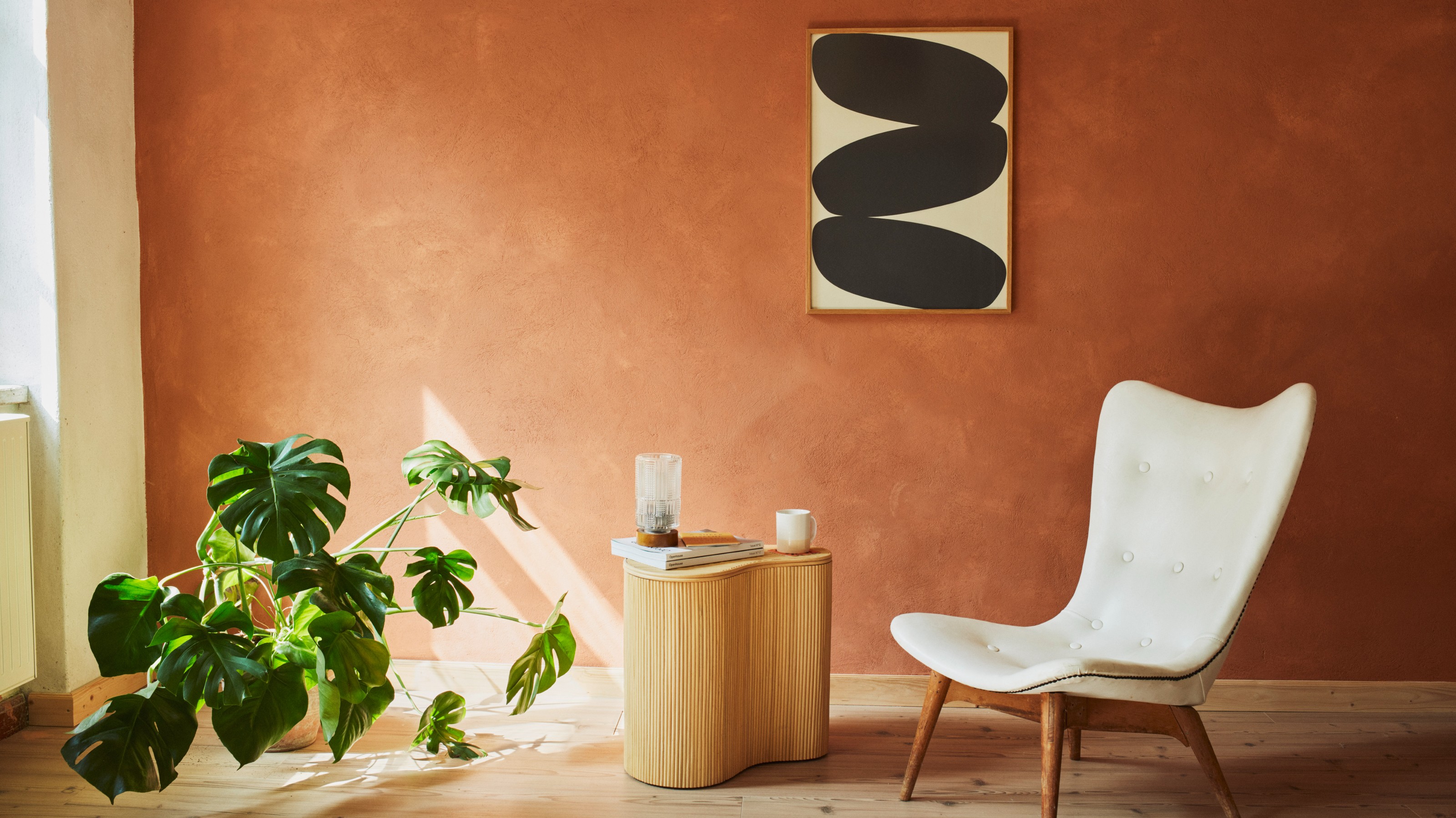
You’d be hard-pressed to find a cooler hotel than The Hoxton. If all hotels looked more like this one, I might even get on board with the whole hometel trend. Because I would love for my home to look anything like one of The Hoxton’s local and international locations. Now, thanks to The Hoxton x Bauwerk paint collaboration, we are a step closer to achieving the coveted, yet individualistic look.
The limewash paint specialist, Bauwerk Colour, has supplied us with many a paint idea over the years. So this pairing and the Neighbourhood collection have our stamp of approval.
Each of the hotel’s sites is heavily inspired by the surrounding neighbourhood (hence the name of the range) and culture, so every branch of The Hoxton is very different. Launching with nine limewash shades, the collection, starting at £30 for 1L tin, is inspired by four of the cities where the hotel has recently opened its branch. So, let’s get painting.
The Hoxton x Bauwerk paint collaboration launches the Neighbourhood collection
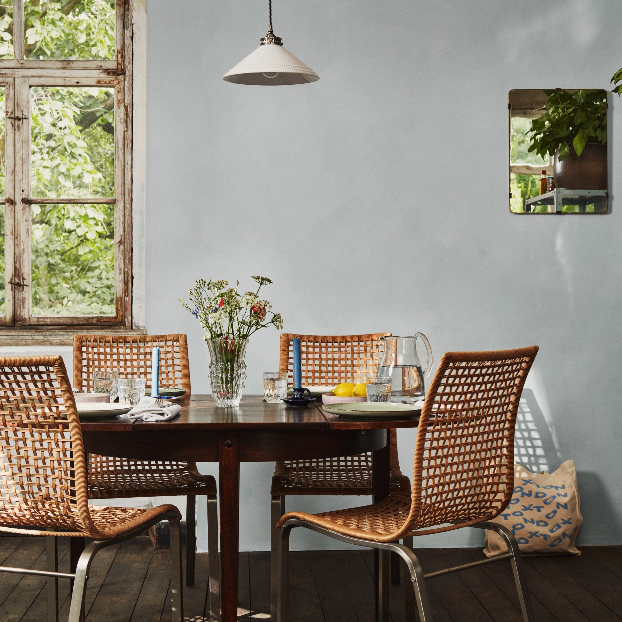
Bauwerk was one of the early pioneers of the limewash paint trend, taking it far beyond a fleeting trend and making the style its brand signature. And honestly, we’re still not over limewash paint. And we might never be. Perhaps what started as a trend is here to stay.
And when something gets The Hoxton’s seal of approval, you know it’s worth paying attention to. Most of The Hoxtons are designed by interior and graphic design company AIME Studios, which worked on developing the right paint colours with Bauwerk.
‘My team at AIME Studios has been specifying Bauwerk paints for the past four or five years for different properties,’ says Charlie North, global VP of interior design at AIME Studios. ‘And I've painted my entire flat using Bauwerk in the last couple of years as well. We just love it as a product, and we thought it was an amazing opportunity to ask Bronwyn to work with us and create something that's pretty iconic for The Hoxton.’
And how did they land on these four cities and corresponding neighbourhoods as sources of inspiration for the colours?
Sign up to our newsletter for style inspiration, real homes, project and garden advice and shopping know-how
‘We were looking at the cities where we have recently worked on new Hoxton hotels and these just jumped out at us as neighbourhoods that have strong personalities that lend themselves to creating unique colour palettes. Another consideration was identifying city aesthetics that didn't overlap with each other too much,’ Charlie adds.
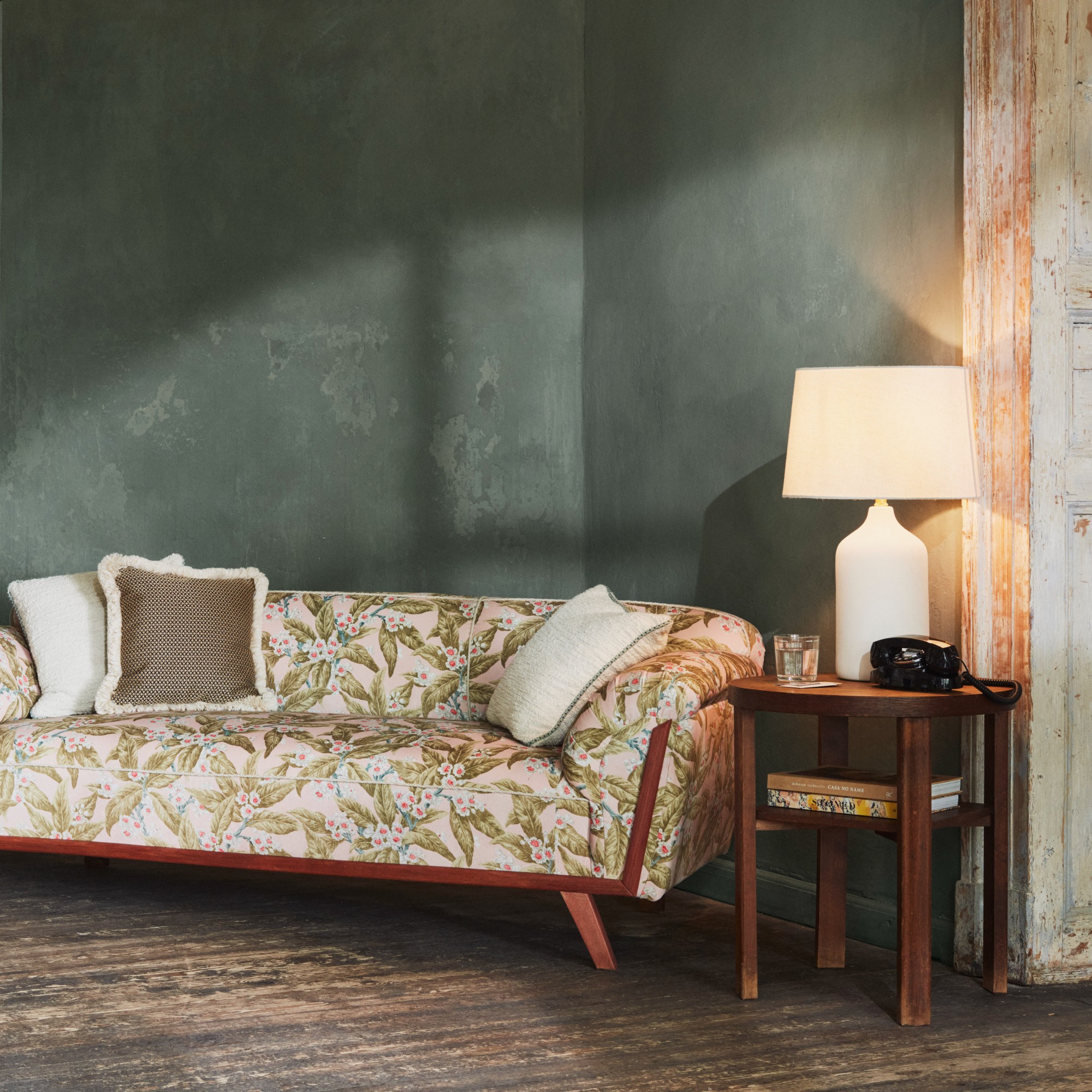
Two of the new paint colours are inspired by Berlin and its Charlottenburg neighbourhood. One shade is simply called Charlottenburg, while the other is named Kino.
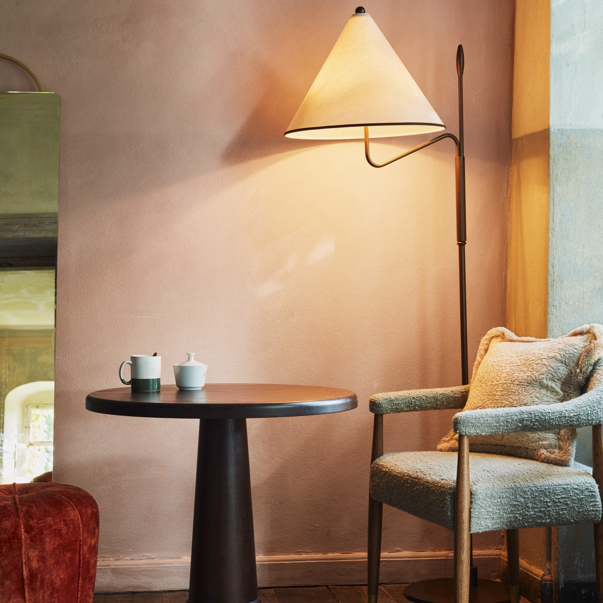
‘Really you’re translating the influences of the things that you see into a colour that actually works on the wall,’ explains Bronwyn Riedel, co-founder and creative director Bauwerk Colour. ‘For Berlin, we discussed together which two colours reflect the golden era of Charlottenburg – the 1920s and 30s where it was a sort of a hub for cabaret, cinema, and café culture in the capital.
‘One of the colours is called Kino and the other is Charlottenburg, which is a sage-like green and dusky pink respectively, and they represent the feeling we were trying to create. We went back and forth with all the colours for about a year.’
Similarly, Barcelona inspired two colours, one a burnt orange called Casa, the other a softer shade named Poblenou.
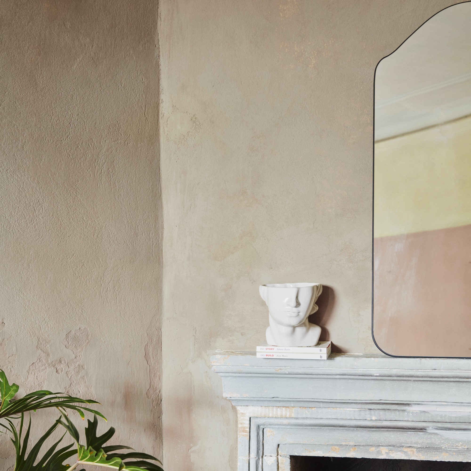
‘Another consideration was identifying city aesthetics that didn't overlap with each other too much. Poblenou in Barcelona has a very specific identity with a contemporary Mediterranean feel. And then there's Charlottenburg, which is elegant but also a bit gritty, they just felt like the four city neighbourhoods that were very different,’ says Charlie. Amsterdam and Edinburgh-inspired shades are also on offer.
The Hoxton x Bauwerk Neighbourhood Collection is available through The Hoxton and Bauwerk Colour websites.

Sara Hesikova has been Room Decor Editor at Ideal Home since June 2024, starting at the title as a News Writer in July 2023. She is now also the Ideal Home Certified Expert on Furniture, and so far has tried over 300 different sofas.
Graduating from London College of Fashion with a bachelor’s degree in fashion journalism in 2016, she got her start in niche fashion and lifestyle magazines like Glass and Alvar as a writer and editor before making the leap into interiors, working with the likes of 91 Magazine and copywriting for luxury bed linen brand Yves Delorme among others.