This small home is a masterclass in using broken plan kitchen design to add space
If you're considering a broken plan kitchen design, then check out this stylish space for inspiration

Ifeoluwa Adedeji
Sign up to our newsletter for style inspiration, real homes, project and garden advice and shopping know-how
You are now subscribed
Your newsletter sign-up was successful
Broken plan kitchen design is a relatively new trend in interiors. While the popularity for knocking down walls and going open plan has been huge for years, the pandemic made families long for more private spaces, rooms where you can work, read or relax, uninterrupted.
This four bedroomed Victorian terraced house in North London is a perfect example of how to design a kitchen and how an open plan space can deliver so much more reconfigured with a broken plan layout.
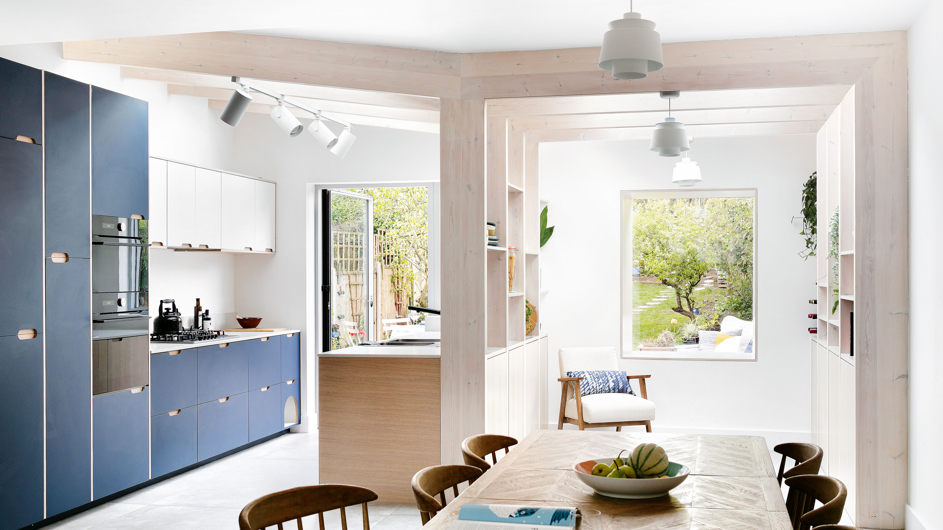
The property was originally small and compact and needed a kitchen extension to give the homeowners more space for their family. While many might be tempted to create a large open plan roomed extension, the owners, with help from their architect Amos Goldreich Architecture, have created a wonderfully airy kitchen diner with a seemingly separate space for storage and relaxing, thanks to a shelf laden dividing wall.
Here, founder Amos Goldreich talks us through the transformation, the issues that the original property had and the design that his firm came up with as a solution.
Article continues belowBroken plan kitchen design - why it works
‘Rather than building a standard box extension,’ explains Amos, ‘we wanted to reference the separate spaces, both internally and externally, using an asymmetric form that is united by white brick.'
'Inside,' he continues, 'the broken-plan layout offers opportunities to enjoy and interact with nature from many angles. We’ve maximised the space and reconnected the different areas while leaving them clearly defined; there is a kitchen, a dining area and a reading nook, plus a WC.'
The kitchen area
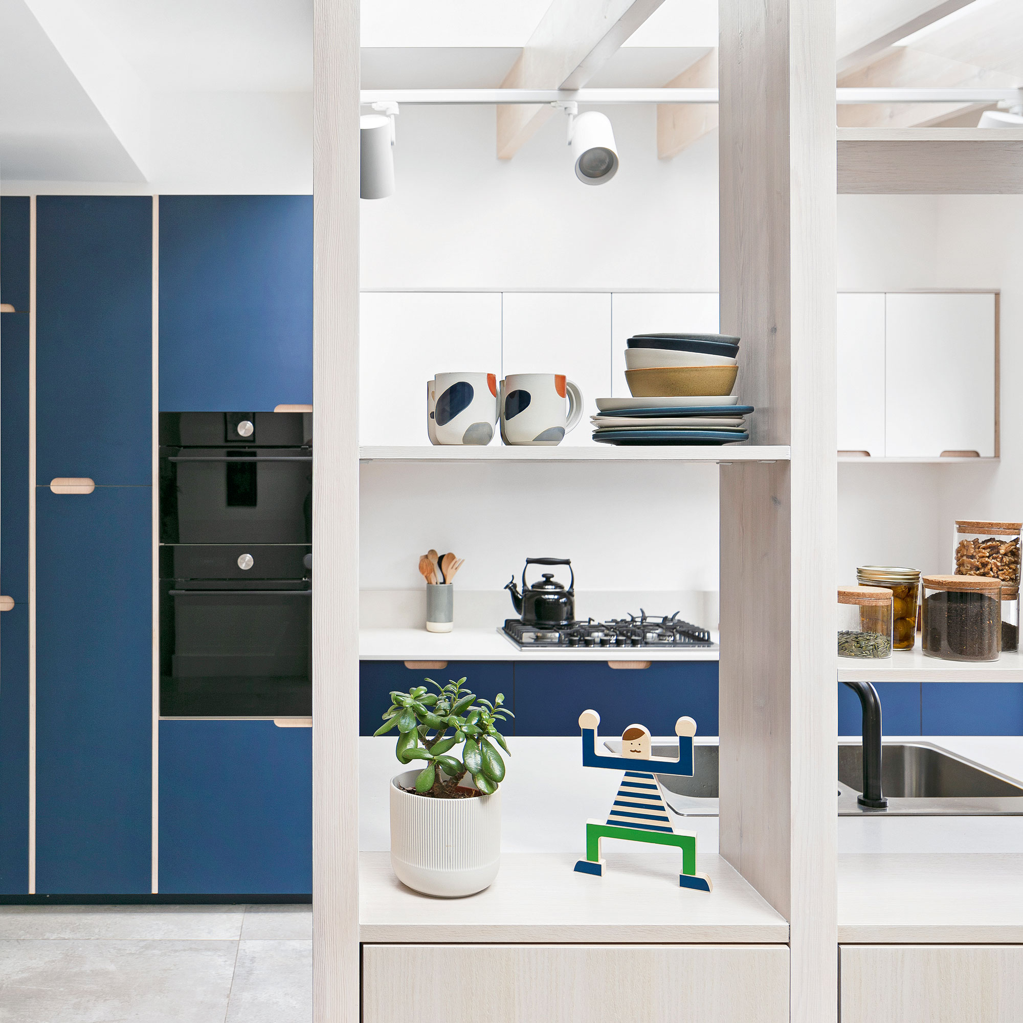
Dark blue replacement kitchen doors on standard kitchen carcasses were a great money-saving option that has allowed the owners to stay within budget while achieving a unique finish.
The bold blue is a great contrast to the neutral palette, ensuring that the space doesn’t feel cold, while the integrated handles on the door fronts help maintain a clutter-free finish in keeping with the contemporary space. These units again use the full height of the new space to maximise on storage.
Sign up to our newsletter for style inspiration, real homes, project and garden advice and shopping know-how

Pine joinery was used to create shallow cupboards and open shelving. This combination of small kitchen storage ideas allows the owners to use the area in a variety of ways, such as a children’s play area, or a cosy snug to read in.
It also provides an extra space from which the couple can work from home. High shelving means they can keep dangerous objects away from their small children and the cupboards allow easy access to everyday objects, which can be tidied away quickly.
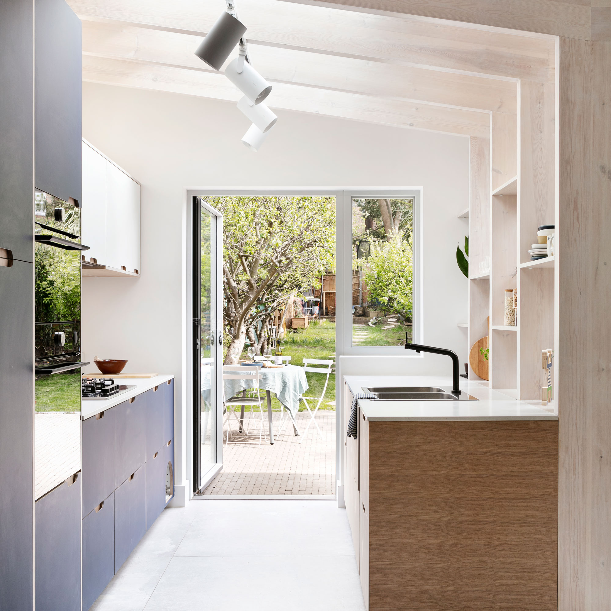
The owners have chosen to have a galley kitchen ideas format, using the natural divide of the structural frame to separate the cooking area from the dining and reading nook. The children can also be in the same room as their parents during meal preps, too.
The wall-mounted white units blend into the neutral scheme with the layout leading the eye out into the garden. Large format tiles add a subtle texture to the finish adding further interest to the muted scheme.
Amos says of the design: 'We used materials that encourage the diffusion of light throughout, while the complementary exposed pine rafters help to divide the areas and come down to form open storage.'
These reflect illumination from the spotlights, skylights and rooflights and natural daylight coming in from the rear garden door.
While the timber structure helps create a diving and clear structure, it does not obstruct views out, but invites occupants to look outside. This makes it feel like the garden is in use 365 days of the year.
Everything now has its own space and people can use the different areas at the same time without the room feeling crowded.

The asymmetric design of the new extension ideas immediately creates an impact as you enter the space. The roofline is highlighted and reflects the external form that can be seen from the garden.
The colour palette is generally limited to natural light hues, although a burst of blue creates a well-considered break in the scheme and stops the space from appearing stark.
Track lighting to one side supplements the rooflights, while pendant lights on the other side create a more intimate space.
Now setting up the dinner table while someone puts the finishing touches to a meal is straightforward. There's plenty of space between the areas to allow for this task to be completed without getting in each other's way.
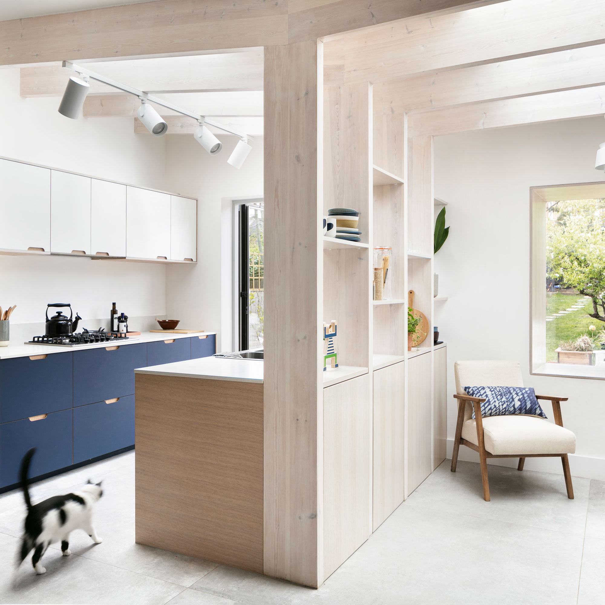
Structural timber beams bend and fold to support the new structure and continue from the ceiling down to not only divide the internal space but provide integrated storage.
There are both open shelving, great for displaying keepsakes, while closed cupboards prevent things being too cluttered.
The pale pine timber used works well in combination with the roof windows with natural brightness bouncing off the wood, helping the space feel light.
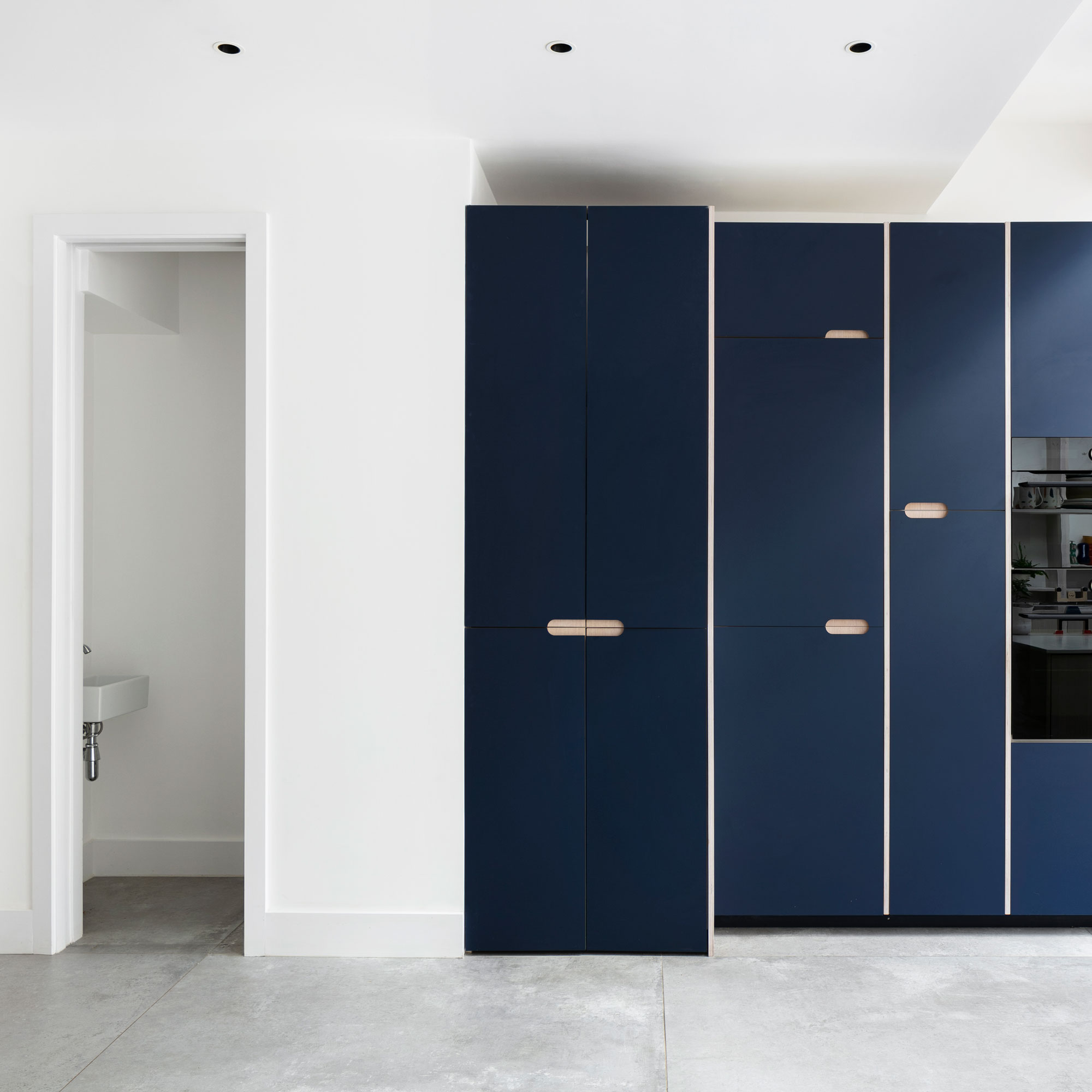
Floor-to-ceiling cabinetry provides ample storage in the small gallery kitchen, while a small toilet with a space-saving sliding pocket door is at the rear of the kitchen.
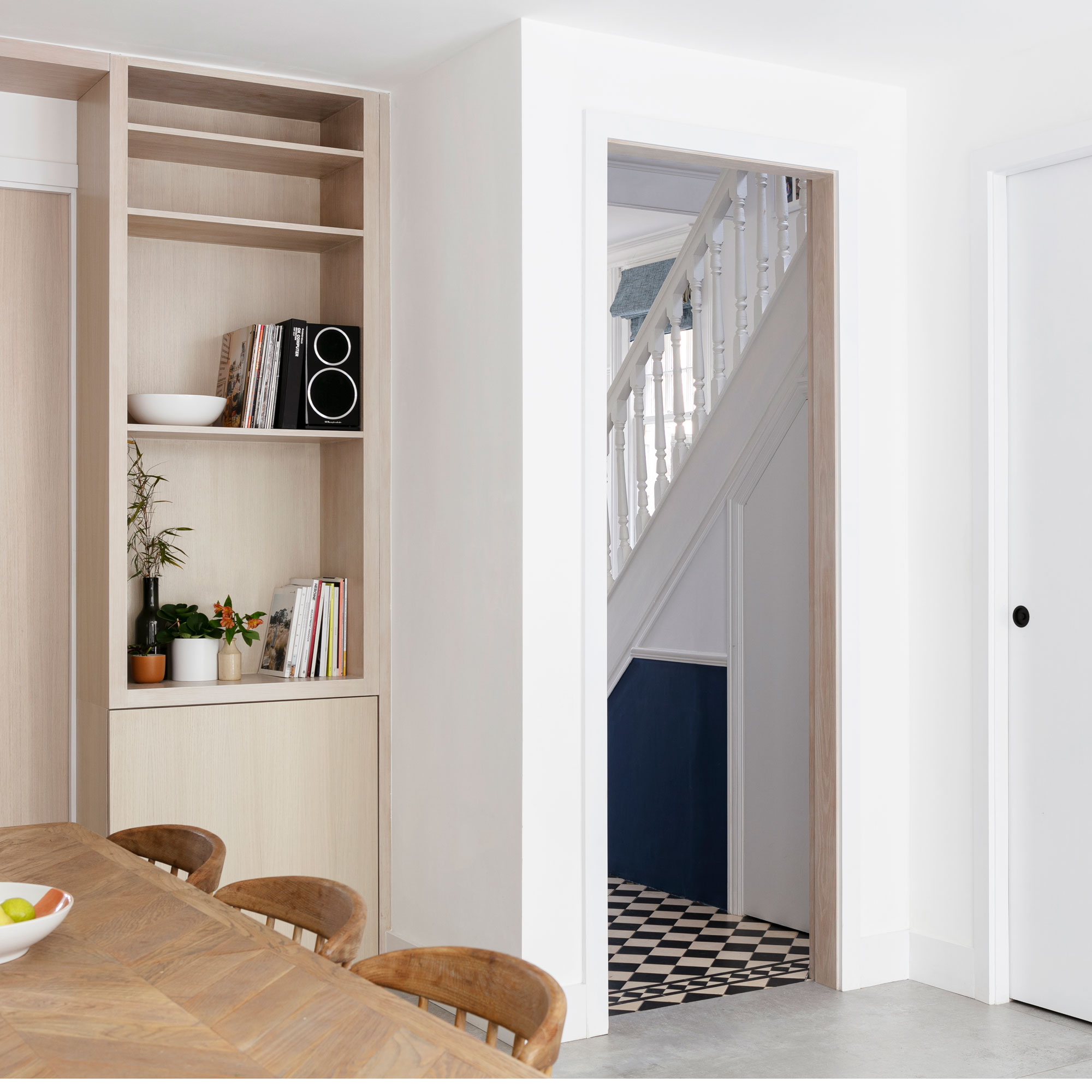
The hallway leads directly into the new extension space which features downstairs toilet ideas, separated from the room with the pocket door.
The dining area feels spacious offering plenty of room for the family to share daily meals, or to comfortably host and entertain guests.
A new shelving unit has been designed to make use of the entire ceiling height and a light timber chosen so it doesn’t feel overbearing.
The window seat

The separate reading nook feels private, yet gives the opportunity to speak to people whether they are in the dining or kitchen.
The space doesn’t have direct access to the garden, but as with all great window seat ideas, when you sit there it it feels like you are outside.
The extension’s asymmetrical roof shape helps filter light deep into the plan of this new addition, while the pale brick was chosen to establish a visual separation between the old and the new.
Perfect for all weathers, the additional ‘living area’ provides more space for other activities so that the extension becomes a multifunctional place that can be enjoyed all day, all year.
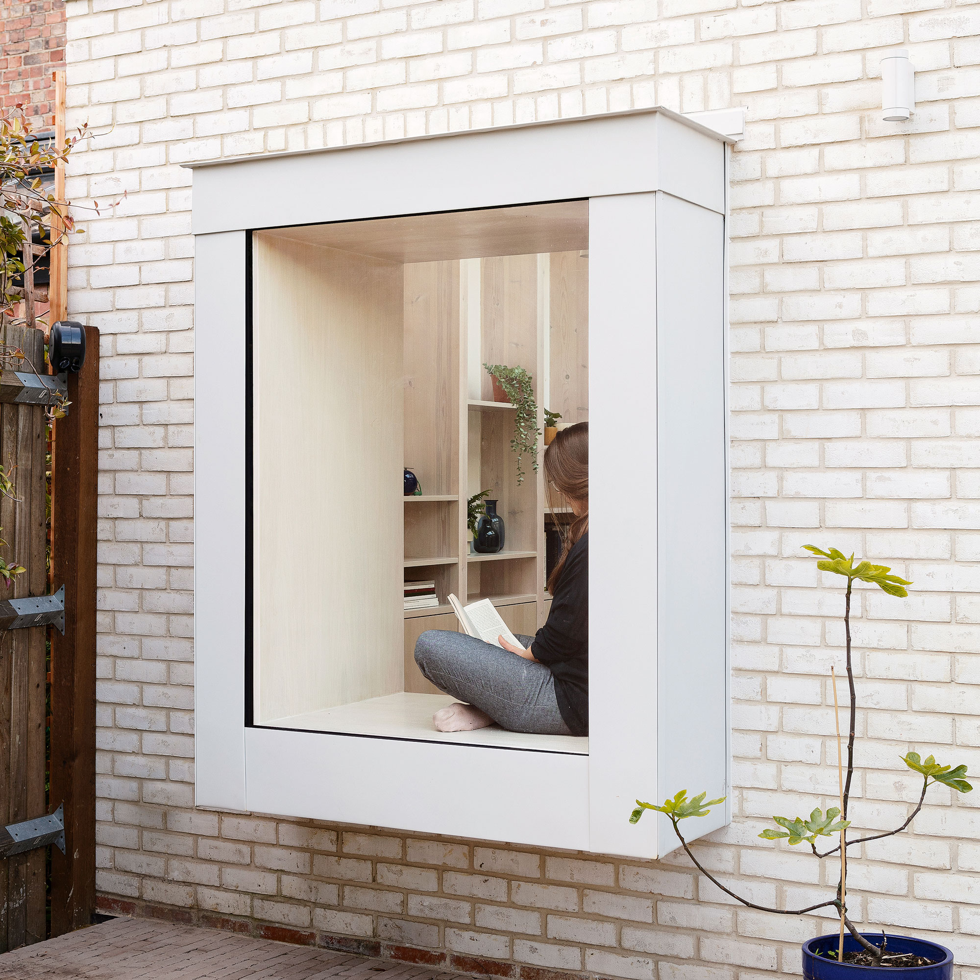
Brick pavers have been used to create a new patio area making the external space appear as light and bright as the internal areas. The window seat projects out into the garden helping to bridge a connection between the two spaces.
The exterior
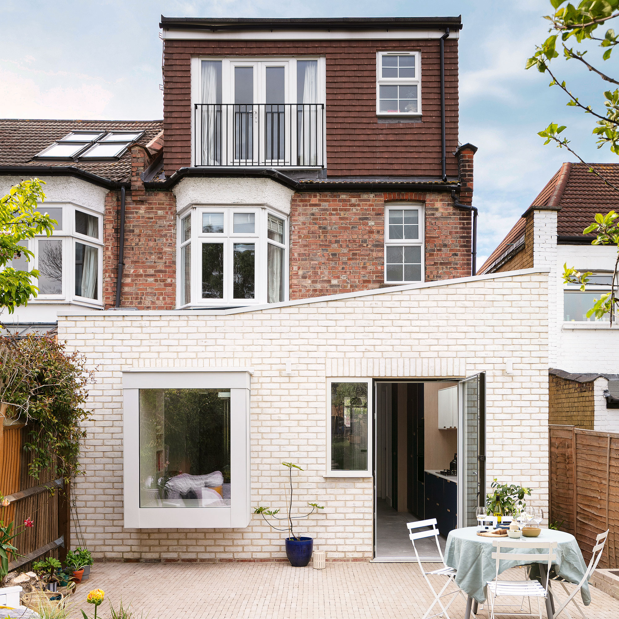
Outside, the contemporary addition is distinct because of the use of Karma White Stock brick. This continues the theme of lightness that has been employed throughout the interiors.
The owners and architects were keen to highlight the difference between the modern addition and the existing Victorian property. A large fixed glazed window complete with a window seat helps create a beautiful finish that connects the internal and external space year-round.
Architect Amos Goldreich adds: 'The use of the pale brick emphasises the freshness and newness of the extension and creates a separation from the existing part of the house. Brick continues to make an impact in the patio area, where we chose stone grey pavers in a small format to add interest while maintaining a similar aesthetic.'
The property before works began
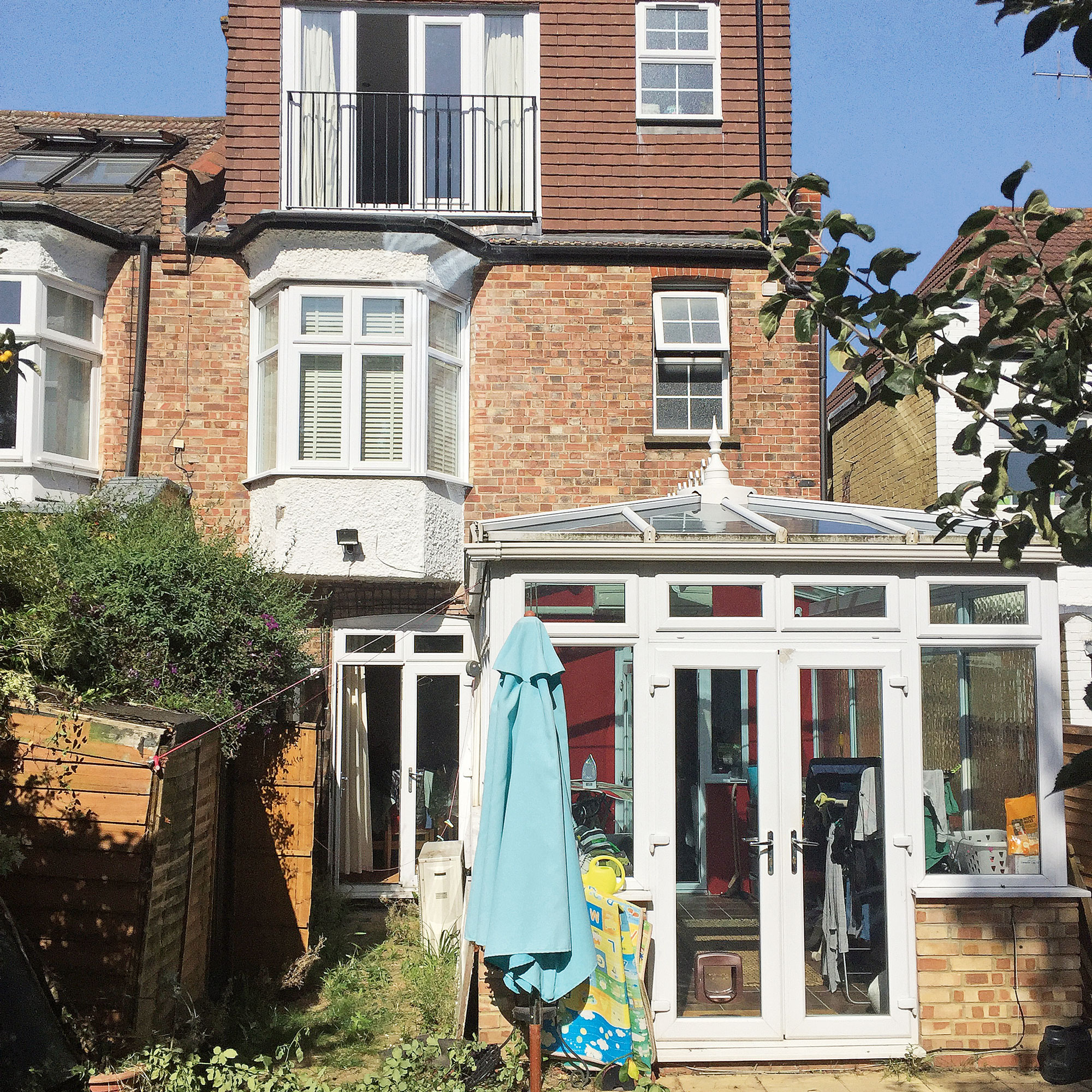
'Overall,' explains Amos, 'we created a better visual and physical connection to the outdoors, which instantly improves the sense of well-being. Now when the owners walk into their home they can see straight through to the garden.’
Focus On: Broken plan layouts
Architect Amos Goldreich shares his top tips and ideas
- A visual connection from one zone to the next allows for the space to act as a whole when wanted. This can be achieved and celebrated using feature joinery to create decorative screens.
- Using similar materials across the different zones will help them feel more connected and create a greater sense of space.
- Use cues not partitions - this can be a change in floor level, a feature skylight or a built-in piece of furniture to prompt a specific use.
- Consider both the room function and the number of people using it; a cosy library is different to a busy dining room. The flow between them could be controlled differently, maybe with concealed sliding doors.
- Different zones need different types of lighting to create the mood required in that space. These can be strip light, spot lights or feature pendant lighting. Think about how these look together and work together in one room.

Ginevra Benedetti has been the Deputy Editor of Ideal Home magazine since 2021. With a career in magazines spanning nearly twenty years, she has worked for the majority of the UK’s interiors magazines, both as staff and as a freelancer. She first joined the Ideal Home team in 2011, initially as the Deputy Decorating Editor and has never left! She currently oversees the publication of the brand’s magazine each month, from planning through to publication, editing, writing or commissioning the majority of the content.