Layout changes and savvy buys have transformed this 1970s Cheltenham family home
A 1970s house gets a modern makeover and the results are stunning
Sign up to our newsletter for style inspiration, real homes, project and garden advice and shopping know-how
You are now subscribed
Your newsletter sign-up was successful
Searching for their long-term family home meant Lucy Stone and her family embarked on their house hunt with a lengthy wish list. ‘We ended up looking for over a year in the end, and eventually had to compromise on the style of property,’ Lucy explains.
The couple originally had their hearts set on a Regency style property, but they also wanted off-road parking and a garage, which limited the search somewhat. With house prices steadily rising, they had to speed up their search and compromise on the style of the house, which opened up a lot more options.
’When this detached 1970s house came onto the market, it ticked so many of our boxes' she says. 'I could instantly visualise knocking down walls to create exactly what we’d been looking for. It was spacious, had four-bedrooms and it popped up at the right time, offering us bags of potential. The potential was just too good to pass up on! As a couple, we aren’t afraid of DIY or getting stuck into a project, so we jumped at the opportunity.’
Article continues belowStep inside more of our beautiful real home house tours
1970s house makeover
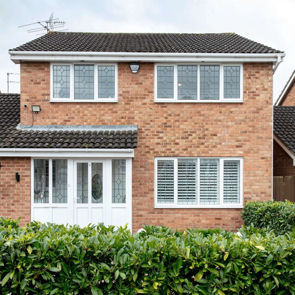
The house was liveable but very dated inside and every room needed redecorating from scratch. It hadn’t been updated in quite some time and the downstairs layout felt old fashioned and impractical. ’When it came to structural changes, we completely reconfigured the downstairs layout at the back of the house; knocking through to join the old kitchen and dining room together, and building a 3m x 10m rear extension. This large-scale extension meant we were able to create the multi-purpose kitchen, living, and dining space that we’d envisioned when we first viewed the property.'
‘We wanted to maximise the natural daylight coming into the extension, so opted for seven metres of sliding doors along the back wall, as well as three large skylights.’
Thinking of extending? Read: Kitchen extension ideas – to maximise the potential of your extended space
Sign up to our newsletter for style inspiration, real homes, project and garden advice and shopping know-how
Open-plan kitchen
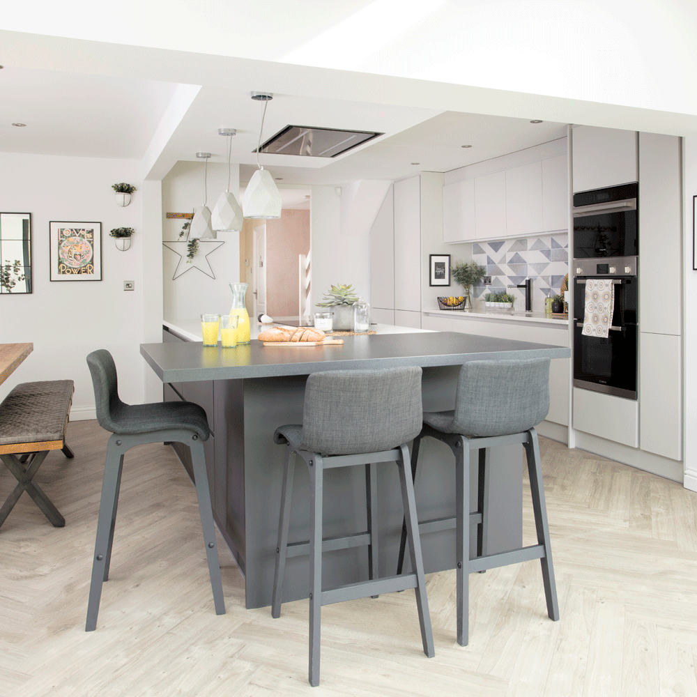
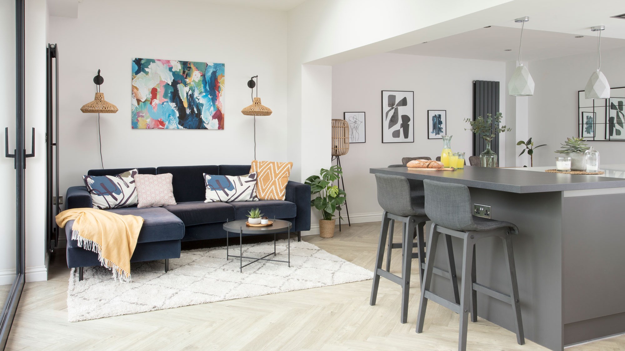
The couple chose to keep the open-plan space quite modern in its styling, to suit the new kitchen’s clean lines and minimalist finish. Grey and white is a timeless combination and it’s easy to update or change by adding splashes of colour through artwork and accessories. They also wanted to keep the room feeling as bright as possible, as this is very much their day-time space, and the light-coloured walls help to create the feeling of airiness. ‘I’m glad that we took the decision to splash out on the large back wall of glazing in the extension, as the amount of daylight it lets in is incredible, even on gloomy days,’ says Lucy.
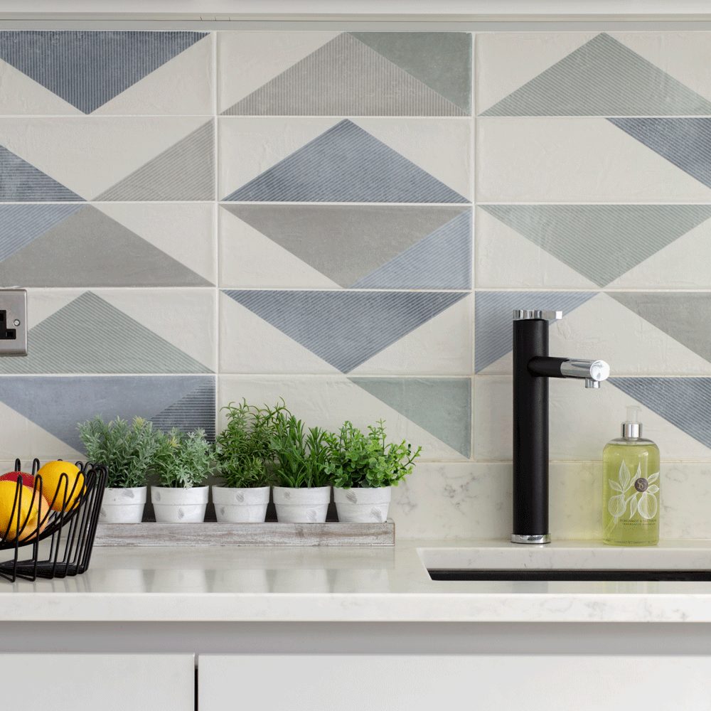
'We chose the Milano kitchen from Wren in a two-tone grey finish, as we felt something modern would suit the style of the property best. To break up the run of units, I chose these geometric wall tiles from Porcelain Superstore as a splashback.’
Speaking of kitchens: Ideal Home Kitchen Awards 2021 – it's time to reveal the winners
Dining area
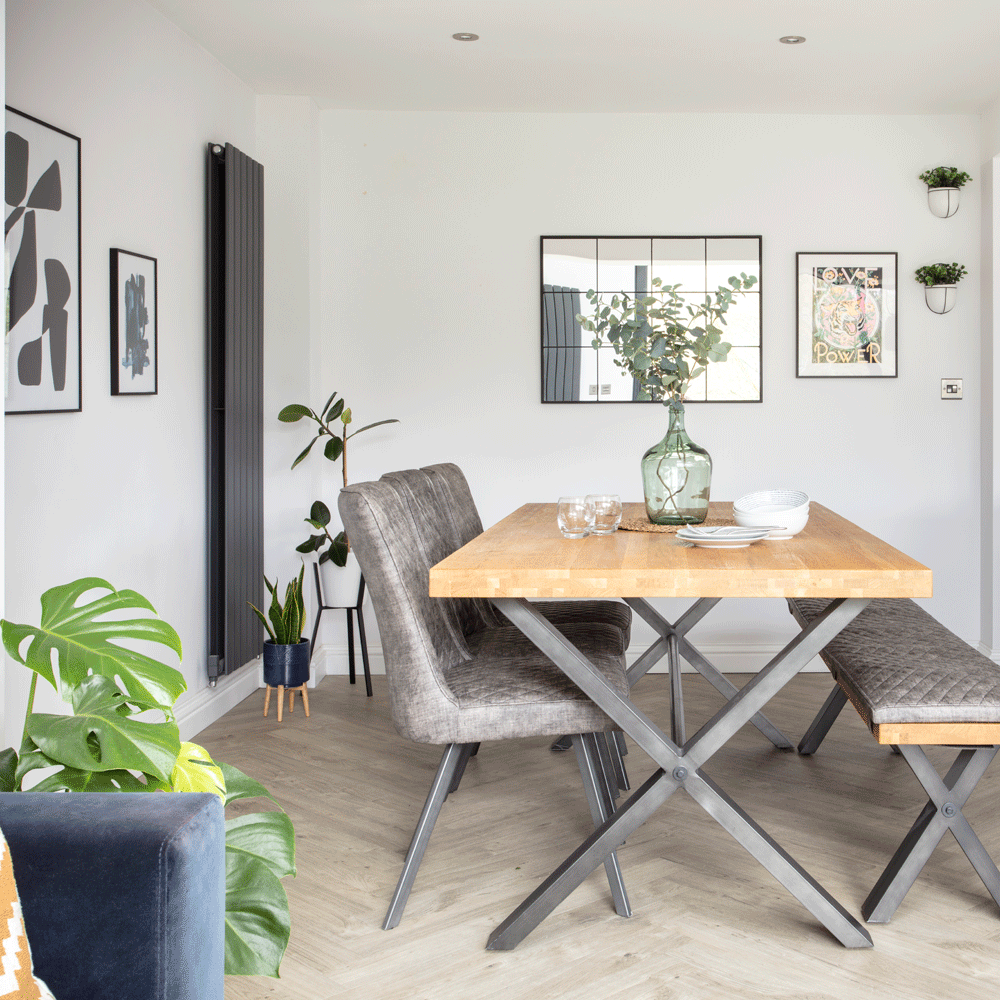
Their top priority was making the kitchen the heart of the house, with other spaces leading off it, with the central island as the main hub and focus. ‘As we stripped back every room, the house was essentially a blank canvas for us to put our own stamp on the interior, particularly in the new kitchen extension.'
‘We love to entertain friends and family so chose this large dining set from Furniture Village. It’s nice to have the more informal breakfast bar area, too.’
Seating area
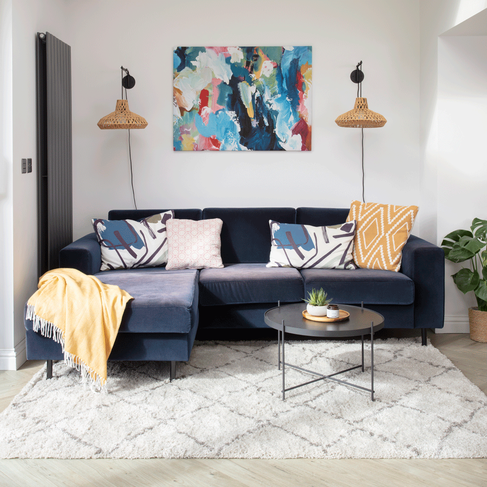
‘I’ve always been drawn to modern, Scandi style and this has certainly translated into how I decorated throughout the house. But I love colour and this velvet sofa from Swoon Editions had long been on my lust list. I’m glad I went for the bold blue finish, as it adds a splash of colour to the otherwise neutral space.’
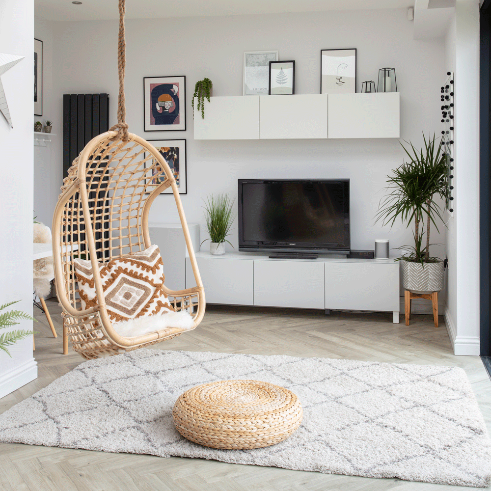
‘My top priority was making the kitchen the heart of the house, with other spaces leading off it. The hanging chair, from Arbol House, is one of my favourite purchases. There is always someone swinging in it, as it has lovely views over the garden.’
Living Room
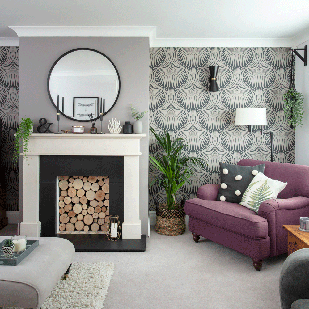
In the front living room, they opted for a slightly cosier colour palette with some richer tones, as this is where the family retreat to in the evenings and so the change in decoration suits the space. ‘We wanted the living room to feel warm and welcoming; the traditional features like the fireplace and window shutters add to the cosiness.’ To help the room feel inviting, they chose Little Greene’s Welcome and Dolphin for the walls and a Farrow & Ball wallpaper for the alcoves. The muted colours here are subtle yet warm.
Love grey too? Read: 32 grey living room ideas – from pale hues to deep charcoals for creating gorgeous spaces
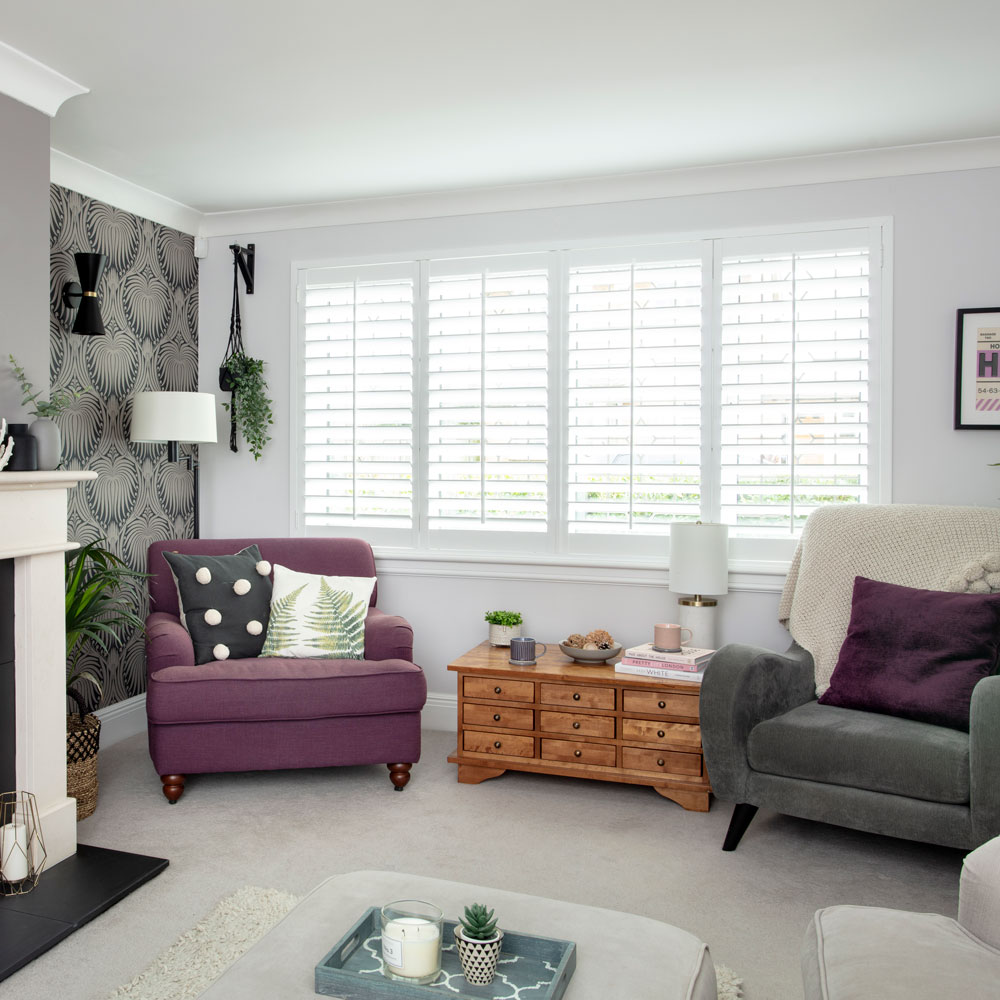
'I gathered a lot of my inspiration from magazines, as well as through Pinterest and Instagram, where I have a dedicated interiors feed, @lucystone80. My background as a homeware buyer and product developer meant I already had a good idea of the type of look I wanted to create, and I have access to lots of fantastic products through my own online shop @stoneandco.
Home office
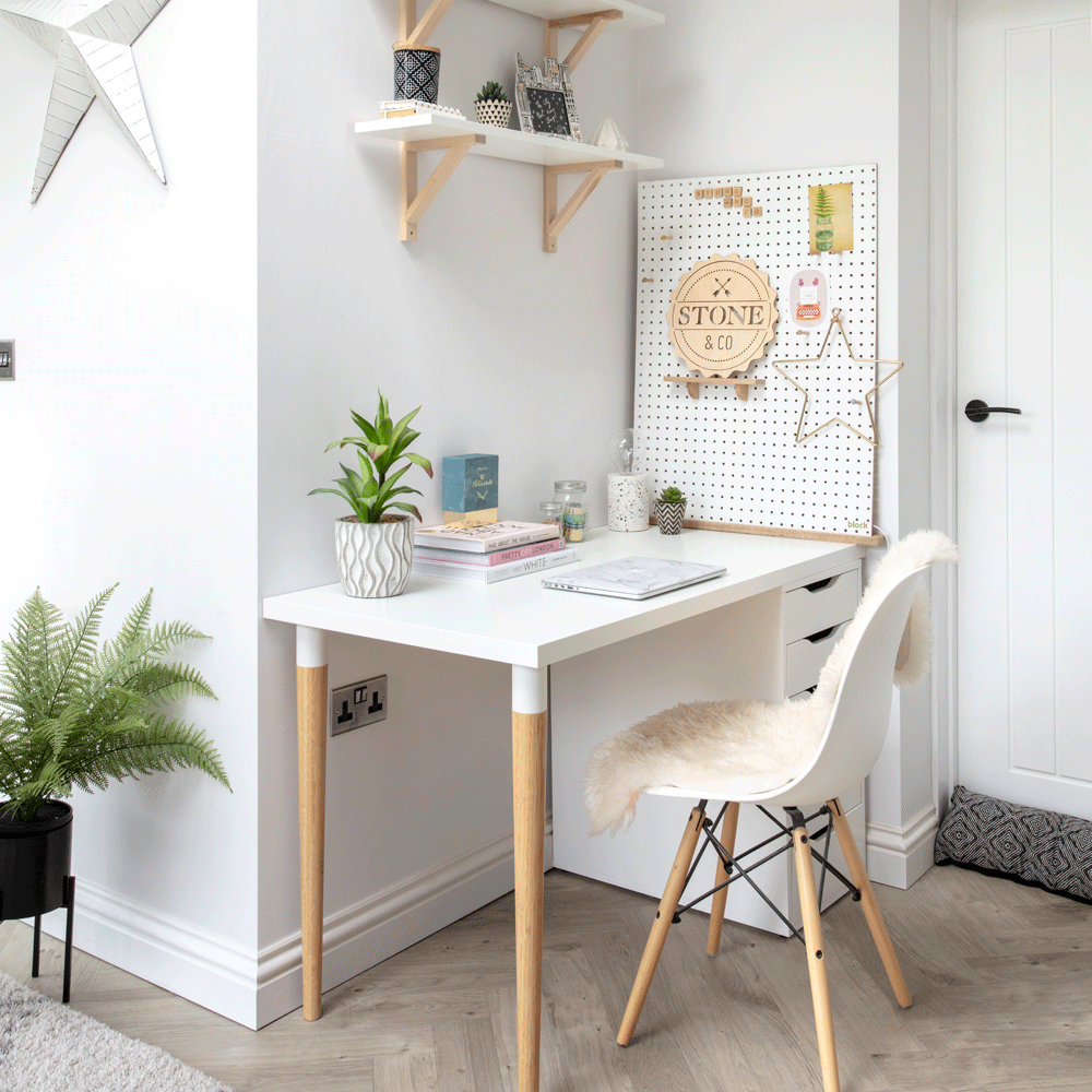
‘As I work from home, we made sure there was a dedicated office space incorporated into the extension plans. I love the fact it’s tucked away so I can switch off in the evenings.’
Master bedroom
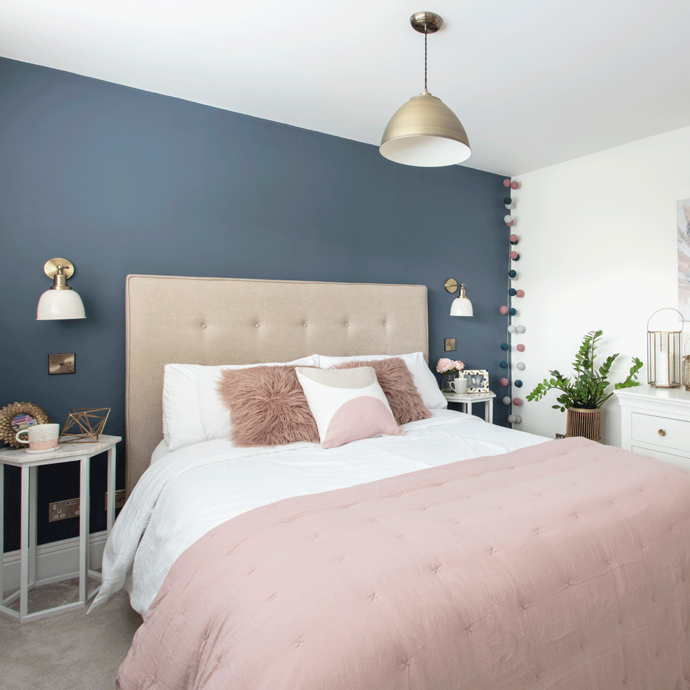
‘After sorting a bad leak in this room, I couldn’t wait to decorate it to become our main bedroom. I chose a colour combo of blue and dusky pink, with plush textiles for a hotel-inspired feel.’
Related: Blue bedroom ideas – see how shades from teal to navy can create a restful retreat
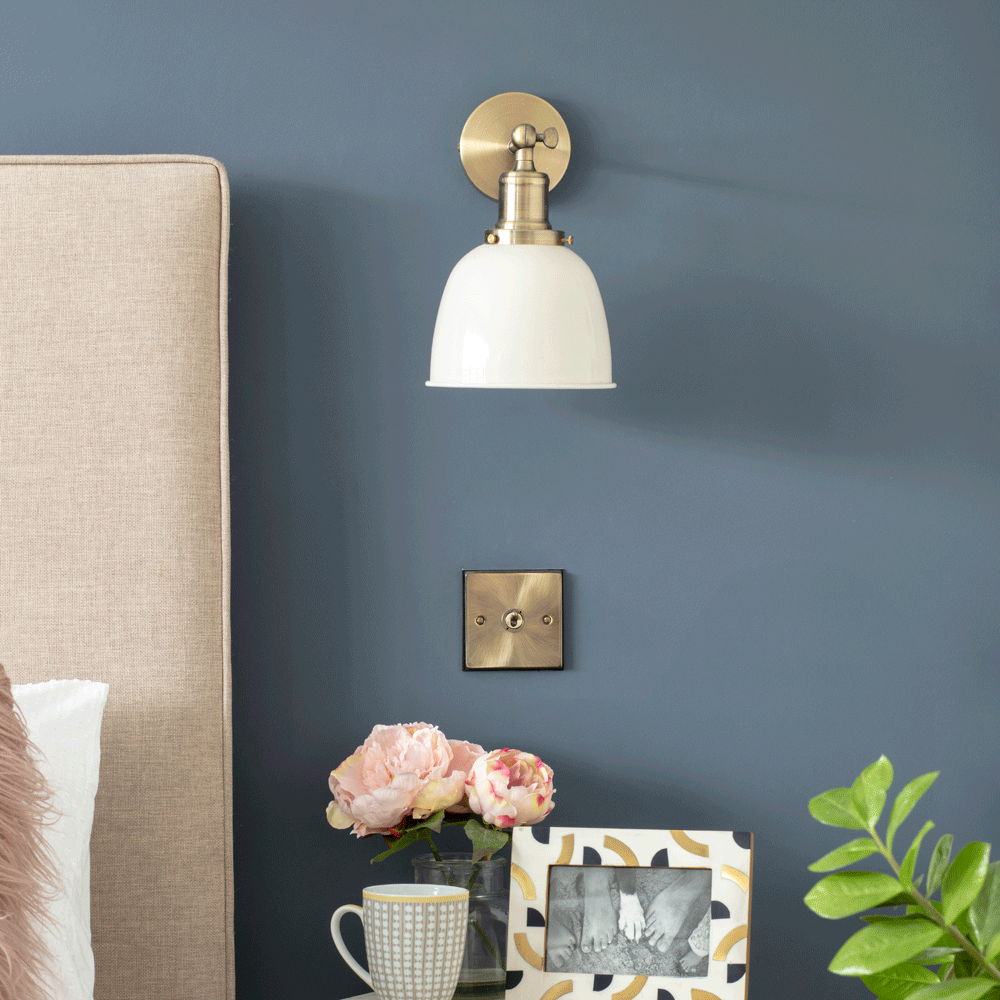
‘We didn’t have room for large bedside tables, so opted for wall lights rather than table lamps to save space. These are from Amazon.’
Guest bedroom
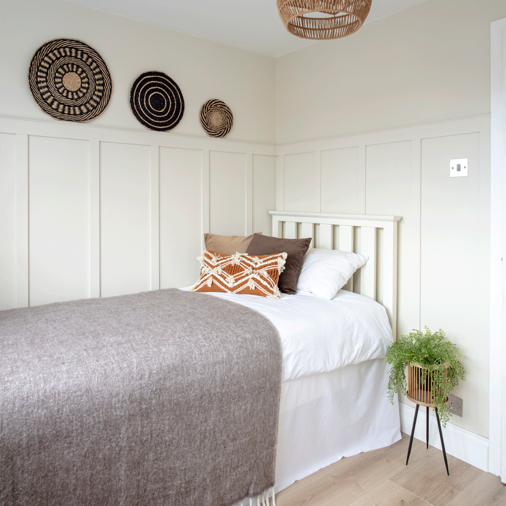
‘We put up the wall panelling in the guest bedroom to add some interest to the walls. We used MDF strips from B&Q and fixed them to the wall with panel pins, before priming and painting.’
Son’s bedroom
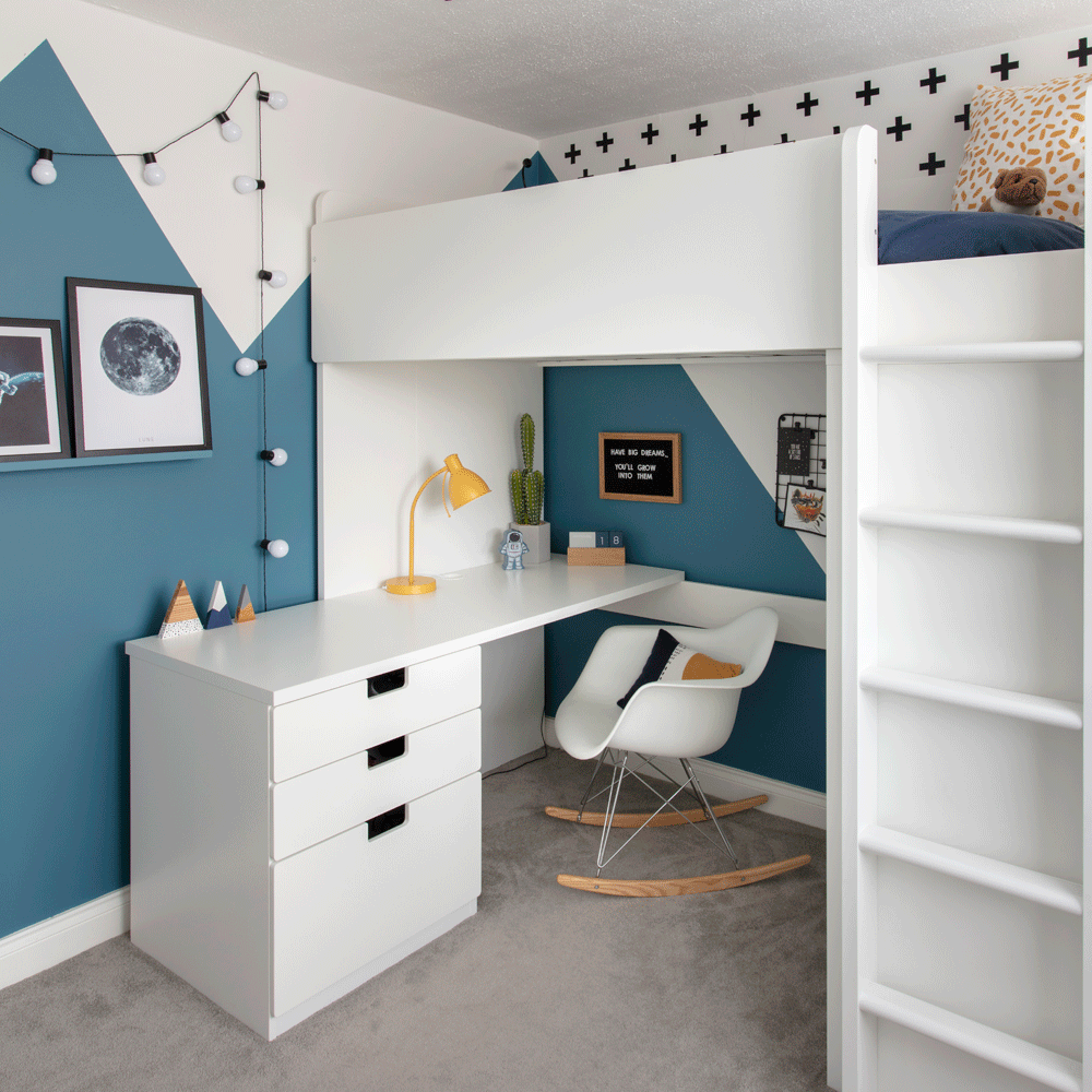
When they first moved in, there were a few issues that needed attention urgently, such as a leaking shower which had been causing damage to the living room ceiling. They tackled their son’s bedroom next, as it was a quick cosmetic job to modernise, and then slowly worked their way through the other rooms.
Daughter’s bedroom
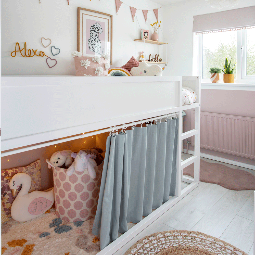
This bedroom has been painted in a split effect with pink and white, to break up the space and make the ceilings appear higher. ‘We turned the bottom part of this IKEA up-and-over bed into a cosy space for Alexa to read and play in. The curtain was easy to fix up using a rail, and the rug makes it feel like a snug den!’
It was a very exciting experience watching the new space take shape and seeing our ideas unfold! Once the new layout was in place, it was clear how drastically the transformation was going to affect how we lived in the house; we’d be able to spend time together, without feeling like we were on top of one another!’