7 2016 colours that are having a huge comeback this year – experts reveal how to make them look stylish, not dated in 2026
Let's take a trip down memory lane

Sign up to our newsletter for style inspiration, real homes, project and garden advice and shopping know-how
You are now subscribed
Your newsletter sign-up was successful
Haven’t you heard 2016 is back in a big way? The internet has been feeling nostalgic this month for what it considers ‘better times’, 10 years ago, and our homes aren't immune to this trend. It is translating into a number of trends staging a comeback, including a revival of these 7 colour trends that were huge in 2016.
I was 15 in 2016, watching my mum ponder over the colour trends of the time, and 10 years on, I’m finding myself considering similar palettes in my own home. How time flies, but also proof that home decor trends are circular.
It’s called a trend cycle for a reason, but as these seven colours come back into fashion, it’s fair to say we’re adapting them for our 2026 tastes. So without further ado, these are the 2016 colours making a comeback in 2026, and how to use them in a way that feels fresh, not dated.
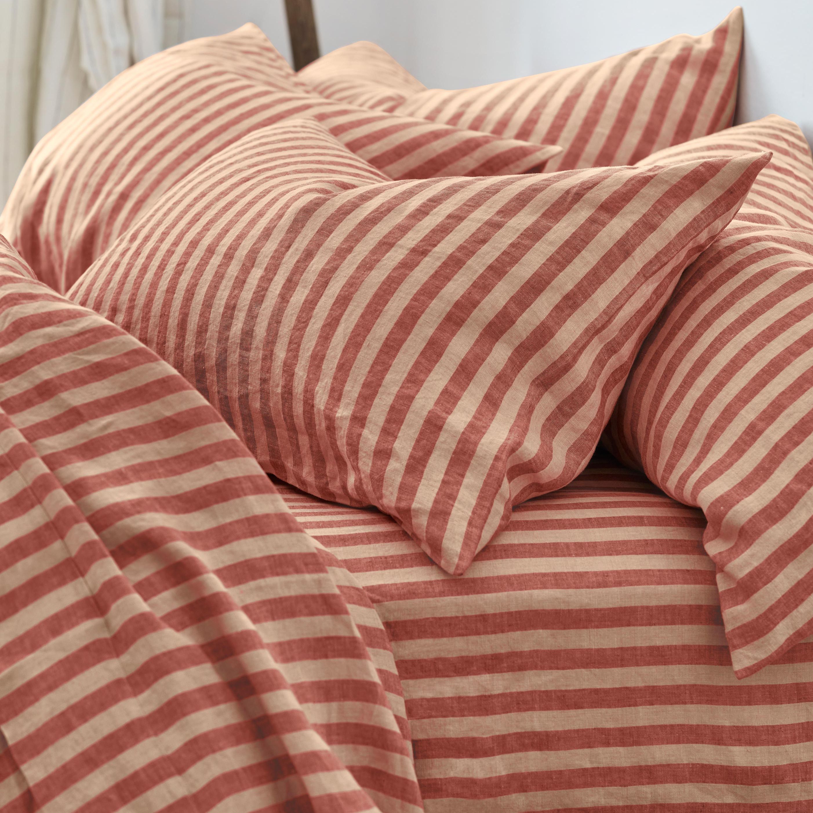
Article continues below1. Millenial Pink
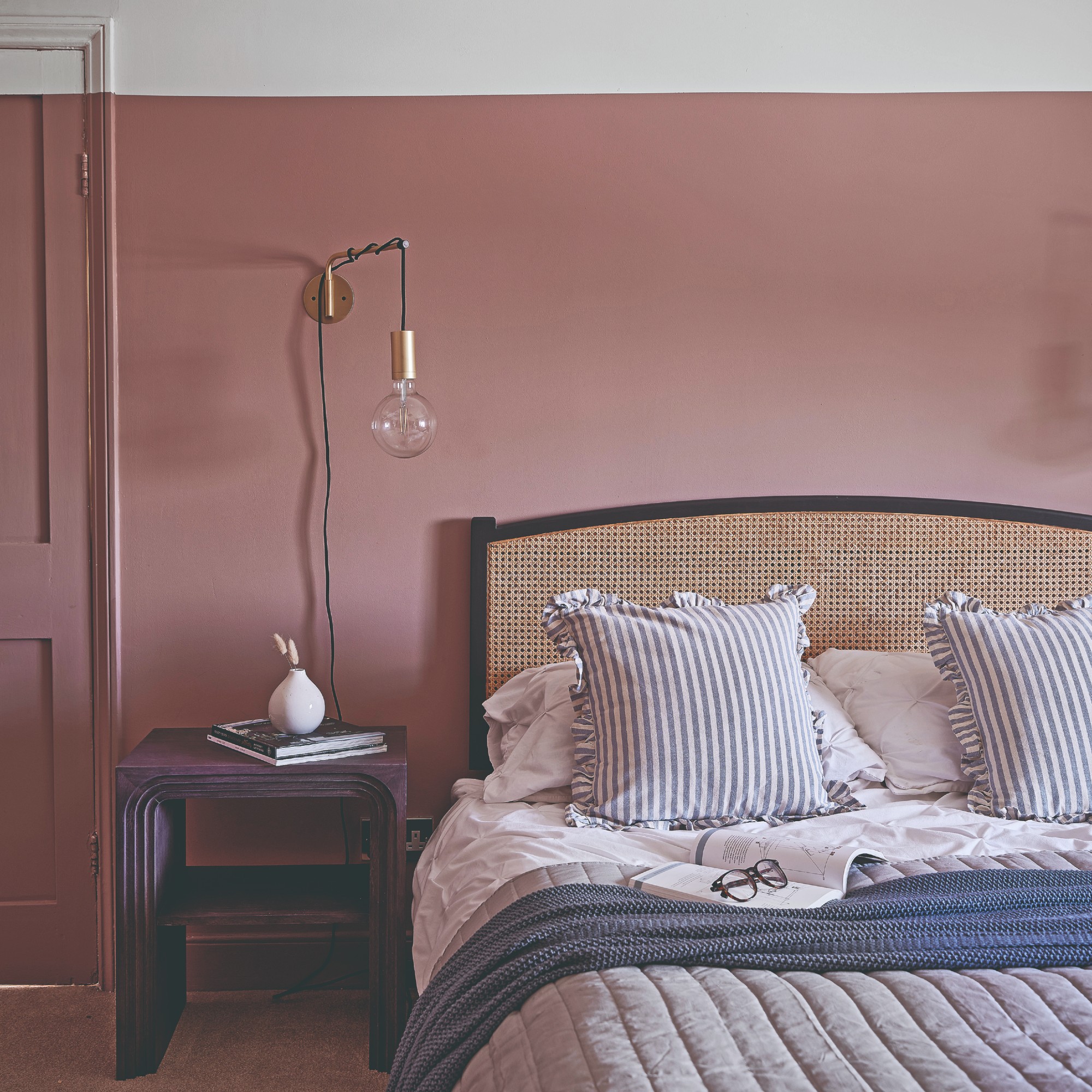
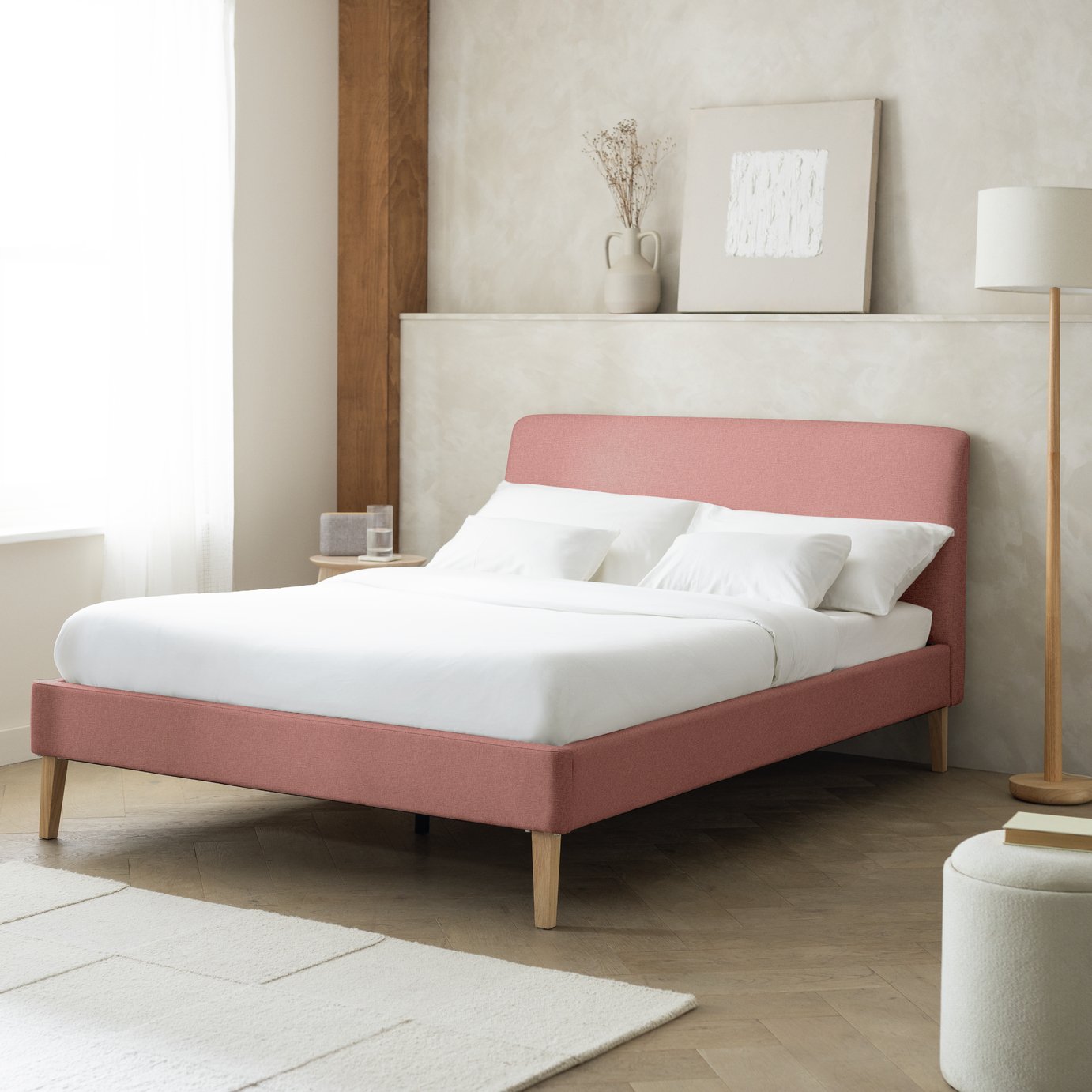
Back in 2016, Millennial pink was everywhere. Pink hues were in everything from rose gold jewellery (I can’t believe this ever trended) to Rose Quartz, a soft pastel, being Pantone’s colour of the year.
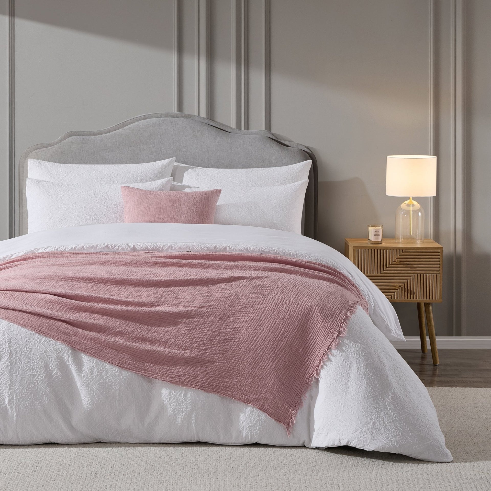
‘A shade that dominated interiors in 2016 was rose quartz, with the soft pink hue often paired with neutrals such as white, greys and creams to create a light, airy and serene atmosphere,’ says Kathryn Lloyd, Colour Specialist at Crown.
‘This year, we’re seeing pink make a comeback, but rather than the stark pairings of the past, this year’s focus is on more subtle shades. Interiors are now starting to prioritise muted, dustier pinks such as Crème de la Rose, bringing the same light and energy to a space with a more refined overall feel.
‘We’re also seeing an uplift in the use of rich, warmer pinks such as Rhubarb Rose and Made With Love. A great technique for incorporating these shades into interiors is by painting a half wall, which injects colour and personality into a room without it being overwhelming.’
Sign up to our newsletter for style inspiration, real homes, project and garden advice and shopping know-how
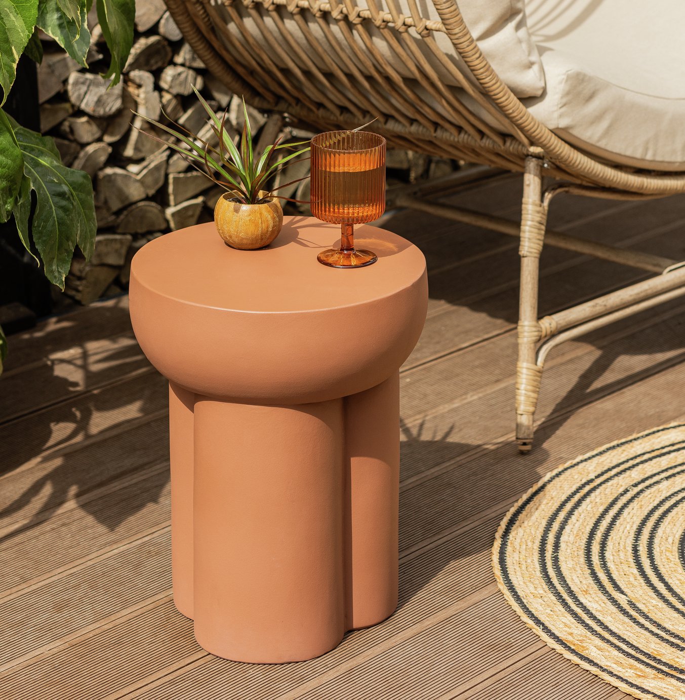
2. Warm Terracotta
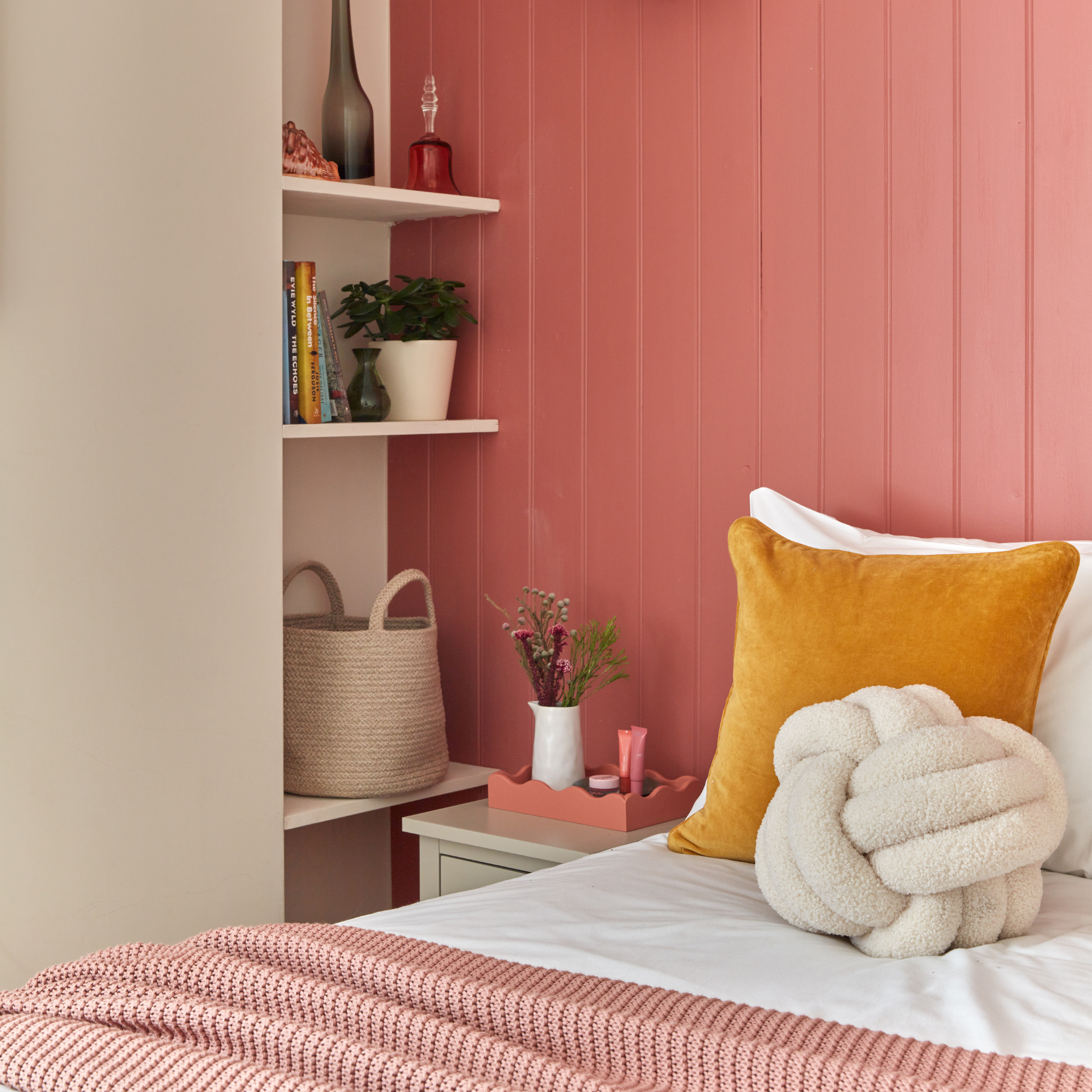
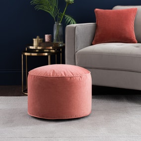
This earthy hue is one of my favourite paint shades, as terracotta is easy to decorate with. It is warm and inviting, so I’m thrilled it’s back in style.
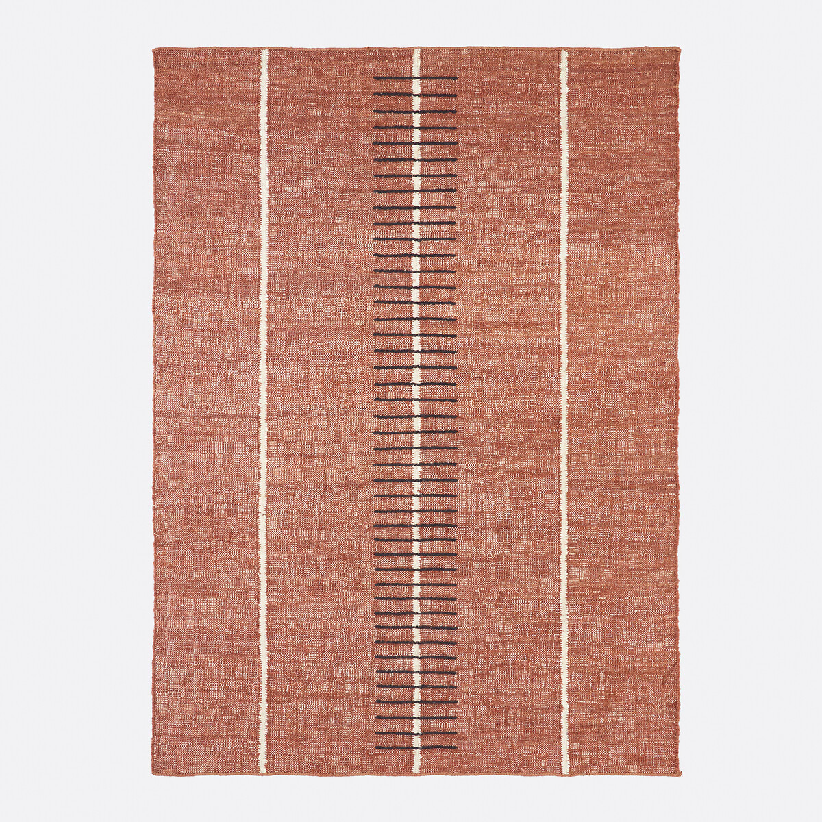
‘Terracotta was the boho shade in 2016, and I’m thrilled to see it back, but in a more refined way. Homes now are leaning into earthy, tactile tones that feel cosy but still sophisticated. Terracotta ticks every box: it’s warm, it’s grounding, and it has that handmade, artisanal energy that people can’t get enough of in 2026,’ says Victoria Robinson, style and trend expert at Hillarys.
‘I wouldn’t paint a whole room in it anymore (that’s very 2016), but I love it in smaller doses. Think cushions, pottery, textured blinds or even a single accent wall. Pair it with soft browns, warm whites and natural fibres to make it feel earthy and intentional rather than overly boho.’
3. Teal
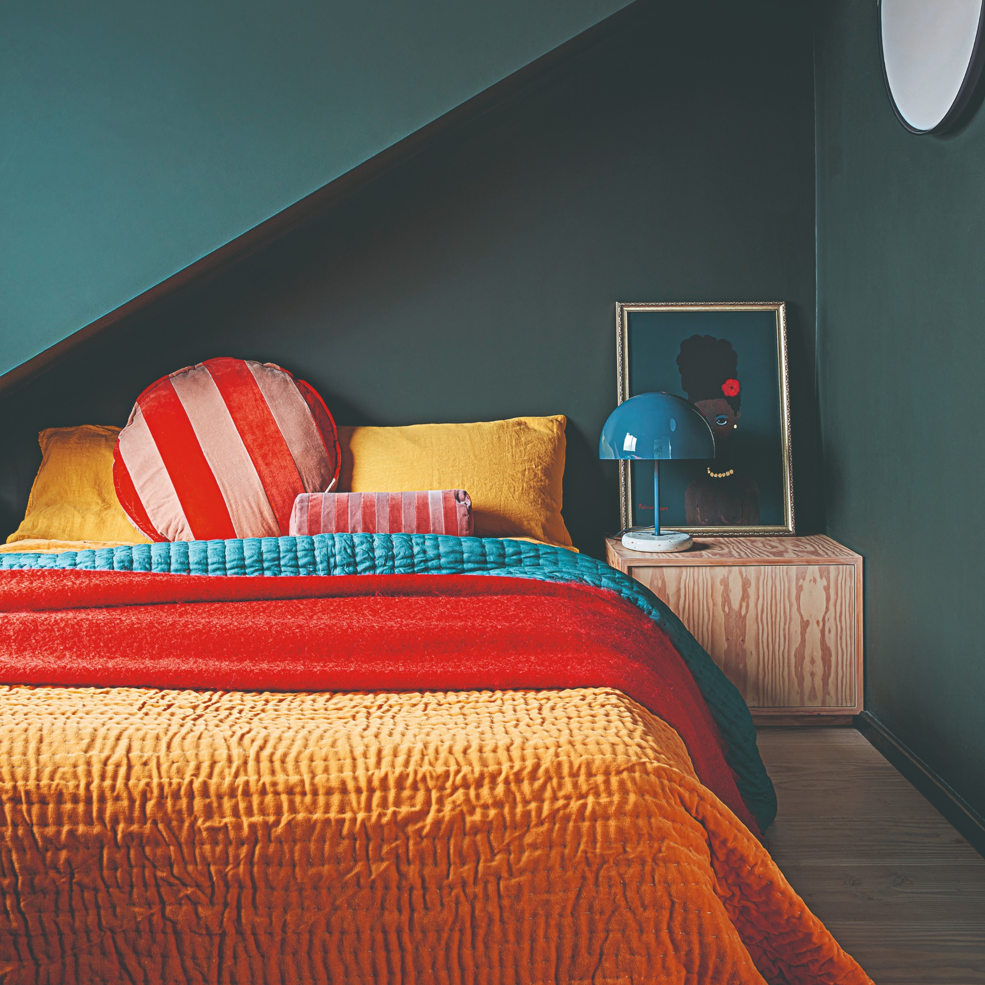
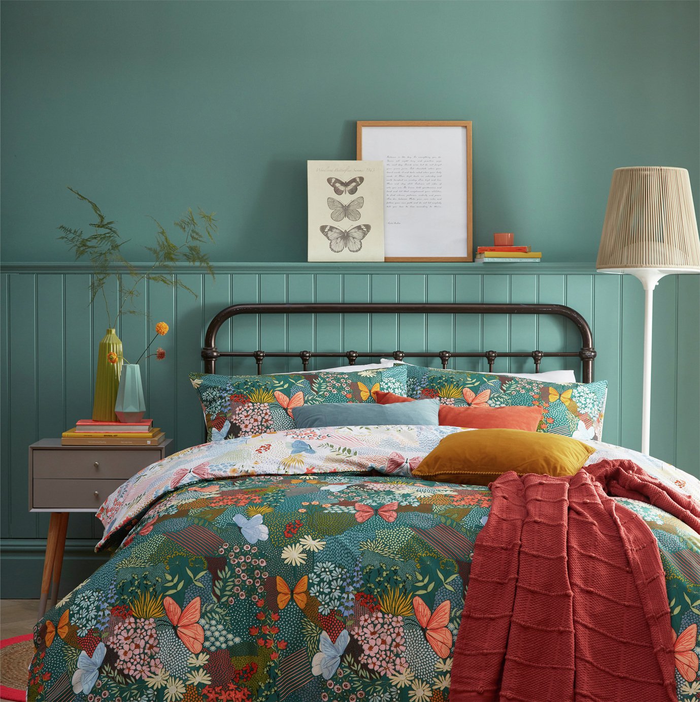
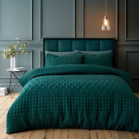
A beautiful blend of green and blue, teal feels like a bit of a blast from the past. I remember my coolest friends having teal bedrooms growing up, and now teal colour schemes will be making a return to stylish homes.
‘Interiors in 2016 favoured coastal blues and teals, and whilst we’re seeing a turn to richer, deeper blues in 2026, teal still remains a popular choice ten years later,’ says Kathryn.
‘Teal is a rich combination of green and blue – the two major colours of the natural world. As a result, it helps people to switch off and evokes a sense of wellness and calm. Shades such as Crown’s Teal work perfectly in living rooms to create a space to decompress.
‘Consider painting both the walls and ceiling with the shade to envelope the room in tranquillity, using deeper blue shades like Midnight Navy as accents to really bring out the depth of the room and create a simultaneously rich and muted atmosphere.’
4. Sage Green
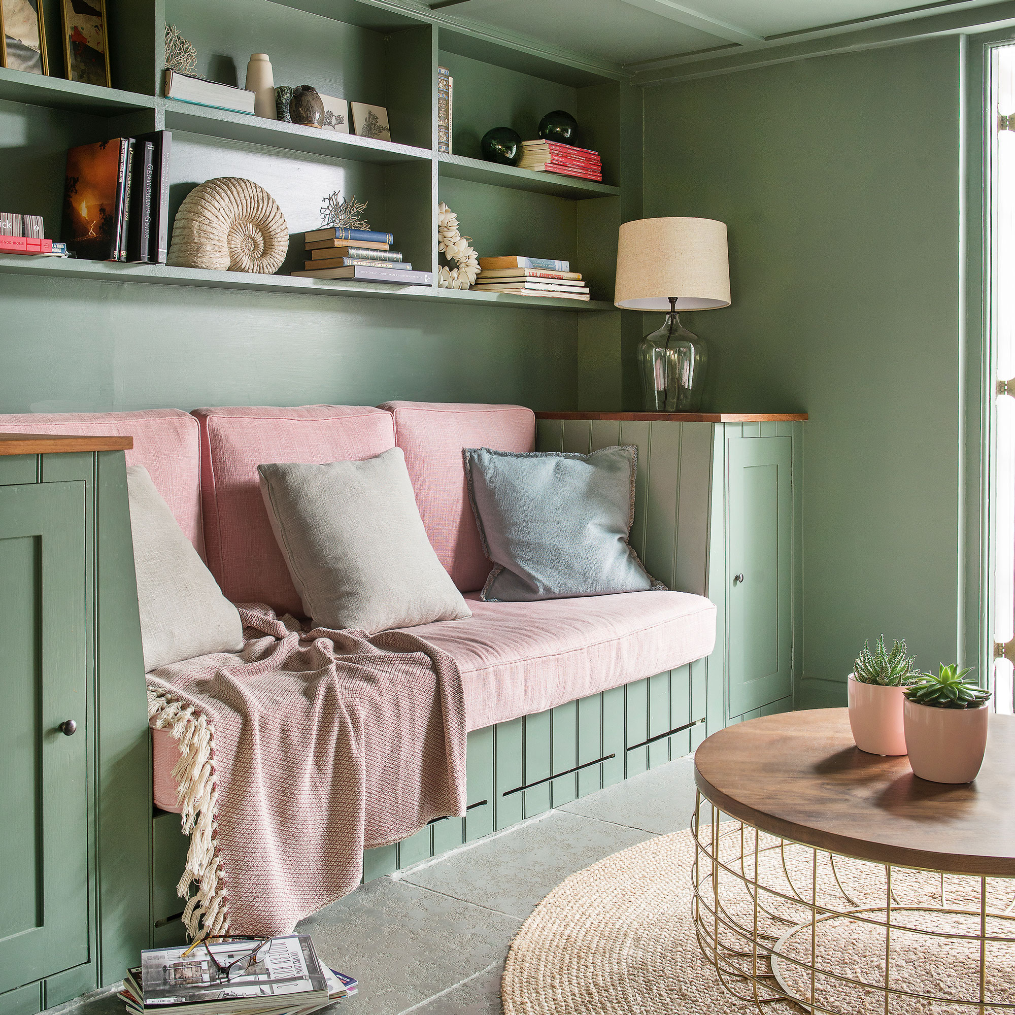
Sage green decorating ideas haven’t ever really left public consciousness, but experts believe they will be just as popular in 2026 as they were in 2016.
‘Sage green was a major player in 2016, with its cooler, muted, bluish undertones. But now, as we head into 2026, green is evolving into a richer, more yellow-infused olive,' says Interior Designer and Colour Consultant, Dan Lovatt.
'We’re craving more saturated, sophisticated hues. While 2016 leaned heavily on greys and greiges, now we’re seeing a warming shift - more yellows, more terracotta influences. Shades like COAT Paints’ 'Pan' or 'Ode to Toad' exemplify this - deep, yellow-leaning greens that feel elevated yet bold. 'Tobacconist' is another perfect example of this sophisticated, lush green direction.'
‘When it comes to greens, we’re now seeing a shift towards more saturated, richer tones. There’s a growing trend of embellishment in fabrics and upholstery, and spaces are becoming more layered and collected rather than just curated. This is where those rich, olive-y, yellow-tinged greens come into play. They still offer that biophilic connection to nature, but with an added layer of energy and vibrancy. This infusion of warmth and depth helps create spaces that feel both inviting and dynamic.’
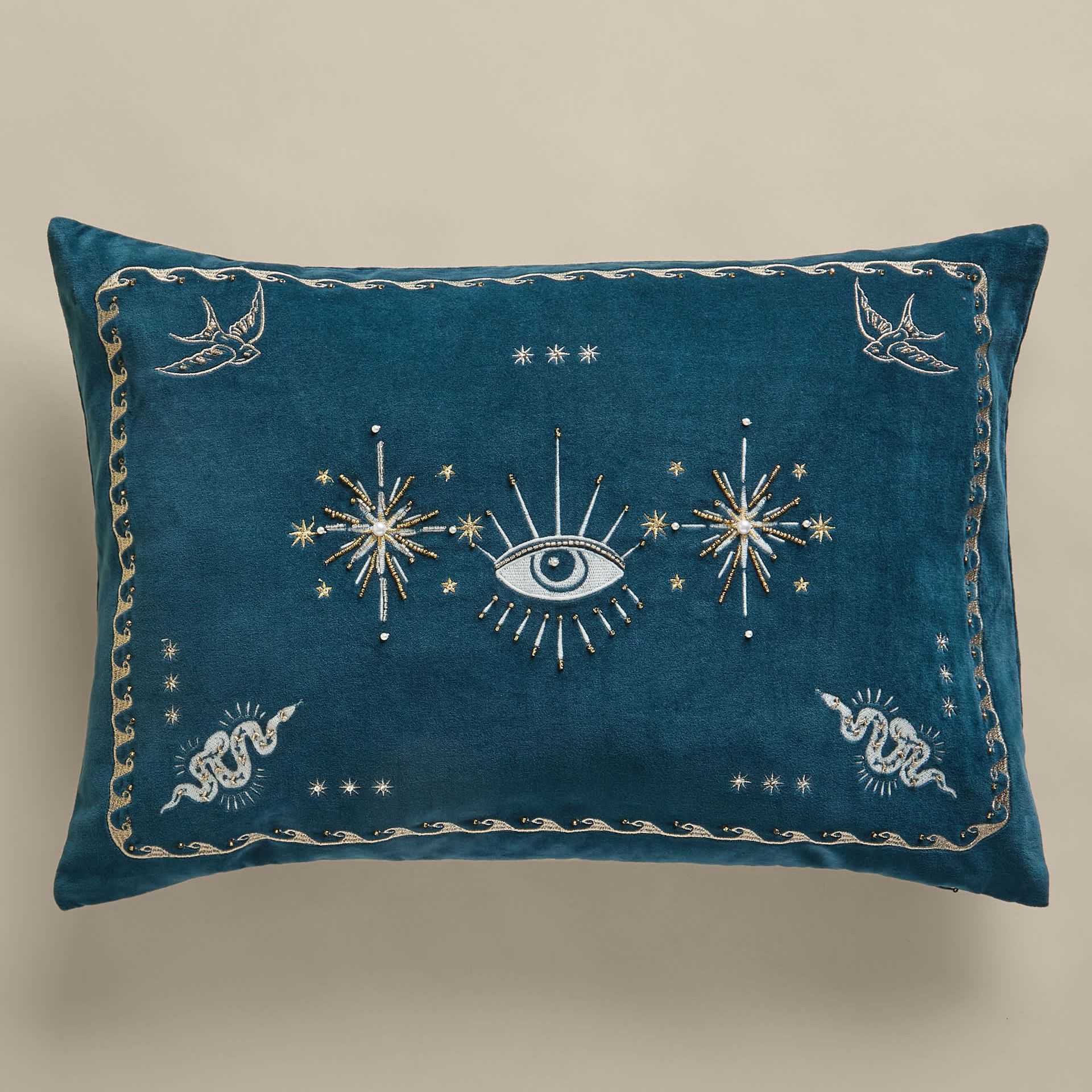
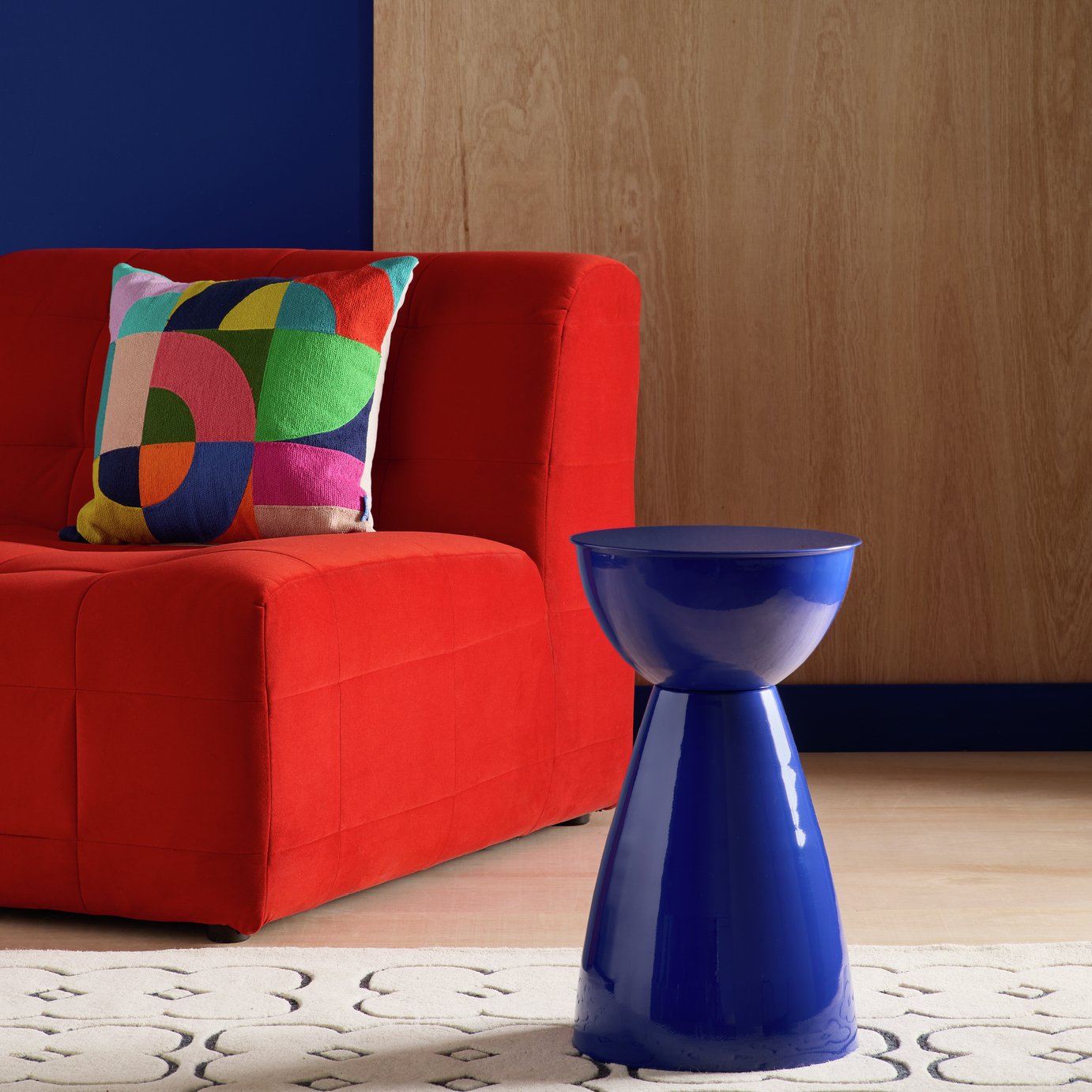
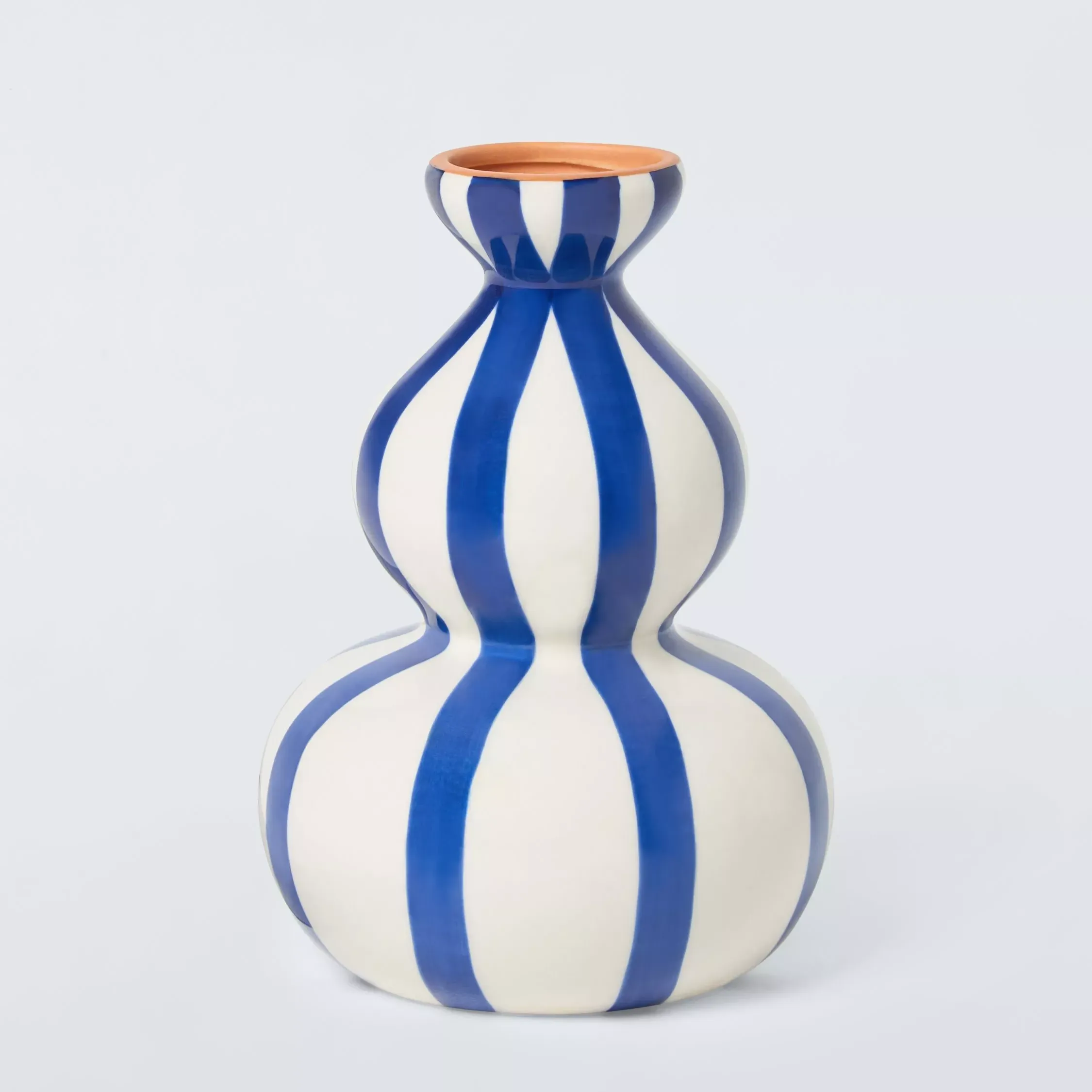
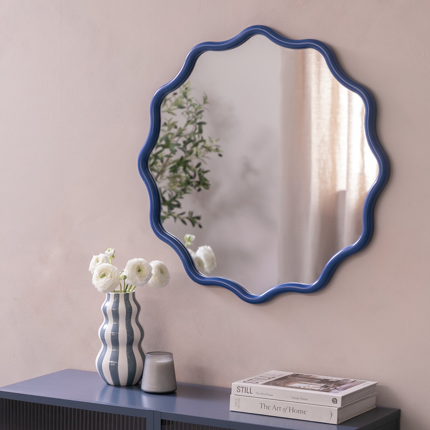
5. Bold Blues
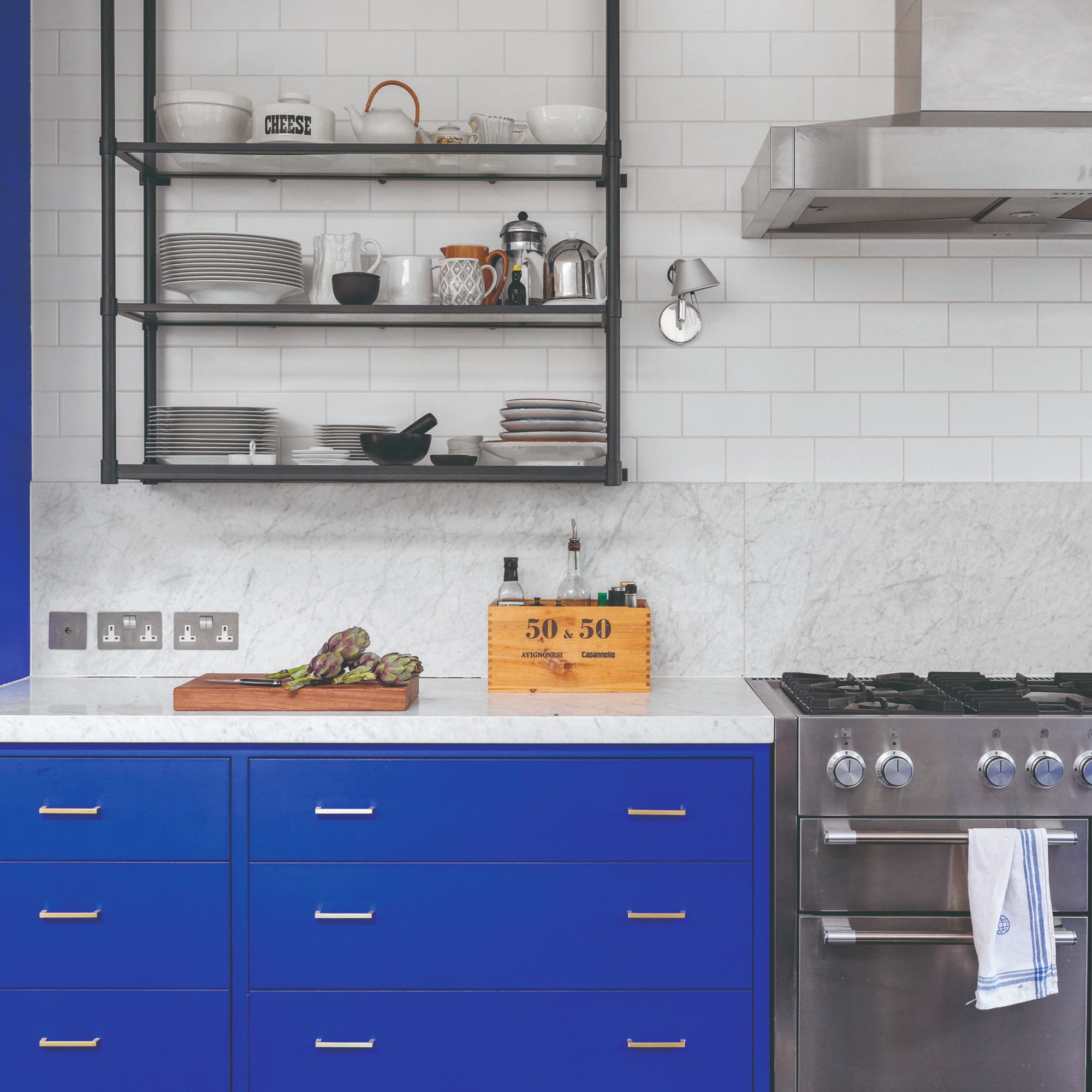
I’m not surprised at all by bold blues making this list, especially as blue is predicted to be one of the most popular hues for both fashion and interiors this year, also featuring heavily on Pinterest’s 2026 colour palette.
‘The popularity of colours changes over time; it is often an evolution rather than a revolution, with a movement towards different colours that feels like a natural progression,' says Ruth Mottershead, Creative Director of Little Greene.
'In 2016, we experienced the use of a lot of blue shades, with blue-based whites and strong blue hues such as ‘Ultra Blue’, ‘Smalt’ and ‘Mazarine’ rising to the fore. This move towards blue had evolved from the love of grey that we had seen in the early 2010s.'
‘It’s interesting to see the bold blues that were popular back in 2016, such as Cobalt and Yves Klein Blue, finding their way onto the catwalk at Loewe and Lanvin. Whilst not yet embraced again on all four walls in interiors, these intense and impactful blues, such as ‘Smalt’, work fantastically as a highlight colour on architectural detailing such as woodwork or skirting.
‘By using different blue hues on various elements with a ‘Double Drenching’ approach, you can incorporate these daring blues whilst maintaining a calming and harmonious feel. Pair rich ‘Royal Navy’ on walls with a related blue, such as deep indigo ‘Dock Blue’ on the ceiling, and a pop of striking, vibrant blue ‘Smalt’ on a window frame for a sophisticated and layered scheme. ‘
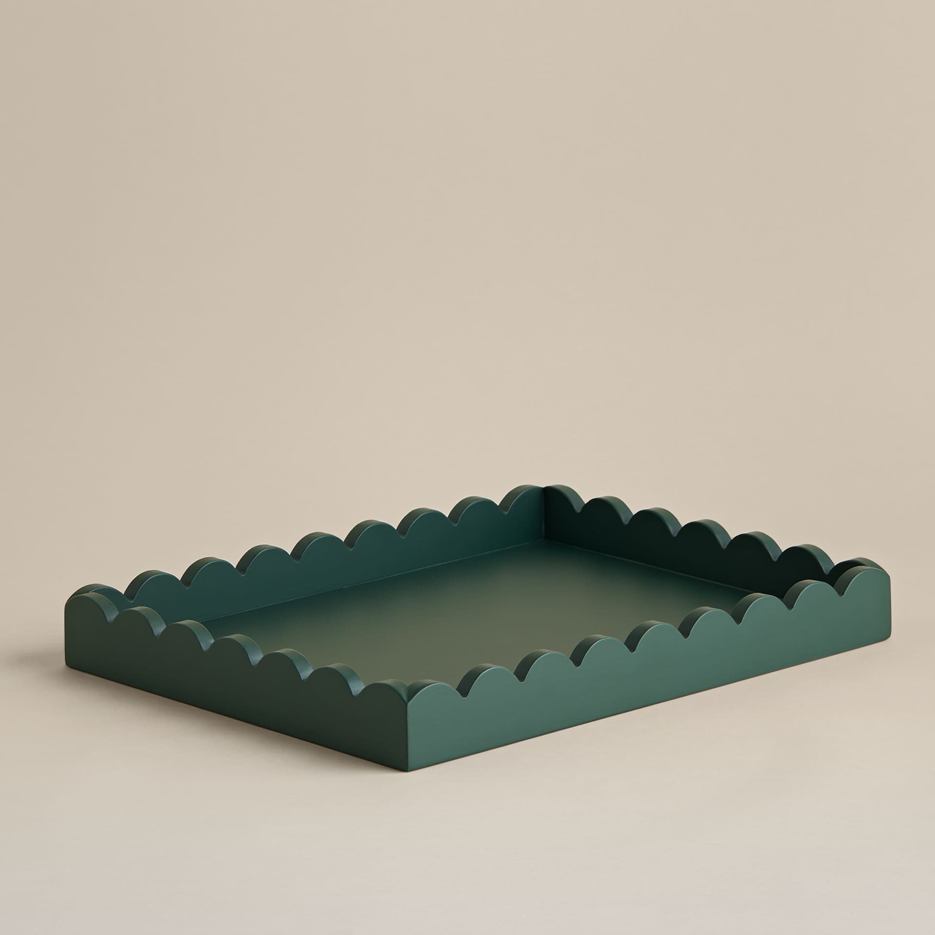
6. Forest Green

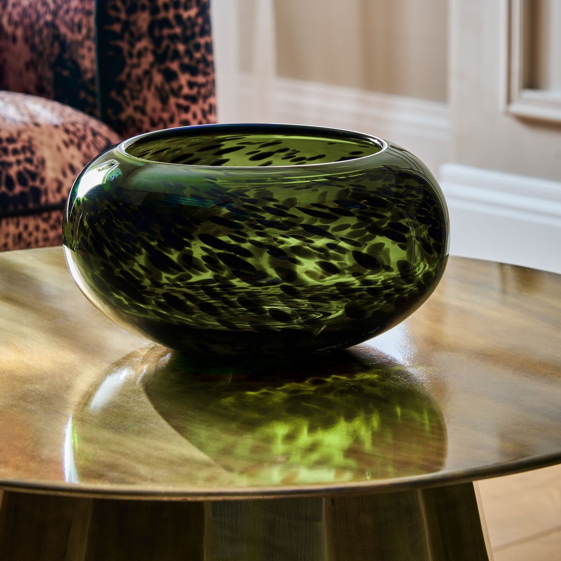
Fans of biophilic design ideas will be pleased to learn that forest green is regaining popularity for 2026.
‘Forest green had a massive moment around 2016, and I remember thinking even then: this is a colour that won’t stay away for long. It’s rich, it’s grounding, and in a world that feels fast and chaotic, people are craving that rooted, natural feeling again. It’s luxurious without trying too hard, which is a big part of why it’s resurfacing,’ says Victoria.
‘I’m using a lot of forest green in cabinetry and upholstery this year. It’s one of those colours that makes a space feel instantly more ‘finished’. Mix it with brass, cream, and natural stone for a really sophisticated look. If you’re nervous about going too dark, forest‑toned Roman blinds are a great way to dip a toe in as they add depth without overwhelming a room.’
7. Bright Yellow
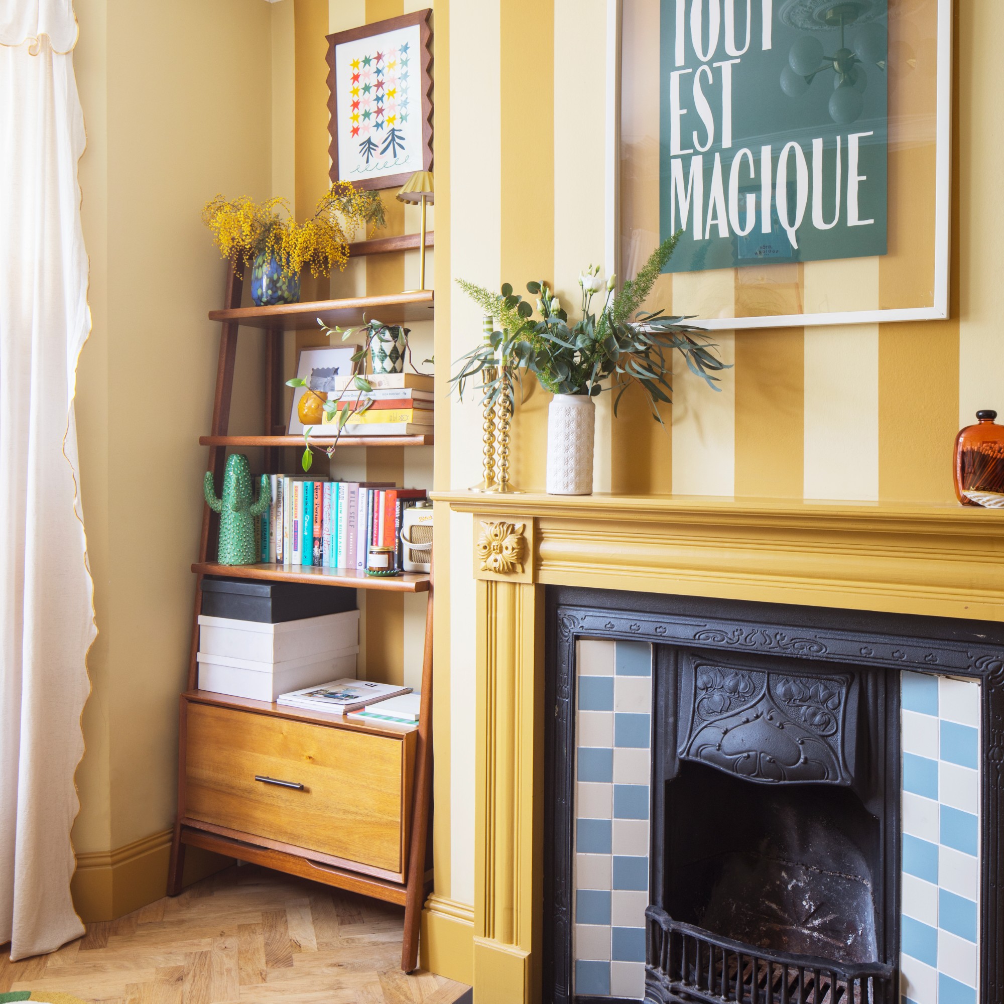
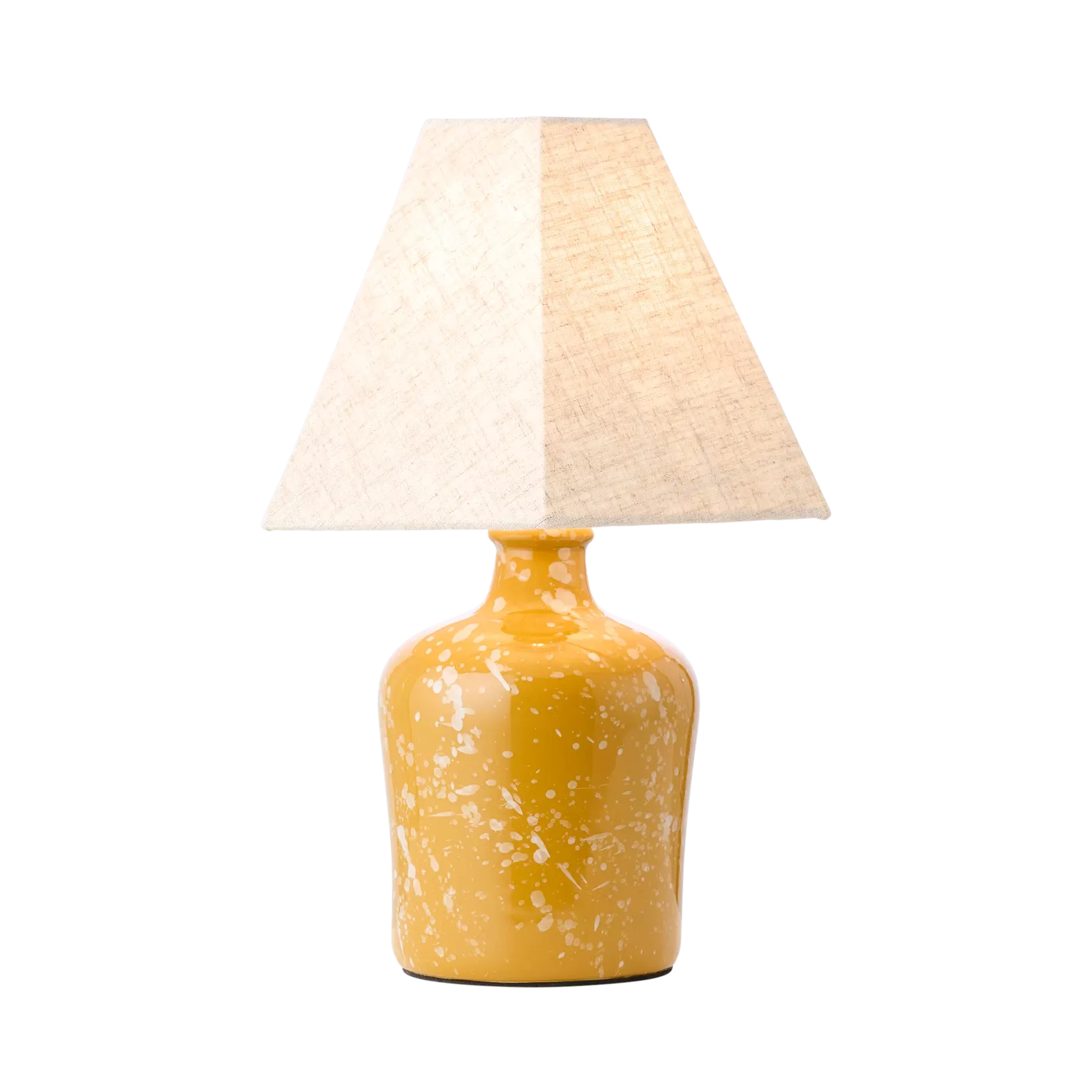
With butter yellow the surprising star of 2025, it’s fair to say yellow isn’t going anywhere in 2026 - just like the ochre tones we saw in 2016.
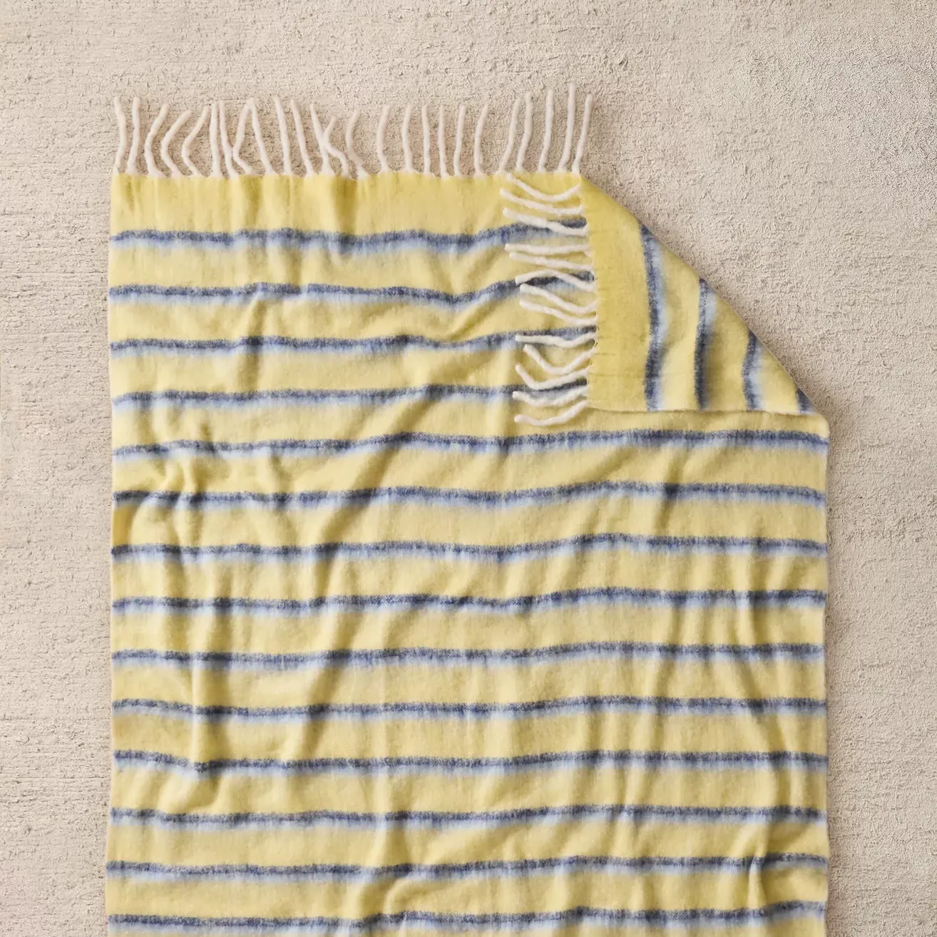
‘Back in 2016, ochre was definitely a standout colour, with Dulux’s 'Cherished Gold' also making waves. We saw a move towards richer, more saturated yellows, like Farrow & Ball’s 'India Yellow'. However, now we’re witnessing a shift towards softer, more buttery yellows. These gentler tones are perfect for details like skirting boards, architraves, and even outdoor spaces, adding a welcoming softness without overwhelming the space. It’s a cheerful, subtle hue that brings warmth and positivity without being too bold or overpowering,’ says Dan.
‘For buttery yellows, the secret is to let them complement rather than dominate. Pairing them with rich woods like teak adds depth, and combining them with soft, pastel blues creates a cheerful yet balanced palette that’s both inviting and not overpowering.’
We’ve reached the end of memory lane. Whether you’ve left feeling inspired or nostalgic for previous colour trends, we hope you enjoyed the trip!

Kezia Reynolds joined the Ideal Home team as News Writer in September 2024. After graduating from City, University of London in 2022 with a bachelor’s degree in journalism, Kezia kicked off her career spending two years working on women’s weekly magazines. She is always on the lookout for the latest home news, finding you the best deals and trends - so you don’t miss a thing!
