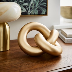
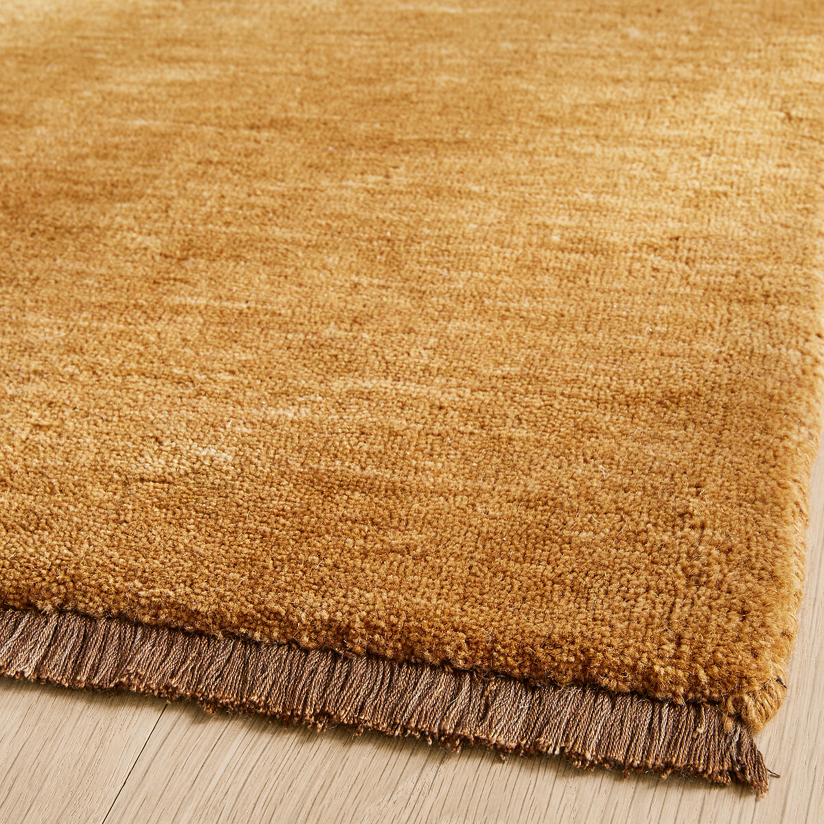
Gold is not just for Christmas! Experts say this luxe shade is set to be the new neutral for 2026 – here’s how to make it chic, not kitsch
Want a subtle approach to luxury? Look no further

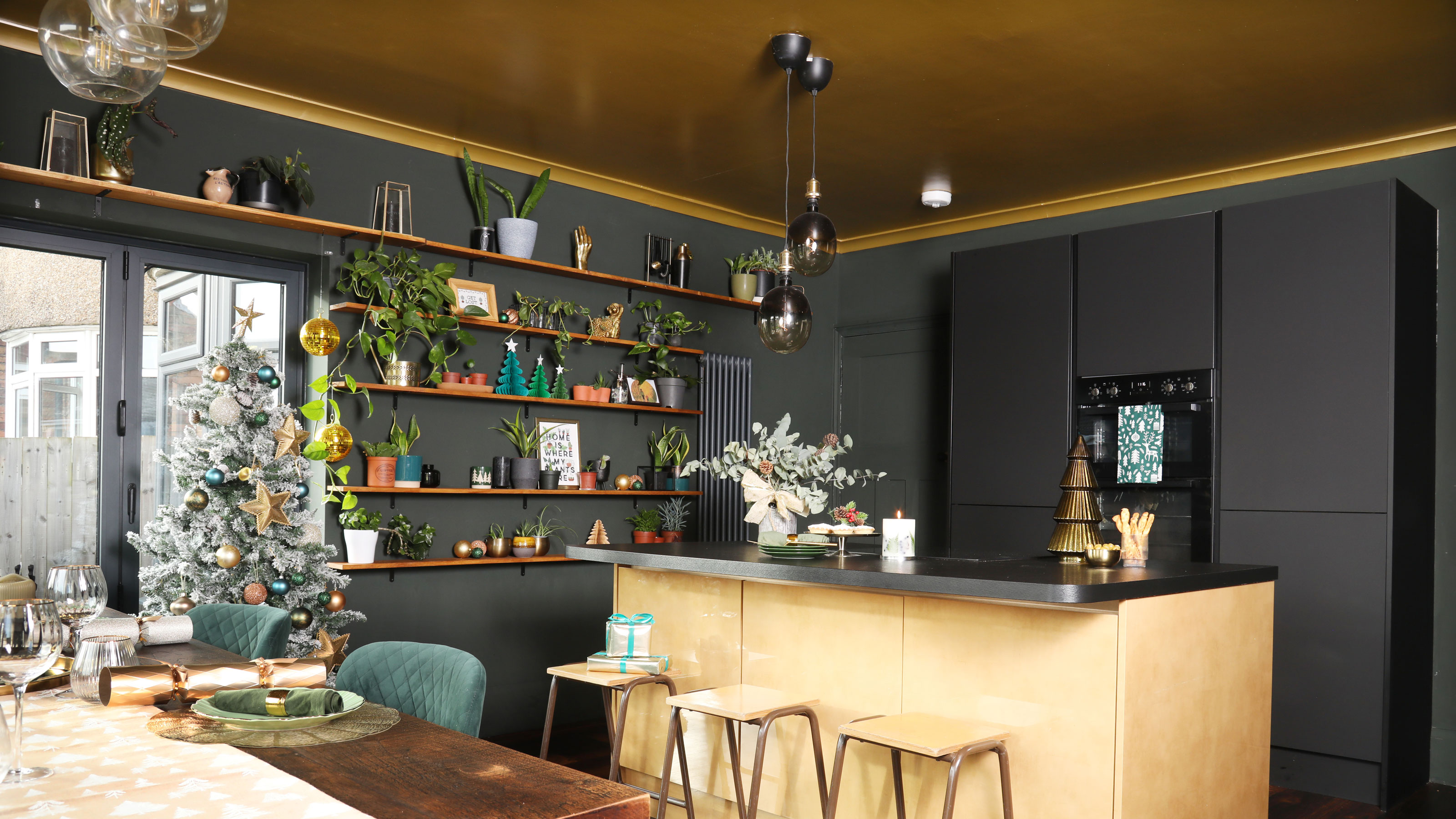
If 2025 has taught us anything, it’s that we shouldn’t be afraid to use colour in unexpected and experimental ways. Whether you drenched your room in a brave shade, or gave colour capping a go, bold paint ideas dominated this year. But now, the end of the year is almost here and it’s time to start thinking about the colour trends that will define our homes in 2026.
While earthy, bold shades are still enjoying their moment, it seems as though 2026 is set to be a toned-down year, with paler, muted shades stepping into the spotlight. But if you want to approach the year of neutrals in a way that still feels elevated and refined, then you’re in luck. Gold and champagne are trending, and experts say it’s set to be the new neutral for 2026.
Is gold the new neutral?
That’s right – the sparkling shade that was once reserved as an accent colour has now taken centre stage in our homes. ‘Champagne has shifted from a luxe accent to a staple neutral for 2026 because it captures the cultural desire for spaces that feel both uplifting and restorative,’ says Daniel Smith, founder of Danetti.
Article continues below‘After several years dominated by darker hues, people are gravitating toward colours that offer warmth without heaviness. Champagne delivers exactly that: a soft neutrality that feels contemporary yet luxurious,’ he adds.
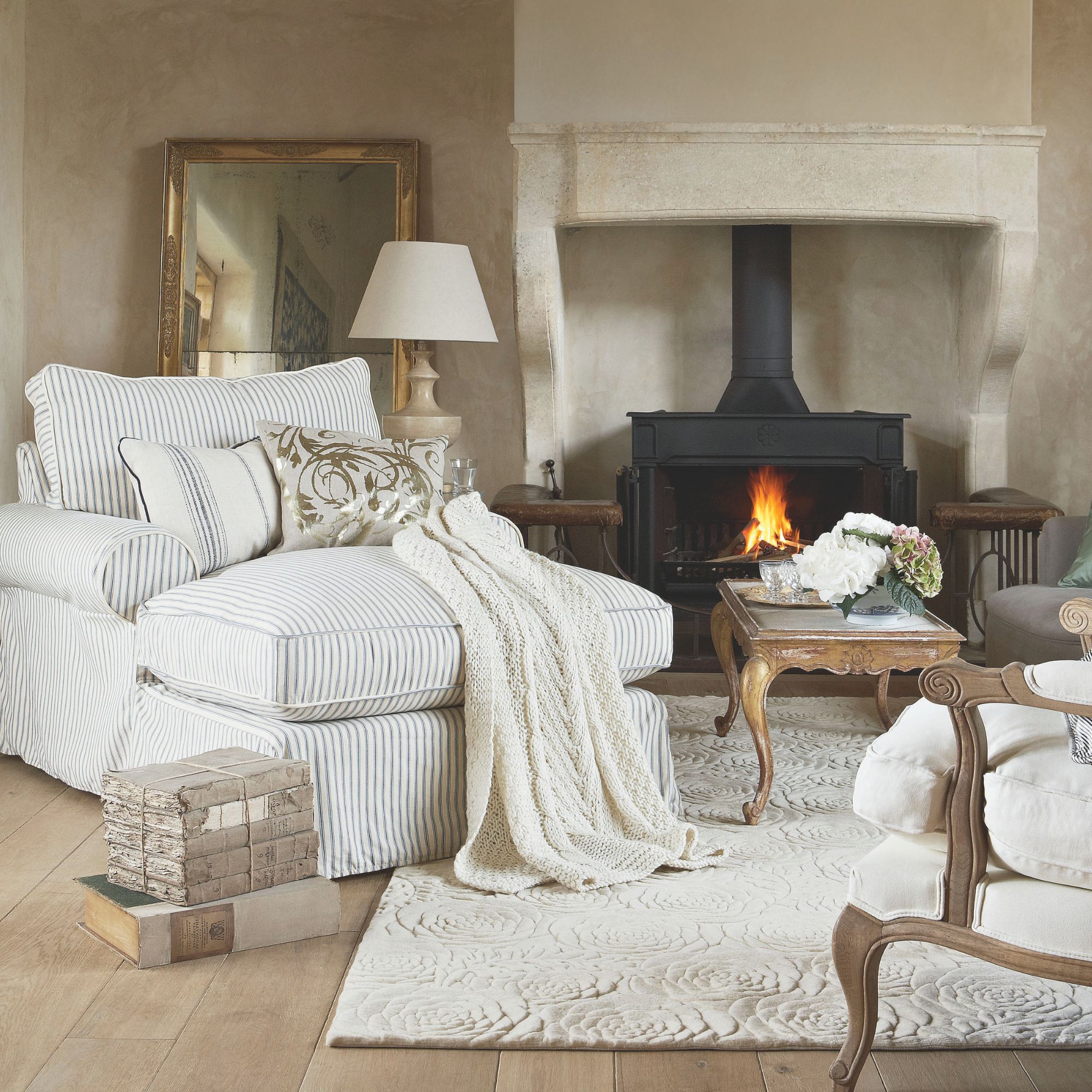
There’s no denying that gold has always had a place within the home, be it through hardware in the kitchen or accessories in your living room. But, in 2026, it’s going to give us more, bringing a sense of rich warmth into our homes.
‘There is a redefinition of luxury in the home, moving away from statement pieces and towards subtle, everyday pleasures,’ explains James Mellan-Matulewicz, CEO and Creative Director at Bobbi Beck. ‘Champagne and gold bring a sense of quiet sophistication, creating palettes that feel lived-in and welcoming rather than formal or showy.’
With its cosy undertones and sophisticated edge, gold provides the perfect antidote to the more sterile neutrals of years gone by, like white, beige and grey. And what’s more, it also effortlessly complements other trending colours for 2026, like blue and charcoal. This is because, as Kirsty Barton, Brand Manager at Alternative Flooring explains, ‘golden hues offer a subtle warmth that works effortlessly alongside richer colours, creating a balanced look without the harsh contrasts of traditional neutrals.’
Sign up to our newsletter for style inspiration, real homes, project and garden advice and shopping know-how
How to use gold as a neutral
Like with many bold shades, when using gold in the home there is a risk that your scheme could become kitsch, rather than chic. ‘Introducing gold tones through both soft furnishings and hardware can elevate the overall look of a space,’ says James, ‘but the key is subtlety.’
To help you achieve a look that is sophisticated and stylish, I asked the experts for their top tips.
1. Focus on texture, not shine
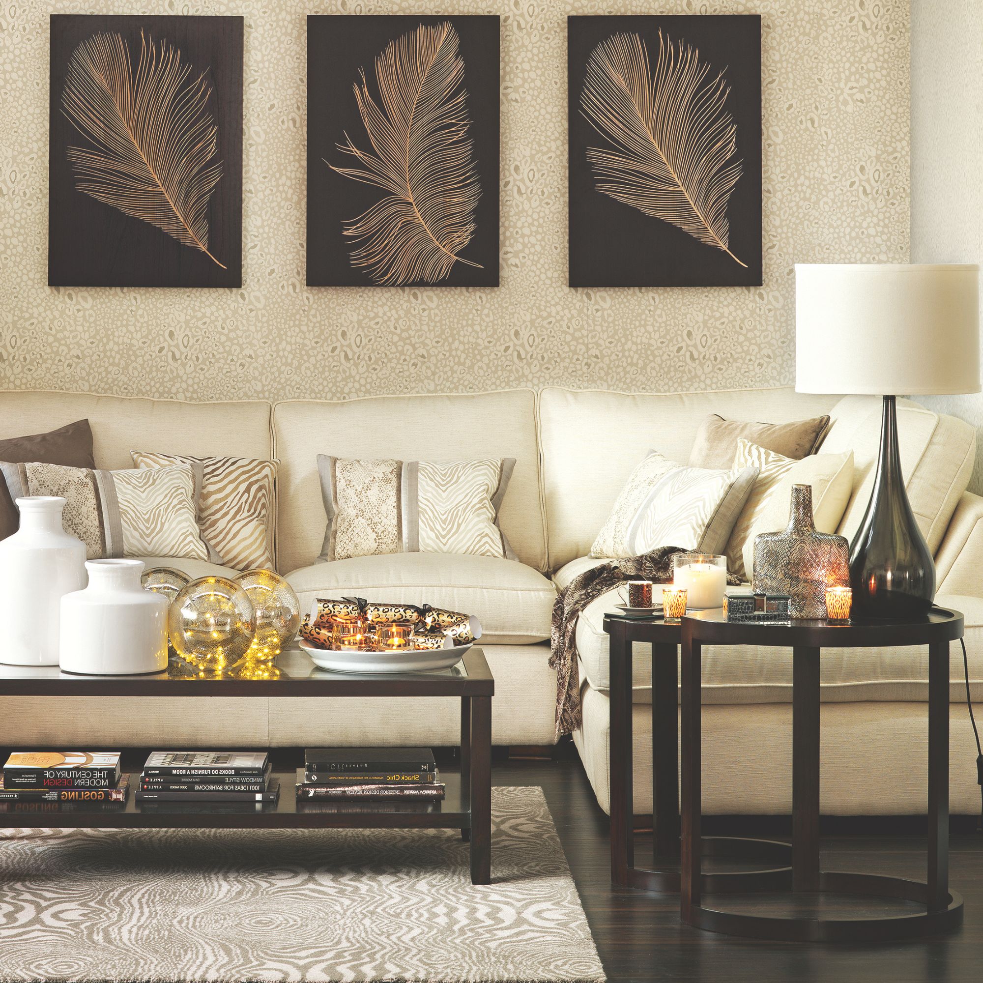
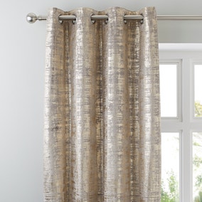
Whether you add accented gold wallpaper to your walls, or simply coat your space with a soft ochre paint, remember that texture is everything when it comes to using gold. It not only softens the shade, but it also helps to keep your space feeling balanced and cosy.
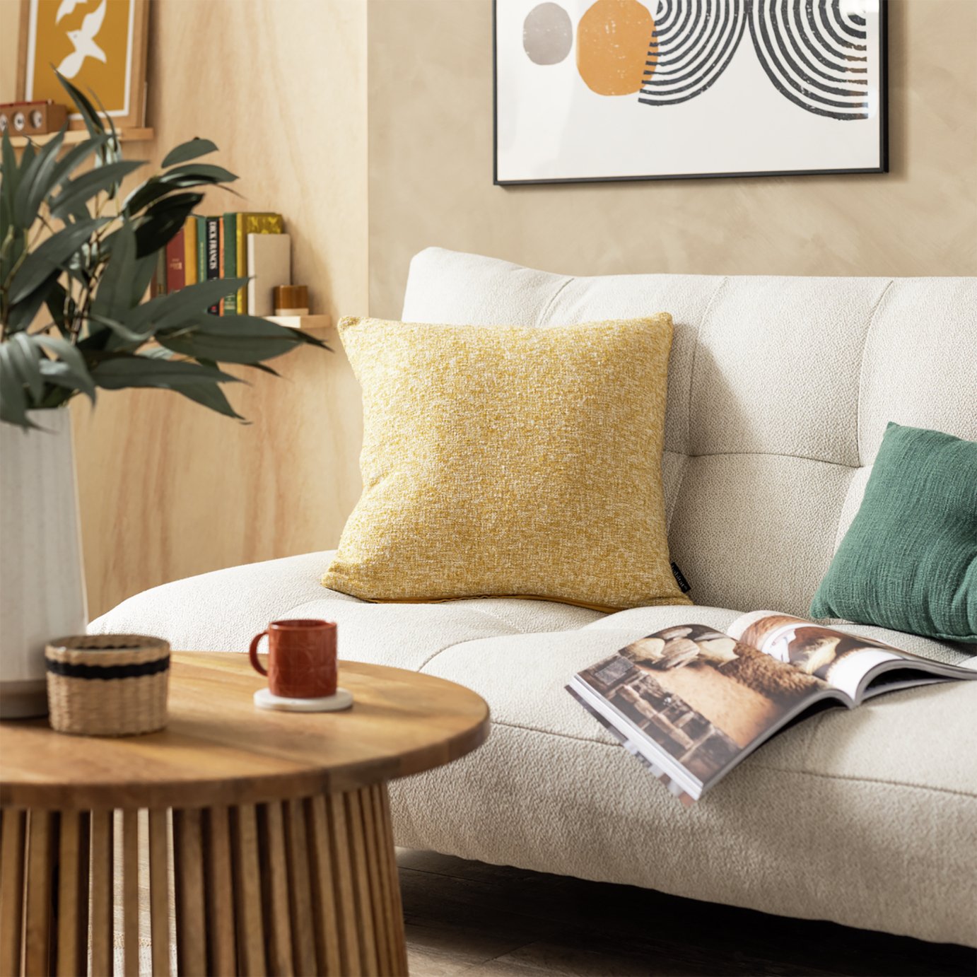
‘Champagne looks most elevated when paired with tactile, matte or softly lustrous materials like velvet, boucle, brushed metals or natural marble,’ says Daniel. ‘So avoid glossy finishes, which can push the look toward overly glam or outdated.’
2. Embrace natural materials
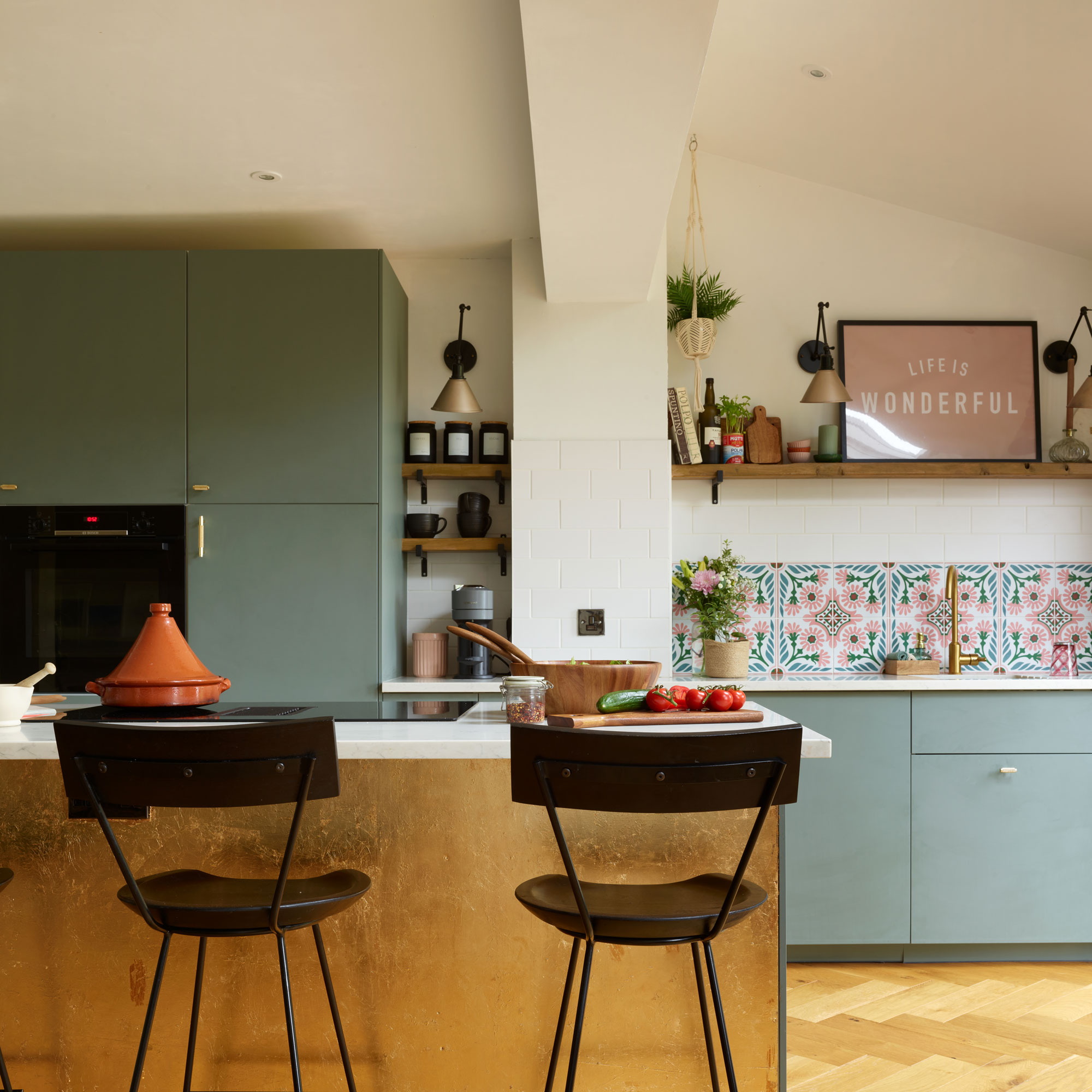
‘Surround gold with natural materials and warm neutrals to keep the look grounded. Linen, wood and stone allow gold to sit comfortably within the palette and prevent it from feeling overly decorative,’ suggests James.
Dark wood and gold are a perfect pairing to help you achieve a look that feels calming and chic.
3. Keep lighting soft
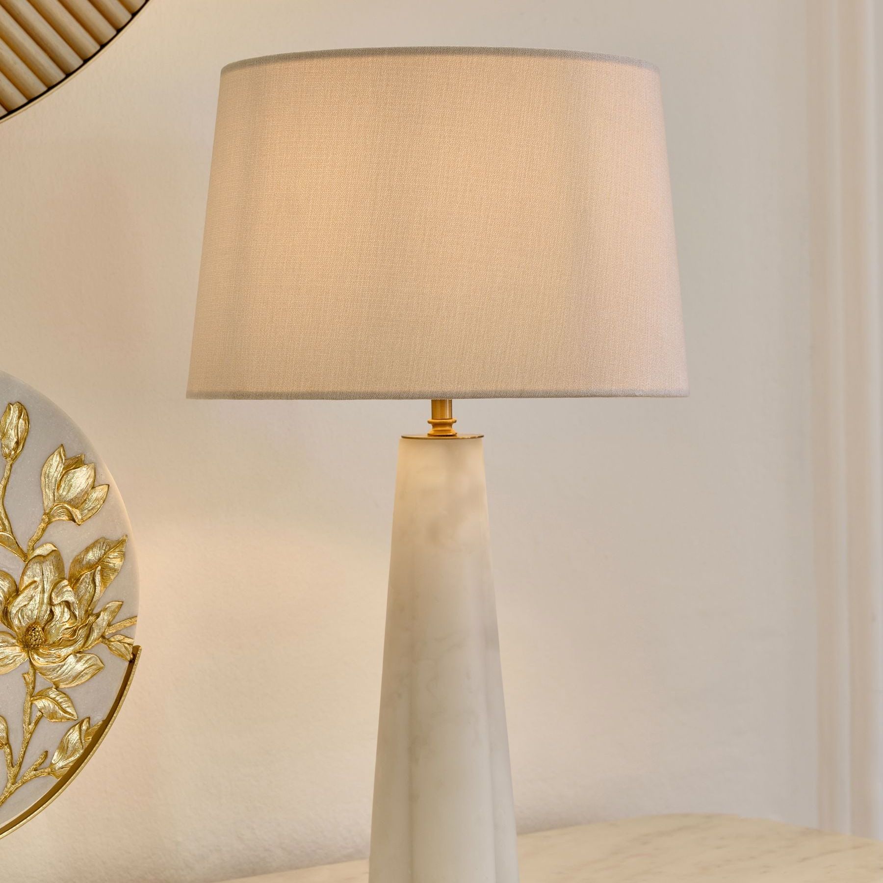
For a look like this, lighting can make or break the overall feel. ‘Use warm, diffused lighting to enhance champagne’s soft radiance,’ says Daniel. ‘A combination of wall lights, lamps and subtle gold accents will create a serene glow that feels expensive, not excessive.’
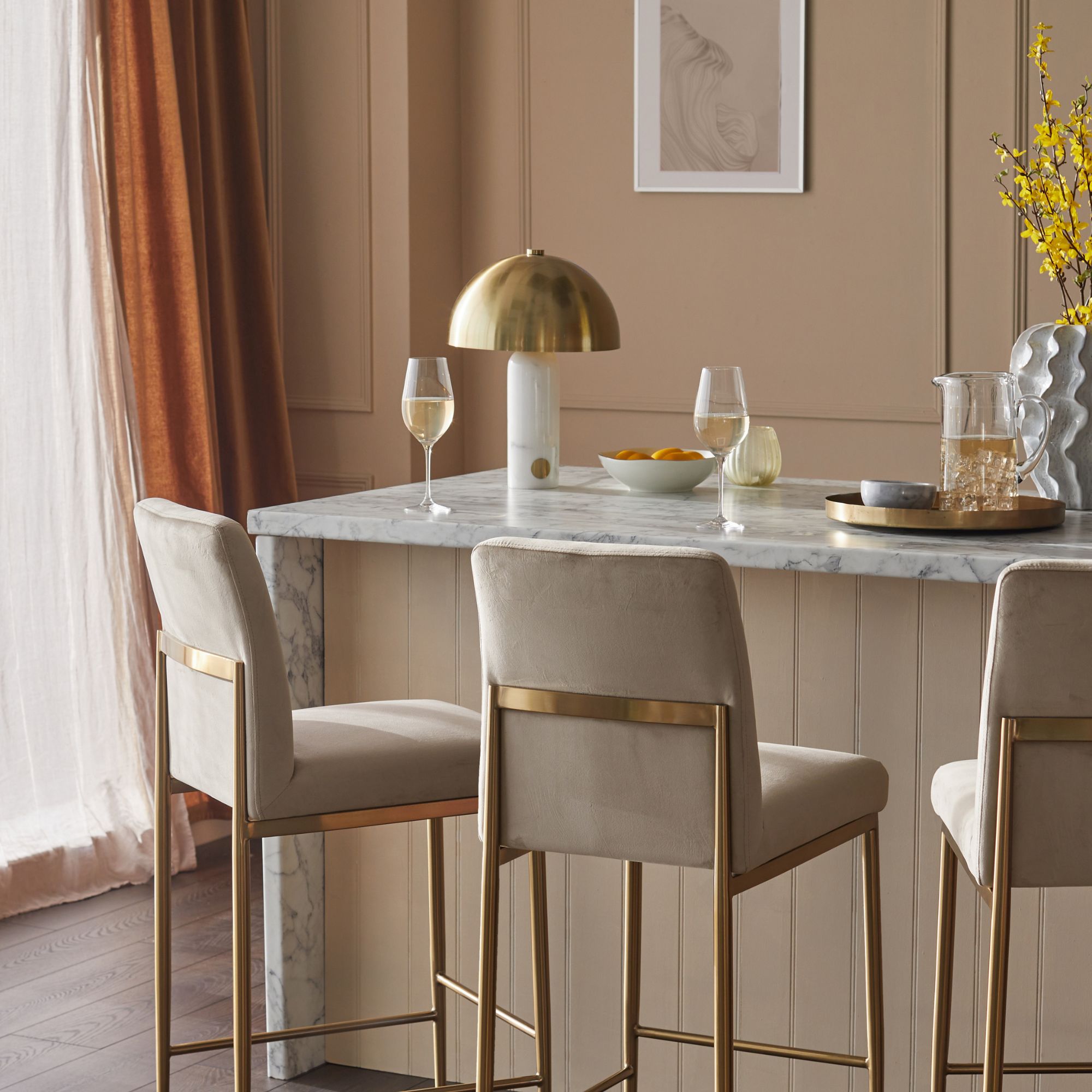
Warm lightbulbs are ideal for a finish that feels snug, rather than stark. A soft light bulb, like this one from Amazon, should do the trick for a cosy glow.
4. Create visual interest
Gold might be an inherently characterful shade, but that doesn't mean you should shy away from adding extra decorative elements to your space. After all, when using gold as a neutral, these finish touches can stop the space from falling flat.
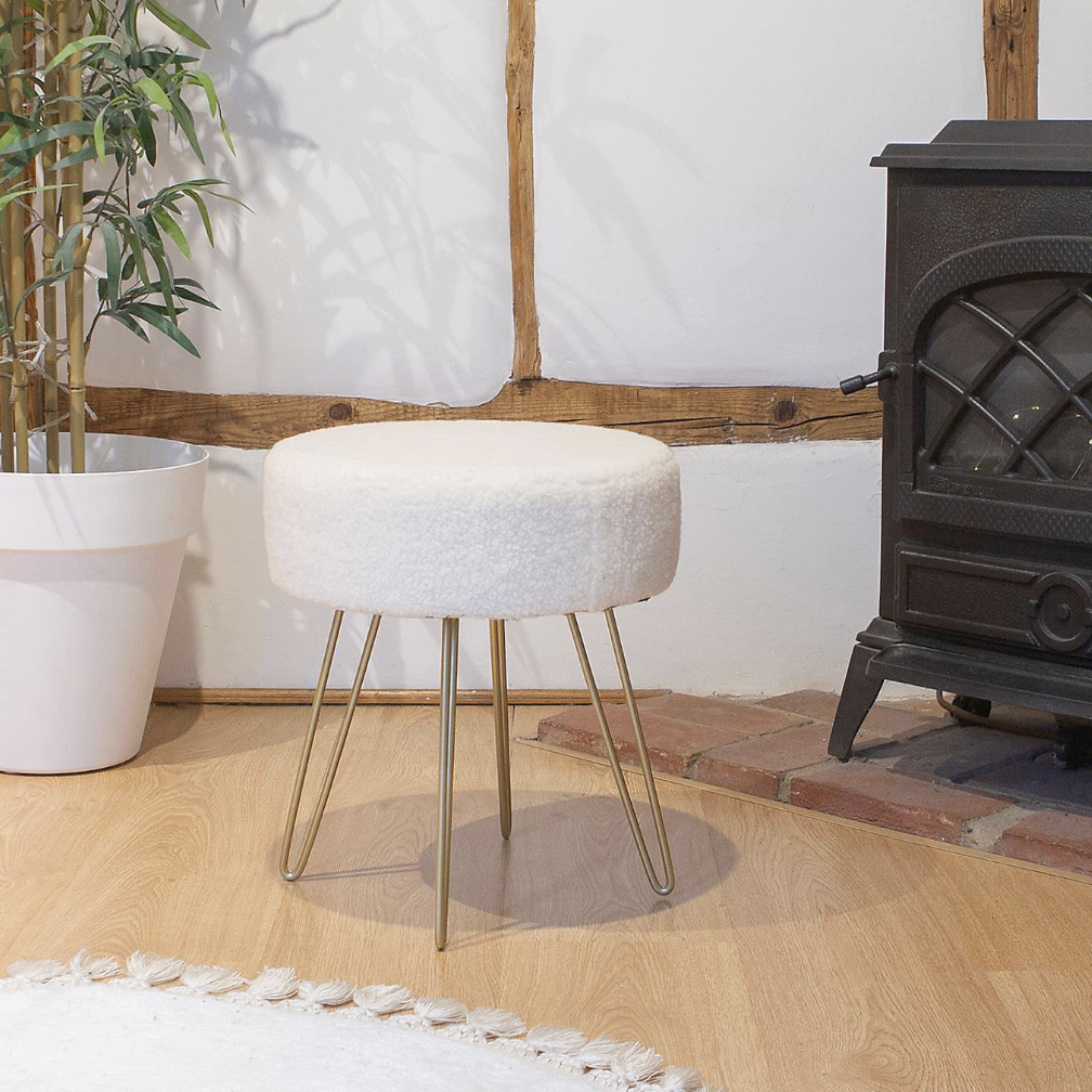
‘Minimalist lines ensure the warmth of champagne reads as elegant and current rather than ornate, says Daniel, ‘so choose furniture and accessories with simple, sculptural shapes.’
Or, add a cosy touch with tactile accents. ‘To add depth, introduce a patterned rug,’ suggests Kirsty. ‘A stripe works well to add visual interest, and a contrasting border in a warm shade can subtly define different tones.’
Will you be trying out the gold trend?

Maddie Balcombe joined the Ideal Home team as Editorial Assistant in December 2024. Having always been a keen writer and reader, she graduated from Cardiff University with a Bachelor’s degree in English and Journalism, and a Master’s degree in Magazine Journalism, in June 2024.
Maddie’s time at university cemented her interest in homeware and interior design; deciding how to decorate her new dorm room was a highlight of each year!
After her studies, Maddie kickstarted her career by freelancing for a number of women’s lifestyle magazines – including Woman&Home and Woman’s Weekly – before making the leap to interiors and joining the Ideal Home team full-time.
