The colour trends that will define our homes in 2026 – I spoke to colour and paint experts, and this is what they say this year's colour palette will look like
These are the shades you'll want to cover your home with in 2026, trust me

When it comes to colour trends for the home, sometimes the comparison between one year and the next is as stark as can be, abandoning one style or shade we’d been obsessed with for one that’s the complete polar opposite. But the transitioning from 2025 to 2026 colour trends doesn’t feel or look like that at all – it’s more of a harmonious evolution or, in some cases, even just a continuation.
Over the course of the last few months, I’ve been talking to colour, paint and interior experts to give me the lowdown on the colour and paint trends set to define this year as most brands revealed their chosen colours of the year (also known as COTYs) for 2026, including perhaps the most important one, the Pantone colour of the year 2026 which was revealed to be a white shade called Cloud Dancer. It’s also the perfect time to think about what you’d like your home’s colour palette for 2026 to look like.
‘Designers are loving colours with plenty of depth and warmth that bring intrigue and sophistication to the home,’ says Lucy Steele, paint and interiors expert from Valspar Paint. ‘By softening and layering these multi-dimensional shades, interiors gain the richness and moodiness that make them feel intentional rather than accidental. So, we can expect to see shades like rusty reds, atmospheric blues, and herbal greens that feel expressive and inviting.’
Article continues below1. Dark reds
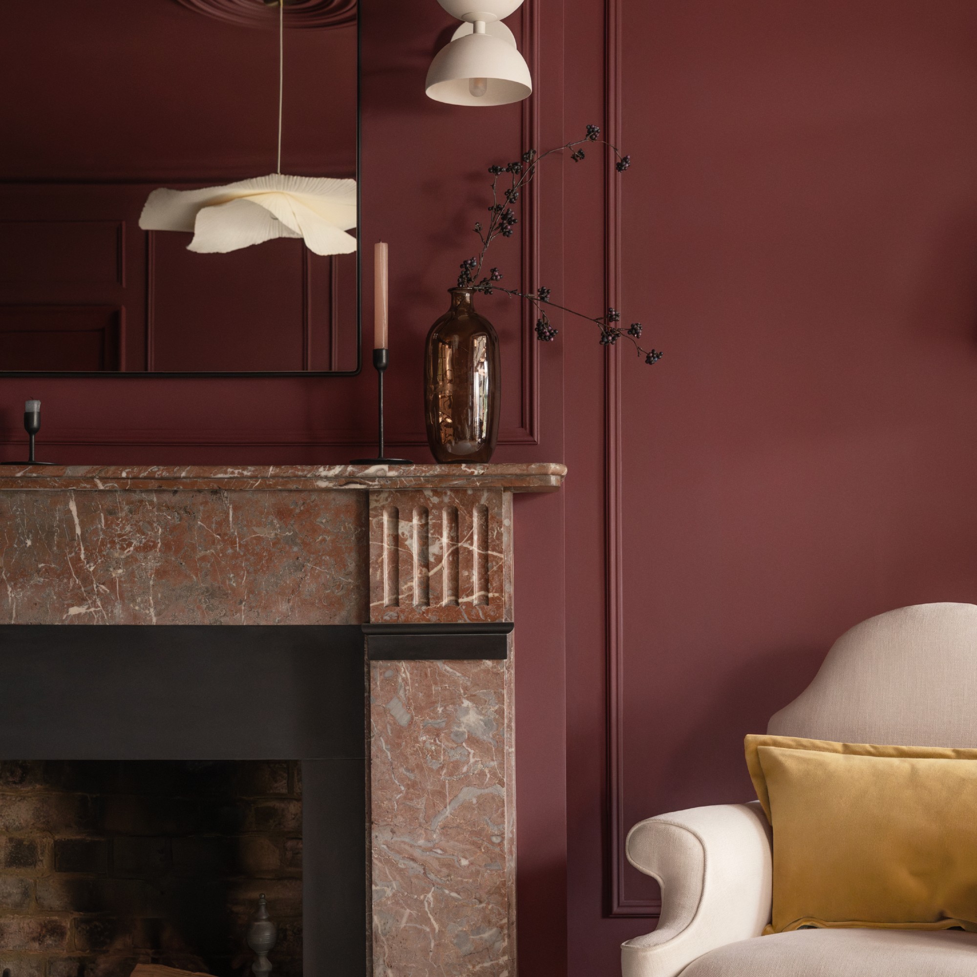
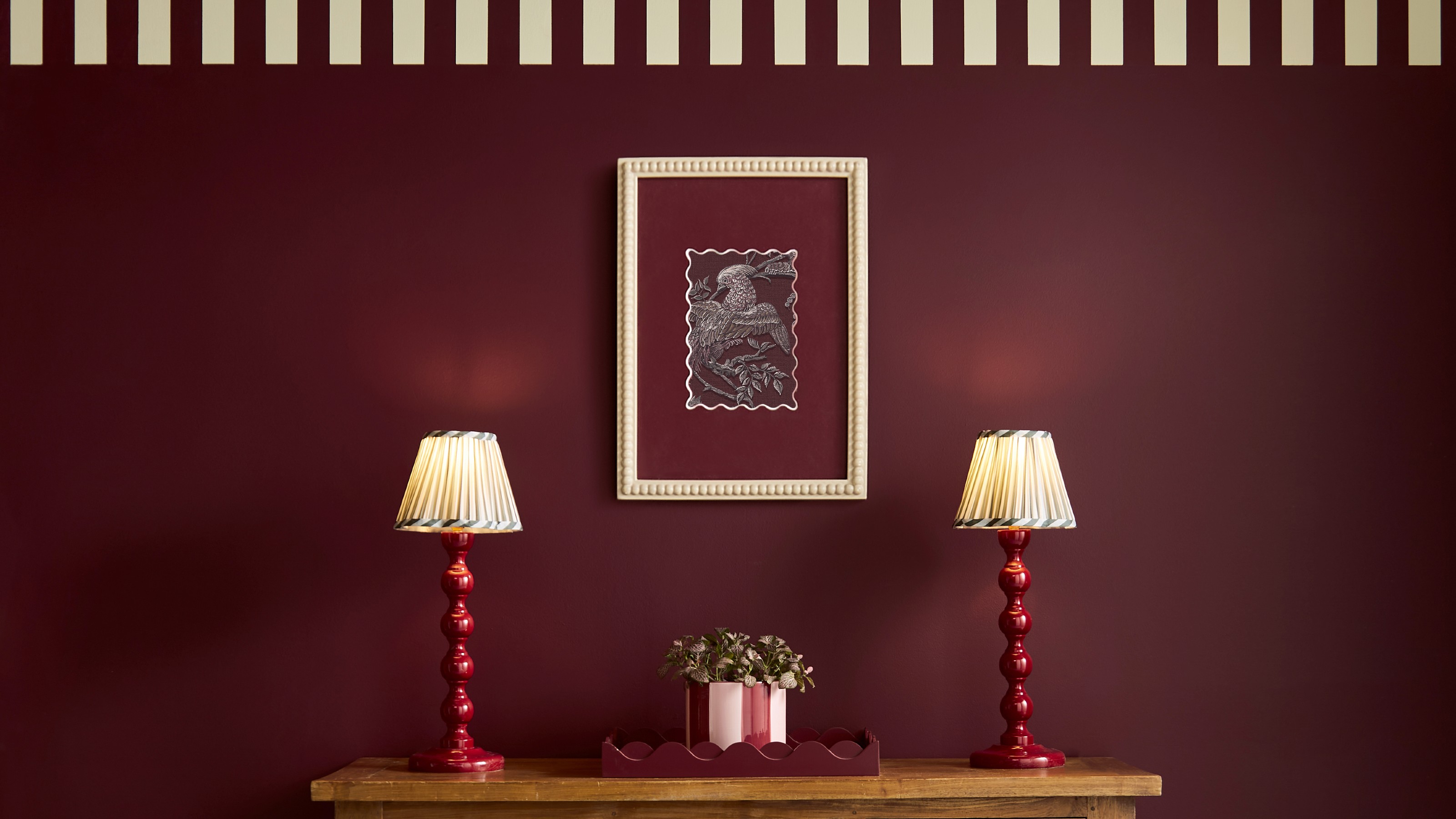
Pinterest called it first by naming cherry red its colour of the year for 2025. And sure enough, dark, deep reds are the shades everyone’d been obsessed throughout last year. So much so that we’re not ready to let go and are bringing dark reds and burgundy shades into 2026 with us and they are replacing other living room colours going out of style – as are several paint brands, from Lick’s colour edit 2026 to Graham & Brown’s new COTY.
Last September, Graham & Brown named Divine Damson its colour of the year 2026. ‘Dark reds and burgundy shades are set to continue being one of the biggest colour trends in 2026,’ says Paula Taylor, stylist and trend specialist at Graham & Brown.
‘Reds will be popular for 2026 in all different shades. Our colour of the year, Divine Damson, is a dark cherry red colour which feels bold and polished, making a strong visual statement in any room it is used in. Its depth brings an instant sense of sophistication, making it a striking choice for more dramatic spaces. Yet it’s equally at home in transitional areas like hallways, where it introduces warmth and character without overpowering.’
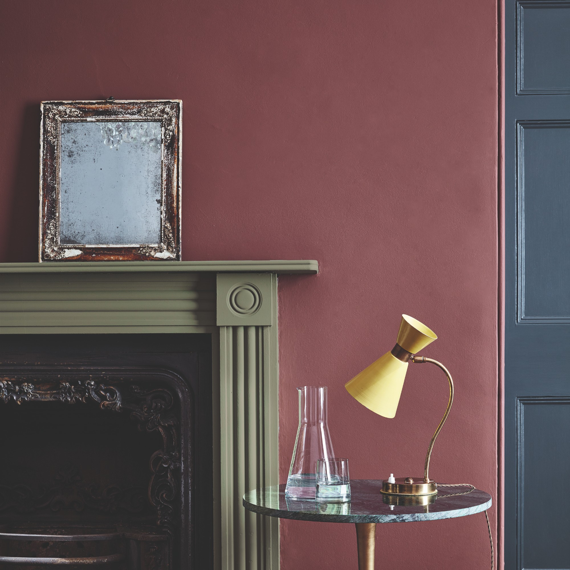
Heritage paint brand Little Greene announced its first-ever colour of the year, naming Adventurer, a shade somewhere between burgundy red and plum aubergine, as its COTY for 2026.
Sign up to our newsletter for style inspiration, real homes, project and garden advice and shopping know-how
‘For 2026, we will see a natural progression in the use of burgundy in interior design, with shades of red, pink and purple all becoming more popular as customers continue to demonstrate more colour confidence in their homes,’ says Ruth Mottershead, creative director at Little Greene. ‘Regal, reassuring plum aubergine hues like Adventurer are historically associated with opulence, providing the perfect shades to combine luxury with tranquillity, intimacy and restfulness in bedrooms, dining rooms and bathrooms.’
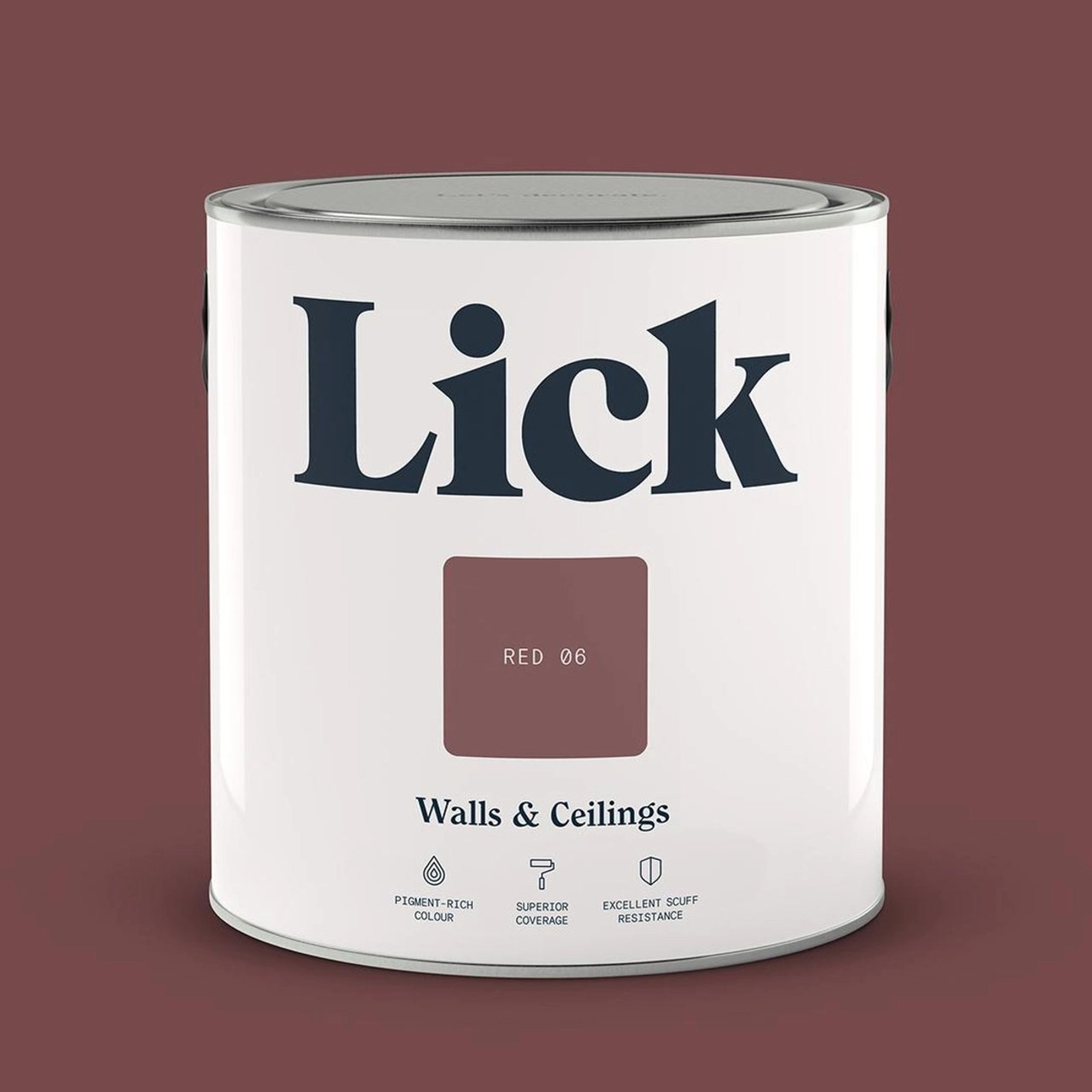
And if you want to create an on-trend colour palette in your home, pair these dark red tones with butter yellow – another colour trend that’s had us in a chokehold throughout 2025. Tash Bradley, director of interior design at Lick and author of Master the Art of Colour, available at Amazon, has been seeing this colour combo everywhere which is why it’s ultimately a solid part of the Lick’s colour edit for 2026.
‘Red 06 draws on red from the primary colour palette but presents it in a timeless way through a rich wine tone that works beautifully with buttery yellows – a colour combination we’re seeing everywhere from fashion to interiors,’ Tash says.
2. Blues
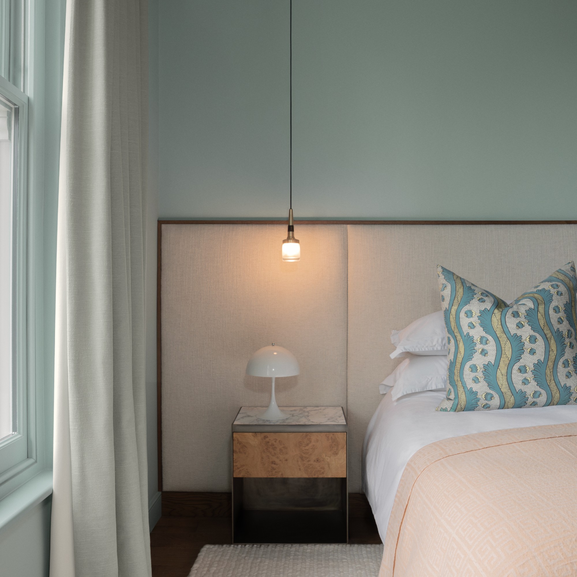
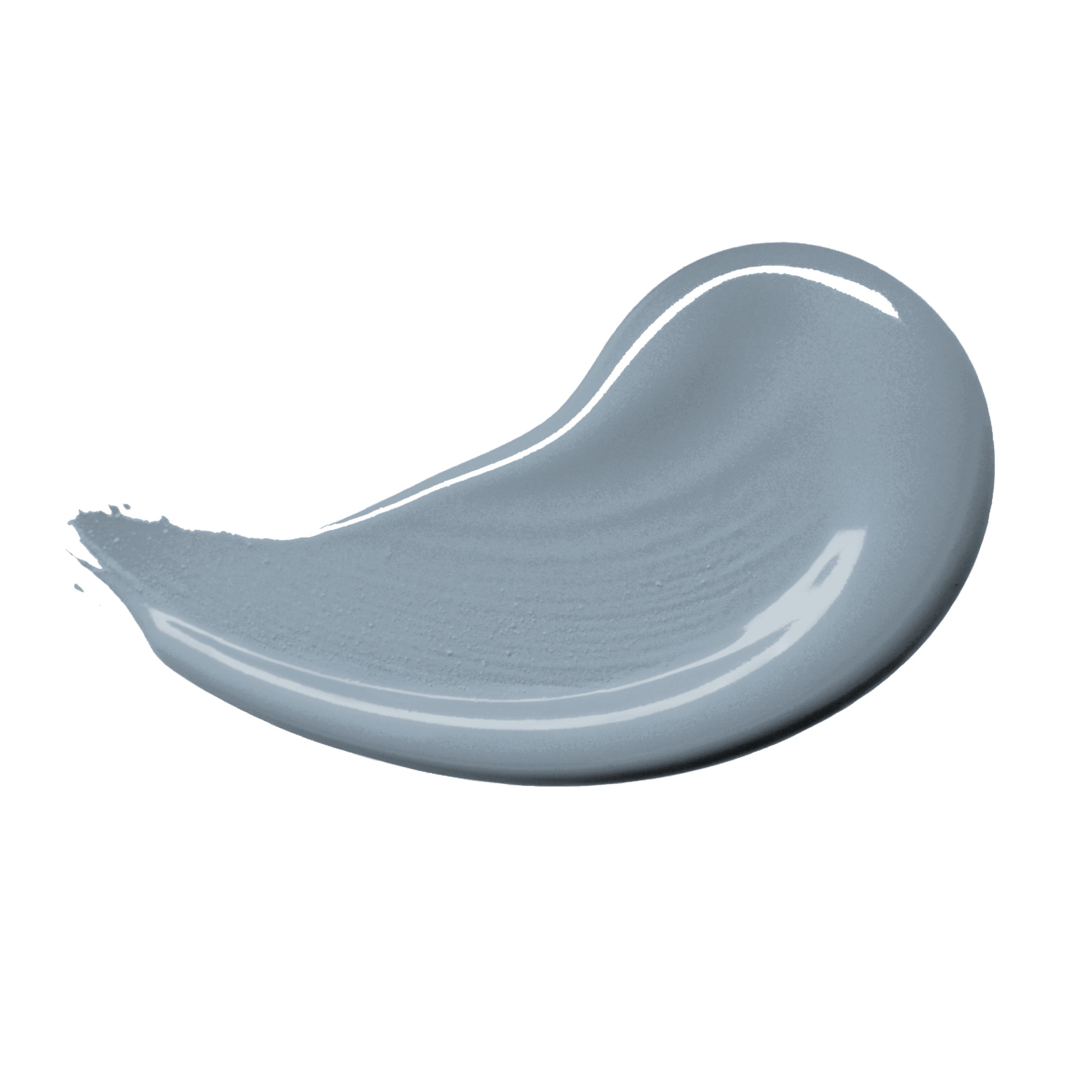
Blue is apparently the world’s favourite colour which is why it’s one that we keep coming back to. The thing that does change from year to year is what shade of blue we might gravitate towards. In 2026, it’s largely about softer blues with warm undertones.
‘It’s a colour that feels safe, familiar, and calming – and in a world that can feel chaotic, people are leaning into colours that bring clarity and peace. But what’s interesting is that blues in 2026 aren’t cold or coastal feeling; they’re more grounded, more thoughtful. People want blues that anchor a space without overwhelming it – something that still feels timeless but emotionally steady,’ Tash at Lick says. So it makes sense for shades like Blue 03 and Blue 18 to be part of Lick’s new colour edit.
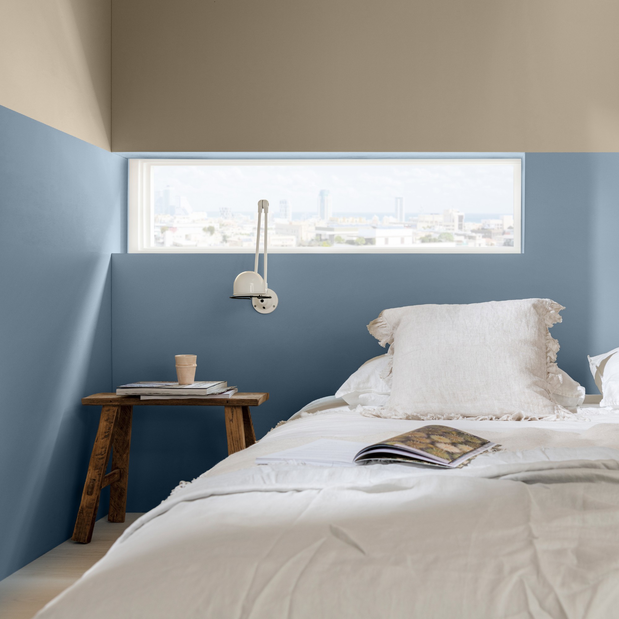
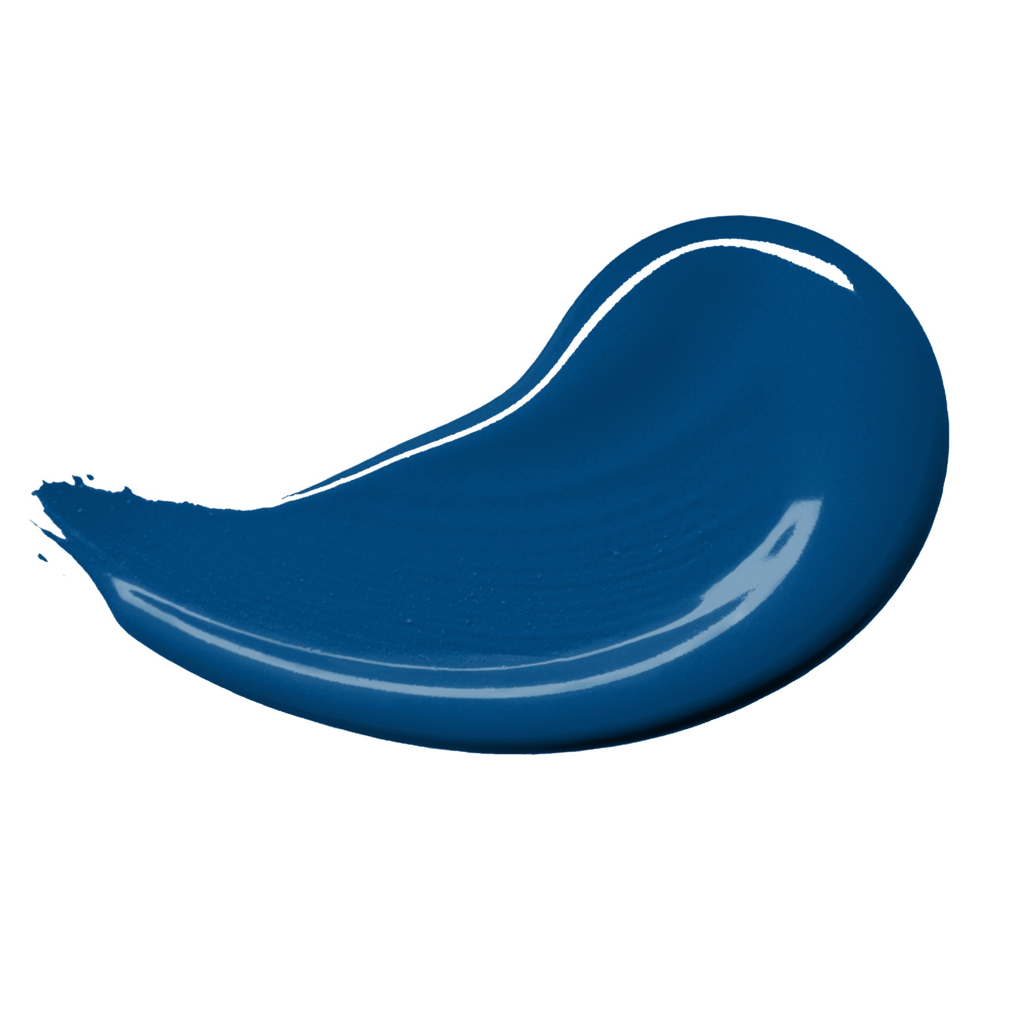
And it’s not just Lick that opted for multiple shades of blue as the year-defining colours. For the first time ever, Dulux introduced not one but three colours of the year for 2026 – all different shades of blue.
‘The versatility that blue offers is much of the reason it continues to be the world’s favourite colour to decorate with – not to mention the fact we are surrounded by blue outdoors in our everyday lives, so it has become a very familiar and comforting colour to us all,’ explains Marianne Shillingford, creative director and colour expert at Dulux.
‘Our colours of the year, Rhythm of Blues, showcase the best of blue’s many talents. From the zingy and sprightly Free Groove, to the soft and grounding Mellow Flow, to the inky and all-encompassing Slow Swing, we’ve shown that there truly is a blue for every person and every mood. I think it’s exactly what we need right now – a colour that feels familiar yet reenergising, steady yet adaptable. That’s why blue will be such a strong colour trend in 2026.’
3. Earthy shades
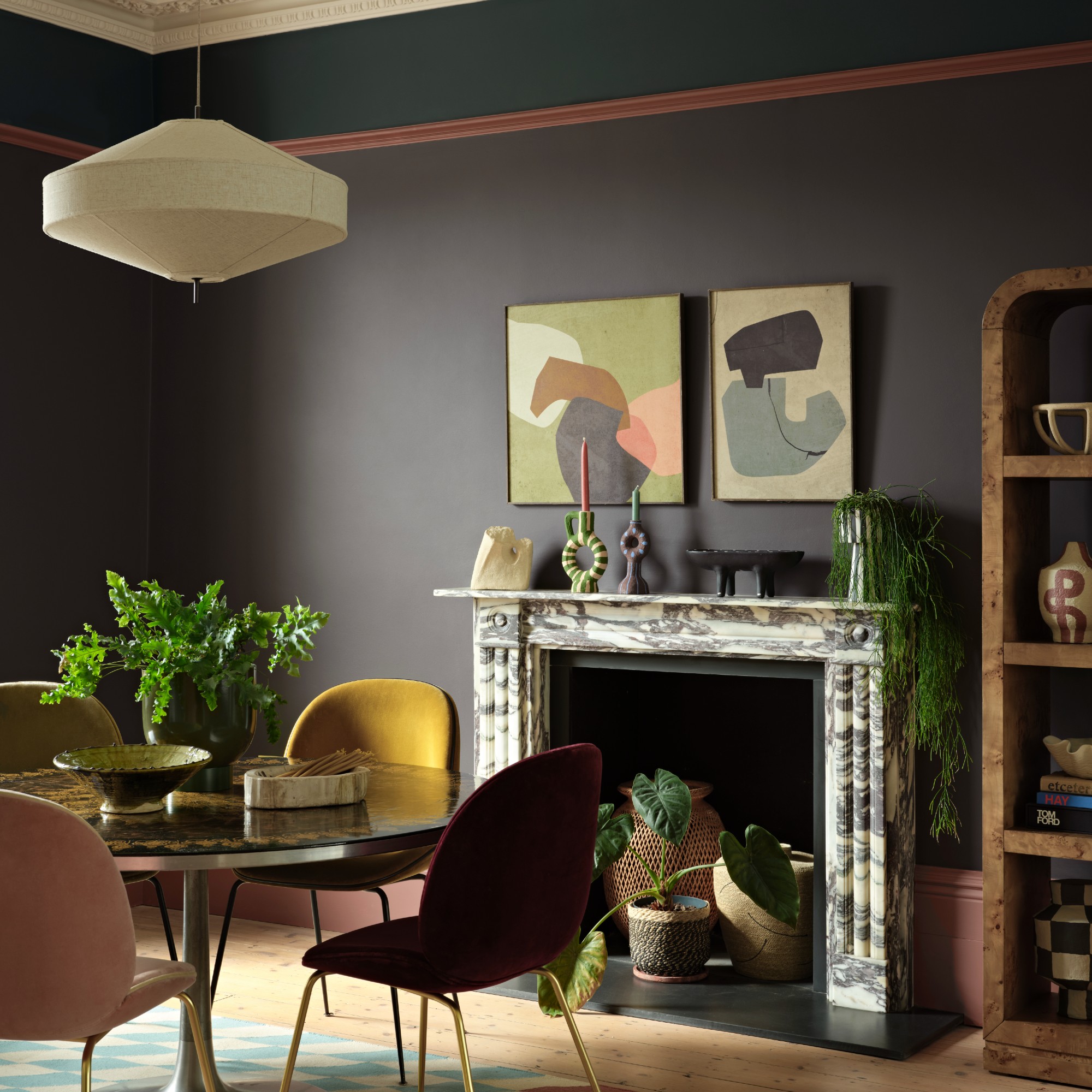
The year-defining colour palette for 2025 introduced the newly found popularity of earthy shades in our homes as we found ourselves craving maximum levels of comfort and cosiness in our spaces. And this trend isn’t going anywhere anytime soon.
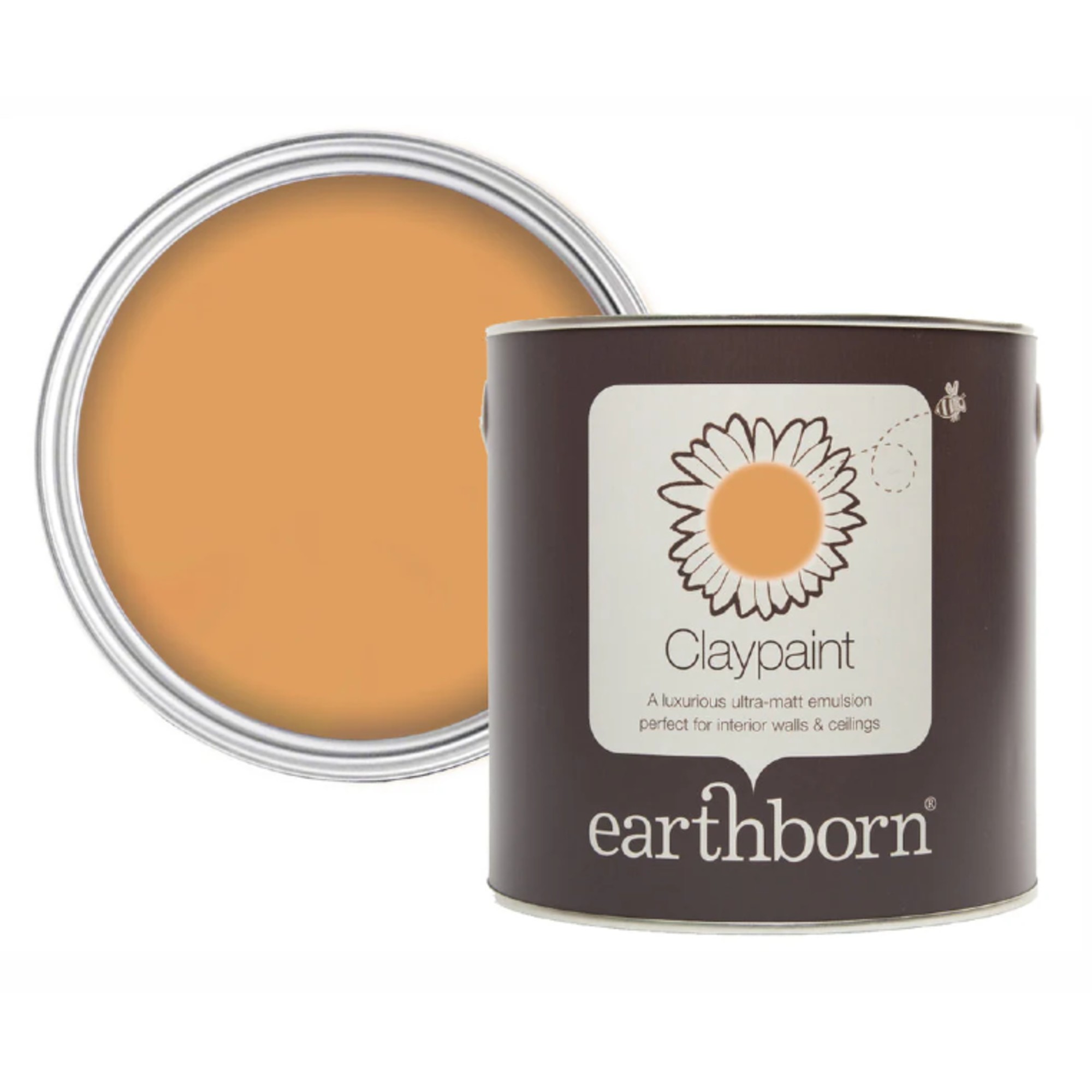
Benjamin Moore reveals a deep brown shade with charcoal undertones called Silhouette as its COTY, Sherwin-Williams opts for a warming neutral named Universal Khaki and Earthborn introduces Freckle, a naturally occurring clay/terracotta colour which is one of the shades replacing beige as the go-to neutral in 2026.
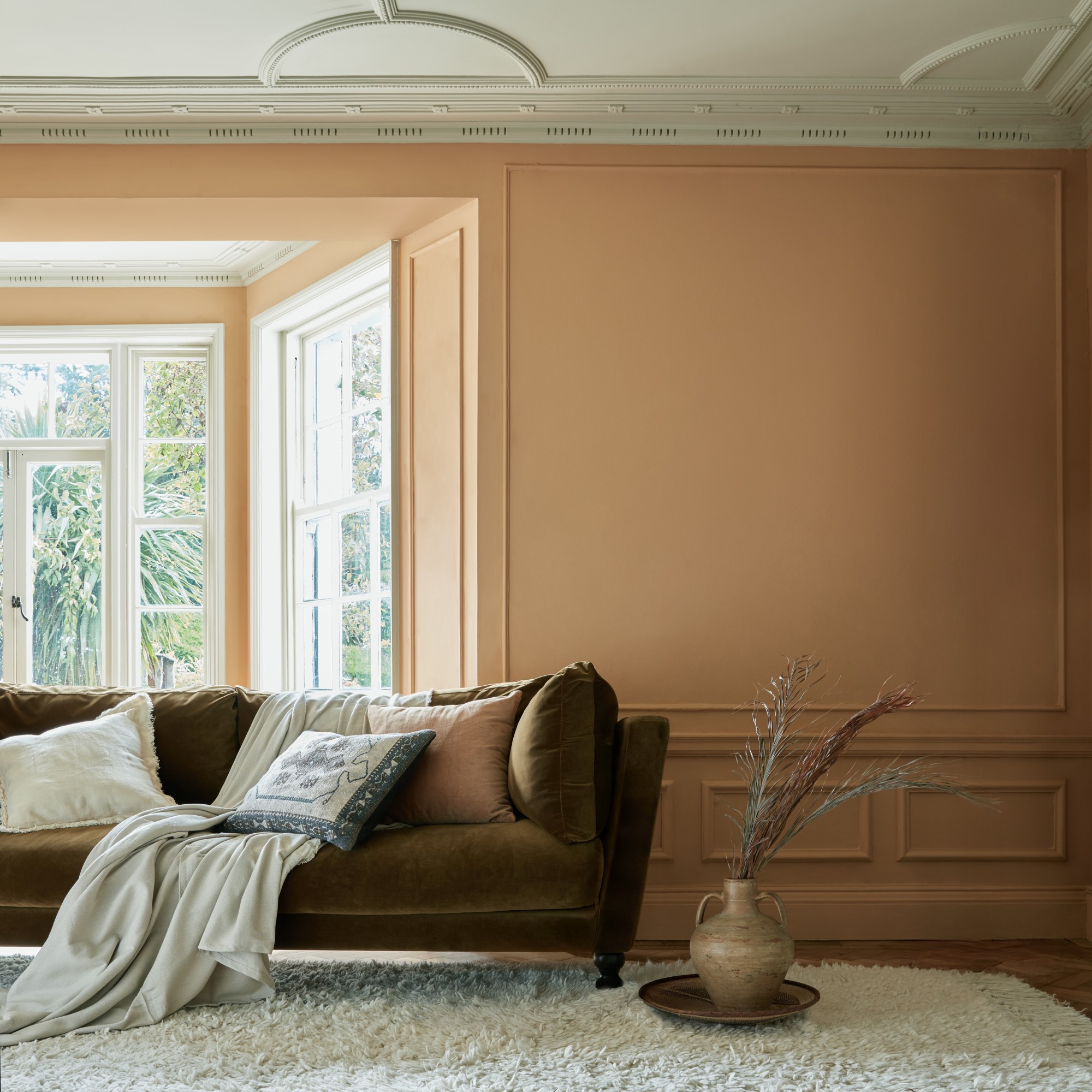
‘Earthy interiors will define 2026 interiors as they help to create an atmosphere that feels grounded, warm and restorative – and using paint thoughtfully can make a huge impact,’ says Cathryn Sanders, head of creative at Earthborn. ‘Soft, earthy and inviting, Freckle is a versatile shade that brings a grounding presence of comfort and connection to any space.’
‘Chosen for its visual warmth, Freckle in Earthborn’s signature Claypaint finish is a naturally occurring clay colour and completely free from colourants – a true expression of the brand’s eco-friendly roots. The versatility of this colour is one of its greatest strengths. Whether chosen for an accent wall, adding a pop of colour to ceilings or introducing personality to kitchen cabinets, Freckle works beautifully alongside bold shades and neutral schemes.’
4. Greens
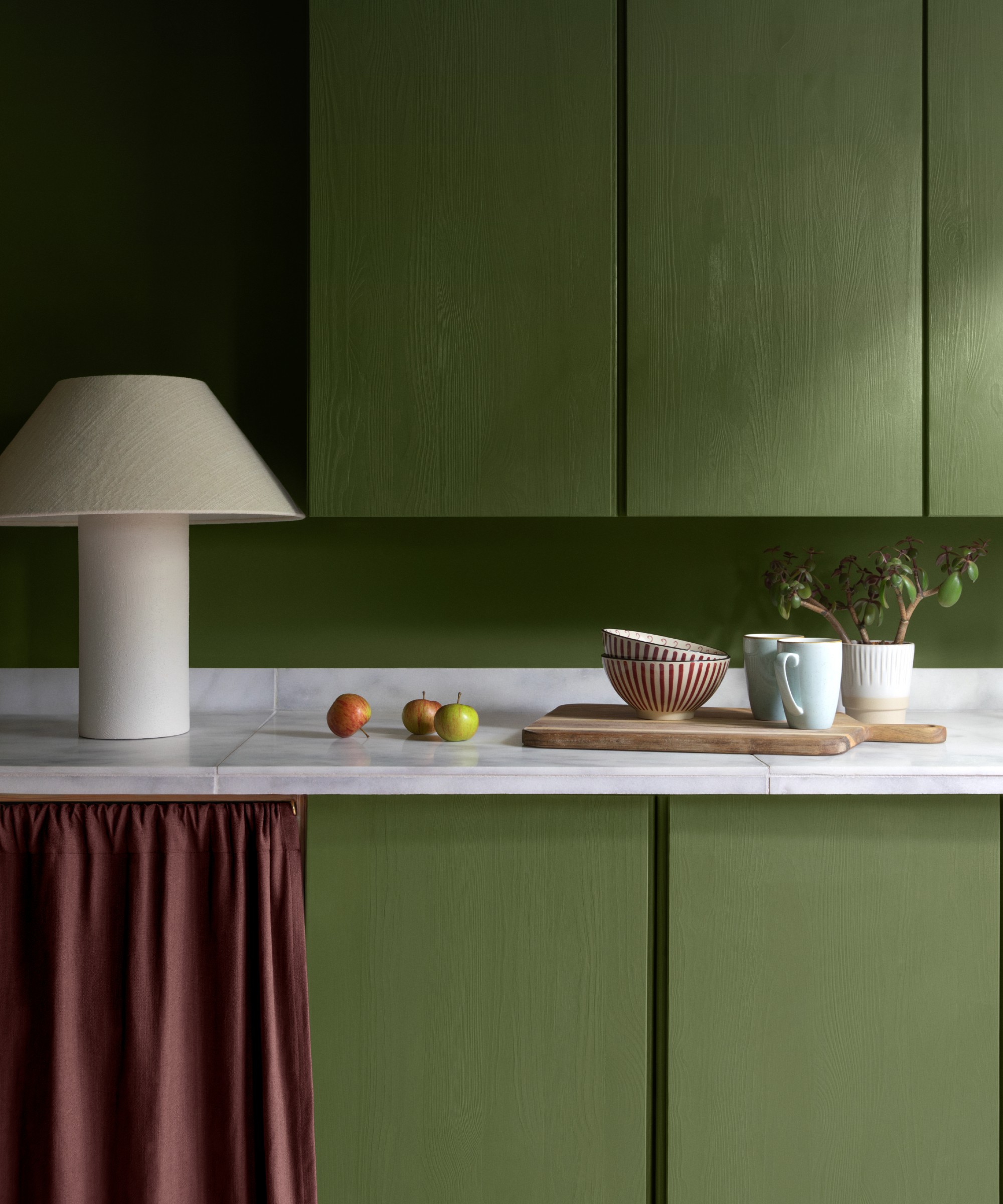
Green, along with brown, has earned the title of the new go-to neutral that replaced beige in interiors last year. But this nature-inspired colour is not going anywhere anytime soon. So it’s no surprise that green is making its appearances in the colour palette for 2026, whether that’s the matcha Green 18 shade and olive Green 05, both part of Lick’s colour edit, or Valspar’s COTY for 2026 called Warm Eucalyptus.
‘In 2026, we’ll see green continue its evolution as the colour of balance, nature, and restoration, but with more warmth and versatility than before,’ Lucy at Valspar says.
'People are craving a connection to nature, but also individuality, so we’ll see richer, moodier greens like moss, laurel, and eucalyptus making their way into living spaces, cabinetry, and even ceilings. Compared to 2025’s cooler, more traditional greens, 2026 will lean into these warmer, herbal tones that pair beautifully with both natural materials and contemporary finishes. It’s a reminder that green isn’t just a trend, it’s becoming a timeless neutral that helps every space feel more connected and alive.'
She also points out that green shades like these are the perfect ones to incorporate into a colour capping scheme which is one of the biggest paint trends coming out of 2025, staying very much relevant for this year. ‘We’re also seeing a rise in the use of colour capping with green. This is where walls are painted up to a certain height in green and finished with a lighter tone above to add subtle architectural interest and make spaces feel more cocooning.’
My top picks
Tash at Lick concludes, ‘2026 is all about feeling confident to play with colour and create homes that feel unapologetically you. After years of cooler, minimalist interiors, people are craving depth, personality and feeling.’

Sara Hesikova has been Room Decor Editor at Ideal Home since June 2024, starting at the title as a News Writer in July 2023. She is now also the Ideal Home Certified Expert on Furniture, and so far has tried over 300 different sofas.
Graduating from London College of Fashion with a bachelor’s degree in fashion journalism in 2016, she got her start in niche fashion and lifestyle magazines like Glass and Alvar as a writer and editor before making the leap into interiors, working with the likes of 91 Magazine and copywriting for luxury bed linen brand Yves Delorme among others.

