5 golden rules for pattern clashing - design pros on how they avoid a messy look for a striking scheme
The only rules you need to know for creating a premium-looking design


If your Instagram feed is anything like mine, you'll have seen that modern chintz is back and with that comes an influx of pattern clashing. And while interior designers make it look oh so easy, when it comes to trying to put your own perfectly imperfect scheme together, it might not look like the vision you had in your head. So, we present to you the golden rules for pattern clashing, as advised by the design pros.
The whole point of pattern clashing is to put prints and colours together that don't match - but there is an art to using pattern in interior design. Throwing together any patterns without any thought isn't going to create the chic, eclectic look you're after - rather, mixing large and small-scale patterns and tying together colour schemes will form a more intentional look.
So how do you pattern clash successfully? These experts have the top tips...
The golden rules for pattern clashing
Just like the best colour combinations, pattern is at its best when used in multitudes. Layering patterns is the simplest way to create a more premium-looking interior, but knowing how to layer them is the tricky part.
Whether it's a statement wallpaper idea or one of the best sofas in your favourite patterned textile, using varied furnishings to layer colours, textures and patterns will instantly level up your home design.
1. Go for entirely different aesthetics

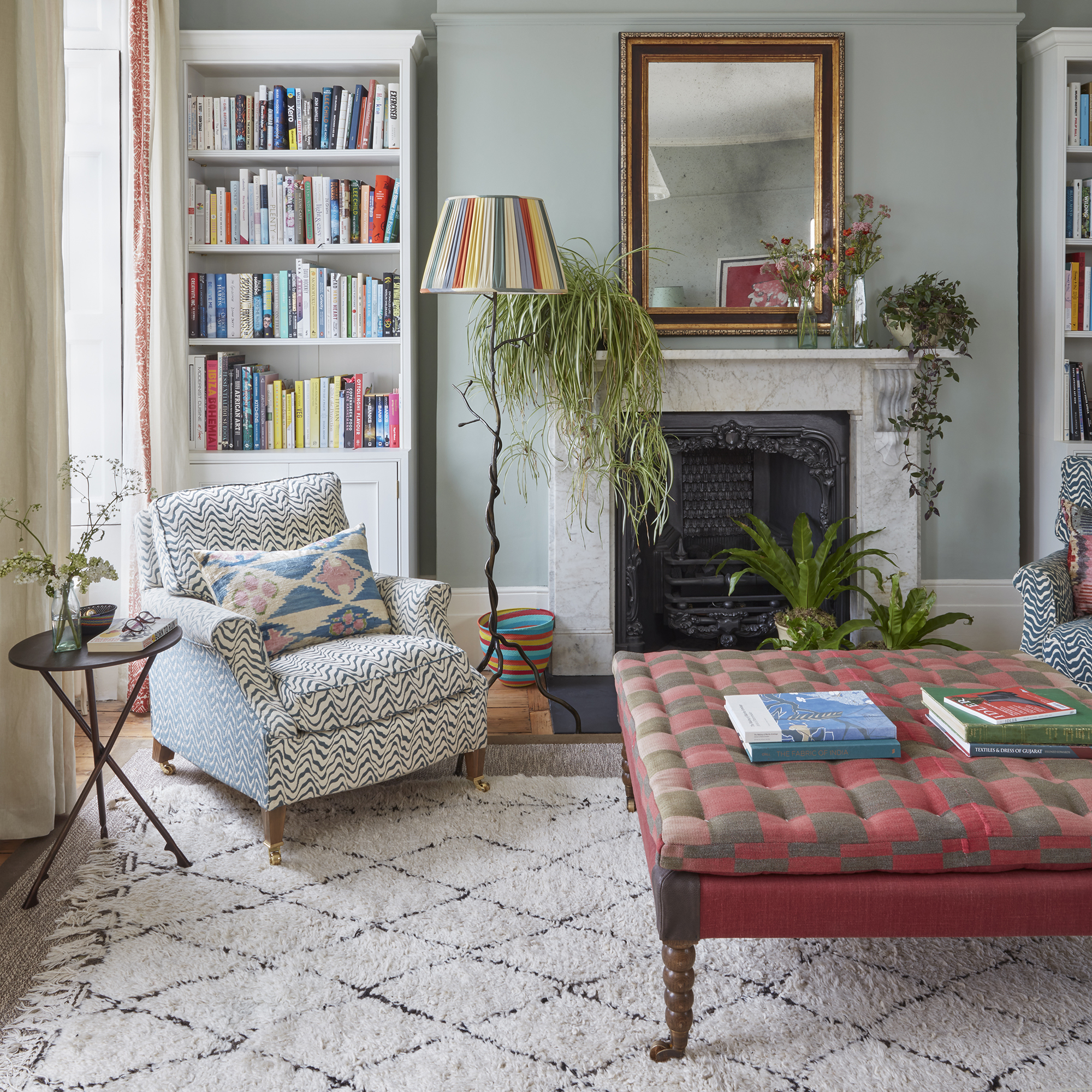
One way to make pattern clashing intentional is to pair prints of different aesthetics. This way, it doesn't look like you've tried to match and just missed the mark, it's obvious you're contrasting two opposing styles.
'I love pairing geometric or contemporary prints with traditional botanical patterns. The balance between the old and new, the classic and the contemporary works so well,' Sophia Ayrton-Grime, interior designer and founder of Studio Raff, recommends.
Sign up to our newsletter for style inspiration, real homes, project and garden advice and shopping know-how
'The modern elements of a geometric print add a sense of structure, whilst the traditional botanical print adds warmth and personality to the space. This eclectic mix of styles and prints adds depth, interest, and character to the design, resulting in a space that feels fresh, inviting, and uniquely curated.'
2. Vary large and small scale patterns

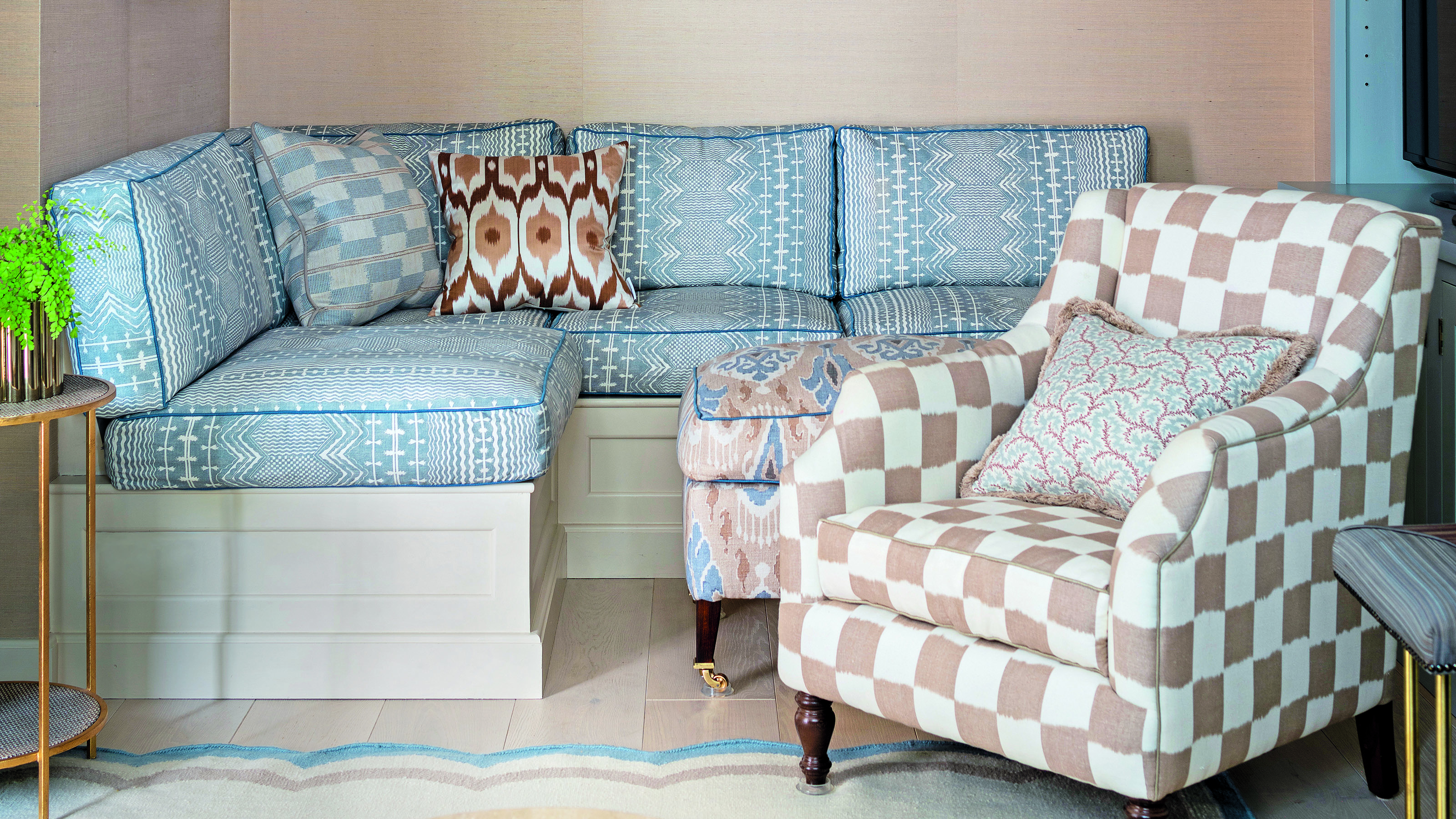
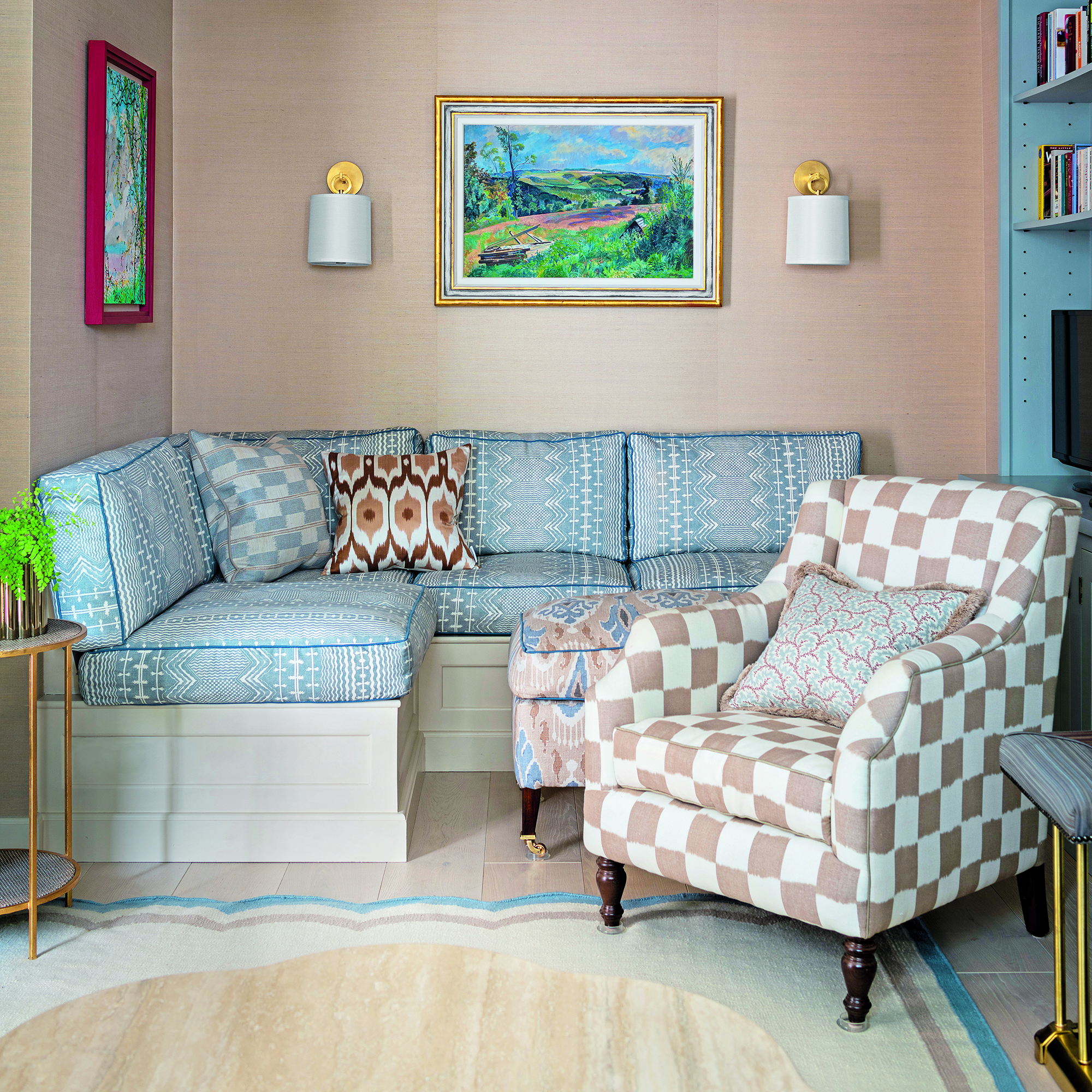
This isn't a hard and fast rule - two small-scale patterns can still look chic next to one another (take chintz for example). But if you want to simplify the process of pattern clashing, pairing large and small-scale prints next to one another will create a look full of dimension.
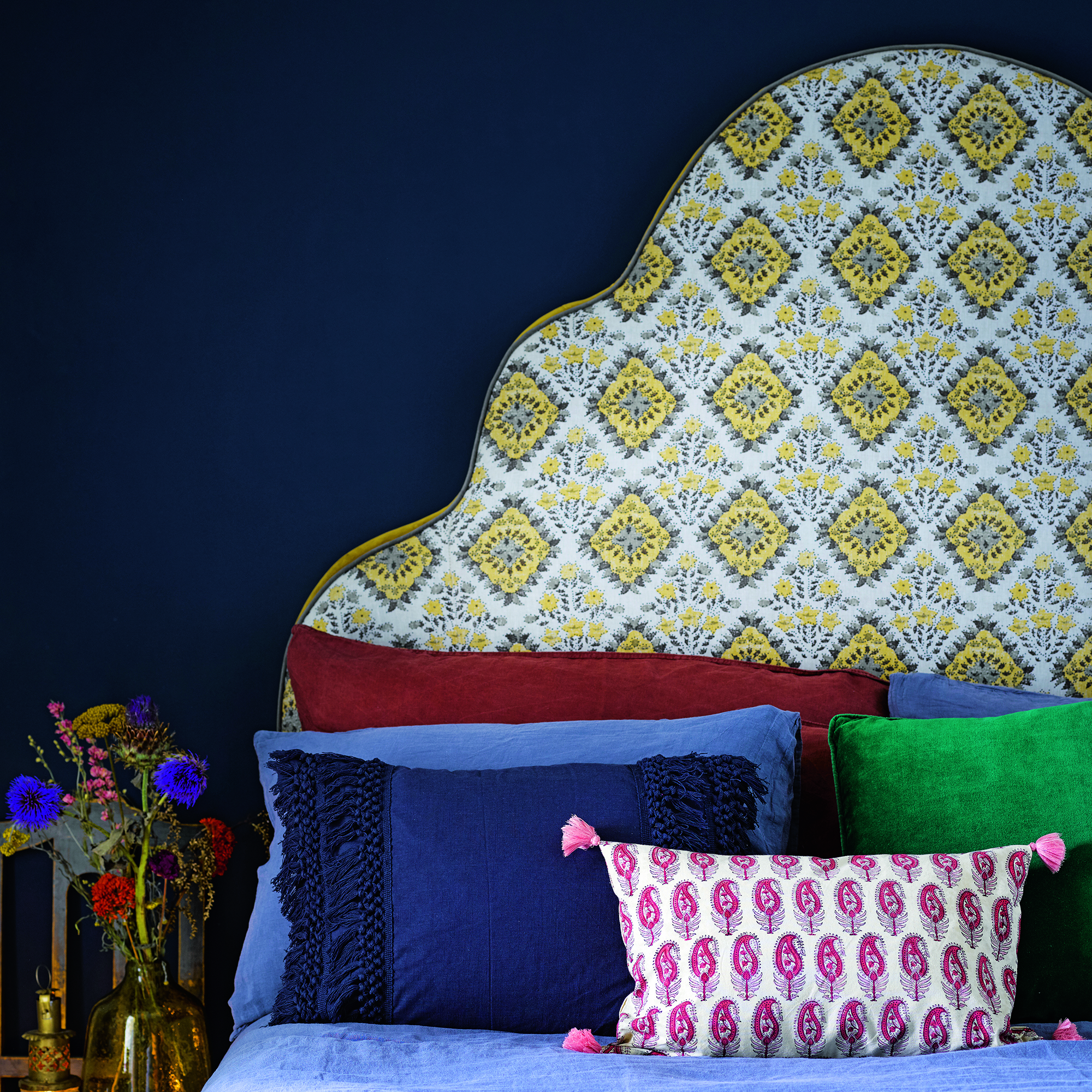
Choosing a larger pattern for the bigger area, for example, curtains, a headboard or an armchair, will make a statement but prevent the design from looking too fussy. Then, bringing in more intricate patterns via floral cushions or Ikat prints will add the perfect amount of flair.
Interior designer, Laura Stephens, adds 'I always ’try’ things to see how they look together but find that working with a large print and then offsetting it with smaller scale prints is fail-safe. This could be large florals with a smaller floral pattern or even a broad stripe with a pinstripe.'
3. Find a common colour

Whether it's a living room colour scheme or a bedroom colour scheme, finding a common thread in the palette will be key to making pattern clashing work.
'Although there are no golden rules when it comes to pattern clashing - keeping within the same colour palette as much as possible can help to ease new patterns into your design,' advises Tricia Guild, OBE. founder and creative director of Designers Guild.
'Even if your contrasting pattern only picks up on one colour theme, it will feel as though design choices were intentional. If your room is full of serene greens for example, you might opt to focus on ensuring that the dominant, darker green is present in both patterns for a strong contrast.'
4. Or pair unexpected colours...

If you want to take pattern clashing one step further (and you're ready for more of a challenge) then consider pairing unlikely colour combinations.
'At the moment I love pairing unexpected colours together; for example, aubergine purple with pale blue, chocolate brown and grass green. I also always find you can’t go wrong with pink and green together in almost every shade!' Laura recommends.
Pink is the colour of the moment and luckily, it's easy to contrast with many other statement shades. 'We love clashing colours at Bombay Sprout! Hot pinks and tangerine, greens and blues, aubergines and greens. Personally, I dislike browns with reds, and greys and blacks in any scheme,' echoes interior designer, Zara Bollingbroke-Kent.
5. Start small

Wanting to dip your toe into the pattern-clashing water? Start small with throw cushions on a bed or sofa. Financially, it's a smaller commitment and you can easily move them around your home if the look isn't quite coming together.
'Cushions are an easy place to start as you can move them around easily, to different corners of the room, or move them somewhere else entirely, but they are a great way to start experimenting on smaller scales,' advises interior designer and co-founder of Hutley & Humm, Melissa Hutley.
More is more with cushions, so don't be afraid to combine a plethora of different shapes and sizes. It might be that a combination of two or three cushions looks too contrived, whereas a multitude will help you to achieve that perfectly imperfect, eclectic aesthetic.
Ultimately when it comes to pattern clashing, there is no right or wrong. The world is your oyster with the patterns and colours you combine, but these rules should give you some guidance on the simplest ways to successfully pattern clash.

After starting out her journey at Future as a Features Editor on Top Ten Reviews, Holly is now a Content Editor at Ideal Home, writing about the very best kitchen and bathroom designs and buys. At Top Ten Reviews, she focussed on TikTok viral cleaning hacks as well as how to take care of investment purchases such as lawn mowers, washing machines and vacuum cleaners. Prior to this, Holly was apart of the editorial team at Howdens which sparked her interest in interior design, and more specifically, kitchens (Shaker is her favourite!).