What colours keep you awake? – the colours that could be disrupting your sleeping pattern
Experts reveal what colours keep you awake and how you can harness their energy positively

Before we start we want to be clear that no, the colour of your walls won’t keep you awake like heartburn, a crying baby or a party-loving neighbour can. However, there are colours that will pile it on if you’re already wakeful and struggling to wind down. If relaxation and sleep don’t always come easily to you, we've identified which paint colours will keep you awake, so you can pick from a palette of calming paint colours for bedrooms instead.
We’re not saying you should ban them from your home… just, proceed with caution. If you’re crushing on one of these shades and need it in your life, there’s nothing stopping you from using it in a space where it won’t harm your chill. You’ll find some great ideas from the colour experts below.
Let’s get down to it. In 1942, neurologist Professor Kurt Goldstein undertook a study of colour that’s still cited today. It boils down to this: colours with a longer wavelength – red, orange and yellow – are more stimulating. A 2020 study by a team of experimental psychologists, Feeling Blue or Seeing Red?, (Domicele Jonauskaite et al), added pink to that list. Sorry, Millennials.

Karen Haller, a behavioural design consultant, colour specialist and author of bestseller The Little Book of Colour explains: ‘Colours that can over-stimulate are bright, vibrant and saturated. From a colour psychology perspective, they stimulate our thoughts, our feelings and our behaviours. However, these colours are great to use when you need that extra boost of energy.’
Colours that keep you awake
We’ve asked the professionals what colours to avoid and why. Don’t worry – if you love these shades, we’ve also included the ways you should and shouldn’t use them in your home.
1. Bright red
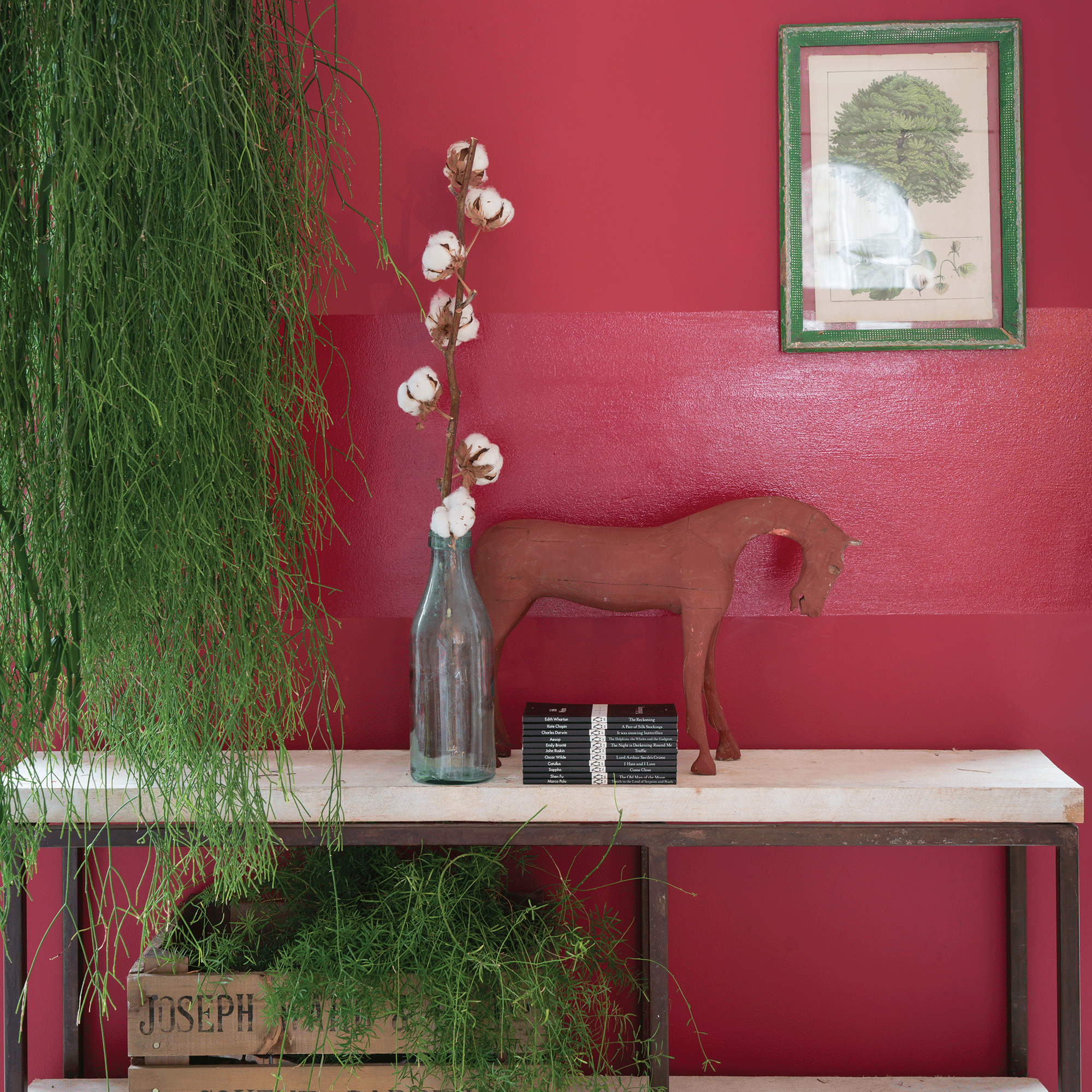
The Feeling Blue or Seeing Red? study found that respondents linked red with both positive and negative emotions (73%, anger; 68%, love). Both things that get the blood pumping and the pupils dilating rather than preparing us for a snooze. After all, it’s the colour we associate with blood, angry faces and sexuality (think Jessica Rabbit’s dress, baboons’ bum-flashing or the scarlet-painted feature wall behind Big’s bed in Sex and the City). It signals dominance to the degree that scientists found sports teams that wore red outperformed others (Hill and Barton, 2005).
Of course, you could use its power for good rather than evil. Joa Studholme, Farrow & Ball’s colour curator, points out that red can be very warm and welcoming. That puts it firmly on the list for hallways and dining spaces. The trick, she says, is getting the right shade: ‘If you want a slightly formal look, then aged burgundies like Eating Room Red or Preference Red are best. These colours have their roots firmly in the past but still look great, especially on panelling or doors in a gloss finish. If you want a more relaxed feel, then try a faded red tone like Red Earth or Book Room Red for a warm and laid-back look.’
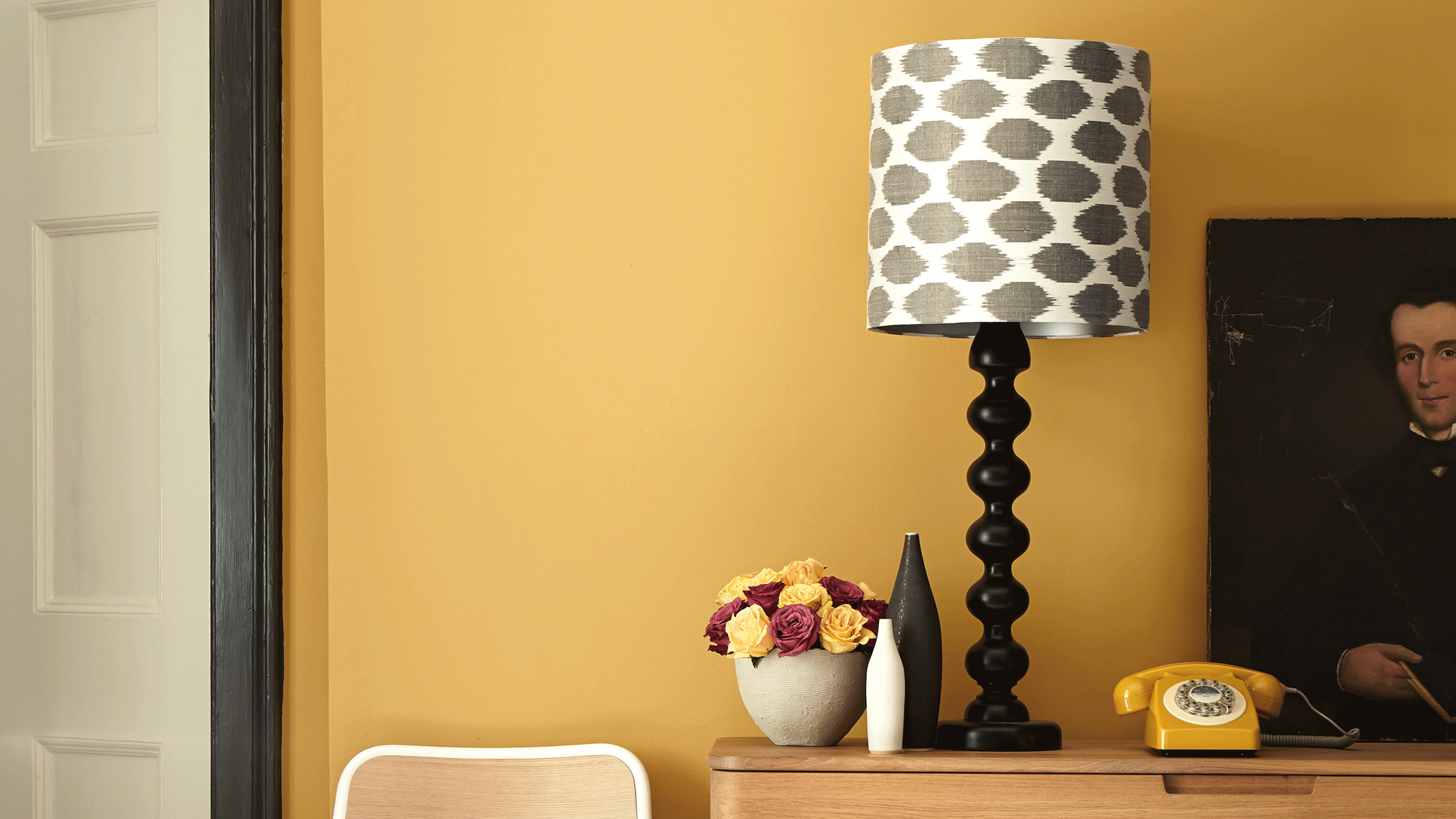
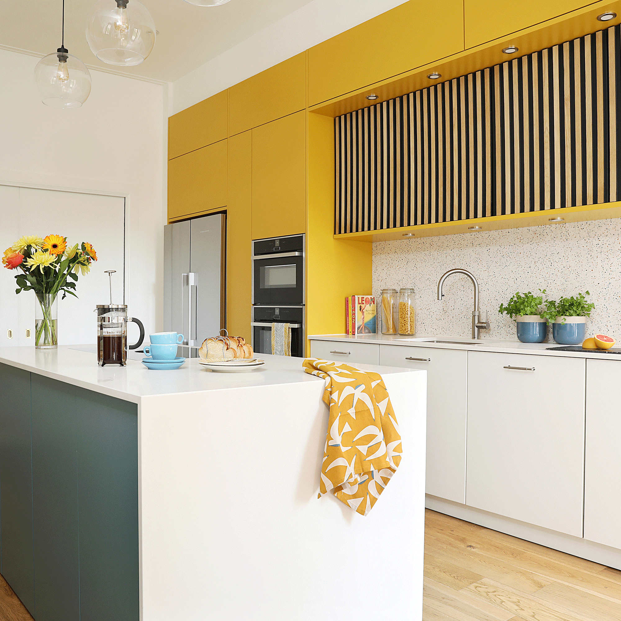
2. Sunshine yellow
Nothing messes with your circadian rhythms more than bright sunshine when your mind and body is craving total darkness. That’s a recipe for jet lag right there. So why paint your bedroom the same colour as that big, blazing ball in the sky? Yes, it’s a happy colour, but a person who’s been cheated of sleep is not.
Karen Haller confirms, ‘Yellow can stimulate the nervous system and you could wake up irritated. It’s why hotels avoid using yellow. It’s the colour that gives you a cheery “hello!”. It can help to boost your confidence and raise your spirits, though.’
To use it in a positive way, try yellow in the kitchen: ‘It’s a great colour to have at breakfast time,’ says Karen. ‘Often just a splash is enough – such as on your front door to welcome you home.’ Joa Studholme agrees – a little goes a long way: ‘Try painting window reveals in a strong yellow to make a gloomy room appear to be full of sunshine,’ is her hot tip.
3. Glowing orange
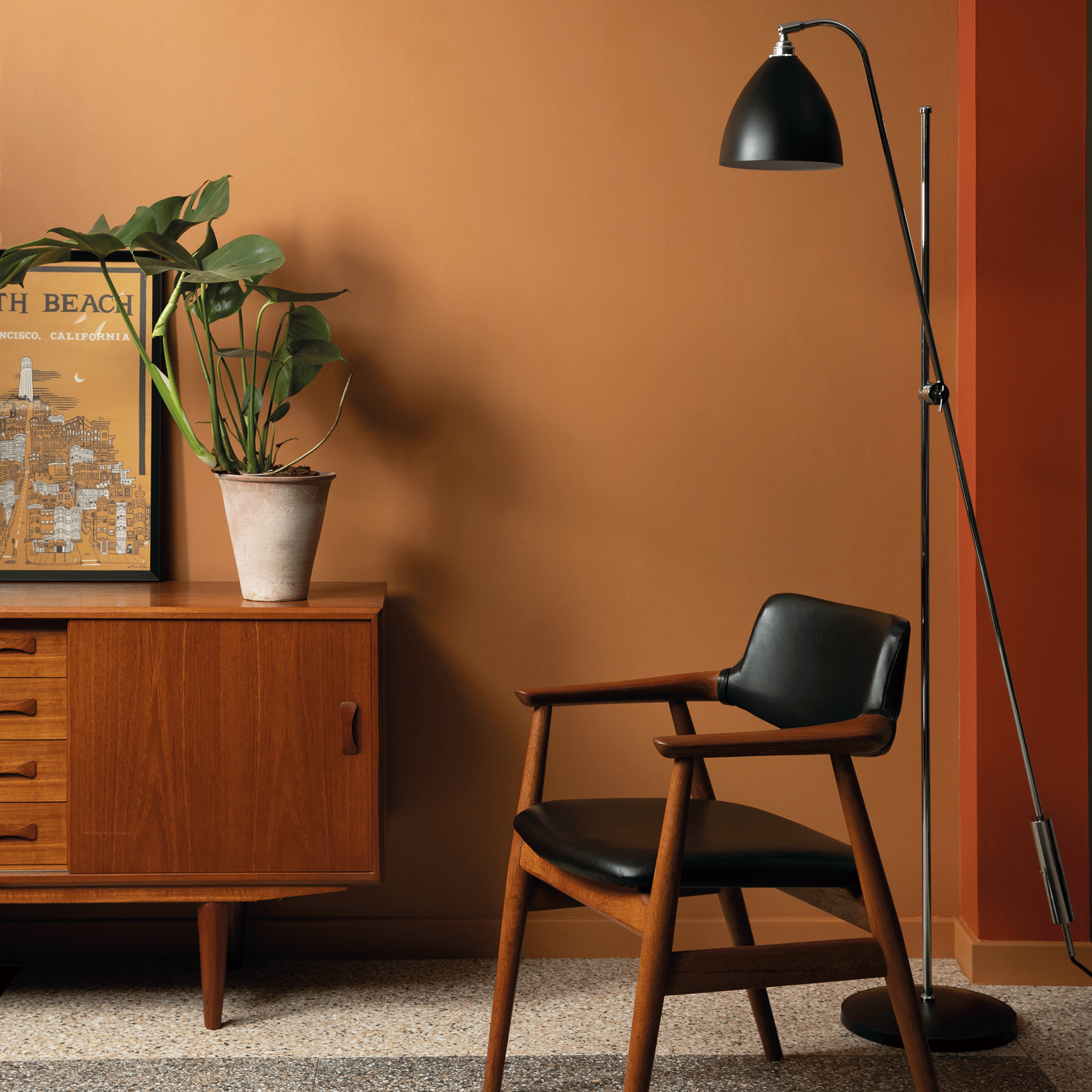
It’s refreshing, it’s tangy, it’s zingy. All the feels you really don’t want at 3am. Psychologist and wellbeing consultant Lee Chambers adds, ‘Bright oranges and yellows might be associated with sunny cheerfulness and enhanced creativity, but spending too much time in these environments can make us become agitated, especially those with sensory sensitivities.’
Ruth Mottershead, creative director at paint company Little Greene, weighs in: ‘Bold yellows and oranges bring positivity to a space and make us feel uplifted, happy and energised, but may be too vibrant in a bedroom.’
Orange is such a warm and joyful hue, though, don’t turn your back on it entirely. Joa suggests using it in a hallway colour scheme: ‘The colour used in your hall will create the first impression of your home and set the tone for what is to follow, but is not a space you spend huge amounts of time in. Colours like yellows and oranges are extremely successful at creating a welcoming feel and their exuberance will be appreciated by your visitors!’
If the idea of putting orange on walls scares you, she advises, ‘Start small with colours like this. They are suited to very small rooms or the inside of a cupboard, rather than painting a large room or one you spend most of the day in. Spaces painted in these colours are a treat!’
4. Bright pink
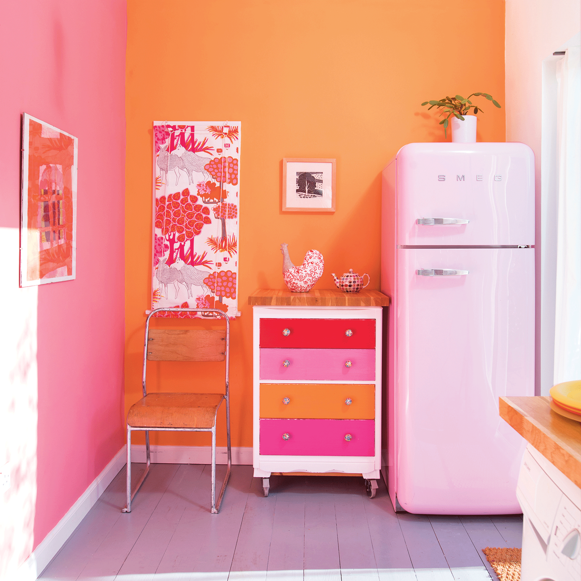
If Barbiecore is your bag we won’t judge you, but be careful where you use those brighter shades of pink. Ruth Mottershead explains, 'Like yellow and orange, hot pinks can be too vibrant for a bedroom, but they’re perfect for spaces that are a hive of activity. Kitchens, where entertaining and family life happen, are the perfect spot for an adventurous and vibrant colour choice that lifts your mood.’ Try pairing your pink kitchen ideas with orange for a sizzling combination.
Joa Studholme’s advice is to stick to pale, nearly neutral shades: ‘Gentle tones like Pink Ground, Setting Plaster and Templeton Pink feel like they’re giving you a big hug. They’re especially soothing when used on both walls and ceiling.’
FAQs
What colour makes you less sleepy?
Colour specialist Karen Haller says, ‘Turquoise can keep the body and mind awake. It’s a great boost in the morning when you need to wake up your body and mind, so is a great colour to use in the bathroom.’
What colours make you wake up?
Karen Haller says, ‘Red is what I call the colour equivalent of drinking a double espresso! I advise my clients that often just a splash is needed to get you up and going. This is tapping into the positive psychological traits of this colour.’
What colours disrupt sleep?
Red. Psychologist and wellbeing expert Lee Chambers explains: ‘Red is known for its stimulating properties and attention-grabbing nature. It can make us feel more energetic and powerful, and has been shown in research to increase our heart rate and blood pressure. It has the potential to stimulate some individuals’ sympathetic nervous systems. It can induce restlessness and irritability, making it more challenging to enter our typical sleep cycle.
