Experts share the best happy colours for a kitchen to create the ultimate feel-good space
Become a feelgood foodie with these expert-selected hues for a happy kitchen

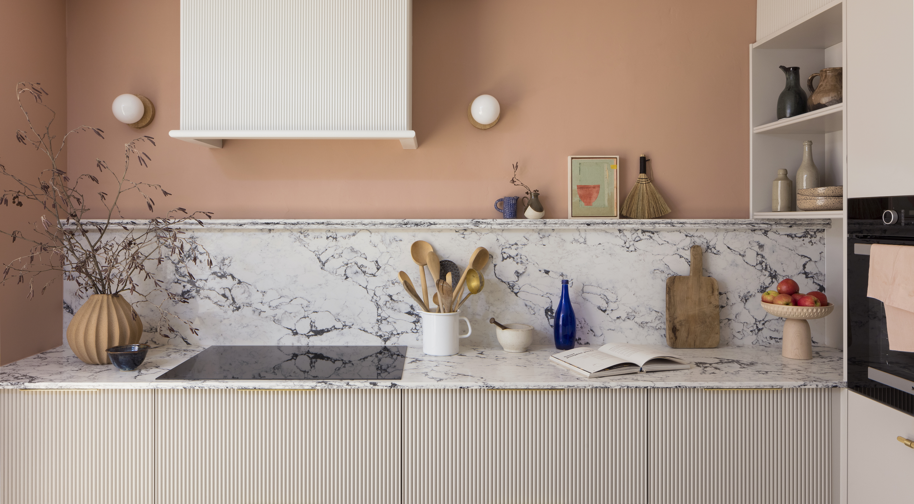

Having an appetite for colour is the secret to creating an uplifting and mood-boosting kitchen. And who doesn’t want to be a happy eater with the best happy colours for a kitchen?
Okay, enough with the foodie puns, but the fact is that choosing kitchen colour schemes is about more than decorating – research shows that certain shades can lift our mood, instil feelings of positivity and make us feel more optimistic about life. With the kitchen the favourite room in the house for the majority of us, according to a survey by the National House Building Council, it makes sense to fill it with happy colours to create a feel-good space at the heart of our home.
We spoke to a colour therapist and design experts to find out the secrets of happy colour for kitchens – and the one shade to steer away from in your cooking space.
Article continues belowHappy colour for kitchens
You don’t need a complete refit to upgrade the happy quotient of your kitchen. While painting your cabinets or fitting a bright kitchen splashback can bring bright shades into the space, you can shift the atmosphere of your kitchen with just a few accessories, for an affordable and accessible mood boost.
‘Kitchen accessories are an opportunity to express your personality, giving you the freedom to introduce pieces that bring you joy and may have memories attached,’ explains colour therapist Momtaz Begum-Hossain. ‘Introduce colour through your choice of tablemats, tea towels, crockery and mugs. These items are often on show, so make them worth looking at and allow them to add to the warm, inviting, happy atmosphere of your kitchen.’
Whether you’re going for a complete redecoration or a few colour tweaks, these are the happy colours to consider for your kitchen.
1. Red
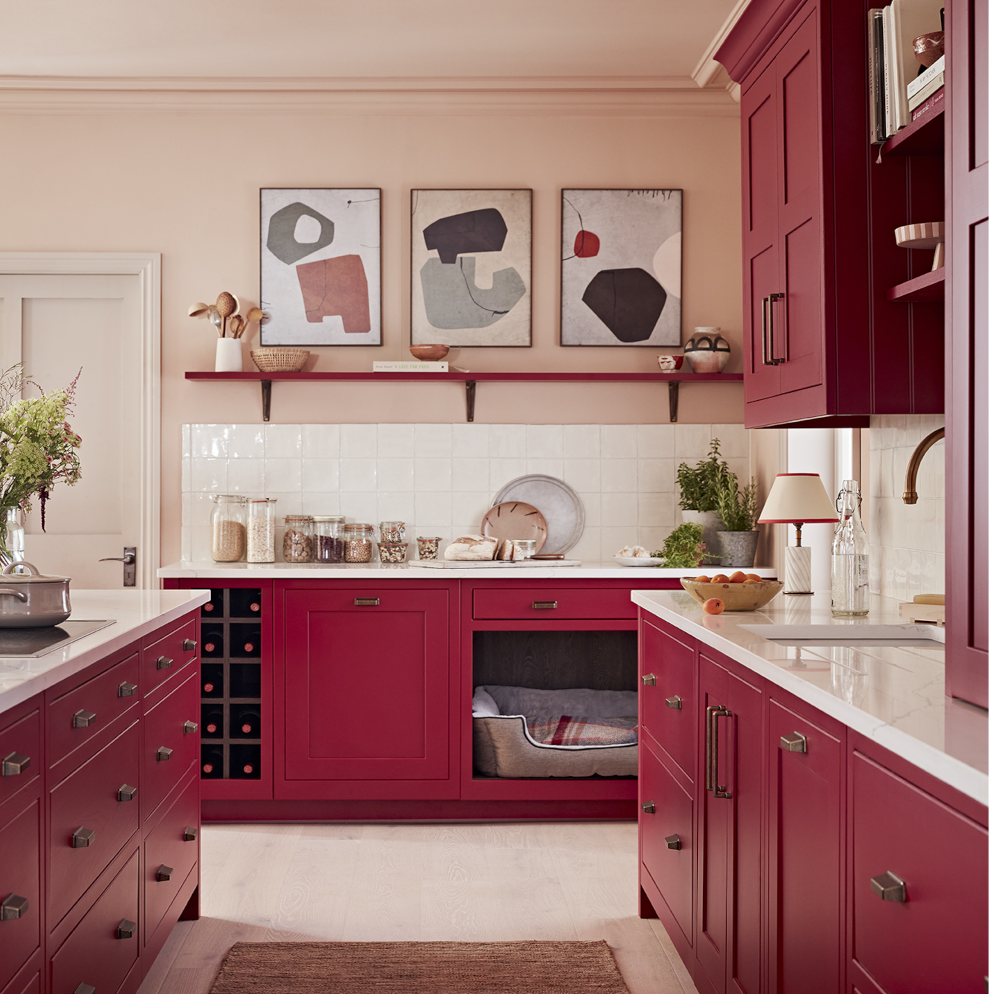
Rich tones are making a comeback in kitchen design, with deep red shades, glowing terracottas and warm beige and golds injecting feelgood warmth and energy into our homes.
Sign up to our newsletter for style inspiration, real homes, project and garden advice and shopping know-how
‘Grey is gone and super-warm tones and shades will be the new go-to, inspired by the vibrant palettes and cosy fabrics of all the dopamine dressing we’re currently obsessed with,’ confirms Melissa Klink, creative director at Harvey Jones kitchens.
‘We’re talking rich burgundies, aged brass, muddy golds, warm terracotta, fresh greens, and crisp teal hues, among others. ‘Inspired by these emerging trends, we are injecting more energy into the home. Clients are showing their true colours and creating spaces in their homes that amplify their personality.’
Of all these rich and deep colours, there’s a reason that red and burgundy tones are dominating dopamine decor and that red kitchen ideas are trending.
‘Red increases our appetite as our mind associates it with foods that are sweet, ripe or juicy, such as strawberries and cherries, and these spark positive memories,’ explains colour therapist Momtaz Begum-Hossain.
‘However, red is a high-energy colour and too much can trigger anger and passion, so it’s best used in moderation. A feature red wall would add vibrancy and character, or introduce hints of red with a framed print or a red chair that can enhance the happy mood of a kitchen.’

Melissa Anne Klink has an extensive design background, with graduate degrees in Interior Design (as well as one in Fine Art and Psychology), plus a Master's Degree in Interior Architecture. At Harvey Jones, Melissa steers clients through the design process to create beautifully personalised kitchens.
2. Green
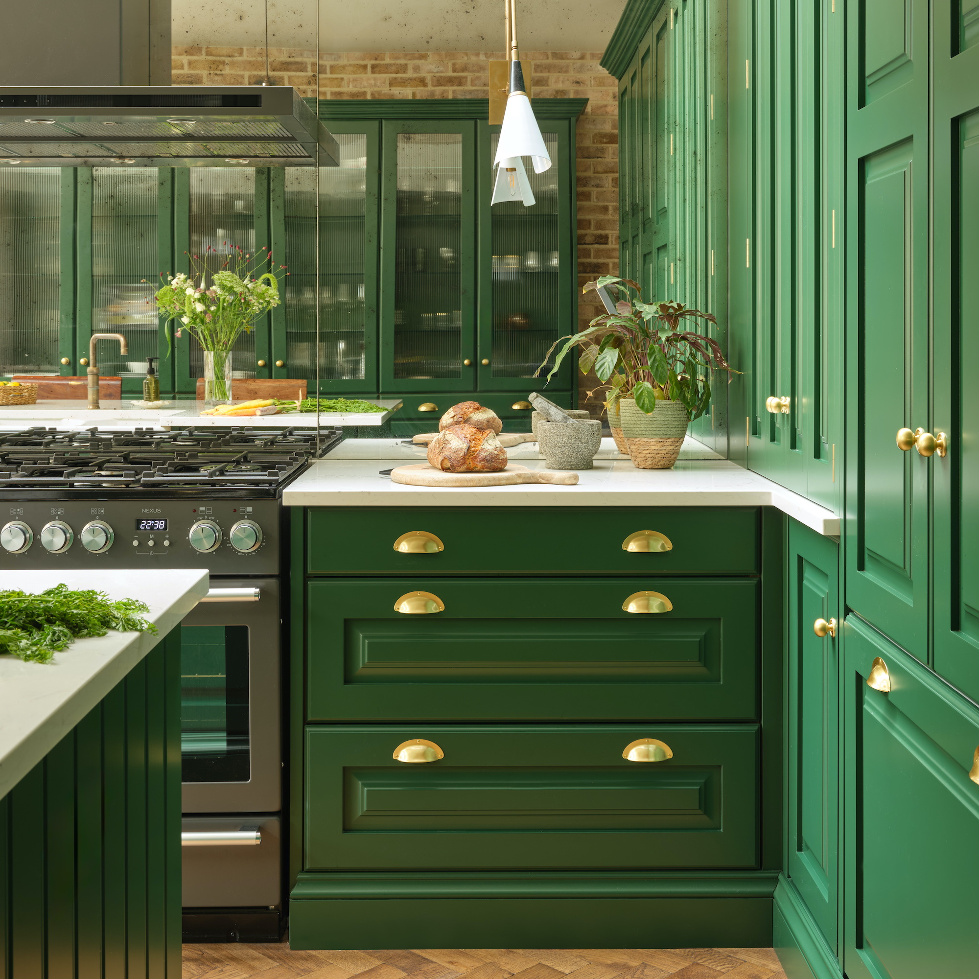
Green kitchen ideas have been a huge hit over the past few years, but colour therapist Momtaz Begum-Hossain says that’s down to more than simple aesthetics. We immediately associate the colour green with health and happiness, which makes it an ideal fit for a kitchen. ‘At the same time, a green setting also makes food look more appealing and pretty, so a great way to enhance food presentation,’ she says.
For a triple-whammy of good looks, good times and good vibes, Momtaz suggests basing the look of your kitchen on your favourite plant-filled restaurant.
‘Echo the Instagram-worthy displays we often drool over in restaurants by filling your kitchen with hanging plants or better still an indoor herb garden,’ she says. ‘You’ll benefit from the happy effects of green as a colour, positive memories and biophilic design.
3. Blue
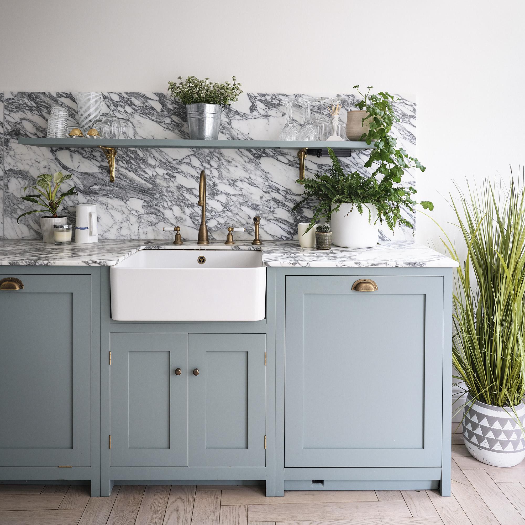
Deep navy and bold cobalt blue kitchen ideas have been a leading trend, but paler pastel tones are also great happy colours for kitchens. Whichever blue you choose, there’s a strong argument for the colour’s uplifting effects.
‘Just like greens and neutrals, blue is a fresh colour that reminds us of nature and the great outdoors, and so can help to enhance wellbeing,’ says Alex Main, director, The Main Company.
‘Blue is also favoured by many as a happy colour for kitchens as it evokes feelings of relaxation, tranquility and calm – perfect qualities for this busy, multifunctional space. From timeless navy blue to eye-catching aquamarine, there is a blue to suit any tone and kitchen style depending on homeowners’ preferences.’
4. Yellow
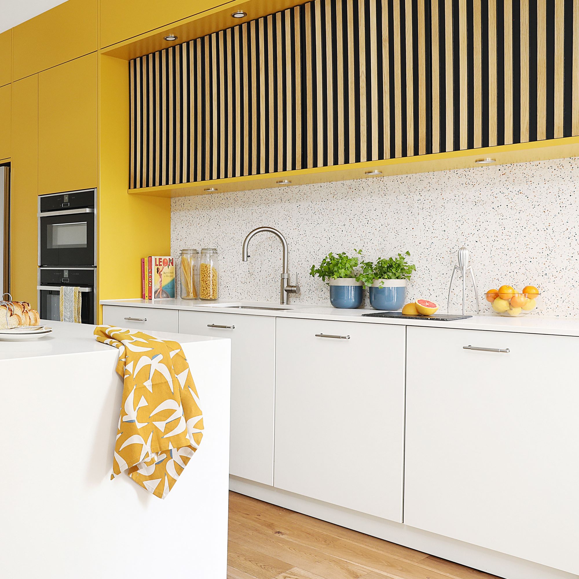
‘Kitchens are often considered the heart of the home, where we spend time entertaining guests, preparing meals and socialising, so it’s important for the kitchen to create a positive and uplifting atmosphere. One way to achieve this is through the use of colour in the kitchen design. Different colors can enhance the overall look and feel of the space,’ explains Olga Alexeeva, creative director at London design studio, Black & Milk.
‘While personal preferences for colours may vary, there are certain hues that are known to bring warmth and boost mood. Warm tones such as yellow are known to stimulate appetite, creativity and enthusiasm. These colours can be incorporated into the kitchen design through various elements such as glass cabinets, window treatments and accessories. By adding these inviting and cosy accents, the kitchen can feel energetic and welcoming.’
Olga strikes a note of caution when looking at yellow kitchen ideas, however.
‘Yellow can be associated with happiness, laughter and energy, but it can also stimulate anxiety,’ she explains. Use the tone of yellow that feels best in your kitchen.
5. Orange

The perfect blend of sunny yellow and invigorating red, orange is another bright and happy colour for a kitchen.
‘Kitchens are a social and creative space so it’s essential that they are warm, welcoming and energising. An orange kitchen is a great choice because it’s a positive colour that uplifts your mood and will also keep you alert without being overly stimulating, as red can be,’ explains colour therapist Momtaz Begum-Hossain.
‘Orange energy promotes creativity and the desire to use your hands, which is ideal when you’re cooking. It adds enjoyment to an activity, so you’ll find that you meal prep becomes more fun.’
For a surprisingly happy colour combination for the kitchen, try orange partnered with teal. ‘These two colours together create a mood-boosting palette that brings you joy each time you step into the kitchen,’ Momtaz says. ‘The complementary colours of teal and orange are vibrant, fun and accessible, making your kitchen feel homely and desirable to anyone who pops around to visit.’
6. Peach and coral
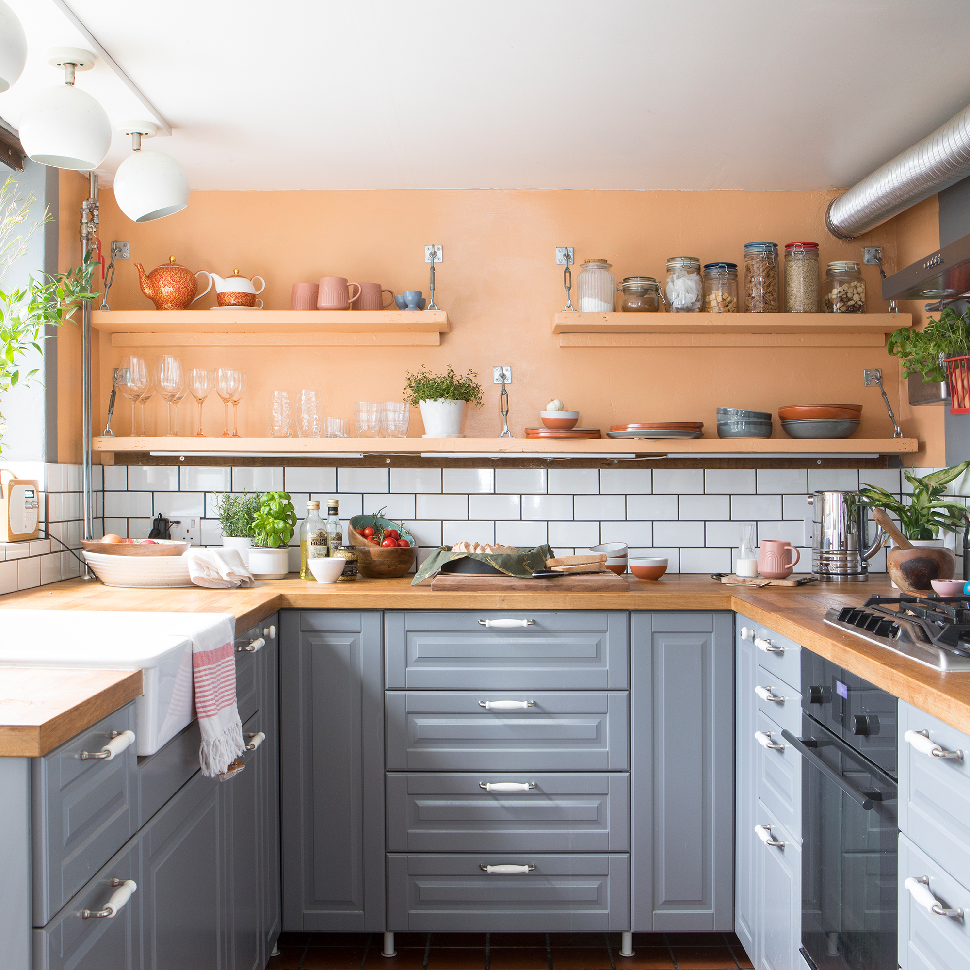
If orange is too strong for your taste but you want to benefit from its happy-inducing hue, then consider a softer tone of coral or peach instead.
‘The orange spectrum includes softer peaches which are ideal for kitchens that double us as a workspace, perhaps if you use a laptop on the kitchen table during the day,’ Momtaz says.
The colour to avoid for a happy kitchen - brown
Okay, this could be controversial, as we’re seeing more rich brown tones in kitchens – especially with warm and darker woods such as walnut. But according to colour therapist Momtaz, painting a kitchen in a dark brown tone is more likely to lower your mood than give it a boost.
‘Unless you have a desire to cocoon yourself in a retro, 1970s-themed kitchen, avoid brown at all costs. It instantly darkens a room, making it feel dreary and uninspiring,’ she claims.
‘Though deep chocolate brown possesses a sensual quality, this trait doesn’t translate into kitchen. Brown is a formal, academic colour that is associated with the professionalism of an office environment, the rigidness of a courtroom, and the formality of an educational institute. When used in a kitchen it’s difficult to shake these associations. Accents of brown in kitchen accessories like wooden salt and pepper shakers is fine, but a brown wall? Avoid at all costs.’
As ever, the happiest colour for a kitchen is the one that you love and that makes you feel good, but start with this selection as cues for your decorating palette and you’ll make a headstart on creating a kitchen that lifts your mood every day.

Andrea began her journalism career at Ideal Home and is currently Editor of our sister title, Country Homes & Interiors, which celebrates modern country style. Andrea is passionate about colour and how it can transform both our homes and our sense of wellbeing, and has completed The Power of Colour course with the prestigious KLC School of Design. Andrea's career spans interiors magazines, women's lifestyle titles and newspapers. After her first job at Ideal Home, she moved on to women's magazines, Options and Frank. From there it was on to the launch of Red magazine, where she stayed for 10 years and became Assistant Editor. She then shifted into freelancing, and spent 14 years writing for everyone from The Telegraph to The Sunday Times, Livingetc, Stylist and Woman & Home. She was then offered the job as Editor of Country Homes & Interiors, and now combines that role with writing for idealhome.co.uk.
