Fearne Cotton shares exciting new interiors role with fans on Instagram
Star reveals she's got the decorating bug, as she returns as Dulux Colour of the Year ambassador
Sign up to our newsletter for style inspiration, real homes, project and garden advice and shopping know-how
You are now subscribed
Your newsletter sign-up was successful
The loveable TV and radio presenter has just announced an exciting new role – breaking the news to fans on Instagram a short while ago. Fearne is back as the ambassador for Dulux Colour of the Year 2020, Tranquil Dawn.
The news comes after the star reveals, since she's learned more about colour, she’s redecorated every room in the London home she shares with husband Jesse and their children, Rex and Honey.
Fearne Cotton shares news with fans...
A post shared by Fearne (@fearnecotton)
A photo posted by on
Fearne was delighted to share the news with her 2.9 million Instagram followers.
Article continues belowShe posted, 'Beaming to be back as @DuluxUK’s Ambassador for the Colour of the Year 2020 and I got to spend the day with the Dulux dog who brought so much joy to our shoot day! This year it’s Tranquil Dawn, a shade to create a space of calm within the house. 2020 means a new decade/new decor so we’ll have lots of tips in the coming months on how to make more room for joy at home.'
One delighted fan said, ‘Looove this shade 🙌😍’.
Another inquisitive follower asks, ‘Is Interior Design Masters coming back for another series?? 💕’. We hope so too, fingers crossed.

It appears working with Dulux, presumably along with presenting 'Interiors design Masters’, has inspired Fearne’s own home. ’I think I have become addicted to decorating, painting in particular’.
Sign up to our newsletter for style inspiration, real homes, project and garden advice and shopping know-how
Fearne explains, ‘In the past year, I looked at my house and thought it was actually quite boring in terms of the decor. I’ve tried to be braver, with things like painting ceilings in colour - I’d never considered the ceiling before!’
Colour of the Year 2020 Tranquil Dawn

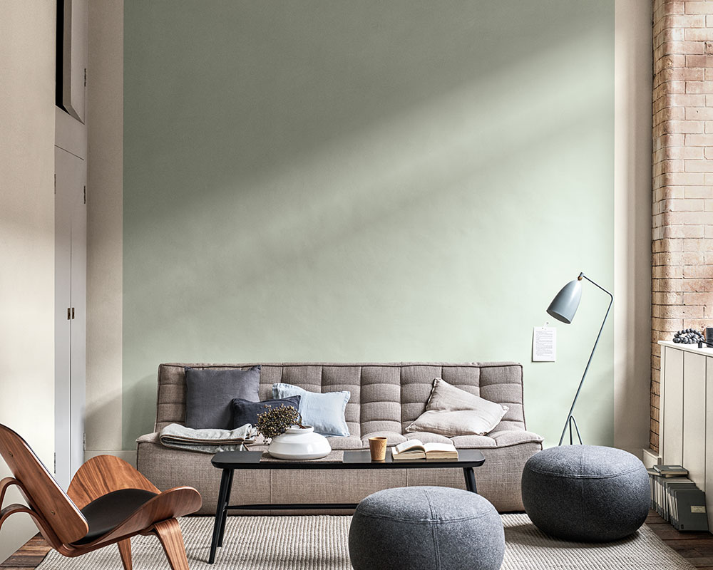
Tranquil Dawn was chosen as the Dulux colour of the year 2020 – a soft serene soft, fresh hue with the power to awaken our senses.
The shade is ideal to awaken interiors for 2020. As demonstrated, it's the ideal 'grown-up' pastel to team with on-trend saturated tones such as black and deep petrol blue. It also pairs perfectly with neutral oatmeal tones, dusky pinks and lilacs – all key colours throughout next year's interiors trends.
Related: Pantone Colour of the Year 2020 announced as Classic Blue
The pale, pastel mint green is very different to that of last year's Spiced Honey.
Which colour most appeals to your senses?
Tamara was Ideal Home's Digital Editor before joining the Woman & Home team in 2022. She has spent the last 15 years working with the style teams at Country Homes & Interiors and Ideal Home, both now at Future PLC. It’s with these award wining interiors teams that she's honed her skills and passion for shopping, styling and writing. Tamara is always ahead of the curve when it comes to interiors trends – and is great at seeking out designer dupes on the high street.