Forget Setting Plaster and Railings! Farrow & Ball’s colour expert shares the 5 underrated and more original shades to choose instead
The fact I’ve never heard of them just proves the point

Farrow & Ball has a collection of exactly 132 paint colours. And while some shades enjoy a lot of popularity with the brand’s customer base and cult following - I’m looking at you, Setting Plaster, Railings and Skimming Stone - many others manage to fly under the radar. But if you’re looking for a new paint ideas why not try one of the most underrated Farrow & Ball shades?
Even though I regularly (almost weekly) look at Farrow & Ball’s colour offering, I, of course, don’t know them all. So I called on the real expert, Farrow & Ball’s brand ambassador and colour expert, Patrick O’Donnell to reveal the most underrated colours that deserve a lot more attention than they’re currently getting.
Opting for shades that are not one of the few most popular Farrow & Ball shades - or one of the F&B colours that are going to be trending in 2026 - is also how you’ll end up with a space that’s much more interesting and original.

Brassica

‘Mauves, lilacs and mulberries are appearing more frequently in fabric and wallpaper, yet uptake in paint has been slower,’ Patrick says. ‘When used thoughtfully, they bring a gentle sense of interest, particularly for those keen to step “off-piste” from perennial blues and greens. Our charming Brassica, which sits within the lavender-lilac family, has a beautifully ethereal quality. It’s soft rather than sharp, making it equally at home in contemporary schemes and more traditional settings.’
While some of the deeper and darker aubergine or plum purples are among this year’s colour trends, softer purple shades and lilacs are currently not very popular. But that doesn’t mean they shouldn’t be or that you can’t use them if purple is a colour you gravitate towards.
And if you’re interested in decorating with birth month colours and happen to be born in February, shades like Farrow & Ball’s Brassica is the perfect one to incorporate into your home as purple is the month’s colour.

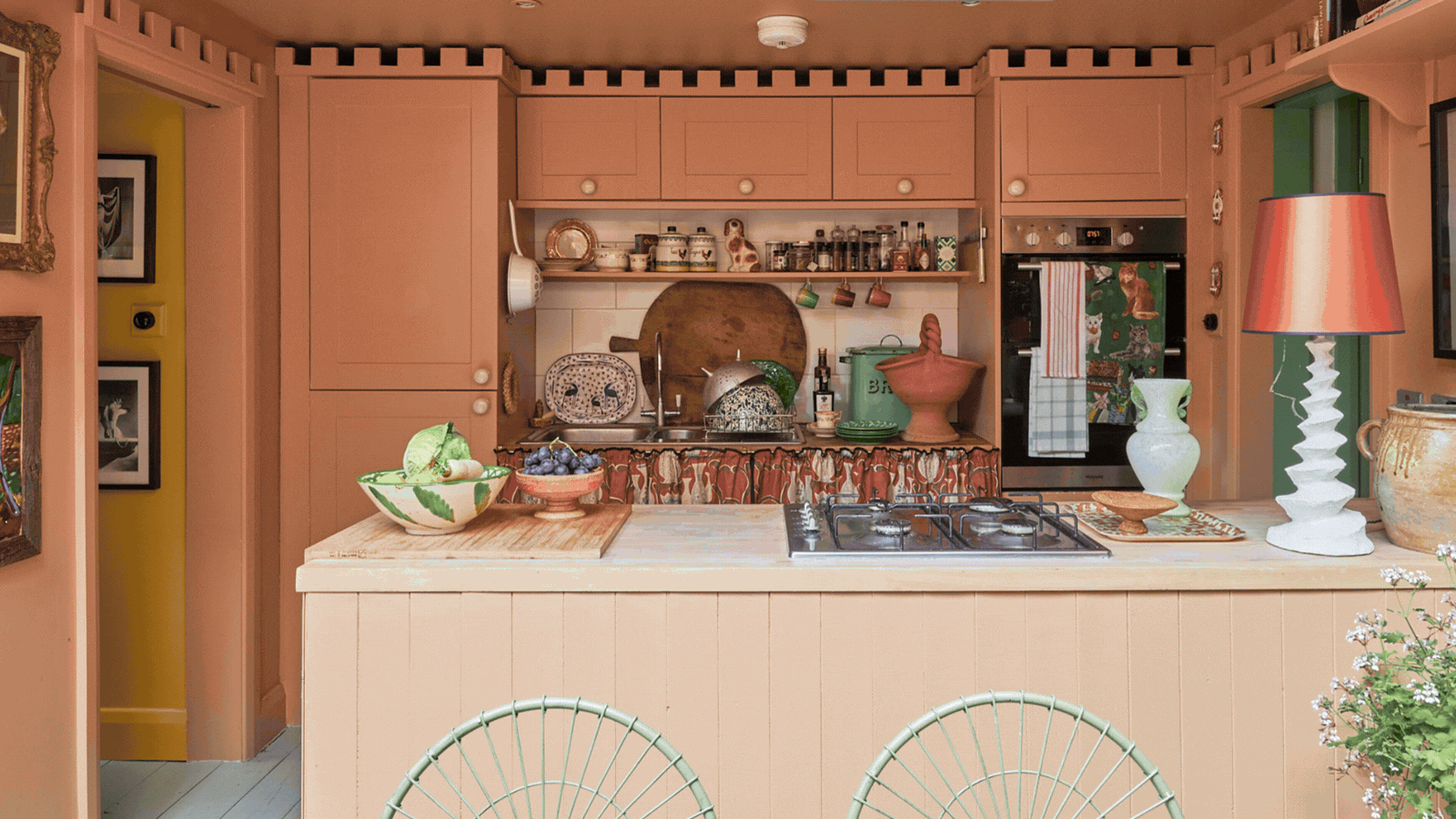
Fake Tan

Darker, earthy shades of terracotta have enjoyed a lot of popularity in recent months as warm, nature-inspired hues are what people are loving right now. But the lighter versions of these colours are not as widely used, even if they are Farrow & Ball colours.
‘Apricot pinks and faded terracottas can feel like a trickier colour family to work with, but it’s incredibly effective for adding warmth. Popular throughout the mid-20th century, with a brief revival in the 1980s, these hues - used wisely - can transform an unpromising space. They particularly shine in rooms flooded with natural light, where the apricot notes soften and create a gentle, sunny glow. Two favourites from our archive palette are Menagerie and Fake Tan,’ Patrick explains.
How to use Farrow & Ball’s Fake Tan to show off its full potential is perfectly illustrated in creative consultant Max Hurd’s home (pictured above).

Suffield Green

Some Farrow & Ball greens such as Green Smoke are among the brand’s top sellers. But others go largely unnoticed – among the most underrated are a couple of shades that Patrick refers to as Regency greens.
‘Green is a perennial favourite, yet we often gravitate towards cooler, paler shades or darker, moodier tones. Mid greens - those richer, more verdant hues - bring a joyful freshness to spaces ranging from bedrooms and sitting rooms to kitchen cabinetry. They work effortlessly alongside many other colours, allowing freedom to layer textiles and artwork. Archive shades such as Pea Green and Suffield Green offer charming period elegance and are particularly suited to rooms with generous proportions and high ceilings,’ he says.

Wainscot and Dauphin

The underrated status of Farrow & Ball’s Wainscot and Dauphin surprised me as brown colour schemes have been very popular in the last couple of years – so much so that Farrow & Ball came up with a new brown shade, Broccoli Brown, and included it in its launch of 12 new shades last year. But according to Patrick, these shades deserve a lot more attention than they’re getting.
‘Tobacco and caramel tones is a palette often embraced by confident designers but can feel less accessible to the DIY decorator, though it deserves far more attention for its understated elegance.
'These colours layer beautifully with greens, blues, pinks and reds, while always adding warmth. Think cosy yet chic. Pair them with a crisp white trim for a more contemporary feel, or lean into softer, drabber neutrals for something more settled and lived-in. Archive shades such as Dauphin and Wainscot are go-to choices for me, with Wainscot making a particularly timeless kitchen cabinet colour when paired with aged brass hardware.’


Which one of these underrated Farrow & Ball shades is your favourite?
