Think monochome and what usually springs to mind is contrasting schemes in black and white. Undeniably sophisticated, a safe-bet decorating winner and certainly chic, if not a little predictable. But strictly speaking, monochrome doesn't have to be black. Any colour that's used with white qualifies. Here are a few of our alternative combos that still look chic and sophisticated, but manage to also shake things up a bit...

Portuguese Blue
Create a luxe setting with Moorish tile-effect walls mixed with pattern and faux-fur curtains. The uniform colour palette keeps things calm, allowing you to layer up all kinds of patterns and textures without fear of things going too busy.
Wallpaper, Christian Lacroix for Designers Guild. Sofa by Roche Bobois.

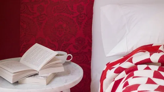
Scarlet and white
Offset the darkness of scarlet with opulent flock wallpapers and bold geometrics for a look that's refreshing and energising yet also calm.
Wallpaper by Sanderson. Headboard fabric Jane Churchill. Velvet side table by Squint. Bed blanket by Larsen.

An emerald affair
A malachite print puts a luxe twist on a 1930s palette of emerald and arsenic green, and provides a striking contrast to the white sofa.
Bolster cushion in cotton by Robert Allen. Wall painted in Troll Green by Sanderson

Smokey grey
Layer soft charcoal with white then add texture with gunmetal furniture and delicate late textiles.
Curtain made from Harlequin fabric. Wallpaper by Eco Wallpaper. Lampshades by Belle & Videre.

Sunshine yellow
Yellow gets a bad rep as a tricky colour but the knack is to make sure there's a hint of brown in the tones, to keep it natural. The subtle white contrasting pattern on the walls prevents the flat colour from overwhelming, adding texture and interest.
Walls lined with The Vase wallpaper by Clarence House at Turnell & Gigon. Chair by Harry Bertoia for Knoll at Aram Store.

Used for millennia, this pigment has an earthy appeal. White accessories keep things fresh though, giving the muddiest of shades modern appeal.
Walls painted in Yellow-Pink by Little Greene. Bed throw made in Orsay Rigato linen, C&C Milano.
And finally... In case you're a purist who just can't see anything other than in black and white, here's something specially for you...

Click here for more great Livingetc ideas on working with colour.
******