You’ve probably heard of the ‘5th wall’ paint trend, but what about the ‘6th wall’? – experts reveal why it's one of the biggest paint trends of 2026
Last year was all about focusing on the ceiling, but 2026 belongs to the floor

Sign up to our newsletter for style inspiration, real homes, project and garden advice and shopping know-how
You are now subscribed
Your newsletter sign-up was successful
As personalised homes and spaces filled with plenty of character become more and more popular, it’s no surprise that this approach is spreading to every possible corner and surface of the home. In 2026, this is giving rise to the ‘6th wall’ paint trend.
Last year, the biggest home decor trend when it came to paint was on the ‘5th wall’ of the room, aka the ceiling. Whether it was painting the ceiling a contrasting shade or a tonal one for a colour drenching, double drenching or colour capping scheme, some people even went as far as covering their ceilings in wallpaper as a 'feature wall'.
But this year belongs to painting the 6th wall of the room, also known as the floor. ‘There’s a growing shift towards applying colour with purpose throughout an entire space, not just on the walls, but across ceilings and floors, too,’ confirms Ruth Mottershead, creative director at Little Greene.
Article continues below‘Painted floors are a simple yet transformative way to change the mood of a space and make the floor a true design feature. As people continue to gravitate towards interiors that feel thoughtful, expressive and rich in character, painting the floor offers an effortless way to introduce personality and dimension.’
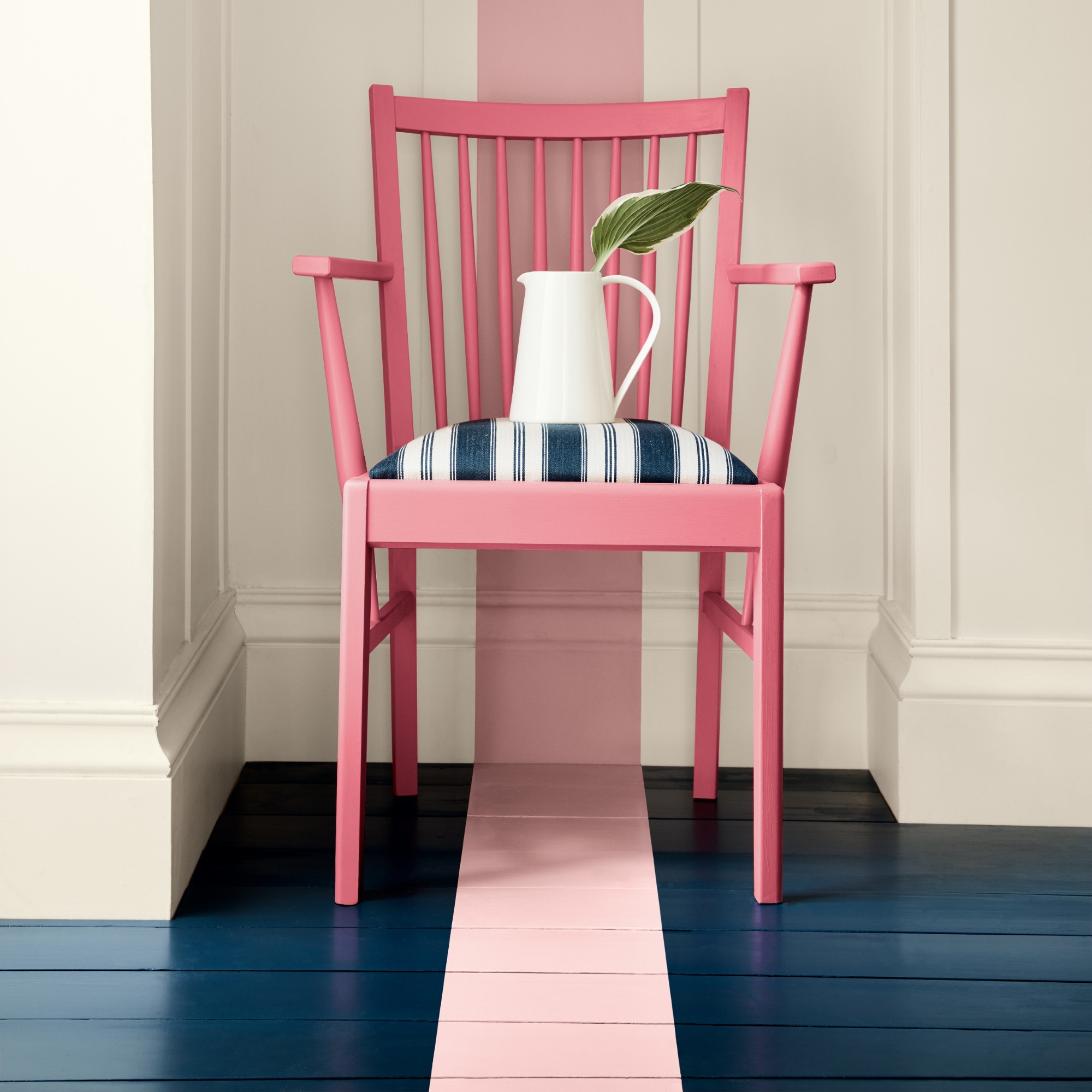
Painting your 6th wall works if you have either wooden floorboards or concrete flooring. And it’s a must to invest in durable paint made for flooring, such as Farrow & Ball’s Flat Eggshell finish or Little Greene’s Intelligent Floor Paint.
But if you get the right paint for this easy DIY project, the possibilities are endless. You can approach this trend in many different ways. But these are the best ways I've seen it used.
1. Opt for a bold solid colour
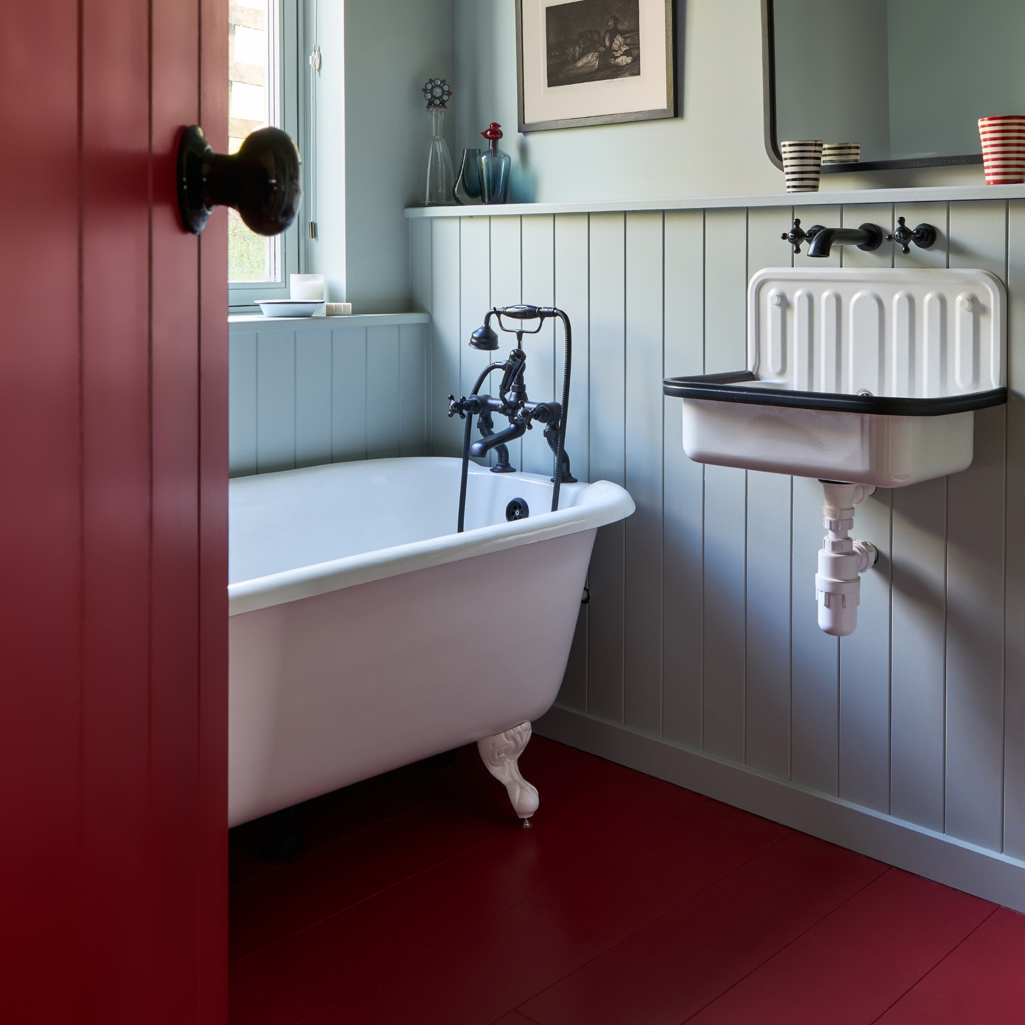
Traditionally, when floors were painted, they were in light neutral shades like white. While you can of course do that if it works for your space, you can also have a little more fun with it and go for a bold shade instead – whether it contrasts with the colour of your walls as in the image above or completes a colour-drenched scheme.
Sign up to our newsletter for style inspiration, real homes, project and garden advice and shopping know-how
‘For a look that is both stylish and practical, try painting your floor in a solid colour,’ says Joa Studholme, Farrow & Ball's colour curator. ‘Strong India Yellow will make the room feel as if it is full-on sunshine, while the use of our new hue Naperon adds warmth and unexpected charm. A true classic, Mouse’s Back is one of my favourite colours to use on floors.’
2. Go for a striking pattern
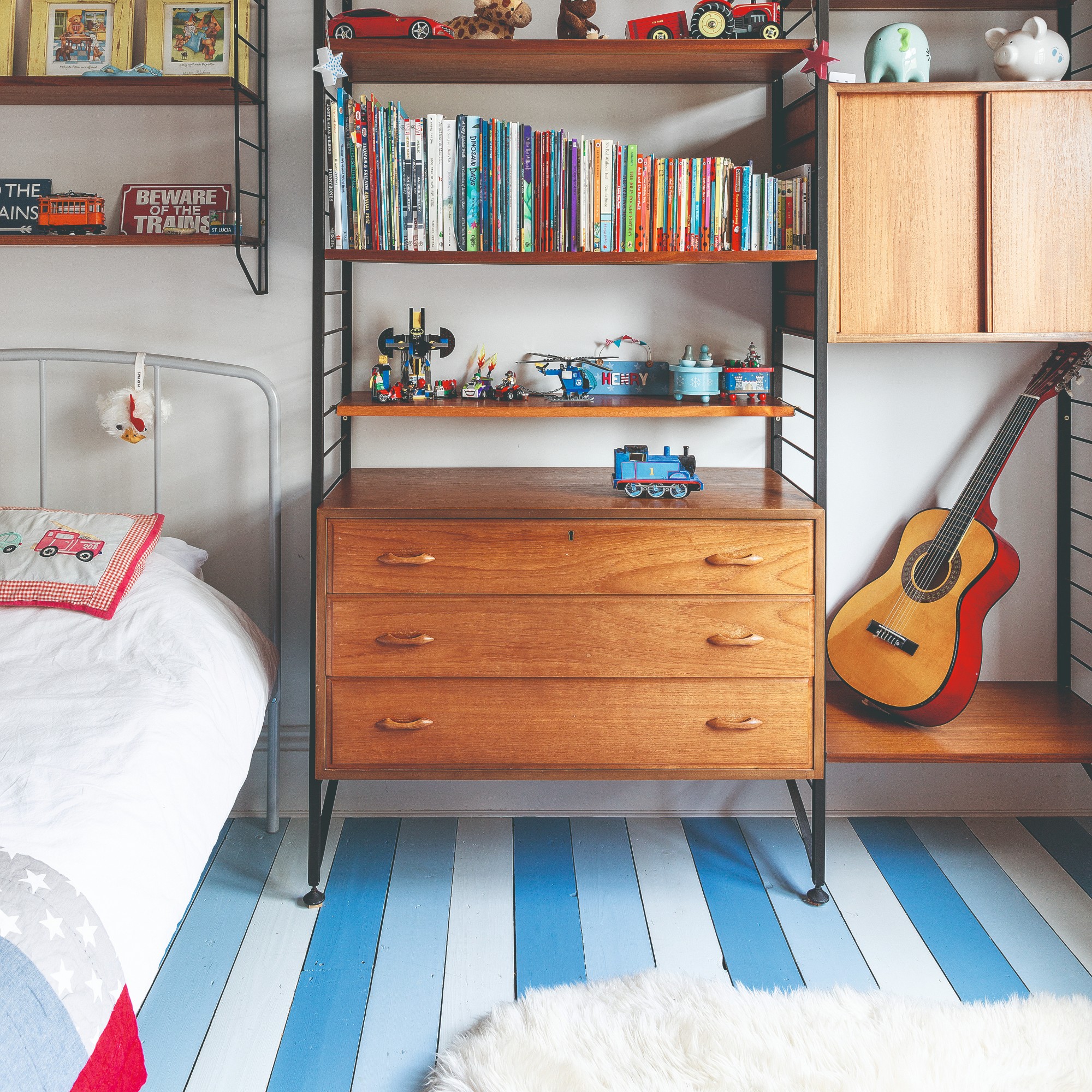
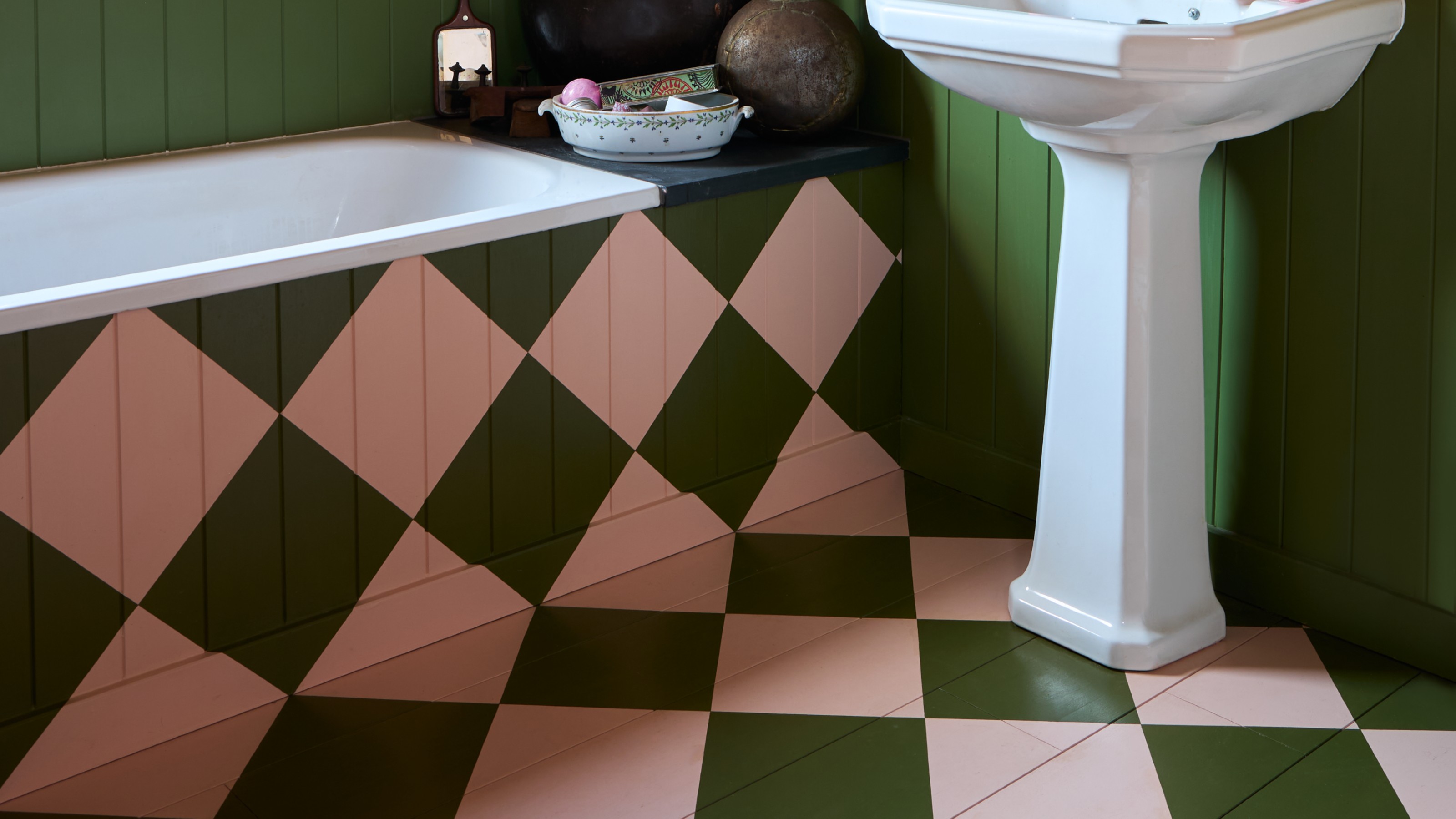
The floor lends itself to geometric patterns perfectly, much like when using tiles. Stripes or even a more striking chequerboard pattern are both popular choices that also looks stylish without overwhelming the room.
‘Far from being a decorating mistake, painting different widths of stripe adds huge visual interest to a room and makes the floor the focal point. Using two complementary colours like Brassica and Manor House Gray keeps a curated yet relaxed feel that won’t overwhelm,’ Joa says.
She continues, ‘And who can resist a bold checkerboard floor? This geometric effect is really striking but somehow always has a friendly feel, no matter which colours you choose. And it’s much easier to achieve than you might imagine!’
3. Pick out a feature
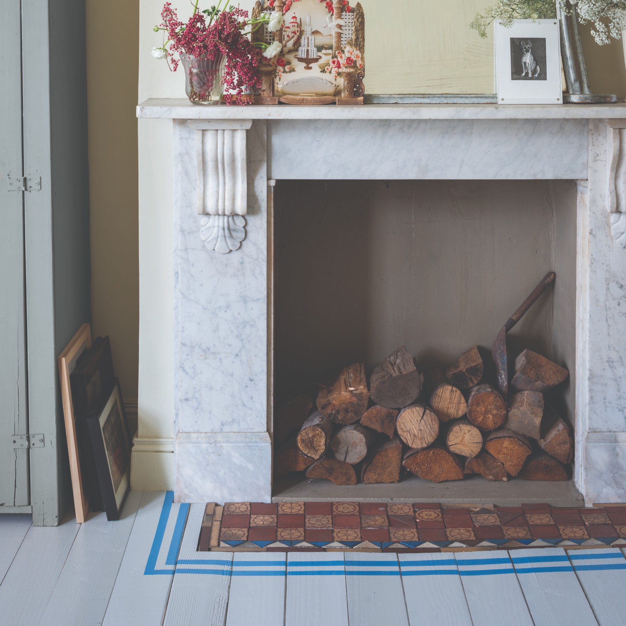
‘It’s such a lovely surprise to come across unexpected, controlled doses of colour in traditional spaces. Simply painting two stripes around the hearth of a fireplace adds a burst of fun and fabulous sense of whimsy to a room,’ Joa says.
Drawing attention to certain features of your home that you love and want to highlight - like your fireplace - is a great way to utilise this paint trend. Alternatively, you can zone certain areas of your space in place of a rug using floor paint.
Joa concludes, ‘Floor colour has a big impact on the look and feel of a room and the more floor space there is, the greater the impact. It’s a perfect way to be bold that won’t be overwhelming, as the use of strong colour below the eye line is much easier to live with.’

Sara Hesikova has been Room Decor Editor at Ideal Home since June 2024, starting at the title as a News Writer in July 2023. She is now also the Ideal Home Certified Expert on Furniture, and so far has tried over 300 different sofas.
Graduating from London College of Fashion with a bachelor’s degree in fashion journalism in 2016, she got her start in niche fashion and lifestyle magazines like Glass and Alvar as a writer and editor before making the leap into interiors, working with the likes of 91 Magazine and copywriting for luxury bed linen brand Yves Delorme among others.