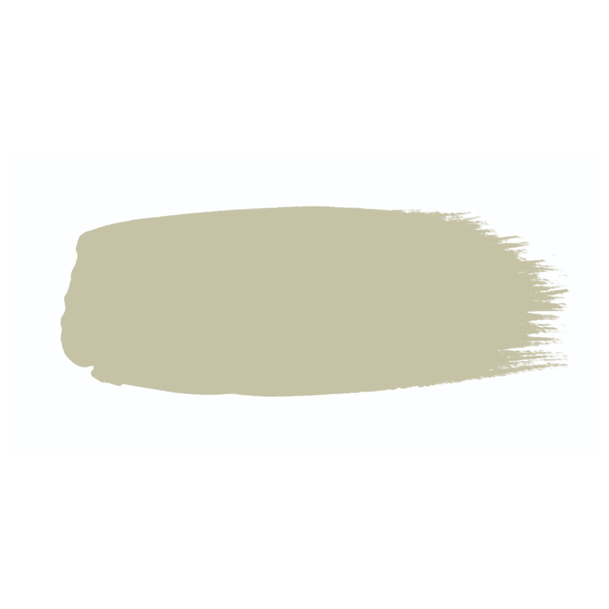
I asked 3 interior designers what their go-to neutral paint shades are, and these 3 came up more than once
Want to paint your walls like an interior designer? These are the 3 go-to neutral shades that they swear by

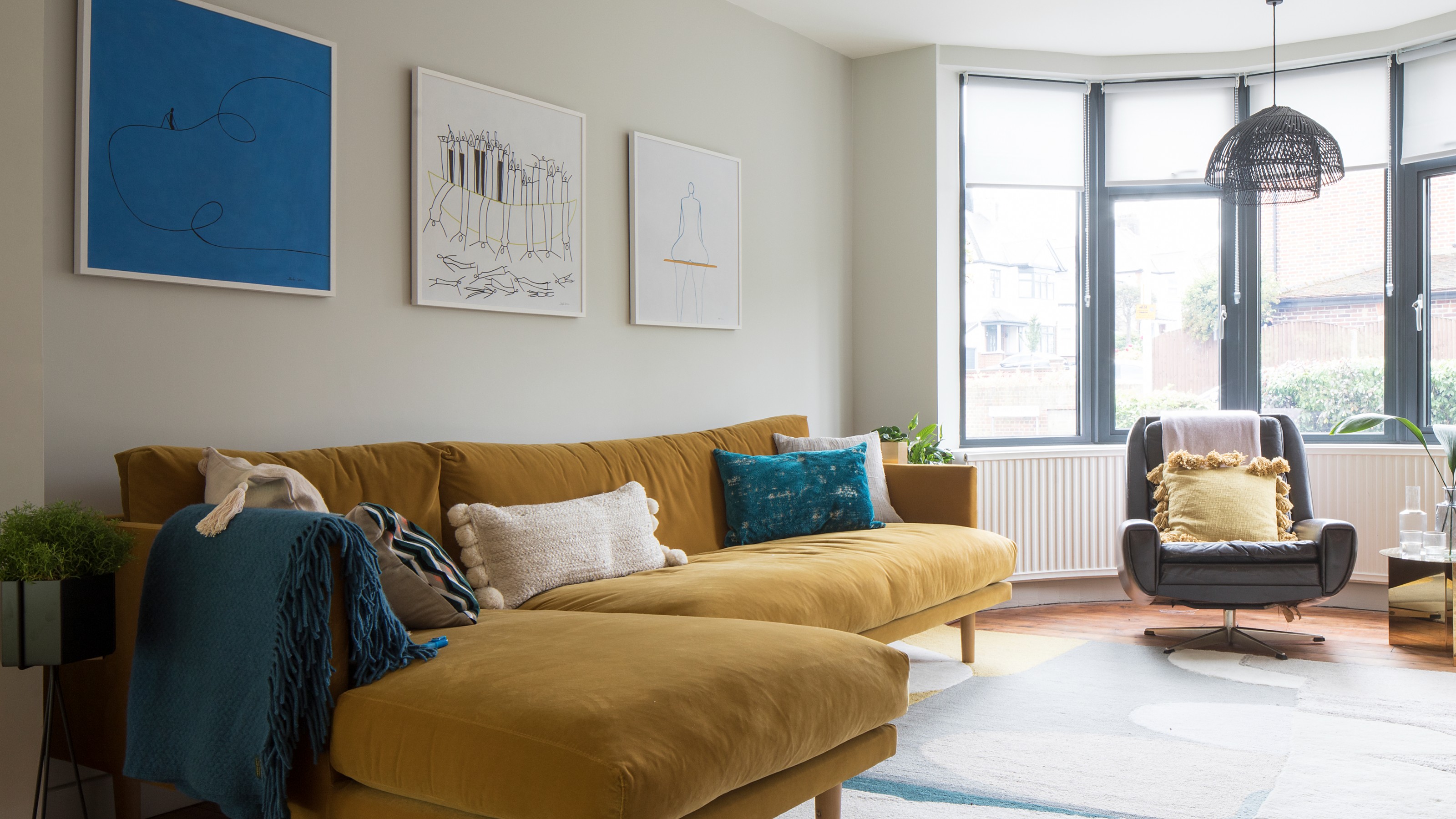
While we all love a splash of colour, there’s something undeniably timeless about painting your walls in a light neutral. But even within the neutral palette, the choices can feel endless. That’s why I asked three interior designers to share their go-to shades, helping us navigate the wide world of neutrals.
A neutral wall isn’t just safe, it's is often the smartest and best paint idea to go for as it serves as the perfect base for all your furniture and accessories. And while the best white paint shades used to be the default go-to to cover walls in, nowadays there are many other options you can go for that might actually be better than plain white.
From off-white to taupe and stone shades, these are the paint colours that interior designers swear by and keep coming back to time and time again.
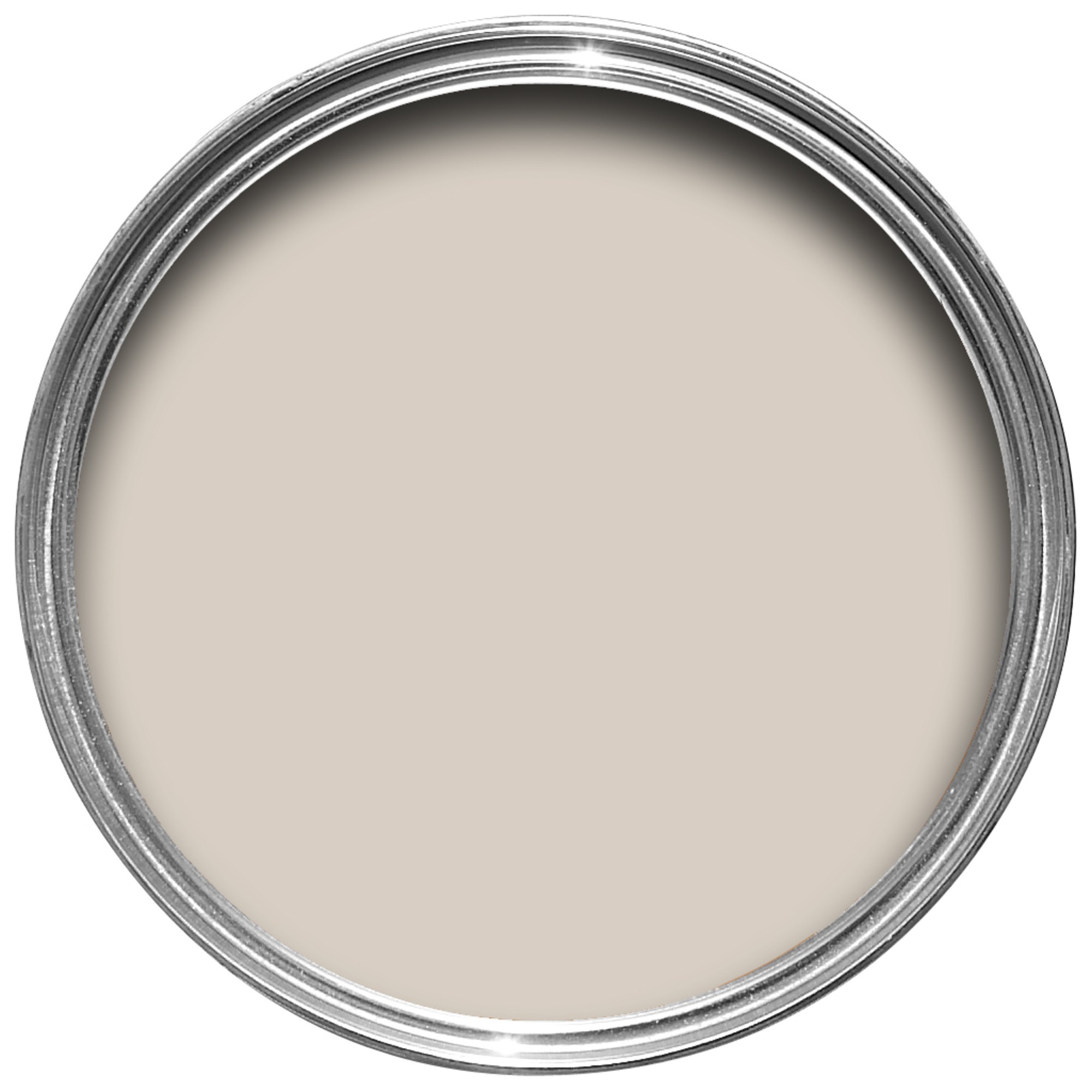
1. Farrow & Ball Skimming Stone
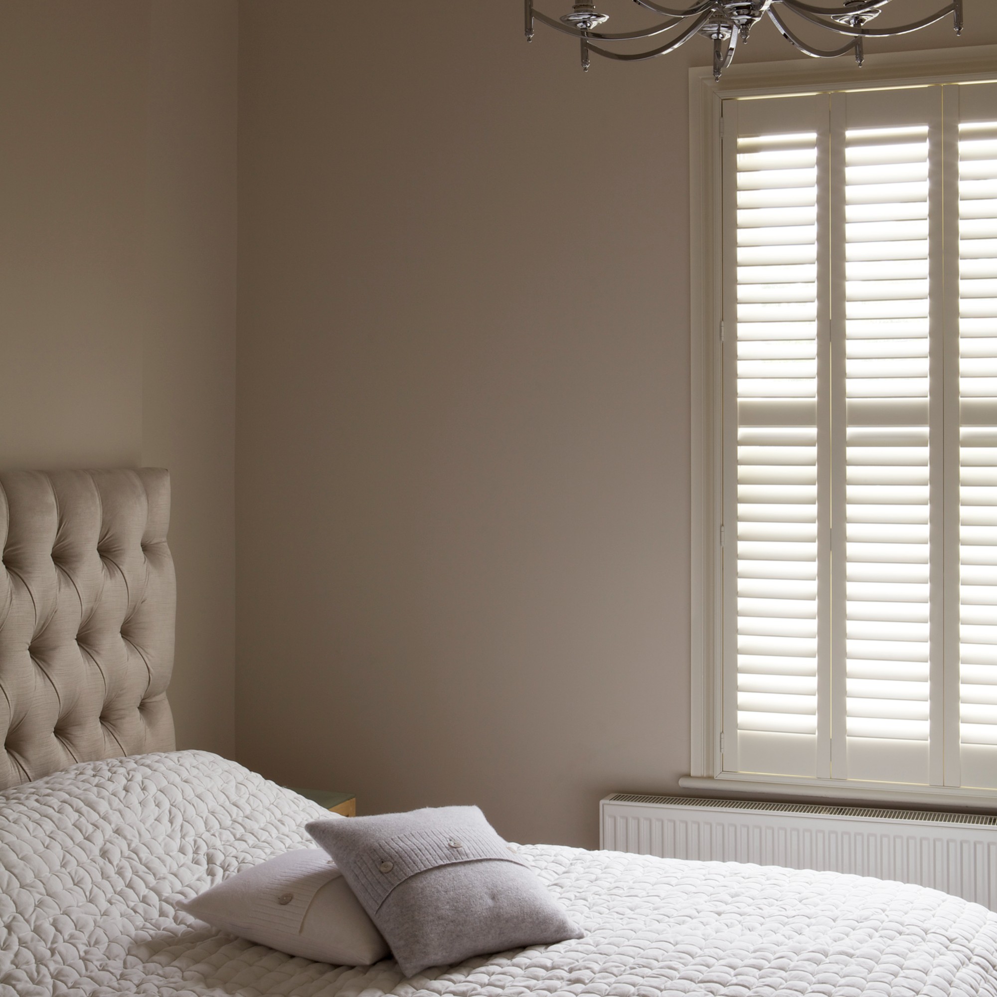
I couldn’t have started this list with any other paint shade than Farrow & Ball’s Skimming Stone. Not only is it one of Farrow & Ball’s most popular shades for many years now, interior designers just can’t seem to get enough of it.
‘Our number one, top-rated neutral paint for any interior and the goldilocks neutral colour we use on repeat? Farrow & Ball’s Skimming Stone, a beautiful light grey/taupe,’ says Jo Lane, founder of See Your Place. ‘In our view, it’s the perfect blend of light, warm, saturated, and tonal. A truly classic versatile neutral that works effortlessly in every setting.’
Noor Charchafchi, founder of Celine Interior Design, agrees, ‘Skimming Stone has this beautiful softness – a warm, stony grey that feels calm and timeless.’
2. Little Greene Portland Stone
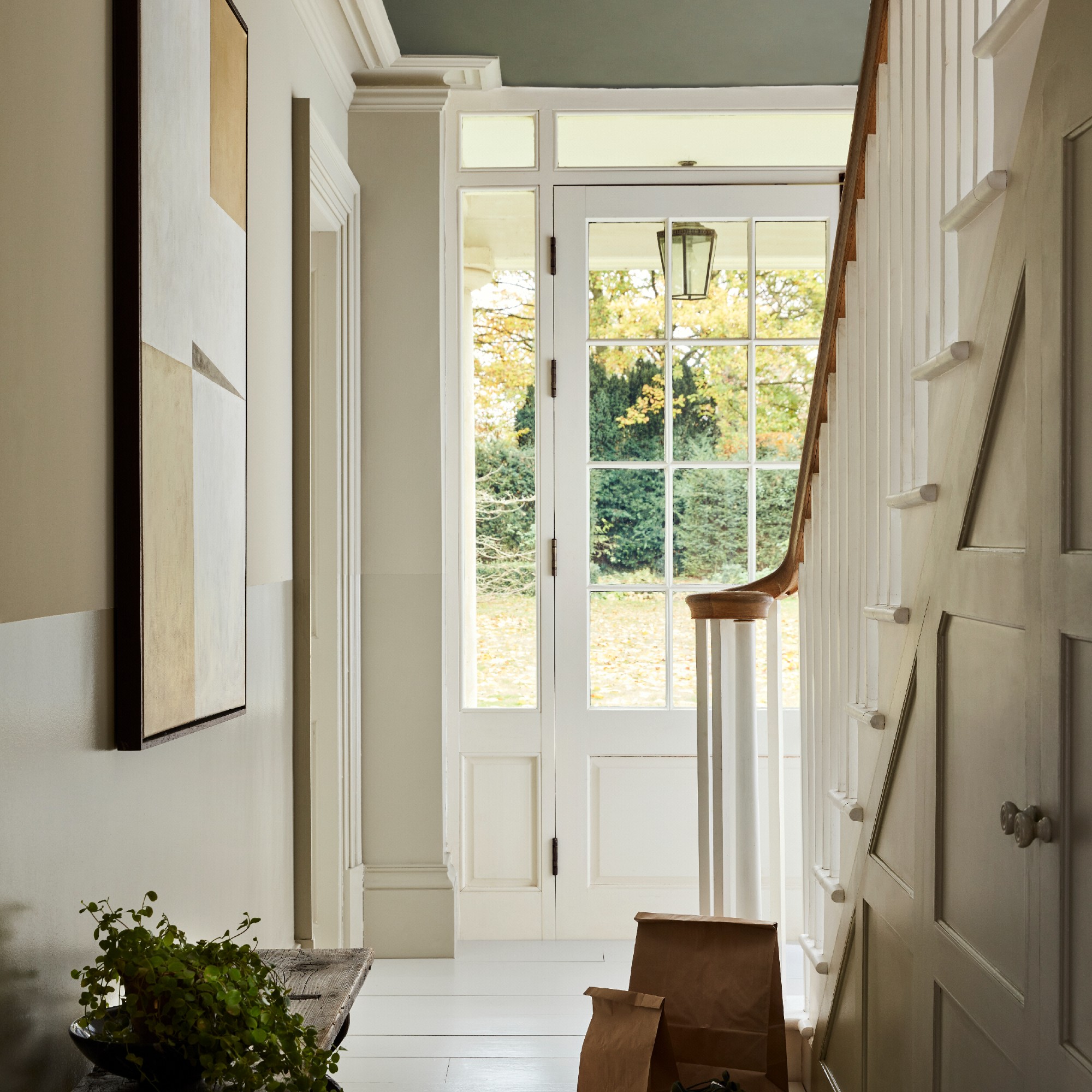
Perhaps not as widely known as Farrow & Ball’s Skimming Stone, Portland Stone by Little Greene is a go-to neutral for many in the know. And that, of course, includes interior designers like John Cooper, the winner of Interior Design Masters season 6.
Sign up to our newsletter for style inspiration, real homes, project and garden advice and shopping know-how
‘I always reach for Little Greene’s Portland Stone, from pale through to dark. It has just the right warmth to feel inviting, without tipping into yellow, and it never carries that cold, lifeless grey vibe you often see. It’s a beautifully balanced neutral that works effortlessly in any space,’ he explains.
As John mentions, this paint colour is quite unique in that it comes in several different shades – there’s Portland Stone, Portland Stone Dark, Portland Stone Light and Portland Stone Pale. Jo at See Your Place is particularly a fan of the Portland Stone Light shade.
‘If your room is on the cooler side, you can introduce warmth with an earthy or yellow-base neutral. I love Little Greene’s Portland Stone Light, a beautiful off-white shade with just the right dose of subtle colour,’ she says.
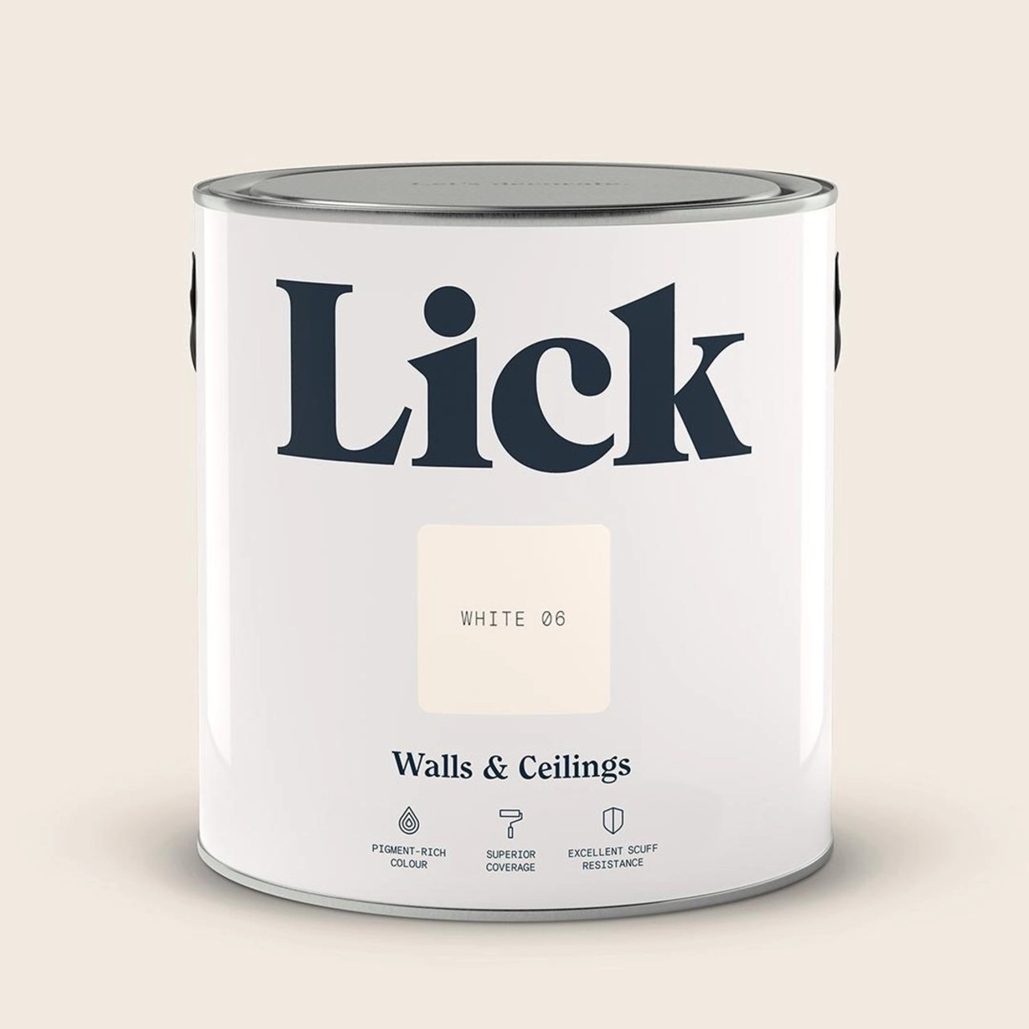
3. Lick White 06
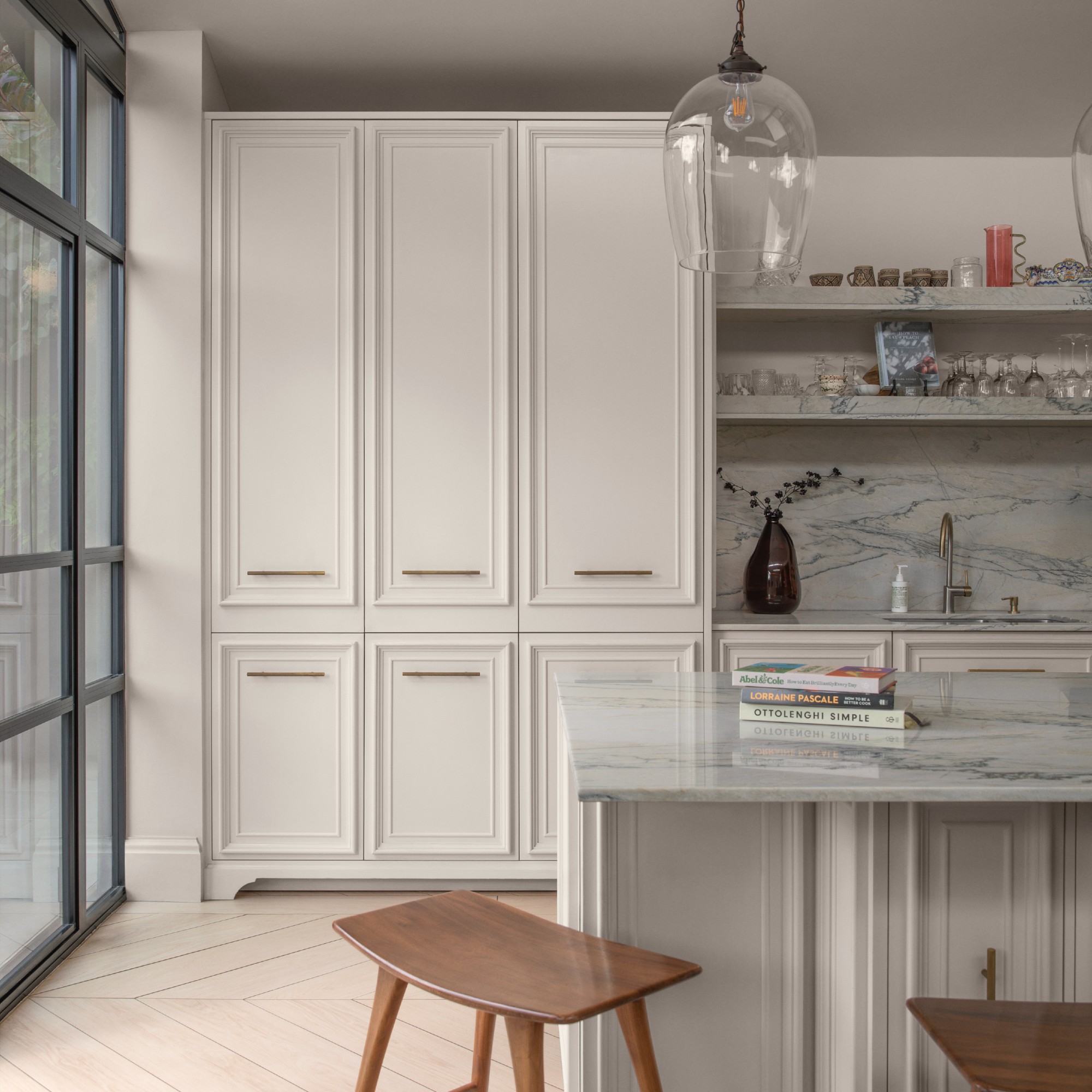
In truth, there are a few of Lick’s neutral shades that have come up when speaking with the designers – Taupe 02, White 05 and Beige 10 among them.
‘I’ve recently fallen in love with Lick. Wonderfully charismatic, a fully UK brand and owner-run company, Lick has also been pushing more eco-friendly practices and being open about its materials and colour psychology,’ Noor at Celine Interior Design says.
But ultimately, it’s White 06 that’s come up repeatedly which also happens to be part of Lick’s colour edit for 2026.
‘If your space gets bright south or east light, the best neutral paint colours for your room are those with a pink or cooler-toned base, as warm yellow-base neutrals can read overly yellow in very bright light. Our favourites include Lick White 06,’ Jo at See Your Place says.
What’s your go-to neutral paint?

Sara Hesikova has been Room Decor Editor at Ideal Home since June 2024, starting at the title as a News Writer in July 2023. She is now also the Ideal Home Certified Expert on Furniture, and so far has tried over 300 different sofas.
Graduating from London College of Fashion with a bachelor’s degree in fashion journalism in 2016, she got her start in niche fashion and lifestyle magazines like Glass and Alvar as a writer and editor before making the leap into interiors, working with the likes of 91 Magazine and copywriting for luxury bed linen brand Yves Delorme among others.

