Optical contrasts are a perfect way to give a room a sophisticated look while heightening the sense of space.
For example, painting the walls in a paler colour, and choosing a darker one for the skirting boards, doors, door and window frames will make the room feel elegant, airy and big. Excellent combinations to achieve this look are Farrow & Ball's Lime White (colour card number 1, a classic neutral reminiscent of untinted bright white limewash) and the cool-hued Bone (15); the versatile off-white Slipper Satin (2004) and the quintessentially neutral Light Gray (17); or the popular, warm Dimity (2008) and the rich Joa's White (226).
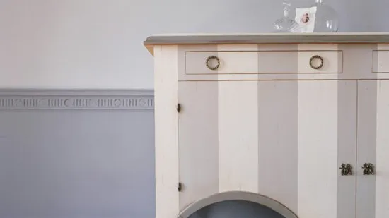
If you hanker for a sophisticated, contemporary feel, dare to go even darker. Choose intensely dark hues for your skirting boards such as the 18th century-like stone hue of Mouse's Back (40), the rich Mahogany (36) or even the dark bronze Railings (31), and everything above the skirtings will look brighter and bigger. And if the thought of darker woodwork feels unnatural to you, consider how often you see mahogany or pine skirtings and doors. You just have to translate that look into paint.

For more information and to request a free colour card, visit www.farrow-ball.com