Pink is my favourite colour to decorate my home with, and this is why I believe it deserves a place on your walls too
I love to decorate with pink and, as an artist, have found it to be the perfect neutral for my layered approach to decor


Sign up to our newsletter for style inspiration, real homes, project and garden advice and shopping know-how
You are now subscribed
Your newsletter sign-up was successful
Screen printer Hannah Carvell is one of Ideal Home's new Open House contributors, sharing her thoughts on colourful home design for a creative family to live in. See the rest of her articles here.
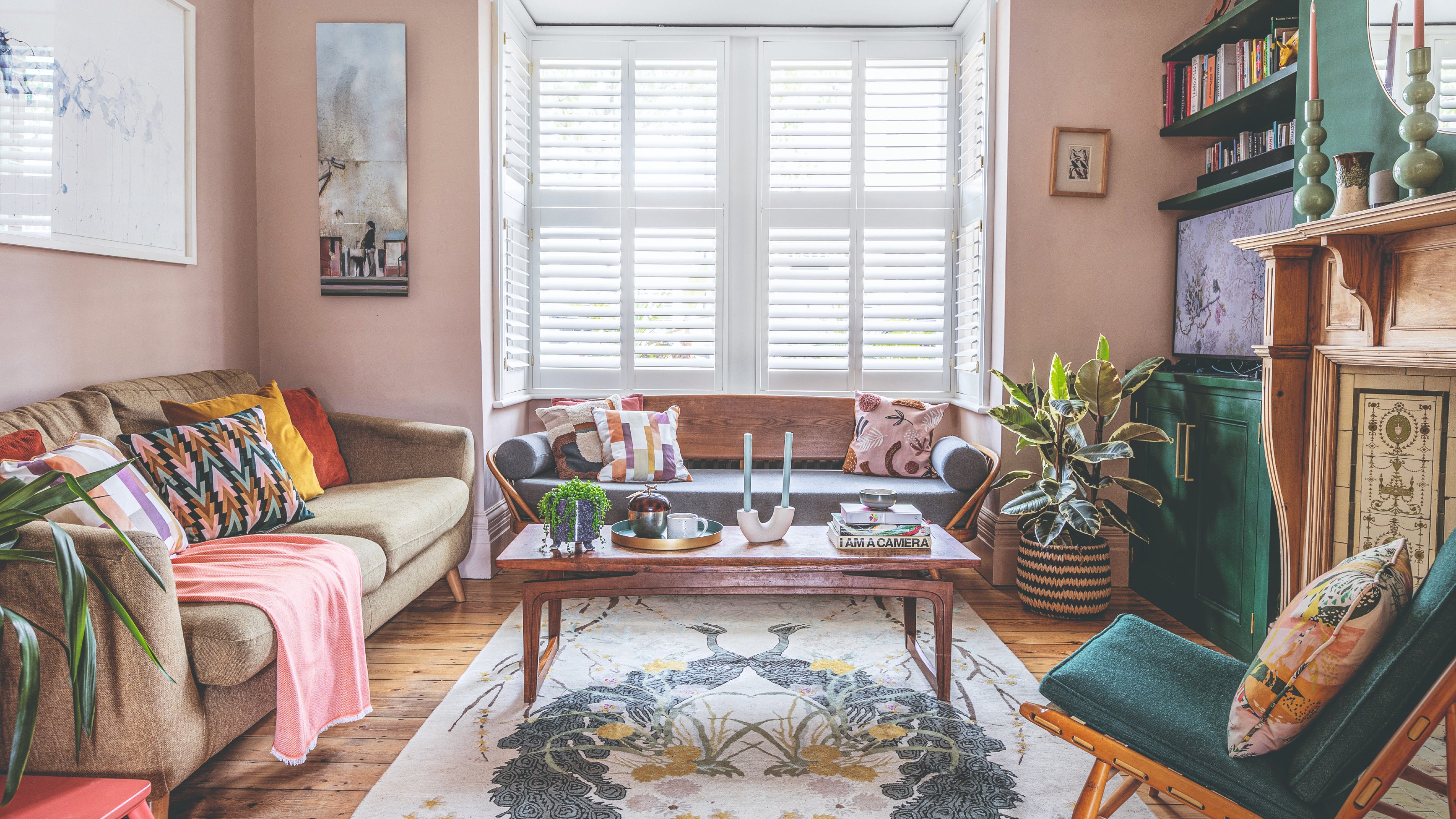
I’ll admit it: painting rooms pink isn’t a one-off for me. It’s a colour I return to again and again, and not because I’ve secretly harboured Barbie dream house ambitions – quite the opposite, I was always more of a Sylvanian Family woodland lodge kind of girl. But pink has become a go-to in my home because it does something magical. It behaves like a neutral, wrapping a space in warmth while still feeling light and fresh. By winter it makes a room feel cosy; in summer it catches the daylight and gives a warm glow.
For me, pink is the perfect base. When I’m screen printing, a soft blush tone is almost always my starting point. It works like a warm neutral that flatters every other shade you throw at it – and I carry that instinct into my interiors. Whether it’s a pale plaster pink or something peachier, I find it’s endlessly adaptable.
Article continues below 
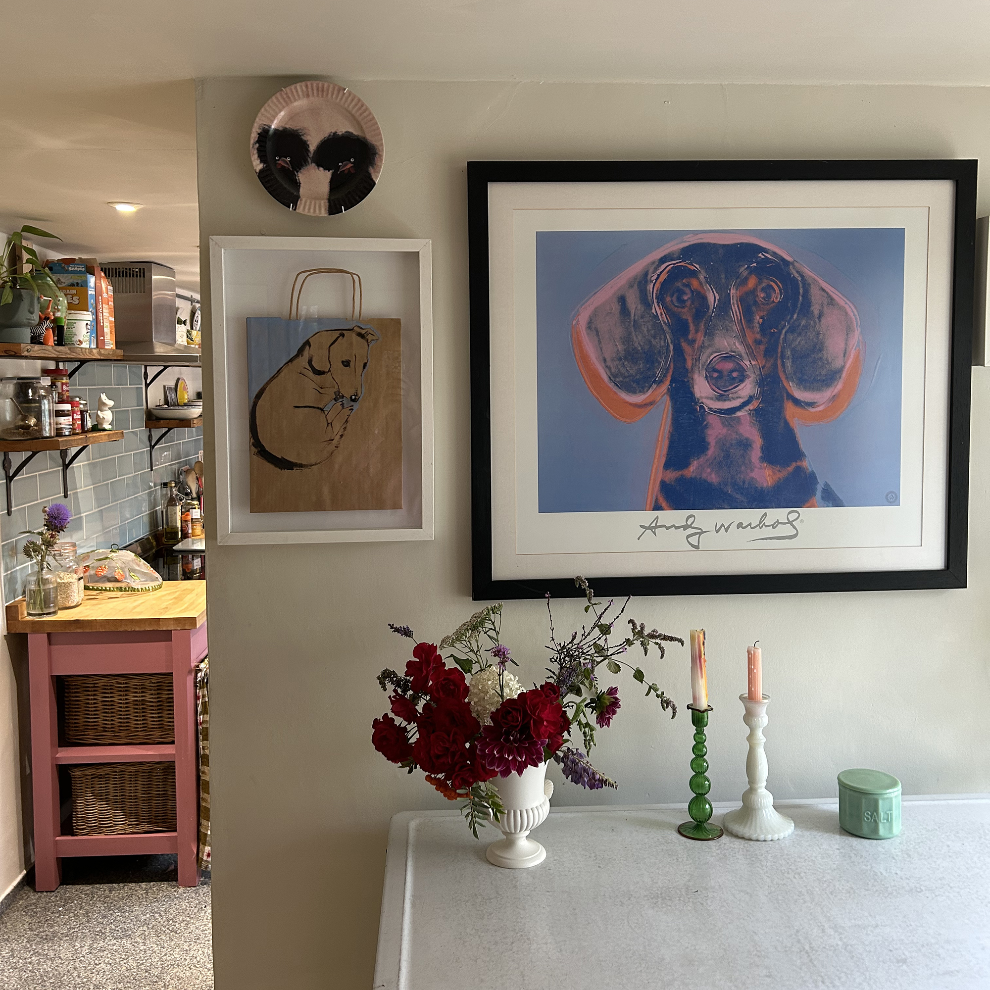
I’ve had many pink love affairs in my decorating. Pink paired with deep green ended up becoming my kitchen – pale blush walls contrasted with emerald cupboards and glossy green tiles. Another favourite moment was in the dining room: marshmallow pink walls, a mustard-painted floor, neon yellow accents (yes, including a DIY chandelier flex made from a neon yellow wire!), and bright mimosa bunches in vases. It was joyous.
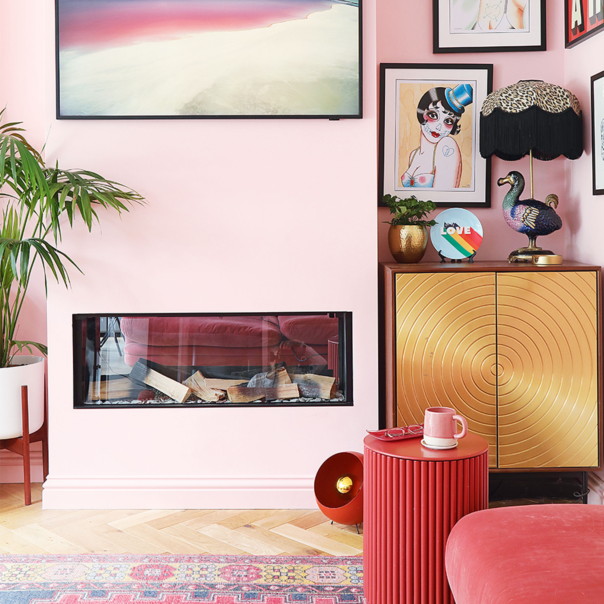
In my living room, I took it bolder: pale pink walls, a darker pink ceiling, then clashed (in the best way) with cobalt blue tiles, a bright orange sofa and statement pink glass chandelier. The result? Think Wizard of Oz in full technicolour. Most recently, I’ve painted both my snug and studio in the same dusty blush from Wickes. At £16 a tin, it’s a steal – and when you paint the ceiling as well, the effect is like stepping into a marshmallow cloud. Cosy, cocooning, but not sugary.
Choosing the right pink is tricky because pinks are nuanced. I made a mistake recently in the snug – the first coat went on and it screamed Dolores Umbridge. Big no. Sometimes you know instantly when a colour just isn’t you, and in those cases it’s better to start over rather than live with regret. My advice? Test bigger swatches than you think you need, watch them throughout different times of day, and match the tone to your room style.
Some foolproof favourites include Farrow & Ball Calamine, a dusty, elegant pale pink that’s gorgeous on cabinetry, and Farrow & Ball Setting Plaster, which is the closest thing to freshly plastered walls – warm, earthy, and pairs beautifully with greens and natural textures. For something joyful but not sickly sweet, Yes Colours Serene Peach is perfect in kids’ rooms; I paired it with Electric Mint Green for my daughter’s wardrobes and it looked fresh and unexpected.
Sign up to our newsletter for style inspiration, real homes, project and garden advice and shopping know-how

The temptation is often to go all pink – pink walls, pink curtains, pink sofa. Unless you want full Barbie Dream House (and if you do, go for it no judgment here), I’d recommend restraint. Let the pink serve as your background canvas, and mix in other shades you love. Here’s where it gets exciting: pink is basically saying, “I’ll work with whatever you’ve got.” It’s a classic partner to green, which feels botanical and grounding. It’s uplifting and sunshine-bright with yellow, from mustard to zingy neons. For those who love bold colour clashes that still feel grown-up, try orange and blue. Or, if you prefer to keep it calm and Scandi, pair it with natural textures like pale timber, stone, and jute rugs.
Pink isn’t just pretty; it’s versatile, flattering, and always a little bit unexpected. Treat it as your neutral, then let just about any other shade – from orange sofas to cobalt rugs – steal the show. And that’s why it’s earned a permanent place in my colour palette.

Hannah Carvell is a screen printer based in the rural heart of Somerset, where she works from a converted stone outbuilding nestled beside her cottage. Her work has been featured in national press such as Livingetc and Ideal Home, and in the the homes - and Instagram feeds - of people such as Erica Davies and Louise Thompson. Her home studio is the creative hub where she hand-pulls her vibrant, layered prints, known for their rich use of colour and the alchemy of overlapping inks that produce unexpected, luminous shades.
Hannah's signature aesthetic – bold, playful, and full of movement – reflects her fascination with how hues interact and transform when placed in conversation with one another.