Colour School: How to decorate with Primrose Yellow
Find out what colours work well with this sunny hue and what to steer clear of
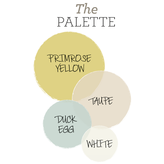
Create a welcoming scheme full of pretty country style with a palette inspired by glorious summer meadows. Make a bold, sunny statement by using cheery buttercup on the walls, then add key accessories in vibrant verdure and soft dandelion. Temper the yellow tones with earthy putty, soothing duck-egg blue and calming white, then add warmth and interest by layering in delicate floral patterns
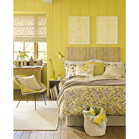
Small-scale prints, raw wood finishes and rustic wicker give this bold hue a softer feel
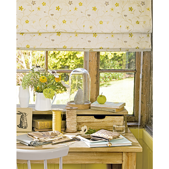
Balance out the top-to-toe yellow look with a ditsy floral fabric on a mainly neutral toned background
Article continues belowLove this look? NOW GET THE LOOK
Pattern 1
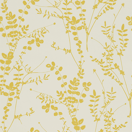
Pop in a frame or use above a picture rail
Salvia 110158 wallpaper, £50 per roll, Harlequin
The Paint
Sign up to our newsletter for style inspiration, real homes, project and garden advice and shopping know-how
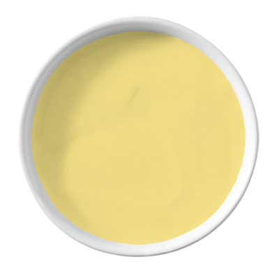
This sunny hue will bring warmth into any room
Verdure Yellow Marble Matt Emulsion, £42 for 2.5ltr, Mylands of London
Pattern 2
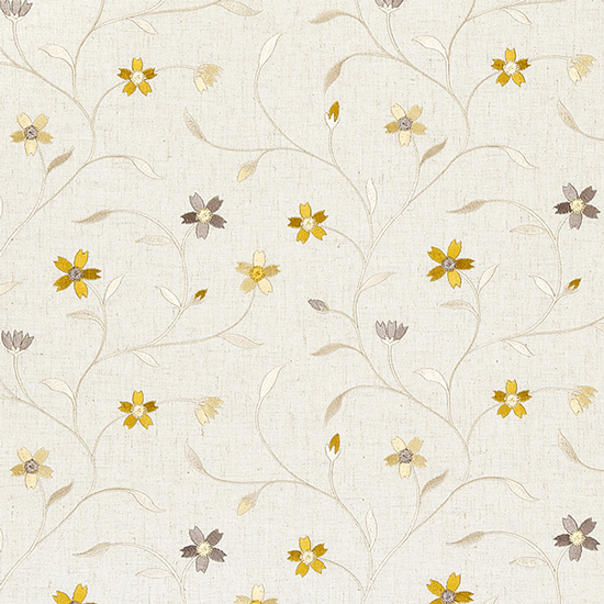
An understated print is ideal for blinds
Mellor Citrus F0599/01, £32 per m, Clarke
& Clarke
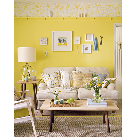
Choose pared-back furniture, in soft, neutral shades to balance out a bold feature wall
Our stylist says
"Go for a brighter tone to add a burst of colour in a dark space, or use a gentler one in a room with lots of natural light"
Nicky Phillips, Decorating Editor
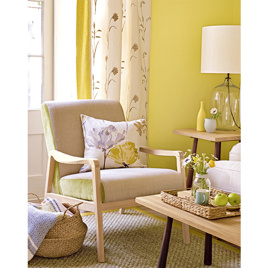
Break up a harvest-toned palette with pretty floral prints to give your room a delicate summery feel
TRY THESE COLOURS WITH PRIMROSE
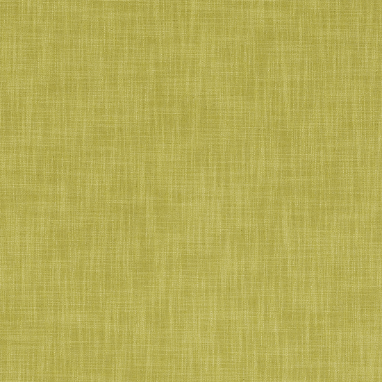
Leaf Green: Add fresh appeal with a shade of green taken from nature, such as sage, olive, grass or apple
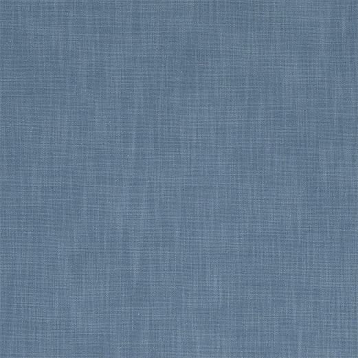
Denim Blue: Create definition by using a smart and classic dark denim, or keep it casual with a worn-in version

Heather: Team your yellow with an equally pigmented purple- try primrose and heather or sherbet and lilac
SHADES TO AVOID
Scarlet: Steer clear of pairing yellow with this fiery primary colour, as the strong combination will feel overbearing and difficult to live with
Mahogany: To sidestep an accidental Seventies revival, opt for neutral shades of pebble, oak or putty rather than a retro brown
Fuchsia: Don't try and outshine primrose with a feisty pink or bold orange hue-opt for pale rosy tones instead and let yellow be the star
Tamara was Ideal Home's Digital Editor before joining the Woman & Home team in 2022. She has spent the last 15 years working with the style teams at Country Homes & Interiors and Ideal Home, both now at Future PLC. It’s with these award wining interiors teams that she's honed her skills and passion for shopping, styling and writing. Tamara is always ahead of the curve when it comes to interiors trends – and is great at seeking out designer dupes on the high street.