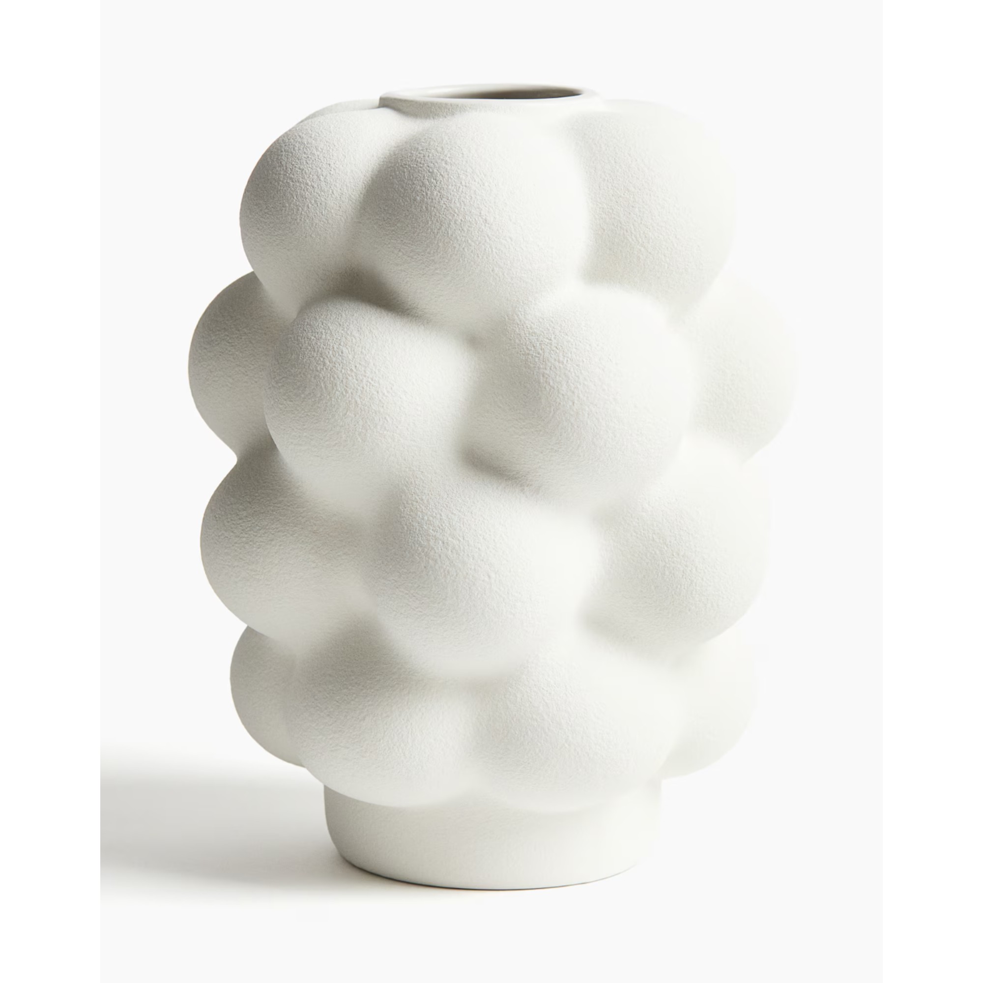
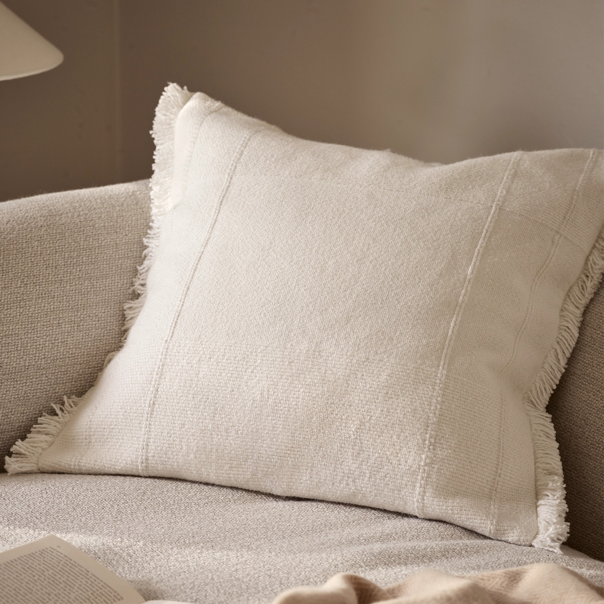
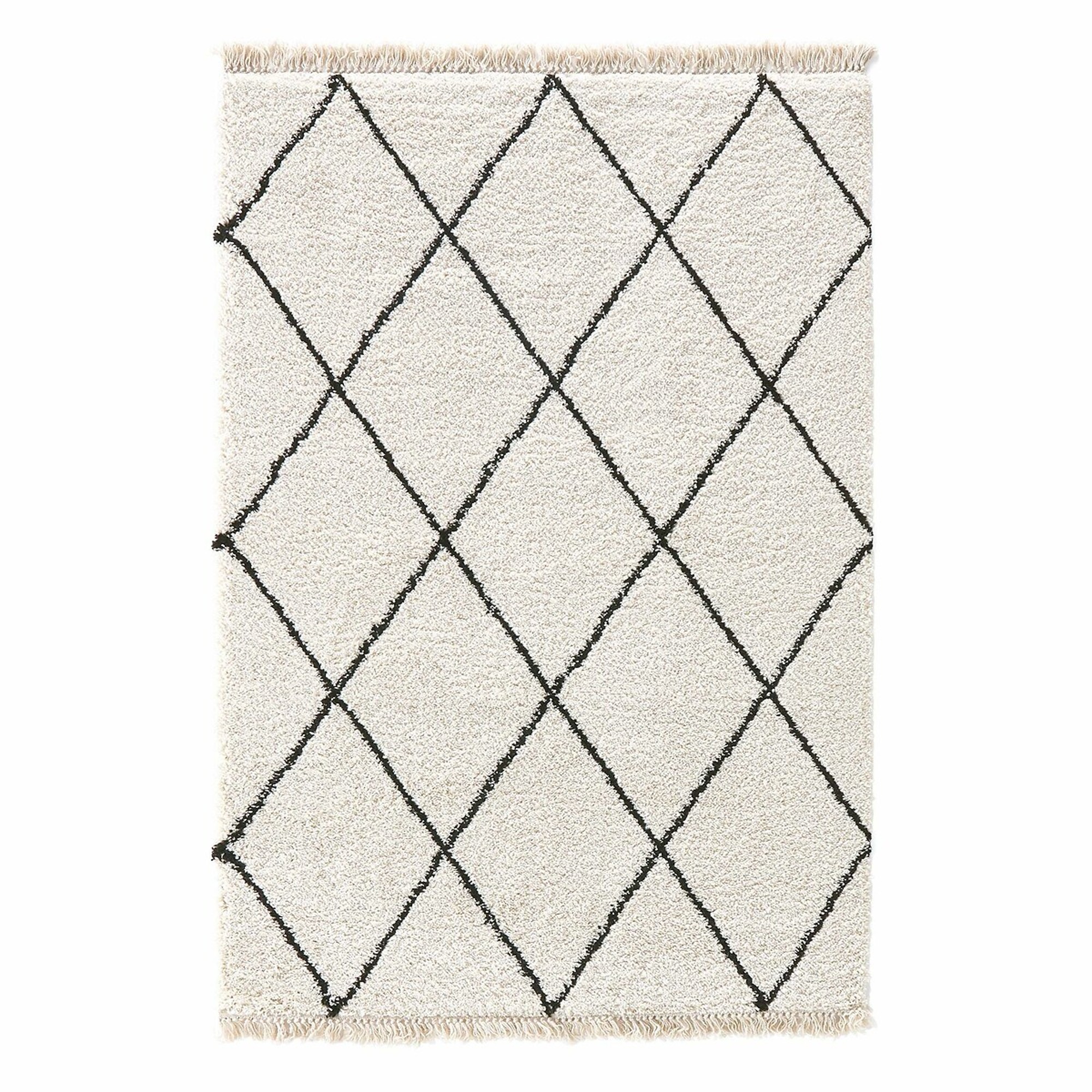
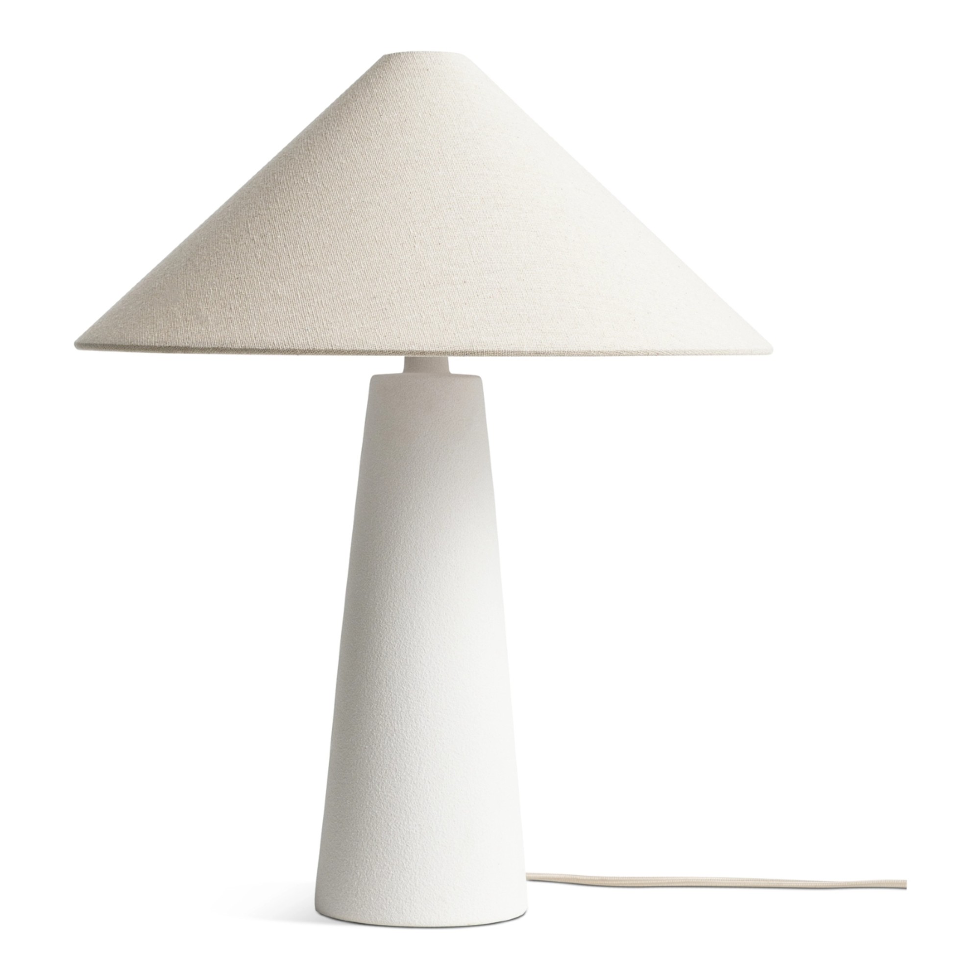
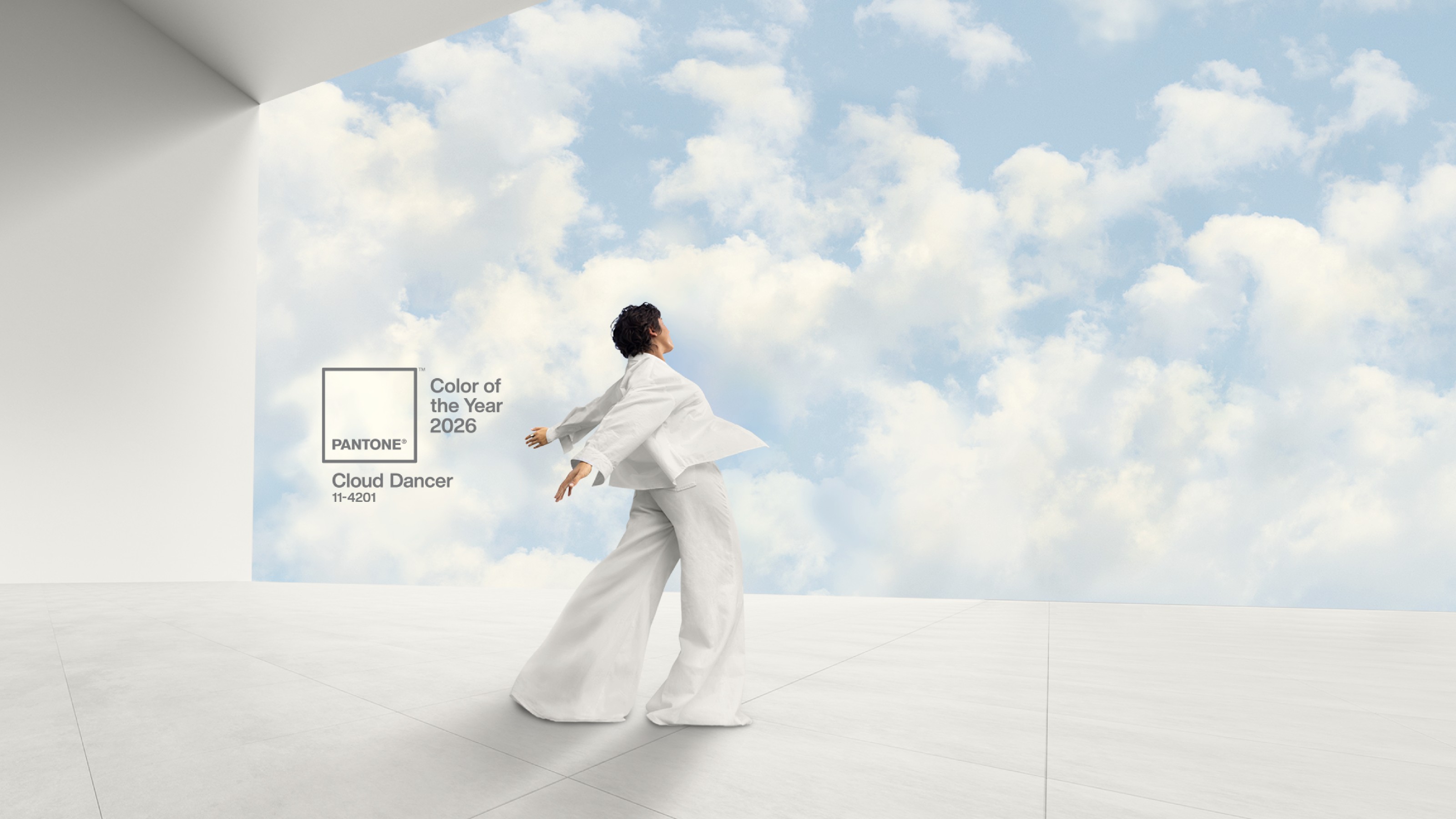
Is Pantone trolling us?! The long-awaited colour of the year for 2026 is out and it can only be described as absence of colour
Pantone’s 2026 COTY, Cloud Dancer, is the most controversial yet!

Sign up to our newsletter for style inspiration, real homes, project and garden advice and shopping know-how
You are now subscribed
Your newsletter sign-up was successful
It’s that time of the year again – no, I’m not talking about Christmas or the end of the year. It’s the time when Pantone releases its long-awaited and much-anticipated colour of the year. Today, Pantone just revealed Cloud Dancer as its colour of the year 2026 – and it’s likely their most controversial yet!
The colour institute is seen as the authority and leader in the world of colour, defining the biggest colour trends. Out of all the colours of the year (also known as COTYs), this is arguably the most important one. So, for the most important, year-defining colour to be, well, the absence of colour is shocking. Yes, Pantone’s chosen colour for 2026 is – drumroll, please – white.
That’s why I’m wondering (or perhaps hoping) whether this is all just a big prank. Are we being trolled by Pantone?!
Article continues below 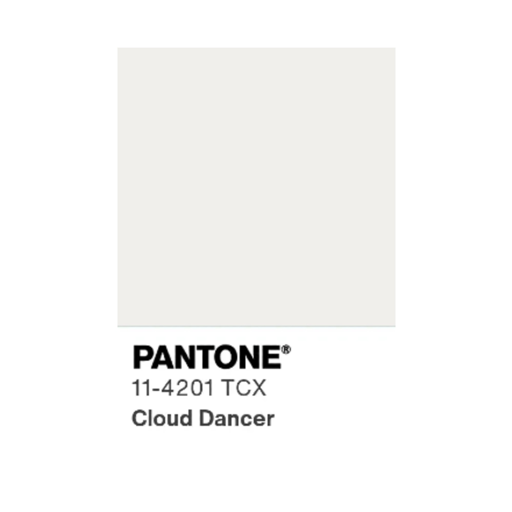
The colour of the year is not just about what colour we paint our walls. I’m all for white walls – after all, there couldn’t be a more versatile and timeless choice than the best white paint. Pantone’s colour of the year is about more than that though – it sets the tone and mood for the year ahead far beyond just walls.
When the soothing brown Mocha Mousse was introduced as the Pantone COTY for 2025, it signalled a more calming, cosy and grounding way to decorate our homes, capturing exactly what everybody was after. Meanwhile, a white COTY feels very clinical and stripped of character. Are the days of cosy, cocooning interiors and bold dopamine decorating over?
And I’m not the only one that’s disappointed by Cloud Dancer being crowned the new COTY. Going through the comments section announcing the colour on Instagram, it’s filled with the likes of, ‘I hope you're ready... For nothing!’, ‘You kidding me?’, ‘So... white? Really?’ and more comments with similar sentiment.
Why is Cloud Dancer Pantone’s COTY 2026?
In all fairness to Pantone, there seems to be a real disconnect between what the colour institute’s intentions were when naming Cloud Dancer as the COTY 2026 and how it’s been perceived by most people.
Sign up to our newsletter for style inspiration, real homes, project and garden advice and shopping know-how
According to Pantone, this choice ‘serves as a symbol of calming influence in a frenetic society rediscovering the value of measured consideration and quiet reflection.’ Themes of a blank canvas, a fresh start and a colour set to give us the space to think, breathe and create.
‘At this time of transformation, when we are reimagining our future and our place in the world, PANTONE 11-4201 Cloud Dancer is a discrete white hue offering a promise of clarity,' says Leatrice Eiseman, executive director at Pantone Color Institute.
‘The cacophony that surrounds us has become overwhelming, making it harder to hear the voices of our inner selves. A conscious statement of simplification, Cloud Dancer enhances our focus, providing release from the distraction of external influences.’
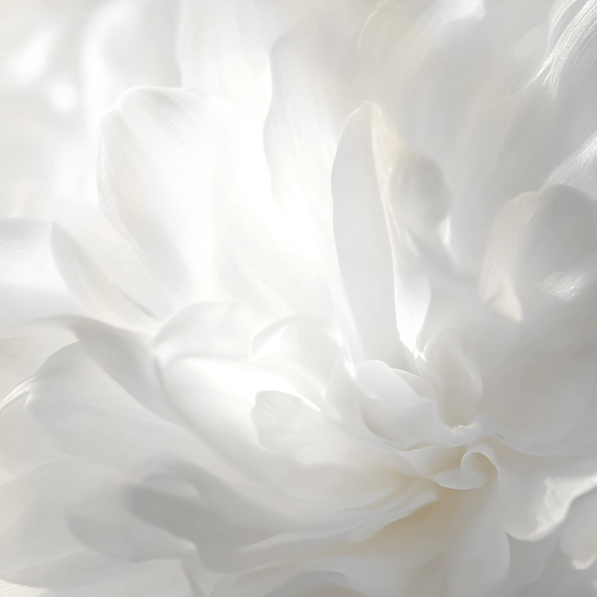
Uriel Tannen, Flitch co-founder, also isn’t opposed to Pantone’s choice of its 2026 COTY and believes it’s a versatile shade that works particularly well in UK homes, ‘Cloud Dancer is a versatile off-white with a soft mineral undertone, well-suited to UK homes where light is often cool and changeable.'
'Its gentle warmth still shows through on grey days, yet it remains crisp enough not to slip into cream, avoiding the flat or bluish cast some whites develop. The result is a refined, consistent brightness that works across a range of spaces.’
How to use the COTY in your home
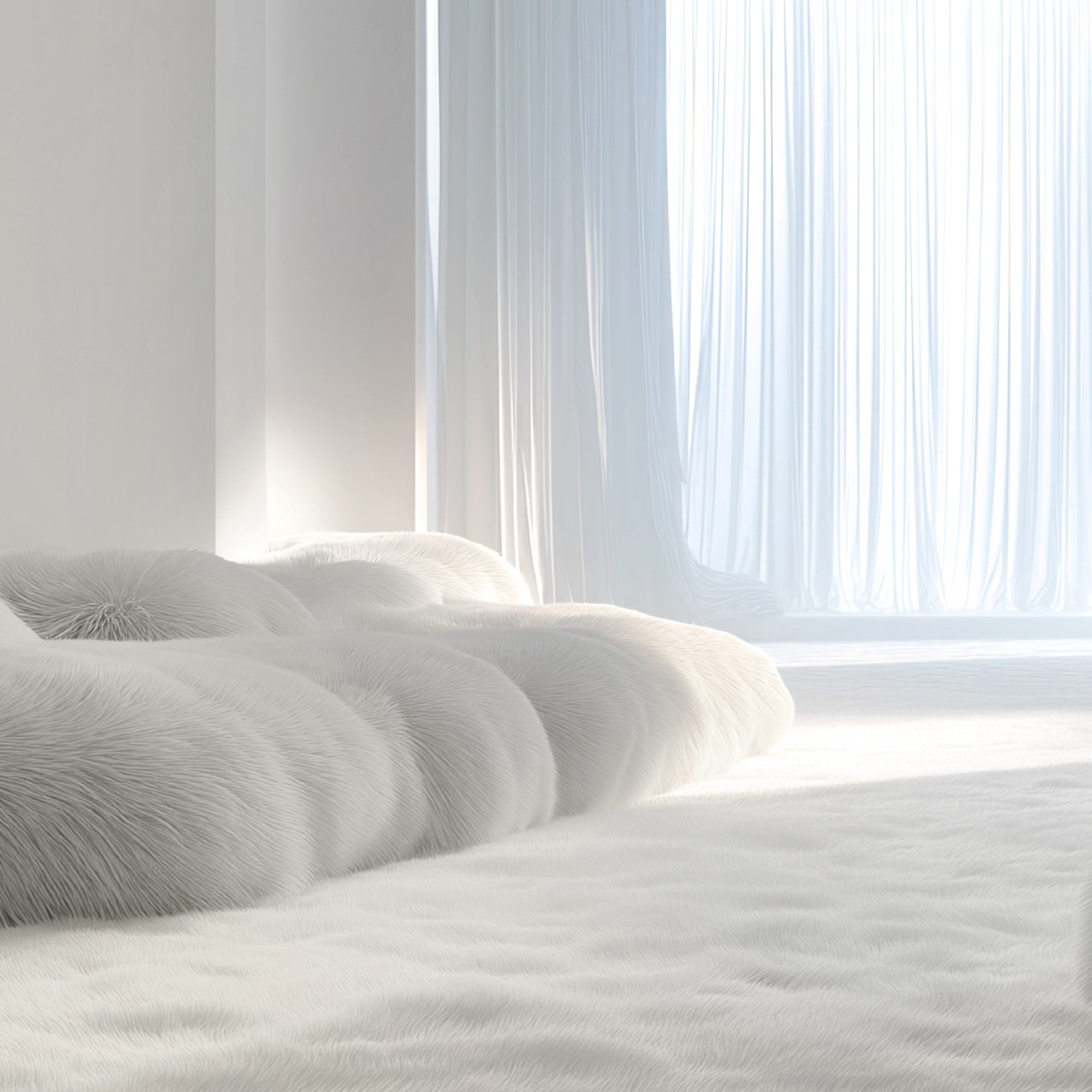
Even though I'm not the biggest fan of white as the colour of the year, white decor and home accessories are the building blocks of pretty much any home. When decorating with white, the key is opting for varied textures.
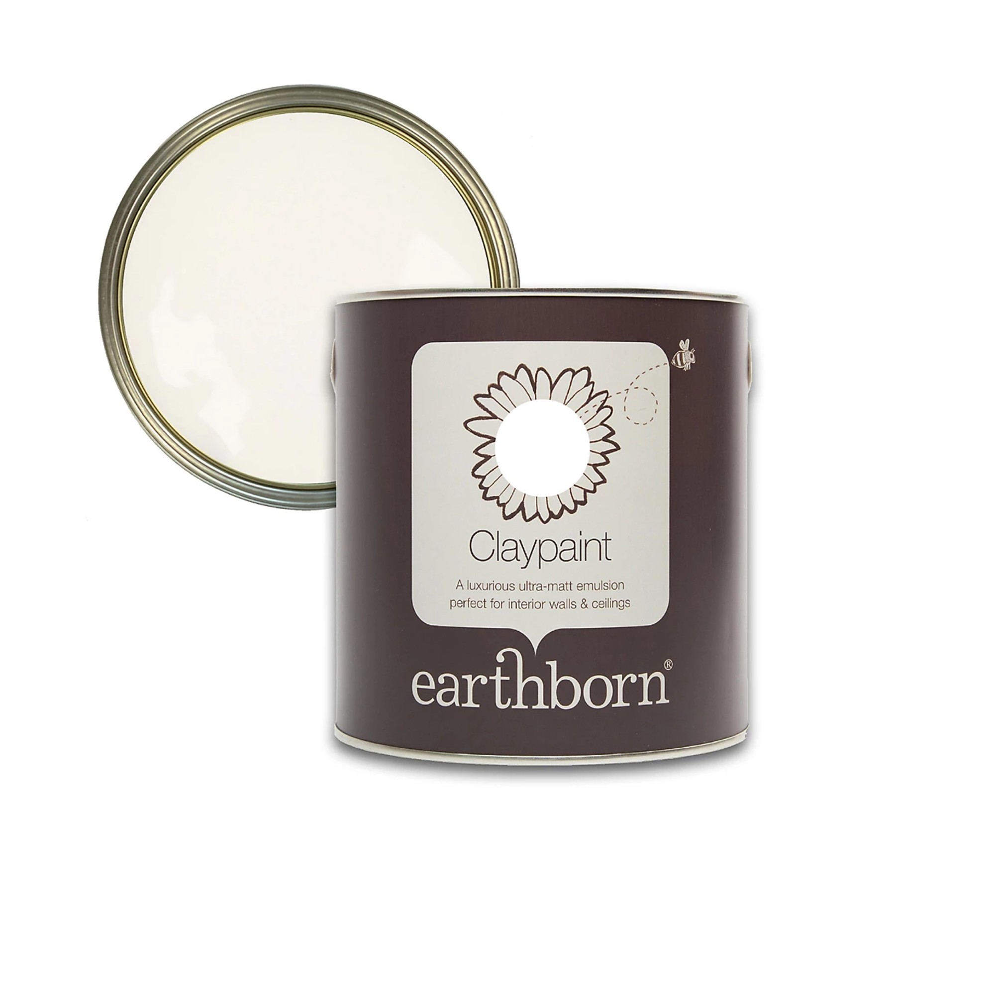
Named the best white paint overall in our guide to all things white paint, Earthborn's White Clay is pretty much the perfect match for Pantone's Cloud Dancer.
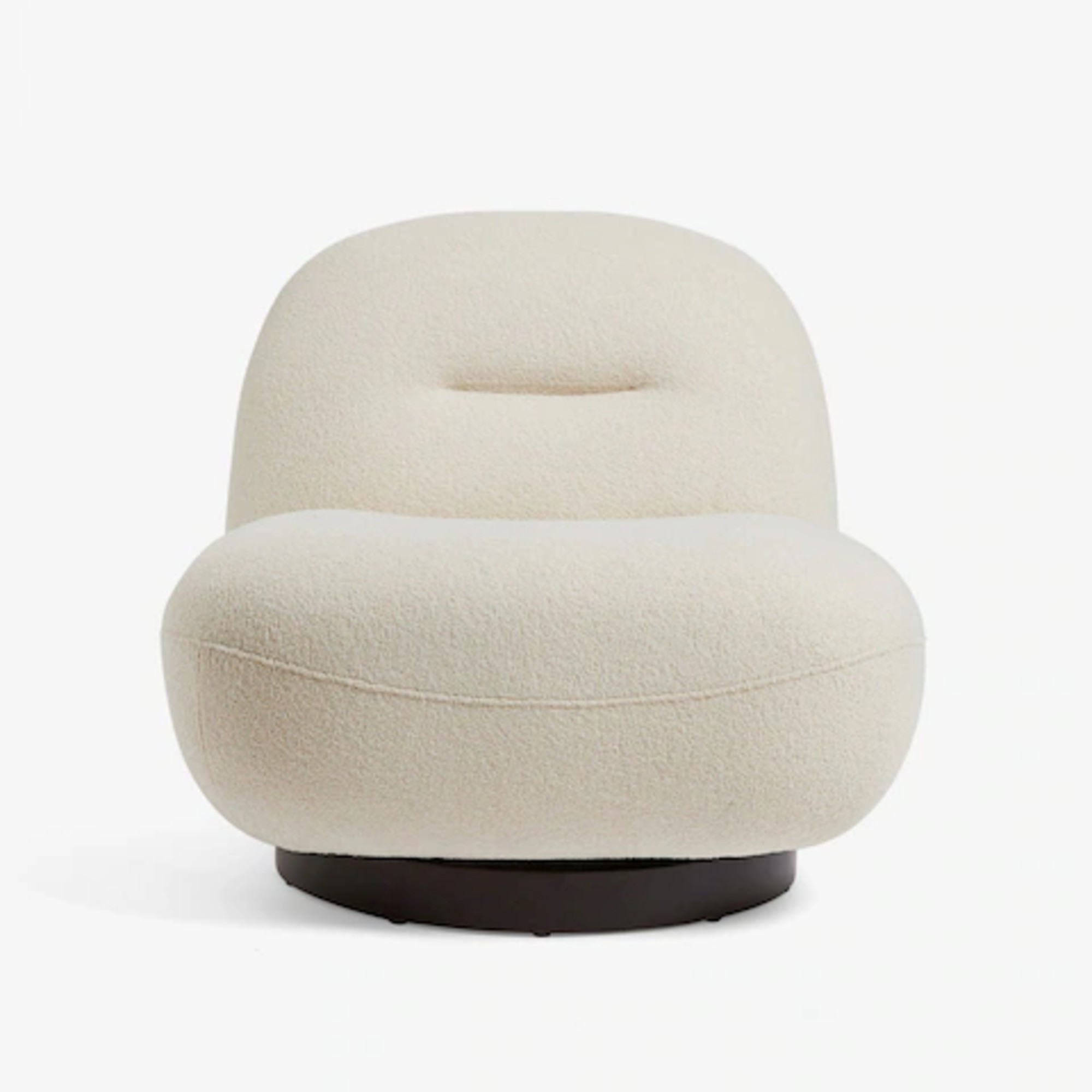
This swivel chair pretty much looks like a cloud. I've tried it IRL and can attest to both its good looks and high comfort levels.
I’m by no means contesting that this is a shade that will work in many different rooms, spaces and homes. I guess I just expected more from a colour powerhouse like Pantone – and I’m left wanting more. Is it just me? Are you with me or do you disagree?

Sara Hesikova has been Room Decor Editor at Ideal Home since June 2024, starting at the title as a News Writer in July 2023. She is now also the Ideal Home Certified Expert on Furniture, and so far has tried over 300 different sofas.
Graduating from London College of Fashion with a bachelor’s degree in fashion journalism in 2016, she got her start in niche fashion and lifestyle magazines like Glass and Alvar as a writer and editor before making the leap into interiors, working with the likes of 91 Magazine and copywriting for luxury bed linen brand Yves Delorme among others.
