Best bedroom colour combinations – 8 fool-proof pairings that will create a calming retreat
Meet the restful colour duos that are guaranteed to inspire sweet dreams

When it comes to decorating a bedroom, colour is everything. The best bedroom colour combinations not only reflect your personal style and complement the architecture of your home – they also get you in the mood...for sleep that is!
Personal taste should always lead the way, but some of the best bedroom colour combinations are consistently calming and so are well-worth exploring when planning a bedroom colour scheme, especially if you struggle to sleep soundly.
Colour psychology shows that cool tones like soft blues, greens and greys help lower heart rate and blood pressure, while warm, muted shades like earthy reds and blush neutrals add comfort without overstimulating. When used together, these cool and warm tones can create a beautifully balanced and restful bedroom atmosphere.

The colour wheel is another go-to tool for helping to choose harmonious pairings. For a calming bedroom, selecting two main shades from the same side of the wheel – such as blues and greens – can enhance the sense of restfulness and flow.
From muted yet trend-setting combos and nature-inspired twin-tones to slightly bolder (but still tranquil) contrasts, each pairing in our expert-recommended roundup has been curated to ensure a relaxed retreat. We’ve also covered strategies for balancing pigment intensity with soft neutrals, bringing in textures and ambient lighting to keep the atmosphere quiet, cocooning and deeply restful. Each combo is fool-proof, the hardest part will be deciding which one to pick!
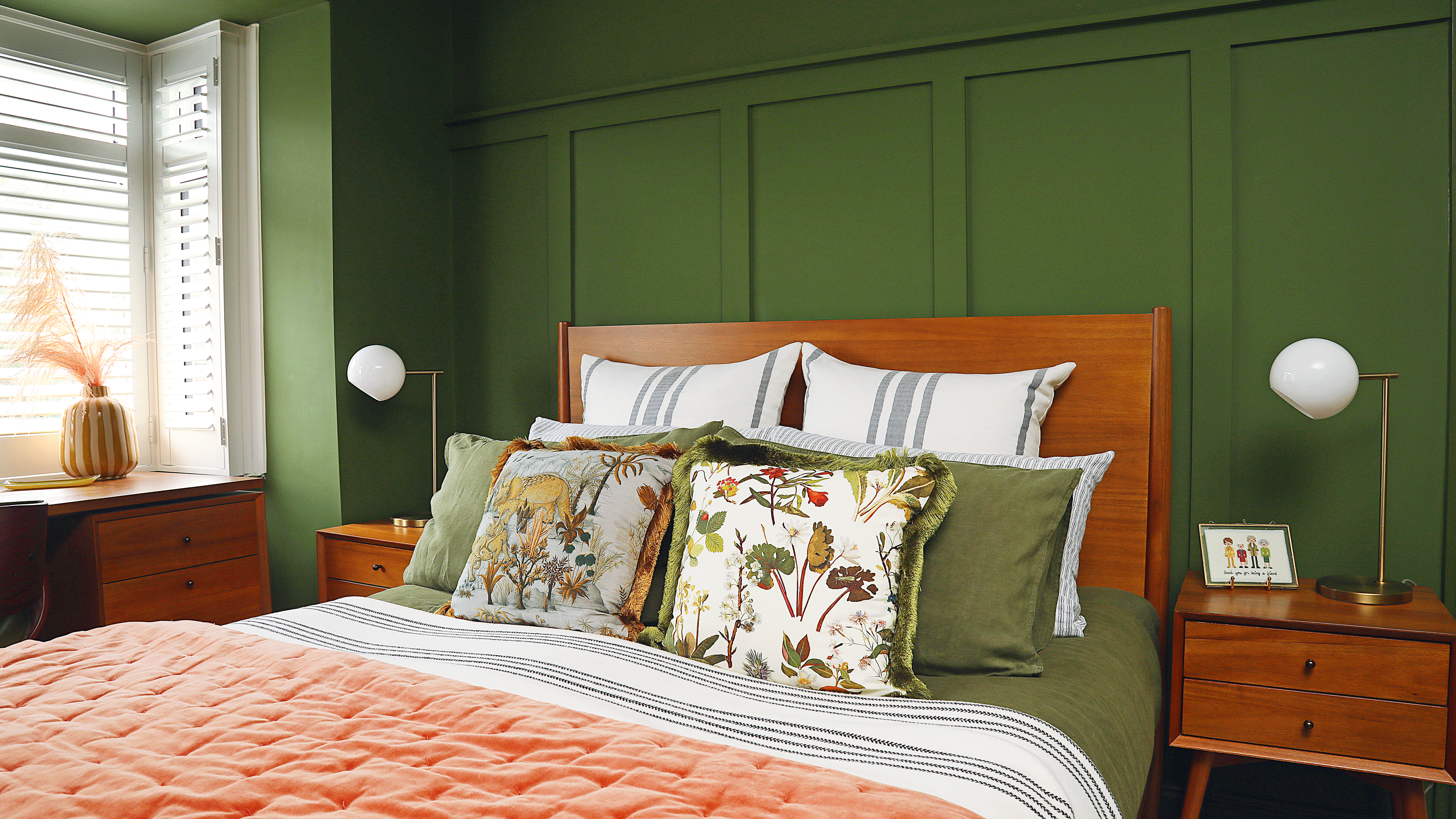
1. Earthy Pink & Moss Green

Earthy pink and moss green are a softly balanced pairing, combining warmth with nature-inspired calm. Both shades have trended individually in recent years, so bringing them together feels like a natural next step. 'This is a really beautiful colour combination for the bedroom as it helps to create a warm, grounded and tranquil environment, that still feels rich and inviting,' explains Anna Hill, Brand Director and Colour Consultant, Fenwick & Tilbrook.
The joy of this pairing lies in its easy balance of warmth and coolness, which makes it easy to work with other colours and finishes in your bedroom scheme. 'Whether you lean into pastel tones or layer in natural textures, this palette creates a peaceful and restorative escape,' says Anna.
You can introduce earthy pink and moss green in subtle or bold ways, through painted walls and woodwork, bedding, upholstered headboards, soft furnishings, or artwork. Aim for a fairly even colour split to preserve the soothing sense of harmony.

After nearly 12 years in corporate merchandising for UK and international brands, Anna Hill swapped the fast pace for rural Norfolk, joining the family business at Fenwick & Tilbrook. Five years on, she now leads the thriving luxury paint brand, known for its premium, pigment-rich colours, made to order in six high-performance finishes using only the finest ingredients.
2. Pale Blue & Mustard

‘A more unexpected pairing for a bedroom, pale blues and mustard yellows will bring in lots of charm and character to the space. Pale blues are ideal for winding down - offering peace, serenity and a sense of openness to the bedroom, while mustard adds a burst of warmth and depth,’ says Anna Hill.
To keep the look restful, for your blue bedroom ideas, use pale blue as the dominant colour on walls, bed linen and curtains. And go as pale as you can before hitting white territory – this is Great Lake by Fenwick & Tilbrook. Then layer in one strong hit of mustard. It could be a rug, an upholstered headboard or a pair of bedside lamp shades. Keep finishes natural and textures soft to enhance the relaxed, comforting feel.
‘The contrast between the coolness of the blue and richness of the mustard creates an eye-catching yet complementary design that feels both relaxing and uplifting at the same time,’ adds Anna.
3. Navy & Stone
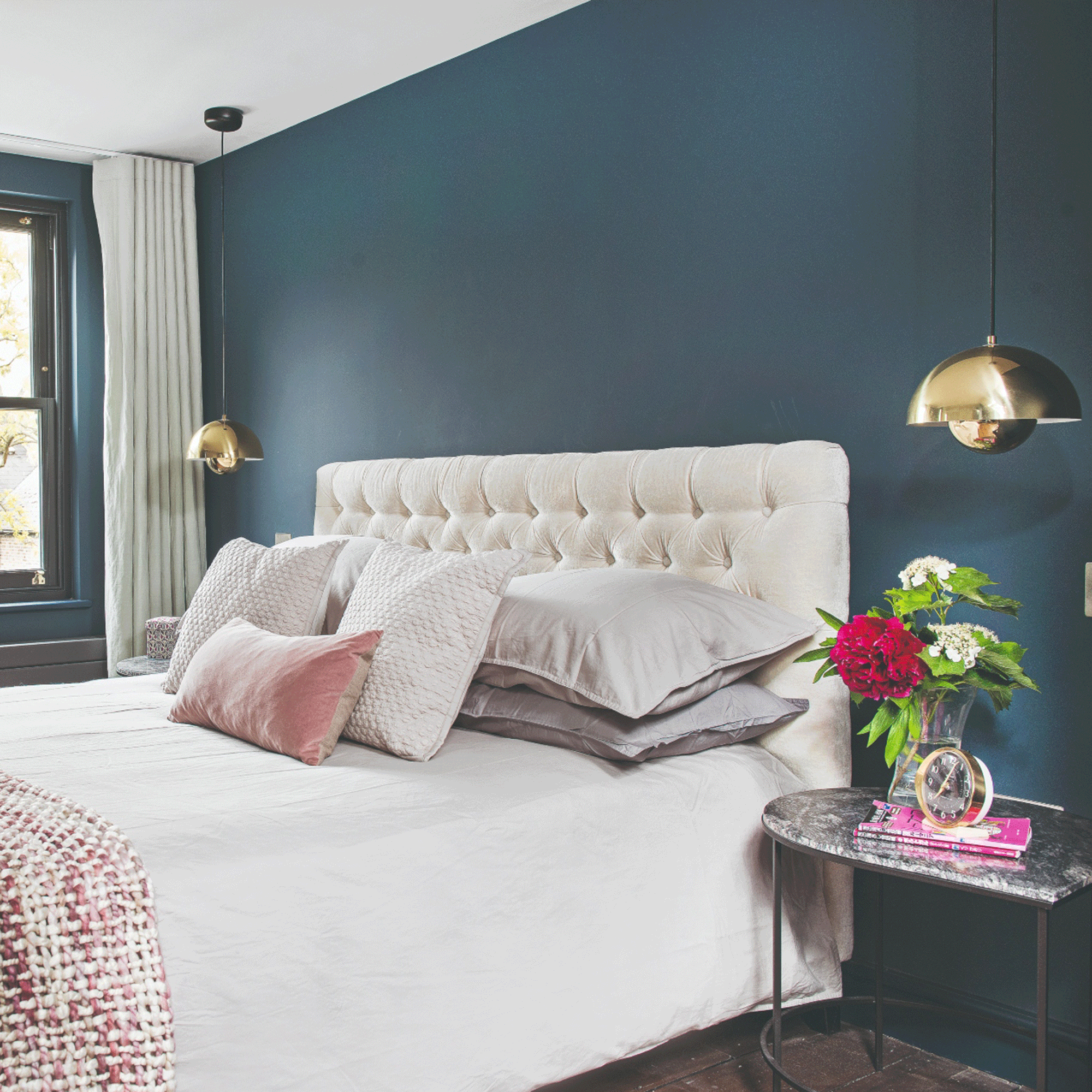
Navy and stone form a winning colour combo, merging the depth and sophistication of navy with the soft neutrality of stone for a relaxed bedroom retreat. Navy anchors the space with its rich, regal vibe, while stone brings softness and balance, ensuring the atmosphere remains inviting and serene.
‘Rich navy is perfect for a sophisticated, English-heritage feel in your bedroom, while stone shades are easy to work with and make any space feel calm without trying too hard,’ says Michael Rolland, Managing Director at The Paint Shed. ‘If you’re after that soft, understated luxury, stone tones like taupe, oatmeal, or soft clay give you a really natural, effortless feel. Navy and stone form the kind of palette that never feels overdone.’
To make this duo work, use navy on accent walls or upholstered furniture, complemented by stone shades in bedding, curtains, and accessories. The result will be a stylish yet peaceful retreat that effortlessly marries bold blocks of colour with understated elegance.

As the fourth-generation MD of this popular UK paint retailer, Michael is widely recognised for his keen understanding of paint colours. His expertise in colour selection and formulation has played a pivotal role in positioning The Paint Shed as the go-to specialist for both trade professionals and DIY enthusiasts.
4. Butter yellow & Burgundy

Butter yellow and burgundy are a match made in heaven and really conducive to a good night’s sleep. Each one is somehow trendy and timeless (at the same time – weird but true), combining a cheerful warmth with a hint of dramatic sophistication. A winning team then?
Let’s start with Butter Yellow, which should be the dominant shade when aiming for calm. 'Soft, warm, and effortlessly uplifting – butter yellow is having a well-deserved moment in interiors. It’s such a creamy, sun-kissed shade that brings instant comfort,' says Marianne Shillingford, Creative Director & Colour Expert at Dulux.
'For the full effect, colour drench the room for the most warming hug when you come through the door,' she says, adding that deeper shades like burgundy will give it a modern twist. This latter shade is the new way to go dark for 2025 and has a richness and warmth you’ll never find in off-blacks, or darkest greens and blues. Use it sparingly so as not to disturb the peace – perhaps on a painted feature wall like this example from Dulux, or on more flexible options like scatter cushions and rugs.
Merging the light and shadow of butter yellow and burgundy will create a bedroom that feels serene but is never boring.

With more than 30 years of experience in colour and design, Marianne is a qualified decorator and signwriter, beginning her career painting traditional fairground rides alongside master decorator, Peter Tate. She later founded her own interior decorating company and became the founding tutor and Artistic Director of the National Design Academy. In 2017, she launched the Colour in Design Award to support emerging designers working with colour.
5. Ink blue & Deep green

For those drawn to the intimate, cosseting warmth of a dark palette, this richly pigmented duo strikes the perfect balance of snug comfort and cosiness. Expelling the myth that blue and green should never be seen, ink blue and deep green are an incredibly relaxing combination. Ink blue is thought to lower blood pressure and soothe anxiety, while deep green boasts biophilic powers to evoke nature’s calmness.
‘United, inky blue and deepest green will create a cosy, cocooning, nature-inspired sanctuary that’s so restful,’ agrees Ruth Mottershead, Creative Director at Little Greene. We love it here with the brand’s Beech Nut botanical leaf print wallpaper.
To make this combo work in the bedroom, go for an even colour mix, drenching walls, ceiling and even architectural woodwork, and don’t be afraid to lean into the sultry darkness on bedding and accessories, too. ‘Introduce natural wood finishes, rattan and trailing house plants for an inviting, serene feel,’ adds Ruth.

Ruth joined the family firm in 2011 after studying Landscape Architecture at the University of Sheffield and working in London on public and heritage landscape projects. She leads concept and colour curation for paint and wallpaper collections, manages branding and bridges spatial and interior design to develop pigment-rich products, drawing inspiration from National Trust archives.
6. Ochre & Black

Ochre’s warm, earthy vibrancy gives us all the mediterranean holiday feels, which is perfect for a relaxing retreat. Matched with black (the blackest black is best) to dial the brightness down a notch, this classy combo is one for those seeking a little more drama.
‘The rich tones of ochre works beautifully with true black for a high contrast and elegant feel in a bedroom scheme,’ says Ruth. ‘When looking to create a harmonious scheme choose colours within the same family, but at varying strengths, perhaps taking a deeper colour for woodwork and doors and a lighter tone for your walls.’
In a bedroom targeting serenity, use ochre on walls, floors and furnishings to bathe the room in sunny light, then ground the scheme with small punches of black – a sleek footstool, gingham bedding, curtain trim – to avoid overwhelm. Finally, connect the duo with crisp whites and layer soft textures like linen and sheepskin for comfort.
7. Peach & Apple

This fruity mix is the fresh way to rejuvenate your bedroom retreat while instilling calm. ‘Being complementary colours, they work to elevate each other and will create a dynamic scheme in a bedroom,’ says Helen Shaw, International Marketing Director at Benjamin Moore UK. ‘As knocked-back tones, they help to keep the look calm and will gently harmonise each other. This combination can be used boldly across walls or as accent touches in the space.’
To knock out any saccharine sweetness, introduce mustard, grey and black in small doses, and perhaps the odd touch of pale blue if things are getting too whimsical or childish (unless you’re decorating children’s rooms that is). Layer in natural finishes like linen and wood and employ soft lighting to keep the overall look warm and inviting.

Helen co‑founded Shaw Paints Ltd with her husband Craig in 2015, establishing it as Benjamin Moore’s exclusive UK distributor. After Benjamin Moore & Co acquired Shaw Paints in 2020, Helen joined the firm’s senior team, leading marketing and colour consultancy. A University of Sheffield graduate, she blends market intelligence with pigment passion to shape innovative, trend‑setting collections.
8. Lilac & Aqua

If soothing colours send you to sleep (but not in the way you’d hope for in a bedroom), you’ll find lilac and aqua make for a refreshing match with a touch more vibrancy. Lilac, with its soft, floral undertones, evokes calm and optimism, while aqua introduces a gentle, watery freshness reminiscent of tranquil coastal scenes. Put them together and they conjure a soothing yet uplifting palette ideal for those with a sunny disposition!
‘No longer associated with being a childish palette, this pastel-based combo has become increasingly popular in the bedroom due to the restorative and rejuvenating feeling it brings to a space,’ says Emma Bestley, co-founder of YesColours.
To ensure the atmosphere stays on the right side of restful, apply the 60‑30‑10 rule: letting one colour dominate 60% of the space (such as aqua walls), then complementing with 30% of the secondary hue (like lilac bedding or furniture), and introducing 10% in accents – perhaps a small pop of brightness to bolster the joyfulness. This balancing trick is how the pros add interest while keeping things calm.

Emma’s instinctive approach to colour is the beating heart of the paint brand she founded with friend John Stubbs in 2020. Emma's synesthetic perception, where she associates colours with letters, numbers, and even days of the week, deeply informs her design work.
What colours shouldn’t you use in the bedroom?
It goes without saying that bedrooms are intended for rest and relaxation, so it's advisable to avoid colours that can be overstimulating or downright disturbing. Bright reds, hot pinks, and neons are known to increase your heart rate and energy levels, making it challenging to unwind – if you’re decorating a child’s bedroom, avoid them like the plague!
Similarly, intense purples can be mentally stimulating, and you should also avoid directly clashing colours if you want a chance of unwinding. While dark shades can work well if they’re nature-led or warm-toned, avoid light-obliterating colours like jet black and charcoal as they can be depressing, especially in small spaces and north-facing bedrooms.
So, which power combo will you choose to transform your bedroom into the ultimate snooze sanctuary?
