Is grey back? Benjamin Moore’s colour of the year 2026 offers a warm, soft and cosy take on the traditionally cold colour
It's an intriguing shade that will keep you guessing

Sign up to our newsletter for style inspiration, real homes, project and garden advice and shopping know-how
You are now subscribed
Your newsletter sign-up was successful
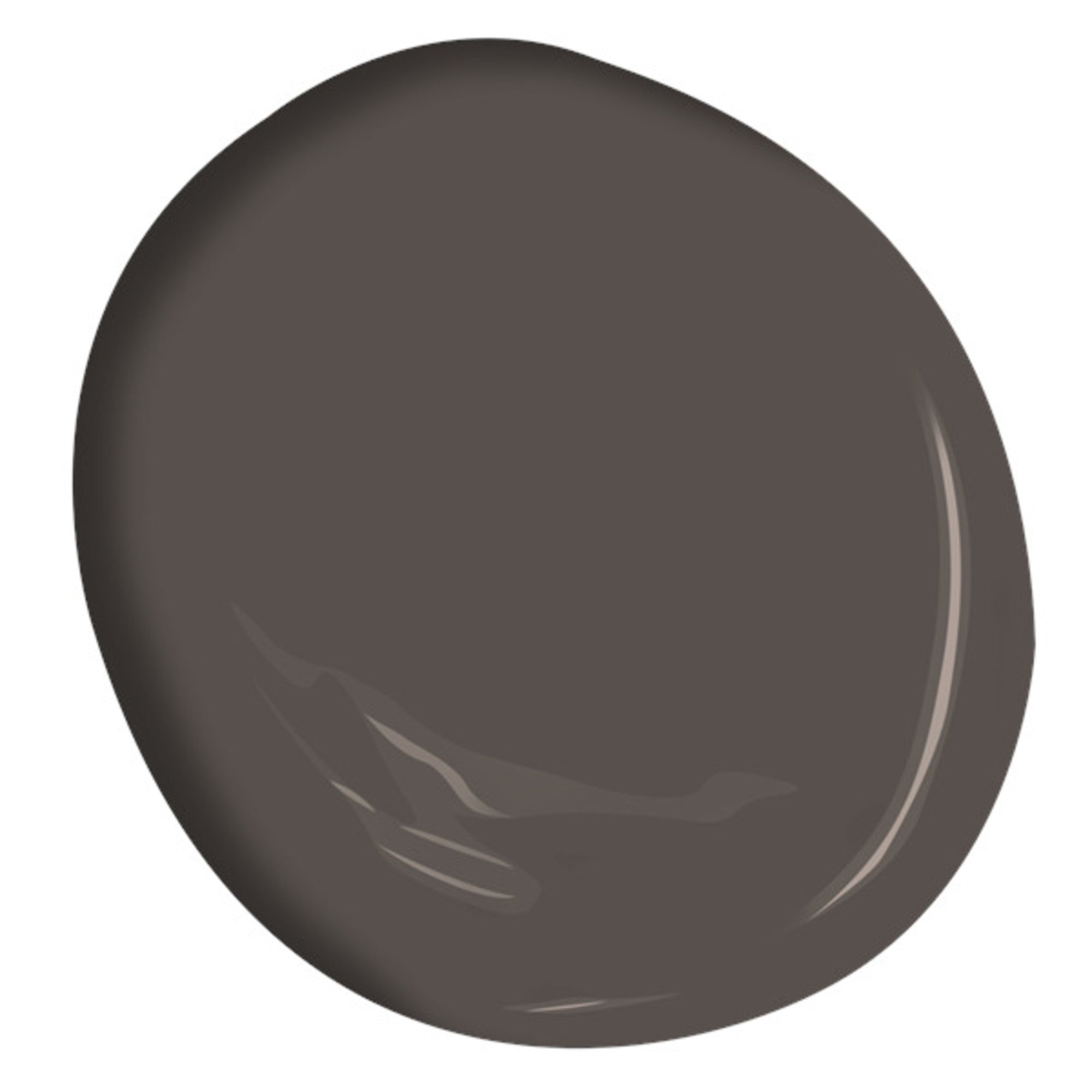
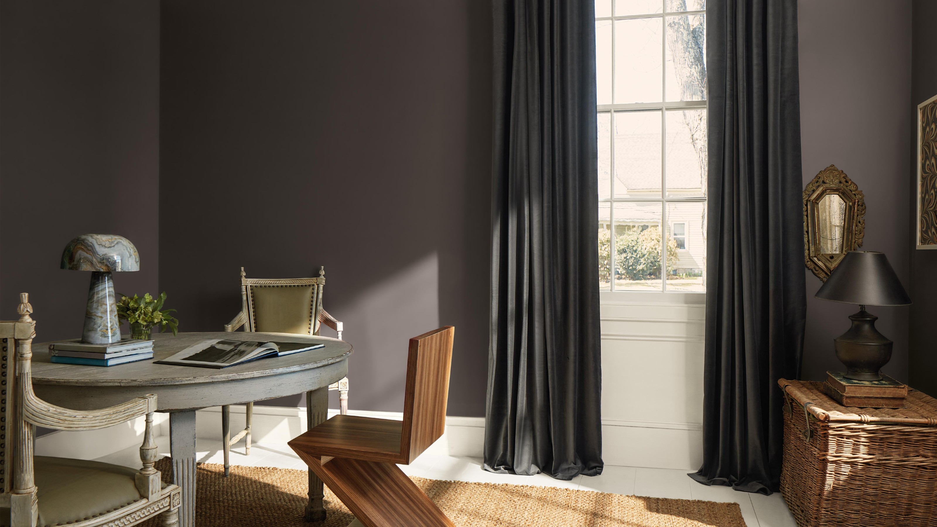
Last night, the Benjamin Moore colour of the year 2026 was announced, naming the dark and rich Silhouette shade as the new year-defining shade. I was there to experience it first hand and I’m glad I was because it’s an interesting in-between colour that dramatically changes and shifts depending on the light.
Is it brown? Or is it grey? The answer is that it’s somewhere in between, but the brand describes it as a brown with charcoal undertones – or more specifically a colour that ‘combines rich espresso hues with refined notes of charcoal’. Benjamin Moore started this paint trend of in-between shades last year already with its colour of the year for 2025, Cinnamon Slate.
‘It’s an evolution rather than a revolution from last year,’ says Helen Shaw, international director of marketing at Benjamin Moore. ‘Last year, we had this idea of in-between colours – colours that we couldn't necessarily place in one colour family, because they've got really strong undertones of one or the other. And so to describe a colour, you have to say, it's a greeny blue, or it's a pinky red and so on.’ And that’s the case with Benjamin Moore's Silhouette, too.
Article continues belowIdeal Home’s Editor-in-Chief, Heather Young was also there to see the new COTY (colour of the year) up close and personal – and she loved the cosiness of Silhouette, ‘I love the richness of this, and I think it will feel really velvety and encompassing in our homes. What I like about it is that it would work well in a smaller room to make it feel really cosy, but I can see it in a light-filled room as well.’
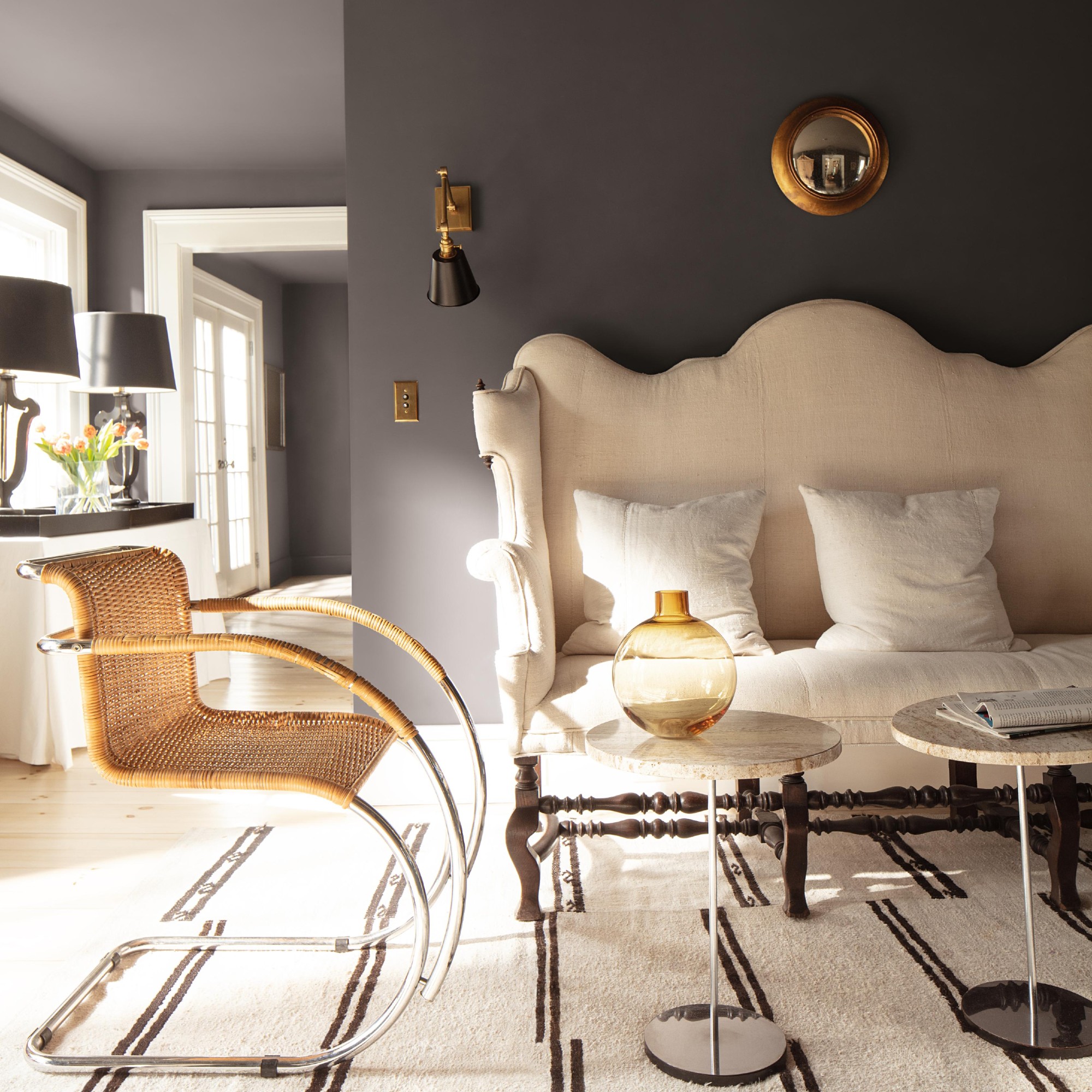
Why is Silhouette the colour of the year 2026?
The world of fashion and interiors is closely linked as fashion trends often make their way into home decor trends soon after. And that’s exactly where the inspiration for the Benjamin Moore Silhouette shade comes from – fashion, referencing sleek tailoring and suiting.
‘What the Benjamin Moore colour team do is they shop for colour for about six months without any filters. They just see what they're seeing, basically. And then they bring it all together, look for themes and see what comes out. And this idea of a deconstructed suit came out really strongly this year,' says Helen at Benjamin Moore.
'In fashion, the suit’s kind of come back, but it's much softer, more fluid. And people are wearing suits that are much more relaxed, rather than structured. I think the fashion industry always informs the interiors industry, but I think this year, it just really popped out more strongly.'
Sign up to our newsletter for style inspiration, real homes, project and garden advice and shopping know-how
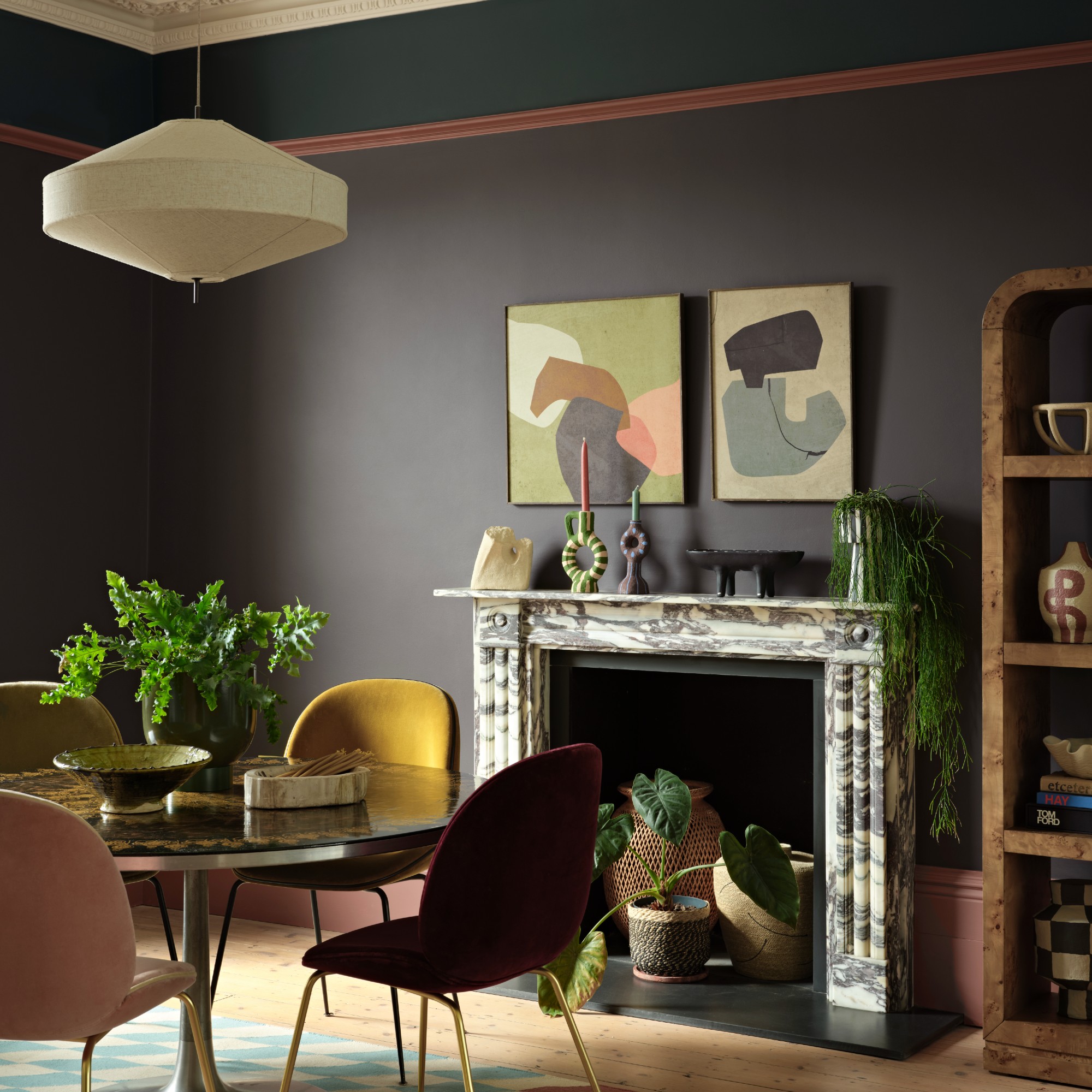
How to use Silhouette in your home
Benjamin Moore’s Silhouette shade is a dark and rich shade and as Ideal Home’s Heather already suggested, it’s perfect for making spaces more cosy because it has warmth and softness to it which is where it differs from the traditional but now outdated grey.
‘It doesn't have the coldness that grey does. And I think the reason grey is going out is because it does feel quite cold, whereas colours like this feel a lot softer,’ Helen at Benjamin Moore says.
She adds that Silhouette is a shade that’s the perfect alternative to stark colours like black or even grey. ‘Black and grey are quite stark. And so when you get this mid tone which is definitely a brown, but it's got this charcoal undertone, it feels a lot softer. A lot of people have black doors in their home, they might have a neutral on the walls and then black on the door. It always looks really striking, but quite cold. Whereas if you did a colour like Silhouette in that design idea, it would feel a lot softer.’
Alternatively, it makes for a great kitchen colour idea, ‘I think this would look really gorgeous as well on kitchen cabinets,’ Helen says.
Alongside the colour of the year, Benjamin Moore also revealed seven other shades that are part of its 2026 colour trends palette, named ‘Tailored Classics’, in keeping with the fashion, suiting and tailoring theme – it includes everything from a blush pink called Batik to a deep teal named Narragansett Green. And they all, of course, work perfectly with Silhouette.
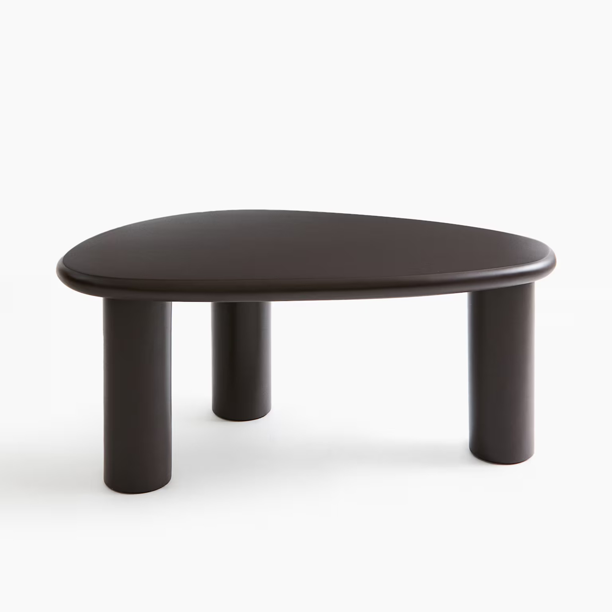
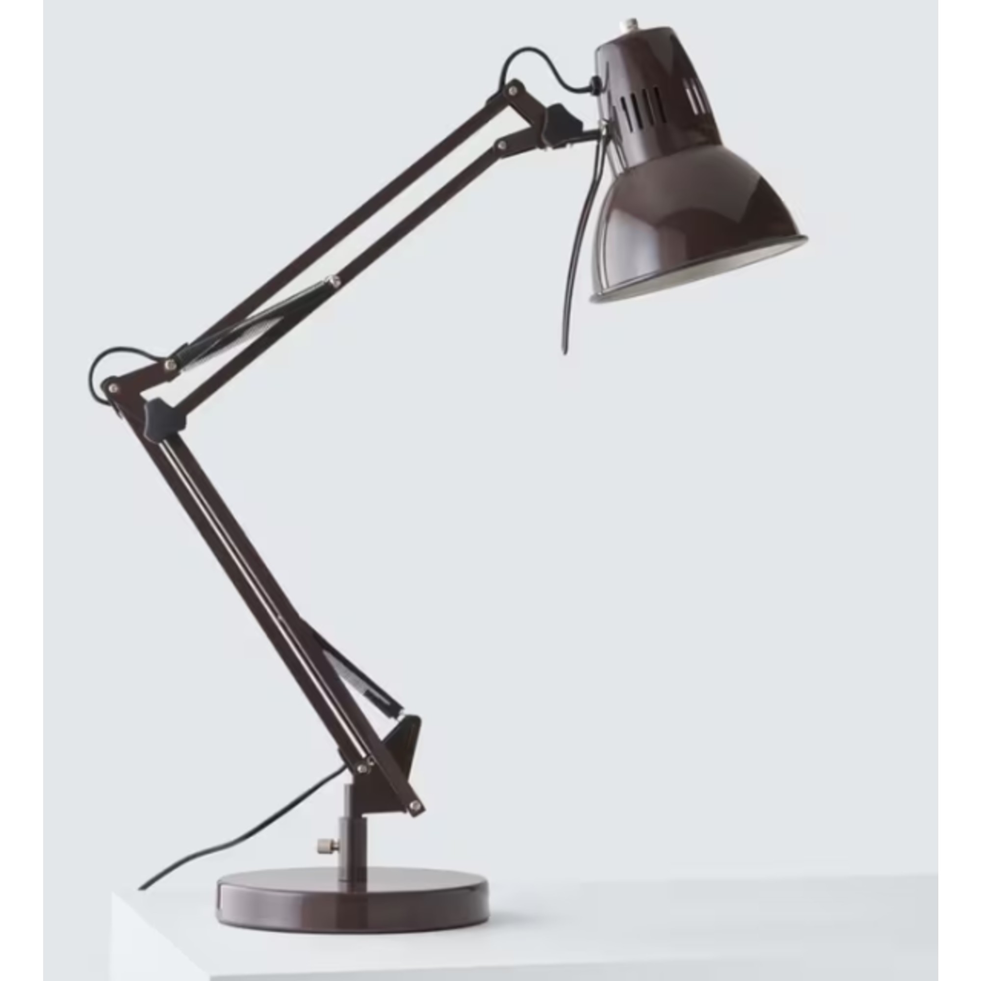
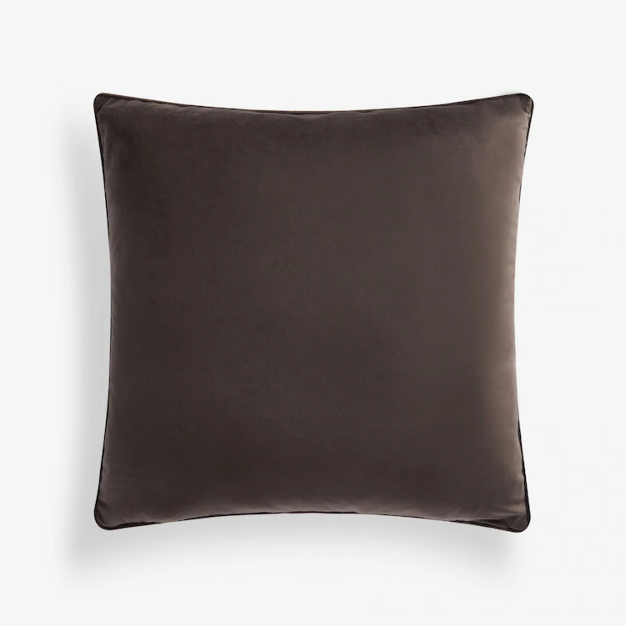
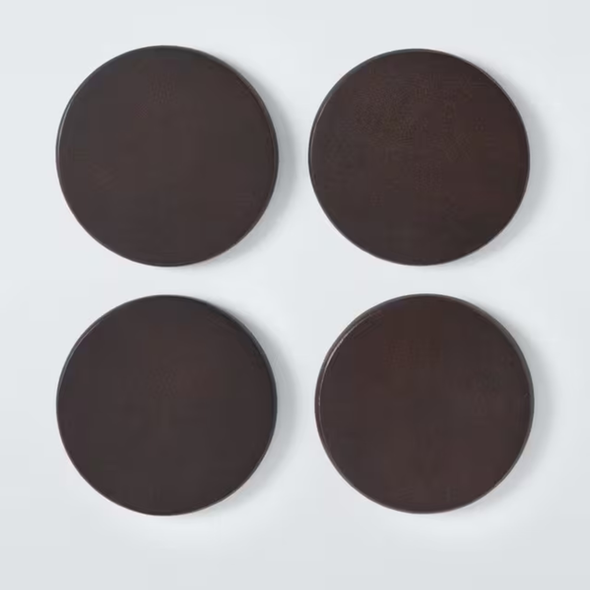
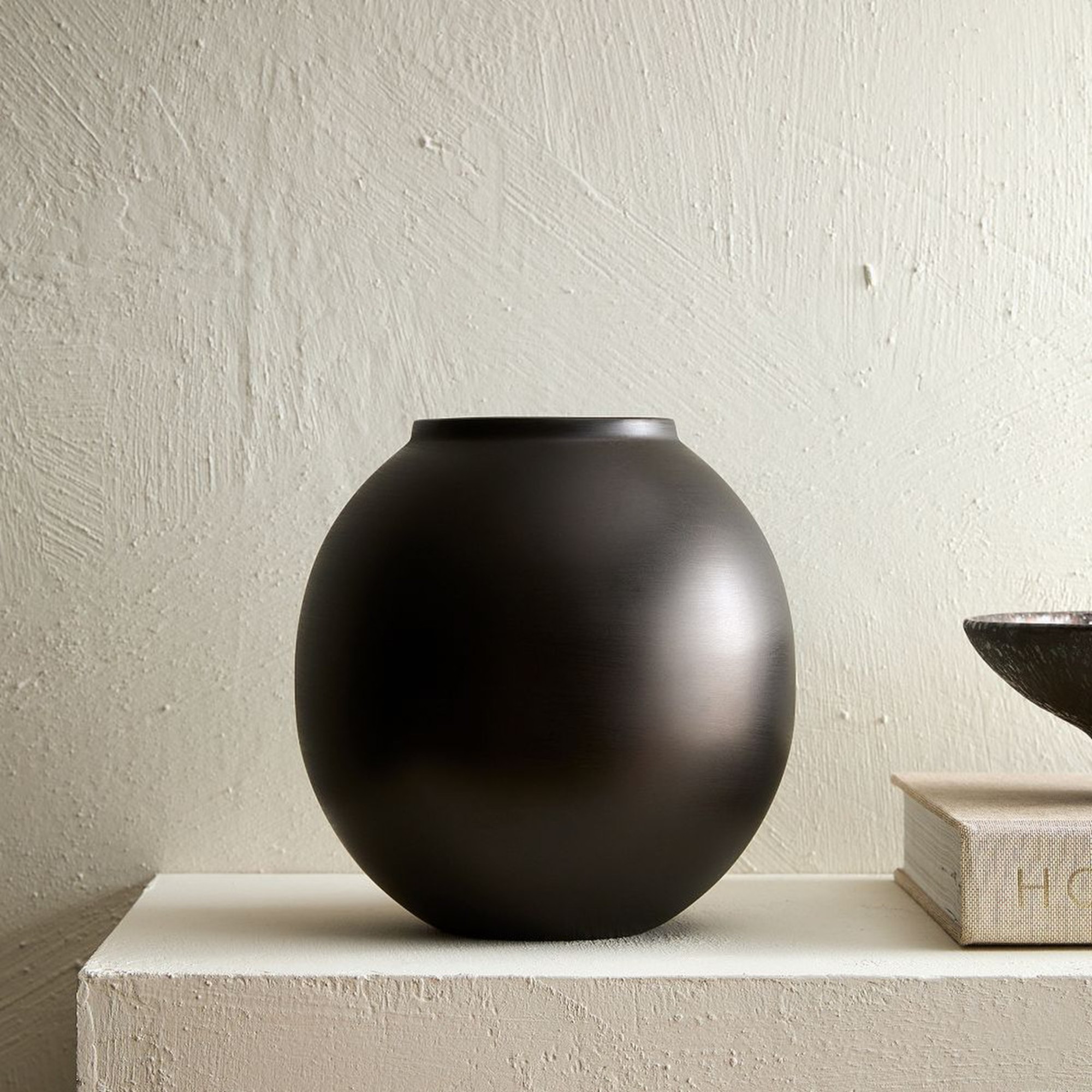
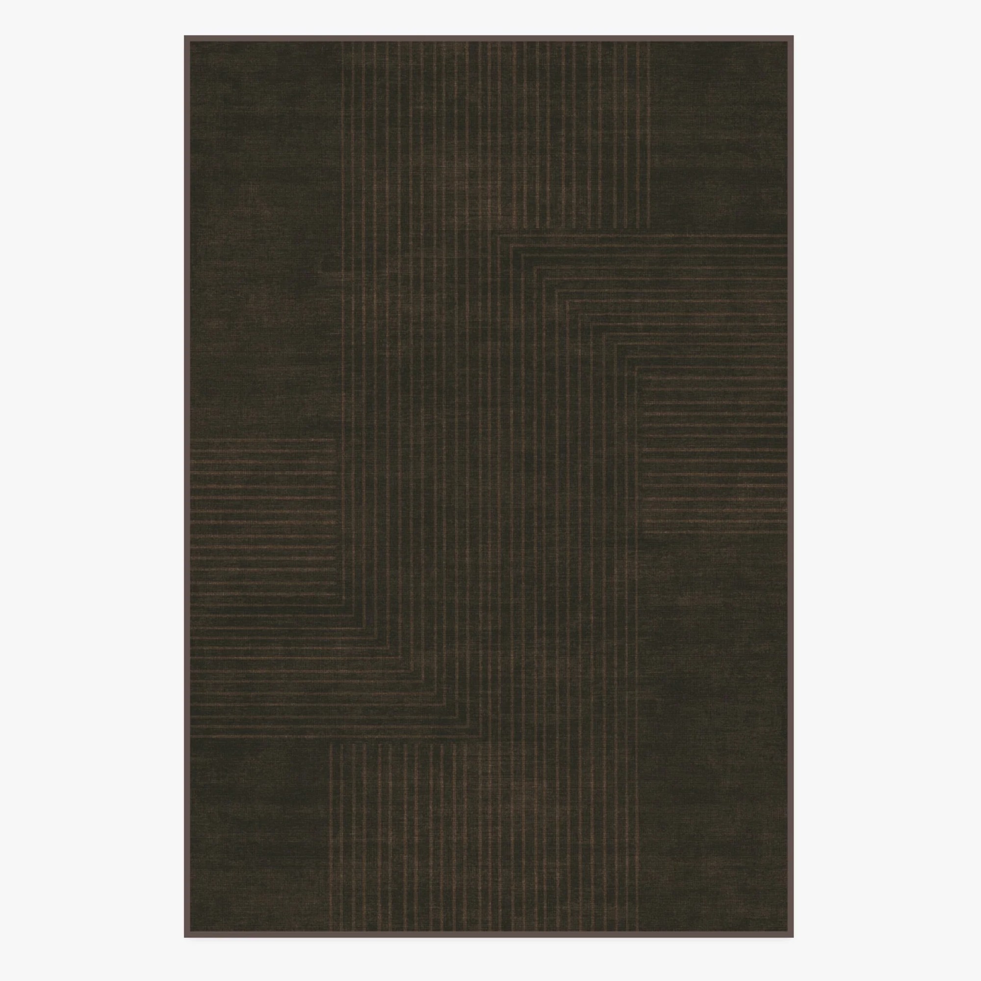
Alternatively, you can inject the dark coffee shade into your home through smalller pieces like these.
What are your thoughts on this espresso shade with a charcoal undertone?

Sara Hesikova has been Room Decor Editor at Ideal Home since June 2024, starting at the title as a News Writer in July 2023. She is now also the Ideal Home Certified Expert on Furniture, and so far has tried over 300 different sofas.
Graduating from London College of Fashion with a bachelor’s degree in fashion journalism in 2016, she got her start in niche fashion and lifestyle magazines like Glass and Alvar as a writer and editor before making the leap into interiors, working with the likes of 91 Magazine and copywriting for luxury bed linen brand Yves Delorme among others.
